new posts in all blogs
Viewing: Blog Posts Tagged with: Off our book shelves, Most Recent at Top [Help]
Results 26 - 50 of 67
How to use this Page
You are viewing the most recent posts tagged with the words: Off our book shelves in the JacketFlap blog reader. What is a tag? Think of a tag as a keyword or category label. Tags can both help you find posts on JacketFlap.com as well as provide an easy way for you to "remember" and classify posts for later recall. Try adding a tag yourself by clicking "Add a tag" below a post's header. Scroll down through the list of Recent Posts in the left column and click on a post title that sounds interesting. You can view all posts from a specific blog by clicking the Blog name in the right column, or you can click a 'More Posts from this Blog' link in any individual post.
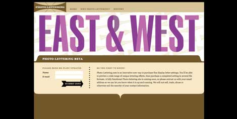
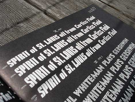
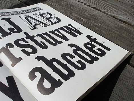
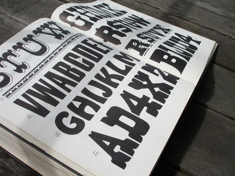
Photo Lettering website
Photo-Lettering was a mainstay of the advertising and design industry in New York City from 1936 to 1997. PLINC, as it was affectionately known to art directors, was one of the earliest and most successful type houses to utilize photo technology in the production of commercial typography and lettering. It employed such design luminaries as Ed Benguiat and sold type drawn by the likes of Herb Lubalin, Milton Glaser and Seymour Chwast as well as countless other unsung lettering greats. The company is best known by most of today’s graphic designers for its ubiquitous type catalogs.
House Industries purchased the entire physical assets of Photo-Lettering and is carefully digitizing select alphabets from the collection and plans to offer them through the new Photo Lettering website.
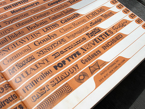
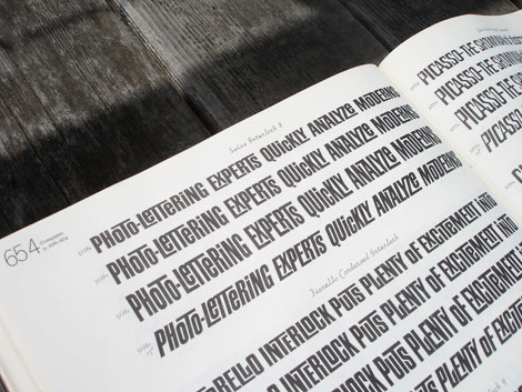
To celebrate, I thought it would be nice to dig up one my Photo Lettering catalogs. Here for your viewing pleasure is Alphabet Thesaurus Vol.2
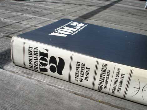
Alphabet Thesaurus Vol 2 - A Treasury of Letter Design
No Tags
Share This
Congrats to our two winners in the Human Empire/Andreas Samuelsson t-shirt giveaway. 1st place winner jessicat - 2nd place winner - Hamsterfish
©2009 Grain Edit

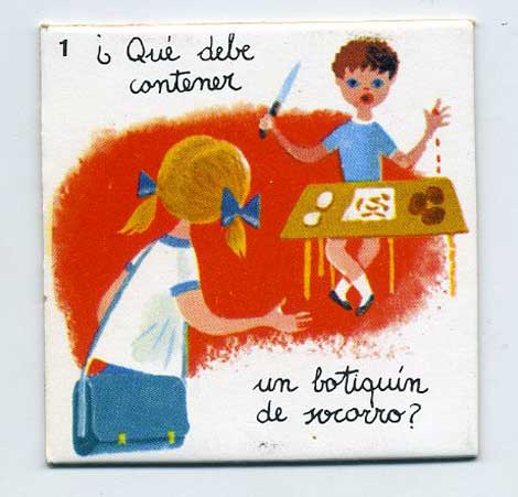
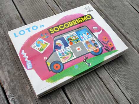
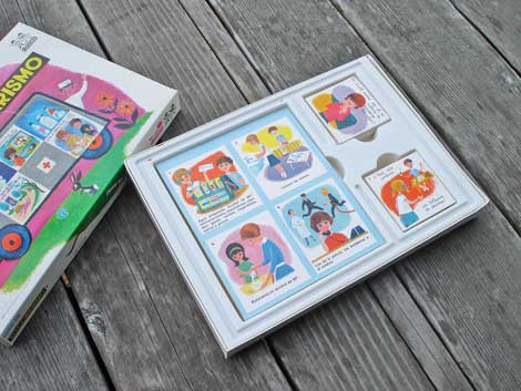
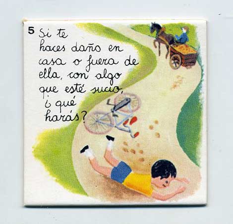
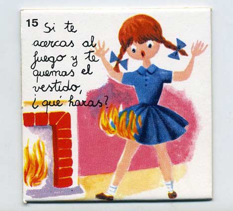
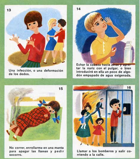
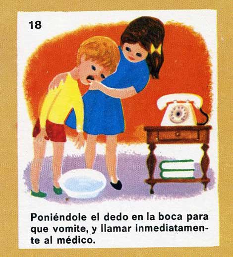
#1 Loto de Socorrismo produced by didacia - Made in Spain
Umm not sure what to think of this one. This has to be the craziest kid’s board game I’ve ever seen. Someone has to translate the text.
WE NEED YOU. HELP US WRITE CAPTIONS FOR EACH IMAGE
In the comments - write a caption for one or more of the images. Include the picture # with your caption. We’ll pick our favorites and one lucky person will WIN A PRIZE.
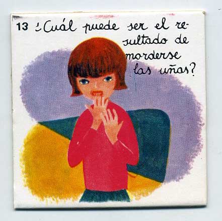
#2
#3
#4
#5 top left - #6 Top right - #7 Bottom left - #8 Bottom right
#9
———————-
Also worth checking: Richard Erdoes: Policemen around the World
Not signed up for the Grain Edit RSS yet? Give it a try. Its free and yummy. Join us on Twitter Y’all.
———————-
No Tags
Share This
Join us on Twitter @grainedit .
Join us on Facebook
©2009 Grain Edit

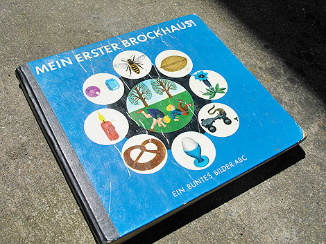
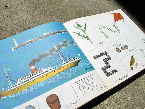
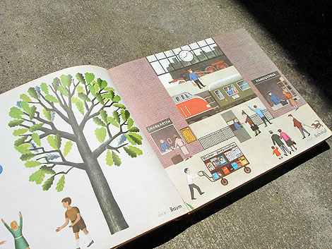
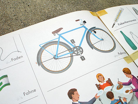
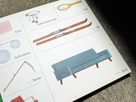
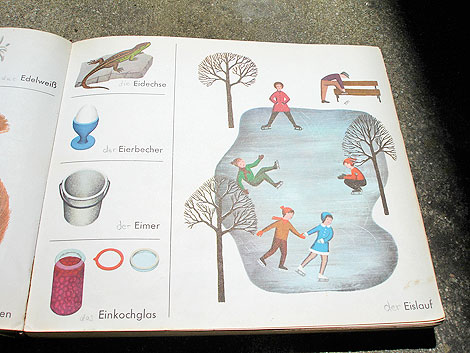
Mein Erster Brockhaus - Ein Buntes Bilder - ABC c1963 Published by F.A Brockhaus Wiesbaden Germany
What young German boy wouldn’t want a book filled with Spargel, Spatz, Specht and Schwable? (most of those were birds..but one was asparagus. I’ll let you guess which one.) This alphabet book is filled with those little dudes. If I ever go to Germany, I’m taking this book with me. I’ll be name dropping German nouns all day. This is the OG way to learn a language. Watch out Rosetta Stone!
Beautiful illustrations and design by: Dieter von Andrian, Paul Froitzheim and Gerhard Wawra.
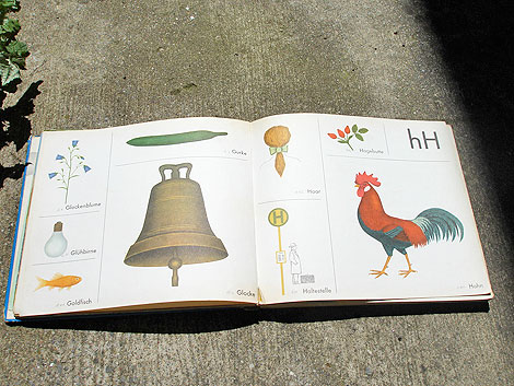
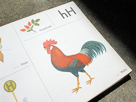
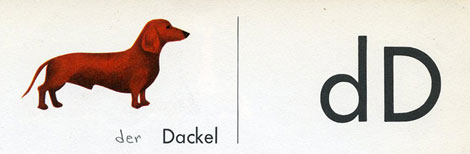
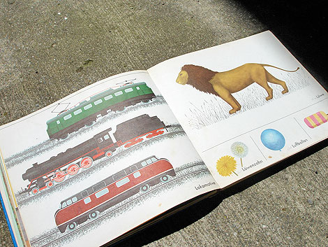
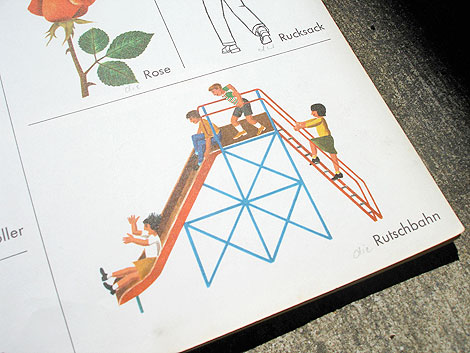
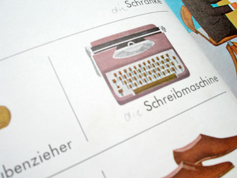
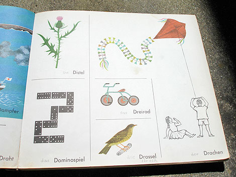
Pass the drossel!
———————-
Also worth checking: The Jungle Race
Not signed up for the Grain Edit RSS yet? Give it a try. Its free and yummy.
———————-
No Tags
Share This
Congrats to our winners in the Alexander Girard/ House Industries Giveaway!.
Grand Prize goes to MidcenturyMaude 2nd Prize goes to Abby S
©2009 Grain Edit

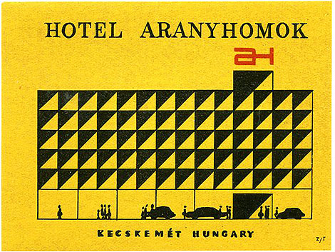
Hotel Aranyhomok - Kecskemet, Hungary
Beautiful luggage label for Hotel Aranyhomok. The hotel still exists.

image via itton.hu
No Tags
Share This
Congrats to our winners in the Alexander Girard/ House Industries Giveaway!.
Grand Prize goes to MidcenturyMaude 2nd Prize goes to Abby S
©2009 Grain Edit

By: Dave,
on 4/6/2009
Blog:
inspiration from vintage kids books and timeless modern graphic design
(
Login to Add to MyJacketFlap)
JacketFlap tags:
BOOKS,
reviews,
Typography,
Off our book shelves,
1950s,
vintage,
1960s,
swiss,
switzerland,
graphic-design,
Add a tag
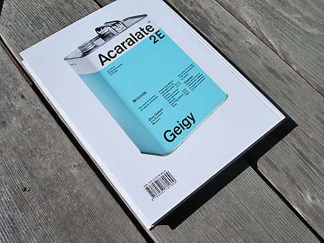
Corporate Diversity- Swiss Graphic Design and Advertising by Geigy 1940-1970. Published by Lars Muller +Museum fur Gestaltung Zurich - Back cover image of Acaralate canister designed by Markus Low in 1967
The fine folks at Lars Muller have just published an excellent book titled Corporate Diversity: Swiss Graphic Design and Advertising by Geigy. I know alot of designers (myself included) that are extremely excited over the release of this book. It chronicles the work of the design studio J.R Geigy AG which was a launching pad for one of the great periods of Swiss graphic design, in the 1950s and 1960s. It’s amazing to see the quantity and quality of the designers associated with Geigy. Under the leadership of Max Schmid for many years, the studio employed Roland Aeschlimann, Karl Gerstner, Jörg Hamburger, Steff Geissbuhler, Andreas His, Toshihiro Katayama, and Nelly Rudin, among others. Freelance designers such as Michael Engelmann, Gottfried Honegger, Armin Hofmann, Herbert Leupin, Warja Lavater, Numa Rick, and Niklaus Stoecklin were also used. In the 1960s, the Basel office, most especially George Giusti and Fred Troller, was involved in developing the studios of the subsidiaries in the United States and the United Kingdom, placing more emphasis on advertising. This is the first comprehensive presentation of Geigy design, an important Swiss contribution to the international history of design.
For those of you that have been wanting a copy of Publicity and Graphic Design in the Chemical Industry by Hans Neuburg, this book features some of the same content and is going to be easier to find. If you have money to buy one design book this spring, this is the one. You can purchase a copy on Amazon, unfortunately it is only available from sellers based in the UK and Germany. It should be available in U.S. soon. We will alert you on grain edit when US based dealers have copies in stock.
———————
Details:
19.8 x 26.4 cm, 208 pages, 385 illustrations, hardcover
Edited by the Museum für Gestaltung Zürich, Andres Janser, Barbara Junod
Book Designed by Norm and set in their typeface Replica
———————
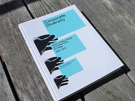
Corporate Diversity: Swiss Graphic Design and Advertising by Geigy 1940-1970
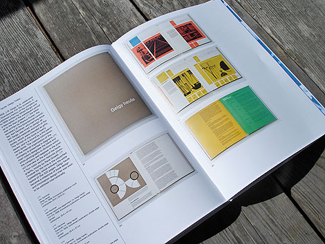
Geigy Heute (Geigy Today) designed by Karl Gerstner 1958, letterpress 25.4 x 22.9 cm
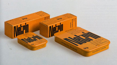
Packaging for Netrin designed by Armin Hofmann in 1953
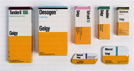
Retail Packaging for Geigy pharmaceuticals 1961-1962 - Design by Max Schmid
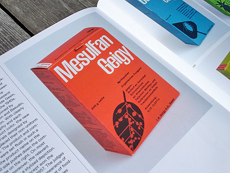
Mesulfan Geigy insecticide/ herbicide packaging for Swiss market designed by Andreas His 1956, Offset printing 12.6 x 8.6 x 4.9 cm
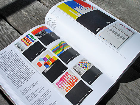
Color sample catalogues designed by Toshihiro Katayama 1963-1964 set in Akzidez Grotesk, 25×18.1×5.6cm Silkscreen
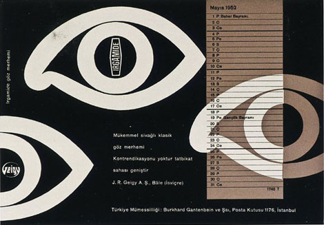
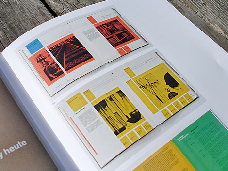
Irgamide Blotter designed by Armin Hofmann in 1952 Letterpress 14.1 x 20.3 cm
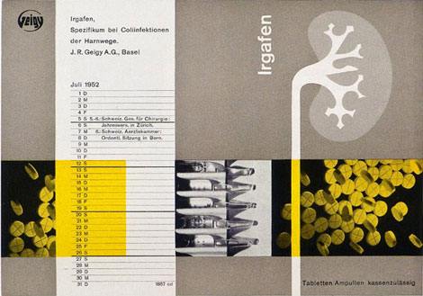
Iragafen Blotter designed by Nelly Rudin in 1952 : Letterpress 14.1 x 20.2 cm
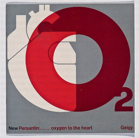
New Persantin brochure designed by Fred Troller, offset printing
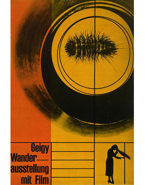
Geigy Traveling Exhibtion with Film poster designed by Karl Gerstner in 1953, offset printing 100×70cm
———————
A short film was created on the exhibit that accompanied the book. (via Aisle One)
Also worth checking: die neue Graphik by Karl Gerstner
———————
Not signed up for the Grain Edit RSS yet? Give it a try. Its free and yummy.
No Tags
Share This
Congratulations to our winners in the Grain Edit Design Stimulus Giveaway!.
Grand Prize goes to Tim Kim - 1st pick of the 4 prize options goes to Vertigo Andy - 2nd pick of prizes goes to Jory Dayne- 3rd pick of prizes goes to Tim Kim - 4th prize goes to Celiajoy our winner from twitter - We will contact all of you directly.
©2009 Grain Edit

By: Dave,
on 4/2/2009
Blog:
inspiration from vintage kids books and timeless modern graphic design
(
Login to Add to MyJacketFlap)
JacketFlap tags:
fonts,
Typography,
Off our book shelves,
vintage,
netherlands,
1960s,
dutch,
type-specimens,
rare,
Add a tag
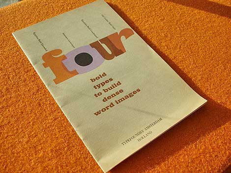
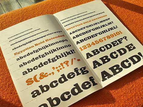
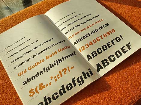
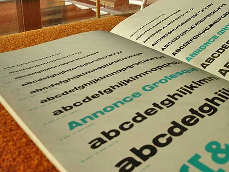
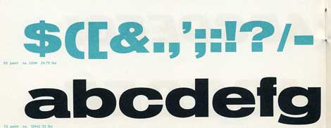
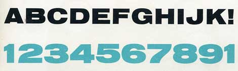
Four bold types to build dense word images c. early 60s?
Beautiful type specimen booklet produced by Typefoundry Amsterdam and imported by Amsterdam Continental. Includes samples of Egyptian Bold Extended, Annonce Grotesque, Egyptian Bold Condensed and Old Gothic Bold Italic.
From the intro of the Booklet:
In this specimen booklet, we have grouped four bold, decisive display type faces. Based on design modes which became classics of the midnineteenth century style, they have in common the power to create a dense , highly integrated word image, with the effect of a broad band or ribbon. A wide diversity is offered within this overall unity of effect: Egyptian and Gothic, roman and italic, condensed and extended. Where strong impact is required, these faces achieve dramatic solutions. They create an advanced, modern accent when maxium contrast with the even tone of text material is the designer’s aim.


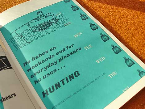
Who writes this stuff? This is great. He fishes on weekends and for everyday pleasure he uses hunting. Killing furry meat in the week and doodle socking on the weekend.. nice!
*Note-I googled fishing slang. I’m not actually this cool.
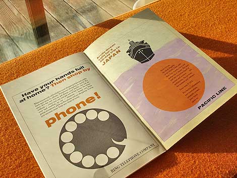
Ring telephone company..clever.

Also worth checking: Vette Annonce
Not signed up for the Grain Edit RSS yet? Give it a try. Its free and yummy.
No Tags
Share This
Congratulations to our winners in the Grain Edit Design Stimulus Giveaway!.
Grand Prize goes to Tim Kim - 1st pick of the 4 prize options goes to Vertigo Andy - 2nd pick of prizes goes to Jory Dayne- 3rd pick of prizes goes to Tim Kim - 4th prize goes to Celiajoy our winner from twitter - We will contact all of you directly.
©2009 Grain Edit


So, I’m hanging out my with friend and fellow book nerd Sean Flores a while ago and he’s breaks out these incredible posters designed for Bally in the 1980s. My jaw drops! He tells me they were created by French designer Jacques Auriac. Who the heck is Jacques Auriac? I’m thinking. Then Sean mentions that a Paris based publisher produced a catalog of his work. Ahh crap!! just what I need, another expensive import book to track down. A year later and a trip to Tokyo I finally got my hands on this thing.
It’s a beautiful book filled with full color reproductions of Auriac’s poster work from the 1950s up till when he died in 2003. He was a profilic designer/ illustrator and produced posters for a broad range of clients includng Middle East Airlines, Air Afrique, Gitanes and Bally. His earlier work reminds slightly of Raymond Savignac, Herve Morvan and Jacques Nathan Garamond.
You might be able to order a copy this book directly though the publisher if it’s not already out of print.


Bally poster c1981 designed by Jacques Auriac

Air Afrique Poster c1965

Groupement de l’industrie chimque 1965 + 1966

Syndicat national des graphistes publicitaires c1970

Salon international de l’agriculture c1970

Foire internationale de Bordeaux c1968

Berliet c1964


cards for Issy 2002

Societe Generale c1970 Grand Prix de l’Affiche 1970

Societe Generale c1971

Loto c1983
In addition, Daily motion has a great video of an Auriac exhibtion from 2007. View it here (In French)
Not signed up for the Grain Edit RSS yet? Give it a try. Its free and yummy..
No Tags
Share This
Congratulations to our winners in the Grain Edit Design Stimulus Giveaway!.
Grand Prize goes to Tim Kim - 1st pick of the 4 prize options goes to Vertigo Andy - 2nd pick of prizes goes to Jory Dayne- 3rd pick of prizes goes to Tim Kim - 4th prize goes to Celiajoy our winner from twitter - We will contact all of you directly.
©2009 Grain Edit


Beautiful Cityscapes designed and illustrated by the German couple Sigrid and Hans Lammle. These illustrations were for a calendar published in 1957. Really amazing details and the colors are super bright and saturated. I need more of this! Any guesses as to what city this might be?


also worth checking: Miroslav Sasek- This is the United Nations
Not signed up for the Grain Edit RSS yet? Give it a try. Its free and yummy.
No Tags
Share This
Join our new Grain Edit Fan Page on Face Book©2008 Grain Edit


Recently dug up this deck of El Al Israel Airlines playing cards. El Al commissioned Israeli artist and designer Jean David to design the set which portrays the Kings, Queens and heroes of Israel’s past. Love the design of the joker. He looks like some crazy elf with danish modern candle holders on his head and a speed bump for an arm.


also worth checking: Dan Reisinger: graphic designer
Not signed up for the Grain Edit RSS yet? Give it a try. Its free and yummy.
No Tags
Share This
Join our new Grain Edit Fan Page on Face Book©2008 Grain Edit


Wildsville : The art of Derek Yaniger - Published by Korero Books
I first found out about Derek Yaniger through Otto von Stroheim’s Tiki newsletter. His art harks back to the sketchy, loose line illustrations often found in cookbooks, maps, pamphlets and packages of the 1950s and 60s. It’s filled with references to hot rods, beatniks and tiki culture. It’s colorful, fun and always full of suprises.
Korero Books has just released this fantastic book entitled Wildsville: The Art of Derek Yaniger. The book is 112 pages and includes more than 140 full color images of Derek’s paintings and illustrations. I love Stuart Sandler’s (of font diner) description of Derek’s work in the beginning of the book.
“Mix together 1 part Jay Ward, 1 part Jethro Bodine, 2 parts Trader Vic, 1 1/2 parts Elvis ( the early years), 1 part Frankenstein and 3 parts Maynard Krebs, shake vigorously and strain gently over the sounds of vibraphone exotica, garnish with a little Sinatra, a rare marbled porterhouse and a dangerously dirty gin martini, and you’ll find yourself staring down the loaded double-barrel of a Derek shotgun ready to blow your mind!”
Grab a copy of the book while you can. It’s available at Korero Books and mister retro.


z


No Tags
Share This
New giveaways coming soon at Grain Edit ©2008 Grain Edit

By: Dave,
on 2/2/2009
Blog:
inspiration from vintage kids books and timeless modern graphic design
(
Login to Add to MyJacketFlap)
JacketFlap tags:
labels,
germany,
Off our book shelves,
vintage,
1960s,
ephemera,
memorabilia,
rare,
luggage-labels,
Add a tag

Hotel deutschland, Leipzig, Germany luggage label
Check the bird in the logo. Very similar to the Braniff Airlines logo designed by Alexander Girard.
also worth checking:
Hotel Rigi Luggage label
No Tags
Share This
New giveaways coming soon at Grain Edit ©2008 Grain Edit


Italia Modern Design - Published by PIE Books c2007
Japanese publisher PIE Books has put together some excellent design related books over the past couple years including Book Design of Graphic Designers in the World, Olle Eksell and Book Design of Graphic Designers in Japan. I picked up Italia Modern Design recently and it doesn’t disappoint. The book focuses on Italian graphic design from the 1950s-1970s and includes many of the heavyweights like Bruno Munari, Giovanni Pintori, Max Huber, Enzo Mari, Pino Tovaglia, Albe Steiner etc. It also includes a fair amount of work from Olivetti and Pirelli.
The people at PIE Books do a great job of sourcing and presenting the materials. They always dig up a few posters/books/magazines that I’ve never seen before. I just wish they would include an English translation (all the text is in Japanese) so, I can follow along with the notes.


No Tags
Share This
New giveaways coming soon at Grain Edit ©2008 Grain Edit


Bag for Polish handicraft store Cepelia 1970s?
Breaking out that case of premium rooster loot. Found this a while back at the local dirt mall. The type is nice, but really its all about that rooster tail. Even the rooster can’t get his eyes off it. I’d be having a how ya doing all day too if I had a tail like that.
The bag comes from Cepelia, which is a chain of stores in Poland that promotes and preserves the traditional art forms and craftmanship of the Polish peasantry. I stopped by their website and it looks like they have some really interesting stuff. Paper cut outs, ceramics, textiles etc. It’s like the OG Etsy. Cepelia has been around for over 50 years and hopefully will be around for 50 more.

No Tags
Share This
New giveaways coming soon at Grain Edit ©2008 Grain Edit

By: Dave,
on 11/3/2008
Blog:
inspiration from vintage kids books and timeless modern graphic design
(
Login to Add to MyJacketFlap)
JacketFlap tags:
Off our book shelves,
menus,
SAS,
illustration,
Uncategorized,
1950s,
modern,
airlines,
ephemera,
sweden,
memorabilia,
rare,
Add a tag

SAS Airlines dinner menu 1958
Dinner Menu celebrating the 1st Anniversary of the Scandinavian Airlines North Pole Route from Copenhagen to Tokyo.


No Tags
Share This
New giveaways coming soon at Grain Edit ©2008 Grain Edit

By: Dave,
on 10/3/2008
Blog:
inspiration from vintage kids books and timeless modern graphic design
(
Login to Add to MyJacketFlap)
JacketFlap tags:
japan,
birds,
out-of-print,
Off our book shelves,
posters,
1970s,
graphic-design,
rare,
illustration,
Add a tag
This is every cat’s nightmare.
Very similar in style to this 70s Japanese poster. Has to be the same designer.

Can someone translate this?

Is this the designers name?
Also worth checking:
1960s Japanese graphic design magazine
No Tags
Share This
Drop a comment and enter to win lots of cool prizes in the Grain Edit 1 Year Anniversary Giveaway Shindig thing! ©2008 Grain Edit

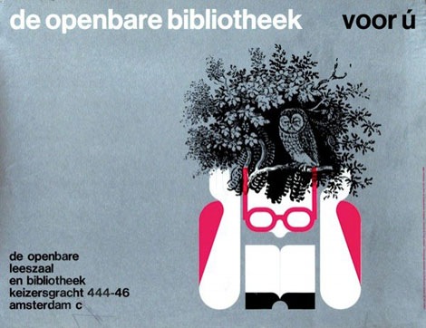
de openbare bibliotheek poster, amsterdam 1968
This is absolutely one of my favorite posters of all time. Design by Harry Sierman.
Harry studied at the Amsterdam Institute for Arts Education and later the Gerrit Rietveld Academy. After graduation he got a job with the Dutch publishing house: Querido He worked there for many years and became well known for his book design skills.
Back in January I had the chance to trade a few emails with Harry’s daughter in law. She was nice enough to send me a copy of a small book that focuses on Harry’s graphic design and typography work from the 1940s till 2003. I’ve attached a few scans from the book below.
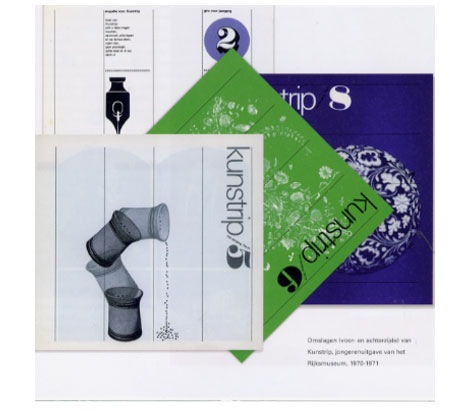
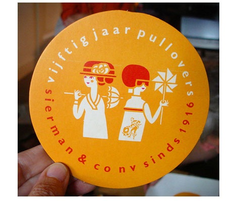
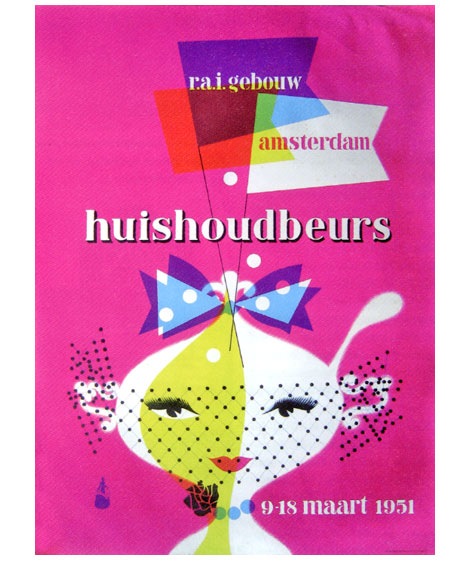
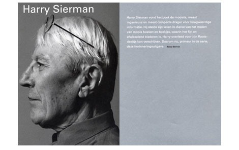
From top to bottom: Issues of kunstrip for Riijksmuseum 1970-1971, Sierman & Co. label for vijftig jaar pullovers-1966, Affiche for Huishoudbeurs-1951, Harry Sierman book
Image credits - very top image via Van Sabben Auctions, vijftig jaar pullovers image via hier houd ik van
Also worth seeing:
317 dutch posters - Heck yea!
dutch typography
No Tags
Share This
Congrats to JAN D you won the Raymond Savignac poster. Please email us to claim your prize. ©2008 -Visit us at Grain Edit.com for more goodies.

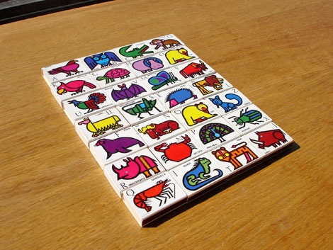
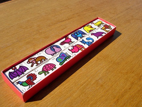
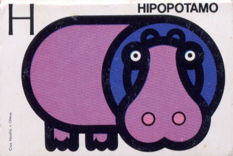
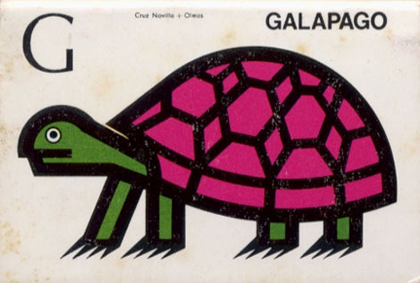
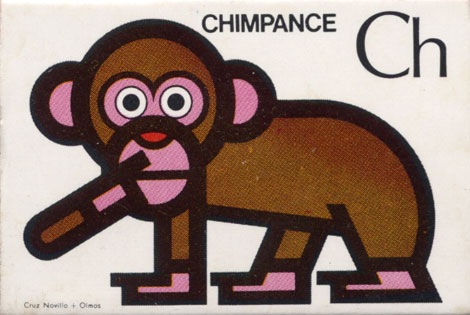
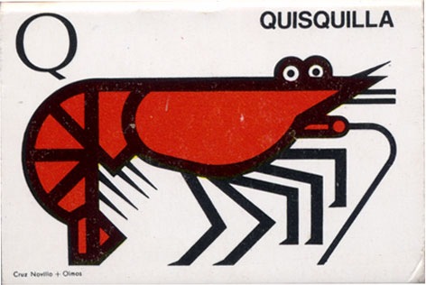
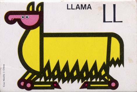
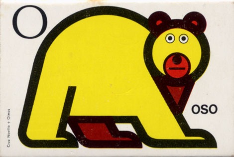
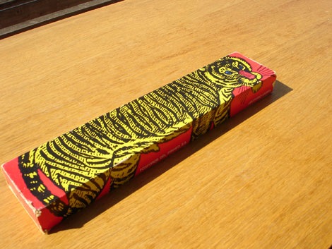
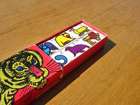
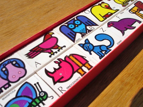
Fosforos Del Pirineo - Abccdario Animal (Animal Alphabet) Spain 1970s?
I found these recently. Super cool matchbox covers designed by Cruz Novillo + Olmos. The matchboxes feature an illustration of an animal for each letter of the alphabet. Hard to pick a favorite, but I think I have to go with the yellow oso (bear) loco. I think he cloned himself, because I notice I have two of the letter “O”.


Also worth checking:
Spanish modern advertising
No Tags
Share This
Congrats to JAN D you won the Raymond Savignac poster. Please email us to claim your prize. ©2008 -Visit us at Grain Edit.com for more goodies.

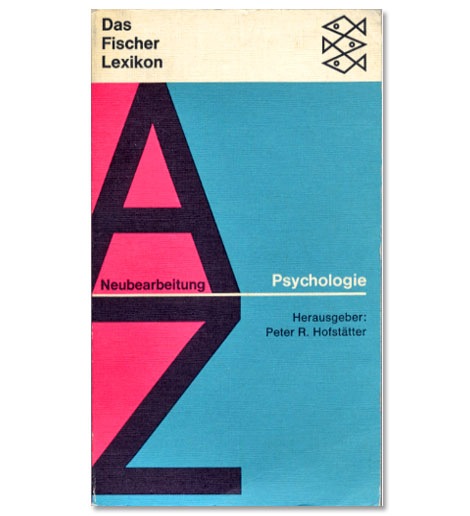
This book cover has all I need, big letters and dagger shaped fishies.
Also worth checking:
450+ examples of German and Swiss Modern Book Design
No Tags
Share This
Congrats to JAN D you won the Raymond Savignac poster. Please email us to claim your prize. ©2008 -Visit us at Grain Edit.com for more goodies.

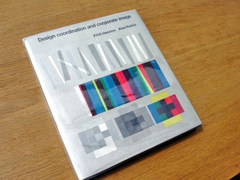
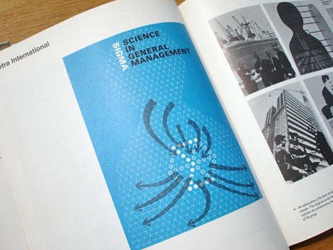
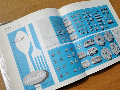
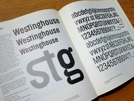
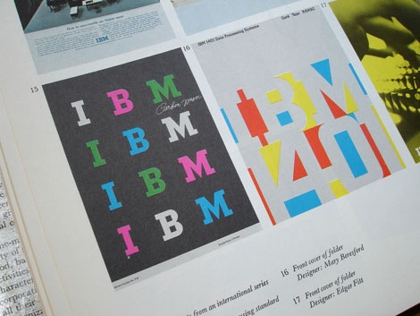
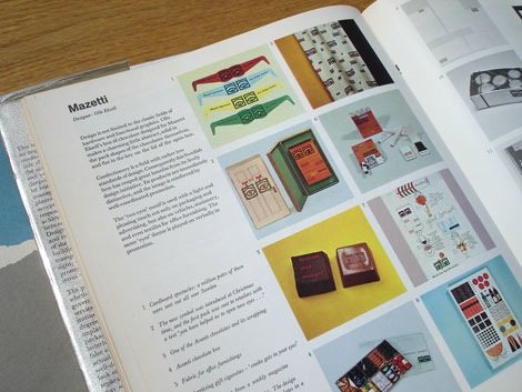
Design Coordination and corporate image - FHK Henrion + Alan Parkin c1967
This is an excellent book on the subject of corporate identity. All the big design guns are in here. The best part, for each case study the designer explains the problems he encountered and his thoughts behind the design etc.
Includes case studies by Dick Merricks, Metra International, KLM Royal Dutch Airlines, Barilla, BTR Industries, Watneys, Braun, IBM, Westinghouse, PAM, Olivetti, Celanese Corporation, Olympic Games Tokyo 1964, Clydesdale Bank, Mazetti, Pirelli, London Transport, Therma, Italsider, British Rail, Rohm and Haas, Herman Miller, Anker Bier, Lunch Bier, British Traffic Signs, Sainsburys, Steendrukkerij de Jong
Designers Include: Otl Aicher, Saul Bass, Lester Beall, Erberto Carboni, Eugenio Carmi, Wim Crouwel, Design Research Unit, Crosby, Fletcher, Forbes, Charles Eames, Olle Eksell, FHK Henrion, Yusaku Kamekura, George Nelson, Paul Rand, Willelm Sandberg, Giovanni Pintori and more.

Also worth checking:
List of Corporate Identity Projects
No Tags
Share This
Congrats to JAN D you won the Raymond Savignac poster. Please email us to claim your prize. ©2008 -Visit us at Grain Edit.com for more goodies.

By: Dave,
on 8/25/2008
Blog:
inspiration from vintage kids books and timeless modern graphic design
(
Login to Add to MyJacketFlap)
JacketFlap tags:
graphic-design,
memorabilia,
Off our book shelves,
maps,
vintage,
brazil,
1960s,
ephemera,
graphics,
Add a tag
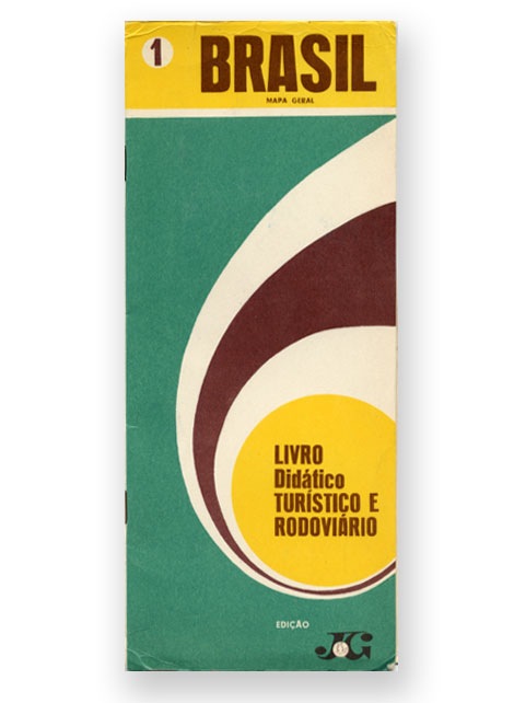
Brasil Mapa Geral - from 1969
I picked this up a couple of years ago and I flipped when I saw this cover. This puts to shame my US Texaco maps. Unfortunately, the map part is missing. All I have is the cover and a few bits of text that were inside. What secrets did that map hold? I bet it was a treasure map that led to a top secret cave filled with barrels of almond milk. Dang, I love that stuff.
Can anyone translate the text on the cover?
Also worth checking:
1960s Brazilian book cover designs by Gian Calvi
No Tags
Share This
©2007 -Visit us at Grain Edit.com for more goodies. 
By: Dave,
on 7/31/2008
Blog:
inspiration from vintage kids books and timeless modern graphic design
(
Login to Add to MyJacketFlap)
JacketFlap tags:
Off our book shelves,
retro,
vintage,
netherlands,
1960s,
dutch,
ephemera,
analog,
booklets,
interfaces,
Add a tag
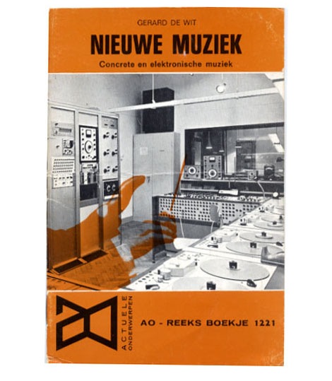
Nieuwe Muziek - Concrete en elektonische muziek by Gerard de Wit c1968
Great cover photo of a dutch recording studio from the 1960s. Check out all the vintage analog recording equipment! So many buttons, switches, knobs, reel to reels and dials. If your into 60s computer interfaces, tape machines and old mixing boards, I highly recommend you check out Stewf’s amazing Control Panel Flickr group.
Mucho thanks to Chris at Groove Merchant for hooking me up with the booklet.
No Tags
Share This
©2007 -Visit us at Grain Edit.com for more goodies. 
By: Dave,
on 7/21/2008
Blog:
inspiration from vintage kids books and timeless modern graphic design
(
Login to Add to MyJacketFlap)
JacketFlap tags:
BOOKS,
illustration,
childrens books,
animals,
out-of-print,
Off our book shelves,
vintage,
1960s,
czechoslovakia,
kids-books,
Add a tag
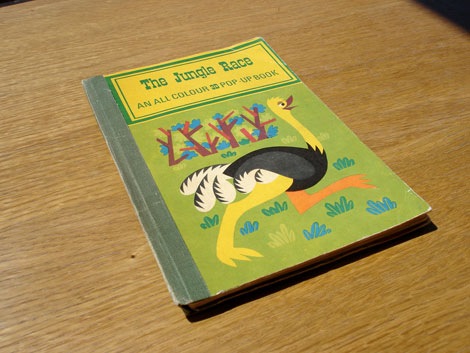
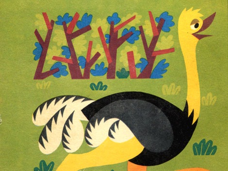
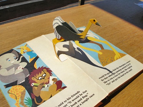
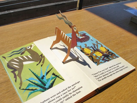
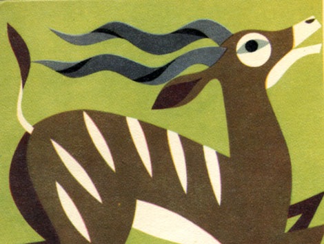
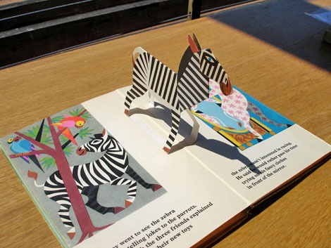
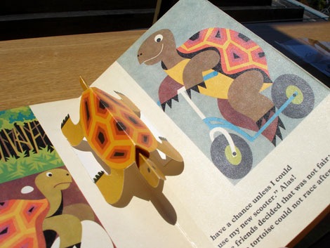
The Jungle Race - c 1967- Published by Bancroft & Co.
Super cool children’s book from Czech illustrators G. Seda and J. Pavlin. One of many pop up books the duo illustrated during the 1960s and 70s.
The short version of this story is: a lion, an elephant and and a giraffe try to put together a race and find out that their friends are totally lame. Their loser friends include trendy Zebra fashions snobs, snorkeling hippos and an antelope that likes to get tossed in the air by a gaggle of monkeys.
No Tags
Share This
©2007 -Visit us at Grain Edit.com for more goodies. 
By: Dave,
on 7/17/2008
Blog:
inspiration from vintage kids books and timeless modern graphic design
(
Login to Add to MyJacketFlap)
JacketFlap tags:
UK,
magazines,
out-of-print,
Off our book shelves,
modern,
retro,
vintage,
1960s,
graphic design. ken garland,
industrial-design,
Add a tag
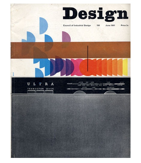
Design Magazine June 1961
Ken Garland served as art editor for UK based Design Magazine for six years. This is just one of many amazing covers that was conceived during his tenure.
also worth checking:
10 years of Vendre Magazine cover design
No Tags
Share This
©2007 -Visit us at Grain Edit.com for more goodies. 
By: Dave,
on 7/9/2008
Blog:
inspiration from vintage kids books and timeless modern graphic design
(
Login to Add to MyJacketFlap)
JacketFlap tags:
BOOKS,
Typography,
out-of-print,
Off our book shelves,
1950s,
modern,
retro,
vintage,
posters,
1960s,
italy,
Olivetti,
graphic-design,
corporate-identity,
Add a tag
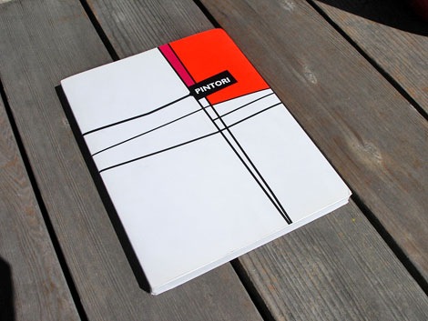
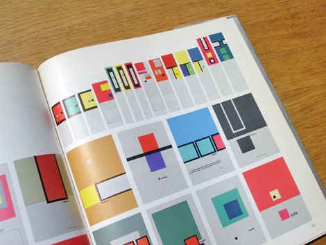
Giovanni Pintori exhibition catalog c2003
Giovanni Pintori won a scholarship in 1930 (at the age of 18) to study at the ISIA in Monza under design heavyweights like Marcello Nizzoli and Edoardo Persico. After graduation he was invited to work for Olivetti in the Development & Advertising Office located in Milan. Three years later he would become the head of the department. Over the next 27 years he created an impressive body of work for Olivetti that would earn him a lasting international reputation.
This book was made in conjunction with a 2003 exhibition that highlighted many of Pintori’s designs for Olivetti.
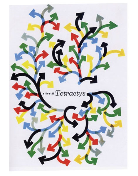
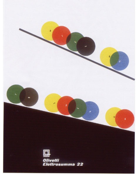
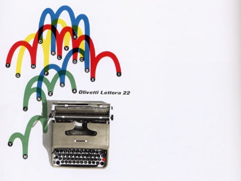
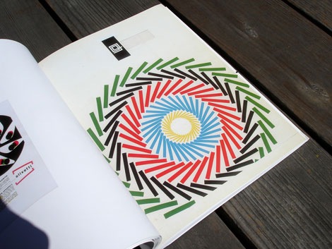
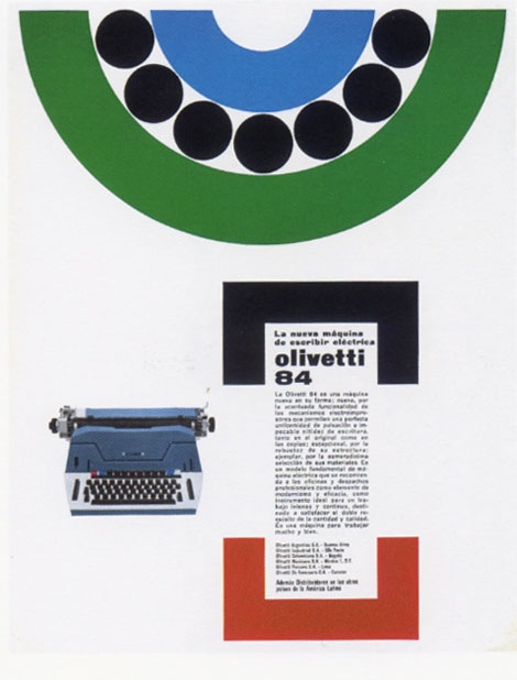
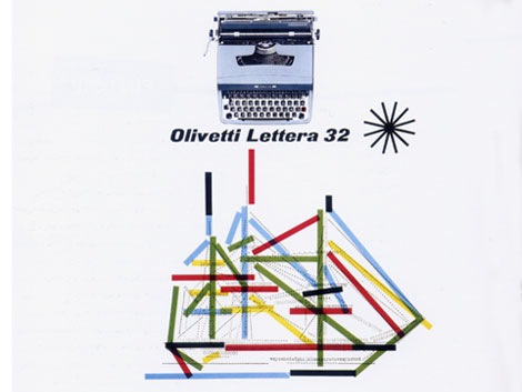
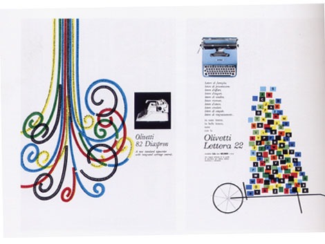
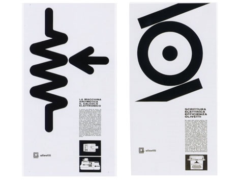
Seen above: posters and advertisements for Olivetti 84, Lettera 22, Elettrosumma 22 typewriters and the Olivetti Tetractys printing calculator
Also worth checking:
Olivetti Divisumma calculator
No Tags
Share This
©2007 -Visit us at Grain Edit.com for more goodies. 
By: Dave,
on 7/8/2008
Blog:
inspiration from vintage kids books and timeless modern graphic design
(
Login to Add to MyJacketFlap)
JacketFlap tags:
Off our book shelves,
modern,
retro,
vintage,
1960s,
ephemera,
graphic-design,
baseball,
stamps,
Add a tag
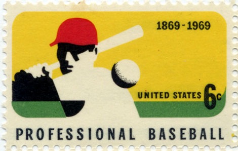
stamp commemorating 100 years of Professional Baseball c 1969 - printed on a Giori press.
One of my favorite stamps from the US. It all works for me, the use of negative space, the colors, and the 6 cent price tag. Makes me miss the days of buying big league chew at the candy store and watching TWIB.
Also worth checking:
vintage modern stamps from Israel
modern sticker, label and stamp club
No Tags
Share This
©2007 -Visit us at Grain Edit.com for more goodies. 
View Next 16 Posts


