new posts in all blogs
Viewing: Blog Posts Tagged with: GRAPHICS, Most Recent at Top [Help]
Results 26 - 50 of 63
How to use this Page
You are viewing the most recent posts tagged with the words: GRAPHICS in the JacketFlap blog reader. What is a tag? Think of a tag as a keyword or category label. Tags can both help you find posts on JacketFlap.com as well as provide an easy way for you to "remember" and classify posts for later recall. Try adding a tag yourself by clicking "Add a tag" below a post's header. Scroll down through the list of Recent Posts in the left column and click on a post title that sounds interesting. You can view all posts from a specific blog by clicking the Blog name in the right column, or you can click a 'More Posts from this Blog' link in any individual post.

Graphics @clipart4resale.com
Today’s story starter is about Halloween, just in case the graphic wasn’t a hint enough.
*Disclaimer: Stories based on the exact set of words, names and attached graphics are already in the works.
“Who are you?” a young voice squeaked as Selma nearer his hiding place.
“I’m Selma,” the reluctant witch whispered back, straightening her hat.
“I’m Willy. Are you a really a witch?”
Selma thought for a second, not wanting to scare the boy. “Yes,” she said, “I’m a witch. But I don’t like to scare people.”
Like my graphics- most come from Alice Smith @clipart4resale.com.


Cowboy Kurt woke up with a start. “Ernestine, what is wrong? Why are you whining?” he asked, pulling on his best cowboy shirt and pants.
Ernestine raced to Cowboy Kurt’s side. She licked his cheek and whimpered.
Cowboy Kurt patted Ernestine’s head. “Go play with your doggies.”
Ernestine did not move. She whimpered even louder. She jumped up and down. She galloped to the closed door and back again.
“Just wait a minute,” said Cowboy Kurt, as he opened the door. “I’ll let you out.”
Ernestine rushed by Cowboy Kurt, her tail thumping his leg “Now maybe I can eat my flapjacks.”

*Disclaimer: Stories based on the exact set of words, names and attached graphics are already in the works.


Recently I attended the Iowa SCBWI conference and meet a new friend, the talented Dorothia Rohner. She graciously allowed me to post one of her illustrations and a bio about her on my blog. You can also learn more about her on Twitter.com.
Nature has been a steadfast inspiration in my life and work. I studied fine art, graphic design and illustration at various universities.
Ultimately I combined my love of science and art, and earned a degree in Biological and Pre-Medical Illustration from Iowa State University. I worked as a scientific illustrator for a computer animation company and graphic designer in the craft industry.
Currently I focus my time on what I love; creating nature art for the licensing market and illustrating picture books. My illustrations have been in Cricket magazine as well as other garden and nature publications.
I have illustrated two picture books; Effie’s Image (Prairieland Press) and “Numbers in a Row, An Iowa Number Book (Sleeping Bear Press).
For more information visit: http://www.paintedwings.com


*Disclaimer: Stories based on the exact set of words, names and attached graphics are already in the works.
“Stand still,” ordered Isabella, raising her net above her shoulder. “Don’t move a muscle. There’s a snake loose in here. ”
Gasps filled the room. All at once everyone jumped up and ran from the room. All except one little child.
“Aren’t you scared?” asked Isabella. 
“Nope,” replied the girl. “I like snakes.


By: Kevin Levell,
on 10/30/2009
Blog:
Kev Lev's Blog
(
Login to Add to MyJacketFlap)
JacketFlap tags:
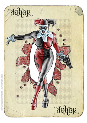
Harley Quinn,
ambigram,
Comic Book,
Blogs,
Digital Painting,
Samples,
Batman,
Composition,
Graphics,
Joker,
Layout,
Digital Rough,
Add a tag
I am lucky enough to once again have a piece of my work thrust into the spotlight over on the fantastic Scotch Corner. Appearing tomorrow will be my version of the Joker. Here is the work in progress for it.
1  2
2 
Initially I drew the head and face for the Joker in my sketch book.
I scanned this at 300dpi, mucked about in photoshop and added the hand with the playing card (1).
Then I started to add some colour to the piece, trying out different things but ultimately knowing that I wanted a classic colour scheme for the final piece (2).
3  4
4 
I changed my mind about how the piece should be cropped and added the top of the Joker's head... at this point I also added the little Joker
as previously posted and the
ambigram of the word Joker from the
Harley Quinn piece I did in July (3).
The next step was to drop out all the colour and create an image that would only print from the cyan tank of my printer (4).
5  6
6 
I inked the "blue-scale" image after printing it out onto a nice sheet of bristol board (5).
Obviously I don't want all that blue, I just want the nice clean ink lines (6).
In photoshop there are plenty of ways to remove the blue - I use the channel mixer to remove most of the blue but some people prefer to convert to CMYK and then throw away the cyan channel. Both methods require some fiddling with levels to remove any grey areas and leave a nice Black and white image.
The final stage for me was to composite my two files (3) and (6), clean up any glaringly obvious problems, add some sort of background and a bit of texture to add some more depth to it all. To see how the final thing turned out, pop over to
Scotch Corner on Saturday!
As an aside, I think this is pretty appropriate as a Halloween post!
Another one of those creatures I've been doing semi-occasionally with Matt and Phil...
My Salamander is not really twisted at all... I wanted to treat this one very graphically to see what would happen... possibly with a view to developing some T-Shirt designs.

Phil's already done his push-me-pull-you styled take on it, but Matt is very busy on some other projects right now - no pressure buddy, it'll keep!
Re-worked, re-coloured and re-presented! I give you Recurrent, my Spider-man story!
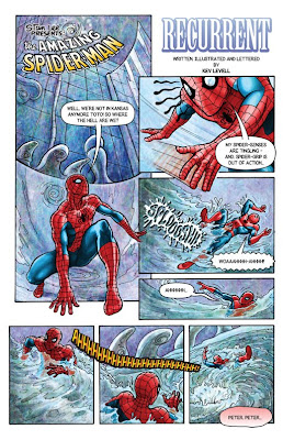
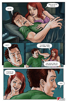
I'm pretty happy with these now... Nice that I've done all of it myself too, there's a sense of achievement in that!
Please leave a comment and let me know what you think.
I've been asking myself questions about these samples; Am I getting closer to the standard necessary for a comic book artist? Are these worth submitting to Panini, the UK publisher for Marvel characters or should I keep hold of them and try to show them at the upcoming Birmingham convention? Can I indeed submit them to Tharg, even though they are not his characters?
My gut feel answers to those questions are; probably, it might prove most useful to get feedback face to face and no, not really.
Next up is a Batman piece I've been casually sketching things for - then it's some strip work for the Zarjaz guys... busy, busy, busy!
I thought I’d write this as I liked to draw in Microsoft Paint, and a lot of people seem surprised at the possibilities you can achieve with such a simple program!
First off what you do is find a picture of what you’re drawing, either use a website link…or a picture on your computer… Print Screen it (Prt Sc) and paste it into a New File in Paint, then select what part of the image you need – a person, their face, a background etc.
Next, select your tool. I prefer the little Pencil icon rather than the Paintbrush icon as it’s thinner. Drawing with a mouse is very tricky, so use the Magnifying Glass to zoom in – 2 times zoom – works for me. The picture now looks like pixels, which is what you then use to recreate with the pencil. Try and draw/copy as close to the pixels as possible for accuracy. This is really useful for drawing eyes and facial features. You may prefer to just draw in whatever style you want though, so I’ll cover effects down the page.

This is a drawing where I used the zoom. Once you draw each bit, zoom out to see if it looks fine, if not rub it out and re-draw. You can use the selection tool to move the drawing about the page also. No need to worry about keeping it in the same place. Once you’ve got you drawing completed. Save you drawing. Save as you go along (CTRL +S), as sometimes it’s possible Paint my crash. Save as a Bitmap, this won’t distort any quality (if you saved as a .jpeg, you cant open the file and fill in colours as the quality has decreased)…
It’s time to add colour, for this I like to use the Pick Colour tool, go to the original image and select the skin tone (if you’re drawing a person). This way you have their exact skin/hair/eye/clothing tone which creates a realistic effect. Then Flood-fill tool (the paint can spilling over) to paste that section that colour.
Play about different shades if you like. The background - again you can copy from a picture or create your own. There are many easy ways to achieve this, if you wanted to suggest a floor or window use Line tool to put straight lines in. I find it’s easy to just put it straight over the people then use the Eraser to wipe out any over lines.

As you can see for this drawing, I uses the Line to create the windows and a garden outside, then filled the colours of grass/walls etc in. Easy. A useful tip is, for filling a colour black, use a lighter shade of black (click the colour black, then define custom colours and go a shade lighter) because if the outside line’s are the same and you want to change it, it will fill in all adjoining black lines and effectively ruin your drawing. Save again, I’d recommend saving before making a huge change as well, as you can go close and re-open to the version you’re happy with.

Here for effects, I’ve created a glistening surface by just drawing little white stars. I’ve used the Line tool to give the perception of cupboards. This was just playing about until it looked right. Anytime you make a huge mistake just Undo it (CTRL + Z), remember you can only undo a few times. So keep saving or keep on top of it. I prefer to draw little by little – check – OK – next bit. Eraser tool is always helpful.
And likewise Free Form Select or Select tools – you can move anything about! I would then add the background, as above. There’s a kettle, a knife, glasses.

Here I have used a darker shade of brown on the door to draw cracks and added text. Adding text is fun, remember it will create a huge block of white on top of your drawing, which you can adjust to a speech bubble or fill in, if it works.
Click Link For Image
I have used some of Paint’s effective tools for this drawing. The Ellipse tool for her bum to create circular feel, the Airbrush tool to give the impression of grass. A lot of copy and pasting in the background, straight lines and colour can make all the difference! Experimenting with different shades is usually the major factor in creating an image.
Once you’re finished Save it. Because Paint is primarily using pixels, if you re-size your drawing you’ll notice a lot of distortion, so it’s probably best to avoid that. If you want to put it on-line, then open the drawing and save it as a jpeg or PNG and upload in that format as you will have less distortion!

I thought I’d write this as I liked to draw in Microsoft Paint, and a lot of people seem surprised at the possibilities you can achieve with such a simple program!
First off what you do is find a picture of what you’re drawing, either use a website link…or a picture on your computer… Print Screen it (Prt Sc) and paste it into a New File in Paint, then select what part of the image you need – a person, their face, a background etc.
Next, select your tool. I prefer the little Pencil icon rather than the Paintbrush icon as it’s thinner. Drawing with a mouse is very tricky, so use the Magnifying Glass to zoom in – 2 times zoom – works for me. The picture now looks like pixels, which is what you then use to recreate with the pencil. Try and draw/copy as close to the pixels as possible for accuracy. This is really useful for drawing eyes and facial features. You may prefer to just draw in whatever style you want though, so I’ll cover effects down the page.
This is a drawing where I used the zoom. Once you draw each bit, zoom out to see if it looks fine, if not rub it out and re-draw. You can use the selection tool to move the drawing about the page also. No need to worry about keeping it in the same place. Once you’ve got you drawing completed. Save you drawing. Save as you go along (CTRL +S), as sometimes it’s possible Paint my crash. Save as a Bitmap, this won’t distort any quality (if you saved as a .jpeg, you cant open the file and fill in colours as the quality has decreased)…
It’s time to add colour, for this I like to use the Pick Colour tool, go to the original image and select the skin tone (if you’re drawing a person). This way you have their exact skin/hair/eye/clothing tone which creates a realistic effect. Then Flood-fill tool (the paint can spilling over) to paste that section that colour.
Play about different shades if you like. The background - again you can copy from a picture or create your own. There are many easy ways to achieve this, if you wanted to suggest a floor or window use Line tool to put straight lines in. I find it’s easy to just put it straight over the people then use the Eraser to wipe out any over lines.
As you can see for this drawing, I uses the Line to create the windows and a garden outside, then filled the colours of grass/walls etc in. Easy. A useful tip is, for filling a colour black, use a lighter shade of black (click the colour black, then define custom colours and go a shade lighter) because if the outside line’s are the same and you want to change it, it will fill in all adjoining black lines and effectively ruin your drawing. Save again, I’d recommend saving before making a huge change as well, as you can go close and re-open to the version you’re happy with.
Here for effects, I’ve created a glistening surface by just drawing little white stars. I’ve used the Line tool to give the perception of cupboards. This was just playing about until it looked right. Anytime you make a huge mistake just Undo it (CTRL + Z), remember you can only undo a few times. So keep saving or keep on top of it. I prefer to draw little by little – check – OK – next bit. Eraser tool is always helpful.
And likewise Free Form Select or Select tools – you can move anything about! I would then add the background, as above. There’s a kettle, a knife, glasses.
Here I have used a darker shade of brown on the door to draw cracks and added text. Adding text is fun, remember it will create a huge block of white on top of your drawing, which you can adjust to a speech bubble or fill in, if it works.
Click Link For Image
I have used some of Paint’s effective tools for this drawing. The Ellipse tool for her bum to create circular feel, the Airbrush tool to give the impression of grass. A lot of copy and pasting in the background, straight lines and colour can make all the difference! Experimenting with different shades is usually the major factor in creating an image.
Once you’re finished Save it. Because Paint is primarily using pixels, if you re-size your drawing you’ll notice a lot of distortion, so it’s probably best to avoid that. If you want to put it on-line, then open the drawing and save it as a jpeg or PNG and upload in that format as you will have less distortion!
By: Kevin Levell,
on 7/22/2009
Blog:
Kev Lev's Blog
(
Login to Add to MyJacketFlap)
JacketFlap tags:
Comic Book,
Blogs,
Logo,
Cover,
Graphics,
2000AD,
Layout,
Creators,
Fanzine,
Zarjaz,
ambigram,
Add a tag
The massive news that I've been sitting on for a couple of weeks is that I have designed a new logo for the 2000AD fanzine Zarjaz. Please do check out the home of the Fanzine at The Quaequam Blog.
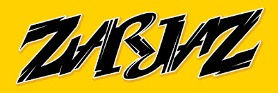
Yes, it's another one of those ambigram things. I'm really pretty chuffed about this, and for another scoop here how it's going to look on the cover of issue 08!
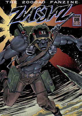
I also have a strip in this issue as previously blogged about. Copies will be ready for BICS on 3rd October and will be available there, via The Quaequam Blog or the FutureQuake shop. There will also be new issues of Dogbreath (with another strip by me) and Future Quake available too.
Awesome Rogue Trooper artwork courtesy of the ever brilliant PJHolden and Steve Denton (colours).
Gonna have to go before I start giggling like a little girl - I'm so excited!
Well, I'm gonna post this here in full now.
I was very pleased with how she turned out in the end. Thanks for all the kind comments.
View Next 12 Posts


 “Doggone it! Of all the times to lose that pesky reindeer…it had to happen the day before Christmas! I knew that reindeer was trouble from the very first time I laid my eyes on him,” Cookie Albertson roared. Grimacing, he used his new cotton kerchief to wipe the sweat from his bushy brow.


 ZuZu dunked her head down under the water with only her eyes showing. All the noise in the grasslands had scared her.


Wow, he's really creepy. Loads of personality in this piece Kev. Nice work.
Nice idea Kev I really like the Mime style T-shirt
Really excellent piece. The step by step stuff is incredibly useful too so thanks for posting that :)
Nice Joker Kev! great seeing the various stages to.
Still gives me the creeps every time I see it! A great piece of work, and fascinating as always to see your process. It's great to see Joker brought up to date and given a new twist. Does he also wear a hoody...:) On a constructive / destructive note, I wonder in seeing it again whether the hand (although excellently constructed as it now is) should be more slender and spindly to match the lanky frame of the traditional Joker...??! Still knockout regardless!