As part of their continued design update (which started with a logo re-design), the Canadian Arabian Horse Registry recently went live with their new website, www.cahr.ca. Based on WordPress, the site offers visitors many functional improvements. The old site, built in 2007, had become bloated, with relevant information spread out across many pages. The new site streamlines information … Continue reading New website for the Canadian Arabian Horse Registry
Viewing Blog: Foxtail Studio, Most Recent at Top
Results 1 - 25 of 82
Foxtail Studio is a blog by Christina Weese, graphic designer, who is currently blogging about designing her first illustrated fairy tale. I also post on other things more or less related to storytelling - literary/writer things, photogrpahy, book design, general sociology ramblings - and also sometimes food.Statistics for Foxtail Studio
Number of Readers that added this blog to their MyJacketFlap:
Blog: Foxtail Studio (Login to Add to MyJacketFlap)
JacketFlap tags: portfolio, Add a tag
Blog: Foxtail Studio (Login to Add to MyJacketFlap)
JacketFlap tags: design, portfolio, Add a tag
I know it sounds weird, but form design is one of my favourite things to do. It’s like constructing an invisible puzzle – everything has to fit, and the ‘solution’ (how to use/read the form) needs to be obvious to everyone who comes across it. Mash Millwright Field Service Labour Report My little brother is a millwright in central Alberta. … Continue reading Form Design
Blog: Foxtail Studio (Login to Add to MyJacketFlap)
JacketFlap tags: design, portfolio, annual report, Saskatchewan, Sask Waste Reduction Council, Add a tag
The Saskatchewan Waste Reduction Council’s 2012 Annual Report featured their vision statement on the cover: Think More… Waste Less. For the print version, the globe was split vertically with half the message on the front cover and half on the back cover. For the annual report’s downloadable PDF, we created one seamless image so the entire statement could … Continue reading Sask Waste Reduction Council Annual Report 2012
Blog: Foxtail Studio (Login to Add to MyJacketFlap)
JacketFlap tags: design, portfolio, annual report, Saskatchewan, Sask Waste Reduction Council, Add a tag
The Saskatchewan Waste Reduction Council’s 2011 Annual Report celebrates 20 years of waste reduction in Saskatchewan. For the cover, we featured the members’ list (over 140 businesses and municipalities) in celebration of their collective accomplishments. The ‘squares’ motif on the front shows an image of a landfill gradually giving way to a natural prairie landscape. The … Continue reading Sask Waste Reduction Council Annual Report 2011
Blog: Foxtail Studio (Login to Add to MyJacketFlap)
JacketFlap tags: Add a tag
Foxtail Studio recently designed a new website and logo for Sky’s the Limit Investments, Inc. Lana and Ken Tatarliov own several businesses in Radville, SK under their Sky’s the Limit company, and have an exciting new development breaking ground in Southern Saskatchewan at the corner of Highways 6 and 13. The WordPress website is built to […]
Blog: Foxtail Studio (Login to Add to MyJacketFlap)
JacketFlap tags: Add a tag
This article was published back in October, 2012 in the Star Phoenix and on WCVM Today. The story was written by Robin Thrasher, who was at the time a third-year veterinary student doing a summer internship at the WCVM. I got to spend a few hours on assignment at the Canadian Light Source Synchrotron taking […]
Blog: Foxtail Studio (Login to Add to MyJacketFlap)
JacketFlap tags: Add a tag
Researchers at the Western College of Veterinary Medicine are looking for healthy horses to be part of a respiratory study this summer. Read more of my interview with Dr. Julia Montgomery and Dr. Katharina Lohmann on the WCVM’s website: http://words.usask.ca/wcvm/2013/04/healthy-horses-needed-for-respiratory-study/
Blog: Foxtail Studio (Login to Add to MyJacketFlap)
JacketFlap tags: Add a tag
Foxtail Studio has black-and-white giclee photos and hand-transferred prints on wood at the Sundogs Faire in Saskatoon this Dec. 1-2, 2012. Thanks to Carissa Erickson for helping us with booth decorating ideas! If you’re looking for a special Christmas present or a memento of the Victoria Bridge, consider a print! And if you’re looking for pet […]
Blog: Foxtail Studio (Login to Add to MyJacketFlap)
JacketFlap tags: Add a tag
Business card and logo I designed for my little bro who lives in Red Deer, Alberta. The business cards were printed by Jukeboxprint.com in Vancouver and feature a spot varnish on the dark grey areas. I love Jukebox’s spot varnish and other special option business cards – they’re classy enough to stand out, and not super […]
Blog: Foxtail Studio (Login to Add to MyJacketFlap)
JacketFlap tags: Add a tag
I was at the Grand Opening for The Two Twenty last night, a hip office/event/coffee/co-working space that is helping to revitalize 20th Street in Saskatoon. The red carpet was a nice touch. What I wanted to share from a design point of view was… the coasters. The schedule for the night’s entertainment (kind of a […]
Blog: Foxtail Studio (Login to Add to MyJacketFlap)
JacketFlap tags: Add a tag
This is a bit late, but better late than never I always say! I’d like to thank and congratulate Bonnie Norrington, my former Saskatoon neighbor (now a Thunder Bay, ON resident), on being the first to purchase one of my Victoria Bridge 2010 prints. I took this photo in late October of 2010; it was […]
Blog: Foxtail Studio (Login to Add to MyJacketFlap)
JacketFlap tags: Add a tag
Writing is physical for me. I always have the sense that the words are coming out of my body, not just my mind. I write in longhand, and the pen is scratching the words onto the page. I can even hear the words being written. So much of the effort that goes into writing prose for me is about making sentences that capture the music that I’m hearing in my head. It takes a lot of work, writing, writing, and rewriting to get the music exactly the way you want it to be. That music is a physical force. Not only do you write books physically, but you read books physically as well. There’s something about the rhythms of language that correspond to the rhythms of our own bodies. An attentive reader is finding meanings in the book that can’t be articulated, finding them in his or her body. I think this is what so many people don’t understand about fiction. Poetry is supposed to be musical. But people don’t understand prose. They’re so used to reading journalism—clunky, functional sentences that convey factual information—facts, more than just the surfaces of things.
- Paul Auster, The Believer, via Daily Routines
Blog: Foxtail Studio (Login to Add to MyJacketFlap)
JacketFlap tags: Add a tag
A while back I posted a helmet-cam video taken by one of the girls at the barn I’m currently boarding at. This one here is a helmet-cam worn by one of the pros, shot at the equestrian’s equivalent of Disneyland: Spruce Meadows. Enjoy!
Blog: Foxtail Studio (Login to Add to MyJacketFlap)
JacketFlap tags: Add a tag
There’s a Far Side comic in here somewhere… Maybe this is the equation of (every Far Side comic ever drawn) x (every Far Side comic ever potentially drawn).
I miss Gary Larson.
Blog: Foxtail Studio (Login to Add to MyJacketFlap)
JacketFlap tags: logo, Add a tag
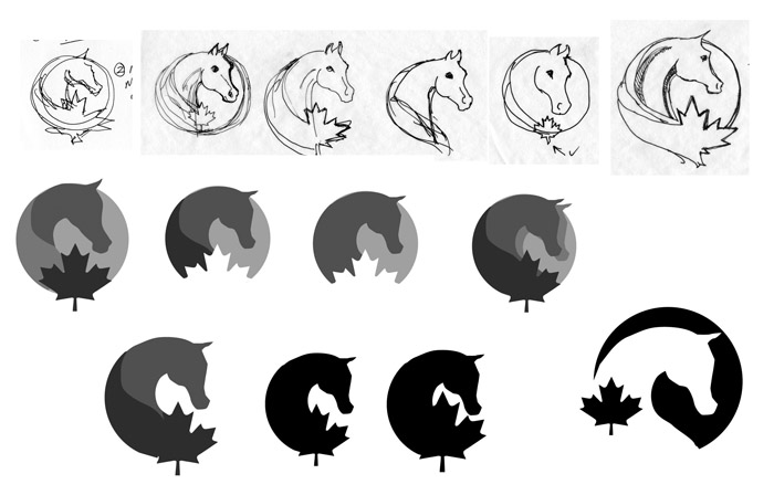
Wow. I went back through all the sketches and variations we did for this logo for the Canadian Arabian Horse Registry, and I must say, it was a bit like herding cats to try and put them all into some semblance of order for a blog post.
Basically, we ended up with three different “prototype families” all being revised and worked on at the same time. All of these options fed into each other during the entire process, but for the sake of brevity, I’ve followed each stream separately until we ended up at the final solution. Hope you enjoy!
To recap – the objectives outlined at the beginning were that we needed a new CAHR logo to be:
- a strong identifier for the breed and its particular characteristics
- attractive, easy to use on promotional items, and a representation that members would be proud to display.
We also narrowed down a few other requirements. The ideal logo would be a) immediately recognizable as an Arabian horse, b) immediately recognizable as Canadian, and c) distinct enough from related logos that it would be unique and memorable.
Before starting with any research or brainstorming, I had dashed off this quick sketch:
This was used as a starting point for further exploration. In terms of process, I like to start working towards a solution using only black and white (and shades of grey, if need be, although that often means the shape isn’t resolved enough), as I feel that I’m forcing myself to have a shape that works, first and foremost. According to Alina Wheeler’s fabulous book Designing Brand Identity: An Essential Guide for the Whole Branding Team, shape is the first thing that the human eye recognizes, followed by color. Details come last.
Once we got into the process, I did a number of mock-ups for this configuration, and we used the logo on the bottom right as one of the possible ‘final’ solutions. This may be a comment on my (lack of) drawing skills, but I often find that shapes that look intriguing in a sketch look much less enchanting when done with flat fields of color and definite outlines. One of the ideas that we dropped from the circle image was the idea of working a maple leaf into the horse’s mane, however, as you’ll see, we came back to that idea in other revisions.
While I was working on this set of logos, Guto Penteado was putting together some ideas as we
Blog: Foxtail Studio (Login to Add to MyJacketFlap)
JacketFlap tags: Add a tag
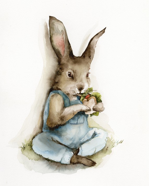
This lovely watercolor reminds me of a Beatrix Potter book I used to read when I was little. I love the mischievous look. More by Amber Alexander here.
Blog: Foxtail Studio (Login to Add to MyJacketFlap)
JacketFlap tags: Add a tag
We recently had the pleasure of creating a new logo for the Canadian Arabian Horse Registry and thought it might be interesting to share some of the insight into that process.
The Canadian Arabian Horse Registry, incorporated in 1958 under the Animal Pedigree Act, is a member-based organization with about 800 members. Its aim is simply to meet the needs of Arabian horse owners in Canada, and to promote the breed both within the horse world and to the general public. The Registry needed an updated logo to serve two purposes:
1. to be a strong identifier for the breed, and,
2. in order to facilitate no. 1, it should be attractive, easy to use on promotional items, and a representation that members would be proud to display.
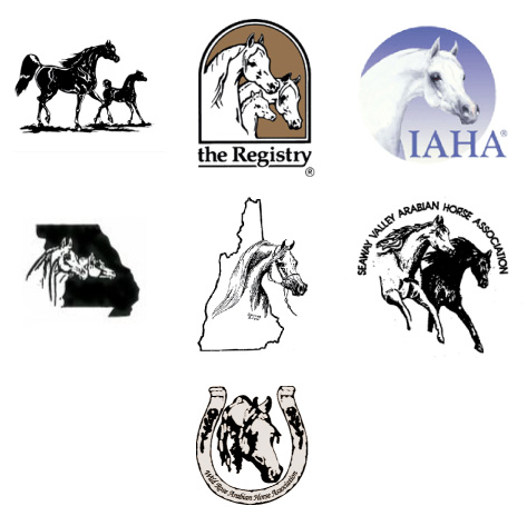
To start the process, we did a brief survey of Arabian and other horse club logos and found that they fell into two general categories.
First, the ‘picture’ logos, featuring a detailed, prominent picture of a horse. When taken as a group within the Arabian breed, many of these logos end up looking quite similar. (Notice how these horses are all facing to the right.) These logos can also date themselves as breed standards (and drawing styles) evolve. The old logo for the Canadian Arabian Horse Registry (known colloquially as the ‘mare and foal’ logo) is of this type and is shown in the top left hand corner.
On the positive side, some pictorially detailed logos can be a beautiful throwback to historic types of advertising imagery. On the negative side, they are not terribly versatile and quickly lose detail when used at small sizes.
The second category contains more iconic logos. The more modern of these stuck with a simplified silhouette or knock-out shape (bottom row). Others had more detail but used a simplified line or outline, falling somewhere between a picture and a purely iconic look (top row). The human brain has been shown to recognize shapes first, colors second, and details third, so simplifying the imagery allows the logo to be more immediately recognizable. It also makes it more useful over a wide range of applications, for example with different sizes and colors.
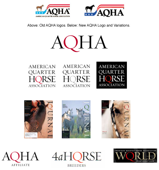
We also looked at the American Quarter Horse Association’s identity system. The AQHA has a particularly strong identity, which they rolled out about ten years ago. (I haven’t been able to find out who the design firm is, but am hoping someone will be able to supply that information). The old logo (top) featured a picture of a Quarter Horse and part of the American flag. The new logo dropped all imagery in favor of a simple red Q. The genius of the mark is that the Q is unique among horse breeds and is an immediate ide
Blog: Foxtail Studio (Login to Add to MyJacketFlap)
JacketFlap tags: Add a tag
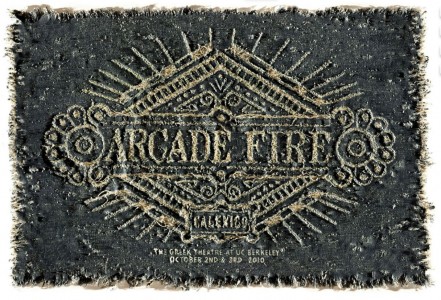
Arcade Fire poster done in denim, with bleach and stitching, by Barcelona-based designer Alex Trochut. See photos of the work in progress on Alex Trochut’s website, or read a few comments from the designer on the UK’s Fireblog.
Blog: Foxtail Studio (Login to Add to MyJacketFlap)
JacketFlap tags: Add a tag
Part of the problem these days is there’s so much choice. At some point, someone just has to say: We’re going to do it like this because I want to do it this way. Because, if you don’t, you’re going to be churning out oatmeal.
- James Victore (“Don’t be a Design Zombie”)
Blog: Foxtail Studio (Login to Add to MyJacketFlap)
JacketFlap tags: Add a tag
“Novels are really philosophy books in narrative disguise… Aristotle defined dramatic action as ‘the change from good fortune to bad, or bad fortune to good.’ The key word here is change. But more than that, your character must change as a result of his experiences. Growing in some way – kinder or more bitter or wiser or more insulated.
“And this is what good plots do: They provide a structure and events through which your protagonist has painful experiences, learns from them, grows, and triumphs in a way that conveys the Big Idea the author has in mind.”
What Writers Can Learn from Harry Potter by Cheryl Klein
Blog: Foxtail Studio (Login to Add to MyJacketFlap)
JacketFlap tags: Add a tag
Blog: Foxtail Studio (Login to Add to MyJacketFlap)
JacketFlap tags: Add a tag
Blog: Foxtail Studio (Login to Add to MyJacketFlap)
JacketFlap tags: Add a tag
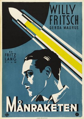
“Deco-ized” modern movie posters here.
Blog: Foxtail Studio (Login to Add to MyJacketFlap)
JacketFlap tags: Add a tag
So, anyone who uses Facebook should understand this basic principle of sharing: when you want to tell someone about something cool that you found, you post a link.
Right?
So can someone please tell me why the media-savvy folks who send out press releases, in the vast majority of cases, do not include a direct link to where press release and/or relevant material can be found online? They’re shooting themselves in the foot.
I realize press releases run on a model of media relations which, many could argue, is fast becoming outdated. You used to blast out a press release, various media outlets picked it up, some of them made mention of your news, a few maybe even printed it more or less intact.
This has all transferred to email and the web. Fine. But for the love of god, can someone please tell me why, when I come across an interesting press release that has useful information that I’d actually like to pass on, there is NO link to where that particular release can be read online? And a generic link to your website is not good enough – trust me, after five minutes of hunting for your press release or a relevant news article, I’ve lost interest and moved on.
It’s your link that I’m going to share. For me to take the time to copy/paste/edit and post your press release on a website that I’m administering, it is going to have to be pretty darned good. So good, in fact, that I’m thinking Hey, I’m glad they sent this, because it saves me the trouble of writing an article about it. I’ll just post this one. But to pass on a link that might prove useful? No prob. The bar is significantly lower.
So please, make it easy for me to promote you. Gimme a link.
Blog: Foxtail Studio (Login to Add to MyJacketFlap)
JacketFlap tags: Add a tag
I’m daisy chaining on blog posts today. Over at Catherine, Caffeinated, Cathryn Ryan Howard put out a post about gatekeepers in traditional publishing in which she commented on Stephen Leather’s guest post on JA Konrath’s blog. And if you followed that, you deserve a cookie.
Here’s the part of Catherine’s post that jumped out at me:
…But I believe that my ability to write came from two things: (i) reading constantly since I learned how and (ii) something innate, a natural talent written in my DNA. I don’t believe you can be taught how to write. You can learn to write better, certainly, and practice and experience helps. But there needs to be something there to work with, and not everyone has it. You can’t go from being a terrible writer to a Booker Prize-winning one, in the same way that if you have a decent singing voice you can be trained to use it better, but you can’t take someone whose attempts at tune-carrying sounds like a bag of strangled cats on helium and turn them into Charlotte Church. So that’s Reason #1 why I don’t give writing advice: because I think if you have the ability to write well, chances are you’re already doing it.
I (usually) dislike analogies. They can help you get your point across, but it’s easy to find analogies to justify both sides of an argument and thus prove not much of anything. Singing is hard to compare to writing because there are physical limitations involved. And, if I were to argue the analogy, singers who aren’t naturally blessed with a great voice can still be very successful entertainers.
The larger question is, what is innate about creative talent? And what is learned?
Some proponents of the “ten thousand hours” theory might argue that anything can be learned with a very high degree of proficiency if you spend enough hours at it. Dan McLaughlin decided to put this theory to the test. He’s seeing if he can go from newbie to pro golfer with ten thousand hours of practice, starting with a putter and slowly working out from the hole. Time will tell whether or not he’s successful.
But with athletics, as with signing, it could be argued that there are physical limitations and advantages to be had.
What about drawing? If you’ve read Drawing on the Right Side of the Brain, there’s pretty persuasive evidence that anyone can be taught to draw realistically if they learn to perceive correctly – if they learn to overcome a few common errors. The final results aren’t Picasso, though… which perhaps favors the “innate talent” argument.
So, to come back to the original question (what is innate about creative talent?), Catherine commented,”there needs to be something there to work with, and not everyone has it.”
Do I agree with that? Yes… and, no. My biggest problem with the label of “talent” is that I think it’s misleading. It makes it seem like God (or genetics) divvied out some type of magical gifts to some, and not to others, and if you didn’t get those genes, you’re S.O.L.
I think a truer label might be “desire”. Or perhaps, “love”. And I think that drive to bring anything to the level of “art” is what’s innate, what drives great talent. It’s the desire you had ever since you were born. Maybe this is splitting hairs over semantics, but I think that the crux of the matter is this: Ta
View Next 25 Posts


