So, you've got that first query email for illustrations while you're at pecking away at your normal bread-and-butter job... maybe Penguin Books' art director's just happened across your portfolio, or that self-publishing author that saw you sketching on a napkin at Costa Coffee got a hold of your Moo business card and dropped you a behemoth email..
This is your first job, or the first bigger one..Fucking ACE! Well done you. :) Big or small, those first jobs can are important.. and maybe daunting if you have to wing it because you've no one in the illustration community to ask questions to, much like clueless me back in the day...
But wait. You're my peeps! So I sat down to flesh out the 8 Top Tips For That First Illustration Job I wish I'D known before I pioneered into the craziness like Cortez with no pants on...
 Pin those mofos DOWN.
They approach you with an idea. If it's Tor Publishing, that's great, let me tell you things are generally smoother with experienced publishers. But if they're some kind of entity that doesn't usually hire illustrators, they mightn't even ask you for a quote in their first email, in fact that first email might even be entirely batshit loco. Don't hold this against them though because it doesn't mean that they'll be bad clients, they just don't know the ropes.
(And you don't either but you must act like you do)
If they don't give you the specifics I am going to list in the initial contact, you will need to write them back to ask for them, and also discretely slip in the fact that you'll need all of this info before you
give them a quote (in case they're the type out there who assume artists just want to work for free... trust me there's more of those out there than you'd think)
So, information needed:
a) Size, resolution and format of artwork they want
b) What the artwork is going on (magazine cover, the side of a bus, postage stamps whatever)
c) number of individual artworks you will need to create
d) date they need it by
e) Whether they will be using the artwork for promotional material
f) If it's a book cover, whether they expect you to be doing the print layout, spine, text etc. details they might think are 'obvious'.
You need to get the specifics needed for you to calculate a quote as quickly as possible - so you don't waste time writing emails back and forth till the cows come home. You have better things to do.
Be concise and unrambly otherwise they might start to get rambly too, unless you're trying to score a penpal as well as a job.
 State your rules
You should spend some time totting up a quote. A lot of people get stuck on this but you can boil it down to some simple truths.... once you've been given all the information necessary, you have to stop and think exactly how long it will take you to undertake the project, whether you can fit it into the deadline, and how much you want to charge per hour. If you realise it's going to take you too astronomically long with regards to the deadline and this is making the project unreasonably expensive, think how you can either speed up your process or cleverly cut corners. Don't push down your price just to take the job up, or you will be doing longer hours than you've bargained for, and why sell yourself short like that? Incidentally, It's a good idea to raise your prices a little if you're given a ridiculously close deadline and will need to pull crazy hours to make it.
Along with submitting your quotation, you should always stipulate a deposit and any rules.
By deposit, I mean a small fee (15%-20% of final payment) to be paid to cover your initial sketching and concepting. In the rules, you can state that if the client should stay dissatisfied with your prelimnary sketches for the project after several drawings and attempts, they are free to commission another artist and you keep your deposit for your time spent creating sketches.
IMPORTANT: Also state what will happen if they okay a sketch you've made, you draw the thing and show them works-in-progress, finish the piece and then they decide they don't really want it anymore. This does happen when you work with people who don't normally hire artists. State that they are due to pay you when the artwork based on the okayed-sketch is finished. It's best to lay it out there, so then they cannot claim that they 'didn't know'.
 Don't go nuts before they show their guts
You may be excited about this job
.. don't go nuts. Don't create concept works or sketch out ideas before you've been given a deposit, or a contract, even if the project is very inspiring and exciting.. or if you want to do that on your own time do, but don't show them. For starters here's nothing to stop them from using your ideas and going off to a cheaper artist and using your ideas for 'inspiration'. Not to mention that you'd be actively working on 'spec' for no money. Nu-uh. Plenty of time to sketch later. This doesn't go for just the unusual clients, it's the same for bigger publishing houses.
okay so if you're still here I'm assuming you haven't scared them off with your stone-cold professionalism? Good, you've landed a client. The next few tips have the onus on YOU, buddy...
 Don't quit your jibber jabber
You know what's extremely frustrating? Paying someone a commission deposit on an illustration job and have them not answer your emails. You can bet that unless you're pretty famous already (and even then) you're not going to be hired if you're cagey about your emails/phonecalls/however you are thinking of keeping in contact with your commissioner. If you are shying away from contact because you're late on something osomething came up, contact them anyway to inform them of the delay.
If they are self-publishers or first-timers and are a little jumpy or excitable and keep emailing you several times a day, notify them that you will be contacting them on X date with an update of work or some works-in-progress if it's a big job.
 Excuses are lame
Unless someone's dead or there's a serious cataclysm (and I MEAN serious.. like a hurricane), don't make excuses as to why you didn't email or something happened to the file or blah blah... this is the height of unprofessionalism and makes you sound lame. The flu, your dog at the vet, etc.. this shouldn't interest your client unless they're already your friend or something.
Especially if your client hasn't met you in real life they might also start to think you're flakey. There's lots of flakey artists out there, don't be a statistic, bro.
If something happened that you couldn't control and made you late for whatever reason, just stay in email contact and say you are running late. This is enough and also doesn't make you sound silly.
 Harder Better Faster Stronger
Try to develop your efficiency as an artist because this will mean less time working, simple as. Not only will this help you with getting to grips with tip number 8, but it means you will be making more money for less time on your project.
After all time is our real currency in this world. A client is buying your time multiplied by your expertise.. the bigger your expertise, the less time you need, so you can spend more time on your own projects, or surfing, or sitting down doing nothing at all.
Know when to 'cut corners' and don't get bogged down on unneccesary detail unless it was specifically in your directive/ is actually part of your style (and you'll therefore be charging accordingly). Always think about your time, otherwise you'll be burning the midnight oil and have no fun at all in life. Maybe it's okay to overdo it in the first project you undertake, and it'd be normal and all that.. maybe this is more of a 'try to adopt this ethos' tip.
 Don't be a diva
 Some artists are more prone to this than others. It could be that it even works for them, I just personall don't like divas. I've noticed the less they've had to work in a team with an art director, the more prone to this some illustrators are. By 'this' I mean treating their close-to-complete projects like immutable masterpieces
Because it's a fact of the illustration world that sometimes you'll send in a sketch, a part-finished piece or even a finished piece, and they will ask for something to be altered. This is okay, and normal, and you should always factor in some rework time into your quote as padding.
If it's specific and small, you go ahead and alter it.
If it's specific and will take a lot of time to change AND it's different to the sketch/idea you'd agreed on, you charge for alteration, but you go damn ahead and alter it.
If it's a vague 'hmmm something is wrong with it but we're not sure why, could you try something entirely different' you get them to pin down a specific idea with you again, you charge them for the extra time, you do a sketch based on their new fancies, get them to okay it, and then you go ahead and alter it.
At the end of the day, they're hiring you. You work for them. You want them to be 100% happy if you want to work with them again and unless they're wasting your time outside of the bounds of your quote, or they want you to change every single thing you do till it does go outside the bounds of the quotes, you don't need to worry. If they do, it is easy enough to explain that this is doubling/adding substantially to your workload and you feel you will need to reassess a final charge, this is particularly so if you work in a medium that is tradtional and not easily altered (bear in mind I am mostly thinking of digital artists with these tips, though the majority of the tips apply to any artist at all)
Don't be difficult, within reason, would be my advice. I can vouch for the fact that each time you re-do a concept you'll learn a lot. Be precious about your time, by charging - not your work. It's kind of annoying but each time I've done re-do's, the end result was 500% better.
 Keep Deadlines
.. Because most illustrators don't. This is just one of those industry truths. I don't really know why this works this way - perhaps artists are inherently an easily distracted people - but illustrators are almost
expected to be late in getting those pictures in. Even when working with publishing houses or industry greats. This makes the entire production line, especially if whatever you're creating is going to print, slow down and be late. This could be costly (not to mention frustrating) for whoever else is going to work on your piece down the production line (graphic designers, printers, marketers). So if you keep deadlines, you'll be that bit more remarkable and the publisher will want to work with you again. Trust me on this one.
Have you got any tips of your own, any questions or stories to share? XO
I'm going to be introducing a 'hard nuts and bolts' section to Thank You For Your Fist, where I hope to reveal a little more background to my work as an illustrator, the projects I undertake and some behind-the-scenes shenanigans.Here's the first one, focusing on a project I worked on for a couple of months, now complete.
The Fairytale Project 
My favourite undertakings are ones that are a little off-kilter. I'm product-oriented when it comes to artistic creation and like to keep the eventual function of a piece in mind while I'm creating it, in a way for illustration this is the way to do it but I also think in such terms when I create personal works intended to be sold as prints in my store. How can I make it standard proportioned so it's easier for people to frame, and such, are questions that cross my mind. I'm afraid this may seem frightfully unromantic but it's the truth about the business side of selling your artwork, and I am too fond of both drawing all the time as well as eating nice things to give either up in the name of unbridled self expression.Besides, boundaries are good. I feel I learn the most when I set boundaries, that my brain works hardest and most focused when I'm given rules.
I become a little bit like Eve from Wall-E with her directive. I think there's a lot of BS out there about jobs in the creatibe world. I want to debunk some myths and I won't lie to you.
Onwards 
For a bit I'd been hankering to create home decor with a bit of deviation from the prints-and-stationery option so when the opportunity came up to work with one of my stationery and home decor publishers
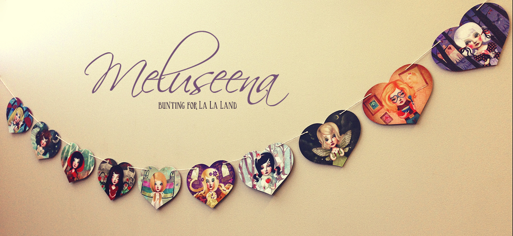
La La Land on their line of bunting it just hit the spot.

La La Land are awesome to work with, have awesome ideas and ultimately - and this is a cincher - they have a top notch product I'm proud to be affiliated with. Their cards are really high quality and their brand just up my street.
I'd been wanting to create something that little bit softer and cuter and it resonated with the whimsy look of the publishing house, who'd already printed several of my works onto cards in the vein of the
Moth and the Moon and such.
And I'd never done bunting before so I was delighted.
With a personal penchant for storybooks and with a theme that would fit the La La Land aesthetic, we settled on having me create 10 fairytale scenes to go on heart-shaped bunting.


Process, idea and technique I felt repetitive compositions would work best since the ultimate product was bunting, so I honed in on central figure-based compositions instead of a series of scenes as was initially suggested. (I wish I'd kept my initial sketches of the process to share but I didn't figure out I'd be reporting this in great detail, I'll know to keep them next time to share.I like to have aims when I set out on a project, that are my own personal aims aside from the frameworks specified
to me by the commission guidelines. Usually it's a mix of subject and themes as well as some artistic self-challenge. Let's call it a personal agenda.

I've been going through a big women-rock phase (for the past thirty years or so to be honest :P) so I wanted the pictures to focus on female protagonists from fairytale and have them looking confident and happy, more masters-of-their-destiny than is portrayed in the standard fare.
I wanted to do away with their male counterparts. It always seemed to me their roles in their stories were always extremely minor but supremely important.. they get as much 'screen time' in their tales as Sauron, only to have ultimately the same extreme crucial importance. I think this is a really messed up message to send to children about gender roles. Some fairytales do a bit of a better job of it (Like Beauty and the Beast) but they still class women heroines as self-suffering saints.
I wanted sassier heroines. It was likely that this bunting would end up in a little girl's room, so I wanted them to be cute, sure... but also witty, confident, unpanicky, artistically-attired, I've-actually-got-a-plan-and-I-may-or-may-not-need-you types. In fact I was glad Alice got snuck in there as one of the ten finalists even though she's a more modern protagonist than any because she gets to be a lot of that in the actual text of the books.

It's also why I chose to feature Tinker Bell rather than Wendy when it came to picking a lady from Peter Pan. Actually I'll take this moment to say Wendy's been a thorn in my side all my life. As a child I never understood why she pined for home, she made me angry, I felt her to be ungrateful of her extreme luck to go to Neverland. She was
so looking a gift horse in the mouth.
She also seemed to embody all I disliked about girls but I couldn't put my finger on why it was so, not back then. I rooted for Tink and Tiger Lily. Then older, away from home myself and understanding the kind of empathy you feel for parents who are missing you, I understood Wendy a little better and cut her some slack.
As a grown-up I also figured out why I disliked what she stood for. It was because I notice more and more how women are brought up to put up with a hell of a lot of douchebaggery from men in particular and forgive their misbehaviour as something men can't help, in a 'boys will be boys' kind of way. I'm generalising and naturally there's a lot of badassery going on, but I have two eyes and I see it, and often. This is how Wendy behaved at any rate. And although this is a disservice to both sexes really, I feel Wendy was worse off because all she did was worry about all the boys in the story and never have any fun.
Alright that was a major digression but you see now why I settled for Tink :P
I wanted this series to burst with colour but both because of my publishers' 'look' as well as personal preference did not want to go down the
rainbow brite route. I pushed myself to not just settle for my beloved tried-and-tested colour schemes and instead researched some old Disney concept art for colour combo inspiration - in the process developed a fierce love and admiration for
Mary Bair and
Eyvind Earle. (Those are wikipedia links but I suggest you open up a new tab google image these artists, their work is superb.)
The first completed piece for this series was my cheeky, snappily-attired Snow White and when it got okayed by the publishers, I sped on to produce the other nine ladies in the same vein.
I had to re-work a couple of them over and over for them to be just right. Tweaking things is part of the illustration process - publishers have audiences and branding in mind and they spot things the artist wouldn't.
I learned early on you kind of have to be really pragmatic as an illustrator and adopt a very 'disposable' attitude to all the work produced. Gallery artists get to be as precious as they like, not so with illustrators. As such you are always working to spec, to rules, within a framework - I think this is a great thing, I love the challenge the same way I love the challenge of micro-fiction adherence to word-numbers.
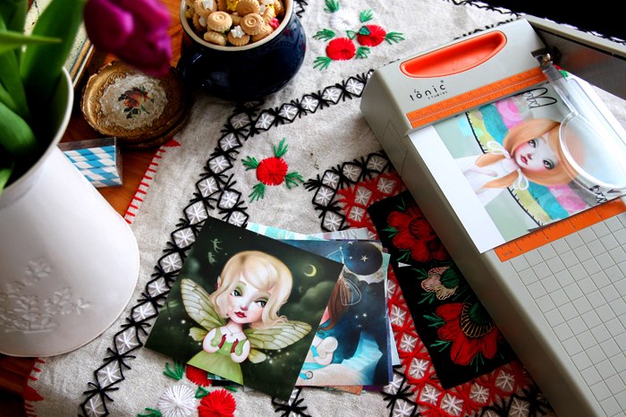
Having created so many images, I thought it'd be effective to offer them in my indie shop as small reproduction prints in a set. I designed some custom packaging for my 'Leading Ladies of Fairytale', with Meluseena branding. I toyed last year with the notion of re-branding Meluseena entirely (name included). But the name's been stuck to me since 1998 in my first early teen forays into the world of online artwork publishing, and something told me it would be a bad omen to let it go.. glad I didn't.
 |
| The ladies are getting a trim.. |
I get my work printed locally at an excellent print store with whom I have great rapport, than manually trim each print to size before putting it into its in-studio-created packaging and send it on its merry way to my customers spread worldwide.
There are 10 8X8" print in each pack.
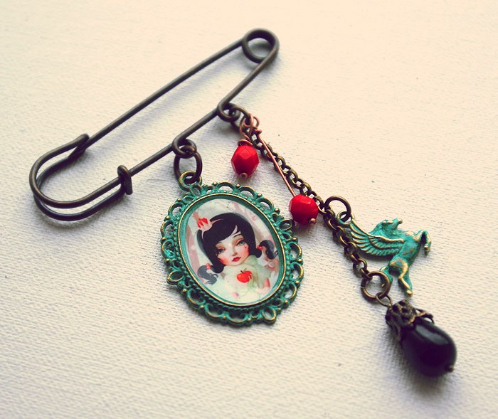
I also created some one-off necklaces and brooch pieces for
Meluseena, to offer yet another way in which to display my line. Check out the jewellery section of my store to see what pieces are still in stock
Do drop any questions etc. in the comment section below and I will endeveour to answer in later posts. I'll say it first though, I won't disclose my manufacturing and raw material sources - you'll have to do your own research on that ;)
relevent links:
La La Land BuntingLeading Ladies Fairytale set
artwork copyright Lisa Falzon 2012 do not reproduce without permission
I do love things that come in pretty packages. This extends to books, boxes, labels on perfume bottles and even food tins and packets... the extra care gone into making something so ultimately superfluous a thing of beauty pleases me greatly.
So when it comes to packaging my own art, I like to go the extra mile. For my prints, my prerogative is transit-safet so aesthetic is moved aside somewhat to make room for stiff backings and rather dull cello sleeves to protect the prints from rain, other bulky mail and the ultimate threat - angry postmen. I always include one of my matte thankyou notes with a personalised note to add a bit of a smile into the package... but...
..with wearable art, I love to go to town with the packaging!
I make the boxes and the labels myself, bit by bit. I think so far this Fall's collection is going to have the prettiest packaging. Also for the first time, I'll have earrings and rings for sale as well as pendants!
The wearable art pieces are small treasures, each is hand cut and assembled by myself. Stay tuned for more info - there'll be only one of most items, two of a few, and then that's it for a good few months.
I'll announce the pieces right before they go for sale first here and on my
page.
:)
... To Connoisseurs ...
I guess there's a lot to be said of getting your portrait painted in 2011. I love portrait work, be it photography or painting, or a mix of both. In fact a mix of both is my very favourite.
Star Spine
Been enjoying experimenting with texture, artand portraiture a lot lately. This is one above of my latest pieces. I used to take up commissions for portraits fairly often some years ago.
Here's two other past creations of mine:
Portrait of Catharine with pomegranate and sparrow
Portrait of Christina
They are mad fun to make, and the client gets a digital high res file so they can print out their old-timey portraits onto large canvases and frame up if they like, or keep just to use online. I had stopped offerring this service for a while due to work backlog but I have a few slots open now commission-wise, so I'll be open to creating your portrait should you be so vainly inclined! ;)
Drop me an email if you're interested,
[email protected]I'll need time to work on any creations so make sure if you want one, it's not for a last-minute event!
..and to collectors...
Now as to the next bit!
I am grateful for the many awesome patrons who have purchased my art - be it of the wearable, of the hangable, or of the postable ilk. It's slightly freaky to think I have my art peppered all over the world at this point. I'd LOVE it if you could send me a picture if you have my art framed, or of you modelling my wearable art.
Know Your Audience
I'd say that's pretty good advice no matter what you do eh?
Perhaps it's just an outlook thing. My magician up there seems to be a big hit with his target demographic at any rate ;)
It'd been a while since I sat down and painted something for my own collection. This is a reworking of an old concept of mine, something like a ten-year-old concept. I am enjoying it more here reworked digitally, it was originally a rather frightful acrylics-on-canvas affair from my teen years.
I've been very busy with my project
Moth and BayLeaf. I participated in a local fashion show. Here's some snaps from it.
Headpiece my Moth and BayLeaf, (my headpiece-and-accessory brand)
Photo by Miki Barlok
Headpiece my Moth and BayLeaf, (my headpiece-and-accessory brand)
Photo by Miki Barlok
As much as I love to work digitally, I love to work in the 'real world' too and making these fantastical headpieces hits just the spot for me. I really enjoy making them. It's also allowed me to meet many stylists, photographers and couture-designers. I've has my pieces modelled in some pretty swish photo shoots.
Headpiece: Moth and BayLeaf :)
Photography: Aspect Photography by Shane O'Neill
Styling: Pearl&Godiva
It's a downright boon to collaborate with so many people - I get to reap the benefit
Gozo landscape
I recently visited the homeland. As some of you might know from previous posts, I was born and raised in Malta though I have since moved and am based in Ireland.
I love Gozo's capital 'city', Rabat. It always feels so sleepy.
You can see Gozo here in the foreground, Comino across the sea with it's beautiful bright blue lagoon, and Malta on the horizon..
Melita is thought to be the word the name 'Malta' came from. It means honey, or 'sweetness'. It's an archipelago in the Mediterranean sea, some 60km off the coast of Sicily. Malta is an independent Republic, and I say this because I am so often asked whether it 'belongs' to Italy or Spain or Greece. But nope!
Our languages are Maltese and English. Most Maltese people also speak Italian fluently though.
There are three main islands - Malta, Gozo and the small uninhabited Comino. The latter is mostly a destination for divers, swimmers and bird spotters. There are also smaller islands all around, but those are REAL small then. Tiny!
Above are three views of the Grand Harbour of Malta.
So following house-warming shenanigans, wanted to share with you some shots from my home and studio. And to make heads or tails of this continuously self-propogating chaos I live in, here is the super-duper annotated version of a partial-tour of my house!
So, here's a small peek at the entrance way to the kitchen
and going up the stairs towards my studio...
and another floor.. it's high up! My legs are getting a lot of training...

Ok phew... now we're outside...

and closing the door behind us inside...

then turn to have a look...
(click these two following pictures to enlarge them so you can read the annotations)
and this one tends to always be with me while I'm working...!
Etsians mentioned in this post whose wares are in my house and above pictured
Can you spot anything that I didn't annotate? Let me know what you think and if you recognise anything e
I'm going to talk to you about my interest in fire. I've had a bit of a preoccupation with it since childhood.
It is my hope to be disposed of via the ceremony of a funeral pyre, once I, as bard-like pedants would say, shed this mortal coil.
My Funeral Pyre
digital collage, 2011
Either way not actually that fussed though. I'm hardly going to be there to watch it :P!
But fire crops up often in both my art and writing.
It is both beautiful and dangerous, symbolic and mundane.
It can be the safety of a campfire on a frosty day, and the crushing despair of an out-of-control prairie fire, destroying acres and acres.
I love that it can both build and destroy. This could be said of all the old elements - fire, water, earth and air. But fire to my mind does it with most panache...
....and lends itself so well to metaphor. And it accomplishes all this while wearing my very favourite colours! No mean feat for any villain, to do so much when it isn't even corporeal.
Some weeks ago Drew and I threw a house-warming party, only we called it a house-burning party because we're annoying like that.
Because you are probably bored by all this pontification about fire, here's photos of me making some traditional Maltese food for our guests.
and some of me messing with SCSI.


Growing up, endangered animals, deforestation and habitat-destruction were major concerns of mine. Particularly in my early-to-late teens I was a bit of an eco-warrior. I worried about rainforests and rising water levels, I worried about recycling. I was a vegeterian for some years (to the detriment of my health, because I did not replace protein from meat intelligently and simply subsisted on carbs for the duration of this madness) though I know now looking back it didn't help the environment the way I thought it was. I disdained the human race, and in my head glorified animals. I suppose I felt personally responsible for the fate of 'the planet', in the way ego-tripping teens tend to feel everything is about (and because of) them.
But I grew up!
And now I'm quite different. I relaxed entirely. Now I am not sure the Earth needs all the saving I thought it did back in the day. Now I've come to really like humans, good bits, bad bits, terrible bits.
SO now I'm a cynical romantic :P Oxymoron? Hmmmm...
But I wanted to share the above video. I adored David Attenborough back as a child, and I still do. I love his frank, no-frills outlook, the fact that he's no rainbow warrior in the traditional sense, the fact you can tell he's always being sincere.
Did you know about this little gem of a site,
Pinterest?
I'd been needing a site like this! A place to store, categorise and share inspiring pictures I come across online without having to actually save them and distribute them in the usual clunky way.
Pinterest allows you to do all this collecting of images on a kind of virtual pinboard. Sharing them with other pinterest users or non users alike is a piece of cake - and the sources of your images are always provided as a link by each picture so the original source can always be traced. You can also add on contributors to your boards, say if you were working on a project with someone and wanted to pool inspiring photos.

found on Pinterest...
Do you have a boards on Pinterest, or have I piqued your curiosity enough to try it out...? ;)
I love collecting things but at the same time have commitment-phobia towards real-life objects. I allow myself plenty of ostentation though when it comes to hoarding virtual pictures.
Here's a direct link to my
boards if you want to see what I've been collecting so far. The collection is bound to grow eh!
 I used to love youselfportait with egg on my canon digital slr.
Settling into the new studio just fine. Now if only there was a way to get it to stop turning into a Pompei-ish mess every time I use it...
Finished this painting today. It's called

V is for...
It's inspired by Vicky Langan who is another Cork-based creative and you can check her and her experimentatal film and music out
here and
here
Summery heat's put me in a mood for lighter, brighter, more casual wearable art than I usually create. And these are what happened!
I like that they can be worn by all ages, that they're so cheerful and sparkly underneath the artisan-made glass and on their merry ball-chain necklaces. They're something like very versatile contemporary cameos. Also they're quite big and attention-grabbing!
View Next 25 Posts


I think it's also useful to agree on the One and Only Person from their side that you'll communicate with during the whole project (if there are many people involved)
Otherwise you're just inviting misunderstandings around.
If the client doesn't have one person initially assigned to making final decisions and passing them to you, here's what could happen:
"I thought Todd called and told you about this change. What? He called and said something totally different? That's funny."
These are very helpful thoughts, thanks for sharing!
Hobo... YES!
You are totally correct and that is one of my own 'rules', it should be included in the list really!
<3