My latest illustration is done (I think) so I thought I might share the steps that got me to the finish line. You can click on any of the images below for a larger version.
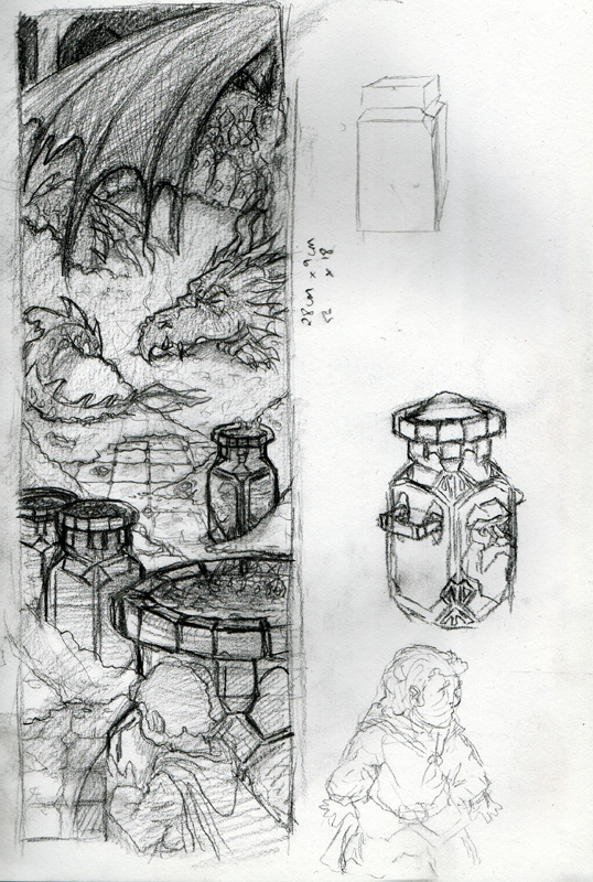
Step 1: Thumbnails, references and sketchesTrying to trace back to the origin of some of my illustrations is difficult. I really can't recall where the seed for this one came from: movies, television, other blogs (of which there are countless that I check on regularly for inspiration)... I am pretty sure the art of Arthur Rackham and Alan Lee was on my mind at the time - particularly the idea of lots of overlapping foliage hiding some fae folk in their natural habitat. When I have an image percolating in my mind I'll start with a rough thumbnail in my sketch book to see whether it is something pursuing. In this case, the thumbnail came out very quickly and seemed faithful to my mind's eye. The next step was to hunt down some references for the water nymphs. Google is very useful (search 'naked female back' for example), as is a growing collection of reference photos I have accumulated throughout the years. I usually like to then sketch something based on the reference and then put the reference away and work from my sketch from there on. That way I resist the urge to be too slavish to the original reference.

Once I have a decent number of references and sketches I commit to the pencil stage. I was working on large arches hot-pressed paper for this one (roughly poster size) and that allowed me to indulge some detailed line work. I decided to approach this illustration with a stronger emphasis on the line work and so avoided adding too much tonal work at the pencil stage. Once the pencils were done I moved on to the ink stage. Inking brings a crispness to the line-work but it also squashes a little of the natural charm of the pencil lines. I noticed that in the face of the reclining nymph in the foreground in particular (perhaps I will skip the ink stage on my next illo). I decided to push the contrast by inking large shadow areas behind the background trees and to the left and right of the foreground. This was a scary stage because it had the potential to over-power the illustration and I wouldn't really know if it was a mistake until I had the bulk of the colours down.
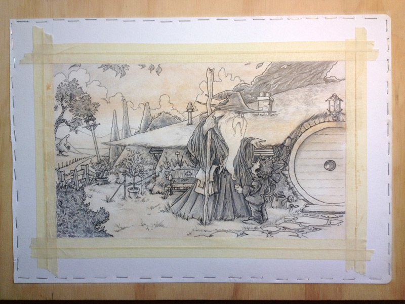
Step 4: UnderpaintingOnce the inks had dried I submerged the paper for 5 mins in a bath of cold water and then stapled the paper to my board. This time round the paper was quite mushy around the staples and I feared it would just rip as it dried so I added some extra insurance in the form of gummed tape. I'm happy to say the paper dried tight with no tears.
I found a great "how to" on
William Stout's website for creating an Arthur Rackham style illustration and used the steps there to prime my paper, starting with a wet wash of burnt umber to take the white sting out of the illustration. I had also read about some other techniques that involved doing a full tonal under-painting followed by washes of colour to really give the painting a glow. I didn't have the raw umber that was suggested so I used raw sienna and went over with successive washes until I had a value range I was happy with. You can probably see the raw sienna washes also took the sting out of the blacks. I had a final trick up my sleeve that I hoped might bring some pop back to them later down the track.
Step 5: colour washesNow the fun part! Laying in successive colour washes to bring it all to life. The image on the left above shows the first few layers of green and the image on the right is a reasonably advanced stage of the colouring step. I used a mixture if raw sienna and burnt umber for the browns and ultramarine blue, lemon yellow and a bit of burnt umber for the greens. Lemon yellow, permanent rose and china white gave me the flesh tones and I used a mix of ultramarine blue and permanent rose for the purple shadows.
Step 6: the final touchesDuring the final stages I push the contrasts as far as I dare and add some highlights (sparingly) with white gouache. I also used William Stout's suggestion of a final wash of sepia ink (very diluted) across the whole illustration to unify the illustration and bring a little bit of pop back to the lines. I noticed this led to some unwanted wash lines when it dried but they were easily blended out with a wet brush.
Done (for now) and now onto my next idea. More to come on that soon.
Brushes down! Happy with the way this has turned out. Time to move on to the next idea - this one containing some finned friends... :)
(click for a slightly larger view)
This is a rather large file but it does show the significant milestones in the development of this illustration. Below are a few notes for each of the milestones for those process junkies (like me):
(click for a larger image)
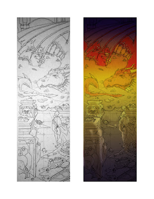
1. The inked line work. At this stage I wasn't too concerned with line weight as I knew the colours would bleed over the lines and I would be going back in at the end to freshen them up. All I was concerned with at this stage was getting a faithful representation of my pencil work down in a more permanent form.
2. This is a photoshopped colour composition of the scanned (photographed) line art. I had an idea in my head of the colour scheme I wanted to go with but I needed to see how it would look in photoshop before committing paint to paper.
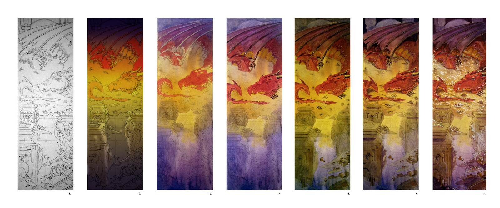
3. Here is the first wash of purple (French Ultramarine and Permanent Rose) through to Indian Yellow, Lemon Yellow and then back out to the purple mix. I was working on was some lovely Arches 300gsm hot-pressed paper that has a lovely smooth finish. I soaked it in the bath for 5 minutes before stapling it to my thick (and heavy) board. I left it it flat overnight and it dried smooth and tight. As you might be able to tell, the washes were very wet and I tipped the board back and forth to help the washes blend together and create some nice run effects that I hoped might help with the reflections I was trying to create in the tiled area. At this milestone you can see I have already started to overlay the red of Smaug and the reddy-purple of his wings. This was really to see how the colours would play when laid over the top of the initial wash.
4. Not being able to resist I continued on adding some more tones to Smaug, deciding to go with dark claws and horns, scarlet tail fins and an orange underbelly.
5. At this stage I had started to block in the colours of the great stone vases, full to the brim with treasure and some of the treasure in the foreground and further back closer to Smaug.
6. A lot more tonal work at this point, pushing the darks behind Smaug and adding shadows under his wing, head and tail to help bed him down in the treasure pile. I also pushed shadows elsewhere in the treasure pile and the stone vases using consecutive purple washes.
7. The final stage was where all the magic happens. I continued to work up the shadows and started adding colour to the detailed parts of the treasure pile - the gemstones, shields, weapons, treasure chest and bowls. Using white gouache I added highlights to Smaug's scales and the gemstones embedded in his stomach. I also went to town on the gold pile adding waves of highlights to really make it sparkle. I also added ghostly white highlights to the invisible Bilbo and, using a damp brush lifted off highlights on the vases to push the stone effect.
And there you have it. I'll be posting the final art tomorrow... just a few little things to do based on some feedback I have already received, which includes pushing some contrasts here and there and cooling down the colour of Smaug's wings so they don't leap out too much. As was pointed out to me - cool colours push back in the painting and warm colours push forward and this was creating a bit of a conflict given how far back Smaug is meant to be in the scene.
I must remember to post something about the journey that the composition has taken for this illustration. While the previous sketch had some charm I couldn't shake the fact that Smaug looked so small, even though I had put in some hints to emphasise the perspective. It dawned on me that if I wanted to emphasise the size of Smaug I should not try and contain him within the boundaries of the illustration. I've also gone to a bit more effort with the perspective on the floor and the big dwarven vases filled with booty and I think it really helps.
Below is the revamped sketch and the final line-work plus a colour comp to show where I am heading.
(Loving this creative bender!)
Tonal work almost done. Coming to the crunch time where I need to decide whether to leave it in grayscale, or ink it or colour it or both... I'm even thinking of inking it with some gold pen highlights... just a thought :)
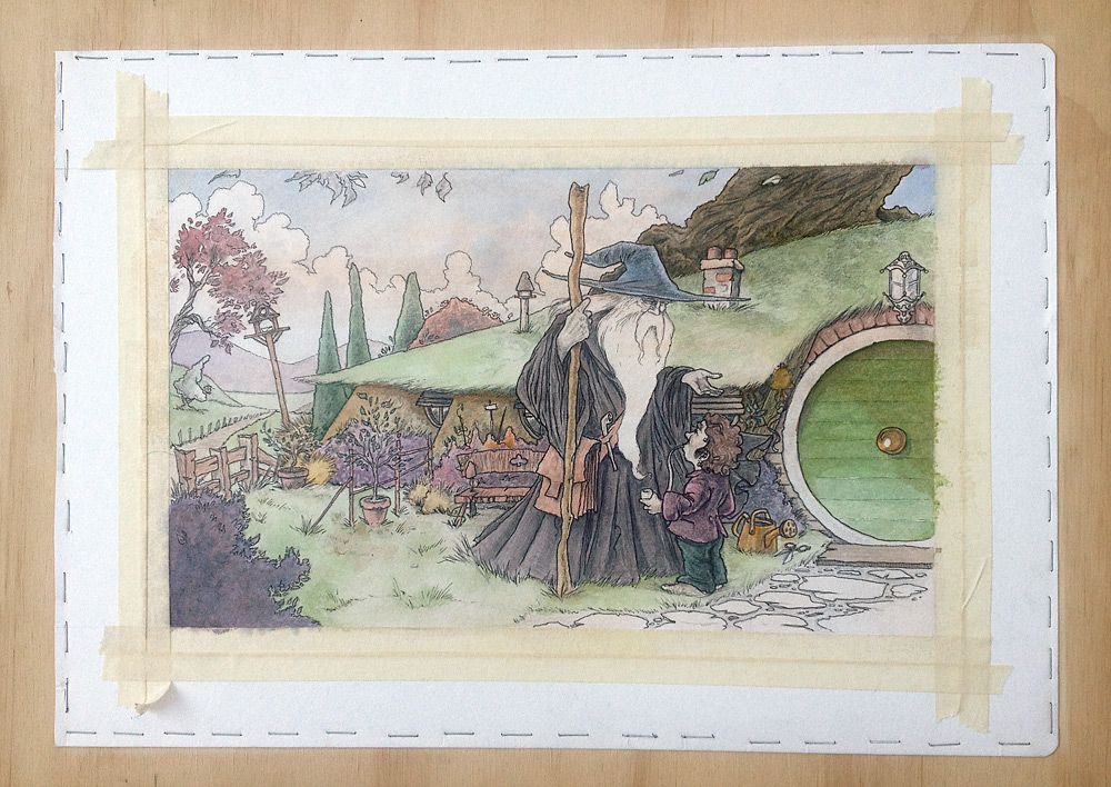
I certainly won't win any prizes for speed on this one - 18 months in the making in the end... nice to have some time to finish it off finally. This is a colour-corrected photo of the artwork (until I can get it drum scanned). One drawback of leaving it this long is the masking tape I had down to protect the edges ended up tearing my paper when I pulled it off. I have some ideas on how to repair it though.
Progress on my Galadriel reboot that has jumped the queue ahead of Bilbo and Smaug (they are not far behind, promise). Having fun working on the tones for this one but undecided whether to go beyond pencil and add colour down the line. It will all depend on how my 'Good Morning' illo progresses. Still, Galadriel has been rendered on some gorgeous (and expensive) Arches 300lb cold-pressed paper - so if I go with colour in the end it should be well prepared :)
Forgive the dodgy photo. This is a large format piece and will need to go in for a drum scan in the end.
It's been a long time between drinks as they say for this illustration. Finally I have some time (and motivation) to progress this. This illustration differs from Bamfurlong in that I have put down the tonal work in grey lead first... as a result I have just been putting colour washes over it with the hope the tonal work would carry the load. In short, it is not. It lacks the vibrancy of Bamfurlong but I will be going back in with progressive washes to address this. More soon!
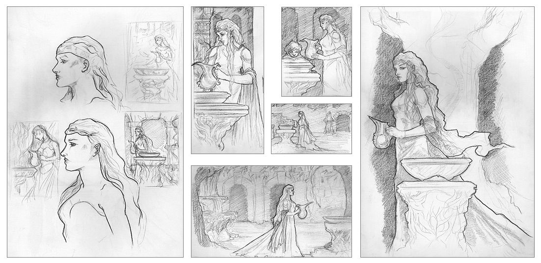
Ever had an itch that, not long after it has been scratched, becomes itchy again? My effort at depicting Galadriel is that itch for me at the moment. I was never really happy with the final outcome and while watching the Fellowship of the Ring again (with commentaries on this time) I was struck by the urge to take another run at this amazing character. Here are some rough sketches and layout thumbs... I'm drawn to one in particular that I think I will work up further... more soon :)
I think Bilbo meeting Smaug for the first time will be the next illustration out of the blocks.
Following are some thumbs and a rough sketch that led to the slightly more detailed sketch where I am chiefly concerned with layout... feedback very welcome :) (click for larger versions)
And, yes, I know I have a couple of other illustration still on the go ('Good Morning' and 'Deep in Mirkwood'). They haven't been forgotten!
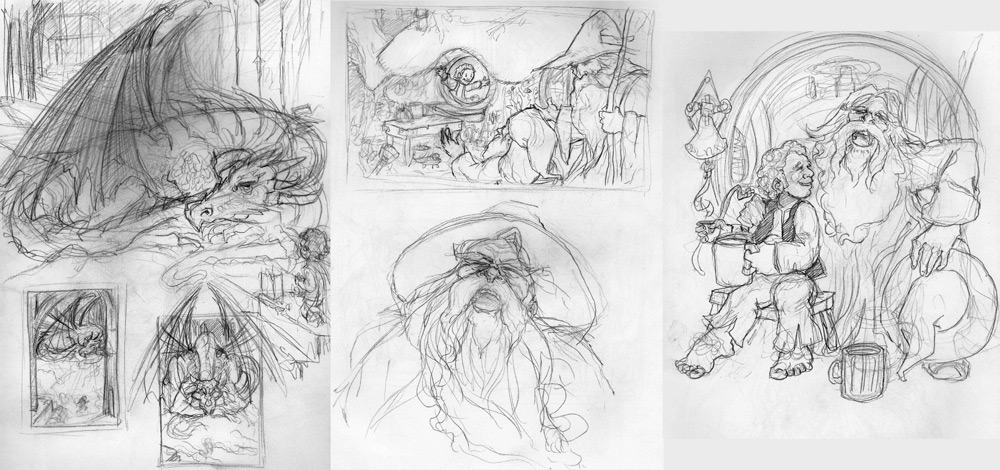
Some ideas for my next illustration... Bilbo meets Smaug, Gandalf and Balin visit Bilbo at Bag End (at the end of the Hobbit) and an updated version of my 'Reminiscing' illustration.
And, yes, I haven't forgotten - I already have a couple of Hobbit illos on the go ('Good Morning') and ('Deep in Mirkwood')... they will get some more love soon!
I just wanted to prove I am working on other things besides life drawing at the moment. I am planning on a couple of larger format pieces and here are some of the ideas. The first is the seminal first encounter between Bilbo and Smaug. The second is a scene from the very end of the Hobbit when Gandalf and Balin come calling on Bilbo at home. And the third is a gnawing desire I have had for a while now to update my "Reminiscing" illustration. There have always been things that have bothered me about it and it can serve as a bit of a benchmark comparison.
Not sure which will be first out of the blocks... more soon though :)
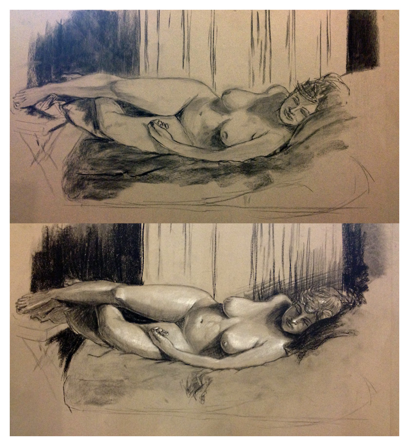
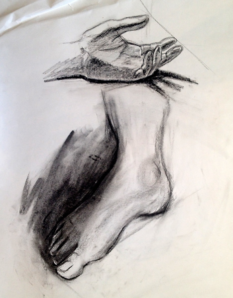
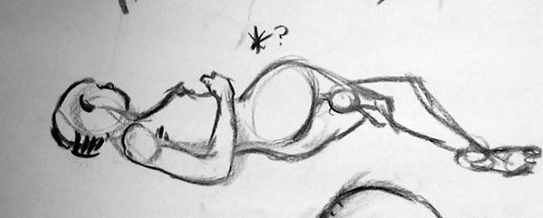
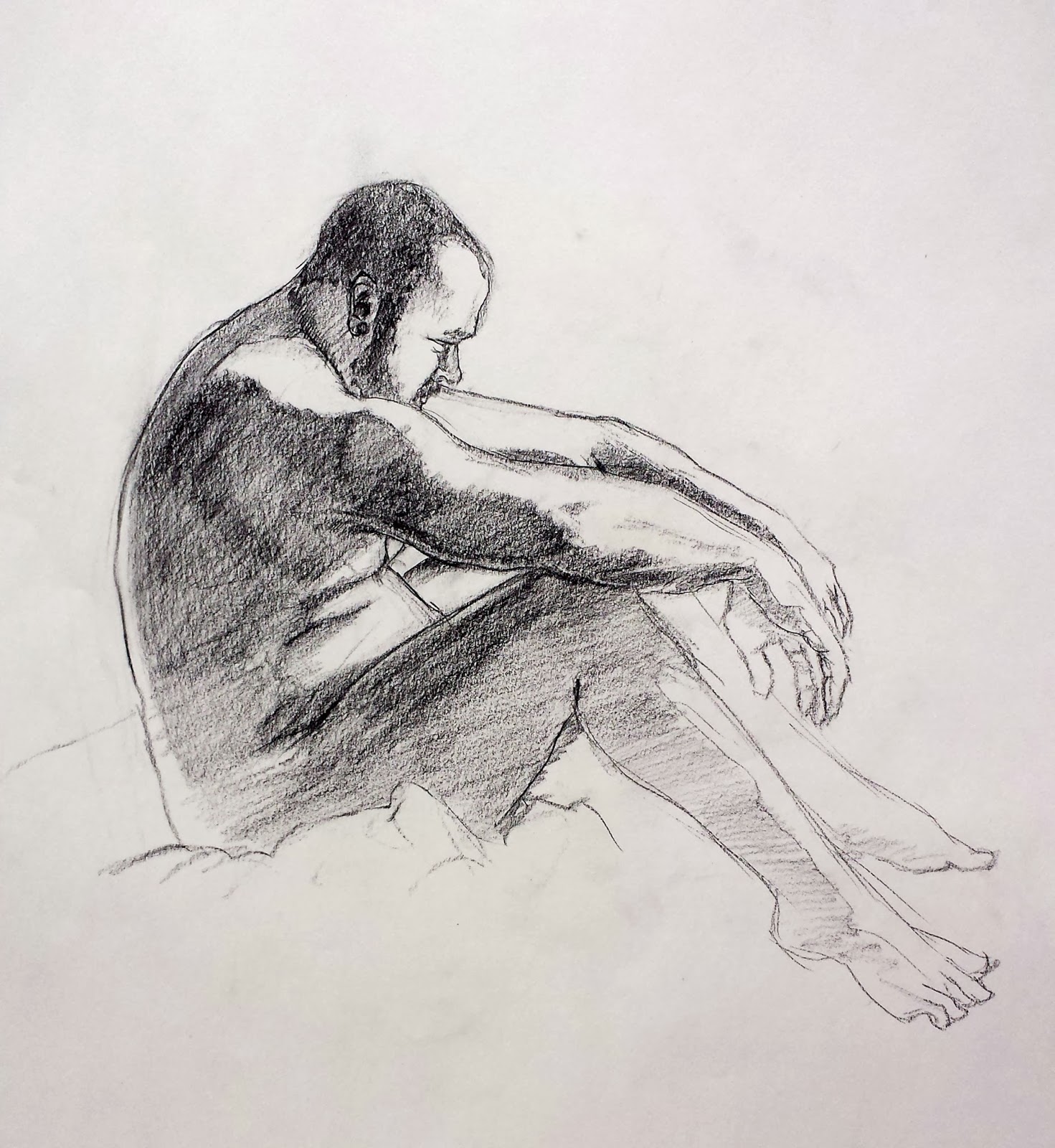
From our most recent life drawing series. This was a longer pose. The top image shows the progress at the end of the first 2 hr block. Vine charcoal for the most part. The bottom image is the "finished" piece using compressed charcoal and white chalk for the highlights... would still have loved more time. Must work faster! :)
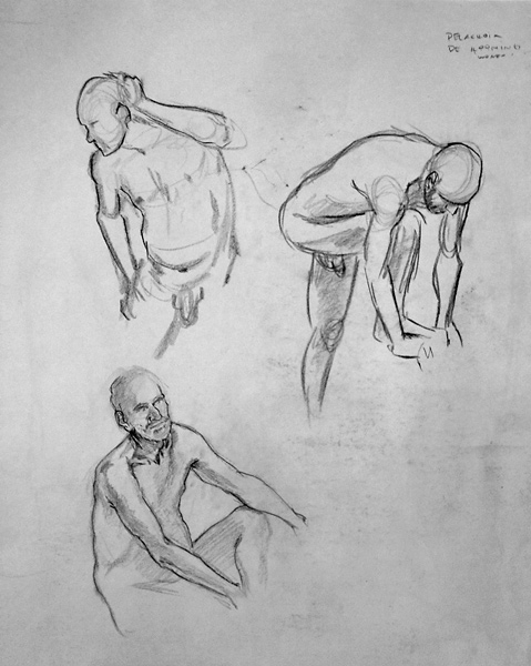
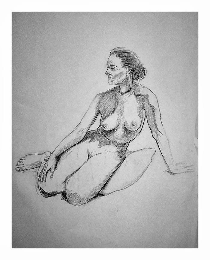
... and a selection from Series 2. Typically we start with 1-2 min gesture drawing followed by 5-10 min poses and then a couple of 20 minute poses to fill out our 2hr class. Sometimes, if we are lucky the 20 min poses are marked off and extended to 40 mins. I am looking forward to the opportunity to spend a good 2 hrs on one pose to see how I go with a more tightly rendered drawing.
Inspired by the
recent post of my good friend Tere, I thought I might share some of my efforts from Life Drawing this year. Since going back to study at the start of the year and being totally consumed by my accelerated course, life drawing has been my only creative outlet and I have come to depend on it to maintain my sanity. Here is a selection from Series 1. Most of these will be between 5 and 20 minutes, from memory.


 |
| Front cover |
I can't remember where I first came across
Blurb.com (I know it was in one of the thousands of blog posts I read about all things creative) and it is not the first site to try to tap into the growing market of people sinking in seas of digital files, but it was the first I have looked at in a while with a really simple web interface that made it easy for me to jump straight in and play. Essentially, it lets you create your own books and I thought it would be a great way to get all of my folio illustrations into one neat little package.
 |
| Back cover |
Blurb provide three different ways to create your own books, ranging from simple, unsophisticated web based templates through to more professional-grade layout software that integrates with Adobe InDesign. I chose the easy route - mostly because I wanted a quick fix. While it is primarily aimed at people who wish to print off photo galleries it can certainly be used for creating folios as long as you have print-resolution scans of your artwork and can export as hi-res JPGs.
 |
| Internal pages |
You have a lot of control over the layout, the number of pages and even the the type of cover (soft, hard, dust-jacket) and the paper quality (basic 80gsm through to heavier, matte-coated paper that has an egg-shell texture). I went with the full fit-out: dust-jacket, top of the list paper quality etc. As a result my book cost me around US$40 but I could get it for as little as US$25 if I went with the cheaper options. Not the cheapest offering of its kind out there but not too scary. You can also sell your books through the Blurb website and set the margin you wish to make on each sale. Nice touch.
The result? While the text and some of the finer-lined illustrations look choppy the overall quality is very good. Ultimately it comes down to the quality of your images/scans. For example, some of my scanned artwork looks less than impressive because my scanner is an el-cheapo Canon but my digitally coloured line-art looks vibrant and clean.
One thing to watch out for are artefacts at the very edges of your images. I have a faint line under my cover illustration that I had never noticed when looking at it on my computer
Re-reading Charles Vess' walkthru of his gorgeous illustration:
Fairy Procession (which happens to be in his excellent book - Drawing Down the Moon... gorgeous, gorgeous illustrations!) I was happy to read he suffers from the same fears I do of that first step in the colouring process.
I have been summoning the courage to put some colour down on this for weeks now. I suppose I am worried I might stuff it up with my very first stroke.
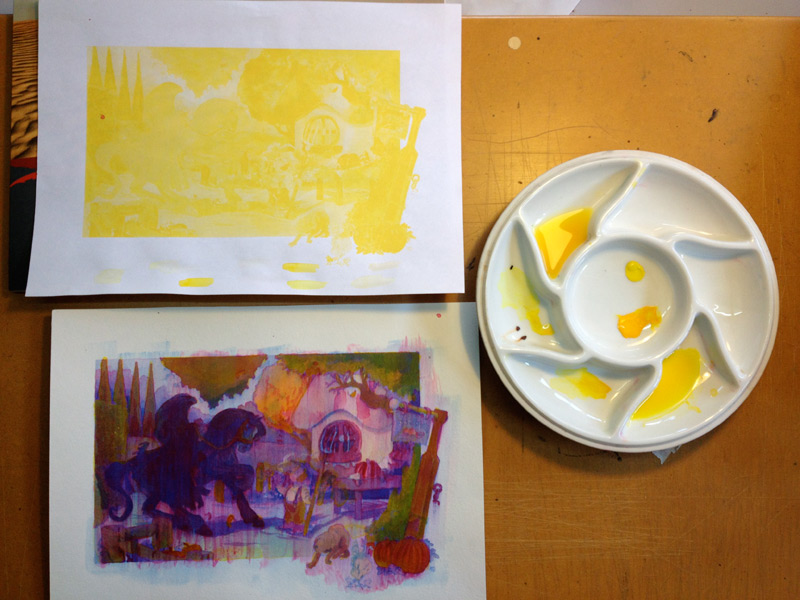
So, partially to ease into it and mostly to help create a united base of colour to work from I have put down a light wash of burnt umber. Baby steps!
I have to admit, I was very much just going through the motions adding the yellow layer today. I only mixed up three or four different value ranges and slapped them down pretty quickly just to see if an magic happened.
I wasn't expecting a lot. But I was pleasantly surprised with the result. Yes, it is a smudged mess and the colours are wrong in so many places... but there are some pockets of colour (autumn canopy behind the cottage, the green canopy in the top right and the orange pumpkins in the bottom left) that have a little bit of pop.
Obviously, I need to address the sealing step - one that doesn't cause my colours to run... and I need to be able to do this without a cheat sheet, which will mean achieving a James Gurney like understanding of colour and light (good thing I have his book!) but overall there is enough in this first experiment to make me want to keep going.
For the record I was using Lemon Yellow and Gamboge for this stage. Lemon Yellow is a poor choice as it is not very transparent but my washes were very light to start. Rooting around in one of many boxes of paints I found some Gamboge, which is at least semi-transparent.
Next step will be to look at other sealing options. I have already been pointed at a couple of options by some helpful readers so will wander off down that road soon.
ok... sealing my watercolour layers is not working. I probably should have expected problems given the matte medium I am using is water-based. Sure enough, my magenta layer is just running and smudging when I try to seal it. Where to from here? I am researching whether there are other sealers I can use that will still allow me to paint over the top of them. I am also going to try building the layers in a traditional watercolour glazing way, sans sealer and see how that goes...
In my original plan, if the watercolour experiments failed I was going to try gouache but given gouache is also water soluble there is probably little point going down that path. Acrylics and oil are next in line in that order. More soon!
View Next 25 Posts


Oh it's so good to see you keep going to those live sessions, I'm green with envy man, you're even going full color now! hey shat do you use for the white highlights?