Login or Register for free to create your own customized page of blog posts from your favorite blogs. You can also add blogs by clicking the "Add to MyJacketFlap" links next to the blog name in each post.
Blog Posts by Tag
In the past 30 days
Blog Posts by Date
Click days in this calendar to see posts by day or month
Here is a little picture I put together this week while I wait for my Christmas cards to come back from the printers.
I am quite keen to do more images without motorbikes for a while as I seem to have dedicated a lot of time to that subject of late. Anyway, I didn't feel like I had a lot of time to do anything elaborate, but I wanted to experiment a bit, so I turned to a thumbnail doodle I found on the corner of one of my pads of a woman with really big hair. I think the original thought when I scribbled it was that she could be one of my angels, and I almost went down that route with this, but instead decided to make the hair teething. Oh and the eyes :-)
Sods law states that I can't now find that original thumbnail sketch, so here is the interim work. I made a blue crayon sketch in a drawing book, then worked up on top of that with a soft lead in a fine propelling pencil how I thought the ink drawing should go......then without stopping to think about it too much I enlarged the drawing a bit and made my ink picture and scanned it in.
It was gratifying for the finished art to appear fairly quickly (for me) on the screen. It gave me a chance to try some radical and quite psychedelic colour ways, some of which I have screenshotted (real word) for future reference, even though I did come back a bit to a more reserved colour-way in the finished piece. Hope you like it...prints will be available one day! :-)
Interesting..I'm drawn to the lava red treatment, it gives a taste of 60s Strepsil to the back of my throat. A novel departure from Steel and Ally, leave the Hipsters to ponder on that stuff for a while. Best Wishes as usual xx
Ah, cheers MrMaguiz - yes I like the hot lava laden temptress too - sometimes so hard to decide on which version to settle on as 'The One'. Hope to see you soon - that Rudge will have patina on it's patina soon;-) X
As promised here are a few pictures of the Biker Greetings Cards collection which I made available for the first time at the Kickback Bike show, where they proved very popular!
The five designs are all printed on a nice smooth matt heavy 350gsm white card, and are blank inside. Four of the images are new this year, while the fifth design is the ever-popular Little Queenie who I just couldn't leave out, especially as her fella British Rocker is here heading the list.
Card size is A4 folded to A5, so that the finished dimension is approximately 148mm x 210mm, and they are each sealed in a cellophane bag, with white envelope, to keep them crisp and clean until needed. They are blank inside for any message you might want to add.
Below is a series of pictures showing the front and back of each card. You'll see I have included a detail of each image on the backs so that they are splendid to look at front and back!! :-D
The cards are £2.50 each, but I will do any mix of 5 for £10. Postage within the UK is as follows: 1 card £0.96p, up to 5 cards £1.30, 10 cards £1.70. For larger numbers or overseas delivery please contact me and I will work it out.
To purchase please feel free to email me and I will sort your order out personally and promptly: [email protected]
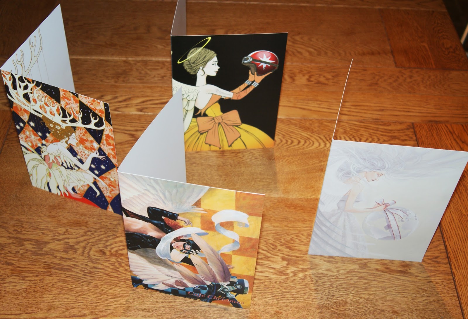
I haven't mentioned the range of greetings cards I had made up prior to the Kickback show yet....and I'm not here to do that just now - maybe next post.....but as I have just been working excitedly on my Christmas Card design for this year, it struck me that now would be a good time to mention that as of the Kickback show I have made the remaining few examples of my previous years Christmas Cards available for sale. There really are only a few of these - it is always a limited edition run as they are intended for me and my family's use really. But, they do take up space and since I have had to store the new non-Christmas cards I ordered in, it seems like a good idea to let them go. Over the years people have asked me if I would do this anyway, and I usually decline as it means sorting the process out, but that done they started selling right away at Kickback, so I guess there is something of a demand for them. I have done a Christmas card every year since I started working as an illustrator in 1980, and one day it will be fun to post a show of all of them (I don't think I have a sample of every one I have done any longer!!), but for this limited number issue I am just looking at 4 recent designs, two are from oil paintings and two are in my digital style. Here is a snapshot of the four of them together
And another of two of them showing how they come - folded, with a good quality envelope inserted and bagged in a cellophane presentation pocket so that they don't get grubby until really necessary
All four designs fold around the back so that the whole A4 outside is printed. One of them - last years design of the girl with antlers wishing on a star - also has a full colour interior comprising of a detail of just the girl herself without the colourful background....the others are white inside.
Here are the designs as they appear folded out flat and a link to where I have blogged about them before:
Café Christmas - an angel falling for my BMW café racer, painted in oils
Eis Quos Amo - another angel with biking ambitions - digital this time
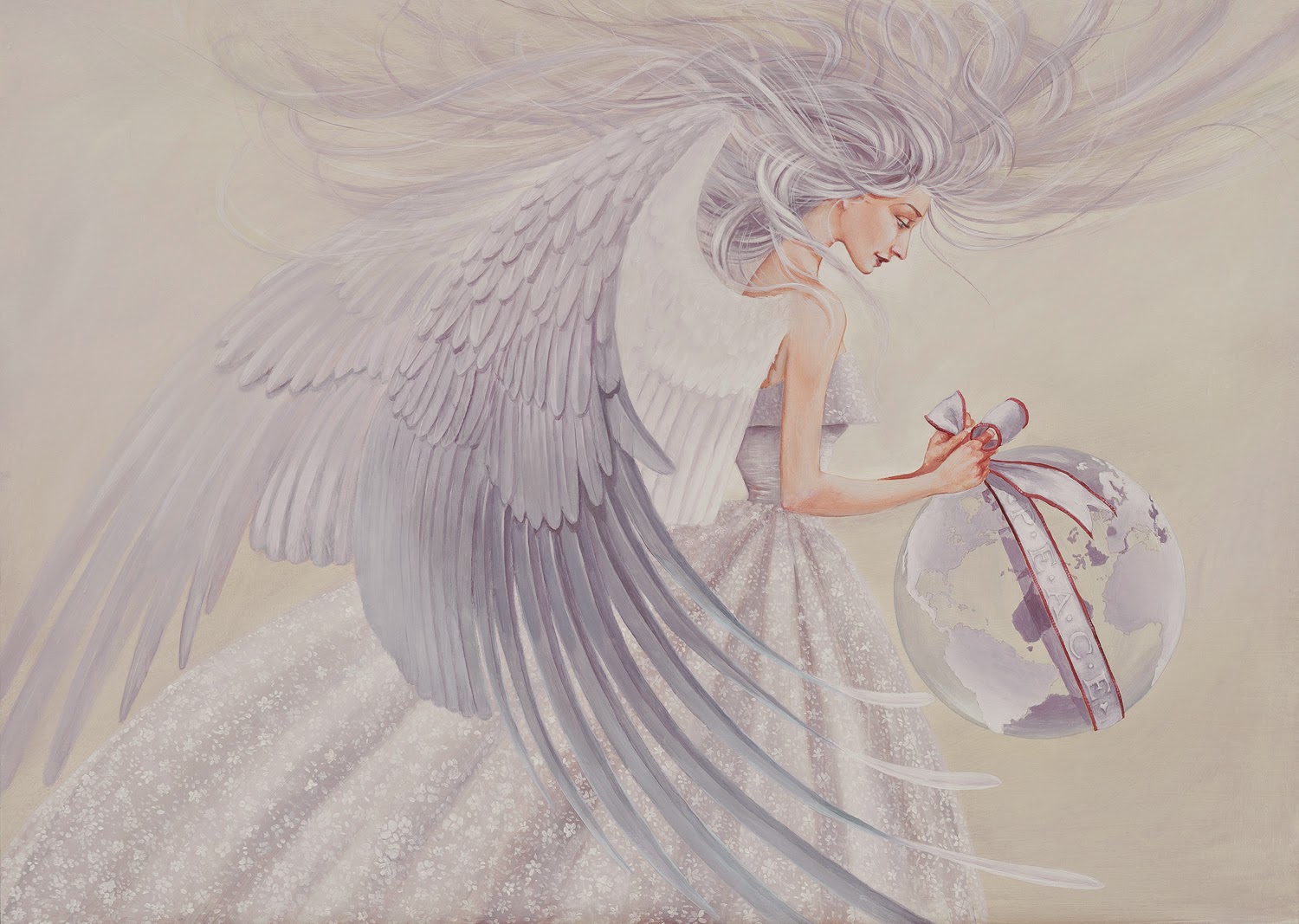
Angel of Peace - an angel trying to wrap a fragile earth in peace
A Christmas Spirit gazing on a star - I failed to write a post about this last year - too busy!! But instead you get to see two pictures - the inside and the outside of the card.
These cards are all available direct from me. Like i say a couple of them are really down into their last very few copies, so if you are interested get in touch as soon as possible and hopefully you can secure one, or two or as many as I have left at the time!!
The cards are £2.50 each, but I will do any mix of 5 for £10. Postage within the UK is as follows: 1 card £0.96p, up to 5 cards £1.30, 10 cards £1.70. For larger numbers or overseas delivery please contact me and I will work it out.
One of my favourite new images from this year is British Rocker which was unveiled at the Kickback Show at Olympia in October.
He is basically the male counterpart to Little Queenie who continues to be my most popular image, certainly as far as print sales are concerned. Hopefully British Rocker will give her a run for her money in that respect :-)
I think the image speaks for itself, no hidden meanings, just me putting down the sort of image that I like to associate with biking - the 'fifties 'sixties look of leathers, badges, greaser hair and a moody attitude. The bike is intended to be a Triton, though I suppose all you can see are really the Norton bits.....but the main thing is you can tell it is something that has been modified in the best Café Racer tradition.
As usual for me the details work as well as the whole image so I include a couple here. At the top you can see I used the same red outline technique as I used in the Goldtop illustration - to help heighten the drama of his face. This works really well in the larger prints.
And just when I thought I had finished the image I got the urge to add a British Rocker banner. This was mainly for the A0 size vinyl prints I took to the show, but I am also making this version available in the far superior Giclée prints. Have a look at the different versions on my prints page on my website if you are interested.
It's been a while, so I aim to do a few posts over the next few days to make up. I wanted to share some of the images I worked on for the Kickback Motorcycle Show which happened at London's Olympia at the very end of October. Of course my plan was to showcase some bits and pieces on here before that event, but hey-ho life sometimes gets in the way of good intentions and time just disappears, as it has all year. Anyway, the show was great - lots of fantastic bikes, great crowds and a good bit of bike art, including some of my prints. Still feeling these events out and trying to figure out the best way to show at them, and I have come to the conclusion that because of the vastness of the halls I need to do BIG pictures. That is great because the best way, in my view, to look at the work I am doing now is on as big a scale as possible - the pieces easily stretch up to A0 size, and would go beyond too. And here, just to show you what I mean I thought I would show one of the new pieces at a goodish size, but also some close ups. I actually think I might start working just on details like these close ups anyway, rather than a whole 'scene', but we shall see....come to think about it, I mentioned this before..... So, here is Go! in all it's glory:
Even when I was working on this one and had scanned in the main image of the girl I was getting fascinated with the close up details of the line drawing, and that is why I reproduced her face large in the background.
The bikers were drawn very roughly and I worked on the line artwork of them until only essential details remained:
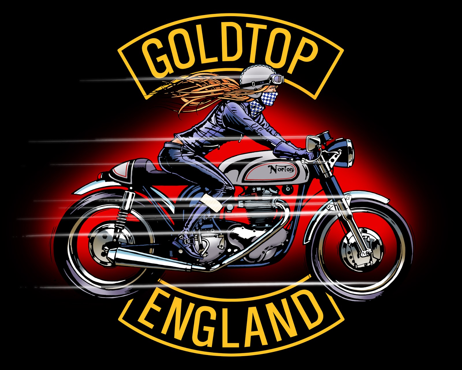
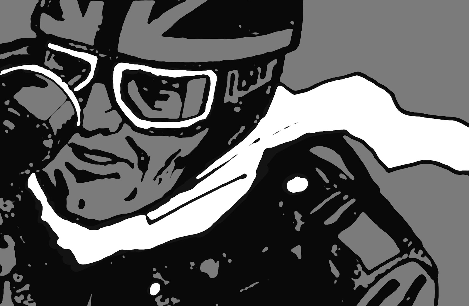
Back at the start of the year I had a call from the people at Goldtop England - makers of great classic leather biker gear. Their main man Kasey had seen my prints at the Kickback custom motorcycle show in Chelsea last December and felt he would like to commission me to do a couple of images for Goldtop to use on t-shirts and maybe elsewhere too. I was pleased about this as I knew the Goldtop name of old, plus the previous winter I had bought a pair of their sheepskin gauntlets to get me through the cold months on my old BMW R100, and they were far far far better than any 'modern' gloves I have had over the years in that they actually kept my hands warm and able to use the switch controls even on the coldest days - so I felt they were a good company to be associated with!!!
Happily, the brief was very simple. Kasey had particularly liked Little Queenie (prints are available!) and was keen to have a like-minded girl on a classic British bike as one of the images, and a guy as the other image. They were to be clothed in Goldtop gear needless to say, but that was fine as the gear is really iconic classic biker gear, and great quality.
So as you can see from these images the guy is something of an intense Rocker. Since all you can actually see of him is his eyes they needed to be quite striking, hence the icy blue to contrast with the warm skin tones. But even as I finished colouring up the original black and white line drawing I thought it still needed a little more punch so I played with another layer of colour beneath the black and got this slight bleed of red around the black keyline, which really gave it a lift.
The girl on a Norton I guess owes a lot to Little Queenie, but she is definitely a whole different girl. Equally as sassy though.
Anyway, the images went off to the client quite a while ago and I have been desperate to see what became of them, and I was keen to keep quiet about them until I knew the t-shirts had been printed. I know Kasey went to a lot of trouble sourcing good quality products and print for these and it is great to hear that they have now gone live on the Goldtop website.
....and as a special offer to you my friends use of the code BRETT15 when making the order you will get a 15% discount!! I hope to see you all wearing them soon :-)
0 Comments on Goldtop England t-shirt designs as of 1/1/1900
Here is a fun job I took on a few weeks ago, a bit unusual for me in that it was a portrait of a real person, and certainly the first time I had taken on such a commission in my digital style.
It all started when I received an order for a 'Little Queenie' print from Emma a new customer who was buying the print for her mum Liz, who had seen the image and fallen in love with it as she saw herself in the picture of the confident young biker with attitude :-)
I duly signed and sent the required print, as ever hoping it would be well received.
So I was delighted to be contacted again soon after with a request - could I do a similar image but of Emma's dad who was approaching a significant birthday, the resulting print would be a gift from Emma and her mum.
I agreed, and a few photos of Martyn, the subject, were sneaked over to me via email and I started to rough out what I might do. I had two problems - one I am not very up on Harley's, so had to figure out which bike it was in one of the photos, and two I had come down with a chest infection which left me coughing and spluttering and not much feeling like working. But there is nothing like a deadline, and there is no more pressing deadline than a birthday, so I pressed on.
The monochrome rough I created didn't go as far as I would have liked tonally, thanks to my bug, but thankfully it was approved - I got the head a bit too big in it though! :-D It was nice that they had faith in me to fill out the image in the final piece, and indeed I got up more of a head of steam once I was working on it proper. I couldn't replicate the pose of Little Queenie as in that image her face is in profile and I didn't have that sort of reference of Martyn, but I did like this angle of the Harley Davidson and it shares the image area rather than taking over.
I offered up a couple of background colour variations and let Emma and Liz decide which one to get run off as a print - they chose the green, and I agreed and had the print made, signed it and sent it off in Little Queenie's tyre tracks.
It was great to hear a few days later that the gift had been more than well received and everyone was delighted with it. Then earlier this week I received this video from Emma and her mum and it brought a lump to my throat (beware, expletives not deleted!!)
And as someone who has built a couple of bikes in the kitchen here, can I just say I approve of the bike in the living room! Thanks for the commission Emma and Liz, and Happy Birthday Martyn - long may you ride!! :-)
0 Comments on Biker Portrait as of 6/17/2016 10:28:00 AM
Oops, meant to write about this last week before going off to Hastings and the Revolution Bike Show......
Sand Race is the final piece I created ready for the show, and it seemed a fitting piece to take down to an exhibition in a seaside location.
Originally I was thinking of making an image of speeding bikes on the Salt Flats - every machine looks so stunning in that white wilderness (not that I have ever been, except in my dreams), but then I decided to have a race with a bike and a hot rod, and at the same time I saw great images from an event called The Race of Gentlemen - this will give you some idea of what I mean, and so it became a sunny California beach scene instead. Actually if I had made the sand more golden it could have been a race here in West Wales at Pendine, but that wasn't in my colour scheme :-D
For once everything went smoothly in the realising of the image, and I think it looks great in giclée print form....BUT as always lately, and as I mentioned in the last post, the more I worked on specific areas of the image the more I enjoyed the abstract nature of tiny details, and I do wonder if this is the way to approach future work.
I particularly like the girder fork details in the first detail image above, and also have done various crops with just the rider, as in the example below, so I probably need to think in this way more in the future.
Meanwhile here is the whole image, which I still do like. Obviously the prints don't have the copyright watermarks on them.
The second new image I have for the Revolution show in Hastings is 'The Kiss'. This actually started life intendedas an oil painting, in the same series as The huntress and indeed a painting was started but it stalled while I had to get on with other commercial work and I haven't found my way back to it - yet......
My drawings for the painting had remained hanging around the studio though, and I got excited about the idea of re-interpreting these in my digital style. The first thing I thought when seeing this drawing again was that I wanted to make the angel wings fuller and more sweeping, and this took the format for the re-vamped picture to more of a square, which was fine as it put the point of almost contact of the two figures right in the centre of the frame.
The characteristics of the two figures was always set in my mind - the angel had to have classic film star looks with auburn hair, though she follows no rules and has a rebellious edge, hence the sleeve tattoo. The biker girl is more contemporary with a sleek one piece leather suit. I was going to have her face dirtied by the ride, clean around her eyes where the goggles have been, but in the end, for this version at least, I kept it simple. Maybe when I complete the painted version she will be more of a 'grease monkey' :-D
What the relationship between the two is I leave up to the viewer - is the angel really there? - she is less clearly defined than the biker. Maybe she is in the imagination of the rider, or, having just had a near incident on the bike she feels as if someone is watching over her? We all have angels - and devils - to guide us, and maybe love us?!
The upshot of the revamp to the drawing is that it has left me with a square format print, which can be awkward, especially as I do prefer the images on a large scale, so although prints will be available I have yet to decide on sizes for this one. For the exhibition I had one printed with both sides the length of A1, making an 840 x 840mm sheet, which is great, but I'd like bigger again if the printers can do it, but then who has wall space that big?? For me personally these images get better and better the bigger they get, and that is why I am happy to be working in this style for prints as opposed, say, for book publishing where they are reduced so much in size that they lose a lot of their essence. And this is why I add close up details in these posts :-)
About time I got around to some new ramblings on here - it's been a while :-)
Anyhow - another motorcycle exhibition looms and I have been invited to add some of my work to it, and so have prepared seven large giclée prints to show my digital work off to the biking hoards who traditionally descend upon Hastings on the Kent coast for the Mayday bank holiday. The guys at Revolt Motorcycles have created an exhibition of art, motorcycles and films at the Observer Building running for the three days, and having seen my work at the Kickback show in december they kindly asked if I would like to be a part. Of course I would!
I did hope to have all new pieces there, but time had other ideas, and in the end there are three new pieces, which I will bring to you one at a time in these three posts starting today.
The first image was completely fun to do, and went from a tiny doodle to the finished thing in very little time (for me). Somewhere in the pipeline was/is a project to do a set of picture playing cards with a bike theme. This idea sprung from my 'Little Queenie' image from a couple of years ago - she's still riding high and as popular a girl as ever - and I thought she should have her own Queen of Hearts card, which gave me ideas for the other Queens, Kings and Princes too........but for now at least, all I have to show you is this joker character.
Skulls are great fun aren't they? And they are a constantly recurring theme in bike art I know, but they are always laughing, so make a perfect joker. And by and large I think bikers are optimistic as well as fun people, so I had to have him laughing at a world he is seeing through rose-tinted spectacles. A world we can all get more frustrated by every day with the rules, regulations, stresses and strains which are constantly thrown at us. And that is why I ride - being on a bike frees me from almost everything. The sensation of speed is so much more real than with any other way of travelling too, and the lack of confinement makes riders live every moment and feel a part of the world and life they are travelling through. If life can sometimes seem a joke, then at least we can get it!
Live Fast, RIDE, Die Happy...... and may that be a long long time from now :-D
Just to say prints of this and many of my other images are available. Have a look on my website, and contact me for details! BB
Time to mention the final image of mine which is making it's way to Chelsea for the Kickback Custom Motorbike show on 12th and 13th December at Stamford Bridge.
This one is called Café Noir and is a nod to my own excursions into café racer builds, which I have mentioned briefly before, and this was the way my first one turned out -
Anyhow, the picture is a very simplified version of a more involved idea I had where a youngish biker couple would be shown building a bike in their loft style apartment, so that the bike was central to their existence and indeed a shared passion, and originally the notion was that there would be hints somehow that the girl would be the driving force behind the build and be the one with oily hands. But, well, it was all too complicated and didn't fit in with other things I was doing in this style so I have mothballed that concept for now and for this decided to concentrate on the bike, a BMW café racer and then litter the place with tools and garments to suggest the girl had finished working on the bike for the day.....ok, it's a bit cheeky, but you have to have a smile once in a while :-)
The other big thing for me was the colour - I definitely wanted to do this rich scheme of deep blues and blacks against the warm reds and oranges, and I think it worked really well. I hope you like it too!
Prints of this and the other ones will be available very soon by the way.
So this time I will tell you about the second new biker image in my digital style, this one had the working title of 'Blondie', and that has kind of stuck but also it's known as '1938 Triumph Speed Twin Bobber', being the bike Blondie is about to ride off on.
Originally I was after quite a fifties look to the whole thing, and was going to keep it quite sparse black and white, with just a flash of red for lipstick and the sole of her boot. The pose was definitely 50's cheesecake with no apologies, and following the look of the original sketch her hair was originally from that era too...
But then I decided I wanted to give her a bit more edge and went back to my working drawings and scribbled this very messy hair in, just to see where to take it. Looking back now I quite like it!!
But again I had a rethink and as I seem to be having quite an early-70's nostalgic phase at the moment, selectively liking lots of stuff from back then - hair, clothes, music, bikes, cars, houses, decor, films, book design, etc etc, I settled on this new look for Blondie's hair.....
And as you can see a bit more colour crept in as well as the graphic device of the black element to the left and the linear shadows cast by the bike and her boot. This bit was great as a lot of detail is actually lost with the black on black going thing going on, but it is still all there in suggestion too.
I'll tell you about the final image in the set before the week is out :-)
0 Comments on Blondie - 1938 Triumph Speed Twin Bobber as of 11/30/2015 2:43:00 PM
I thought I would tell you this time about one of three new digital images I worked on over the last couple of months. Ever since making the Little Queenie image a couple of years ago I had toyed with the idea of drawing a male counterpart, and to otherwise add to and expand on my digital portfolio a little, probably with other motorcycle pieces. Christmas cards aside I had to wait until other projects were finished before I could think of clearing my decks enough toward on them, and then just as I was getting ready to get started I was contacted by the organisers of the Kickback motorcycle show in Chelsea, London asking if I could exhibit some prints at the forthcoming December show - so not only a time slot to do some work in but also a good kick in the side to get on with it! First new image was always going to be that Little Queen follow-up, and he was always going to be, in my mind, riding an old British café racer. Unlike Little Queen, who was all about attitude, the bike was to be a big part of this picture, and after a few doodles to decide on composition I eventually made this ink sketch using sharpies.
Scanning it into the computer and tweaking the image to a solid black on white,I was then able to start adding tone and colour to depict mood. Night time seemed to be the right time for my leather clad speed freak to be barrelling along the roads on his BSA A10 Golden Flash, and so the stark black and white line drawing began to sink into nocturnal hues.
As I worked on it I wanted to add just a little context to the background without having or wanting to confuse the image with too much detail (I did try out street lights and road signs and stuff like that in doodles, but was never happy with any of the ideas). And then the dark tones I was using, plus the fact that right outside my studio window the leaves were falling from the trees as autumn progressed, I figured a cold autumn night was the perfect setting for a very British scene....maybe adding rain would have completed the picture and I did contemplate that too...but no, a few leaves would be good, and here was the way I suggested them on the colour rough
with the way it was looking I went back to my original line drawing and made a cleaner version of it, and scanned that in and tweaked it in photoshop - this is a detail of that.
And so all that remained was to go through the colouring process again, a little more thoroughly this time, and this was the end result.
The Chelsea Kickback show is at Stamford Bridge on the 12th and 13th of December 2015. I will have four large prints at the show - 'Little Queenie' 'Café Racer' and two more, and will post information about the other two prints here before then :-)
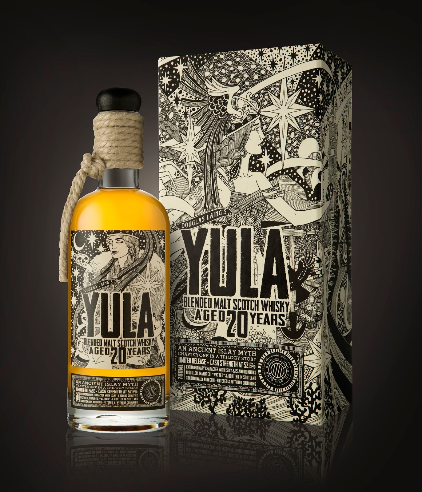
Hi - well I said I would bring you another whisky project which I had the privilege of working on earlier this year, and here it is - label and packaging art for Yula 20 year old malt whisky from Douglas Laing's distillery on the Isle of Islay.
This was another black and white line commission from the designers at Pocket Rocket Creative up in Stirling, but unlike 'The Devil's Punchbowl' and 'Angels' Nectar' this wasn't to be a scraperboard illustration. Instead it was to be just ink line, incorporating a lot of pattern and interlocking elements to tell the story of Yula and how the island of Islay came to be.
Yula was said to be a Danish princess, and she left her homeland to travel across the sea. With her she took many pebbles, all of different sizes, in the pockets of her apron, and on the journey these pebbles fell out into the sea and they each became an island, and ultimately one of them became the island of Islay. Unfortunately Yula then perished in soft sands on the coast and was taken to a sacred spot and buried there....... So even in that short synopsis there is plenty of imagery to play with, but also I was asked to incorporate a few items specific to Islay and to whisky production, so I had even more things to interweave into my drawing.
As is usual I started with a rough to fix elements in place and to discuss with the designer and client, and this led to a very detailed tracing, of which this is a detail:
Happily that proved to be quite acceptable to one and all, so it just became a matter of carefully tracing it down onto some nice hot-pressed heavy-weight watercolour paper, and then got my technical pens out and began inking it in....
It was quite mesmerising and very therapeutic just spending hours and hours filling almost the whole image with lines and dots. With my headphones on listening to music I was as happy as a pig in muck, I can tell you.
The aimed-for effect was to get a good overall tone, so that it looks quite grey from a distance, but then Yula's skin and her apron are clear in their milky whiteness by contrast.
I am hoping that this won't be the only time I work like this, but meanwhile the idea of surface pattern is creeping more and more into my other styles of work, particularly the oil painting I think. In fact, in the Three Angels paintings, although there isn't the abstract patterning, there are a few stars that recurred there from here.
Anyhow, this was the final full image, and at the top of the page is the finished thing.
I will just leave you with the separate image of Yula which is the bottle label :-)
0 Comments on Yula - a Norse Spirit as of 11/9/2015 3:08:00 PM
It has been a busy year, and the work has been nicely diverse. This post is about the creation of a new whisky label, a job which I undertook in June - another commission from the Pocket Rocket Creative team in Scotland who also had me work on 'The Devil's Punchbowl III' packaging which I wrote about in august last year here
So - from Devil to Angels - both my favourites!! The idea behind this theme is related to the small amount of spirit which evaporates away from the casks as the whisky matures, and which is known wistfully as the angels' share - and naturally the angels have found this particular blend a favourite, and so it is their nectar :-)
Gary at Pocket Rocket contacted me and discussed the sort of image they were after, and provided a rough he had created to sell the idea to his client. What he wanted was an angel made up of lots of smaller angels, and these smaller angels would be sipping whisky from tumblers! Ok, great I thought, sounds like a challenge, especially as the required scraperboard illustration would have to have fairly robust lines to be able to withstand being reduced down and ultimately to be printed using a gold foil.
It was this need for robustness of line that initially threw me off the basic concept as I struggled to see how I could achieve so many figures in such a small space. Of course I could just do the illustration huge and pack it with detail, and that would be great until it was reduced to label size (the final label on the finished bottle has an angel with a wingspan of only 6cm and an overall height of 7cm - pretty small!). So, I decided I should work at a maximum of 200% final size. And working at that scale made me realise how small the individual angels would be. So my first sketches made me wonder if it would be better to have fewer angels but with the rest of the form of the main angel to be created somehow out of evaporating whisky swirls. This was a working drawing at that early stage....I knew I was going away from the brief, but sometimes I just have to get something out of my system before I can get to where I need to be with a job:
I even made a partial line image to show how this might work out in scraperboard
But, quite rightly, Gary reeled me back in and gave me a pep talk and I increased the number of small angels making up the main angel figure, while reducing the vaporous swirls, ending up with this sketch which was given a tentative thumbs up, there were a couple more tweaks needed, but mostly it was there:
Then it was just a matter of transferring that to a blank sheet of scraperboard, adding black ink and then scratching off what wasn't needed until the whole thing was done. The head didn't quite work the first time I worked it, and so a new one was done on a separate board - scraperboard doesn't take to re-inking once you have scratched into the chalky layer once...
That one had hair which was too fine for the foil treatment, and so was revisited again when I composed the finished artwork in photoshop, and so after much to-ing and fro-ing, we got there, and I sent the work off:
I would have liked to have written about it at the time, but patience is a virtue they tell me, and I waited until now, which is good as I can link you to an image of the final product here, and even better, tell you that last month it won an award at the Scottish Creative awards - for Best Illustration - I can't really ask for more than that can I?
I hope you like it! I will be back to tell you about another whisky project soon TTFN :-)
0 Comments on Angels' Nectar - a new whisky label as of 11/4/2015 10:05:00 AM
I can now tell you about a fun project I worked on over the summer creating these three paintings of angels, which for once weren't intended for publication or reproduction, but instead to be hung and displayed on walls.
The main impetus for the project was the marriage of great friends Lowri and James, which happened here in Pembrokeshire, in the sunshine of June, and for them I thought it apt to create a small image to celebrate their togetherness. And in itself that seemed a good excuse to continue with my theme of angels. Lowri is from these coastal parts, and a love of the seas and oceans of the world forms a part of her soul. Both she and James spend as much time as they can beside or in the water, including three adventurous years together in Australia where surfing before breakfast became their enviable way of life.
Also into the mix were two other dear friends to whom I owed a something, and that 'something' I was allowed to decide was also a painting, and could also, therefore be an angel. Steve and Jenny share a love of, well, many things, but two that were relevant to this project were motorbikes and ancient sewing machines, both of which they have quite a few of. They also had an overseas adventure this summer with a ride along Route 66 with a gang of high octane bikers on fully-dressed Harley Davidsons.
In for a penny in for a pound, I thought I could make it a triptych and also dedicated a third angel in the series to Lucy and me. After working on a few books over the past few years where I had many paintings on the go at any one time I thought having three canvasses on the go would help keep the momentum going, and it was a cosier and more complete set than two would have been.
So I designed an over all layout, and had each angel holding up the initials of all involved. Each angel has a unique personality and the paintings had their own flavours and colour schemes. As the images weren't intended to be reproduced in print, I decided to use canvas boards instead of my usual primed hardboards, and it was great to feel the difference as the oil paints gripped and filled the canvas weave, unlike on the smooth hard boards where it can be a bit slippy-slidey.
Colourwise, the Lucy and Brett painting had a fifties theme going on, with pinks and powder blue.
Lowri and James' painting was more from the colours of the sea. All the angels had dramatic big frocks on...well, just because that's how I wanted them. And the dresses were going to display details relevant to each couple, so L and J's had an apron of fishing nets, to later be adorned with sea treasures.
Steve and Jenny's angel was darker, with biker blacks and aluminiums, and a redness inspired by Moto Guzzi frames. The hair styles also needed to be different, and this helped to define the individual nature of the three sisters...as that is what they had become as I plodded on with painting them.
It was really nice not having to seek client approval (I hoped for it later!!), and this meant no detailed drawings of what each painting would eventually contain, just a vague notion of where I was heading with them.
Well, eventually, the paintings were finished and I then created some frames with cushioned fabric mounts for the pictures which didn't hide any of their edge details as conventional framing would do. And this is how they looked:
I won't explain all the details, but I hope you like them. The paintings were delivered by Lucy and me to the other two couples when we met up in Bristol yesterday, and now the three angels have flown their separate ways, but of course 'L & B' came back with Lucy and me. I am happy to report that 'client approval' was very graciously forthcoming :-)
0 Comments on A Tale of Three Angels as of 1/1/1900
It is that time of year again, and I am just about ready to think about putting my feet up for a day or so to enjoy the festivities with loved ones. It has been a busy year with one thing or another - and that seems to be the case with everyone I know. We are all chasing our tails and at too many times the world seems like it has gone mad and there is nothing we can do to stop it. So, best we all take time out, breathe, smile and be thankful for all the good things we have in life.
After completing the illustrations for Hosan Nadolig a couple of months ago my mind turned to producing an image for my Christmas card. Inevitably for me at the moment I decided on an angel, and to the surprise of many there was no sign of a motorbike. I can't remember all the thoughts that were swimming around in my head as I dreamt up the angel carefully wrapping a ribbon of peace around a fragile world, but hopefully what I created speaks for itself. Actually my initial sketches involved a couple of other details, but I backed off for the purposes of the card as I felt it might get overly complicated, and might not even get finished in time. But now that it is done, and has been scanned and therefore 'saved' as is, I might go back into the painting next year and add those details and see how that works. I'll let you know if I do!
Meanwhile, I have included a detail shot of the painting taken while it was in progress a few weeks ago, and below is the finished thing. So it just remains for me to add my wishes to you all for a very merry Christmas, and a happy and peaceful New Year :-) X
0 Comments on Merry Christmas and a Peaceful New Year! as of 12/27/2014 4:30:00 AM
Only a week now to Christmas Eve, and I promised some more images from Hosan Nadolig, so here you are.
First up is a detail of one of my favourites from the book, illustrating the story of Papa Panov. The version in the book is actually a retelling (by Cynthia Saunders Davies) of a classic Leo Tolstoy story. For an English language version go here, and you will see which element of the heart-warming tale I latched onto for my painting.
Below is the complete painting.
The originals for all fifteen pictures in the book are 290mm wide x 230mm high (so a little over A4 in size) and are oil paint on board.
This next one is for another classic story retold. Y Llygoden Fach Lwyd or Little Grey Mouse, originally by Janet McNeill is here recreated by Alwena Williams, and it is the tale of a mouse experiencing the magic of Christmas of the first time, where the cottage cat doesn't eat her, and where, up in the Christmas tree she sees all kinds of wonders, including three chocolate mice. At the top of the tree the angel takes her under her wing and they watch the proceedings together. So, although we know the angel is a doll, I wanted to give her some semblance of being alive so those big blue eyes might just be real!
Finally, another fun image, another figure from a Christmas tree come alive, this time a fairy who is tempted to sample the mince pies, and has rather too many, falls from the tree breaking a bauble on the way and gets a sore head and crumpled wing into the bargain. The stories were all good fun to illustrate, and the resulting book is a very handsome hardback, which you can get from here
I hope you like the pictures, let me know! :-)
TTFN
0 Comments on Hosan Nadolig - Christmas Stocking as of 12/17/2014 6:18:00 AM
Once again - it has been a while since I wrote anything here! What can I say? - I have been busy, honest!,..... same old same old!! Summer is becoming a distant memory now, not that I saw too much of it, and my studio is getting distinctly frigid again. (All very well having a north facing studio - constant light and all that, but the fact the sun never shines on my windows here at the back of the house does mean a lack of solar warmth come the winter months, and multiple layers of fleecy clothing become essential). But during the warmer months from May through into October I was busy and completed 15 small oil paintings as illustrations for the re-print of an old Gomer favourite 'Hosan Nadolig'. The book, as it's title meaning 'Christmas Stocking' suggests, is a wonderfully varied collection of stories all with a Christmas theme, full of great images for me to depict - robins, angels, fairies, puddings, presents, the fat guy with the white beard, Christmas trees, and of course the Nativity too. It is funny that I can now fit those fifteen paintings - the endeavours of what is basically half a year - side by side onto my coffee table, with room to spare, but that said I am pleased with the results and I think a very handsome book is the result.
This image is for the story called 'Y Robin Goch a'r Goeden Nadolig' (The Red Robin and the Christmas Tree), where I created a very glamorous fairy who is helping the robin with the broken wing. She contrasts nicely with a more worse-for-wear fairy elsewhere in the book!!
I will come back with more images as Christmas approaches, but in the meantime can any of you identify the little artistic tribute I included in the above image of the nativity scene??
:-)
There are a few more of the pictures on my website here
Here's a very pleasing job I did back in april and which I decided to keep quiet about until I saw the final thing in the flesh, which was today!!
As a whisky drinker I was delighted to be asked by the Pocket Rocket Consultancy in Stirling to do a scraperboard illustration to enhance this project they were undertaking for the Arran Distillery, and it was a theme I was equally excited about - a devil tempting the viewer with a quaich full of finest Arran malt whisky, amid a sea of sulphurous smoke and flames. Gary the designer at Pocket Rocket had seen my dark illustrations for the two Daniel Morden books - Dark Tales from the Woods, and Tree of Leaf and Flame - and felt that the style was perfect for what they were trying to achieve with the packaging for this third and final outing of 'The Devil's Punch Bowl'. Fitting to the name, this 53.4% alc/vol whisky is a limited edition of 6660 bottles, and the whole packaging is sumptuous with it's use of different coloured foils and inks and cloth covered luxury board.
It is a joy to hold and open the box to reveal glinting foiled type giving an introduction to the drink within, followed by a message from James MacTaggart the distiller himself. Across from this is a listing of the casks used to achieve the particular flavour he was concocting. A ribbon pull then invites you to unmask both the bottle and the devil himself.....
It's great to see him all in golden colour after working on him in black and white. And it was great that they included my signature on the illustration there.
As far as the illustration went it was a classic scraperboard subject matter, what with the uplighting and everything. The designer had a lot of input and ensured that my early sketches were improved immensely before committing to the final artwork. This is how he looked when I was done with him:
Now, I hope some of you get to sample this malt whisky one day - I certainly am looking forward to trying it. But I do have some bad news on that front.....the entire edition sold out within an hour of going on sale!!! But, on the brighter side, I believe some of those bottles were bought by retailers, so get hunting :-)
Also take a look at the distiller's website for more info: www.arranwhisky.com
One last note about my photos - anyone who knows me knows I am currently working all hours on paintings for a Christmas book - I will probably bring some news and glimpses of that here soon - but as a consequence housework isn't a priority and I couldn't find an uncluttered place to take the photos, so I went out to the sanctuary of my shed, which seemed appropriate with the black bikes, the oil and engines, and sunlight slanting through cobwebbed windows!! I hope you like them.
And a final footnote....there is another whisky story to come soon too :-)
TTFN
0 Comments on The Devil's Punch Bowl as of 8/11/2014 3:22:00 PM
Since last posting I have been very busy with a number of projects, in fact it has been a busy 2014 altogether so far, with no sign of a let up. And the variety of work has been great - I have produced some watercolour paintings of historical landscape features for some signage to go in the Brecon Beacons National Park, I have done scraperboard work for a whisky packaging project, I have oil paintings and digital work of my own in hand, I did the book jacket I am about to tell you about and also I am now embarking on a series of 15 illustrations in oils for a Christmas anthology of tales from Wales to go with the two previous anthology titles I undertook for Gomer. With all of this going on I really wish I could share things with you more often, but there has to be a certain amount of secrecy about projects until they are unveiled as I'm sure you will understand. So hopefully in the coming months as the above pieces get published/printed/produced I will then be able to show you my work on them in detail. Last week, at the Urdd Eisteddfod, saw the publication of 'Gwylliaid' - a book for teenagers written by Bethan Gwanas and published by Gomer. It is the story of a band of red-headed brigands who went about their adventurous and sometimes dubious lives in the wilds of sixteenth century Wales. Bethan wrote the book after winning the T Llew Jones Memorial Award. I had been given a brief synopsis of the book at the start of the year, but couldn't sit down to produce a rough until late in March. I didn't have much detail about characters within the gang who featured in the story, but one of the notes from the publisher suggested that maybe they didn't have to be portrayed too specifically, so I latched onto another aspect of the story which seemed quite pivotal involving a sword found buried in the snow (a lot of the action takes place in the snow). With that in mind I produced this rough:
I thought this would be a good attention grabber from across a room, as jackets have to work that way. But even so I wasn't convinced it was the right cover, and so when the word came back from publisher and author that they would prefer a different direction I wasn't too surprised or bothered. I then asked for more details about the characters in the gang, and as soon as I read their descriptions I knew there was a far better cover to be had.
So - rough number 2 focussed very much on the rogues in the wild mountain gang, who dressed in rags and animal skins, had various scars and facial characteristics, and who mostly had bright red hair (the one who didn't wore a fox fur hat so he looked like he had red hair!) Indeed, the red hair now became my focus. So this what what I submitted as the second rough:
Thankfully all were delighted with this and so I was to proceed. Here is me proceeding:
As you can see I went back to my watercolours for this cover - even with fast drying Alkyd oils I doubted I would finish in time for the proposed launch at the Urdd Eisteddfod. Below is a detail showing a wet area with the colours running in to each other for the ragged clothing:
Finally/eventually, I finished the painting, cut it from the stretcher board and scanned it in, this being the result I sent to a happy publisher and author:
And after a week or so I had this image sent back to me showing the typo treatment they had given to it:
Now I am back to painting, inevitably, piles more snow in the illustrations for the Christmas anthology. I am due to finish these by october, by which time I should be quite sick of the sight of tinsel, holly, jingle bells and robins, and will be craving a tree-free Christmas, but in the meantime I shall put my Santa hat back on and wish you a cheery Ho Ho Ho until next time :-)
0 Comments on 'Gwylliaid' book jacket as of 6/6/2014 8:19:00 AM
Back to the digital work again now. Here is an image I wanted to have a bit of fun with - a girl in a cat mask. No real reason, other than I am enjoying the whole 60's thing of iconography, music, colour, fun.....and the oil paintings take so long I wanted to do something much quicker. Perhaps because the paintings take so long I wouldn't paint anything so simple as this (and maybe I should.....maybe I will!!!)....they (the oil paintings) seem to require more reverence and substance from me because I know I will be at them for weeks or months, and, Catch 22, because of that they take even longer again!! Sooooooooo, yes, in between times, I like to play with a drawing, establish it quickly and blast a lot of colour at it in photoshop. I was just explaining to an editor friend that this method I use here has evolved from a way to make large images at an economically quick pace for children's books into something more refined and punchy. I kept seeing the potential of the style when I was in close up to a detail in a busy picture (perhaps see my posts from april 10th and june 26th 2010 for what I mean), but the pictures as a whole often let me down because looking at the whole thing meant the niceties of the details got lost when zoomed out of. So, now I am making all of the drawings like a detail. It brings me back nicely to thinking about pop art which has always been a favourite of mine - and beyond the gallery pop art of say Lichtenstein or Warhol, to the art which inspired them in the first place, comic books and commercial art in the 50's and 60's.
So, here is my picture, called The Cat's Whiskers:
But, even when I have created an image that I think is only a 'detail' of something larger, I still can't stop myself zooming in to see different crops of the same, revealing whole new pictures. I suppose we all do it all the time now our photos are on our computers rather than as A6 prints on photo paper. Still, I do like the process, and I do like the idea of these images being very big when printed out. I said before that my 'Little Queenie' image looked better the bigger the print, and I went as far as A1 with that (so far!!), well - I think this one might have to be A0 at some point, will just have to find a wall somewhere big enough to display it!!
Here are some crops:
Well, I hope you like the picture. Please leave a comment and tell me which crop you prefer!
TTFN :-)
0 Comments on Pussycat Pussycat..... as of 3/6/2014 9:40:00 AM
Having just finished the latest in my Angel series of paintings, I thought I would post a few work-in-progress photographs taken over the past weeks when I have worked on the piece.
As with others in the series there is a motorcycle connection, and in my head a back story of what the picture is all about, but I'm not going to dwell on that just now. Enough to say this one drew inspiration from the idea of Diana the Huntress, who is usually depicted with hounds, but here she has two Vincent Black Shadow motorbikes for company. Their blackness and her whiteness were perhaps as much the theme of the painting as anything else.
The opening photograph shows the painting near completion, but not quite, I was working on the dirt splashes on the bikes at that point, and still had to tackle her tattoo and a few details needed tidying up.
But going back to early days, this was my first sketch for the angel after thumbnail doodles. It was done to the size of the painting, which isn't very big at w460mm x h305mm.
From here I went on to make further composite drawings on paper and in the computer, adding the bikes as part of that process, before transferring the design to my gesso-prepared board.
This is early stages on the angel, although the wings and eyes are pretty well established it looks like!
The bike on the angel's right hand side had to be brought up to a near-to-finished standard before I really worked on the dress and bodice. The arrow flights and her lipstick were intended as major colour counterpoints.
The bike in the foreground really tested my research abilities - there was no single donor photograph, and I scoured hundreds of pictures to decipher what all the parts are....and I was left with a stronger wish than ever to win the lottery and own one of these beautiful machines. It did take a long while to paint - I've said before, cars are a lot easier to depict!!!
Gradually though I worked through all of the many details, including the headlight glass which I put off for ages! Having painted lots of cars back in the day, I knew it was a tedious necessity to do!!
And then I dirtied the two bikes up!!! The near one in particular was far too gleaming, I don't trust clean bikes, they usually don't work for a living. Luckily my bikes gave me plenty of reference opportunities for dirt spray patterns. I did wonder how far to go with this procedure, but ultimately I did want the engineering aspects of the bike to show through, so just gave them the look that they had been out for a good run.
And once the bike was finally finished I went back to those details on the angel. I am still undecided on whether to give her a halo as in the first sketch, I think I will live with the painting for a few days as it is while I get on with other work before deciding on that potentially final detail, but at some point I will need to declare it done and get it photographed for reproduction purposes.
I hope some of you out there like it.
Must get on with other work now! TTFN :-)
0 Comments on Huntress Angel as of 2/27/2014 10:10:00 PM


Interesting..I'm drawn to the lava red treatment, it gives a taste of 60s Strepsil to the back of my throat. A novel departure from Steel and Ally, leave the Hipsters to ponder on that stuff for a while. Best Wishes as usual xx
Ah, cheers MrMaguiz - yes I like the hot lava laden temptress too - sometimes so hard to decide on which version to settle on as 'The One'. Hope to see you soon - that Rudge will have patina on it's patina soon;-) X