


My apologies for the paucity of posts. We had a death in the family and have been sitting shiva all week long.
Which leads me to Things It’s Taken Me Too Long To Learn About My Daughter: When she says “My tummy hurts,” that means she’s going to throw up. Like, immediately. Do not pass Go, do not attempt reason, do not offer apple juice. This morning, she awoke, groaning, and proceeded to barf up what looked like a solid mass of undigested rugelach and dark chocolate nonpariels.
Adam has diagnosed Count Chocolutis, brought on by too many sweets at the shiva house. We are hoping for a speedy recovery.
Anyhow…a few weeks ago a friend asked if I’d read Carolyn Parkhurst’s second novel, LOST AND FOUND, which she’d just seen an ad for.
“Read it?” I said. “I loved it!” I trotted off to my bookcase to get it. My friend looked at the book, frowning.
“No,” she said. “This isn’t the right book.”
Turns out, it was the right book…but the publisher had so radically changed the cover between the hardcover and the paperback that it was pretty much impossible to recognize the book in its new incarnation.
Publishers do this all the time, for obvious reasons. When a book – particularly a piece of literary fiction – comes out in hardcover, the image will scream, “SERIOUS WORK INSIDE THAT MUST BE TAKEN SERIOUSLY.”
Then, once the reviews have been secured and it’s time to get the attention of readers (who tend to be female) as opposed to big-shot critics and editors, the book will be repackaged with a cover that pleads. “PUT ME IN YOUR BEACH BAG AND I’LL SHOW YOU A GOOD TIME!”
My favorite example of this phenomenon is Francine Prose's A CHANGED MAN. Here is the hardcover:
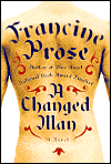
It's great, isn't it? Riveting, original, impossible to miss. The book got amazing reviews. But between the naked tattooed torso and Prose's farbissena author photo...

...you can see where readers could feel a little put off.
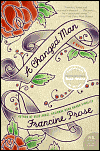
So here's what the publisher did with the paperback:
Here's another example of the same thing: Allegra Goodman's very fine INTUITION, about love and betrayal in a post-doc research lab. In hardcover, it's all business:

Again, another compelling image that tells the story. Evidently, though, it didn't work well enough to keep it in paperback, 'cause the paperback looks like this:

It's pink! It's green! There may be shoes and shopping!
LOST AND FOUND was, I think, just a flat-out misfire. Here it is in hardcover...

...where the message is less SERIOUS FICTION than JIMMY BUFFETT CONCERT. (To be fair, the book's about a bunch of teams on an Amazing-Race style reality show, and one of the items they have to collect and travel with is a parrot).
So the publisher went back to the drawing board, and here's the paperback:

Much better, I think. You get the mother/daughter thing (one of the teams is a mother and daughter, hiding the obligatory Terrible Secret), you get the travel/adventure component, it's catchy, it's pretty, and I hope it gets the book the audience it deserves.
I hope to post the cover for CERTAIN GIRLS very soon. No parrots. I dig it. I hope everyone else will, too. Add a Comment