new posts in all blogs
Viewing: Blog Posts Tagged with: sepia, Most Recent at Top [Help]
Results 1 - 25 of 59
How to use this Page
You are viewing the most recent posts tagged with the words: sepia in the JacketFlap blog reader. What is a tag? Think of a tag as a keyword or category label. Tags can both help you find posts on JacketFlap.com as well as provide an easy way for you to "remember" and classify posts for later recall. Try adding a tag yourself by clicking "Add a tag" below a post's header. Scroll down through the list of Recent Posts in the left column and click on a post title that sounds interesting. You can view all posts from a specific blog by clicking the Blog name in the right column, or you can click a 'More Posts from this Blog' link in any individual post.
By:
KidLitReviews,
on 9/16/2012
Blog:
Kid Lit Reviews
(
Login to Add to MyJacketFlap)
JacketFlap tags:
Children's Books,
relationships,
lily pads,
discrimination,
5stars,
Library Donated Books,
saying I'm sorry,
tadpoles,
Frog's Life Cycle,
picking friends,
Add a tag
 5 Stars
The Silly Looking Thing
Eva M. Sakmar-Sullivan
Schiffer Publishing
No. Pages: 40 Ages: 4 - 8
. . . . . . . . . . . .
From Book Jacket: “I don’t want to be your friend because I don’t like the way you look!” That’s not a very nice thought! Itsy-Bitsy Frog discovers that just because someone looks a little different than you. Doesn’t mean you can’t be friends—or at least give the friendship a chance. You just might be surprised or shocked at what you find out!
Isty-Bitsy Frog is a young frog in search of a friend. He longs to play in the pond with a new friend. After his parents give him permission to go to the pond, Itsy-Bitsy Frog happily hops to the water. There, he finds a young boy already swimming in the pond. The young boy asks Itsy-Bitsy Frog,
“Hey Frog! You want to play?”
Itsy-Bitsy looks and says,
“No way! I’m a frog and you’re a silly-looking thing.”
This happens several days in a row until Itsy-Bitsy Frog simply stops going to the pond. His parents ask him why he has been staying home. Itsy-Bitsy Frog boasts that he is a frog and only plays with other frogs. His parents are not pleased and tell Itsy-Bitsy Frog that simply being different is not a good enough reason to not be friends and play together. Itsy-Bitsy returns to the pond to apologize to the silly looking thing, but he is gone. A small, young frog is sitting on a lily pad. Itsy-Bitsy Frog calls out,
“Hey, you want to play?”
The young frog does not reply, frustrating Itsy-Bitsy Frog. He tells the young frog he is acting rude and the youngster finally replies.
“I thought you didn’t play with silly-looking things?”
I like this book. The illustrations are clean, colorful, and bright. Itsy-Bitsy Frog is full of emotions, especially when he gets angry or  boastful. He has wild arms and legs flailing all over the place when he gets angry and adamant at the silly-looking thing. Ironically, this makes Itsy-Bitsy Frog looksa bit silly himself. He also looks adorable in his red striped shirt and jean shorts with suspenders. In the spread in which Itsy-Bitsy Frog explains to his parent why he has not be going to the pond, Itsy-Bitsy Frog humorously looks like a snobby debutant, stating matter-of-factly,
“I’m a frog, and I only play with frogs.”
Kids can be horrible when it comes to exclusiveness. They ostracized any child who looks or dresses differently, speaks with an accent, is handicapped, or a multitude of other subjective reasons. Most often, the reasons are senseless and based on falsehoods. The older the child, the more destructive these acts can become. It can be hurtful on the receiving end of such behavior. At its worst, the exclusion includes criticizing and discrimination.
I like the way the author/illustrator has taken an animal, which is non-threatening, and one that alters physically based on age. At its youngest, a frog is a tadpole, with a differently shaped head and body. “It is a silly-looking thing.” It then becomes a frog and looks like all the other frogs in the pond, or no longer like a “silly-looking thing.” Itsy-Bitsy Frog had no idea he was once a silly-looking tadpole, so he did not recognize a soon-to-be frog. Instead, he turns from the unknown animal, preferring someone who looks like himself.
I like that she used a frog because it can represent our own transformations from infant to child to teen and then adult. We change how we look at each stage, just like the tadpole. For example, a shy, quiet kid, who always gets beat-up—for being shy and quite, grows up to be outgoing, demonstrative, and talkative. We transform just like the silly-looking tadpole Itsy-Bitsy Frog would not play with—because he was silly looking.
 After the story, there is a spread called A Frog’s Life. Using a circle, similar to if one looked through a microscope, she illustrates the life cycle of a frog as it progresses from an egg to a tadpole, and all its changes, to a frog. It is a nice science lesson that helps further explain the silly-looking thing.
Nothing in The Silly Looking Thing is preachy. It is a fun book, with fun pictures and a simple approach, even the youngest child will understand. With this mix of helpful, easy to understand story and great illustrations, The Silly Looking Thing becomes a wonderfully useful book your child or grandchild will treasure.
Author/Illustrator Eva M Sakmar-Sullivan website
Publisher: Schiffer Publishing website
Release Date: August 28, 2012
ISBN: 978-0-7643-4144-1
Number of Pages: 40
Ages: 4 - 8
. . .. . . . . . . . . . .

Filed under:
5stars,
Children's Books,
Library Donated Books Tagged:
children's books,
discrimination,
Frog's Life Cycle,
lily pads,
picking friends,
relationships,
saying I'm sorry,
tadpoles 


 Brrrrrrrrr. I've had a stomach bug today. It started last night and had really kicked in by this morning. I did this drawing in between vomiting (sorry, too much information). Which is my excuse for this piece of crap.
 This was a complicated drawing. Drawing the compartments was complicated. Drawing the contents of each compartment was even more complicated. It was nearly as complicated as rocket science. Most definitely as complicated as quantum physics. Yet not as complicated as using my DVD remote control. All in all, it's safe to say, it was quite complicated. And long. Yes, it took a long time. A very long time. It took longer than the longest longboat took to get from Longsville to...erm...Longland. That long.
So, to reiterate; this drawing was complicated. And long.
.jpg?picon=572)
By:
andrea joseph,
on 2/29/2008
Blog:
andrea joseph's sketchblog
(
Login to Add to MyJacketFlap)
JacketFlap tags:
sepia,
herbs,
EDM,
spices,
illustration friday,
ink,
sepia,
herbs,
spices,
EDM,
Add a tag
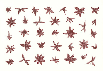
The entire contents of a jar of Star Anise (15g).
EDM challenge 143; draw a herb or spice. Illustration Friday; multiple.
(Click on image to view)
 I got out of bed to draw this late last night. I couldn't sleep. I drove for six hours yesterday. Do you find it hard to sleep after a long distance drive? When you close your eyes are you still behind the wheel? Weaving in and out of all that traffic? Putting your foot down on the accelerator and not taking it off? Not caring what's in your way? Feeling like you could just drive off the end of the earth? No? Oh. Right. Ok then. Oh.

2.5 x 3.5
Polychromo on illustration board
ebay
Uno mas. Back to my Polychromos. This was done with "Walnut Brown". Funny, I thought the Sepia color would be darker, but nope. I actually like this a lot.
Wouldn't it be funny if after all this trying out different brands I came back to my Polychromos after all?
(Remember, this was all about finding a warmer alternative to just black.)
I think I might do one or two more, then decide which way to go. I have to get started on the piece, a private commission, that inspired this search in the first place!
To see all the Yarn pieces in this series side-by-side, please go here. Or visit my ebay store to see which are available for sale.
All images and content herein are © Paula Pertile and may not be used or reproduced without permission.

By:
Paula Pertile,
on 2/11/2008
Blog:
Drawing a Fine Line
(
Login to Add to MyJacketFlap)
JacketFlap tags:
Derwent Coloursofts,
Cretacolor,
Derwent Drawing,
chocolate,
sepia,
yarn,
Polychromos,
sepia,
yarn,
Derwent Coloursofts,
Polychromos,
Cretacolor,
Derwent Drawing,
Add a tag
SOLD
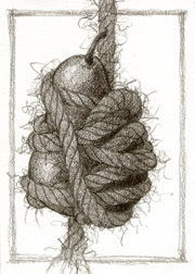
2.5 x 3.5
Polychromo pencil on board
I'm back to my Polychromos! That last one, the Cretacolor, just irked me enough that I had to go back to my faves. You know how when you go on vacation and sleep in hotels and try all new things, then you come home and sleep in your own bed and go "Ahhhhhhh"...well that's how my Polychromos feel to me.
I did this with just the Dark Sepia one.
You can hardly tell that's a pear underneath all that yarn, but yep, its there.
So check this out: (click it to make it bigger)
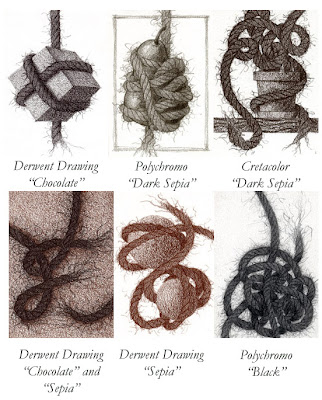
Look at how greenish the Polychromo sepia looks compared to the others!
My favorite "non black" here is the Chocolate Derwent Drawing pencil, by far.
I do like the Cretacolor Dark Sepia COLOR, but hate working with the pencil.
My favorite pencils to work with are still the Polychromos, but I can deal with the Derwent.
There's one more I want to try before the jury is all in. I need to do some Coloursofts and see what I can do with those, then I'll make my decision.
To see all the Yarn pieces in this series side-by-side, please go here. Or visit my ebay store to see which are available for sale.
All images and content herein are © Paula Pertile and may not be used or reproduced without permission.

By:
Paula Pertile,
on 2/11/2008
Blog:
Drawing a Fine Line
(
Login to Add to MyJacketFlap)
JacketFlap tags:
Cretacolor,
John Nez,
sepia,
yarn,
charcoal,
sepia,
yarn,
Cretacolor,
charcoal,
John Nez,
Add a tag
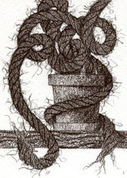
2.5 x 3.5
Cretacolor pencil on illustration board
ebay
Well, like the color, don't like the pencil.

Pictured here is a light sepia (from their website), but I used Dark Sepia.
The Cretacolors are charcoal, and charcoal is DRY DRY DRY. I wasn't able to achieve the subtlety I usually do, or at least it was way too difficult. The pencil felt scratchy on the board, which drove me NUTS. Then it broke once in the sharpener and I had to do the Heimlich on the thing to get it out.
I don't want to bad-mouth these pencils. I think they're fine quality and would be just perfect for some other application. Like shading, blending, etc. Some of these you can even add water to.
But for what I do, with my grainy detailed thing, no. I won't be using these again.
Harumph!
I'm sort of cranky, can you tell? I have all sorts of cool projects going, and can't talk about or show any of them. Then the ones I could show, aren't really bloggy type things. So I'm super busy, but in a "too many things on my mind at once" kind of way.
In better news, today is the first day here of no more "Bleakitude" (to quote John Nez). The sun was out this morning, the plants were happy, my cats were basking on the back deck, and the birdies were chirping it up. That's what made me feel like drawing a plant.
I wish I could just sit and take tea on the lawn, or work my needlepoint by a sunny window, or take a long walk through the woods to the neighbor's estate for a chat and dinner. (Can you tell I watched Pride and Prejudice last night?)
Ah well, back to the 21st century and my drawing table.
To see all the Yarn pieces in this series side-by-side, please go here. Or visit my ebay store to see which are available for sale.
All images and content herein are © Paula Pertile and may not be used or reproduced without permission.
.jpg?picon=572)
By:
andrea joseph,
on 2/8/2008
Blog:
andrea joseph's sketchblog
(
Login to Add to MyJacketFlap)
JacketFlap tags:
blue,
sepia,
collection,
lyrics,
inventory,
ink,
blue,
sepia,
inventory,
lyrics,
collection,
Add a tag
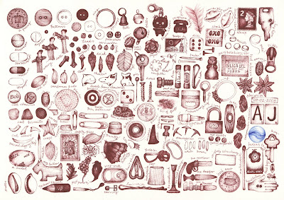 This week I lost my marbles. No. Seriously, I did. And, not just because I went and did this drawing all over again. When I completed it first time round I knew that there was something wrong - the marble. Back then I drew it from my head, when really I'd prefer to have the subject there in front of me. Knowing that I intended to re-draw it I went and bought some marbles. It took me ages to find the perfect blue one, one that looked a little like an eye. After all, the marble is the punch line in this picture; it's the cherry on the cake, so it had to be right. So I selected the perfect one, bought the bag and then proceeded to lose them. Annoying. Very annoying.
This is one reason it's taken so long to complete this drawing - losing my marble. I spent hours on Flickr getting lost in stunning photos of marbles, but to me, the one in my drawing still looks contrived. There are a few other new additions to this picture, since the original; my favourite being the corn plaster. There are other things that became subject matter out of desperation to finish the drawing, like...erm...well I'll let you find them.
Anyway, you know the drill; click on image to enlarge.
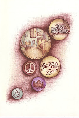
I love the 1970s. Does it show?
This little drawing actually began as a study for one of the two bigger drawings I am currently working on. I've been trying to introduce some colour into my sepia ink drawings but I'm not, like, convinced that it's happening, man.
 (Click on image to view)
This is what the inside of my head looks like. If you were to put a probe to my ear, and look inside, this is what you'd see. Endless lists and bits of paper. All in sepia, of course. And some blue. Always some blue.
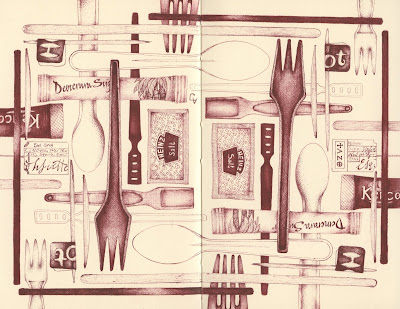
Stirrers, sachets and stuff swiped from Starbucks and service stations.
And, as Stephen Stills once said "That's a lot of alliteration".

England's Glory made in Sweden. Who'd have thunk it? Amazing the stuff you find out through drawing. Another piece of useless information I'll file away somewhere no doubt. I like to think it'll all come in handy when I'm a contestant on Who Wants To Be A Millionaire.
A few posts ago I asked you whether you could guess the theme of this drawing. It wasn't that easy unless, of course, you are a Paul Weller anorak like me. The answer was the classic Stanley Road album by Weller. You can see all the answers to the clues HERE. And, if you don't already have this album in your collection then you SHOULD!
 Phew! The pencils are out and I'm ready for action. I hope to be drawing, and posting, as much as is humanly possible from now. And, I hope to get around to visiting all of the drawing blogs too. Just have a little patience. (Yes, I've been listening to Take That. Don't tell anyone though, I'd never live with the shame)

I'd like to say that the idea for this drawing was my own, but it wasn't. While looking for some retro patterns, I found THIS gorgeous material, on Flickr. I knew I had to make a drawing like this. The model for my drawing was a fold out Ikea chair. I drew it while watching Brief Encounter. It was the first time I'd ever seen the whole film.
This is one of my absolute favourite things about art. That unique interpretation of a subject. I may be wrong, but I'm guessing that I am the only person in the history of man, who has ever made a drawing of an Ikea chair, inspired by some material from a 1950's dress, in sepia pen, whilst watching Brief Encounter. It's just a hunch.

Phew. Perhaps my longest drawing ever. I got lost in this baby for days. And so, when I look at it, how do I feel? A sense of pride, accomplishment, achievement? Well, no actually. All I see is that little bit of map that I well and truly messed up on - just above the Chopper drawing, behind the Passing Time card. Can't keep my eyes off it. Damn.
Anyway there is a theme going on amongst all the stuff and nonsense. I won't say anymore I think all the clues are on the board. I think. Do you know what it maybe?
(Click on image to view)
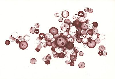
You are my sister, and I love you.
 Yes, another case. This is the deluxe edition. There are many scale issues with this one, but overall, I am really very happy with it. I spent the entire day drawing this, yesterday. Literally. There are clues to somebody's identity in this drawing, but I think only the Brits would recognize this person. Any ideas?
**Thanks everyone for the visits and guesses. The answer is James May. I've added all the notes HERE. **
 Here's another little quiz. I've been listening to a particular album all week and this drawing, unintentionally (at first), became a tribute to that piece of work. I have absolutely no idea whether it is possible for you guys to figure out which album it is from this picture, but I'd love to know. Obviously, you'd need to be familiar with this record too. Every piece on the pinboard is related, or inspired, by it - but that may only be obvious to me. Perhaps you can work it out, perhaps not. It may be way too cryptic, but I'd love to know either way. It makes me wonder.
**The album that inspired this drawing was, indeed, Deja Vu by Crosby, Stills, Nash & Young. I have now added notes to this drawing on Flickr to explain some of the clues. Check it out HERE. I have a feeling this was pretty easy as Jason got it about 2 minutes after I posted the drawing! The next one I'll make more difficult. Cheers.**
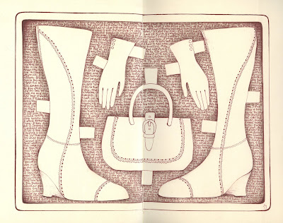 One of the most annoying things about wearing heels, in my opinion, is that you just cannot drive in them. Well, I can't (I do know people who do). This means keeping driving shoes in the car and having to change them every time you get in and out of the vehicle. That whole scenario is made even more annoying when you are wearing boots like these. All that zipping and unzipping. Especially when you are, say, at a retail park driving from outlet to outlet. Getting out at TopShop, Next and NewLook - zip and unzip. Then driving over to Marks and Spencers, Borders and Starbucks - off and on come the boots. Over to Tescos - zip unzip. The Range - zip unzip. Then back to the original park you started in - off and back on. Then, finally, Morrisons - zip and unzip. Annoying enough for you the driver but spare a thought for the poor passenger. Sorry Cla!
 My first drawing in a week. Haven't even picked up a pen. Sometimes it's good to have a break. Recharge these batteries. And, I'm such a creature of habit. I find it very difficult to draw unless I'm sat in this very armchair. So after the most gorgeous week away - full of laughs, singing, laughs, driving, laughs, Top Gear, laughs and love - I got back, crashed into this chair and came up with this.
This one's for you Cla. Love ya!
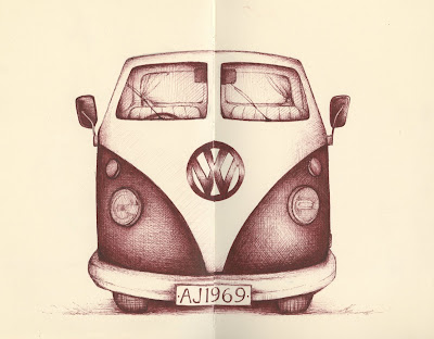 ....and buy a pick-up, take it down to LA".
OK, so I know it's not a pick-up but there's a few of reasons why I had to use this title. I've been listening to Harvest by Neil Young all week. A classic album to go with this classic camper van. This is one of my all time favourite openings to a song. Actually, not only is it the opening to the song but to the whole album. I hear those words and get tingles. In my life I've always felt this way. Like packing it all in, buying a pick-up and heading for the refuge of the roads. I've never been able to shake that feeling off. Ole Neil, bugger Lynyrd Skynyrd, I need you around.
I'm going away for a few days too, so actually I am taking to the road (I'm not going to LA though). Don't know if' I'll get a chance to post much this week but hopefully I'll get some drawing done.
Finally, a few weeks ago an old friend found me through Facebook. We'd lost touch and not seen each other for about 10 years. I told her that I wasn't the old hippy she known back then, I'd really changed. Hmmm. She didn't believe a word of it and after this post I kind of think she may be right!
Ooops, I haven't quite finished yet! It's a bit of a rubbishy drawing but my first vehicle. Inspired by France Belleville (I wasn't brave enough to do a side view - it's the wheels that scare me off drawing cars) who coincidentally made this post yesterday; Neil.
Cheers everyone, see you when I get back to town.
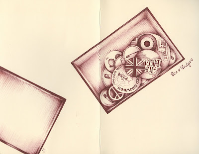
 (Click on image to view) I was absolutely convinced that I had already drawn a pinboard. I'm still surprised that I haven't - I mean, it's so me! This, once again, was going to be a little 'light relief' in between drawing buttons. It's taken me about a week! ALL week. I really don't want to draw those buttons it seems.
It doesn't look like I'd pictured it in my head and the sizes of the objects are all out of proportion. But none of that matters because I really really loved drawing this subject. I'm going to give it another go too (I know!) maybe with a little colour.
Lots of notes about this drawing on Flickr. Check it out HERE.
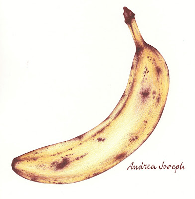
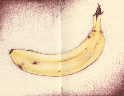
Have another banana. A few people commented on how my last drawing bore a resemblance to Warhol's iconic artwork for the cover of the Velvet Underground's brilliant album. I had to agree. It was not intentional, I didn't even notice the resemblance until I'd uploaded it. This, however, was intentional. It is also the same banana as in the last post, just a couple of days older.
For those who are not familiar with that album check it out HERE.
View Next 25 Posts
5 Stars
The Silly Looking Thing
Eva M. Sakmar-Sullivan
Schiffer Publishing
No. Pages:  40     Ages: 4 - 8
.   . . . . . . . . . . .
 boasts that he is a frog and only plays with other frogs. His parents are not pleased and tell Itsy-Bitsy Frog that simply being different is not a good enough reason to not be friends and play together. Itsy-Bitsy returns to the pond to apologize to the silly looking thing, but he is gone. A small, young frog is sitting on a lily pad. Itsy-Bitsy Frog calls out,
 boastful. He has wild arms and legs flailing all over the place when he gets angry and adamant at the silly-looking thing. Ironically, this makes Itsy-Bitsy Frog looksa bit silly himself. He also looks adorable in his red striped shirt and jean shorts with suspenders. In the spread in which Itsy-Bitsy Frog explains to his parent why he has not be going to the pond, Itsy-Bitsy Frog humorously looks like a snobby debutant, stating matter-of-factly,
 After the story, there is a spread called A Frog’s Life. Using a circle, similar to if one looked through a microscope, she illustrates the life cycle of a frog as it progresses from an egg to a tadpole, and all its changes, to a frog. It is a nice science lesson that helps further explain the silly-looking thing.




I'm amazed you could draw at all! Looks pretty good to me. Especially getting stripes to go round the folds. Hope its just a 24 hour bug and you're feeling better soon!
so now i wonder if i should tell you i think they're amazing? that's a lot of detail and patience for a sickie. Wow!
hmmm, i'm feeling pretty sicky today too ... so why is it I can't draw brilliant 'crap' like this? Hmm?
I came here to know why you called this a piece of crap. I agree with Mariana... if stomach bugs had these kinds of consequences on my drawings, i'm willing to be sick every day.
It must be your eyes that are sick because this is just great!!
What a piece of crap!!! Oh..whoops...did I write that?
What are you talking about anyway? This is spectacular! Hope you start feeling better soon!
Uh, this looks like your usual amazingly wonderful work to me Andrea. Hope you're soon feeling better!
Yeah, too much information. Sorry, hope you feel better now. Being able to draw in the circumstances though is amazing. When I'm crook, I just want to whinge and curl up and complain.
w.
Hope you felling better know!
And I like your piece of crap I could you do it, being sick? Your have a great talent!
Um, I like it....
sorry your feeling ill. I must really love crap...cause I love this drawing.
You have my sympathy - but your socks are lovely. Do hope you are better today.
What would the socks look like if you drew them when you were fit and well?
Hope you're over the beastly bug.
This is NOT a piece of crap! This is a wonderful drawing of some lovely, warm, fuzzy socks, drawn exquisitely! You just feel lousy, that's all!
Thank you all so much. I'm feeling much better already after reading all these kind comments! Nope, I'm over the bug and seeing things in a different light. Perhaps they're not so bad...perhaps.
Cheers folks you make my day.
I think they are amazing too! And I wish I could draw so well on a healthy day! Glad you are feeling better.
When you do simple objects or few objects you use to make non symmetric layouts. This is a centered composition but full of movement and tension (maybe there was enough "asymmetry" in your stomach). Anyway I agree with France: if feeling sick produces this, I could treat.
On my best day, I wish (someday I will) I could draw this well...hope your feeling better, I really love your art...
I'm sorry you've been under the weather. I hope you're feeling better by now. You must have had a fever too because you'd have to be delirious to think this drawing is crap. I LOOOOOVE these socks.
I felt the same way, and that must be the reason I was not able to produce a drawing of half the worth of this one! My response was to chug Pepto Bismol and take a nap. Yours was to draw wonderfully detailed socks. I hope you feel better now.
Your socks made me smile. They are groooovy! :)
Hope the buggies have gone...
I do wonder what your definition of 'crap' is! ;)
its BEAUTIFUL!
OH, I hate those tummy bugs! I'm glad you're over it now. As to the socks.....FANTASTIC!
Thank you all peeps. All better now.
Cheers.
If only I could do this kind of 'crap'.....
Huh??? Crap? I think it's great! They really look like socks, which i do not think just anyone can render, and certainly not as well as you do! Hope you are feeling better.