The snow it snows and snows and snows, the wind it blows and blows and blows, and so does my nose...
The penguin is warming up his ice pod for Bunny Week. The Chinese Year of the Rabbit begins on Feb 3 and all are invited to the FB page of Illustration Board to post your bunnies!
Here is the piece completely inked. I've coloured it since and am not sure what I think yet. It needs some tweaks. I tried colouring it in such a way that it didn't affect the contrasts too much that had already been laid down in pen and ink. This is easier to pull off colouring digitally but I wanted the imperfections of a watercolour wash.If you're curious I ink the foreground first and move backwards. I read somewhere that Arthur Rackham did this so I gave it a go and it became my usual practice. I find it gives me a sense of depth to work deeper into the picture this way.
I ripped the picture when removing it from the masonite board I had attached it to. Not badly and I fixed it with glue but I discovered, or rediscovered, how easily illustration board paper can separate from the board itself. The masking tape left rough spots everywhere I had it on the picture. As illustration board doesn't warp too badly I may forgo masonite in the future.
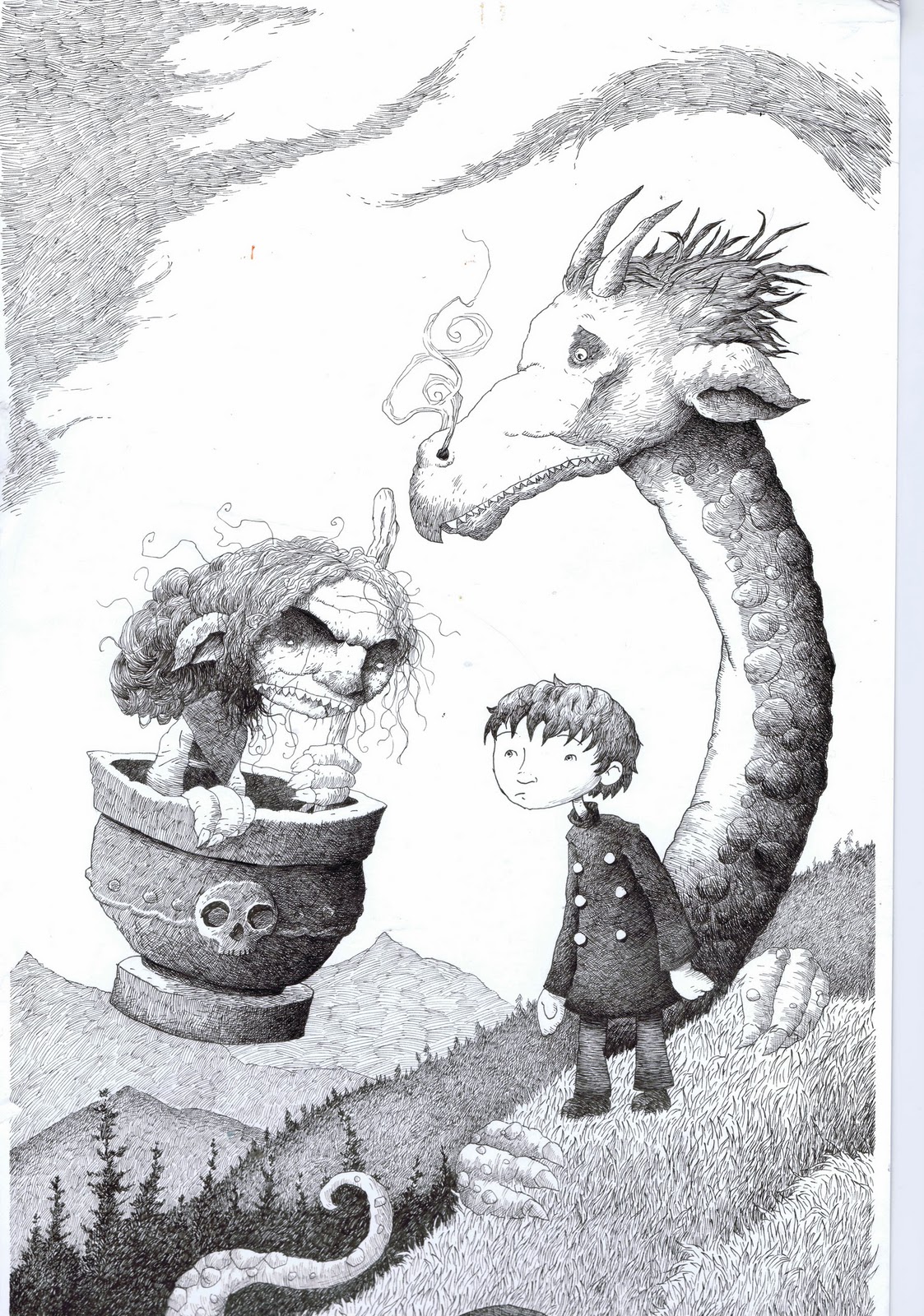
Here's a new pen and ink drawing that will accompany an interview in
Onspec magazine, Canada's best science fiction and fantasy magazine.
2.5 x 3.5
Polychromo Walnut Brown on PAPER
ebay
I bought some Rives BFK print paper last time I was at the store, and thought I'd better try it!
This is a HUGE departure from my usual illustration board. HUGE I tell you.
I've always loved illustration board for its durablility (doesn't crease easily, its more sturdy) and versatility (you can use all kinds of media on it).
But you can't see through it. That's a major drawback. It makes it really hard to transfer finished drawings, especially for colored pencil work (if you do the usual "lay the drawing down on top and trace over it to transfer it" it leaves a groove in the board, no matter how light a pressure you use, and that's not a good thing for pencil work.)
What I've been doing with the board is this labor-intensive "scan the drawing, clean it up in Photoshop, then print it out really really really really light onto the board with my Epson 2200 printer".
Well, that works, but its kind of a drag. And the printer only goes 13" wide, so if your board is wider than that, then what do you do? You can see the problem. (Except for all of these little pieces ~ I just draw them freehand directly onto the board. I'm talking about more involved illustrations.)
So this paper works with a lightbox. YAY!
And I like the paper. Not as well as the board, but its OK. It doesn't take many layers of pencil. I think it will be good for this monochromatic kind of work where I don't have to do too many layers anyway. But I think for really heavy handed many-colored and layered kinds of work, it wouldn't hold up.
The paper is soft and lovely, but that's the problem. The tooth squishes down too fast (if you do colored pencil you know what I mean by that.)
The other interesting thing is that the Walnut Brown color looks different than it does on illustration board.
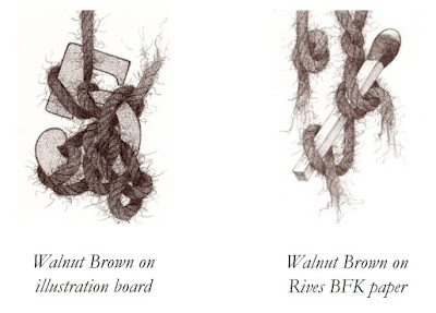
Do you see the difference? It looks softer on the paper, and it also doesn't go quite as dark.
I used cream colored paper ~ I think. I know that sounds stupid. I remember there was a grey (which I didn't want) and this. I know they make both white and cream, and I'm pretty sure what I have here is the cream. I guess I get to go back to the store and check, or order some white from online someplace. (I've already searched online, and when looking at the little color swatches of both colors, what I have here actually looks like something in between the two, which is no help at all!)
Remember when art was easy? You just had your little box of crayons and some construction paper?
To see all the Yarn pieces in this series side-by-side, please go here. Or visit my ebay store to see which are available for sale.
All images and content herein are © Paula Pertile and may not be used or reproduced without permission.

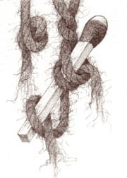
2.5 x 3.5
Polychromo on illustration board
ebay
Uno mas. Back to my Polychromos. This was done with "Walnut Brown". Funny, I thought the Sepia color would be darker, but nope. I actually like this a lot.
Wouldn't it be funny if after all this trying out different brands I came back to my Polychromos after all?
(Remember, this was all about finding a warmer alternative to just black.)
I think I might do one or two more, then decide which way to go. I have to get started on the piece, a private commission, that inspired this search in the first place!
To see all the Yarn pieces in this series side-by-side, please go here. Or visit my ebay store to see which are available for sale.
All images and content herein are © Paula Pertile and may not be used or reproduced without permission.
I'm rereading great bouquets of Robert Frost poems now for a project I'm working on, and I'm rediscovering how much I love his work. So many little gems embedded in simple walks in the woods. Can any Frost fans out there identify which poems these are from? (I'll post answers next week.)
- Earth's the right place for love.
- Good fences make good neighbors.
- We have ideas yet that we haven't tried.
- So all who hide too well away must speak and tell us where they are.
- 'Men work together,' I told him from the heart, 'Whether they work together or apart.'
- 'Home is the place where, when you have to go there, they have to take you in.'
- It's a nice way to live, just taking what Nature is willing to give.
If you live in New England, check out the Robert Frost Trail in Ripton, VT some day. It's a beautiful walk through woods and meadows, short enough for small kids. You can stop along the way to read Frost verses that correspond to the landscape. We stopped to catch frogs, too, on a trip when my son was little. The website says it will be closed for work for a few weeks in June but will be open in time for blueberry picking season.


Beautiful!
Lovely!