by Laurie Rosenwald
Blue Apple / Chronicle Books 2007
This is one of those books that reviews best visually. Here's the front and back cover spread.
This genius of a mess of a color concept book revels in the playfulness of its rhythm and the perfect child-like roughness of its collage work.
I'll grant, this book won't be for everyone, especially those who might
both by Susan Goldman Rubin
Chronicle 2007
Board books are funny things. On the one hand they make perfect sense if you are trying to get kids used to the idea of books and reading at a very early age. They have sturdy coated cardboard pages that withstand throwing, food spills and the gnawing and chewing that comes from young pups.
But board books didn't always exist. They were invented, much like the term teenager was invented to suggest a difference between child and adult, probably more like the way the tween demographic was identified by markers and advertisers in order to better capture income from a growing consumer demographic. Somewhere in between the social science of presenting kids books at the earliest possible age and the capitalist goal to build a loyalty and brand recognition from the cradle, that is soupy mire from which board books arise.
Board books are not evil but there is a whole lot of cute mixed in with the good. It saddens me, for example, that publishers make board book versions of classic picture books, often abridging texts or images to fit the format. And there are those books that have "cute" spred all over their intents, proving that their true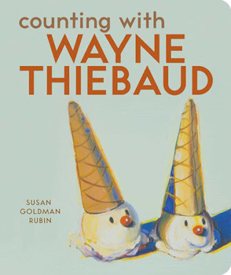 market is parents and grandparents for whom the book is going to have a greater appeal; they aren't buying for the child so much as they're hoping to impress their opinion of what is cute onto soft minds.
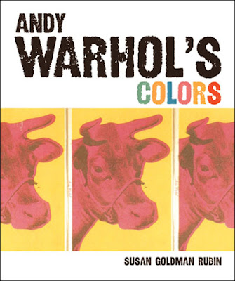
But sometimes people get that a board book can be more, and here we have two examples. Author Goldman presents classic Andy Warhol illustrations from the 1950's and 60's with short bits of rhyming text that are linked to their predominant colors. For those who only know Warhol's iconic factory-produced screenprints these fresh ink and watercolor illustrations may prove that, when he wanted to be, Andy was a talented artist. Featuring a typical assortment of animals -- cat, butterfly, lion, monkey, &c. -- Rubin fuses the color concept board book with a mini primer on a modern art master.
In the Thiebaud book Rubin offers us some of the artist's food paintings with a counting rhyme. That Thiebaud's paintings are done in a very thick application that makes them look as if they'd been composed with cake frosting is an added benefit. Consisting mostly of deserts -- pie, ice cream cones, cupcakes, candied apples -- the fact that they are well-known paintings from a still-living master is almost completely overshadowed by their tempting yumminess. Yes, I said that. The counting aspect of this book is practically lost but not in a bad way. It feels more a casual counting book, among a collection of food illustrations that, oh, just happen to be famous paintings hanging in museums.
 Yes, okay, so these books are intended to appeal to adults on some level (did I not say yumminess?) but for those, parent and child alike, who might not be as familiar with these artists or their works, what a delightful little introduction. I noticed that there's no modern art master alphabet book from Chronicle but I hope they're considering it. In fact, I think this sort of art history could make for a very good series of board books.
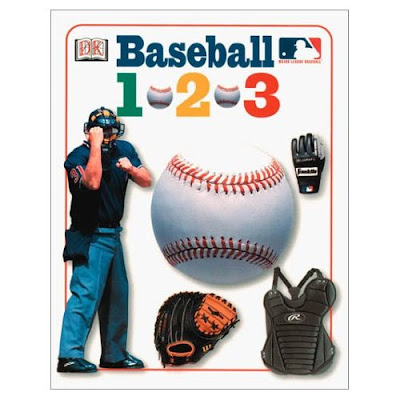
After all, if Major League Baseball can produce board books (building that brand/team loyalty in the cradle again) then why not do more of the same for the arts and sciences? Just a thought.


what, no CROOKED KIND OF PERFECT?
Gaaaaah! You KNOW I'm going to miss some. Geez, David. I'm adding it.
Scooped again! I was keeping "The Reinvention of Moxie Roosevelt" with "Sweet 15", hoping to find another one or two to match with it for a post on covers with legs dressed differently.
Oh, no! Sorry, Linda. The fact that we're finding the same things just goes to show how these images seem to come in waves, no? Please, still do your post, as I'm sure you'll have another perspective, plus you always provide the summaries to go along with the books. Wow, the Sweet 15 cover is eye-catching! Reminds me of that song I hate: "She wears high heels, I wear sneakers, blah, blah, blah."
All those legs! So, what other body parts are you going to feature?
I think that designers are just trying to find new parts of the body to feature because they don't want to do faces. Seems like it used to be that books *had* to have a face for kids to want to buy them, but now there seems to be this idea of making the protagonist universal.
How strongly that's driven by the desire to avoid categorization by race, or a broader idea that readers can't enjoy a book about a character whose looks don't appeal to them in some way, I don't know. In any case, it results in a lot of leg. I find these excerpted body parts kind of suffocating, or maybe I mean suffocated, myself.