After backing the campaign last June, I was extremely pleased to receive a shipment in December containing my reward from the
Kickstarter for
Lady Sabre, a webcomic created by Greg Rucka, Rick Burchett and Eric Newsom. It took twelve months longer than anticipated to get my copy, but the creative team delivered a very special edition that perfectly suits its source material. Not only that, Kickstarter stretch goals also unlocked a Pocket Guide written by Rucka about the world where Lady Sabre takes place, a process book that illuminates how Greg and Rick work together and other extras. Below is my review of that package.
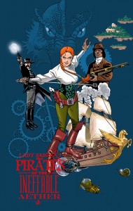
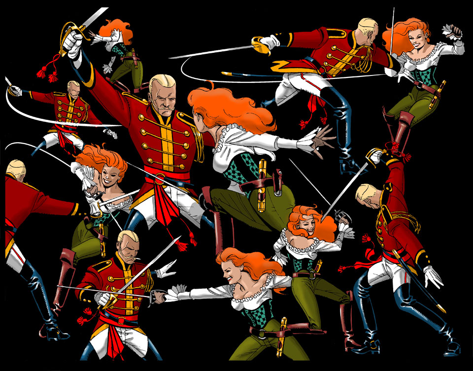
Lady Sabre & the Pirates of the Ineffable Aether Book 1: The Map begins with a prose story called “The Affair of the Mickten Clockwork” that sets up the relationship between Lady Seneca Sabre and Captain Hans von Kater. Rucka is a well-seasoned writer of novels, with a library that includes the Attius Kodiak and Jad Bell series as well as two Queen & Country books. More people should be reading Greg Rucka’s prose, and this short story and the worldbuilding material in the back of the volume will likely convince them to do exactly that. At the same time, Rucka should be writing more prose like this. It’s easily among my favorite I’ve read.
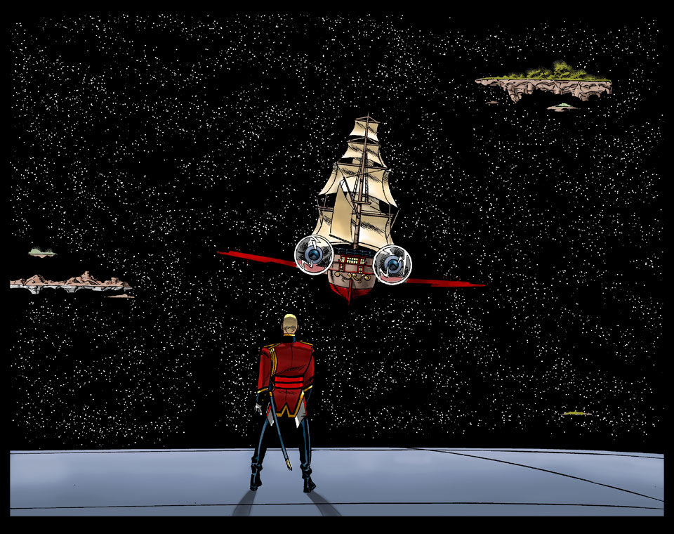
Book 1 of the Lady Sabre series is very much the start of a longer story, but it’s an impressive introduction to what I presume is the main cast. Chapter 1 dives straight into one of Sabre’s escapades, which includes a grand theft and duel with Hans. There isn’t a ton of story in the first chapter, necessarily, but you get a lot of atmosphere out of those pages, especially if you read “The Affair of the Mickten Clockwork” beforehand.
Chapters 2 and 4 introduce us to Marshall Miles Drake and Tracket Keyton Drum, also through elaborate action sequences. While giving Burchett more chances to shine, Rucka also shows his writing chops with clever back-and-forths and a demonstration of the pair’s bold heroism. Chapter 3 sets up the larger storyline with the very convenient but appropriate appearance of a prophet, who predicts some of the danger lying ahead.
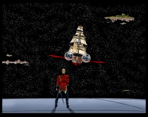
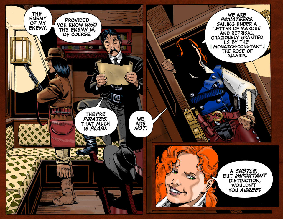
Chapter 5 is the first time Drake and Sabre get to interact. The tension between a man of law and a woman of lawlessness is a fun dynamic, and the rapport we get between them is one of the highlights of the volume. Their acquisitions from previous chapters reveal the instrument for the larger story. I’m also intrigued to see that move forward, but it’s a testament to Rucka’s writing and Burchett’s illustrations that I’m most excited for the palpably tense relationship between Sabre and Drake to continue.
Part of me wants to complain that Lady Sabre is decompressed, especially given all of its action sequences, but I think the only reason I feel that way is that I want more of it sooner. The story is not text-heavy and each page has a relatively low panel count, but, in spite of that, though, every page feels significant. I may believe that in part because I’m aware of the original 2-pages-a-week format, but it’s clear that Rucka and Burchett went out of their way to make sure every one of their updates mattered. I’m hoping that future volumes of Lady Sabre also contain prose stories so readers can get more background and plot a little faster, but it’s hard to complain about the pacing of the comic itself. I don’t know how long Rucka and Burchett intend Lady Sabre to go so this volume could either be the first step of the hero’s journey or the entire first act. Either way, I know I’m on board until the ship lands.
Rick Burchett’s art isn’t flashy, which might be why he and Rucka couldn’t initially find a publisher for a project. Flashiness, though, is overrated. Burchett’s art is high quality in every panel; he never fails to deliver the goods. His solid storytelling skills are something the flashier artists should take note of.
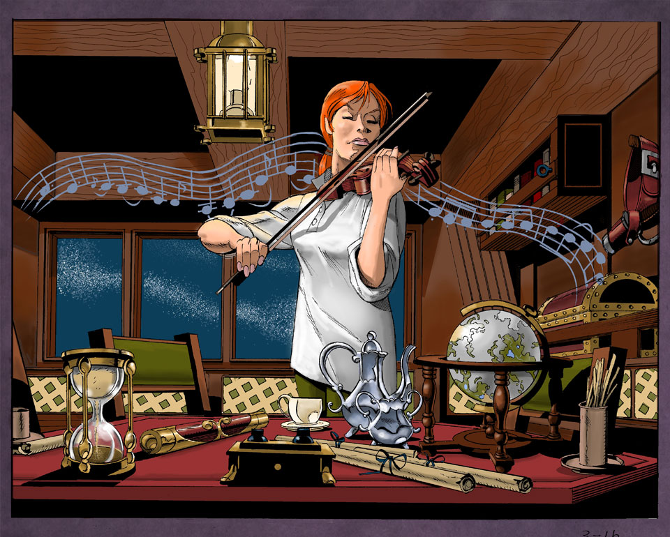
I read that Burchett said that he was nervous about working with Rucka on Lady Sabre because he “can’t draw beautiful women,” but beauty is relative. He isn’t drawing pinup models, no, but for my money the personality he imbues in Sabre and other characters makes them more “attractive” than any two-dimensional characters gorgeously drawn by a Frank Cho or Terry Dodson or Adam Hughes. Greg Rucka is known for writing powerful women, and Rich Burchett compliments Rucka’s development of Sabre with a powerful, non-exploitative depiction.
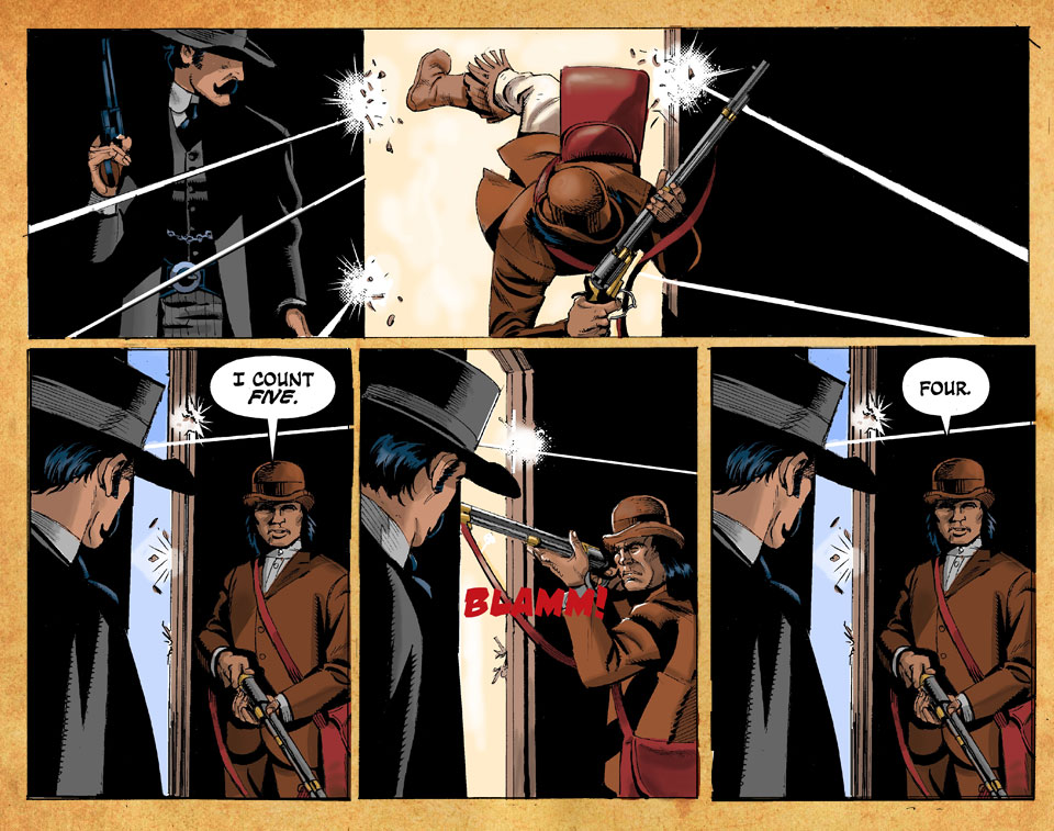
As a veteran of superhero comics, Rick could probably have delivered satisfactory action sequences with relative ease. But he doesn’t rest on his laurels, offering up innovating action in several of the first five chapters. The swordplay early on in Chapter One is particularly excellent, from the motion lines when the blades swing to pages that feature Sabre’s epic duel with Hans.
I believe Lady Sabre is the first comic Rick colored, which is pretty impressive. The color choices don’t astound, but it’s never a distraction. That’s more than I can say for some of the comics being released by major publishers, and I only expect Burchett’s coloring to improve over time.
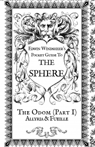
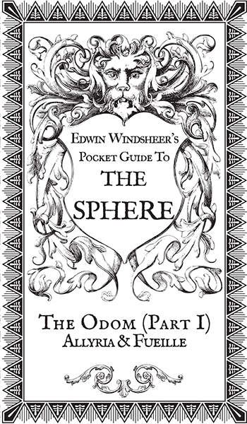
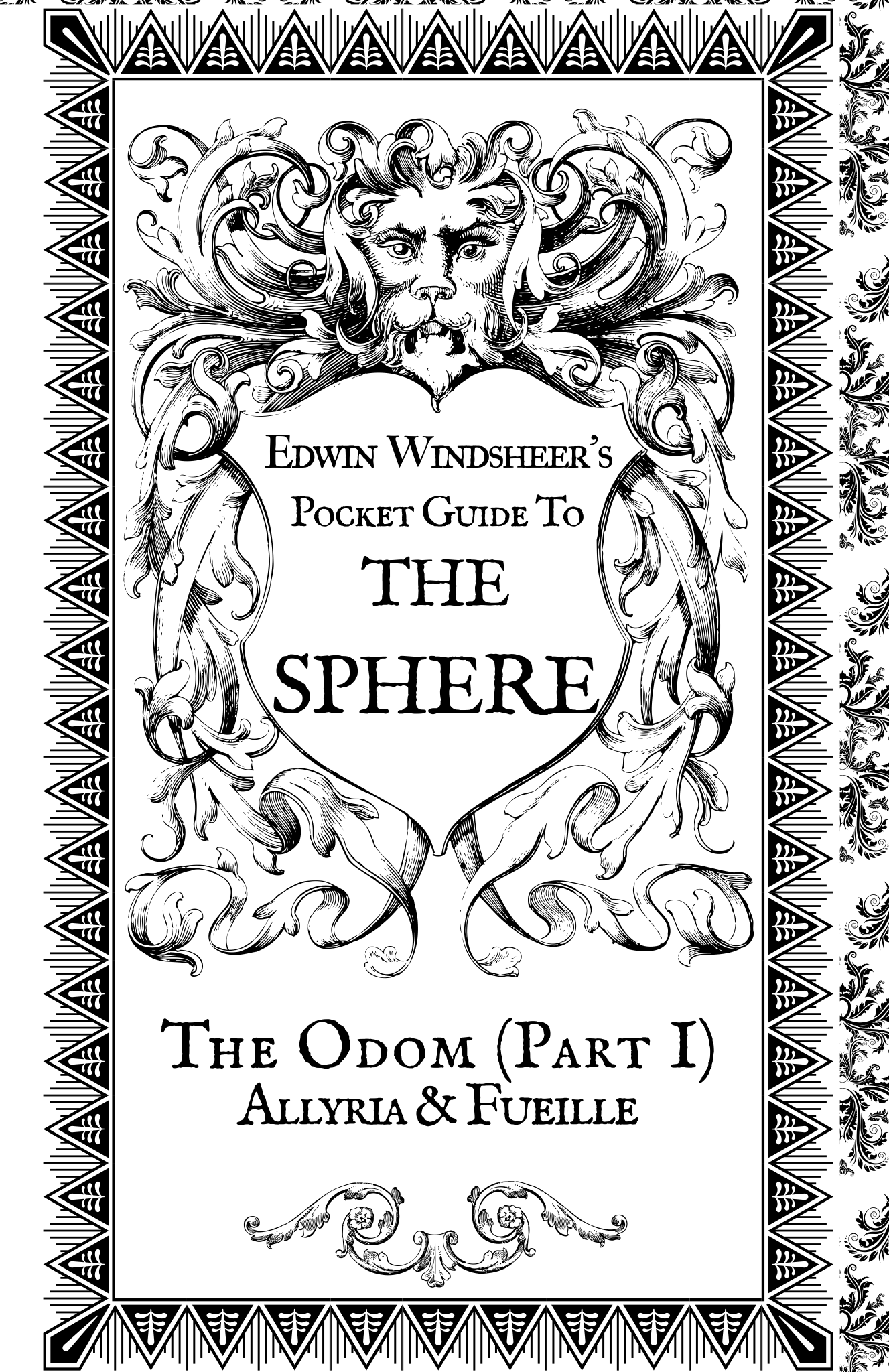
The next thing I want to address is the pocket guide included with the Kickstarter package. The amount of worldbuilding done in the mouthful-of-a-title Edwin Windsheer’s Pocket Guide to the Sphere: The Odom (Part 1): Allyria & Fueille is absolutely staggering. To the best of my knowledge, Rucka didn’t really get compensated for these 64 pages that help you further understand the world of Sabre. If anything, it probably cost money due to printing While tiny, the hardcover book is definitely readable, though I admit I prefer viewing it as a PDF on my tablet to reading the hardcover itself. Even with that in mind, if I ever lost the pocket guide my collection would feel woefully incomplete. It’s beautifully designed, and is a wonderful companion to the main book.
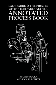
There’s not a whole lot to say about the process book other than that it demonstrates the effort Rucka and Burchett put into Sabre. The paperback includes annotations by Greg and early design sketches by Rick, immersing you into their (obviously effective) creative process. Watching the project come together and move forward is something special to behold. I hope they offer a copy of the book on their website eventually, so more would-be webcomic creators and creators of comics in general can learn a thing or two.
The design of all three books is one of the best parts of the package. I pledged for the least expensive edition, and it still largely failed to feel cheap. As beautiful as the cover is, I particular love the the look of the graphic novel without the dust jacket. The only real flaw I can point to is the back insert. The pouch and the map felt sort of jutted out. I actually ended up peeling off the pouch, which thankfully caused minimal damage to the book. To be fair, though, the map and pouch were part of a stretch goal that the team didn’t even reach, and the map itself is great, so it’s hard to complain too much.
Lady Sabre is, to date, the 23rd most successful comic book Kickstarter campaign ever, but I highly doubt it was anywhere near the 23rd most profitable. Rucka and company were extremely generous to offer so many upgrades to already-impressive rewards, especially for a price as low as $30 for print copies of the first volume, the Pocket Guide and the Process Book. At some point the creative team plans to offer remaining copies of the book on the
Lady Sabre website. I would highly encourage you to buy them while you can.
Rating: Worth The Wait
Eric Trautmann is probably currently best known in the comics industry for his collaborations with comics author and novelist Greg Rucka, originally as an editor and sometimes co-writer. Most recently, though, he has been working with the co-creator of Lazarus and Lady Sabre as a graphic designer. Trainman flaunts his impressive design skills in the pages and back matter of Image series Lazarus, as well as on the Pocket Guide bonus reward from Rucka’s Lady Sabre Kickstarter. I spoke to Eric Trautmann to learn more about the role of design in comics and the man himself.

How did you first connect with Greg Rucka?
When I was still working at Microsoft, part of my job was creating a publishing program for the Perfect Dark franchise. I was a huge fan of Whiteout, Queen & Country and the Atticus Kodiak books that Greg had authored, and to my mind there was no one else better suited to the task of writing our near-future corporate war dystopia. So, when I was finally given the go-ahead to approach Greg about the work, I introduced myself at Emerald City Comic Con in Seattle, and he was definitely interested. (I wasn’t allowed to actually name Perfect Dark yet, because the title hadn’t been announced as an Xbox 360 launch title, but I hinted strongly, and he reacted with appropriate manic fervor.)
Of course, it took months for the agreement with the book publisher to be completed, and by that point, Greg assumed the project died.
At the same convention, my wife invited him as a guest signer at the comic shop she owns (Olympic Cards & Comics in Lacey, WA), so I re-introduced myself to him. By that point, the publishing contract was done, and we were off to the races.
His two Perfect Dark novels paved the way for me to con…I mean convince… my bosses I should be allowed to write a tie-in comic series, and I slotted it right between Greg’s two novels. Between my edits on his novel manuscripts and the work I did on the comic series — and the fact that we hit it off pretty well — he later asked for me to help co-write Checkmate with him at DC.
The rest, as they say, is history.
What kind of discussions did you have with him to understand the complex world of Lazarus?
I was pulled onto Lazarus fairly late in the game; issue one was basically done, and they just needed someone to handle basic book design chores—typesetting of the letter column, the indicia, the inside back cover, and so on. So, I read issue one and had a pretty good handle on the tone Greg and Michael were looking for.
But, by issue two, I didn’t have a lot of design sketches or material like that to play with as incidental art for the letter column. I came up with the idea of the timeline that ran in the margins, which in turn led to lots of face-to-face and phone meetings to decide what material would be included. As with most of my half-baked schemes, it became a rather massive undertaking. Greg and I work well together, so he’ll often call, Skype, e-mail, etc. and we’ll hash out whatever background or story concern he has. I’m sort of a part-time back-up developmental editor, on a fairly small scale.
What are top priorities when you’re designing the fake ads for Lazarus?
First, I want them to look authentic; I’ll research ad styles in various era/cultures to try to inject if not accuracy, then at lease verisimilitude. Then, I want them to underscore something about the setting, that edge of creeping corporate hegemony. And then, I try to inject just a little bit of black humor—slogans that sound just slightly over the top with latent villainy, for example. (That typically curdles a bit when you see or read something almost exactly like it in the real world.)
For the Hock ad, for example, they’re selling a visual acuity enhancer, and the list of side effects is long and horrible. It’s good for a bit of a laugh if you’re a bleak-minded fellow like me. Except, that list 99% culled from a list of actual side effects from contemporary visual acuity enhancements already on the market today.
That’s basically my “process” for the ads.
How do you effectively incorporate your design within the sequential pages themselves?For the interior art, my contribution is limited almost exclusively to computer screens, targeting reticles, and so on (with the odd signage for Hock thrown in). I whip the designs up based on Michael’s needs and the script’s descriptions, and Michael handles the actual integration on to the finished page.
I think it’s the dream of every world builder to have a map like the one in the Lazarus hardcover. How much work, and what kind, go into mapmaking?
Oh, lord, it took forever (no pun intended).
It started on Greg’s back porch, as we drank rye whiskey and used colored pencils and crayons to divide the world up on a photocopied map. After that, I brought the sketch into Adobe Illustrator, and began manipulating an old vector art map I’d purchased a decade ago, gradually building it into the final piece. It was fiddly work on a massive file, which I’m about to have to re-do again, if you’ve read issue 16.
Pardon the sobbing.
Is it satisfying seeing your designs in print form, like in the Lazarus comics and collections and with the patch?
Absolutely. I’m primarily a writer, but I periodically get the urge to make physical things. The hardcover was a massive undertaking, and I had to learn how to do a bunch of stuff I’d never done before—the spot gloss on the cover, the endpapers, and so forth. It was a bit of white-knuckle terror; I didn’t want to make some horrible mistake and cost us thousands of dollars, but it was also a lot of fun to learn some new skills.
(The patch, I should add, is actually Michael’s design. I did all the other Family crests, but they spring from his original template, the Carlyle family insigne.)
The worldbuilding and design is meant to be in service to the story. How specifically do you think your design work serves the story being told in the pages of Lazarus?
I’m probably a little too close to it to judge it fairly. I view what I do as something that should be, for the most part, as seamless and invisible as possible. My contribution should be seamless—if it looks tacked on or out of place, I probably over- or under-designed it. My job is to, in whatever way I can, serve Greg’s story and Michael’s art.
In terms of specifics, I think the best integration was in issue 10: all the Hock signage works really well with Michael’s pages, but they’re there to sell the mood, the tone, the grimness and general awfulness of living under Hock’s rule.
You also designed Edwin Windsheer’s Pocket Guide for Ruck’a Lady Sabre Kickstarter. What were the challenges of designing a book of such a compact size?
There were many. Readability was a big concern, since there was a lot of text and not a lot of space. Plus, using vintage typography has its own readability challenges. I spent a lot of time looking at scans of old British newspapers and an old Sherlock Holmes hardcover my parents gave me a long time ago; it reproduced some pages from the Strand magazine, and I took a lot of my cues from that.
What kind of research did you do to make sure the pocket guide was historically accurate?
Lots of looking at books in my personal library, lots of Google image searches, that kind of thing. As for accuracy, I wasn’t too concerned, since we’re dealing with a world where people zip around in flying boats.
Who are some of your biggest design influences, in and outside of comics?
Howard Chaykin, for sure. His page constructions are unassailably clean and clever, as is his use of type.
As for specific design influences, probably very few individuals, but I do love styles—Art Deco is a favorite of mine, as well as Art Nouveau.
What are your thoughts on the state of design in the comics industry?
It depends on where you’re looking. Big Two design has sort of calcified into a sort of lockstep “Logo up top, corporate brand upper left, UPC code down here” kind of template. There’s areas of individual excellence, for sure, but for the really interesting moves, Image Comics and Oni Press seem to be doing really neat things. The aesthetic on Saga is very clean and pretty (and had no small influence on our own approach on Lazarus); same for Low and Drifter. And the strongly graphic look of books like Letter 44‘s and The Fuse‘s trade paperbacks is just fantastic. The Fuse‘s TPB cover is more or less an infographic, something I couldn’t imagine on a Marvel or DC book, and it doesn’t just stand out on the shelf, it sings opera at you. Bitch Planet referencing old comics and grindhouse movie posters is another title that doesn’t really look like anything else out there while simultaneously managing to be totally familiar. That’s a hell of a trick.
And then look at ODY-C. Trippy, well-designed, ambitious. As a physical artifact, without reading a word of the story, it is gloriously eye-catching.
I love that. That’s exciting.
How would you like to improve as a graphic designer? Are there things you want to do in books like Lazarus and the Pocket Guide but don’t feel ready for?
(Laughs) I generally feel unqualified to do just about anything I’ve ever done.
I try to push a little bit past my default skill set on just about every project I do. For example, I had never done a spot varnish cover before, where varnish is applied to specific areas on the cover image to make them shiny, while leaving other parts of the image matte. When Greg and Michael mentioned, “Oh, yeah, we’re gonna do a spot varnish cover on the Lazarus hardcover,” I maybe — perhaps — panicked a little bit. But that’s part of the fun: learning how to do new stuff. I asked the Image guys a million questions, and probably drove them nuts, but I know how to do it now, and fortunately, I didn’t mess it up on that cover.
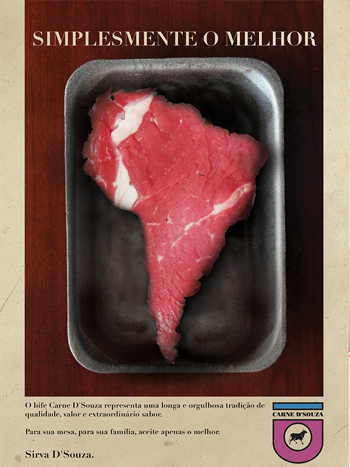
I don’t have any specifics about stuff I tried or wanted to do that didn’t make it to press. The closest was the “Family D’Souza” ad I did for Lazarus. It’s a late ’60s-early ’70s ad for a large South American meat producer/packager. I found some stock art of a steak, and digitally repainted it into a piece of stake in the shape of South America. There was a lot more manipulation of the image than I’d done before, and I was concerned that it wouldn’t play. Happily, it seemed to click with the rest of the team. But, yeah, that one was nerve-wracking.
You’re not just a designer of comics, you’re also a writer of them. What are you currently working on?
I just wrapped up some short pieces for Dynamite, contributing to their “#100″ issues for both Red Sonja and Vampirella, titles I’d done extended runs on; I’m also hard at work on a comics story with Greg Rucka, to be illustrated by Matthew Clark, but it’s probably too soon to talk much about that one.
You’ve been mainly employing your design skills in comics on Greg Rucka’s titles. Do you have any interest in using them to build your own worlds?
Most of what I’ve done thus far is work-for-hire. I did sneak some stuff into various DC projects. The “Code Zoo” in Checkmate/Final Crisis: Resist is a good example; the concept was that Checkmate, DC’s global espionage/peacekeeping organization had a repository for various rogue AIs, alien operating systems, and other harmful, aggressive code that they’d managed to scoop up over the years. To represent that, there were various icons/screens to show what was being stored—a Thanagarian navigation AI, a bit of Kryptonian “Eradicator” code, a Durlan communications program, and so on. I whipped up designs and included them with the script, and the art teams on those issues (Chris Samnee on Checkmate #17, Marco Rudy on Resist) incorporated them into the final art.
I’ve yet to tackle a creator owned series (knock wood, that’s later this year), and when I do, you can bet I’ll be handling a lot of that kind of work.
Over on ComiXology, our long-stalled digital comic, Frost: Rogue State (co-created with Brandon Jerwa and artist Giovanni Timpano) features a lot of the same kind of work I do on Lazarus: I designed the logo, lay out the covers and credits page, lay out the backmatter and so on.
The tl;dr answer is “Yes. Yes, I do have that interest.”
You can learn more about Eric Trautmann at his website and online portfolio, and follow him via social media on Twitter, Facebook and Tumblr.


 Greg Rucka has been on a tear lately. Not only has he written two Star Wars novels and a comic book series set post-Empire, he’s also been impressing in the creator-owned sphere. Lady Sabre, Lazarus and Stumptown continue running on all cylinders, and his newest series, Black Magick with Nicola Scott, recently launched to great acclaim. I […]


[…] Comics Beat has a great interview with Portland writer Greg Rucka. He talks creator owned, backmatter and more. […]