Viewing: Blog Posts Tagged with: kate willaert, Most Recent at Top [Help]
Results 1 - 3 of 3
How to use this Page
You are viewing the most recent posts tagged with the words: kate willaert in the JacketFlap blog reader. What is a tag? Think of a tag as a keyword or category label. Tags can both help you find posts on JacketFlap.com as well as provide an easy way for you to "remember" and classify posts for later recall. Try adding a tag yourself by clicking "Add a tag" below a post's header. Scroll down through the list of Recent Posts in the left column and click on a post title that sounds interesting. You can view all posts from a specific blog by clicking the Blog name in the right column, or you can click a 'More Posts from this Blog' link in any individual post.

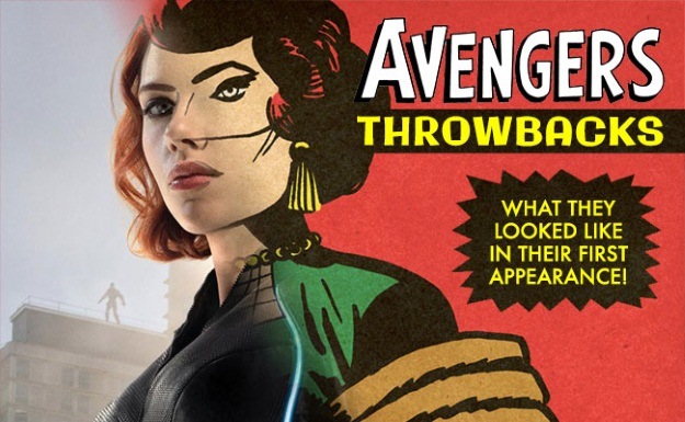
Mistress of the infographics (and cover reviews) Kate Willaert has really outdone herself with this then-and-now piece on the Avengers. Willaert took stills of the Avengers from that Avengers: Age of Ultron movie—including news kids Vision, Scarlet Witch and so on—and matched it was a drawing of how they debuted back in the day. Suffice to say we’ve come a long way from simple four color designs.
The infographic was created for Shirts.com because…Avengers wear shirts? I don’t know. But whatever the marketing reasons, it’s a cool piece.
And in case you didn’t hit the first link above, Willaert regularly critiques the month’s comics covers here at The Beat. Agree or disagree, check out some of her columns.

Speaking of Daredevil, infographic whiz Kate Willaert created this diagram of Matt Murdock throughout the years for Shirts.com
. It is a notable fact that while the Kirby/Ditko/Bullpen team generally hit a home run with all their character designs, the one that was a little squibbler straight to the pitcher was Daredevil’s red and yellow guise. Even in a “four-color”, one would long for a turn to the current grim and gritty basic black.
Plus, no codpieces.

Hopefully by now you’ve all seen the debut of new contributor Kate Willaert’s column “By Its Cover” which looks at the best of the week’s cover designs—I’ve been wanting to add more craft-focused pieces to the Beat and this really fits the bill.
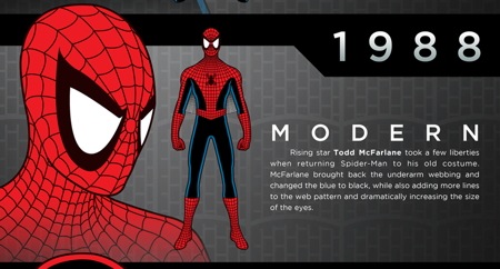
Kate is a pretty great designer herself, and I have to say, her infographic showing the evolution of Spider-Man’s costume deserves a place in Best American Infographics for sure! (yes there is such a book.) The infographic was created for HalloweenCostumes.com, and whatever they paid, it wasn’t enough.
One thing that i found very interesting was the change in eye holes! If I were editing Spider-man, I would go nuts trying to remember what is “on model” or not. Props to all the artists who’ve made Spider-man a comics icon despite the complicated costume.
ALSO, no change in the costume from 1966 to 1984 — that must be some kind of record!
Finally, as a reminder, here’s my review of Amazing Spider-Man 2.


Not a single meantion of Jack Kirby in the article?
Actually…
These were so well done, I thought they were Kirby originals.
Jacob: Mission Accomplished. :-)
It’s not just Kirby I was imitating, but also Don Heck and John Buscema (and Joe Simon, who I think at least partially contribute to the art on Captain America Comics #1?).
These were well done, but Ultron looked like a crazy fridge in his first appearance.
Brian: Unless you can point me to the issue I’m missing, Ultron-1 (the “crazy fridge”) didn’t appear until a flashback in Avengers #58, several issues after Ultron-5’s first appearance.
In what way are any of these “infographics”? A better title may have been “Awesome Graphics on the Avengers Then and Now”
Nice.
I would have liked to see Ironman’s original 1963 suit matched up with the movie version of the Mark I suit though.
Dsabender: I’m going to call them awesomegraphics from now on.
Seriously awesome work, Kate!