


 The Victorians loved ornamentation. That's an understatement. They reveled in pattern and color and delved into design that was "simply too utterly utter, i.e. beautiful beyond the ponderous weight of description.
I happen to think Victorian design is gorgeous. But I realize that others think it's just gawdawful cluttered.
Jacket Whys posted two covers recently that contrasted a cluttered design with a simple one--with the conclusion that simplicity is best. Studying the examples she used, I agree completely. (Be sure to have a look; that YA cover is really poorly executed). However, in general, I happen to like both spare and busy design, and I think kids do, too. That got me wondering: When does a busy cover design work, and when is it just a muddled mess?
Leon and the Place Between by Angela McAllister, illustrated by Grahame Baker-Smith, designed by Mike Jolley (Templar/Candlewick, 2008), has a busy cover that I think works wonderfully (although I would not consider it necessarily Victorian in style). It's carefully composed, balanced and pleasing. While it is true that this cover is full of "utterly utter" patterns and images and curlicues and arabesques and such, much of which is highlighted in shiny gold foil, the motifs repeat in a pleasing way. They don't crowd or overwhelm the title or the creators' names. They make room. They make room for Leon's shadow, which is, I suspect, meant to represent the "place between" or the place where real magic actually happens. The art is planned around the necessary elements of text. (And the title typefaces, carried out throughout the interior test, are just delightful.)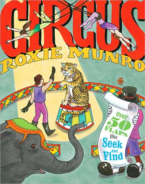 Contrast that with this cover I found online. Circus by Roxie Munro (Chronicle, 2006) is not as busy, but seems more cluttered. This one is less successful to me for a number of reasons: There is no clear focal point or difference in scale between the various elements. They all seem to demand the viewer's attention equally (granted that is the nature of a circus, but what works for a three-ring extravaganza is less effective for a book cover). There is little attempt at repetition of shapes to lead the eye around the composition. Figures overlap needlessly. And what about contrast? The spotlighted area isn't any brighter than the rest. Also, the trapeze artists clutter and obscure the title. There's a sense of disorganization in the composition, of the elements not making room for each other.
It's not Victorian in the least, but that's what I call gawdawful cluttered.
Viewing: Blog Posts Tagged with: jacket whys, Most Recent at Top [Help]
Results 1 - 2 of 2
Blog: JACKET KNACK (Login to Add to MyJacketFlap)
JacketFlap tags: Clutter, Victoriana, Bad Covers, jacket whys, Busy Covers, Add a tag
Blog: JACKET KNACK (Login to Add to MyJacketFlap)
JacketFlap tags: Bad Covers, jacket whys, Young Adult, fonts, middle grade, typefaces, Add a tag
 Because of this blog, I am becoming naturally more attuned to cover design and especially to typeface choices, which can make or break a cover. Take, for example this book, Between the Deep Blue Sea and Me (Kamehameha Publishing, 2008) highlighted by L. over at Jacket Whys. I agree with L.'s analysis. It's a gorgeous image, and I also agree that it's a toss-up over whether teens will be attracted to it. I don't know about you, but the typeface is off-putting to me. Doesn't it make you think of a book of essays, or a textbook, or one of those literary criticisms you were required to buy for a class? I had to look to make sure it didn't say Harold Bloom at the bottom. Sorry: Fail.
Now here's a book that's not due out until May, but it shows quite well what happens when the typeface fits the book:
This is Folly (Wendy Lamb Books, May 11, 2010), a historical fiction for teens (Yay!). It takes place in Victorian England, with a description that sounds as if the novel is full of joys and sorrows. Certainly, the cover suggests the sorrows. Note how the scratched ceramic surface of the girl's skin fits with the scratchy font, yet there's also a bit of joy in the slanting serifs and those curly "l"s and "y"s. Double-plus like.
Now more really neat-o title fonts for your viewing pleasure:
Seems like everyone but me has probably already read Beautiful Creatures, a gothic fantasy by Kami Garcia and Margaret Stohl. The actual cover, like many YA books out now, has fabulous embossed lettering. And what elaborate lettering it is.
Newsgirl by Liza Ketchum (Viking, 2009) is a middle grade historical (Yay!) in which the main character hawks papers on a street corner. Hence the well chosen, printerly font.


I love the Haida-looking art for the Deep Blue Sea Book, and that font really ruins it. I hate to say it, but you know what face would look good for that style? Neuland...
I thought that, too! But even something with a bit of curl or wave would have worked.
Hmmm...for me, the font for Between the Deep Blue Sea and Me doesn't look academic, it just looks straight-forward and clean - it works beautifully. I want to look at the swirls in the design of the dolphin (killer whale?), and I wouldn't want the font competing for my attention with its own waves or curls. In a way, the font used on the book looks clean-washed - appropriate for a tale about the sea. And Neuland, well, for me that font always feels pre-Columbia; it's supposed to be kind of Aztec-ish - and this story is set in Hawaii, right? Nope - I like the font plain. I don't know about whether teens will like it - it's true, teens like a bit of drama, but doesn't the design behind the font provide that?