

Playing with owls and patterns...

0 Comments on Paula: Owls #1 as of 6/19/2014 3:39:00 PM
Add a Comment

 By: Paula,
on 6/19/2014
By: Paula,
on 6/19/2014
Playing with owls and patterns...
Yes, I'm in London. Which is wonderful, especially as I'm with family, about to go on an amazing trip to celebrate my dad's 80th birthday ... yet a wee bit frustrating as well, as I'm missing two whole weeks of the e-course that I've been so thoroughly enjoying ... But yes, I am definitely counting my blessings.
I did manage to take some time off and doodle. We're having a few internet connectivity problems so I'll keep this short and sweet, and post it before I get cut off. Here's the black and white sketch:
I'm not sure if I'll be able to carry on blogging much till I get back home, but I'll be posting photos and updates over at the Floating Lemons Facebook page so pop by there if you'd like to accompany me to Istanbul ...
Have a wonderful day. Cheers.

A panel on Friday, March 29th, the first day of programming at WonderCon brought together a rather iconic cast to discuss “iconic characters” and what keeps a character “true” to their origins over long periods of time. Mark Waid opened as moderator by pointing out that the table full of seasoned pros had more than 125 years of comics experience between them and most had worked on longterm characters and newer creations alike. The essential question posed by Waid was how to “vault” characters “into the 21st century without losing what keeps them special”. The question seemed particularly pertinent to Waid, whose ongoing work on DAREDEVIL has evoked critical acclaim. Waid asked his panellists how they handle the “core elements of characters” to face this challenge.
 J. M. De Matteis introduced an image that stayed with the panellists as a reference point for discussion. He felt that creators handling long-lived characters work “within a cage”, so they can’t “go wide” with the character in term of change, but they can “go deep” in terms of making new discoveries. For De Matteis, personally, it’s all about the “Big Why” of characters, figuring out what makes them tick. He prefers working with super-villains to pose questions about the formative impact of their past histories because there’s “always a little corner of the psyche to dig into”. Ann Nocenti, however, in her recent work with Catwoman found that “her archetype was pretty clear” as a troubled kid originally, “on the streets” originally, and moving through “foster homes”. Her intuitive approach is to “play with a character and see what feels right” and she doesn’t mind the fact that later creators will do the same with long-term characters. It’s “like treading water”, she said, “You give a sense of constant, dynamic action, but you’re really not moving far”, and she expects later creators to be under the same constraint.
 Doug Mahnke’s challenges, as an artist working on long-term heroes, is rather specific, handling costumes and their overtones. He observed that heroes, even today, often don’t look “contemporary” because their appearance has become iconic and we no longer question the anachronism, like Superman’s “underwear outside his pants”. Other features like capes and boots, Mahnke said, “made sense at the time” they were created based on a “swashbuckling” influence. In fact, he explained, an artist’s job is to “bring out the majesty in the character. It doesn’t matter so much what they’re wearing”, but you can use costume as a “tool” to use to your advantage.
 Several of the panellists then commented on the fact that objectively, some of the nomenclature and costumes of characters created decades ago would seem “stupid” now. Nocenti’s example was a resurrection of a minor character, Zebra Man who was “visually fantastic” but the name and concept bizarre. Slott felt that once an icon is an icon, “the fact that it’s an icon gives it weight”, preventing further critique from readers. Even Waid’s considered opinion was that “Green Lantern” is a “stupid name for a character, but after 75 years”, it has “gravitas”.
 The panel then tackled the question of when and how exactly a character becomes officially iconic, and they set the bar high on awarding this status. De Matteis opined that “nothing about the character idea makes it iconic. It’s the execution”, and not every character reaches this status despite reasonably strong storytelling behind them. Dan Slott interjected that it only takes “one writer and one artist to do it”, like Frank Miller on DAREDEVIL. The discussion often drifted into slap-stick commentary on the more absurd aspects of superhero lore like the possession of a super vehicle as an icon accoutrement. Nocenti provided the little known detail that Cat Woman’s car is known as a “Catillac”. Slott confessed to proposing in a “meeting with real adults” that Superman’s car should be known as “Superman’s Ford Taurus of Solitude” with disasterous results.
Waid observed that some characters are iconic in pop culture without necessarily being long-lived, like Woody Woodpecker, who’s highly recognizable, but not a currently active character. Waid commented that the tendency toward merchandizing may encourage the slow-down or freeze of new developments in a character since “every character becomes a beach towel” in the end. The entire panel segued into a long and fairly serious discussion of Wonder Woman as a character and why she has, or has not, lived up to her iconic status in terms of actual comic storytelling.

Most felt, like De Matteis, that Wonder Woman comics have not always been “all that good”, nevertheless the character definitely qualifies as “iconic”. Waid had a fairly idiosyncratic theory behind why this is the case. He observed that there was a strong “sexual element” to the “first 10 years of the strip” that was later removed to render the character more “plain vanilla”, and that now, lacking that “x-factor of sexuality”, stories fail to live up to the early days (an issue, he said, he frequently discusses with Grant Morrison). Slott disagreed pointedly with Waid’s assessment. He instead blames the lack of verve in Wonder Woman comics to the fact that comics are essentially a “make dominated industry” that has not explored the “many angles of the character” sufficiently. Slott still feels that if the right team is put together, the stories can rise to iconic status again, without recourse to the “weird quirky bits”. His choice of phrase caused plenty of giggling among the panellists.
This led Waid to ask his panel how they decide what elements are most essential to a character, what continues to translate, and what can be left behind. De Matteis advised to “always approach the characters psychologically and emotionally” and not worry too much about the “other stuff”, and sometimes that psychological appeal can be found in lesser known characters. Nocenti commented that her current work on KATANA based on the strange but intriguing concept of a “girl with a sword” produced “good potential” for developing “obsessional love triangle” elements between herself, her murdered husband, and his murdering brother.“The less iconic a character, the more fun you can have!”, she enthused.
Slott agreed with Nocenti on this idea, up to a point. When you’re handling an iconic character, readers lose the fear that their reckless lifestyles will do them in, whereas if a character is “unknown”, “Everyone is worried”, wondering if they will survive from issue to issue. Slott and Nocenti shared an interesting moment of commiseration, albeit brief, about their mutual killing off of Spider-based characters, and the emotional reaction of fans. “Screw letters from emotional fans”, Slott concluded, laughing, but Waid intervened by informing the audience that he’s sure Slott “weeps himself to sleep at night with 6 year olds’ fan mail” over the death of Spider-Man .
 The panellists didn’t always find their subject matter easy to decipher, nor did they feel that there’s always an easy answer for why some characters “click” as icons and some don’t. Batman, particularly, has a mysteriously successful dynamic, they said. But some things do change. Waid observed that he “couldn’t have imagined a world where I walked down the street and everyone knew who Tony Stark was” until after the Iron Man films had been made. Waid suggested that iconic status for characters might be measured in the number of imitators who have sprung up. De Matteis returned to his general position that archetypal patterns determine iconic status, however. Slott provided examples, stating that Superman is like Hercules, Batman a being on a vengeance-quest, and Tony Stark is, too, iconic in formula, as a combination of “Man and Machine”, an icon that the world is ripe for right now.
 The panellists’ parting thoughts during the Q and A period focused on an interesting point made from the audience about the superhero/villain ratio. With so many more supervillains than superheroes in comics, “recycling” them is the norm, but at what point do they become “stale” and need to be retired, at least for awhile? De Matteis was firm about the roles of the artist and writers, insisting that there are “no stale characters but stale interpretations of characters” and that good work will prevent this problem. “Every character is great if you did into them in the right way”, he said. Waid’s closing example to support De Matteis’ point was that “20-25 years ago, no one would have thought that GREEN ARROW would become 2 times the best selling DC book, and then get his own TV show”. His bottom line: “If you dig deep enough you can find something that resonates”, and that’s the key to creating an icon, something that may not happen overnight.
Photo Credits: All photos in this article were taken by semi-professional photographer and pop culture scholar Michele Brittany. She’s an avid photographer of pop culture events. You can learn more about her photography and pop culture scholarship here.
Hannah Means-Shannon writes and blogs about comics for TRIP CITY and Sequart.org and is currently working on books about Neil Gaiman and Alan Moore for Sequart. She is @hannahmenzies on Twitter and hannahmenziesblog on WordPress.
By: Paula,
on 3/14/2013
Thought I'd put up some Easter-related items here, since we are into March. This is part of a licensing package I've been working on.

 By: John,
on 5/1/2012
By: John,
on 5/1/2012
 By: Donna Farley,
on 3/14/2012
By: Donna Farley,
on 3/14/2012

 |
| from this site http://www.crosses.org/icon/ |
By: John,
on 2/23/2012


Critical visual essay for my Graphic Novel Literature class. This was really fun to do and I really like that character.
 By: Kirsty,
on 10/3/2011
By: Kirsty,
on 10/3/2011
Image, branding, and logos are obsessions of our age. Iconic images dominate the media. In his new book, Christ to Coke, art historian Professor Martin Kemp examines eleven mega-famous examples of icons, including the American flag, the image of Christ's face, the double helix of DNA, and the heart.
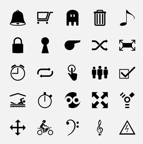
The Noun Project is a bold idea with a simple mission statement: “Sharing, celebrating and enhancing the world’s visual language”. Essentially, the Project aims to collect, organize and add to the universal library of symbols and images that make up our visual language.
A project like this has many benefits for the design community, but I feel that the simplification of ideas is very helpful. For those people brainstorming, the sorting by category feature is a great way to see a variety of symbols within or near a tangible concept. (Images are viewable by category and also en masse). Also, the images are free to use and place nicely in Illustrator.
As of now, The Noun Project is available only in English — but they are looking for help in translating to other languages.
——————–
Also worth viewing:
Paul Ibou: Logos, Posters & Calendars
Not signed up for the Grain Edit RSS Feed yet? Give it a try. Its free and yummy.
——————–
No Tags©2009 Grain Edit - catch us on Facebook and twitter
 By: Sevensheaven.nl,
on 2/21/2011
By: Sevensheaven.nl,
on 2/21/2011
![]()
Realistic 3D illustration about the many apps and accompanying icons for the Apple iPhone.
Sevensheaven images and prints are for sale at sevensheaven.nl
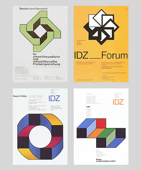
Posters for the International Design Center Berlin (IDZ)
Herbert Kapitzki, a former student of Willi Baumeister, conceived and designed exhibitions for the state industrial inspection board (Landesgewerbeamt) in Stuttgart in the 1950s and the early 1960s. He developed a distinct language of forms modelled on constructive forerunners, and campaigned for the popularisation of functional graphic design. His own groundbreaking work was exemplary in this respect.
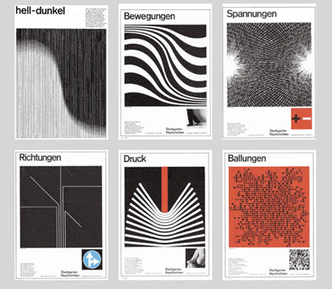
Full-page advertisements in the “Stuttgarter Nachrichten” a German newspaper.
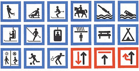
System of signs for sporting and leisure pursuits, 1969
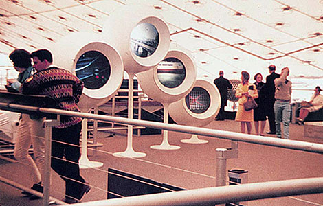
Contribution for the Federal Republic of Germany to the Montreal International Exhibition
1967
When Otl Aicher asked him to teach at the Academy of Design in Ulm, where he remained until the closing of the school in 1968, he already possessed mature creative solutions and precise concepts of modern information design.
The interdisciplinary discussions about actual and future ways of communication of the Stuttgart ‘group 56′ inspired Herbert Kapitzki. He was a pioneer in exploring the visualisation of information through graphic symbols or systems of codes to meet the needs of modern mass communication in times of mobility.
With his pictograms and orientation systems for airports he set international standards for a lingua franca which nowadays seems self-evident to us. Systematic form design remained the central theme of his teaching in Ulm and in Berlin, where he taught at the Academy of Arts from 1970 until his retirement in 1990.
(Source AGI)(Via Swiss Legacy)
——————–
Also worth checking: Publicity and Graphic Design in The Chemical Industry. & Icographic Journal
Not signed up for the Grain Edit RSS Feed yet? Give it a try. Its free and yummy.
——————–
No Tags
By: John,
on 6/1/2009
 I’m such a book junkie.
There’s a new one out for all you kitsch-mavens, advertising art gurus, and mid-20th-century style hounds. Warren Dotz and designer Masud Husain have just released Ad Boy: Vintage Advertising With Character, a compendium of cool brand identities culled from what must be a spectacular collection of ephemera. Although it is a followup to his previous book Meet Mr. Product: The Art of the Advertising Character, Warren says this one is quite different. Although I haven’t yet got my hands on a real live copy, there is a preview available on Amazon. The table of contents shows the book is arranged by subject matter: Mechanical Men, Scottish Plaid, Genies, etc.
I asked Warren if he had information on the creators of all these mascots, but he said it’s so hard to trace that he doubts if he has even 10% of the designers’ names. If any of you old retired illustrators and designers are the culprits and you read this blog - gee, a lot of us advertising and illustration historians would sure like to know who did what and when!
By: Sevensheaven.nl,
on 5/27/2009

Graphic 2D symbols that express security services, used as prints on a company car.
I love creating 2D graphics like these, next to my 3D work.
More at Sevensheaven.nl
By: John,
on 1/9/2009

Today Jon Hicks posted some sketches and early prototypes of the icons he designed for Linotype’s FontExplorer app.
Also worth checking out are the similar posts he has written about designing the icons for Mozilla’s Firefox and Thunderbird.
 By: Sondra Santos LaBrie,
on 6/10/2008
By: Sondra Santos LaBrie,
on 6/10/2008


.jpg?picon=441) Posted on 2/17/2007
Posted on 2/17/2007
Design for a range of gift items...mugs, T-shirts, hats, you know the sort of thing. Done as a quick tiny pen sketch and blown up for the crunchy line effect.
Add a CommentA little fellow called "Bright Spark" to be used in workbooks published by The Primary School Homework Company for 7 year old school children.
Add a CommentHere are some icons commissioned by UNISON, a major British trade union. The images accompany a questionnaire about members' interests and aspirations and replace some unpleasant clip-art. The brief stated that the pictures should be on a circular background.
Add a Comment
Such great coverage and photography.
Now THAT was a thorough story. Wonderful coverage of the panel.
And thank you for giving photo credits to the photographer. I did con photography for years and, more often than not, the idea of a photo credit gets forgotten. Why, even in the last year, I’ve had three of my con photos swiped by Bleeding Cool for their articles. (Something you’ll never see in THEIR Swipe File column). It seems, for some, it is easier to treat Googled images as “free” clipart rather than asking for permission let alone paying.
Well done, Beat! Always the gold standard!
Glad to see Nocenti and De Matteis are still active (and enviably young looking). They wrote some of my favorite comics of the ’80s — and Nocenti’s Daredevil run (1986-1991) is a treasure that many fans still need to discover.
“Screw letters from emotional fans”, Slott concluded, laughing …
Seriously, I wish more creators would say that. This New Yorker article describes how obsessed fans have not made life pleasant for George R.R. Martin and Neil Gaiman. As the author writes: “The same blogging culture that allows a fantasy writer like Neil Gaiman to foster a sense of intimacy with his readers can also expose an author to relentless scrutiny when they become discontented.”
http://www.newyorker.com/reporting/2011/04/11/110411fa_fact_miller
Nocenti appears to be aging in Marvel Time.
Maybe they should focus on trying to design and make their own characters from scratch that are just as worthwhile instead of lamenting that the classic ones just aren’t as recyclable as they would prefer. Or staying with what classically works. Throw-away versions of cheap characters to comment on Superman or Batman is not the same thing. Its hard to make a Wolverine or a Superman. Or make a batch of great ones like Kirby, Lee and Ditko did. Even in the modern age.
To me, that’s what’s pretty stale about the comic industry. Milking and rebooting the past too much under “new visions” and high price tags. Works for movies with the recent state of special effects and interest but at the 50 year point of expensive print comics with tons of competition for entertainment time, I’m not so sure,
@johnrobiethecat:
These are writers and artists. If they create new characters, they have to convince some (presumably small) publisher to publish them where they won’t make any money. Writing and drawing existing characters is where the money is (unless you’re a really big name).
This makes it seem like one a character reaches iconic status it’s better to leave it alone.
After that people are just stuck cranking out same old same old and hoping they don’t piss anyone off or bore them.
I’m trying to think of a way to say this without sounding harsh to the panelists (not my intention), but it feels like they’re all saying “we’re all hacks, and sometimes that sucks”.
…still came out way more harsh than I wanted…
But how does one justify being the 236th out of 307 writers to re-tread a 40 year old concept?
Every once in a while someone will come around who’s really really good at it, like Miller or Moore in their earlier years, but it still seems disposable and fruitless to me.
I’d have liked to attend that panel–but the perspectives the writers have on the characters might be biased. The psychology of a reader–his identification with the character, his desire to experience a type of fantasy, his need for an attachment–is more important in leading him to buy a series than the composition of the character is. The makeup of a particular character might create more story possibilities than others will, but over years, any character will burn out. A reader who’s attached to a character won’t care about the burnout.
Wonder Woman, for example, has been a problem for writers because she’s much more a symbol than she is a literary character. Readers attach themselves to her because of her power as a symbol, then are disappointed when she fails as a character in a story.
Creating new series characters is difficult mainly because the creator isn’t being asked to design a new literary character. He’s being asked to design something that appeals to fantasies that a few types of readers engage in regularly, without blatantly copying what already exists. That would be difficult for anyone.
SRS
“But how does one justify being the 236th out of 307 writers to re-tread a 40 year old concept?”
These characters have to keep going, for reasons of merchandising and movie, TV and video game deals. I don’t find it very interesting, either — I’d rather see new characters and concepts — but that’s the reality of the business.
I see the points…Its looks like the general plan is lets match different teams on different books and lets see if we can find one that has magic to be a breakout success.. Not sure that a Frank Miller/Janson Daredevil or Claremont-Byrne-Smith X-men type magic is going to happen anytime soon. Everybody is using the same bag of tricks and its getting really old.. I know a lot of these creators are serious, dedicated craftsmen and a comic team is much like a movie team but something like the “Age of Ultron” or “Avengers vs X-Men” is never going to be anything special,. Its just blowing out the fireworks to get sales and more trades via the cheapest tricks available. Maybe they do make money but if i were a professional, I would like to do something more meaningful than a Jean Claude Van Damme type comic with better effects and rich production values.
I saw the trailer for Wolverine. The story doesn’t look like it’ll match the comic series (understandable, its a long story) but there’s enough there to even reference into something interesting. That was a 4 issue mini series (Wolverine’s first btw) by Miller & Claremont than then folded into an awesome 2 issue finish in Claremont/Paul Smith’s X-Men that might have been just as good. That was the sole X-Men book at the time. These things happen(like 30 yrs ago) but there are real long periods in between and the market is so convoluted and byzantine, its better to just stick with the movies for hero entertainment. Who knows where to start in comics…
Adding to that, James Bond movies are doing just fine without James Bond books coming out every couple of years, I can see the same thing happening in comics. The public is satisfied with just the movie output alone.
I’m afraid that for a lot of people these days, superheroes are movie and TV characters — not comic book characters.
Start here:
http://books.google.com/books?id=oqjiV6fOn0kC&printsec=frontcover&dq=The+Myth+of+the+American+Superhero&hl=en&sa=X&ei=oNhYUdbFMO_k4APWi4DACA&ved=0CCQQ6AEwAA#v=onepage&q=The%20Myth%20of%20the%20American%20Superhero&f=false
Or, if you want the basis for most American storytelling:
“A community in a harmonious paradise is threatened by evil; normal institutions fail to contend with this threat; a selfless superhero emerges to renounce temptations and carry out the redemptive task; aided by fate, his decisive victory restores the community to its paradisiacal condition; the superhero then recedes into obscurity.”
(Yes, superheroes are outsiders, each with secrets.)
Iconic? It resonates. Sometimes it reflects and focuses a particular Zeitgeist in society, like “Death Wish”. Or it gives power to a power fantasy, like “The Turner Diaries”. Or it presents an idealistic hero or society, like the militaristic socialism of “Star Trek”. Perhaps each hero is just a literary facade we can wear over our own faces, masking us from society and reality.