new posts in all blogs
Viewing: Blog Posts Tagged with: hardcover to paperback, Most Recent at Top [Help]
Results 1 - 6 of 6
How to use this Page
You are viewing the most recent posts tagged with the words: hardcover to paperback in the JacketFlap blog reader. What is a tag? Think of a tag as a keyword or category label. Tags can both help you find posts on JacketFlap.com as well as provide an easy way for you to "remember" and classify posts for later recall. Try adding a tag yourself by clicking "Add a tag" below a post's header. Scroll down through the list of Recent Posts in the left column and click on a post title that sounds interesting. You can view all posts from a specific blog by clicking the Blog name in the right column, or you can click a 'More Posts from this Blog' link in any individual post.
I love comparing covers and judging books by their covers! We all do it and it's fun to analyze what works and what doesn't. Here are some recent cover changes I've come across:
Hardcover:
I love the color and the eye on the cover just feels like this is going to be something spooky and mysterious.
Paperback:
I still like the color, but I'm not sure about the rest of the cover and I'm not sure why. I do like how this cover gives more of a feel of the 1920s, but I think the spookiness is missing.
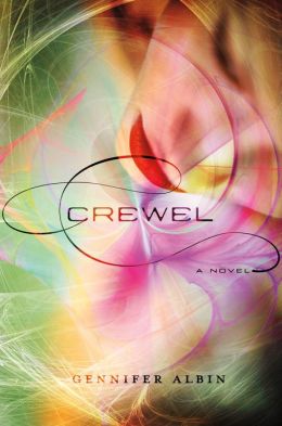
Hardcover:
I think this one is pretty, but nothing special. It wouldn't catch my eye.
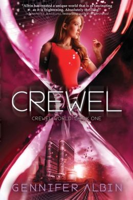
Paperback:
-I like how this one has a more futuristic feel, which I find appealing. It also feels a bit science fiction like and for some reason makes me think of Star Trek (which has nothing to do with the book and it's nothing like Star Trek) but it would make it pick it up.
Hardover:
-This one is simple which I think makes it stand out.
Paperback:
-Again the simplicity of the cover works for me, although this cover makes me think it's a fairy tale retelling.
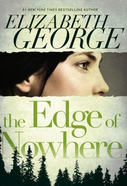
Hardcover:
-I think this one is nicely mysterious if a bit plain.
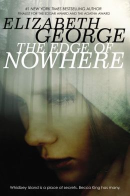
Paperback:
-This one is a miss for me. It now looks like a poorly made self published cover that was thrown together and instead of looking like a mystery it looks like a sad, depressing book.
What do you think of these changes? Any others you've noticed recently?
I love looking at book covers, especially when they change from hardcover to paperback. I think the cover evolution and marketing directions books take is interesting! Here are some recent changes I've seen:
Hardcover
-Simple, yet it gets the story across-I like it
Paperback:
-This one is much more simple, but it works and I really like it. I also think it adds an element of humor the first cover is missing.
Hardcover:
-I don't know what I think of this cover. I like how she's coming through the book and entering the story, which gets the plot across,but it just looks a bit odd at the same time-not sure why.
Paperback:
-I really like the look of this cover, but at the same time it feels a bit historical.
Hardcover:
-It's simple, but I like it. I also like how the girl doesn't look too nerdy.
Paperback:
-This one changes the look of the book to a romance Sarah Dessen-esque cover. I like the cover, just not for this book.
Hardcover:
-I thought I had talked about this one before, I guess not. I love this cover-so cute, I love the text and the Eiffel Tower in the back.
Paperback:
-This is an OK cover, but it feels like the book is trying to become "new adult" and being marketed to adults more than teens. It also looks a bit more serious to me than the original cover.
-I really like this cover-simple and just the right amount of scary. It flies off my library shelves.
Paperback:
-I really like the paperback version too. It's a different take than the hardcover, but I think it still manages to get across the mystery of the book. I do think the cover model looks a bit like Kristen Stewart in that photo and I wonder if that will turn off readers thinking this is a Twilight readalike.
I really like the other two covers in the series:
What covers do you like and dislike?
Sometimes paperback covers can be for the better and sometimes they can be for the worse. Here are some recent cover changes I've seen:
First up, Code Name Verity, a book that is near and dear to my heart.
That shiny sticker looks so pretty, doesn't it? I like this cover, but the paperback is really growing on me:
I'll admit at first I hated it, but the more I look at it the more I like it. There's just something so beautiful about this cover.
Here's another one I really like. The hardcover for The Catastrophic History of You and Me makes sense with the book, but I just don't like the way it looks as a whole and I'm not sure why. I think it's the fact that I don't like the dress.
But I really like this paperback cover, even if it does look a bit like other covers. It's just simple and beautiful
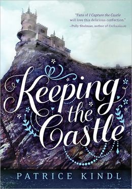
Here's one I really dislike. I love the hardcover for Keeping the Castle:
But the paperback looks so childish!
It really looks more like a middle grade novel now and the main character looks so young and a bit Disney character-ish. It's a cute cover, just not for this book.
Here's another cover change I'm not a huge fan of. I really liked the hardcover for Throne of Glass:
It looks like it's got a cool kick butt girl on the cover.
And now here's the new paperback:
I guess she still looks pretty kick butt, but she looks like a cross between Lara Croft and an anime character. I almost expect the content inside to be a graphic novel.
Ok, let's talk about the evolution of a cover over the years. What My Mother Doesn't Know was one of the first books I read when I started reading YA lit and it remains one of my favorites. Here's the original cover from 2001 that I checked out from my library:
The cover got a makeover in 2003 in paperback:
And here's the latest cover makeover for 2013:
I have to say I like all three covers, even if the last one does look a bit like all the other contemporary YA covers that are coming out right now. I do like how it looks with the sequel, What My Girlfriend Doesn't Know:
Now for a book that's new but that has still undergone a complete makeover. Here's the original hardcover for Gilt:
Now, the paperback that was supposed to be:
But that paperback isn't happening and it's had yet another makeover. Here's the newest paperback cover:
Author Katherine Longshore has a great blog post about the evolution of her covers and why they changed.I think all three covers are great and really like the new paperback look.
So what do you think of these cover changes? Good or bad?
I've got more hardcover to paperback changes! What do you think of these?
Hardcover
Paperback
-I think both of these are well done and reflect the bleakness of the landscape in the story.
Hardcover
Paperback
-As fun as I think the paperback is, I think it's marketing more to an adult audience. It looks like your typical adult mystery bestseller. The hardcover looks like lots of fun and like the book will have lots of action (which it does)
Hardcover
Paperback
-I'm not a big fan of either covers, but I gotta got with the hardcover because it's creepier.
Hardcover
Paperback
-I like the hardcover on this one. The paperback is too simple and I think the hardcover has a cool computer/techy/time travel feel to it which matches the book.
Hardcover
Paperback
-The paperback for this one changes the entire look of the book! Now it looks like a steamy romance novel instead of historical fiction about Catherine Howard. I'm sure the paperback will get people to pick it up, and there is a lot of intrigue in the book, I'm just not sure it matches the steaminess on the cover.
I love looking at covers! And I think we all judge books by their covers to some extent. Here are some recent hardcover to paperback changes:
Hardcover:
Paperback:
-I gotta got with the paperback on this one. It just looks more appealing to me.
Hardcover:
Paperback:
-I think both covers are appealing. I think the paperback has more action and the hardcover is more subtle, but both fit the book well. I think I still like the hardcover better.
Hardcover:
Paperback:
-The paperback looks like a comic book. It's still really cool and I think this cover change is interesting because I think each cover markets to a different group. The first looks like fun and fluffy and the second looks more serious. I'm not sure which one I like more.
Hardcover:
Paperback:
-I love both of these covers, but I think I like the darkness of the paperback. I do think the hardcover has more of a Sleeping Beauty feel which matches the book.
So which ones do you like or dislike?
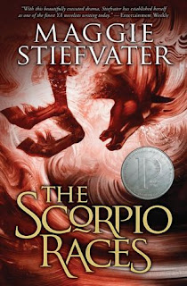
I love looking at cover changes from hardcover to paperback. Some are good, some can be bad, and they're always interesting!
I'm highlighting cover changes that have happened mid-series this time around. I hate whey they change covers mid-series both as a librarian and a reader. It can be very frustrating as a librarian because now our first book in the series doesn't match what the teens are seeing online or in stores, so they don't think we have the book. And the cover that pulls up in the catalog now is different from what we actually have on our shelves. When a patron comes into the library asking for one cover and you show them a different one, it can be very frustrating-especially when working with kids and teens who only want the book they saw.
As a I reader, I just don't like when my books don't match.
So let's take a look at some series changes:
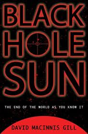
This is the hardcover for Black Hole Sun. I actually kind of like this cover-it's simple, but I think I can tell this is a science fiction book.
And here's the paperback. I like and I don't like it at the same time. I like that this one looks more action packed than the hardcover and I like that it really looks like a science fiction book-I know from the cover what to expect from the book. I do think the guy is brooding a little too much, although I guess I can see him as Durango-he can be somewhat moody.
This cover is OK, but it really doesn't say anything about secret societies or justice. It looks a bit like a generic mystery novel instead. So I can understand why the covers changed before book two was released.
But as much as I like this cover in general, I don't like it for this series. This looks like a 1940s noir murder mystery, which the book is not. I think it's even more misleading than the original cover.
5 Comments on Judge a Book By It's Cover, last added: 4/23/2012


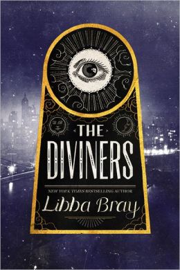
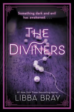
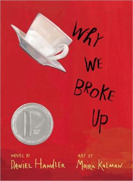
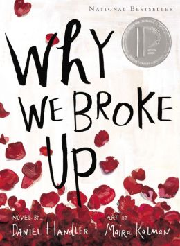


I prefer the original cover for The Diviners. I think the new cover looks like historical fiction but maybe teens will like it more.I prefer the original cover for Why We Broke Up too.
I do like the new cover for Crewel. It definitely makes the book look more interesting.
HATE the new cover for The Diviners! Yuck!
LOVE the new cover for Why We Broke Up.
And honestly I don't like either cover for Crewel.