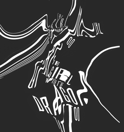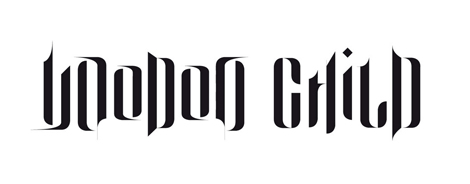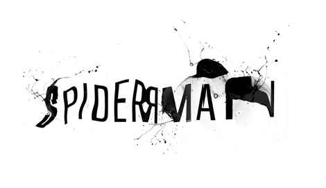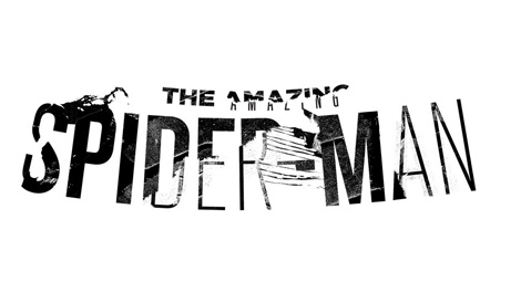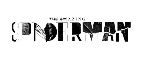
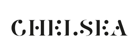
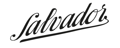
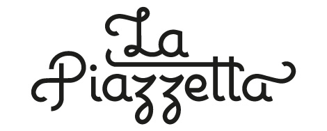
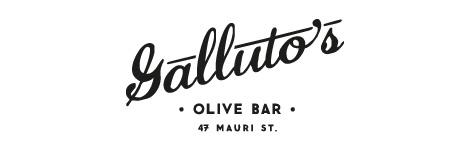
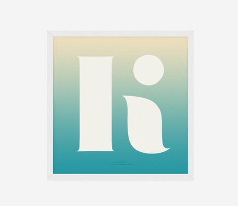
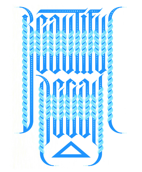
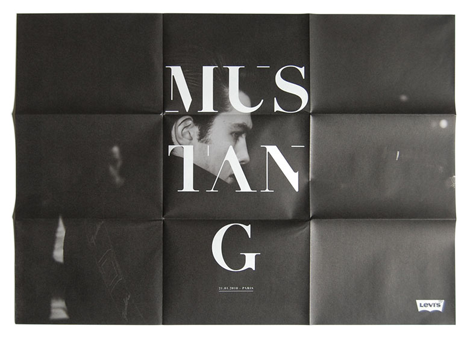
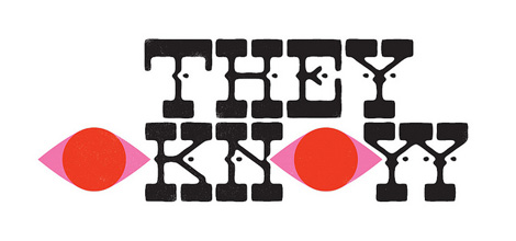
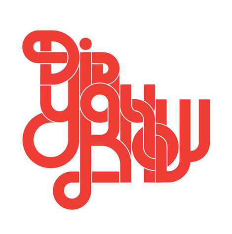
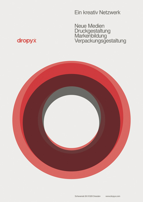
Lots of cool, crisp typographic work from Denmark-based Mads Burcharth. I love his clean, minimal approach to lettering and type design and his ability to add flourishes and interesting details to his work. His style is strong and bold, and has a great flair to it as well.
——————–
Also worth viewing:
Recently Received
This Is Forest — Joel Speasmaker
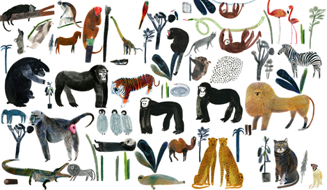
Designer’s Bookshelf: Amy Cartwright
Not signed up for the Grain Edit RSS Feed yet?
Give it a try. Its free and yummy.
——————–
Share This
Grain Edit recommends: Wondering Around Wandering: Work-So-Far by Mike Perry. Check it out here.
©2012 Grain Edit - catch us on Facebook and twitter
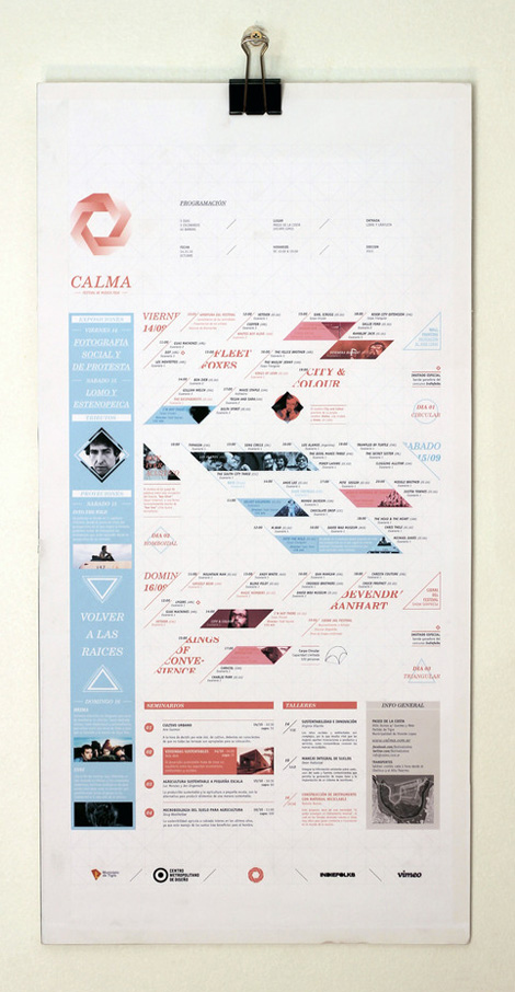
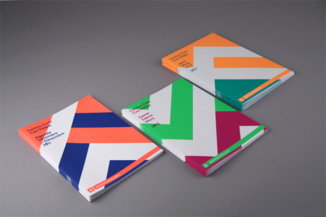
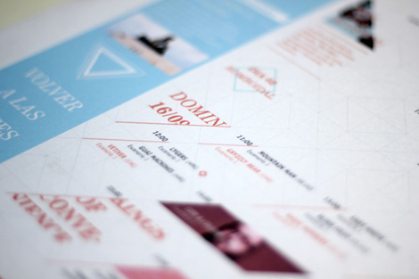
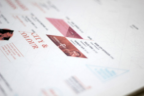
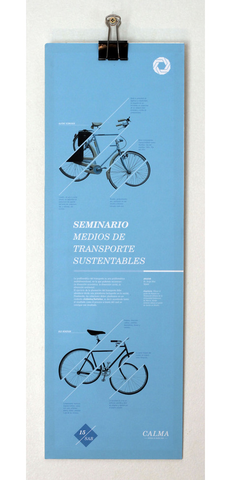
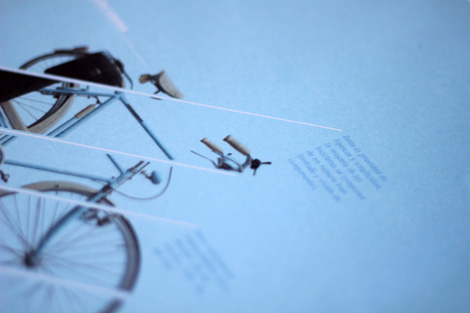
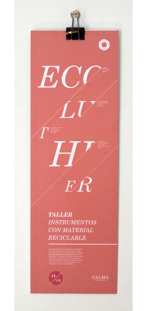
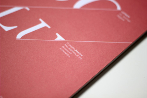
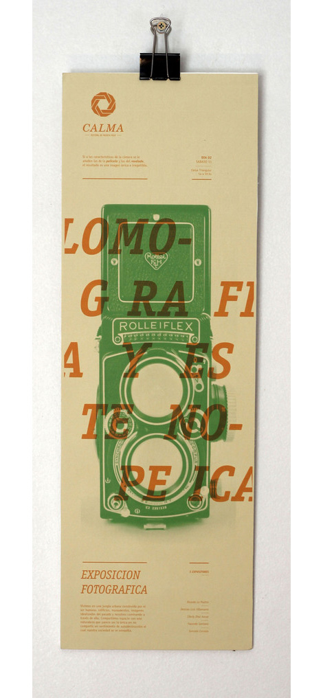
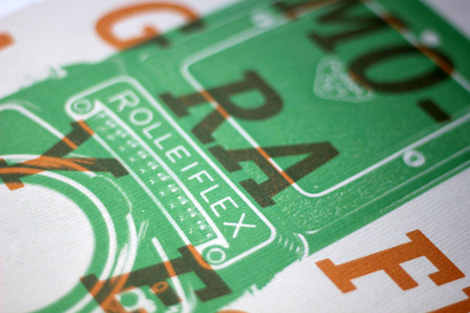
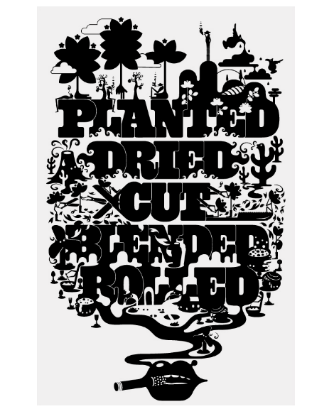
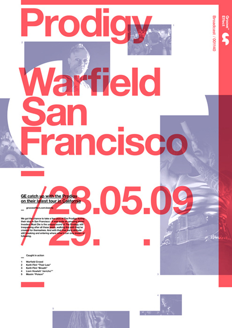
Great work coming from Argentina-based Estudio Tricota. Shown above is their work for Calma, a music festival — I love the movement in the piece and all of the small, considered typographic details.
They do a good job of maintaining consistency with their previous branding for Calma, creating a new visual aesthetic but keeping some of the elements in place. These posters represent a fraction of their portfolio and capabilities. Check out their Behance for more branding, identity and editorial work.
——————–
Also worth viewing:
Timba Smits
Herb Lubalin Archives
Mike Davis Interview
Not signed up for the Grain Edit RSS Feed yet? Give it a try. Its free and yummy.
Share This
Grain Edit recommends: Wondering Around Wandering: Work-So-Far by Mike Perry. Check it out here.
©2012 Grain Edit - catch us on Facebook and twitter
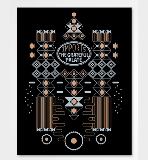
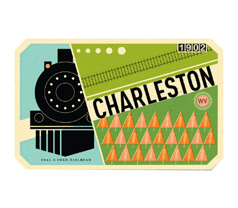
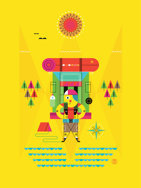
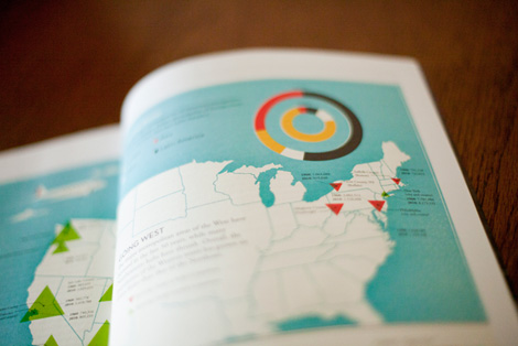
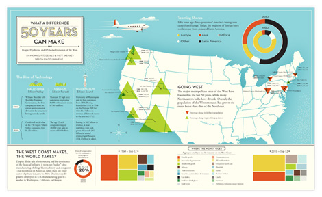
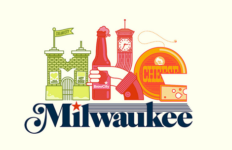
Fresh work coming from Mr. Brad Woodard in sunny Southern California. Brad’s an accomplished designer/illustrator and an info-graphics whiz to boot. I love his color palettes, form-making and how deliciously his illustration style bleeds into his information graphics. The two play very nicely together.
Currently, Brad is a designer at the very cool design/data vis studio Column Five Media, and a writer for Visual News. And he’s got some prints for sale up in his shop.

———-
Also worth checking: Katie Kirk Illustration & Design
Not signed up for the Grain Edit RSS Feed yet? Give it a try. Its free and yummy. Also catch us on Twitter.
———-
Share This
Grain Edit recommends: Wondering Around Wandering: Work-So-Far by Mike Perry. Check it out here.
©2012 Grain Edit - catch us on Facebook and twitter
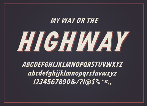
As users of an ever-changing internet, it’s amazing to see large project come together by someone that we’ve been following for years. In this case, I was lucky enough to get a sneak preview of a really great new typeface by Dan Cassaro, called Highway. Easily manipulated to create the look of lettering, but tight enough to use as ready-to-go typography, Highway fills the gap of versatility that many will find just perfect for their next project.
To get a bit more insight into the process and how the idea began to come together, I asked Dan a couple of questions.
I know that you took a fairly epic road trip around the country during the summer last year. How did you translate that into returning home to work on such a labor-intensive project?
I was really ready to get back to work full time when I got back to Brooklyn. Traveling every day is harder work than I thought it would be but most of the initial work on the typeface was actually done on the road. When I finally got home, it was actually really nice to zone out on a computer screen for hours on end. The back of a camper in a RV park in Arizona is a charming, but probably a less than ideal place to get work done. I’m not complaining though, I’ll probably do it again this summer.
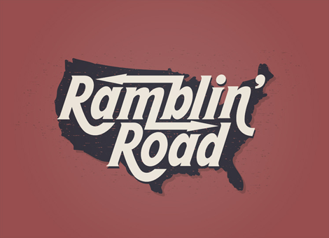
Your work speaks to an era of rustic, hand-made lettering and typographic styles. How did you let that influence your type designing process?
I have always been charmed by imperfect typography and lettering that is just a little bit off. We aren’t robots and design isn’t an assembly line and I find it much harder to relate to letters that look like a they came out of a machine.
There was a time before digital reproduction and desktop publishing when most advertising and signage had to be done by hand. Not just sign painters making show cards, but unskilled Joes just trying to draw a knock-off Futura in there shop window. That stuff is painted all over the guts of America and I got to see all of it this summer. I don’t mean to be hokey but that stuff feels alive to me and inspires me more than any single designer ever has.
You know what kills me about all of this “unskilled” lettering? It’s always PERFECTLY SPACED. I went to school for 4 years to learn how to kern a headline and Farmer Brown crushes it on his first try.
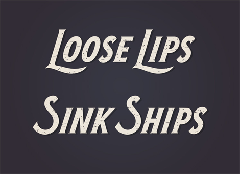
How did you find the process of creating a full typeface with swashes and ligatures? (as in, was it tedious, fun, annoying, the most amazing thing ever, etc?)
It was definitely a new thing for me, both the technical aspects and the whole “patience” thing. I am, by nature, a very fast worker and that isn’t the best approach for making a system of letters. I thought it was going to feel like math class or something, but I ended up enjoying it; teaching my left and right brain to get along. I didn
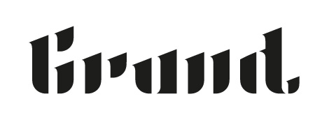
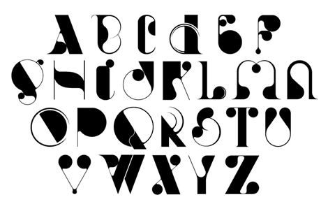
Typographer extraordinaire Marta Cerdà Alimbau brings new meaning to the idea of decorating type. With her modern and elegant letterforms, she creates compositions that put her at the top of her game. I love her penchant for creating 3 dimensional forms with letters that allow the work to extend past their natural 2D state. Marta also often collaborates with another extraordinary typographer and friend of Grain Edit, Alex Trochut. With an amazing roster of clients, this young and talented designer is sure to be one to watch going into 2012.

——————–
Also worth viewing:
Alex Trochut
McBess
HypeForType
Not signed up for the Grain Edit RSS Feed yet? Give it a try. Its free and yummy.
——————–
Share This
Grain Edit recommends: Saul Bass - Henri's Walk to Paris. Check it out here.
©2012 Grain Edit - catch us on Facebook and twitter
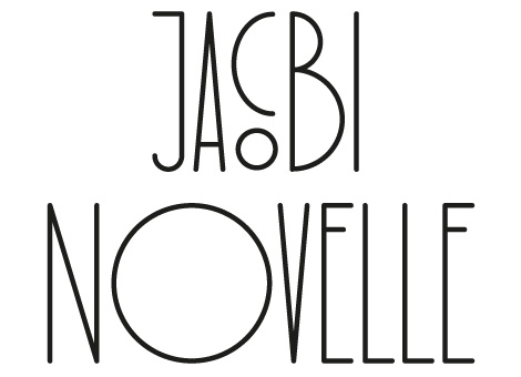
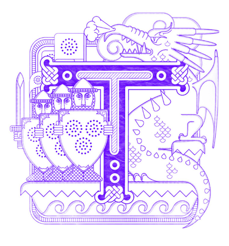
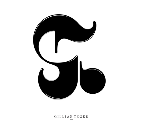
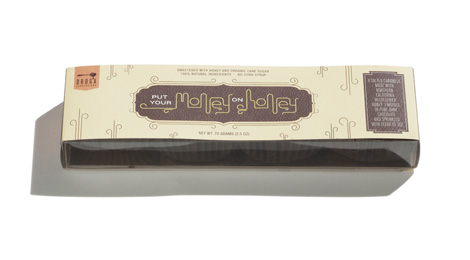
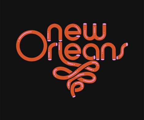
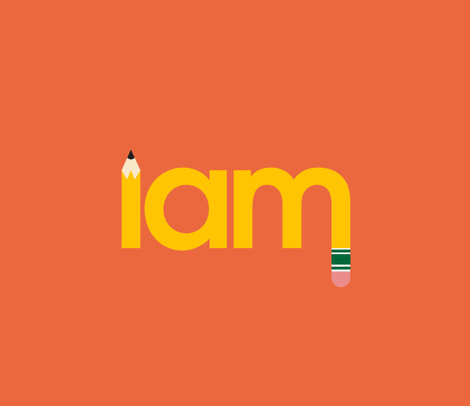
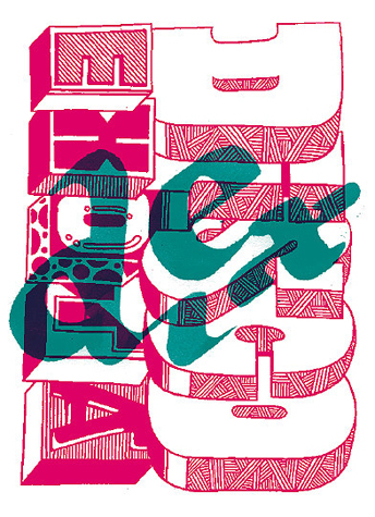
Graphic designer Andrew Woodhead takes from his Parisian surroundings by consistently managing to make each typographic project truly elegant. Whether it is a logo or a full typeface, there is a running theme of experimentation and sophisticated stylistic choices that create Andrew’s cohesive style. Designing type & typography for companies big and small, Andrew is sure to be one to watch in the world of design.
Also worth viewing:
Function, Restraint, and Subversion in Typography
Mario Hugo
Jonathan Zawada
Not signed up for the Grain Edit RSS Feed yet? Give it a try. Its free and yummy.
——————–
No Tags
Share This
Congrats to our winners in the Bike Print giveaway: Gianluigi Farnetti, Brian_HF, brianjbarron, Adrienne Wu
Grain Edit recommends: Karel Martens: Printed Matter. Check it out here.
As a young design student at California College of the Arts I had the wonderful opportunity of interning for ReadyMade magazine — way back in its hip Berkeley headquarters heyday.
It was a fantastically unique experience and my first in a bustling design office. Under the guidance of art director George McCalman, the office’s art department was a lively, collaborative, ambitious and (extremely) entertaining place to work — and home to the best design office music jams I have had the pleasure to groove to (courtesy of Mr. McCalman himself).
George is a magazine veteran, having art-directed Mother Jones, ReadyMade and Afar to name a few. He is responsible for relevant, thoughtful editorial design as well as some very compelling branding, packaging and identity work. Recently, I was able to catch up with George and find out about his past, present and future. And of course, his opinions regarding his favorite magazines.
George, take it away:
Where are you from originally? How did you come to find yourself on the opposite coast?
I’m originally from a small island in the Caribbean called Grenada. My mother and I moved to Brooklyn, New York when I was eight. I always doodled and drew as a kid and routinely got into trouble with my teachers for drawing in the margins of my notebooks instead of paying attention to my lessons. I never thought about art in a commercial sense until college, but a guidance counselor (based on my high school doodles!) suggested I go meet with the head of the Fine Art Department at St John’s University, and that’s what started me on my art career.
How did you become involved in design for magazines? Was this a conscious career choice, or did you somehow fall into it?
A little bit of both. My last year of college we had an internship program, and I couldn’t decide between a small design firm (whose name I’ve forgotten) and a magazine position. I remember sitting in the waiting area of the design firm, waiting to meet with the principal designer. It was orderly and neat and there was no music and remember thinking I was sitting in hell. The magazine option was a mag called Money Magazine. It was a bustling office with marble counters, frosted doors and loud people. I was hooked. The Creative Director was an old school magazine Perry White’ type who had put in over a decade at Time Magazine and chewed up whatever and whomever happened to be around him. I was hooked. The art department was a benetton ad of ethnicities. I thought I had hit the big time. I subsequently went over to Entertainment Weekly, which had an incredible impact on the kind of designer I would become. I got to learn and experiment with type on a grand scale and do it on a weekly basis. I was a baby designer at that time and worked with a talented (and competitive) team that drove me to not settle for mediocrity. I received a job offer in San Francisco in 1999 at Health magazine and moved out here.
Did you ever work in a traditional design studio?
No, but I always wondered about the kind of designer i might have become if i had. Sliding doors!
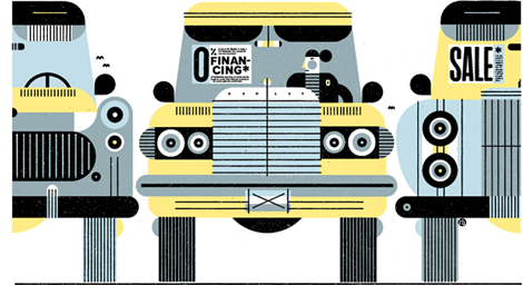
Multi-media designer Justin Harder produces mainly motion graphics for music videos and commercials, but his online portfolio also boasts a rather nice collection of static images. From geometric throwback typography and thick black logotypes, to illustrations and more experimental computer graphics, this LA based creative has a lot of hard work under his belt.


——————–
Also worth viewing:
Harry Murphy & Friends
Jeremy Pettis
Trademark Tim Lahan
Not signed up for the Grain Edit RSS Feed yet? Give it a try. Its free and yummy.
——————–
No Tags
Share This
Congrats to our winners in the Bike Print giveaway: Gianluigi Farnetti, Brian_HF, brianjbarron, Adrienne Wu
Grain Edit recommends: Karel Martens: Printed Matter. Check it out here.
©2009 Grain Edit - catch us on Facebook and twitter
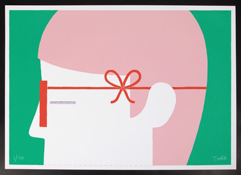
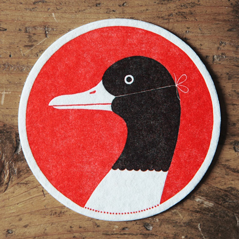
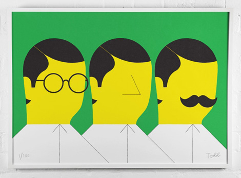
London-based illustrator & designer Ryan Todd creates refreshing work; Taking a great understanding of how to use bright colors best, combined with a wonderful retention towards simplicity, his work leaves you with pleasant thoughts and emotion. Ryan states that his focus is on “producing ideas-led images which exercise forms of creative thinking and wit.” He also holds his desk at East London image factory: OPEN
————
Also Worth Viewing
Eric Ellis
Andrew Neyer
Trademark Tim Lahan
Not signed up for the Grain Edit RSS Feed yet? Give it a try. Its free and yummy
————
No Tags
Share This
Congrats to our winners in the Bike Print giveaway: Gianluigi Farnetti, Brian_HF, brianjbarron, Adrienne Wu
Grain Edit recommends: Karel Martens: Printed Matter. Check it out here.
©2009 Grain Edit - catch us on Facebook and twitter
Chicago, Illinois based designer Eric Ellis produces clean and colorful graphics via a mixup of classic and contemporary influences. A recent graduate of Columbia University, and now an employee of Ogilvy & Mather, Eric is steadily continuing to create a plethora of awe-inducing imagery for us. For more of Ellis’ work, dig around through his site a bit, and be sure to also check out his great collection of #2 pencil sketches, Noon Studio.


————
Also Worth Viewing
Heath Killen
Jeremy Pettis
Trademark Tim Lahan
Not signed up for the Grain Edit RSS Feed yet? Give it a try. Its free and yummy
————
No Tags
Share This
Grain Edit recommends: Karel Martens: Printed Matter. Check it out here.
©2009 Grain Edit - catch us on Facebook and twitter


Timbuktu is the first iPad based magazine specifically designed for children. The magazine combines imagination and technology to engage youngsters in news and stories centered around interesting topics. With a bold and brave graphic style and clear and focused interaction design, Timbuktu is on the cutting edge of educating kids in a fun and informative way.
Art Director Olimpia Zagnoli, whose work we’ve featured previously on the site, chats with us today about her latest project, giving us insight to her new role as well as some juicy tidbits about the magazine.
Where did the name Timbuktu come from?
Timbuktu is the title of a book by Paul Auster. Timbuktu is a place everyone has heard of but only a few know exactly where to find it. Timbuktu is a name that usually indicates something remote and unknown, unreachable by definition.
Instead it’s a place that really exists! It’s in the desert of Mali and now it’s also on the iPad!

On It’s Nice That, you mentioned discussing being the Art Director of Timbuktu with Editor-in-Chief Elena Favilli and Creative Director Francesca Cavallo over tea and cake, which sounds fantastic. What are some of your favorite aspects of your role thus far?
I have to say I love this role. I’ve always worked on the other side before, so this was a new thing for me. Elena and Francesca gave me total free rein, so I was able to play with a few ideas I had in mind and take them further together with Graphic Designer Francesco Ceccarelli at Bunker Studio. I like to put things together nicely, so this was a good exercise for me. Having the opportunity to work with designers and illustrators from all over the world was a real honour and a very energizing experience.

What artists can we expect to see in the first issue?
For this issue we called artists from San Francisco, New Delhi, Milan, Lisbon, Berlin and Barcelona. They belong to different fields of art as theater, fine art, photography, illustration or motion graphics but they all created something especially addressed to kids. You will find Planeta Tangerina, Massimo Caccia, Jan Von Holleben, and many more.

What can kids look forward to in this as well as future issues of Timbuktu?
They can expect a digital magazine with visually stunning content and intuitive interaction design. They can expect a place where they can cultivate their curiosity and strengths. Plus, they can expect to get in contact with everyday news told in a
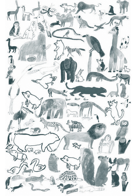
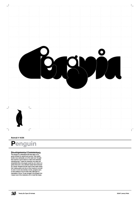
Jeremy Pettis is a Milwaukee, Wisconsin-based designer who creates some really amazing throwback typographical treatments. You may be familiar with his “26 Types Of Animals” project, in which he creates unique bespoke treatments through an alphabetical list of animal types. Jeremy’s website is dedicated mostly to that project, but you can find more real gems of work by digging through his flickr.
——————–
Also worth viewing:
Harry Murphy & Friends
Mimmo Castellano: Posters & Packaging
Trademark Tim Lahan
Not signed up for the Grain Edit RSS Feed yet? Give it a try. Its free and yummy.
——————–
No Tags
Share This
Grain Edit recommends: Karel Martens: Printed Matter. Check it out here.
©2009 Grain Edit - catch us on Facebook and twitter
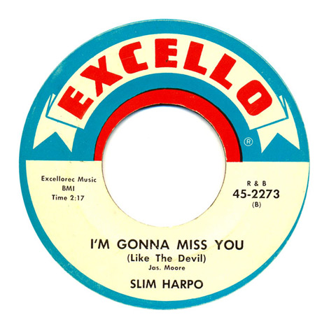
Center of Attention is an online collection of vintage record center labels by designer Simon Foster. Simon’s collection contains some real colorful gems of labels, which seem to be mostly from the 60’s and 70’s, although he has a few more antique examples. Although the aging crisp graphics, imperfect printing, and retro typefaces are super intriguing, my favorite thing about these old labels are the classic song titles; with such great hits as “I’m Gonna Miss You (Like the Devil),” “T-R-A-M-P,” “The Machine Demands a Sacrifice,” and “Fattie Bum Bum.”
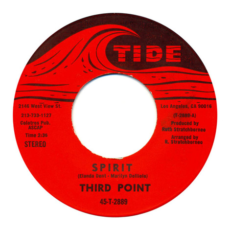
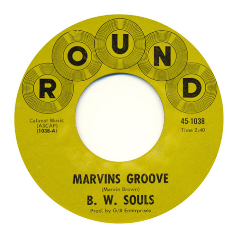

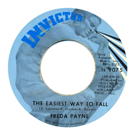
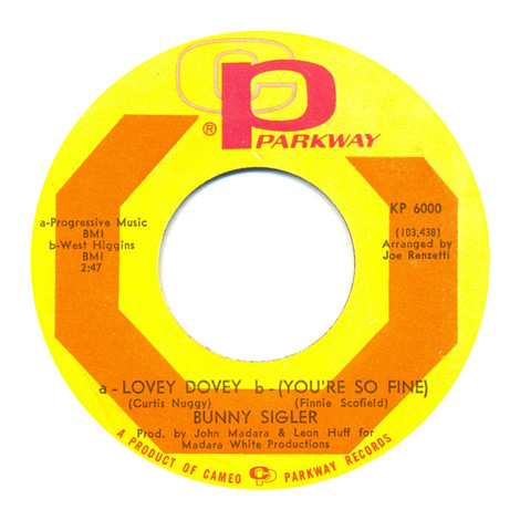


Simon also just added to the site a collection of record sleeves, in case you’ve already had too many donuts this morning.
——————–
Also worth viewing:
Project Thirty Three: Vintage Album Covers
Vintage Cassette Tape Covers
The Jazz Loft Project
Harry Murphy & Friends
Not signed up for the Grain Edit RSS Feed yet? Give it a try. Its free and yummy.
——————–
No Tags
Share This
Grain Edit recommends: Karel Martens: Printed Matter. Che

Taking another look back into San Francisco design studios as they stood in the late 70s, I bring you the second in a series of posts from the book “Graphic Design San Francisco“. Today we’ll take a look at Keating & Keating, who in present day is known as Kate Keating Associates, Inc., a heavy hitting SF corporate design firm.
“Keating & Keating have an attitude toward their work that can be stated in a definition of graphic design as ‘the architecture of visual communication.’ They believe that a project should entail not just applied cosmetics, but rather must be approached from a thorough problem-solving process in order to be successful.”


Images:
1. 1977 Annual Report. Systron-Donner Corporation.
2. Poster for an Art Directors Club event. San Francisco Society of Communicating Arts.
3. Product catalog for an outdoor manufacturer. Alpine Products, Inc. Photography: Peter Thompson
4. Poster for a ski competition. International Ski Trials. Sandy Liman Associates.
5. Trade Mark for a ski area. Alpine Meadows of Lake Tahoe.
6. Trade Mark for a retail store. McIntosh’s Sports Cottage.
7. Trade Mark for a recreational resort. LodgeWood.
——————–
Also worth viewing:
Harry Murphy + Friends
Vintage Travel Posters
Vintage Cassette Tape Covers
Not signed up for the Grain Edit RSS Feed yet? Give it a try. Its free and yummy.
——————–
No Tags
Share This
Congrats to our giveaway winners! Alan S (Cranston, RI), Emily S (Denton, TX), amluke and Anna M (Ithaca, NY)

Robert Murdock is Postmammal. As the pseudonym suggests, Robert’s work is sophisticated and evolved — illustrating the efforts of years of experience. Within the portfolio is variety, depth and style. There are large campaigns, small personal projects, identity systems, illustration, custom typography, and more.
To me, the common theme consistent throughout the work isn’t a particular style (there definitely is style), but rather a way of thinking, and a feeling that the work just “fits” or is appropriate for the product. Everything feels effortless, smart, and refined. It’s not often you find a designer’s work that feels this curated or compelling.


Robert is CCO at the very cool Method, in San Francisco. Go to the Postmammal.
——————–
Also worth viewing:
Darren Firth
Wim Crouwel Archive
Hey Studio
Not signed up for the Grain Edit RSS Feed yet? Give it a try. Its free and yummy.
——————–
No Tags
Share This
Only a few grain edit shirts left.Get yours now!
Grain Edit recommends: Born Modern: The Life and Design of Alvin Lustig. Check it out here.
Darren Firth is an extremeley talented designer, art director, and founder of Occupy, WIWP, and is currently working for Six.

Be sure to check out our interview with Sasha Barr.
Sign up for the scrumptious Grain Edit RSS feed.
No Tags
Share This
Only a few grain edit shirts left.Get yours now!
Grain Edit recommends: Born Modern: The Life and Design of Alvin Lustig. Check it out here.
©2009 Grain Edit - catch us on Facebook and twitter


Tomingekijo Music Circle concert pamphlets from 1963
In a prolific career that spanned over 5 decades, Japanese designer Ayao Yamana left behind a rich body of work that few could duplicate. He is mainly known for his elegant and delicate illustrations of women which graced the packaging and printed advertisements for Shiseido cosmetics. These concert pamphlet covers for the Tomingekijo Music Circle represent a side of Yamana that is less familiar, but equally as impressive.

Tomingekijo Music Circle concert pamphlet 1964

Tomingekijo Music Circle concert pamphlet 1960

Tomingekijo Music Circle concert pamphlets from 1956

Tomingekijo Music Circle concert pamphlet 1963

Tomingekijo Music Circle concert pamphlet 1963
The images seen above are from the now hard-to-find Ayao Yamana’s Graphic Design (Pie Books ©2004).
—–
Also available for your viewing pleasure: Japanese Graphic Design in The 1950s
Enjoy this post? Sign up for our tasty free grain edit RSS feed.
—–
No Tags
Share This
Only a few grain edit shirts left.Get yours now!
Grain Edit recommends
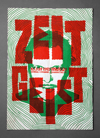
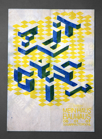
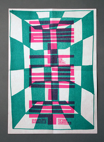
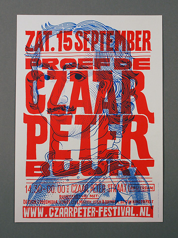
Job Wouters is a designer, illustrator, typographer and massive doodler based in Amsterdam. The sheer range of his work is astounding; it’s been a long time since I’ve seen this kind of variety put out by a designer.
Check Job’s site.
No Tags
Share This
Only a few grain edit shirts left.Get yours now!
Grain Edit recommends Buffet Script A font designed by Sudtipos. Check it out here.
©2009 Grain Edit - catch us on Facebook and twitter

View Next 25 Posts