Viewing: Blog Posts Tagged with: emily oberman, Most Recent at Top [Help]
Results 1 - 1 of 1
How to use this Page
You are viewing the most recent posts tagged with the words: emily oberman in the JacketFlap blog reader. What is a tag? Think of a tag as a keyword or category label. Tags can both help you find posts on JacketFlap.com as well as provide an easy way for you to "remember" and classify posts for later recall. Try adding a tag yourself by clicking "Add a tag" below a post's header. Scroll down through the list of Recent Posts in the left column and click on a post title that sounds interesting. You can view all posts from a specific blog by clicking the Blog name in the right column, or you can click a 'More Posts from this Blog' link in any individual post.
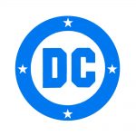
As we told you on Tuesday, DC Entertainment unveiled a brand new logo for all its branding across all platforms. It's more of a "print" type throwback logo, designed by Pentagram, specifically partner Emily Oberman, just in time to give DC a "rebirth" to its older, more hopeful and optimistic self.
 As we told you on Tuesday, DC Entertainment unveiled a brand new logo for all its branding across all platforms. It's more of a "print" type throwback logo, designed by Pentagram, specifically partner Emily Oberman, just in time to give DC a "rebirth" to its older, more hopeful and optimistic self.


The Marvel logo of the 90s was better than most of the comics.
The one where they fire Eddie Berganza, Jim Lee, DiDio and rehire Karen Berger is the logo that will work. It’s all just lipstick on a pig until then.
Also: put back the OVERSHORTS.
PS: Clearly Milton Glaser needs to be called in to update Milton Glaser’s design. It’s not like Chip Kidd wouldn’t jump at the chance to take it on either.
Hire Kate Willaert yesterday. That’s a winner
The one with the 200 logos; last full line, third from the right. But then not on a slant.
The wonky, wobbly C of the new logo really hurts my aesthetic eye.
Also, I just tightened up Matt Krotzer’s version some more – Removed the nick in the C and made the bottom of the hole in the D square, so that the D and the C mirror each other diagonally more.
http://imgur.com/EMSKElH
I think the 5th deckchair from the smoking room window on the Titanic looks the best!
The DC logo used from 1949 to 1970, with the words “Superman” and “National Comics,” was the best. They should bring that back, along with the go-go checks.
http://comicsalliance.com/dc-comics-logo-history/
George:
https://imgur.com/7SX5mzj
Kate: I love it! Maybe that would spark a full-scale ’60s revival, with DC’s chief rival calling themselves “Marvel Pop-Art Productions” again.
Logo redesigns come and go. Surely the real news is that they might change their name to “DG Comics.” Bold move after all these years.