Login or Register for free to create your own customized page of blog posts from your favorite blogs. You can also add blogs by clicking the "Add to MyJacketFlap" links next to the blog name in each post.
Blog Posts by Tag
In the past 7 days
Blog Posts by Date
Click days in this calendar to see posts by day or month
Viewing: Blog Posts Tagged with: customization, Most Recent at Top [Help]
Results 1 - 14 of 14
How to use this Page
You are viewing the most recent posts tagged with the words: customization in the JacketFlap blog reader. What is a tag? Think of a tag as a keyword or category label. Tags can both help you find posts on JacketFlap.com as well as provide an easy way for you to "remember" and classify posts for later recall. Try adding a tag yourself by clicking "Add a tag" below a post's header. Scroll down through the list of Recent Posts in the left column and click on a post title that sounds interesting. You can view all posts from a specific blog by clicking the Blog name in the right column, or you can click a 'More Posts from this Blog' link in any individual post.
Whether you’re a personal blogger, a designer, or an artist, Isola gives you a bright, clean space to showcase your work. Its minimalist design stays crisp across devices and screens of all sizes, with generous white space to keep the focus on your content.
Isola, a free theme, comes with numerous customization options, from featured images and custom header images to sleek post formats. Let’s take a look at three sites that are already using it to great effect.
Leon Scott, who writes thoughtful posts on design and technology on his aptly-named blog, makes the most of Isola‘s out-of-the-box look. He kept the layout simple and clean; all the widgets are tucked into a panel off screen.
Many of Leon’s posts — like the one shown above — include featured images, which establish their tone and also add a welcome burst of color.
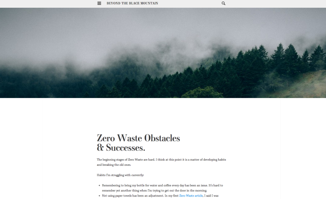
The environmentally-conscious blogger who writes at Beyond the Black Mountainfocuses on the intersection between fashion and eco-friendly living. Her site’s vibe echoes her approach elsewhere, with a stylish, spare look. A moody custom header image coupled with a retro serif font (Ambroise, which is available with the Custom Design upgrade) personalize Isola even further.
The blogger behind a dimpleate, based in Northern Virginia, has created a photo-heavy lifestyle blog that still maintains an airy, clean feel. She uses Isola‘s image and gallery post formats to highlight the beautiful images, linking them to her Flickr galleries for visitors who wish to explore more of her work.
Have you also customized Isola? Is there another theme you’d like to see featured here? Let us know in the comments.
Very nice theme! The only thing I would change is the size or placement of the custom header. I found it a bit awkward that the header can be so wide but the page contents so much thinner.
I love this theme! I just switched yesterday. custom features are cool too. I have been unhappy with some of the free themes of late. They never look anything like the ones advertised even after you try to customise them yourself. This one just took a few clicks and it was done. Beautiful!
Kelly, which was designed by Automattic’s own Kelly Hoffman, is an inviting, fun theme for bloggers of all stripes. Its clean, one-column layout makes it perfect for text-heavy posts, but can be just as ideal for a tumblelog-like stream of images.
With bold featured images, the ability to customize the header and the background, and three widget areas in the site’s footer, you can make it your own with just a few quick tweaks. Here are some examples of the theme’s versatility.
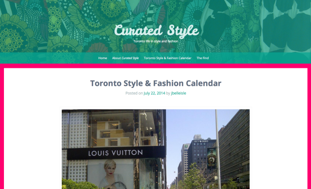
Curated Style, a Toronto-centered fashion blog, makes great use of Kelly‘s out-of-the-box look. The theme’s cursive font in the header injects a stylish playfulness, while the generous white space in the posts makes the images of Toronto’s fashion scene stand out.
The blogger behind Curated Style effortlessly added a few personal touches, like a patterned custom header image, a splash of bright pink in the custom background, and an easy-to-navigate custom menu.
Created by a photoblogger based in the Southeast (of the US), The Lens Less Traveled shows how radically different Kelly can look with just a few small changes.
The site uses a more neutral palette than the theme’s trademark bright greens and pinks, as well as a serif custom font instead of the default cursive. The focus is squarely on the gorgeous photography, like the picture above, taken in a state park in Georgia. The splashy featured image in each post creates a particularly striking effect, drawing viewers in and enticing them to explore more.
The dark background and sans serif font join forces to become a modern, clean canvas for Lorenzo’s thoughts, while the theme’s original focus on readability and balance stay as effective as ever.
Have you customized Kelly as well? Is there another theme you’d like to see featured in this series? We’d love to hear your input!
It would be great to see The Simfo Theme featured, as well as other Premium themes. I am interested in viewing how others have customized their Blog and/or website using The Simfo Theme, as I am currently using it for my site at http://www.stylescheme.com. Additionally, if possible, a CSS tutorial would also be very helpful and much appreciated. Thank you so much for asking and have a wonderful week!
MeAndDating said, on 8/5/2014 8:54:00 AM
Very versatile and yet easy on the eye. Positive addition to the world.
JA Shanks said, on 8/5/2014 9:21:00 AM
Thanks for highlighting my blog. I have to admit the extra stats/attention confused me a little at first. Really appreciate the mention.
Ben Huberman said, on 8/5/2014 9:31:00 AM
My pleasure — I’m happy I stumbled on it!
Ben Huberman said, on 8/5/2014 9:40:00 AM
Thanks for the suggestion, DawnMarie. We’ll definitely highlight some premium themes as well in future posts.
As for CSS, beyond our supportpages on the topic, we also ran a three-part tutorial last year; you can find the relevant posts here, here, and here. I hope you find them useful!
soccerjlj said, on 8/5/2014 3:13:00 PM
Any idea how to reduce the font size for the Kelly Theme without upgrading to the $99 premium account?
rosegainsan said, on 8/5/2014 3:23:00 PM
Please help me. I can’t upload picture. What shall i do.
Nina May said, on 8/5/2014 4:30:00 PM
It’s nice to see less photo-oriented themes being promoted! Pictures just aren’t my thing, so oftentimes I’ll opt-out on adding a picture.
jbelleisle said, on 8/5/2014 7:47:00 PM
Hi Ben, thanks so much for the kind words about my blog, Curated Style! I appreciate the kinds words and promotion.The Kelly theme is lovely although I noticed the formatting changes depending on the screen/browser (ie. pictures and texts won’t always look centered). Not sure if I’m going to stay with Kelly, but it is lovely and I like the simplicity.
Ben Huberman said, on 8/5/2014 9:41:00 PM
My pleasure! I suspect that the layout differences you’re seeing are a result of the theme’s responsiveness — it tries to optimize the viewing experience depending on the screen size you’re looking at.
In any case, I’m glad to hear you’ve been enjoying Kelly — and curious to see what you’d pick if/when you decide to switch themes.
Ben Huberman said, on 8/5/2014 9:44:00 PM
You’ll find all the information you need on uploading images on this support page.
Ben Huberman said, on 8/5/2014 9:46:00 PM
You don’t need WordPress.com Premium to change font sizes — you can accomplish that with the Custom Design upgrade, which includes Custom Colors, Custom Fonts, and Custom CSS. You can find more information about that upgrade here.
In our Early Theme Adopters series, we focus on bloggers creating great-looking sites with the most recent additions to our Theme Showcase. Today, let’s visit some of the sites that are already using Illustratr, a stunning, modern theme perfect for portfolio sites and blogs alike.
4 Comments on Early Theme Adopters: Illustratr, last added: 5/29/2014
Hm, every time I read these posts, I drool for a beautiful minimalist theme! But I chose my themes partly because navigation and interaction for visitors was transparent. I haven’t chosen many swoon-worthy themes because I feel that in the balance, visitors, especially from outside WP, won’t be able to navigate the site on account of the ‘hidden’ menus, though I realise they’re hidden to showcase the work. Am I completely wrong about this?
Ben Huberman said, on 5/28/2014 8:53:00 PM
With Illustratr, your primary menu can actually still be visible near the header if you want it that way (that’s how the featured bloggers here use it). As for ‘tucked’ / hidden menus on other themes, it’s really a personal call — some visitors might find those less intuitive to find and use, though it’s also true they’ve become quite common of late.
Po' Girl Shines said, on 5/29/2014 4:43:00 AM
Illustratr keeps popping up everywhere I look lately. Love the different looks you can get.
ninasbreakfast said, on 5/29/2014 12:40:00 PM
Would love to see a theme specifically geared for flip books.
One other detail: custom menus can be deleted with CSS if you want a simpler version of a theme that includes one. That’s what I did and I’ve been very happy with the result.
the book shelf said, on 5/23/2014 7:16:00 PM
This is probably a stupid question but i’ll ask it anyway. I am using the Twenty Ten theme and I was wondering if or how I can use the same sort of slide show that you have that Global Art Junkie uses in the On Demand theme, or is that kind of thing only available on certain themes?
John Hayden said, on 5/24/2014 10:00:00 PM
It would be interesting to see an updated list of the free and premium themes that support WordAds.
In our Early Theme Adopters series, we focus on bloggers creating great-looking sites with the most recent additions to our Theme Showcase. Today, let’s visit some of the sites that are already using Hemingway Rewritten, a free theme that makes both words and images shine.
10 Comments on Early Theme Adopters: Hemingway Rewritten, last added: 4/23/2014
theworldoutsidethewindow said, on 4/23/2014 6:06:00 AM
Yep, I’m using it too, have been for a couple of weeks :)
tellthetruth1 said, on 4/23/2014 7:25:00 AM
Where have I heard the name Aaron Buckley before? Gonna look him up :)
Little Miss Menopause said, on 4/23/2014 7:58:00 AM
Has anyone actually been brave enough to use this theme to rewrite some of Hemingway in “earnest?”
Ben Huberman said, on 4/23/2014 8:00:00 AM
That right there sounds like a solid reason to try out this theme!
careerschap said, on 4/23/2014 8:17:00 AM
OK I’ll give it a go instead of “There is no friend as loyal as a book.”
― Ernest Hemingway
How about, “There is no friend as loyal as a blog”.
There you go “Hemingway Rewritten”.
I really like this theme. Visually it’s so clean. I’ve had more compliments on my blog since I changed to it (and of course, feel free to pay it a visit!)
Chris Carter said, on 4/23/2014 8:23:00 AM
I don’t remember what the default theme was when I started my blog a few weeks back, but as soon as I found Hemingway Rewritten I latched onto it and haven’t considered any other themes.
dferreira2010 said, on 4/23/2014 8:28:00 AM
I just started a blog this week and chose this theme for its clean look. Didn’t realize it was such a new theme. Still learning all the ways to customize it so love having real world samples of the same theme to look at.
Ruth2Day said, on 4/23/2014 9:13:00 AM
I’m glad you showed this because I tried the Hemingway template and couldn’t quite get it right for me, but I’m impressed by the examples here and might give it another go
Darshan Gajara said, on 4/23/2014 9:33:00 AM
Life, Love & Lucy seems to be a pretty theme.
sdneeve1 said, on 4/23/2014 9:49:00 AM
I too changed my theme to Hemingway Rewritten over the past week. I love the fact you can have different headers for each page, and the simple, but clean overall look.
We release beautiful new themes every week. In our Early Theme Adopters series, we focus on bloggers who are using the most recent additions to our Theme Showcase. Today, let’s visit some of the blogs that are already using Sorbet, a vibrant, inviting theme.
10 Comments on Early Theme Adopters: Sorbet, last added: 3/30/2014
I love this theme, especially the navigation from post to post. Also love the way these bloggers have customized it.
belindq said, on 3/26/2014 6:38:00 AM
I having using Sorbet since Valentine. Can’t seen to get tired with my Valentine background and matching logo. Love the vibrant colours of Sorbet.
Katya Pavlopoulos said, on 3/26/2014 7:54:00 AM
I’m using Sorbet and I love it :) I don’t see myself switching to another theme anytime soon.
બગીચાનો માળી said, on 3/26/2014 8:08:00 AM
I’m also using this theme on my self hosted personal blog in gujarati language with some custom changes.
msshe said, on 3/26/2014 5:31:00 PM
I too am using sorbet. Love the color options!
narcissuschronicles said, on 3/26/2014 10:14:00 PM
This should help alot.. :-)
cdman83 said, on 3/28/2014 7:01:00 AM
Are wordpress blogs not hosted on wordpress.com/org eligible to be mentioned in the “Early theme adopters” section?
Ben Huberman said, on 3/28/2014 9:23:00 AM
For now, at least, this series is focused on WordPress.com users.
aworriedstudent said, on 3/29/2014 2:36:00 PM
Being new to WordPress, it can be difficult choosing which theme to select and I tried out a few before settling on Sorbet because of its clear, clean and bright appearance :)
twoboredsisters said, on 3/29/2014 9:01:00 PM
This theme is definitely very cool, and we thought about switching to it for a while- the image icon/text icon specification was not ideal though. Overall the fun spring colors really let a blog with this theme stand out!
Excellent things to do! I plan to also change the color scheme of my site and lighten the heading font. used a “Chunky” font for the winter, and plan to use a “lighter” font choice for the spring and summer
wwwander said, on 3/18/2014 7:12:00 AM
Your Spring-tips were very welcome – I have already applied some of them! Thanks!
Christine Goodnough said, on 3/18/2014 8:28:00 AM
One thing I would encourage is that everyone ADD a Recent Posts widget. I’ve visited blogs where you had to click ‘Previous post’…and click ‘Previous post’…and click ‘Previous post…’ if you wanted to know anything about what the blogger wrote before today. I like to see at a glance the titles of their last five posts so I know if their other content will interest me or not.
Another thought: If bloggers go back and edit the Tags on some recent posts, why not also spice up some titles if needed and be sure they accurately reflect the post’s central point?
I advised one man yesterday to change his Archives to a drop-down menu because he had a long line–30 months I think–in his sidebar. I did the same for my Categories.
Pradipna Lodh said, on 3/18/2014 8:31:00 AM
The blog is excellent, but I did not get the third point.
timethief said, on 3/18/2014 8:33:00 AM
It’s so easy to accumulate clutter and you are my hero for publishing this excellent advice. May I also suggest that broken links checks and editing to update popular posts with new information ought to be on our spring blog cleaning list?
Laura P. Schulman, MD, MA said, on 3/18/2014 9:05:00 AM
Thanks for reminding me about all the unfinished drafts that are stuffing up the closets in my blog. Time to rummage through them and either use them or throw them out! (Wonder if there’s a “Second Hand Store” for drafts?)
The DIY Show said, on 3/18/2014 9:13:00 AM
Right on time!! I’m in the process of revamping or as you say Spring Cleaning!!! Thanks for sharing.
Mara Eastern said, on 3/18/2014 9:16:00 AM
There is one more idea that hasn’t been explicitly mentioned in this (very helpful!) article — disabling pingbacks and trackbacks. I don’t how you guys feel about it (and I’d love to hear your opinion!), but I recently disabled these because I was unhappy with the dozens of automated pingbacks to my Daily Post responses. Now I think it’s much better.
Ben Huberman said, on 3/18/2014 9:31:00 AM
Broken link checks are a great idea — it’s a small detail, but it can be so frustrating for a reader to click through only to find… nothing.
Ben Huberman said, on 3/18/2014 9:32:00 AM
Thanks for the additional tips — very helpful! I particularly like the idea of going over titles to make sure they do a good job channeling the essence of your posts.
Ben Huberman said, on 3/18/2014 9:38:00 AM
It’s aimed for those among us who start many drafts that we then let languish in our dashboards, unpublished. It’s a good idea occasionally to go over them to create material to publish.
Ben Huberman said, on 3/18/2014 9:42:00 AM
I think that’s a solid choice if you want to exercise stricter control over your comments section, especially if you’re part of a very active community, like the one at The Daily Post.
mscharlies said, on 3/18/2014 10:01:00 AM
Wow, thanks for the tagging tips, I was much in need of a spring cleaning!
Most bloggers display their latest posts first — reverse chronological order is the classic blog format, after all. Many WordPress.com users, however, choose to build a static front page — a homepage — that creates a website feel and brings your long-term content to the front.
A well-designed homepage has always been a staple of major websites, like The Henry J. Kaiser Family Foundation — a WordPress.com VIP partner. You don’t have to be a large company or non-profit organization to see the advantages of a homepage, though. Artists and other creative professionals enjoy the benefits of portfolio sites and personal pages to showcase their talents. Increasingly, so do personal bloggers across a wide variety of niches. To give you a taste of what a homepage can do for your blog, here are some sites that use this option in a smart, creative way.
Claire, the Seoul-based kindergarten teacher behind Groovy Bow Sequence, put together a sleek-looking homepage for her travel-focused personal blog.
She uses Mokato great effect. The theme offers the option of adding a splashy post slider to the homepage, enticing visitors to click on Claire’s striking landscape images and read her posts, while still maintaining the easy navigation and streamlined look of a fixed front page. While sites with a homepage often still feature a blog section, Claire has opted to forego one altogether, presenting some recent posts on the homepage itself, and letting the rest be easily accessible through the sidebar menu.
She chose the clean, easy-to-navigate Suits, and kept most of the theme’s out-of-the-box look. The focus here is on her content, and her homepage is a distraction-free zone — visitors will only find an author’s portrait, along with a short bio tucked into a Text Widget in the sidebar. They can then quickly decide which section of the site to explore first.
Dan, the blogger behind redstuffdan, is a retired expat living in the southwest of France. His blog is mostly about his art — a mixture of photography, digital art, and painting — and he’s opted for a homepage to showcase his creations. Right beneath a short introductory text to his site, visitors quickly plunge into a colorful tiled gallery full of Dan’s art. The gallery’s composition can be modified whenever new material is uploaded — just because the page is “static” doesn’t mean it can’t be updated and refreshed.
Up From The Deepis the labor of love of Mark Ellinger, a musician-turned-photographer who chronicles the gentrifying streets of San Francisco’s grittiest neighborhoods. Creating a homepage allowed him to highlight the different types of writing on his site: a blog to which he uploads new photos regularly, as well as long-term project pages, like the ones on the Tenderloin and Mid-Market neighborhoods.
The homepage layout features a selection of images that whet the visitor’s appetite, and its primary menu leads not only to the site’s main content, but also to an extensive bibliography page and a Prints page, where interested readers can order copies of images from Mark’s website.
Creating a homepage
If you’d like to try out a front page that isn’t populated by your latest posts, setting one up is a breeze. Go to the Settings → Reading tab in your dashboard, and select “a static page.” Then, choose your desired page from the “Front page” drop menu, and you’re set. If you wish to add an optional blog section to your site as well — where your posts will be displayed in reverse chronological order — specify a separate “Posts page” in the second drop menu. Note that you can also set up a homepage from the Customizer, where you’ll need to go to the “Front” panel.
Looking for more ideas for your homepage? Here are a few more examples to inspire you:
I recently switched to the Suits theme and I really like it. Maybe I’ll try a static front page again… I used to have one.
michellerozek said, on 2/12/2014 8:42:00 AM
This is good to know to help with my blog. Good tips!
sumfreebird said, on 2/12/2014 8:56:00 AM
Wonderful advice, thank you!
tobymarx said, on 2/12/2014 9:19:00 AM
Thanks very much for highlighting my homepage. What a nice surprise!
bobbypoe said, on 2/12/2014 9:31:00 AM
This is an interesting concept…
Bobby
The Sisters Eternal said, on 2/12/2014 9:37:00 AM
This post came at a perfect time! I’m designing a home page soon and this has given me great ideas. Thank you!
Marilyn Armstrong said, on 2/12/2014 10:00:00 AM
I am going to ponder this. It will be a while before I could do anything anyhow, but an interesting idea for positive change.
Paul Bowler said, on 2/12/2014 10:08:00 AM
This is really great, very helpful. Some excellent advice.
HipsterApproved.net said, on 2/12/2014 10:10:00 AM
Yes…some very good info here…
I’ll have to keep these tips in mind when it’s time for a re-design.
I think I do have a bit of a Homepage going already…what do you think?
Your blog’s design should reflect your personality, and we want to make that as easy as possible. That’s why, today, we’re releasing three big upgrades to the Theme Customizer on WordPress.com that make customizing your blog faster and easier.
1. A more-focused Customizer.
We’ve made the Customizer more compact; open it via Appearance → Themes → Customize, and you’ll notice that you have more room to view your customized design in the live preview. The panels open when you need them, and they slide out of the way when you’re done.
What does this mean? Instant live previews of your CSS, font, and color changes. See your creativity immediately instead of repeating the old cycle of “edit-save-preview, edit-save-preview.”
Add some pizzazz
3. Custom Design Snapshots.
Design Snapshots make it possible to save all of the Custom Design changes you’ve made in the Customizer, together, so that you can reapply them in the future as a group without having to recreate them. Save a snapshot of any customization combination you like; there’s no limit on the number of snapshots you can save.
All of these features are included in the Custom Design upgrade for just $30 per year, and you can try them out before purchasing. If you don’t have the upgrade yet, just look for the “Custom Design” option under Appearance → Themes → Customize.
Looking for inspiration? Check out what other WordPress.com members have made in the Custom Design showcase.
10 Comments on Customization Made Simple, last added: 4/9/2013
Last year we launched wordpress.com/restaurants, giving restaurants the ability to quickly and easily build a site with menus, maps and directions, an OpenTable reservations widget, and more, along with an elegant new free theme. Since then, we’ve seen restaurants from venerable favorites to underground supper clubs using WordPress.com to entice customers with websites as beautiful as their signature dishes. Here are a few whose sites (and menus!) we love:
POSH is an “improvisational restaurant” in Scottsdale, Arizona where Chef Josh Herbert creates custom menus for each evening’s crowd based on seasonal ingredients and personal preferences. Using the Confit theme developed especially for restaurants, he’s able to give potential patrons a feel for the restaurant with a custom background photo showcasing the restaurant’s interior while maintaining a clean overall feel.
We particularly like the way he’s loaded up the left sidebar with all the key things a customer wants to see — links to information about the chef and his food, the restaurant’s hours and location, the OpenTable reservations widget — while using the rest of the page as a blog to highlight well-loved recipes.
(And Confit doesn’t have to be just for restaurants — it also works for secret supper clubs, rental properties, and more. Visit the Confit page for instructions on configuring all the restaurant-specific features.)
The Elephant Walk, a popular French-Cambodian restaurant in Waltham, Massachusetts, is a “benefit restaurant” — 3% of its profits go to non-profit organizations dedicated to fighting poverty. Using a customized version of the premium Duet theme, they’re spreading the word about their food and mission.
They’ve souped up their site with a custom header (which they carry over into an image widget, to keep the look consistent), and custom navigation that quickly shepherds readers to menus, FAQs, and information on the non-profits they support. As with POSH, they’ve also kept the most popular information in the sidebar, so readers can get directions or make a reservation no matter which page they’re on when the mood strikes.
Friends Matthew and Sean run Canapé, a pop-up restaurant, every Sunday night, taking over an existing restaurant space to present a new 11-course menu. Their site, using a customized version of the free Forever theme, uses stunning close-up photographs of their inventive, refined food to great effect.
Their custom background and header hint at their elegant but playful style, but it’s the slider of featured images that really steals the show — it showcases ten of their perfectly composed dishes, leaving each on the screen just long to activate your Pavlovian response before shifting to the next. Above, a custom menu takes visitors to more information (including a whole page dedicated to food photography, if the slider images weren’t enough for you) while below, blog posts keep followers up to date on upcoming menus and other news.
Are you a restaurant owner who needs an upgrade, or just a happy customer whose favorite taco joint has a website from 1997 and wants to help? Welcome to WordPress.com!
11 Comments on Restaurants Whet Your Appetite on WordPress.com, last added: 1/31/2013
Photos can add life to your blog and be the catalyst for getting a message across to your readers. Today, we launched new options for our WordPress.com galleries that allow you to create elegant magazine-style mosaic layouts for your photos–without having to use an external graphic editor.
When adding a gallery to your post, you now have the option to select a layout style for your images. We’ve added support for Rectangular, Square, and Circular galleries (take a look at the screenshots below for examples). By default, galleries will continue to display using the standard thumbnail grid layout. To switch to one of the new layouts, head over to Settings –> Media in your blog’s dashboard, scroll down to “Image Gallery Carousel,” and select the box next to “Display all your gallery pictures in a cool mosaic.”
Choosing this option makes the new look the default for all your blog’s galleries, old and new, without having to manually change each one of them. And they also should work great with all our themes!
If you’d like, you can also manage your galleries individually. Leave the box unchecked to keep the default thumbnail grid layout across your site. When you want to include one of the new galleries in a post, simply switch over to the ‘Text” tab in the post editor and add the code for the gallery style you want to use to the gallery shortcode text. Shortcodes for the new gallery layouts are:
[gallery type="rectangular"]
[gallery type="square"]
[gallery type="circle"]
The new galleries also allow you to set captions without taking space away from the images. Captions are hidden and slide into sight when you hover the image. You can check it out now: below you’ll find a demo of all of the new gallery layouts using images from our recent company meetup in San Diego!
Rectangular (default if you enable tiled galleries)
Square
Circular
Oh, and one more thing! We added support for mobile devices to our full-screen gallery carousel. Now you can view galleries on your smartphone and swipe to navigate.
We hope you find these galleries to be a neat new way to wow your readers and present your creations!
10 Comments on Streamline Your Photos With New Tiled Galleries, last added: 10/5/2012
Fantastic! Several lovely upgrades to the Gallery feature sure to inspire lots and lots of image posting. The addition of mobile Gallery support is another wonderful feature. Thanks so much for everything.
El Santo said, on 10/4/2012 11:59:00 AM
Oooh, those look fantastic! I’ve been doing a lot of photoblogging lately, so I’m going to have to try it out some time.
Kojiki said, on 10/4/2012 12:32:00 PM
What a great surprise. Thanks for all your work…..
Tisha said, on 10/4/2012 1:11:00 PM
Great! I love this feature.
kaitui_kiwi said, on 10/4/2012 1:12:00 PM
This is awesome guys, so sharp looking, a fantastic addition!
Guita Naeima said, on 10/4/2012 1:57:00 PM
These new options for galleries are great. I am going to try them.
Thanks for the instructions.
I do appreciate all your efforts!
Fancy new tiled galleries! One of our San Diego meetup projects.
Guita Naeima said, on 10/4/2012 2:48:00 PM
I tried it and the result is GREAT! I am so excited. It is really lovely!
Make changes manually worked for me better.
But:
1. Why does it take a long time to load? Does it make the page heavy to load? I hope I haven’t uploaded something the wrong way.
2. What if I add new images to my page? Should I insert the shortcodes each time again?
(My gallery page will be be updated gradually.)
Thanks again.
Veselin said, on 10/4/2012 3:27:00 PM
Thanks!
You only need to insert the shortcode once. The new Tiled Gallery will find a place for it.
Philip Arthur Moore said, on 10/5/2012 5:40:00 AM
I don’t think words can express how ridiculously stoked I am about this new feature. Be right back, there’s a rooftop waiting for me, on which I plan to sing the praises of these sweet new gallery layouts until the neighbors shut me up.
Adding Custom Colors to your blog just got simpler than ever! Now you can change your entire color scheme with the single click of a button. Color has impact: it sets context and should complement your message.
You’ll find the most popular palettes and patterns from COLOURlovers are sure to delight whether you want to paint the town red or always bet on black.
Adjust your color palette by using drag-and-drop to swap colors, view suggestions and variations, or pick colors manually.
To appeal to your inner fashionista, dress up your blog in a gorgeous background pattern—they’re preloaded based on your chosen color palette.
Themes that have Custom Colors support have been set up so each color value can easily find its place. Not only that, color contrast is carefully calculated to make applying colors as easy as pie.
To get started, go to Appearance → Themes, click the Live Preview links or the Customize button for your current theme, and select the Colors & Backgrounds panel. Custom Colors is part of the Custom Design upgrade. When you save changes, your colors will be stored and then you can apply them live on your blog once you have purchased the upgrade. See the Custom Colors help page for more details.
Whether you want something bold, understated, or with just enough oomph, you can make your message stand out from the crowd by selecting colors that fit your style.
Choose your colors with purpose. Worlds of difference await!
Thanks! I’ve been trying out new color schemes with my latest theme change and appreciate so many options!
New Heights Dance Ministry said, on 7/11/2012 12:23:00 PM
I agree with this totally. The color scheme is one of the most important parts of the website. As you can see, my website logo is bright with shades of purple and red. It catches people’s eyes when you have BRIGHT, VIVID COLORS. << Just like the words I just typed in ALL-CAPS<<
Deli Lanoux, Ed.D. said, on 7/11/2012 12:31:00 PM
Wow! Splendiferous!
Deidhre at Artist Practice said, on 7/11/2012 2:29:00 PM
Reblogged this on An artist's practice and commented:
I love that WordPress has added this option! I’m a big fan of COLOURlovers, and this is so simple to use. Demands a daily refresh of colour!
Mikalee Byerman said, on 7/11/2012 2:32:00 PM
Thank you for this! Color sends such a strong message, but that message can change over time. For example, when I started blogging I was in what I called my “blood and death” stage (just post-divorce); thus, I chose red and black. But now that I’m far healthier (and a tad more optimistic!), I’d love to try out other colors to better reflect my writing voice. This will make that easy — and for that, I’m grateful!
Sheri said, on 7/11/2012 2:37:00 PM
More color support is on the way! In the mean time, try sorting Appearance → Themes page by Popular and clicking on some of the Live Preview links if you want to play around with Custom Colors early.
Li Li said, on 7/11/2012 2:38:00 PM
No custom colors on my theme (yet) but I still LOVE this!
Sheri said, on 7/11/2012 2:47:00 PM
I don’t think it’s disingenuous at all. The post started with what Custom Colors is then explained how to get it.
Sheri said, on 7/11/2012 2:49:00 PM
That’s true! I like the idea of changing your blog colors with your mood.
Ebrael Shaddai said, on 7/11/2012 2:49:00 PM
Well, I always prefered WP, but the Blogger ever offer this feature long ago, and for free…when will we have it, and else others (such as Custom Fonts, also free in Blogger), for free here??
Can’t convince your little one that reading is worth their time? I’d be willing to bet that they still think comics are cool and don’t even realize that when reading them, they are in fact READING. I won’t “nerd out” on you and tell you that comics deserve every bit as much literary criticism as novels (you must admire my self control) and simply state that the pictures provide a very effective “carrot” for your reluctant reader.
Bitstrips is a site that allows users to make their own comic strips with customizable characters. Customization… what a good idea, right? Now, they’ve rolled out a kiddie version for schools called, well, Bitstrips for Schools.
By making their own comics, kids are empowered, and yes, tricked, into creating literature.
I must brag that I have been a Bitstripper since just after the site’s launch and have even had a comic featured on the “front page”. You’ll see my lovely wife in a cameo in the second panel.
We are quite proud of the fact that we offer personalized images inside of our custom kids books. It is extremely important to us that the children receiving our books see THEMSELVES inside, not just their name.
But how did our artists create characters that could be customized to become every child in America (and some very far away countries, too)? A fantastic book called “Making Comics” by Scott McCloud illuminates how, as a default, a reader envisions a character as him or herself. I’ll try to explain with my own horrible drawings.
Imagine a stick figure. We recognize it as an icon signifying a human. Any human. It could be you!
<— You.
You identify with the stickman. Feel his pain. But when we give him a monocle, top hat, and cane, it is no longer you (unless you are Mr. Peanut).
<— Some jerk.
So it is through each new detail that you begin to differentiate a character on a page as “not you”.
“Okay,” you say, “so you were too lazy to create all the different face shapes, noses, and brows to more accurately match each character to an individual child, so you went generic.”
Not quite. Have you ever seen this piece of art?
If not, I’ll relate how nearly everyone learns about it. The French script underneath the pipe says, “This is not a pipe.”
“Silly French Artist,” you say with a bit of disdain for all people who were berets, “of course it is. Look at it, it looks just like a pipe.”
“But can you smoke it?” asks some snooty art person who’s already in on the joke, to which you sheepishly hang your head, roll your eyes and admit, “Fine. It’s not a pipe. It’s a PAINTING of a pipe.” And then you wait anxiously for the moment you can look smart by explaining it to someone else.
Back to our “laziness”. We realize that anything we put on a page can only be a visual REPRESENTATION of any particular child. Photorealistic detail only underlines this fact, which is why it’s a lot easier to believe that this…
<— Jeff
is ME, and this…
<— Some jerk.
is just plain creepy.
I suggest everyone who has ANY interest at all in comics (funny papers count) to go out and buy or check out from the library “Making Comics” by Scott McCloud. It’ll change the way you see not just comics, but art itself! Check out his amazing lecture on Ted.com.


 <— You.
 <— Some jerk.
 <— Jeff
 <— Some jerk.
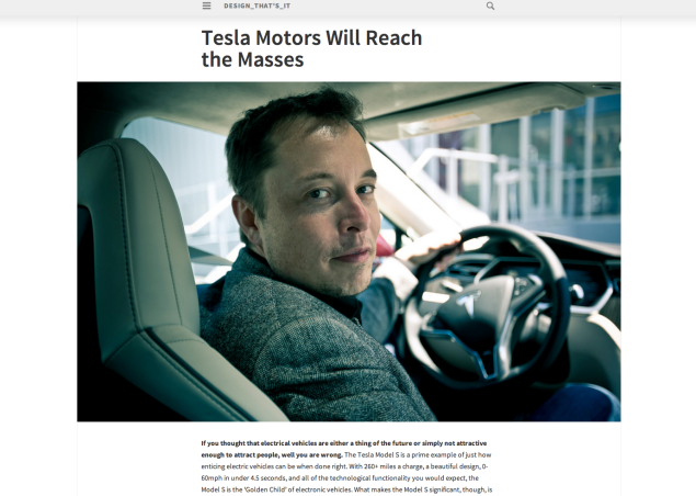
And we all want to be the Tesla of bloggers. We want to be the Tesla of everything. Guess I can be the Tesla of #HappyDonut eaters!
LikeLike
Just switched to this theme. Love it!
LikeLike
Beautiful themes! I guess it’s time to think about some changes in my blog’s appearance.
LikeLike
Me too – love it !
LikeLike
Excellent theme.
LikeLike
Very nice theme! The only thing I would change is the size or placement of the custom header. I found it a bit awkward that the header can be so wide but the page contents so much thinner.
LikeLike
The theme is good, but it will be good to have better font. Or is there any feature, I can change the font?
LikeLike
Yes — like Beyond the Black Mountain, the blog featured in this post, you can get the Custom Design upgrade, which includes Custom Fonts.
LikeLike
The theme looks good.
LikeLike
I love this theme! I just switched yesterday. custom features are cool too. I have been unhappy with some of the free themes of late. They never look anything like the ones advertised even after you try to customise them yourself. This one just took a few clicks and it was done. Beautiful!
LikeLike