


 |
The Art of Romance: Harlequin Mills & Boon Cover Designs |
I discovered this great book at Amazon, while I was looking for something else. Lucky find!
The cover art from romance books fills me with nostalgia. My grandma would read them and
she unloaded bags upon bags of them on my mom. I was drawn to the art on the covers then,
and I still am today. The color stories used in the cover art can be a great jumping-off point.
I use this book in that way—as an inspirational tool for color palette experimentation.

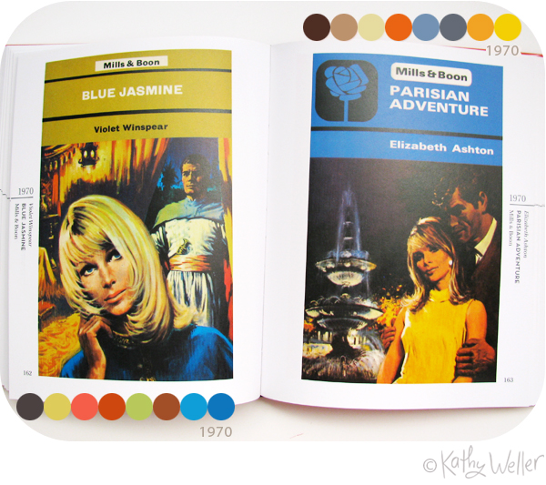
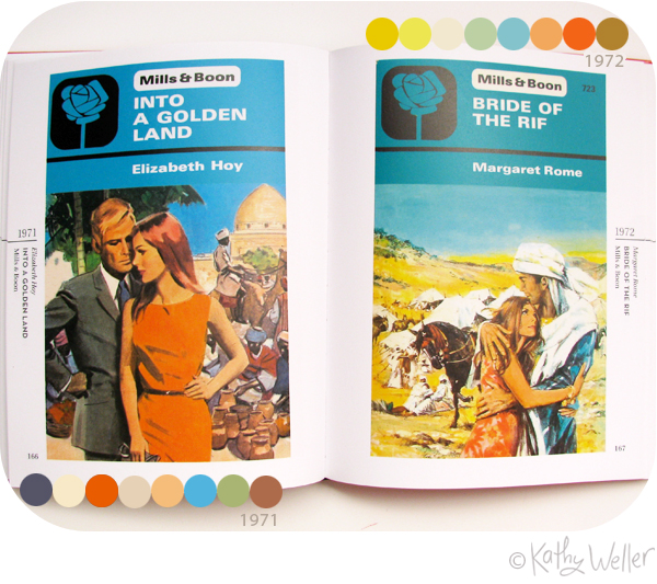
It's also cool to see how the color palettes change through the decades.
This one from the early 60's above, feels very very late 50's, just as
I understand the early sixties were (thank you, Mad Men!)

These from the mid-sixties are stylistically more textured, more
painterly, looser and the palette features more citrusy acid brights.
painterly, looser and the palette features more citrusy acid brights.
Turning over again, from one decad
0 Comments on "Romantic" color stories as of 1/1/1900
Add a Comment