new posts in all blogs
Viewing: Blog Posts Tagged with: Studio Bowes Art, Most Recent at Top [Help]
Results 1 - 13 of 13
How to use this Page
You are viewing the most recent posts tagged with the words: Studio Bowes Art in the JacketFlap blog reader. What is a tag? Think of a tag as a keyword or category label. Tags can both help you find posts on JacketFlap.com as well as provide an easy way for you to "remember" and classify posts for later recall. Try adding a tag yourself by clicking "Add a tag" below a post's header. Scroll down through the list of Recent Posts in the left column and click on a post title that sounds interesting. You can view all posts from a specific blog by clicking the Blog name in the right column, or you can click a 'More Posts from this Blog' link in any individual post.

By: Brian Bowes,
on 7/10/2012
Blog:
Studio Bowes Art
(
Login to Add to MyJacketFlap)
JacketFlap tags:
Illustration,
Process,
Studio Bowes Art,
children's books,
fantasy,
drawing,
Painting,
Watercolor,
The Legend of Sleepy Hollow,
Brian Bowes,
Add a tag
Summary: In a rush to submit work for an upcoming SCBWI conference, I share my process of painting Icabod Crane, which was developed over the course of a week.
I’ve been developing my own adaptation for The Legend of Sleepy Hollow in preparation for the upcoming SCBWI LA conference in August. There will be an workshop for Illustrator/Writers called a “First Look.” This my fledgling foray out onto the winds of storytelling, although those who know me, will know that I do love telling some pretty windy tales!
 Summary: What follows here is my story of becoming involved with my immediate neighborhood to solve the issue of an unsightly asphalt ramp. The result is an example of how we can use the power of illustration better the world we all live in.
Read the complete blog post here: steps-in-the-right-direction
Dear Reader,
Please note that I do publish my blogs primarily from my website. If you would like to stay up to date, use the above link, and you can subscribe to the RSS feed there. ~ Thank you, Brian

Well, wish me luck, the images have been submitted and the bill has been paid! Now it's all up to the judges at this year's Society of Illustrators annual show/ contest to vote on this year's winners and participants in the 53rd Illustration Annual.
For my submissions, I had to balance the cost and the number of images that I could afford to submit. I felt that 4 of the images that were created over the last year would be a nice representation. Of course I wanted to submit the piece that I did for the IMC, that was such a formative experience that I wanted to show the final piece. Also, in keeping with the Steampunk vibe, I entered my cover illustration for Steampunk Magazine #6.

Next up for submission and in a different genre, is the wraparound cover completed for PM Press' Noir Anthology;"Send My Love and A Molotov Cocktail." I submitted this one because of the over all feeling of the image, and because it is a little more concept and a little less figurative work, and besides all that, I just like it.

And finally, the piece that I have been working on for the past month or so, and that was alluded to in an earlier post, "A Curious Introduction!"

Watch for an upcoming process post about the creation of not only this image, but of the whole promotional piece that this is a part of, and of the considerations behind the core concept. But for now, these are my four entries, and I feel that they do represent where I've been and where I am at. Of course I live in hope that maybe one or more of these images might be chosen to be amongst the prestigious pages of the Society of Illustrators Illustration Annual #53! Only time will tell.
Links to other blog posts:
Click here to read more about the "Jetcycle Getaway," and part of my IMC experience.
Click here to read about the creation of Ol' No.6.

- "What have I gotten myself into now!"
"Humble" would be the word that can summarize my feelings about attending this year's Illustration Master Class. Never in my life have I been surrounded by so many incredibly talented and wonderfully supportive people. My plan is to revisit many of the ideas and experiences from this trip through different blog posts. I thought I would just start with an over view of the whole experience first.
The Illustration Master Class is a week long intensive workshop focusing on Fantasy and Science Fiction Illustration. Rebbecca Guay is one of the central organizers ( if not "the" central organizer, ) and she is supported by a faculty that reads like a "who's who" of Fantasy/ Sci Fi Illustration; Donato Giancola, Scott Fischer, Gregory Manchess, Dan Dos Santos, Julie Bell, Boris Vallejo, and Art Director Irene Gallo. This year's special guests were none other than James Gurney of Dinotopia and the Gurney Journey, and Art Director for Magic the Gathering, Jeremy Jarvis. If you don't already know these folks and have an interest in the this field of Illustration, I would HIGHLY recommend searching these folks out online.
The outline for the week went something like; arrive on Friday, meet the faculty and thumbnail/ sketch critique on Saturday, followed by a healthy dose of "Get the F to Work" on Sunday through Thursday, ending with a clean-up and open studio on Friday. Each day was punctuated by 2 talks given by one or two members of the faculty. These were great moments to open up my mind and just soak in the incredible talent and intelligence of the presenters. During the studio hours, the faculty would circulate between the 85 participants and encourage, guide, suggest, and paint with them.
My personal journey here started 2 days prior to the IMC, with a plane flight into La Guardia airport in New York. I was up all night the night before preparing everything that I could think to bring with me, maybe I brought too much, but I remembered my portfolio...at 3AM! Sheesh! In a focused hurry I printed out 7 new prints, and whammo, there's a new portfolio. I believe it represents the best of my work as it is now. It was kinda fun actually. I slept mostly on the flight, connected in Philly, on time to LGA in a little puddle jumper. I brought my drawing board ( the standard one, 24x26" ) on the planes. On the first flight it was in the overhead compartment, on the second flight it fit in plane's closet. To circumvent any hassle from the airlines, I played the neurotic-artist card, which seemed to work.
The evening that I arrived I crashed at my sister in law's house in Queens, where I found out that New Yorkers, unlike San Franciscans, like to eat tacos rather than burritos... which is just weird. The next day I had arranged to meet with Dorian Iten at the bus station to ride up together. We met at the depot and prepared for the 4 hour bus ride. Most of our time was spent looking at Dorian's portfolio from the past 2 or 3 years in Florence where he'd been studying. I don't mind saying that already I was feeling quite small! We made it to Amherst College around 3pm and signed up for one of two groups. I accidentally signed up for the group that was headed by Donato, Dan, Boris, and Julie. What I had meant to sign up for was the group which had Jeremy Jarvis, Rebbecca, and James Gurney in it, as they worked in water-media to one extent or another. It was like choosing between 'brilliant' and 'awesome!'
 This piece was commissioned as a wedding present by a friend of mine, for his friends' wedding. I believe that he's kinda hit the trifecta of goodness with this gift. Let me explain, in one way he's strengthened our friendship by believing in me and my aims to support my life with my art (which feels great, I must say), next he's generated more positive energy by giving a totally unique and personal gift to his friends, which all kinda culminates in generating the reciprocal esteem from his circle of friends as well as from myself. It's like a win, win, win.
Technically speaking, this piece was a fun one to work on. I guess sometime here in the recent past I'd become aware of my problem with soft edges. The manner in which I work tends to favor crisp clear edges, which I really like. However, even too much of a good thing can be not so good. It was my intention with this piece to create a soft feel for it. Not only for the technical challenge of it, but more so, because of the subject matter. Toss in a little diaphanous light, and we're starting to set the stage for romance! To see the results of the initial intentions, I would urge you to check out the shadows across the ground as well as some of the passages in the dress, and the bride's shoulder, or the groom's shoe.
I don't suppose that I would've have guessed at the onset how this image would affect me. But I am glad to say that after putting myself in a mind set of affection and love, that my relationship with my own lovely wife got a little bit better. Funny how focusing your mind and energies on everything that this picture represents can change you. I said before that "sometimes even too much of a good thing can be not so good," I should amend that and add, "..unless it's love."
My best wishes and warm regards go out to my friend, and my friend's friends!
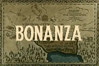
There are no doubt some of you out there who remember this show. I have many fond memories of the rump-bubbabump bubbabump of the theme song and all the cool cowboy stuff, mostly the hats. For those of you who've not had the Bonanza experience, basically it's a family from the old west who ran cattle. At some point they'd have to deal with branding the cattle.
This weeks challenge has to do with defining one's own brand. { but Brian, where are the week 5 and 6? You may rightly ask. Well, I've been working on some images, but they will be posted another time. } For now, this weeks challenge is about asking the poignant questions, and discovering the principles that underlie my work. Along with finding a color pallet, fonts, and images that help to support those key concepts.
I tackled this in two parts, the wordy part and the picture part. There are a whole list of questions that are designed to help initially define the brand. Like; What is it that my product/service does that makes it different? What do I do that adds remarkable, measurable, and distinctive value? What do I do that I am most proud of? Then there are some questions that were addressed in the beginning of the 12 week challenge about identifying clients. These questions all fit under the umbrella of the "Feature / Benefit."
Here are the answers to some of those questions.
How does my work add value?
• Through the hand crafted and unique technique my work strives to have a warm and personal quality to it.
• My work aims to engage the viewer's imagination through metaphor and implication (aka story telling/ narrative devices.)
• My work draws forth an emotive sense of the subject through imagery, color, and technique.
• My work achieves an understanding of the conceptual problem and creates a unique visual concept as a solution.
What is measurable about my work?
• Quality of craftmanship
• Engaging imagery
• A history of growth and development via blog (you're watching it happen before your very eyes!)
• Consistent theme/ area of focus/ audience
• Punctuality, meeting deadlines
What am I most proud of?
• A technique which is very personal, effective and unique.
What do you want to be famous for?
• I want to create memorable and inspiring images that will stand the test of time.
What is it that my product/service does that distinguishes it from others in my field? (15 words or less)
• My work is skillfully crafted to effectively communicate timeless adventures to a targeted audience.
• My work provides a unique visual solution through a distinctive and engaging technique.
• My services create visual content designed to engage and inspire our youthful imaginations.
So, you can see, that I have no problem setting up some lofty ideals for myself there. Time will tell if I am able to meet these objectives, but I have always been one to aim for the stars. For now, I am going to post this up an
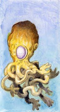
 "Goggles"
I am happy to have pulled this piece together... finally. The ardent reader will recall that this image was actually started some 7 months ago*. It is unusual for me to put something away like this, but at the time, well, let's just say "stuff came up," and leave it at that. For the last few months this piece was actually pulled of the board that it was taped to, and stuck on my wall... staring at me... watching... waiting. Every time I worked at my desk, it would be there, looking back at me all un-done.
So, I took this opportunity to set things aright, and pulled it down from its lonley and dusty place, taped it back up and started making moves. The process was realitivley easy going, almost alarmingly so, but perhaps during its time on the wall, it was ripening. Ah, such are the fruits of labor. For this painting, I didn't stop to take process pics, things just moved along smoothly from one stage to the next.
*I'm keeping this post short, but if you're interested in the first stages and the story behind the image, please check out the first post
{ here }, and the second
{ here }Stay tuned for more to come, there will be another painting coming up in the next two weeks. Thank you to everyone who's been leaving messages it's really great to hear from you.
Cheers,
Now we've come to the end of week 4 of the 12 week challenge. Arguably, we've entered the "fun" part of illustration, making images!
Before I move on to the painting, I have to say that part of this challenge for me has been about zeroing in on what I want to do, who I'd like to purchase my works, and how I can make a business of doing this. After looking at some of the other challenger's works, I have to say that I am at once, both terrified and filled with the "I'm not worthy" thing and, greatly inspired. This, of course is part of the inner, personal challenge. To be able to find my own self worth in the presence of other talented artists may be one of my biggest obstacles. Illustration is unique in this way, where we can find ourselves cheering on our friends while challenging them, and in return to be challenged by their now stronger works.
Now, here's the story of the painting! As some of you may remember from the earlier post "Alien Moon Phases," recently a friend of mine finished writing a fantasy novel, "Velor" which is looking for a publisher. In order to create a more positive and appealing property he decided to commission a few pieces of work from me.
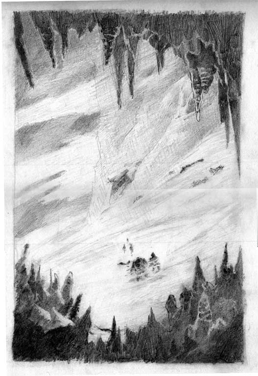
This is will be the cover image for the book, so we talked about some of the key concepts that he wanted to represent his story. High on the list were feelings of ambiguity, of being lost, and that kinda the main character in the story is the journey it's self. After discussing some key scenes in the book, we arrived at a moment wherein the band of travelers is lost in a mountain range and decide to take shelter in a cave.
 After a few thumbnails, we liked this drawing. The characters were ambiguous, the mountain is big and they are small, and the cave is threatening while offering shelter. I wanted this to be a "frying pan to fire" scene.
 Moving right along, this is the first image that I took after the first washes were laid down. As a technical note, I tried some new paper, an Arches 260lb hot press. In the store I liked the plate finish which seemed smoother than the 300lb paper, but not as slick as the Strathmore 500 series that I had been using. I thought I'd just give it a go. The paper was stretched, it was kind of attached to a board {wet paper and tape don't mix so well, I guess that's why everybody else uses thumbtacks... lesson learned,} and we're off to the races.

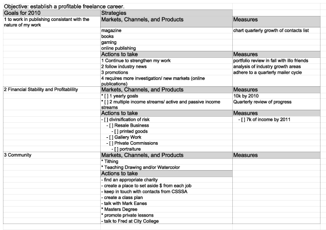
 Well, another week, another challenge. This week it is the Business Strategy whittled down to a nice 1 page document; the OGSM. Objectives, Goals, Strategies, and Measures is what OGSM stands for.
I will start off saying that this is a totally brilliant piece of information to generate for any business. Entering into the wild and wooly world of illustration, it is absolutely key. I see it as being a bit like a tuning fork. It allows me to retune to my initial objectives for my business.
However, getting myself to do this was like giving a cat a bath. I had all kinds of problems with focusing my vision in this way. Part of my problem was in trying to get my statement to be both succinct and realistic. Sure, I'd love to say, "by the end of 2010, I will have made 100k," but that isn't realistic for me right now. So keeping it real was important to me.
What was a little bit easier was the creation of a list of things to do. In fact it was so easy that I created a 3 page outline listing it all. The next challenge was for me to put this in a format that would be like the one presented. But, this is why having deadlines is good. Without a deadline I could've put this off indefinitely. So, here's me turning in my work.
I suppose I will need to review and renew this initial outline, but for now, it is a place to start, a structure upon which to build towards my objective for 2010: "To establish a profitable freelance career."

As ever, if you would like to make a comment, I am always glad to hear what you think. You can comment here on the blog, or send me an email through the contact link on my website {here}
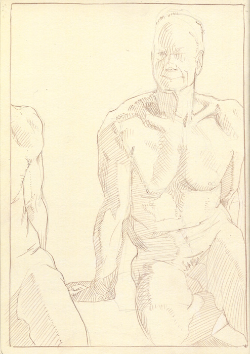
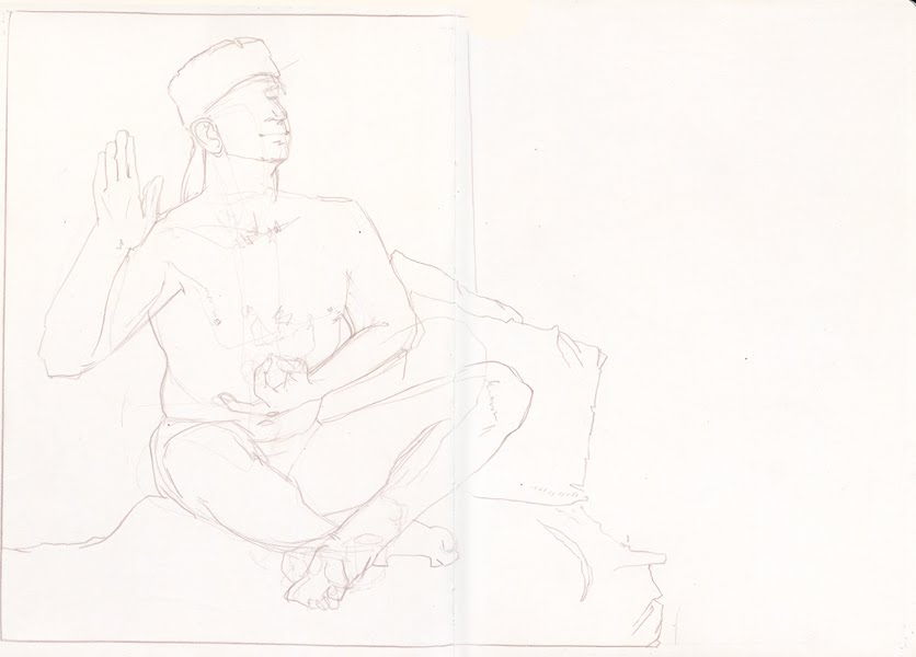
I have to admit that this most recent life drawing session was a lot of fun. How to explain, just good people having good times. Well, enough said, the pictures can speak for themselves.
 20 minutes
Ok, I can't resist making a few comments, these are all still so fresh at the time of this writing. I felt a few things coming together tonight, not just the good people, but on the drawing board too. It just seemed like I was able to concentrate on things like composition, on line quality, and center of focus.
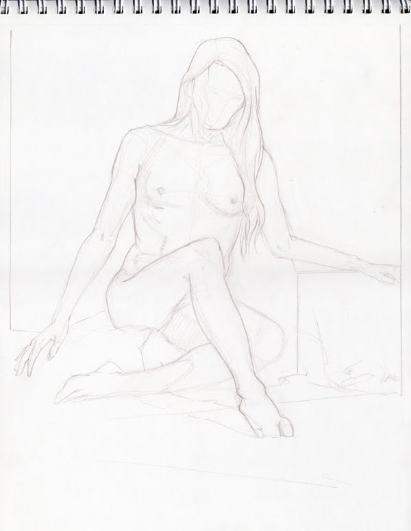
 1 hour
I have to admit that I am proud of this drawing. I feel like the pose says something along with the quality that the drawing seems to have. Don't ask me what it's saying, but it's saying it.
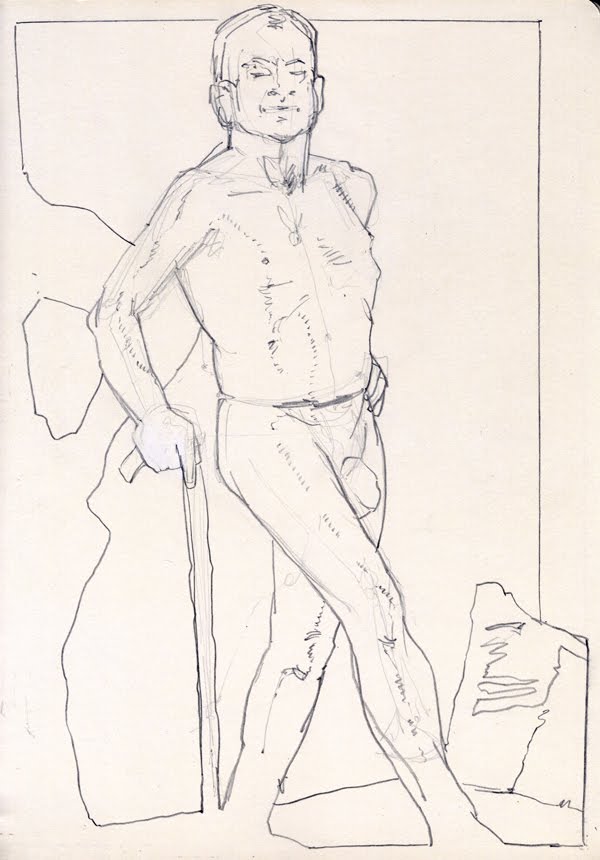
 45 minutes
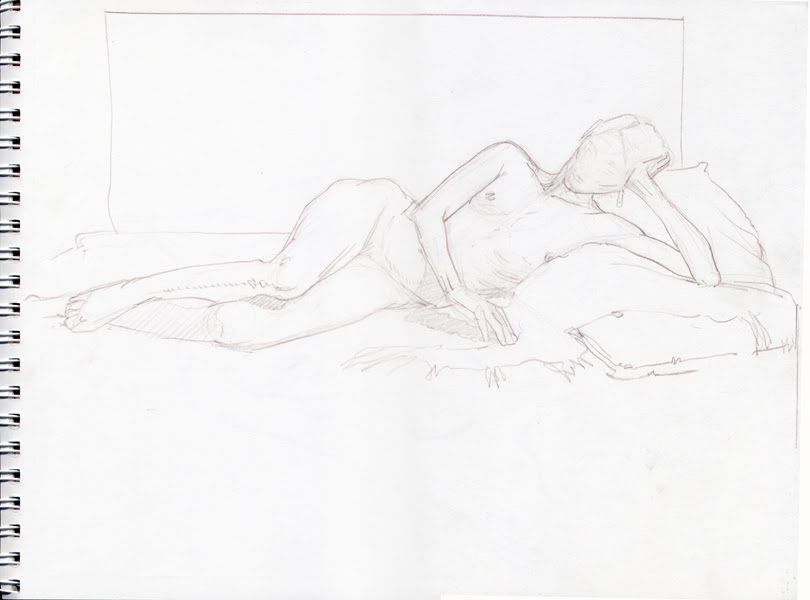
This was the final drawing of the night. Here I had some fun with splitting the pose in two. This is a tactic I may explore further some other time as well.
Hope you enjoyed these as much as I did making them. As always, feel free to leave comments and to share your own observations.
To see more figure drawing posts you can go
{ here }Cheers
By: Brian Bowes,
on 3/16/2010
Blog:
Studio Bowes Art
(
Login to Add to MyJacketFlap)
JacketFlap tags:
Brian Bowes,
Studio Bowes Art,
*Client Work,
fantasy,
drawing,
Process,
Painting,
Watercolor,
book cover,
Add a tag
 Recently I had the good fortune to paint the cover of Steampunk Tales #6. It so much fun to work in a genre that I really dig. I like to describe Steampunk Tales as a 'Digi-pulp.' They are really taking a great format that has propelled so many story tellers and illustrators forward from the past, and bringing it into the 21st Century by making it accessible to so many tech platforms. Sort of a past future in the present, much like Steampunk.
{ I've posted links at the bottom of this post where you can go to download the latest issue, please check it out! It's a lot of entertainment for just $1.99}
I really enjoy Pulp action and drama, and may have really started my romance with them after reading { and by 'reading' I mean 'mostly looking at the pictures,' } "Bradbury: An Illustrated Life, A Journey To Far Metaphor. Ray Bradbury was one of the first authors who really got to me. His work was a.) short, b.) rich with fantastic imaginings, and c.) just down right beautiful. I've been in love with his works since I was in my single digits. Moving forward, what I saw in this book was how he got his start through pulps and fanzines. Of course, next to each one of those stories were fabulous, bizarre, and wonderful illustrations. Many of those illustrators went on to have full and rich careers, but, in the beginning they were doing it in a spirit of adventure and a love of the stories. I don't mind saying that here too, in this same spirit, I wish to send down a tap root in the hopes that my works will, over time, blossom and bear fruit.
I like to share the process of how these images come about. I have to say right up front that I didn't document a lot of steps on this one, but what I have is here.
I guess what really got the ball rolling was a note from the editor that connected me up with the writer G.D. Falksen, whose authored a series entitled "An Unfortunate Engagement." He briefly described an scene wherein the Hero, Heroine, and Sidekick are liberating slaves from a Siberian airship factory. Already I was drooling, there is just so much to work with here; giant airships, explosions, narrow escapes... ahh the stuff that pulps are made of!
The first take that I was ready to settle on { there were many that ended up on the cutting room floor } was one that showed the Hero charging at the front of the masses, grit in his teeth, and explosions all around! I described it like this in the email: "Take 1: Our intrepid trio crests a hill ready for more action as the giant airship burns to the ground in the background. Airships! Ray guns! Action and Adventure!"
 As I continued to work over what was going on, I wanted to leave more for the imagination of the reader. Some of my favorite works of art allow the viewer to access what's going on. This can be done in an infinite number of ways, the way I chose was to allow most of the action to be "off screen" and to focus on the Hero and Heroine. The second sketch was discribed thus: "Take 2: The faces of two


I want and NEED to to go to this SOOO bad!
I'm in a funk with my art right now and I feel if I had the direction of legends guiding my way I could battle my way though the weeds. lol
I'm looking forward to hearing more of your IMC adventures.
Watermedia represent! lol
-baker
Thanks for posting Baker,
Man, IMC is such a boost. I will be slowly revisiting as many things as I can from it. It's one of those things that are really intense, but I think that the real learning comes from reviewing, and savoring it over time.