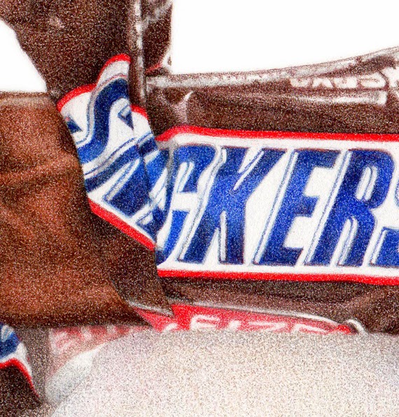
Snickers "fun size" bar
6" x 8", colored pencils on paper
Did I tell you my dream about Einstein? A while back I dreamed I called him up, and after introducing myself and telling him I was an illustrator, somehow (through the magic of dreams) we were sitting across a table from each other at a cafe or something. I started showing him my chocolate drawings, and he says to me (in that affable, smiley way, with the goofy hair) "You should do more!".
And right after that, I had this commission! The client wanted the wrapper torn 'just so', similar to my
Heath Bar drawing I did a while back. So I had the arduous task of tearing open wrappers and taking pics to email over, until I got one that was just right. (Of course 'someone' had to eat all those opened Snickers bars - good thing they were 'fun size'.)
I thought it was finished at this stage, below. I even signed it. The client loved it, but wondered very gently if maybe the wrapper could be darker?
She was right. Sometimes when you look at something for too long, you can have trouble really 'seeing it' properly. I went out shopping or something for a while, then came back and added some color to both the wrapper and the chocolate, and voila - perfect!
I used mostly Polychromos on this, except for the red on the wrapper (LOVE Prismacolor's Permanent Red), but then came back in with some Prismacolor chocolatey browns to add a little 'more' to it over all.
This was done on Stonehenge paper, since all of my other candy drawings have been on that, and I wanted it to look the same (I've been switching over to Fabriano Artistico Hot Press for other work lately.)
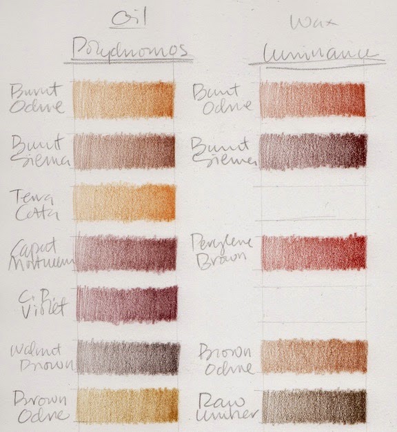
I decided to make a swatch chart of all my chocolate colored colored pencils, so I'll really know what I have to work with. Sometimes chocolate is orangey, sometimes purpley, and the shadows can go almost black. The wrappers aren't always chocolate colored, but when they are, the same thing applies.
Terrible scans of how the whole chart looks ...
And terrible close ups of them (sorry) so you can kind of see what I did.
I did Prismacolors, Pablos, Polychromos, and Luminance.
There are gaps, because at first I was going to try to match colors by name across brands, but that all fell apart pretty fast, and I ended up with a sort of disorganized mess. But it works for me.
(Every time I do swatches I have flashbacks to Illustration 2 class at the
Academy of Art, where we had to make watercolor and gouache swatches of all our new paints - and they had to be
perfect, an exact size, all lined up in straight rows ... actually I think we did them on watercolor paper, then cut them out and pasted them onto a sheet of illustration board with rubber cement - crazy, but they were beautiful, and I used them for years and years. But I digress ...)
This is what they look like when I just do them for me, and just want to get a splotch of color down so I can see what I have. It still surprises me sometimes when I think a color is going to be one thing, based on the casing or lead, then it looks totally different when it goes down on paper. Luminance are the ones that do that the most I think.
I have
Alyona Nickelson's
Colored Pencil Painting Bible, and in it she shows how she swatches her pencils. GURL, she be crazy (I mean that in a good way), but very thorough and totally impressive. She does color 'mixes', as well as un-burnished and burnished. I considered doing something like that with these, since its the mixture of colors that will make just the right chocolate color for each drawing, but then couldn't wrap my brain around how to do it without making it my life's work.
Alyona does have a cool tip about printing your swatches out onto clear paper (like overhead projector transparencies) so you can then lay them over a partially rendered drawing, and see exactly how a new color applied will look. I think that's worth a try.
But I know myself, and figure I'll just do tests as I go along, each time I do a drawing.
For fun, I just googled "drawings of chocolate", and found this
Pinterest page which has a lot of cool art (and a few of my pieces too).
I've made prints of this piece available in my
etsy shop.
Next up is a small architectural food piece . . .
The end of another year. Where did it go? This one really seemed to whoosh by.
I finished a nice house rendering commission just before Christmas. Isn't this a charming home? Its so nice to work on a piece that's something you like drawing. This was a special portrait of a family home for the owners, who will (sadly) be moving. So it was kind of bittersweet.
This was done with Polychromo and Pablo pencils on Stonehenge paper.
One big goal for 2013 is to expand my architectural rendering / house portrait business. I have samples done in different styles, and want to put together a commission page on my website, or maybe even a whole separate site, just for this. I work in color as well as black and white, and do colored pencil, ink, and watercolor. I also have some new exciting ideas for "alternative", more decorative styles that are not so photo realistic. So that's a BIG "to-do" thing on my list!
* * * * *
I posted this Teapot illustration a while back, and have now listed it as a print in the
shop.
Another goal for this next year is to keep working on all my shops. I have ideas for oodles of art and designs, but only two hands and 24 hours in a day. You know how it is! Guess we all have that. So I'm trying to balance out what I want to make (just because I want to make it), with what people will actually want to buy. (Sometimes they're not the same thing.)
I've also raised my print prices just a hair, especially on the really "ink heavy" pieces. I've learned the hard way that printers really love to drink ink! Especially magenta. I am very thankful for Office Depot's free home delivery service, which I have taken advantage of many times over the past couple of months!
Its a constant learning curve, crunching the numbers on selling things you make yourself, making sure you stay in the black. But that could be another whole post in itself. Prices for similar things on etsy can vary wildly, and I'm always amazed that some people charge what they do and seem to sell a lot, while others practically give it away and set the bar way too low. Don't even get me started on what people charge for knitting!
Anyways.
* * * * *
One of my artist followers, Koosje Koene in the Netherlands, has let me know about a new online drawing course she's offering.
"It's a six week course in which the participants will get weekly updates with tutorials, step-by-step instructions, video's, photos, and lots of practical tips on drawing techniques and illustrating. Unlike many other online courses, each participant will be provided with my feedback on exercises and assignments they do. Apart from that, the course is full of unique content, practical tips, tricks and fun."
Looks like fun. I hope lots of people sign up Koosje!
* * * * *
So guess that's about it for me, for now. Like you probably are, I'm half relaxing, and half making big plans for next year. We're having some nice California sun here, which is lovely. The cats are out sunning themselves on the back porch or in windows, while I make yet another cup of Peet's coffee and either draw or knit or do this or make lists.
I sincerely hope this next year is full of good health and prosperity and joy for everyone. Things have been rough for too long. There will always be challenges, but hopefully they will just be little bumps, not mountains.
Happy New Year everyone!
 The longest day of the year, the first day of summer, has arrived. Ah, sit back and relax, starting tomorrow the days begin to get shorter and school is here before we know it. Of course, the longest day is not more than 24 hours, but it gives us in the Northern Hemisphere the sun for the longest period of time.
  It appears to us Earthlings at its most northern point. At the North Pole, nearly the entire day is bathed in sunlight. Some years ago my youngest brother pitched summer baseball with the North Pole Nicks in North Pole, Alaska. The big game was on the Summer Solstice and played at midnight without lights! You can guess what the shortest day of the year brings the folks up north–darkness.
See NASA’s Solstice Animation –what the Earth would look like on the Summer Solstice if you were standing on the Sun!
The spin axis of our planet is tilted 23.5 degrees with respect to Earth’s orbit around the Sun. The northern summer solstice is an instant in time when the north pole of the Earth points more directly toward the Sun than at any other time of the year. It marks the beginning of summer in the northern hemisphere and winter in the southern hemisphere.
A few children’s titles come up with a keyword search, summer solstice, at the San Francisco Public Library: The Summer Solstice by Ellen Jackson, The Longest Day by Wendy Pfeffer, Mermaid Dance by Marjorie Rose Hakala, and Mermaids on Parade by Melanie Hope Greenberg.
Visit StarDate Online from the University of Texas at Austin MacDonald Observatory to get the latest Summer Solstice news for 2012. Enjoy your summer! SSPP Reads will post around the Fourth of July.
Reposted from June 2011.
Graphic from Flickr Creative Commons License by rupjones


 0 Comments on Summer Solstice 2012 as of 1/1/1900


You are going to be a busy lady! Wow! The online course looks like fun. I know exactly what you mean about balancing what you think people want to buy and what you yourself want to create. It's a hard thing, sometimes. Your pieces here are GORGEOUS! I love your style and the colors you choose. I'm glad to see that you use the Pablos, too. Not many people do, but I love them for the sharpness, combined with the softer prismacolors.
Happy New Year to you, too, Paula! The house portraits are great...such a unique keepsake! Your comments about keeping your etsy business profitable are interesting. I keep thinking I'll try to put some things up for sale, but haven't been convinced that it will be worth the effort. I guess I'll just have to take the plunge to find out. I always love looking at what you're working on!
I've got another thought for your "what to do next year" for you. See my email and this post http://makingamark.blogspot.co.uk/2012/12/the-home-front-making-mark-awards-2012.html
Paula, you are a true inspiration! A very Happy New Year to you too :) You have given me the courage to start my own blog this year to help keep pushing myself to succeed in my own art work. Looking forward to seeing more great work from you in 2013!
Happy New year!
Thanks for the mention!
The house is beautiful and I am in love with that pink tree out front. But the teapots are my favorite part of the post. SO CUTE and funny. Adorable. I love your style! As for pricing and such things, I'm coming up on the end of year 2 in my Etsy shop and I'm still working it all out. :)