Pudders, why did you choose this background for your blog, pray tell?
Why it is because I like ellipses...of course.
Some of you have expressed surprise and dismay that I abandoned my archy and mehitabel policy. They wants to know why and if it’s merely a bout of temporary insanity.
The why is easy: I was bored. It was get rid of the no-caps or find a new template. The one takes seconds, the other days. Not a difficult choice.
The no-caps rule lasted quite a long time. To be precise: from 25 May 2005 up till 8 Jan 2008. More than two and a half years. That’s AGES.
I don’t think the no-caps will return. Been there, done that. By all means continue to eschew them in your comments as homage to the way Things Used to Be. I’m all for stubborn nostalgia. I like it almost as much as I like change.
I received an email a while back from someone asking how I get my watercolour effects. Specifically, the granulation. Difficult one, as I have been mucking about with paint ever since my old dad got me my first basic Reeves box, when I was about four. So it's kind of second nature, precocious though that may sound. I break the 'rules' about mixing different kinds of paint (I do, frequently - gouache and watercolour) and I sometimes use old, and often dried up paints, frequently getting bits of dust in the wash. But somehow granulation always occurs in my washes, even though I hadn't heard of the term until a few years ago when someone told me I was doing it.

The main thing is, I watch my washes hawkishly, like a chef minds his (or her) sauce. This painting already has already two flimsy and dried washes. They go down loose, like liquid tissue paper...

...and when it is finished to my satisfaction, I get it levelled (or I might prop it a little, to push the darker paint into the shadow area) and watch it dry. It has to dry evenly, and naturally. No hairdryer. Ever. The upper photo shows the evaporating, dulling wash in the bottom right corner. This is what I watch, to check it is not drying too hard into the wash, which might create a tide mark. If it is going too fast, I might tip the board, or put a bit more water in, to coax and blend it into the existing one. It's a matter of squinting sideways and judgement. Then acting quickly and confidently if action needs taking.
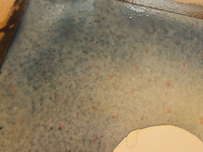
The granulation; basically a speckledy finish. And below, just to the side of the window, the pigment in danger of drying into a slight trough. If it is left it will create a darker line - so I tilt the board gently this way and that, to even it out.
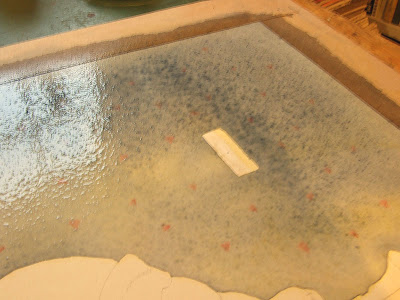
After about 40 minutes of babysitting it, I popped down to make some tea, and returned to a minor hiccup - the dark area had dried unevenly, resulting in a nasty little blotch.
Somewhat late for surgery, but some careful tweaking just about sorted it. Luckily it's in the shadow area where I will be putting in some pencil work, but I don't loose too much sleep over little mishaps - it's all part of the process. You can't teach this and the most disappointing answer I give - in reply to most things, not just painting - is it takes time, trial and error, which results in experience. Making mistakes and waiting are sometimes the best way to learn. Putting the time in can seem boring - but I don't have a magic, instant solution, and it works for me.

?
Did you know that the question mark is a stylised q on top of a very tiny o? It was monkish shorthand for questio, which they used to write at the end of a sentence to indicate it was a question.
!
Oh, and the exclamation mark is a stylised io, which means "exclamation of joy" in Latin.
&
This little critter didn't get a name until the 19th century, when it was taught as the 27th letter of the alphabet. The kiddies felt Awkward saying "w, x, y and and", so they said "w, x, y and, per se, and". Which turned into ampersand.
via Neatorama.
.jpg?picon=160)
By: Matthew Cheney,
on 5/11/2007
Blog:
The Mumpsimus
(
Login to Add to MyJacketFlap)
JacketFlap tags:
punctuation,
Add a tag
I've noticed recently that many of my students use single quotation marks to indicate irony. For instance, they'll write:
He had such 'beautiful' hair I couldn't help but say, "Hey, Joe, is your barber a sadist?"
I wonder if this is a development from email or IM or something, because it's easier to put single quotes around a bit of text than to italicize it. It's an interesting differentiation, too, because traditionally (in U.S. usage) double quotes have been able to indicate either a quotation
or irony (
scare quotes), which can be annoying, of course, but it seems to be a generally accepted usage. I actually kind of like the newer usage; there's a certain cleanliness to it.
What do people in countries where single quotes are the norm do? Does the phenomenon I'm describing even exist outside the U.S.? Does it exist outside my classroom? (Actually, I've seen one blogger do it, so I'm pretty sure it does.) Is this is usage with a long history that I'm oblivious to?


Hello PG and many thanks for another excellent and generous tutorial. It is so wonderful to see how your pictures develop.
Yes, mixing watercolor and gouache can certainly create wonderful, unexpected results. The more that we experiment, the more our instincts are strengthened. I always keep a little palette with a mix of these paints.
My introduction to gouache was years ago when I aspired to become a textile designer. That career did not welcome me, but how I have loved more about that medium, though I still prefer watercolor's transparency.
Let me stop typing, and get back to my own paintbrushes!
xo
How fun! I hope you show more photos as Bunchy progresses.
Love the dirty pink, also looks like pinks from Elizabeth's House in Marakeesh....
This is looking beautiful! I hope you post some pictures of Bunchy when it is all finished :) :)
I love the way you can see the colour in your head before you mix it, that is something I could not do! I admire what you do!
Can't wait to see how Bunchy turns out - looking lovely so far. Thanks for showing your work in progress, it makes the end result seem more real in some way ;-)
-Gail X
Thanks for those fantastic close-up pics of your mixing bowls! I love the process of mixing colours and most of the time, leave dried on colours where they are, just in case they're the perfect ingredient for the next one. I haven't ever yet mixed gouache with watercolour, but I'll certainly try it now. I can't wait to see the finished Bunchy :)
Don't you just love the whole process of applying washes? Have you tried Winsor & Newton's Potter's Pink - fabulous (new) Elastaplast colour with an unpredictable granulation. Wish I had the time to play with my watercolours these days...
I've always been drawn to watercolors and have always wanted to try my hand at them. You do such beautiful work. Come give me lesson, won't you? :)
I'm already loving bunchy. I had a dirty pink dog thing that looked very similar. Although to be more precise it was a pink square with ears and a face!!! But I loved it anyway, and of course it was named Pinky :) Your blog brings back many bittersweet memories
Kim x
It is always fascinating to me to see how other artist's work. It looks like you like to stretch your paper first, I am a great fan of stretched paper too. I love the way your painting is shaping up with it's wonderful watercolour grainy bits.
Looks like another beautiful painting in the mix ... I love your art!
What a great way to get the the right colour!
It's really fascinating to learn of the process. However you do it, you seem to achieve the perfect colours for these little creatures.
Grubby pink should be a crayola color! We used to use pink erasers (or rubbers, here) and they would get that same grubby pink.
Do you ever give tutorials to children?
hello gretel. great post about the chimney sweep and your artwork. i ws wondering what paper you use to paint on? i am currently experimenting with paint and am bit scared of all the different paper there is to choose from. dx.
hello gretel. great post about the chimney sweep and your artwork. i ws wondering what paper you use to paint on? i am currently experimenting with paint and am bit scared of all the different paper there is to choose from. dx.
PAD is the one in Preston-well thats the one i go to-you should check them out online-i am sure they will love your cards and also prints of your work. dx.
http://www.padshopandgallery.com/
Great post, Gretel. Love to see the process. I also enjoyed the intriguing phrase "counteract the slope of the studio."