new posts in all blogs
Viewing: Blog Posts Tagged with: Pen and ink, Most Recent at Top [Help]
Results 1 - 25 of 532
How to use this Page
You are viewing the most recent posts tagged with the words: Pen and ink in the JacketFlap blog reader. What is a tag? Think of a tag as a keyword or category label. Tags can both help you find posts on JacketFlap.com as well as provide an easy way for you to "remember" and classify posts for later recall. Try adding a tag yourself by clicking "Add a tag" below a post's header. Scroll down through the list of Recent Posts in the left column and click on a post title that sounds interesting. You can view all posts from a specific blog by clicking the Blog name in the right column, or you can click a 'More Posts from this Blog' link in any individual post.
I've a new book out for Christmas! The title kind of gives away who it's about!
Most people will think of L. Frank Baum as the author of
The Wizard of Oz, but he was an incredibly prolific author who created many other wonderful and classic titles, one of which is
The Life and Adventures of Santa Claus, first published in 1902.
Hesperus Press, which
focuses on publishing neglected classics, has just released a new paperback edition of the book with interior pen drawings by me.
Released on 1st December in paperback, I contributed 22 black & white drawings (note: the cover however is
not my illustration).
Book details are here:
http://www.hesperuspress.com/santa.htmlISBN 13: 9781843915904
Here's a taste of some of the interior drawings:
The blurb from the publisher's site:
Who is Santa Claus? We all know he is real, but where did he come from, and how does he deliver presents to all the children of the world? In this wonderful book, L. Frank Baum, author of The Wonderful Wizard of Oz
, tells the true story of Santa Claus, from being found as a baby in the woods to making the first toy the world has ever seen (a carving of his cat Blinkie), to the invention of the dolly, the Christmas stocking, the Christmas tree, his battles with the evil Awgwas and being granted the mantle of immortality so he can keep bringing joy to children for ever. Beautifully written, and with glorious new illustration by John Shelley, The Life and Adventures of Santa Claus
brings the magic of the Oz books to the life of Father Christmas. Introducing unforgettable characters like the Master Woodsman, Necile the Wood-Nymph and little Mayrie, who just wants a toy of her own, this is a book for children of all ages, and is as immortal as Santa Claus himself.You'll have to buy the book to see more!
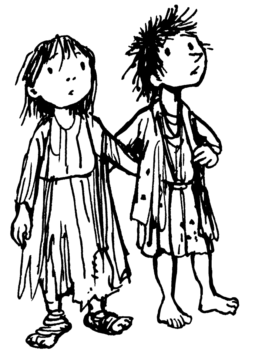
This was a fun book to illustrate, the narrative rolls on quickly with many scene changes that could have been illustrated. With limited space for illustration though it was a struggle to decide which passages to illustrate and which to leave. Inevitably I drew more than were initially commissioned, thankfully the publisher found room to include all.
Into the Woods. Day 31 of #Inktober2016.
It's the last day of Inktober, so here is my final offering. Happy Halloween everyone!
Maritime Mansion. Day 30 of #Inktober2016.
Housing Development. Day 29 of #Inktober2016.
Poor Children. Day 28 of #Inktober2016.
Today's Inktober is a little different - an extra illustration for a current book project, a new edition of Frank L. Baum's The Life and Adventures of Santa Claus. This was a 'warm-up' drawing to get me in the groove and test nibs, so a little rough and ready, though often first drawings have an energy that re-draws somehow miss! Unfortunately, although there are several sections featuring children it doesn't quite fit with any specific passage in the book, so I've not submitted it to the publisher with the other cuts.
I can show it here though!
The book is in production as I write, more news on that to come.
Ogre. Day 27 of #Inktober2016.
Split Ends. Day 26 of #Inktober2016.
Birds and Trees. Day 25 of #Inktober2016.
Aide-de-Cramp. Day 24 of #Inktober2016.
Tangled Relationship. Day 23 of #Inktober2016.
Tank Bike. Day 22 of #Inktober2016.
Ponderer. Day 21 of #Inktober2016.
Round the Neighbourhood. Day 20 of #Inktober2016.
Suburb Slant. Day 19 of #Inktober2016.
Neighbour. Day 17 of #Inktober2016.
Autumn. Day 17 of #Inktober2016.
Day 15 of #Inktober2016. Last night's sketchbook while half-watching the telly.
I'd not heard of "Inktober" before, but after a few recommendations, one of them from everyone's favourite anthropologist @DrAliceRoberts I thought I'd give it a go this year. The idea is to post on social media an ink sketch every day throughout October and tag it with #inktober2016 and #inktober. I wasn't sure at first whether the sketches have to be created the same day you post them or can be older, for the first five days of October it overlapped my series on Archives, which included ink drawings, so I just tagged those posts, but this week from 6th October onwards I've been tweeting fresh sketchbook doodles.
 |
| Day 6 |
Looking at the splendorous work from other artists tagged with Inktober some has clearly been laboured over for several hours, but I'm keeping very much within the spirit of the idea and just posting coffee-break doodles, and other down-times grabbed during the day, so these are very rough around the edges.
 |
| Day 7 |
In case you don't follow me on Twitter here's a summary of the last few days worth of
Inktober sketches. Anyone can join in, and it's not too late to start now... here's
more information  |
| I was offline on Day 8, but this for Day 9.... feeling somewhat adrift perhaps |
 |
| Day 10. In retrospect I think I might have been subconsciously channelling Mervyn Peake's Captain Slaughterboard |
 |
| Day 11 - messing about with faces on the TV last night |
I'm thinking, well, if I'm going to do it I shouldn't just limit to Twitter, let's put them on my blog, so for the remainder of the month I'll post one a day. Provided I can keep up that is .... lots to do, so few hours in the day....
Read the rest of this post
Number 8 in this series of ten archive items from my dad's loft are some surviving copies of The Blue Blanket fanzine, which briefly flared on the streets of Norwich from 1981 to 1982.

Three years in Manchester may have seen a mixed development with my artwork, but it had a profound effect on other aspects of my life - especially through music. It was a fabulous time to be in Manchester - I moved there at the height of punk, and left just before the Haçienda opened. I saw all the iconic bands of the era, from Buzzcocks to The Fall to Joy Division, and all their touring contemporaries. Despite poverty as a student I loved Manchester and often wonder why I didn't just stay in the city after graduating, but I was penniless and disillusioned with my artwork, there were no potential clients for my drawings and the prospect of looking for a job or signing on in Manchester filled me with dread, I couldn't see any reason to stay in the city. A temporary return to the family home was inevitable, however while I was in Manchester my parents had decided to leave the West Midlands and move to a village outside Norwich. It was an entirely alien world to me, from the gritty streets of Manchester to a hamlet in the Norfolk countriside, which I'd only visited there on holiday once. What was I going to do now?
My head was full of musical and creative frustration, I needed some outlet for this energy, I was angry, disillusioned, full of post-grad angst and resentment. I needed to get something off my chest....
 |
| Cut from Blue Blanket issue 4, 1982 |
Musical ambitions were never to be fulfilled, so I did the next best thing - I started a fanzine.
Why
The Blue Blanket? The first thing my parents did after I returned to the family flock, after throwing away my entire wardrobe of arty (to my eyes) second hand rags (in theirs), was to tag me along on a short holiday in Brittany. I was really not in the mood, but there was a large blue blanket at the place we stayed, and blue fluff seemed to attach itself to everything - long after the holiday we were picking bits of blue out of things. I wanted a magazine that would get into the crannies of Norwich, a blanket coverage that would stick everywhere. The name was a joke, but it also reminded me of
Der Blau Reiter art movement started by Kandinsky and others.... this was to be a magazine about art as well as music (or so I hoped). Hence
The Blue Blanket. The fact that I knew absolutely
nothing whatsoever about Norwich, it's music or art scene didn't seem to matter, in fact I saw it as an advantage as everything came to me fresh, and to my eyes there really didn't seem to be that much of a scene to discuss anyway. Today, Norwich has several venues and numerous galleries, but in 1981 it was more of a city of antiques and second-hand bookshops, there were only a handful of pub venues and two small clubs that put on indie bands -
The Gala (a former ballroom) on St.Stephens, and
The Jacquard on Magdalen Street, plus occasional gigs at the University of East Anglia (UEA). Nevertheless there was an energy in the city, with some ambitious local bands, an energy which I soon connected with.
The first issue of
The Blue Blanket extended to 16 sides of A4, printed (extremely badly) by the Freewheel Anarchist Bookshop in Norwich. It consisted of a manifesto, a news page, a band interview (the non-band Sans Culottes), some gig reviews and lots of opinionated noises from me (under various aliases) questioning whether Norwich was a creative cul-de-sac, a diatribe against the media, jokes, cartoons, an unplayable song and some truly awful poetry. I think the first edition stretched to 200 copies, some of which were stocked by HMV and other local outlets, Rough Trade in London offered to take some, and to my immense pride John Peel at the BBC gave it a shout out on his Radio 1 programme.
 |
| Spread from Blue Blanket #2, 1981 |
To my amazement it sold out, so I upped the price and print run and produced another one, followed by another, and another. My fanzine wasn't alone in Norwich (there was another
Is It Fish?, produced by Farmers Boys compatriot Kid Brian), but my policy was staunchly to focus on the whole of the local indie music scene rather than promote any particular band or cover touring acts. Succeeding issues ran features and interviews on Norwich bands The Vital Disorders, Carl Gustav and the 84's, Zod & the Universe, The Suspects, After Dark, The Higsons (author & comedian Charlie Higson's band!) and Popular Voice, though plans to include the local art scene as well as indie music never really materialised. By Issue Four the print quality had greatly improved and it still regularly sold out of it's much increased print run, it was actually turning over a small profit, but the job of writing, compiling, designing and selling it was becoming a burden, though by that stage I had a few contributors and the distribution was much easier. John Peel's encouragement kept me at it for a quite a while (he announced the release of every issue and phoned me up once to talk about the Norwich scene on air, tragically I was out!), but my energy was being pulled back towards my illustration career. The focus and self-discipline of running the magazine was giving me a more professional attitude to my work, it gave me the determination to research the market and produce a new portfolio of illustrations to show around London.
The decision to finally hang up ambitions of journalism and close the covers of
The Blue Blanket came when I was commissioned to illustrate my first children's book in 1982 - Jeremy Strong's
Fatbag, published by A&C Black.
I thought I'd lost all but one remaining copies of
The Blue Blanket, so was very happy to find a few surviving in my father's loft.
For the seventh selection in A History of my Archive in 10 Objects here are some surviving sketchbooks from my 3 years on the Illustration course at Manchester Polytechnic.
 |
| Collection of sketchbooks, 1978-1981 |
Okey, so this is cheating a bit - these are clearly more than one object! But the contents are pretty consistent and were all bundled together in my father's loft, so I think I can safely lump them together as a single item.
Actually, very little remains of my work from the years 1978-1981 while I was at Manchester, as previously mentioned on this blog I ceremoniously
threw almost all of my course work out of the 4th Floor window of Chatham House on the final day of the last term, keeping only my degree show portfolio work. It was an act of bravado, but also a statement of the frustration and disillusionment many of us sensed at the end, I felt I'd somehow lost direction during the course. So I was pleasantly surprised to find these sketchbooks still in existence in my dad's loft.
Unfortunately there's not much I want to share, most of the pages are testament to a struggle within confines I'd placed myself in as a pen and ink illustrator. Some time during the First Year I was told by my course head Tony Ross (yes,
that Tony Ross) that painting wasn't really my thing, I shouldn't worry about colouring and would be best served by concentrating entirely on pen and ink drawing, with just a splash of colour. I took this advice rather too much to heart and pen drawing was pretty much all I did for most of the 2nd and 3rd years. When I wasn't galavanting off to punk gigs I spent much of my studio time illustrating some of my favourite novels in black and white -
The Wind in the Willows,
The Lion, the Witch and the Wardrobe,
Treasure Island,
Tom's Midnight Garden,
Mrs Frisby and the Rats of NIMH... all really imaginative books for an illustrator to explore.
 |
| College project: Treasure Island, pen & ink 1980. This drawing survived as a degree show piece. |
I saw myself as a black-and-white specialist in the manner of E. H. Shepherd, Mervyn Peake and Edward Ardizzone, it didn't occur to me that in the late '70's fewer and fewer publishers were actually printing novels with text illustrations, that my heroes were all of their time. Most surprisingly of all (and this is something I was to particularly wonder about later), I either wasn't given, or chose to ignore, any guidance to study, write, or dummy
picture books, the stock-in-trade of any would-be children's illustrator!
Years later when I met Tony Ross again at Bologna I questioned him about this, and was told, "you have to remember John, it was a commercial illustration course, not a children's book course"... which only partly answered the question. Tony was the head of the course and a children's illustrator, I was the only children's book illustrator in my year (all the others working towards the broader illustration market). I'd set myself very narrow constraints, my pen and ink drawings were still clumsy, the sketchbooks are full of marginalia, doodles rather than dynamic ground breaking work. Maybe I'm being rather hard on myself, but looking through the sketchbooks now from a professional point of view, of the illustration work there's very little I would want to share, I'm not surprised I wanted to throw most of my course artwork out of the window!
 |
| College project: Mrs Frisby and the Rats of NIMH, pen & ink 1981. Another degree show survivor. |
However, mixed in with the heavy-handed experiments (which I'm
NOT going to show!) the sketchbooks also contain lots of drawings from life, sketches of those around me which bring back very clear memories of the time. As a break from struggling with pen and ink I drew fellow students, the things around me... it seems the more I tried to be a 'proper illustrator', the further away I was drifting from inspiration, yet the sketches from life have an authenticity and lighter touch I was somehow missing in my course work. Here are a few.
The most ready-to-hand subjects were the other illustration students on my course....
 |
| Fellow student Shirley Barker sketch mixed in with a page of course work on The Wind in the Willows, 1979 |
 |
| Melanie Dabbs, 1980 |
 |
| Bob Wood 1980 |
 |
| Jean Yarwood, 1981 |
 |
| Tammy Wong, 1981 |
... even occasionally the course teachers...
...then there were the places I lived...
 |
| A scruffy room in Didsbury, 1980. That's my Corona typewriter on the table. |
 |
| The All Saints campus from the Halls of Residence, around 1979. Student Union on the right, Oxford Road in the distance. |
...and there was the Thursday afternoon life class (regretably stopped half way through the course), which was a wonderful escape while it lasted as it was purely observed drawing.
My eyes were greatly opened by my time at Manchester, not least thanks to the Manchester indie music scene and my friends. The course itself though had narrowed my output and possibly development, but I don't exclusively blame the tutors, I've a tremendous respect for Tony Ross. We must have been a tough bunch to teach.
 |
| Tony Ross drawing in my sketchbook margin, I think he was encouraging me to make my animals fatter. |
In part three of 10 objects from the archive of objects found in my dad's house, I'd like to offer this.
 |
| School project: Toothless Old Man. Pen & Ink. 80cm x 60cm, 1976 |
After the tentative steps of the Henry Hudson picture I worked on two other school projects before setting to work on this large piece, which proved to be the most experimental and successful of my school drawings in pure pen and ink. It was drawn from a randomly selected photo reference using a multi coloured pen and ink line technique - on the face and hat I used three separate pen nibs to switch colours and gradually build up the drawing in different coloured cross-hatching, the waistcoat was filled in by dabbing ink with sponge. It was a labour-intensive technique for such a large sized drawing, but proved a great success. Sadly many of the coloured inks have faded over time.
The image was the centre piece of my school's 1976 art show during the summer festival, and made it to the pages of the local newspaper - my first press appearance! Even my junior school headmistress came to see it. By this time I was absolutely determined to be an illustrator and had my sights set on art college.
After the show this picture adorned the walls of my parent's house for a few years before being consigned to the loft. The identity of the man in the photo I never knew!
Number 2 in the discoveries made at my dad's house from long hidden archives of my work. In my wildest dreams I never thought I'd ever see this picture again, but there it was, in my dad's loft, warts and all, the very first drawing I ever attempted in pen and ink, from 1975, aged 16.
 |
| School project: The Last Voyage of Henry Hudson, copy of an engraving in The Graphic, after the painting by John Collier. Pen & Ink with watercolour on paper. 73cm x 51cm. 1975. |
Prior to this drawing I'd worked steadily but quietly at school on assigned projects. It was acknowledged that I was "good at art", but this was post modernist, late hippy mid 1970's, most of the art classes were light on drawing skills, heavy on texture and tactility, I found little to inspire me. Batik tshirts? Organic bio-plant patterns? Yeuk! No, I wanted to draw! Draw people! Things!
Away from school however I'd long since discovered the joy of the BIC biro, and filled old unused school exercise books with drawings, copied or inspired by WW2
Commando comics. After my dad bought me a couple of Adrian Hill guides to drawing and sketching I'd taken a sketchbook with me everywhere I went, and on every holiday over the previous year filled it with directly observed sketches from life in biro. This was all entirely independant from school. Finally a confrontation with a school bully ended up with the contents of my school bag scattered across the classroom floor, and my sketchbooks were discovered by my form tutor (and art teacher) Al Sayers.
Everything changed from then on. My wonderful art teacher Jackie Asbury (where is she now?) introduced me to a dip pen and a bottle of indian ink for the first time, and told me to draw something challenging. A 19th engraving of Collier's
The Last Voyage of Henry Hudson seemed to fit the bill. I knew absolutely nothing about Henry Hudson or John Collier, or for that matter pen and ink drawing, but I set to and produced this clumsy, tentative piece, little knowing that pen and ink was to become my chief medium for the next 40 years.
Well, this is what I wanted it to look like....
 |
| The source engraving, The Last Voyage of Henry Hudson, after the painting by John Collier |
It's embarassing - those terribly badly drawn hands... it bears little resemblance to the source image, how could I hope to reproduce an engraving with a dip-pen? I had a lot to learn, but it was a start, and I never looked back.
View Next 25 Posts