Comics design is something everybody appreciates whenever they walk into a store – in many cases, it’s one of the central reasons why they try a comic series they’ve never seen before. And yet it’s something which doesn’t get discussed as much as it perhaps should do, considering the importance of a good logo or cover design. Which is why I approached Dylan Todd a short while back to ask him a few questions about what comics design entails, what good art direction offers a comic, and where he thinks design should be improved within the industry.
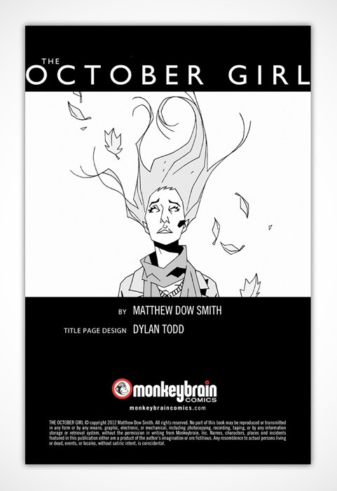
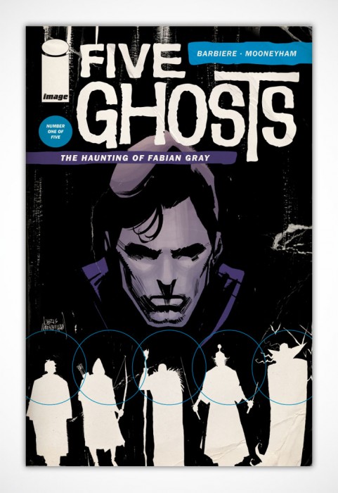
Todd is best known perhaps as the main artistic designer for Monkeybrain Comics, where he developed the design of their interior layouts, as well as the central logo for the company and several of the comic mastheads. He’s also worked on various other comics, including Frank Barbiere and Chris Mooneyham’s ‘Five Ghosts’; ‘Sacrifice’ by Sam Humphries and Dalton Rose; and many others. He’s a man who knows what he’s talking about, which is always a good thing when you’re talking to somebody like me – who rarely knows what he’s talking about.
He was kind enough to take part in an interview with The Beat about his process, what he looks for in a design, and just why it remains one of the most important facets in the creation of a series. His answers are fascinating, and well worth reading in full:
Steve: How did you get involved in design as a career? Do you have a background in art and design?
Dylan: Yeah, design is my career. For my day job, I’m an art director and designer in-house at a place here in Vegas. I started drawing in fourth grade, around the same time I discovered comics. I’ve always been interested in design, though when I was younger, I didn’t really know that was what I was interested in.
I remember the Dick Tracy movie campaign — which ran ads in every comic for months leading up to the release — being a real eye-opener for me, because it wasn’t just illustration, which I thought was what I was interested in, because there was also type involved and the copywriting style alongside the iconic, primary-colored illustrations. A few years later, I read or heard about design and thought, “Oh yeah; that’s what I want to do.”
Steve: Were you always a comics reader? I’m wondering if there may have been any dovetailing between an interest in comics and your subsequent interest and career in design.
Dylan: Until I was 10 or 11, I had no idea comics existed. But one night I slept over at a friends’ house and he pulled out a box of Jonah Hex and Nth Man and Masters of the Universe comics and my mind was blown. I grew up with Spider-Man cartoons and Wonder Woman TV shows, but had no idea that there were comics, too. And they came out every month!
The next day, we walked down to the 7-11 at the end of the street and he showed me the spinner rack full of comics that, somehow, I had never noticed before. I’m not 100% sure, but I’m pretty sure Fantastic Four #313 was my first purchase. I was hooked from then on out. I remember sitting in my friends’ yard with a hand-stapled comic, drawing the cover and taking a long time on the masthead (which was a perspectival, X-Men-ish thing) and our publisher logo. (Which was probably something like Cool Dudes Comics.) Way more time than on the actual cover.
Steve: How did you first make the move to work in comics? What was your first project?
Dylan: My first project was designing the cover for Curt Franklin and Chris Haley’s first collection of Let’s Be Friends Again strips, Under Pressure, which was a lot of fun to work on.
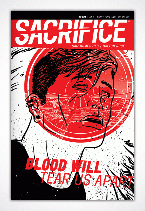
My first “big break,” was working with Sam Humphries and Dalton Rose on their self-published series, Sacrifice. Sam had followed me on Tumblr, saw some stuff I’d posted and hit me up to see if I’d be interested. I said, “Um YES,” because I’d just read Our Love Is Real, and knew he was super-talented. Then he showed me Dalton’s artwork with Pete Toms’ coloring on top of it, and I couldn’t resist.
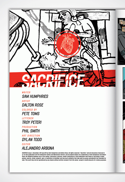
I’m a huge fan of everybody involved in that project: Sam, Dalton, Pete (who, if you haven’t read his comics, is just a real talent. Go check out On Hiatus over at Study Group. It’s hilarious and beautiful.), editor Alejandro Arbona, who’s the Associate Editor at Valiant now. It was intimidating to be included alongside those guys.
Steve: What would you say is the core goal of a strong design? Is the aim to convey as much as possible in as simple an image or design as possible?
Dylan: I think good design communicates. Period. Whether it’s minimal or maximal or in-between-imal, good design tells a story through art and typography and iconography. For comics, that’s usually a cover that catches the eye, lures a reader in, and gets them interested enough to plop down three or four bucks for, well, more words and pictures that tell a story.
Steve: Branding is a huge undertaking, and one which you took on for the launch of Monkeybrain Comics. How did that originally come about? Did Chris Roberson and Allison Baker approach you?
Dylan: I’d met Chris and Allison at an iZombie signing here in town and chatted with them while I waited in line to gaze uncomfortably upon the visage of Mike Allred. (He’s so dreamy.) I gave them my card and we started following each other on Twitter and stuff, chatting back and forth every now and then.
After Chris cut ties with writing for the Big Two, you could tell they were up to something, so when I got an e-mail to chat with them about “something cool,” I knew I wanted in on whatever this thing was.
Steve: What were the goals of the design? Was there a brief of what kind of identity they wanted for Monkeybrain?
Dylan: There wasn’t a brief per se, but we had a phone call where we talked about what they needed, the type of versatility the mark needed to have, what their end goal with the mark was, what sort of things it would be used for, etc. I’ve since developed a “new project questionnaire” that I give to new clients, but our phone call basically ticked off all the boxes there, so I knew what direction to be headed in. The only real restriction was that they had this icon they’d used previously for Chris’ novels, that literal monkey-brain drawing, and they wanted the mark to be fun, but not too fun that they wouldn’t be dismissed as not being serious enough.
Steve: If we take the main Monkeybrain logo as a starting point – this is a logo which uses the same image as Monkeybrain Books, but then adds to and around that central point. How did you approach building up the logo for Monkeybrain?
Dylan: So yeah, once we established the tone we wanted and set some parameters, I got started with my usual, what I call, “wool-gathering”: looking at reference, making word lists, sketching out rough ideas, building computer comps, deciding what to develop and what to toss. I remember looking through the Comixology publishers page and seeing which marks jumped out as you scrolled past quickly. With most things, it’s the simpler, easier reads that are memorable and jump out at you.
I think we went two rounds with the logo, with my first round being close, but overall too whimsical. (I’d had a gut feeling I was being too goofy, but went ahead and shared where I was at to get feedback) Once we looked over the first batch, I sent another round with the one we ended up going with. It was one of those projects where, as soon as I finished that comp, I knew that was the one they’d pick. Feels good man.
Steve: Did knowing this would be a digital launch affect the way you approached your design of Monkeybrain’s logo and branding? Your logo would need to be appropriate for a twitter avatar, for use on ComiXology – does there have to be an added versatility in design now?
Dylan: Oh definitely. I mean, end use of a design should always, not necessarily dictate the design, but at the very least, inform it. It’s something that you need to always have in the back of your brain as you go through the process, regardless of the project. But creating versatile marks and branding systems is something you’re trained to do in school. You need something that works horizontally, or can be stacked, something you can use as a social media icon, something recognizable when it’s shrunk down to an inch or blown up 3 feet wide.
Steve: Do you feel as though the rise of digital has now changed the way comics are designed as a whole? Instead of appealing to readers amidst a shelf of other comics, issues are now struggling for reader attention as undersized icons on, say, ComiXology.
Dylan: I think it’s still too early to say. I think there’s a lot of savvy creators who are definitely keeping digital in mind, but I also think there’s enough people who see digital comics as just a variation of the print product and approach it with that same mindset. It’s not that dissimilar from going from having a 12” LP to design a cover for, to a 5” CD to a 200 pixel iTunes album preview.
I think a good design by a good designer is going to work regardless of size, but I also think you need to remember how your art’s going to need to be used rather than approaching it in a one-size-fits-all mindset. There are titles I purchase digitally that I constantly manage to scroll past when I’m doing my digital New Comic Book Day shopping that look just fine on the shelf, but manage to get lost in the visual noise that is a digital storefront. Digital vs. print isn’t an apples vs. oranges thing, but it’s maybe an orange vs. grapefruit thing. Like, it’s still a citrus fruit, but it’s its own citrus fruit that’s consumed differently.
Did that make sense?
Steve: Looking across the various Monkeybrain covers and logos, the most striking thing is how different they all look, emphasising the variety of genre and styles in the stories the company publish. Was there ever an interest in creating a shared concept for the design of each book, or was this always the idea?
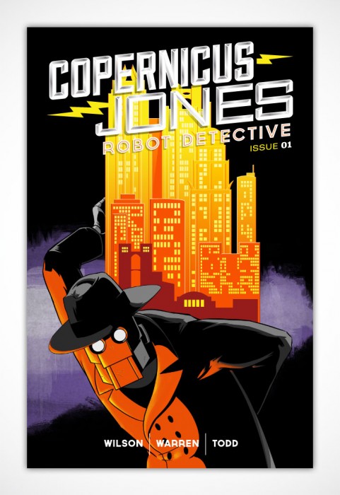
Dylan: The three MonkeyBrain titles I’ve done masthead design work for, Edison Rex, Theremin and Copernicus Jones: Robot Detective, are all wildly different books. I mean, one’s a supervillain-turned-hero book, one’s a psychedelic alternate history action thing and one’s a robot noir, so I’ve approached each of them from those starting points. From the beginning, Chris and Allison wanted to give the creators the freedom to come up with their own ideas and look while still managing to make it all feel like part of a whole.
One of the great things about MonkeyBrain — and one of the biggest challenges in coming up with their main logo and identity — is that they publish a crazy amount of different titles. So my goal was to find a mark and look that could apply to everything from superhero stuff Like Edison Rex or Anti-Hero, to stuff like High Crimes or Amelia Cole or Bandette or Strange Nation. With the exception of Edison Rex, I had no hand in developing the visual identity for any of those other books, but I had to make sure the templates I provided for the credits and bio pages, etc. were variable enough to allow for a host of genres and stories.
Steve: What influences the choices behind the fonts you use? “monkeybrain” here is in all-lowercase as well, which is possibly to highlight the company’s more informal and open approach to publishing?
Dylan: Will it completely blow the mystique if I tell you that the logo is that way because it made a nicer shape with only had the stem of the “K” and the descender on the “Y” sticking out of the shape of the logomark? Haha. I mean, yes, the friendliness of lowercase was definitely a factor, but the final decision came down to it looking nicer with most of the letters taking up the same visual rectangle of space. Sorry?
Steve: Fair enough! You’ll notice that lots of my questions are perhaps somewhat vague here, which is because I don’t know how to talk about design, particularly! I’m trying to learn. Do you find that people do tend to misunderstand or misrepresent the role of design in comics?
Dylan: Graphic design is really hard to understand in general. One of my professors in college told us a story about his dad, who could never understand what exactly he did for a living. My professor was home visiting and one of those Claymation California Raisin commercials came on. His dad looked at him, and said, pleadingly, “Is this what you do for a living?” My professor sadly told him it wasn’t. His dad finally, resignedly, threw his hands up in the air and said, “I’m never gonna get it.”
It’s a hard thing to wrap your head around. And really, design in comics hasn’t really been a thing until fairly recently. You have people like Jim Steranko and his work on FOOM in the 70s, but largely, it wasn’t until the Direct Market took hold and collections became a thing you could buy rather than hunting down back issues from retailers and comics started competing with books in bookstores (for younger readers, bookstores were IRL Amazon.coms) that designers were really brought in to make the product look like, well, a product as opposed to a pulpy, disposable entertainment module that was produced in the quickest fashion possible.

Steve: We’re in a period now where comics are being pulled apart more by fans and critics, and the role of colourists, letterers, inkers are getting more attention. With people like – for example – Jonathan Hickman placing a particular importance on design, do you think we’re starting to now see people pay more attention to art direction and design in comics?
Dylan: I hope so. I think people like Hickman, who has a good eye for design, and Jim Rugg, who won national design awards for his and Brian Maruca’s Afrodisiac, Rian Hughes’ work on the Valiant relaunch and now Dynamite’s Gold Key line, basically the entire output of Fantagraphics and Adhouse, the Steranko revival we’re seeing (his work on Marvel’s FOOM fanzine in the 70s is still some of the best superhero-related work out there), all are working to make comics look better, and that helps the recognition of design’s effect on comics.
Even having Chip Kidd, who is a fantastic book jacket designer (though I think his comics work mostly stinks), doing work in the comics sphere is a good sign.
The sad fact is that most comics design is pretty poor. And I get the reasons why: tight deadlines, overworked staff, corporate politics and cost-cutting, last-minute editorial decisions, being in this weird transition period between comics being this physical thing that sat piled on a shelf in a neckbeard pulp dungeon to something you can read on a future-tablet wherever you want. I get it, I do. I just want sexy, cool-looking comics. I want to try harder.
Steve: What do you want to see more from in terms of comics design? Or on the other hand, what concepts do you think we could do with less of right now?
Dylan: I’d like to see more experimentations, more risks, more pushing how a comic book is presented. More conceptual thinking and daring executions.
As far as what we need less of? Less covering up weak executions with textures or effects. Less “first idea is the best idea” concepts.
Also, more holofoil.
Steve: You write for Comics Alliance, and a few years back had a series of interviews with designers which I’d recommend people track down – in fact, with several of the people you mentioned above. Which designers do you admire, yourself? Which companies or books have especially strong work right now?
Dylan: Off the top of my head, my design heroes are Stefan Sagmeister, Milton Glaser, Jeff Kleinsmith, Chip Kidd, Rian Hughes, Aesthetic Apparatus, Bradbury Thompson, Paula Scher, Vaughan Oliver and the Australian duo behind We Buy Your Kids. I’m probably forgetting somebody, but those are the big ones for me.
As far as publishers who are really putting out top-notch work: Fantagraphics, AdHouse, manga publisher Vertical, 2000 AD/Rebellion. Lots of cool stuff coming out from Image, though that’s more a book-by-book type of thing, but I really like covers for Antony Johnston and Justin Greenwood’s The Fuse, Jasons Aaron and LaTour’s Southern Bastards. Fonografik’s work on Nowhere Men was excellent and his work for Saga is so simple and great. Tom Muller’s work for Ales Kot’s Zero and Jeff Lemire’s Trillium has been fantastic, surprising no one.
I’m not sure who did the design for the Manifest Destiny book, but that’s a really nice masthead. Vertigo’s FBP’s always looking on-point. I really like the design for Joe Casey’s Dark Horse superhero book, Catalyst Comix. Again, I’m forgetting a lot, but that’s what stick out in my mind.
Steve: What other projects are you working on right now? Where can people find you, and your work, online?
Dylan: Right now, I’m finishing up design for for Curt Pires and Jason Copland’s upcoming POP mini-series from Dark Horse, as well as finishing up an anthology I’ve been working on for the last six months or so titled 2299, featuring sci-fi future stories from Kyle Starks, Derek Charm, Nolan T. Jones, Kevin Church, Jordan Witt, Caleb Goeller, and a bunch of other people. It’ll be a 96-page-or-so anthology that we’ll have available through Gumroad in the near future and I’m really excited about it. Lots of dayglo future comics.
-
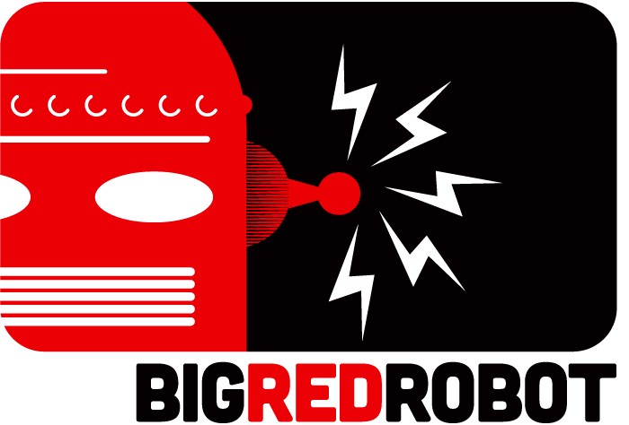
As far as where you can find me, my comics and pop culture design portfolio is located at bigredrobot.net (I have a non-comics design site as well at dylantodd.com). You can follow me on Twitter at @bigredrobot. I also have a bunch of Tumblrs, but my main one’s here. Guttersniper, which is more design/comics-focused, is here.
RED LIGHT PROPERTIES, now available in its first five issues through Monkeybrain Comics on Comixology, is a genre mixer with a gritty dose of realism that, for Eisner-nominated writer and artist Dan Goldman, hits close to home. Growing up in Miami, and aware of its hectic combination of cultures, crime, and mystery, Goldman ingested plenty of fodder for comics creation. A lifelong interest in the paranormal and occult has taken him down some unusual roads in storytelling, and his unlikely but all too human hero Jude Tobin couldn’t have a stranger profession: exorcist for haunted properties in Miami during the current economic slump. His methods “green light” properties that are bedeviled by hangovers from their violent pasts with a practical result of money in the pocket for our occult explorer as well as downtrodden home owners. It’s just a day in the life of a guy who ingests psychedelic substances to boost his own natural sensitivity to the spirit world in order to sell houses.

Goldman’s approach to comics storytelling establishes belief in a number of intriguing ways. Not only does Goldman emphasize the personal relationships in Jude’s life, dealing with a live-in ex wife who still has feelings for him, a step-son who is starting to display his own occult abilities, and wrestling with his own personal demons including his dead father’s ghost, but he also explores a relationship crux in the stories of many of the haunted properties. Many of the darkest emotions that haunt “red light” real estate spring from love and loss, and owners themselves benefit from Jude’s exorcisms by making peace with traumas in their past. Add to that the artistic methods that Goldman pursues, including use of photography and digital imaging, as well as increasingly experimental page layouts, and RLP delivers a hefty sense of realism alongside its phantasmagorical subject matter.
RLP has been a long-term project for Goldman as an indie creator, and he’s particularly enthused that the comic has now found a home at Monkeybrain. It’s the kind of comic that naturally makes you want to fire questions at the creator. It’s the equivalent of seeing a circus performer pull off a remarkable high-wire act while juggling weighty and disparate materials to create a unique spectacle. You want to ask, “How on earth did you do that?”. But I tried to ask him a few intelligent questions rather than just gawking at his handiwork.
HM-S: How did you come up with the unusual concept for RED LIGHT PROPERTIES?
Dan Goldman: It comes from the collision of a few things kicking around my head for many years: waking up at night and feeling someone watching you from the empty hallway, listening to my mom rattle off war stories of Miami real estate drama for twenty-odd years, my own experiences growing older in this body while trying to figure life out. I was working RLP for nine years before I drew the first page, trying to develop my visual style because the characters were already walking around in my head and I needed the chops to do them justice.
Red Light Properties’ owner/shaman Jude Tobin serves a dark mirror for me, person I’ve looked deep into and decided I don’t want to be. He comes off as an asshole but he’s really just misunderstood with bad communication skills. He and his family are utterly real to me, and that makes RED LIGHT PROPERTIES a great platform stand on and poke all these ideas about life and death and love and consciousness and failure, all using the language of comics.

HM-S: I notice that the setting is not only Miami, but multi-ethnic. What does this bring to the comic for you?
DG: The whole world is multi-ethnic now, I’m just reflecting it. The world grows richer and more interesting in places where cultures bump up against each other. I grew up in Miami, where the series takes place, before I ever traded it for New York City (or more recently São Paulo). All three of these cities are massive destinations for immigrants. It’s how I’ve always seen the world, so it’s only natural that it’s a part of this one too.
HM-S: Has researching the occult and haunted property taken you into some strange places mentally or physically, or is the background for the work purely imaginative?
DG: I’ve been researching the occult/paranormal since I was a boy. My grandfather died right after my fifth birthday and I used to see him around the house for years. After he passed, my mother shared with me something she’d read about Peter Seller’s death experiences during a heart attack and it just sunk down into my consciousness, emerging again around the time I got a library card. I think it was the same summer GHOSTBUSTERS came out. I was a weird little nerdling then; I used to ride my bike to the library during the summer (they had cold A/C) and I stayed mostly in the back aisle of the library, poring over musty old spirit photography books.
So whether it’s perception or just my overactive imagination, I’ve been plenty of places that made me feel things and theorize about them: my brother lived in an apartment that made my skin crawl the moment I set foot there. It turned out that the landlady’s sister committed suicide and she kept her ashes in a box in top of the closet (while he lived there). There are always touches everywhere I went and sensitivities to energies that I’ve been aware of… and whenever I dug deeper, usually found a cool story in answer to my questions.
That desire for the underlying pattern that explains how life/death works is where Jude Tobin comes from.

HM-S: Jude is a pretty extreme character who appears to struggle with a reason to live, “whacked out on drugs and living with ghosts”. What is it about Jude’s character that appeals to you and how do you think he appeals to readers?
DG: Jude’s tragedy is that he needs to take hallucinogenic drugs to fully access the spirit world and accomplish exorcisms, which is rough on the body and the mind. Cecilia asks this of him on a daily basis, knowing that it keeps him straddled between the living and spirit worlds… but without his work, they’re just another real estate agency in a depressed market. It’s Jude’s talent that drives the office, and she’s determined to be successful, even though she knows it comes at a huge price for her family.
He appeals to me because as any cartoonist knows, when you sit down to draw pages, you’re separated from everyone else’s world, coming up for air to eat with your loved ones and get a little rest. To Jude, his shamanism is a kind of art, so I relate to him artist-to-artist. I think that’s clear to readers too.
HM-S: Jude seems to have a sensitivity to the supernatural without the use of drugs, but he uses them to boost his consciousness, often further than he expects. Do you find it difficult to depict these kinds of altered states in comics form?
DG: Yes, as a baseline, Jude was born with a sensitivity to spirits. He knows when they’re around and can sometimes see them, but he needs a heavy entheogenic agent from his toolkit to amplify his abilities enough to project himself into the spirit realm and interact with them directly. There’s a whole logic to the way ghosts function in relation to the life/death membrane that I get into the book and how Jude’s drug-mixes relate to that.
Is it difficult to depict? Yeah. But it’s also the most fun part of drawing RLP. I love weird brain-melty comic page designs and surreal storytelling dropped in the middle of mostly-realistic stuff, so Jude’s work-trips are a perfect excuse for me to let any story off the leash and maul the reader’s eyeballs for a while.

HM-S: What about this comic makes you want to write and draw it?
DG: The initial germ started off as metaphysical questions but now all these characters are ALIVE IN MY HEAD AND THEY HAVE TO GET OUT. Getting the first chunk of the story done was literally a release of a decade’s worth of pressure in my skull — trepanning by comics — but the more I tickle them to understand their life stories, the more the whole story starts growing. I think I’m gonna be at this a while…
HM-S: What’s it like both drawing and writing the comic? Are there pros and cons to being your own creative team?
DG: The drawing for me is a lot hard harder than the writing, which just kinda flows out of me when I sit down. The art — especially getting it just the way I want it — is a brutal process, like squeezing juice out of oranges until there’s just nothing left. I’m always destroyed at the end of a story. It also takes longer; I think I’d be much more prolific if I worked with artists and just worried about the script… but I don’t know anyone who can do RLP the way I do it.
HM-S: I notice the use of photographs blended with artwork. Is that a form you think is particularly suited to comics?
DG: It’s just a style that I’m playing in; RED LIGHT PROPERTIES actually combines photography and rendered 3D models and digital artwork together into its comic pages. I’m comfortable using whatever tools are at my fingertips to give the stories the most impact I can.
Comics are a fluid and evolving medium anyhow, stories made using words and pictures. I have zero patience with anyone who insists otherwise; I just smile and nod as they tell me about which Windsor & Newton brush they like best.
HM-S: While there’s the overarching theme of the occult and supernatural, relationships seem to be a major focus of the series, from Jude and his ex-wife Cecilia, to the stories behind the properties. What role do you think relationships play in the comic?
DG: The relationships are everything in RLP because that’s what makes characters worth caring about. I purposefully make their little tensions and joys as dramatic than the supernatural events, things that would be horrifying to us but they’re totally desensitized to after years in the business. That’s interesting to me as a creator and reader: I want to know what this kind of work, and what trying find meaning in the living world while surrounded by spirits of the dead feels like.
Where the casework, the haunted properties, come in is to ground every ghost stories in something human. Having a poltergeist throwing dishes around is neat visually but it’s got no emotional meat to it. When you find out the tragic reasons and complicated metaphysical structures behind those flying dishes and how to “treat” the house, suddenly the scenario demands more of your attention than just a Hollywood BOO!-type scare.

HM-S: A lot of the more seemingly fantastic elements of the comic, from occult rituals to bizarre murder cases, are actually pretty firmly grounded in reality, aren’t they? What do you think is the value of talking about subjects like pedophilia, murder, and the afterlife?
DG: Placing RLP in the “real world” demands that, doesn’t it? Miami is a violent and vapid city where crazy things happen every day, and these good and bad things are all part of human experience. When you’re delving into the reasons why spirits linger in a structure, that’s historically been the explanation for hauntings (though I’ve got a doozey coming up that gets into the inverse of that).
What draws me to telling ghost stories (versus, say, zombies) is that they’re not just the shells that remain of who we were but echoes of the dreams and experiences that aren’t ready to let go, for whatever reason. And the spectrum of reasons behind that is rich material to tell all kinds of stories with.
HM-S: I notice that “A Series of Tubes”, issue #5, really branches out in terms of panel design. In creating and designing the artwork for the comic, have you had any surprises or discoveries?
DG: I’m so happy you brought that up. I’m very proud of A SERIES OF TUBES… I’m not sure what started happening there, maybe I just really let myself go with those layouts and got all free-jazz with them. The end result is a direction I’m continuing to push in with the new stories I’ve been working on.
The biggest discovery that came from that was how little of it was conscious. I’m a heavy full-scripter and a very loose sketcher, and when I finished the story and read it, I was transported, like I was reading someone else’s work. That’s a good sign to me.

[Photo by Seth Kushner]
HM-S: So what’s the history of RED LIGHT PROPERTIES in terms of production? How did it end up at Monkeybrain?
DG: In the three years I’ve been creating this series digitally, I’ve stayed free enough approach the series from different directions without being locked down to a single format or system. RLP started off as a free publisher-sponsored webcomic serial, it became DRM-free digital issue downloads on its own site, and now it lives at Monkeybrain Comics as an exclusive part of Comixology.
It was always the intention to tell these characters’ stories in an ongoing series like this, though at launch I saw it as a series of graphic novels because the digital marketplace hadn’t really happened yet. This whole time, I’ve been watching my creator friends having a blast in a floppy-to-trade world, and I’ve developed a really intense case of “ongoing series envy.” Until now, all my books have been for the book trade; the only time a comics publisher has ever published my work was a 4-pager I had in Image’s POPGUN anthology. But comics are born from serializing, designed for series. In the book trade, it’s something they’ve learned from us and had great success with. So when it came time to make a new change, doing an ongoing series of digital issues seemed like the cleverest route. No shipping delays, shortages, returns, or waiting on the publisher.
And in the digital-first series world, becoming part of Monkeybrain Comics was an obvious choice. They speak fluent internet. They’re the tiny mammals eating dinosaur eggs, poised to inherit the landscape. That’s something was already a part of, but we are stronger together. Being able to publish easily and quickly to Comixology in multiple languages on all major platforms (except videogame consoles, right boys?) means I’m maintaining almost as much control as I had rolling solo, but now I’ve got distribution and discovery on my side as well. It’s a huge flaming sword to cut through the noise with.

[Photo by Seth Kushner]
HM-S: What’s coming up for RED LIGHT PROPERTIES? What are you most excited about?
DG: Word of mouth around Miami is going to bring the Tobins a lot more success and attention than they’re prepared to handle, which is going to cause all kinds of problems for them, professional and personal. There’s a long road ahead for Jude and Cecilia, and I’ve got many stories in the can, just waiting to get out.
Presently, I’m finishing up the remastering work on the existing part of the series, making the early pages and script the best I can before releasing them as digital issues through Monkeybrain. There are print collections coming too but it’s not the time to announce anything just yet.
I’m probably most excited about finally seeing these characters in print; for three years, I’ve been watching them jump screens with nothing new for comic shops or book stores or my table at conventions. That’s all going to change soon, and it’s gonna be glorious.
HM-S: Thanks for the in-depth insights, Dan! You do realize that you’re going to make all your readers think twice before buying a new house, don’t you? Well, we know who to call, at least.
Hannah Means-Shannon writes and blogs about comics for TRIP CITY and Sequart.org and is currently working on books about Neil Gaiman and Alan Moore for Sequart. She is @hannahmenzies on Twitter and hannahmenziesblog on WordPress.
By Steve Morris
SDCC only finishes once Heidi finds out where in Stately Beat Manor I’m currently hiding (under the rug? down the stairs? behind the curtain?), and throws me out once and for all. With that in mind, Chris Roberson and Allison Baker’s digital publishing company Monkeybrain Comics had a big panel at the event, which saw some new titles announced.
Amongst them were books by Joe Keatinge and Joshua Williamson, as well as an anthology title edited by Chris Schweitzer. Here’s the full list of titles announced, to go alongside the five books already released by the fledgling company:

WANDER, by Kevin Church and Grace Allison
A fantastical story about a woman from Earth who ends up in a magical, fantasy world.
MASKS AND MOBSTERS, by Joshua Williamson and Mike Henderson
A 1930s/40s crime story about the mob, unsurprisingly, as they find their business interrupted by the birth of the superhero.

INTERGALACTIC, by Joe Keatinge and Ken Garing
A ‘realist’ space story which explores what would’ve happened if humanity had kept pushing for space exploration. There are no aliens in the book – this is about a family who try to keep themselves alive in the depths of lawless outer space.
KONQUEROR, by Chris Schweitzer and Audrey Morris
This sounds like the book we all wanted Amethyst to be. Silly sci-fi, but with politics mixed into it. And also, according to Schweitzer, there is a character called Princess Thunderpunch, so she sounds lovely.
ROUNDUP, edited by Chris Schweitzer
The anthology title I touched on above. This will feature a number of creators like Kevin Church, Stan Lynde and Matt Kindt, all writing western-themed stories which last around 8-12 pages.

DREAMSEQUENCER: SPIRIT OF THE LAW, by Brandon Seifert and Michael Montena
This is also an anthology of sorts, but really just a chance for Seifert and Montena to do stories about whatever they want, with no real theme interlinking them. Just whatever takes their interest.
AWESOME ADVENTURES, by Chris Roberson and Thomas N. Perkins IV
A family of explorers go out and have weird adventures – a little like the Fantastic Four, perhaps, just by means of simple comparison.


A really fun title, highly recommended.