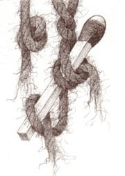
2.5 x 3.5
Polychromo Walnut Brown on PAPER
ebay
I bought some Rives BFK print paper last time I was at the store, and thought I'd better try it!
This is a HUGE departure from my usual illustration board. HUGE I tell you.
I've always loved illustration board for its durablility (doesn't crease easily, its more sturdy) and versatility (you can use all kinds of media on it).
But you can't see through it. That's a major drawback. It makes it really hard to transfer finished drawings, especially for colored pencil work (if you do the usual "lay the drawing down on top and trace over it to transfer it" it leaves a groove in the board, no matter how light a pressure you use, and that's not a good thing for pencil work.)
What I've been doing with the board is this labor-intensive "scan the drawing, clean it up in Photoshop, then print it out really really really really light onto the board with my Epson 2200 printer".
Well, that works, but its kind of a drag. And the printer only goes 13" wide, so if your board is wider than that, then what do you do? You can see the problem. (Except for all of these little pieces ~ I just draw them freehand directly onto the board. I'm talking about more involved illustrations.)
So this paper works with a lightbox. YAY!
And I like the paper. Not as well as the board, but its OK. It doesn't take many layers of pencil. I think it will be good for this monochromatic kind of work where I don't have to do too many layers anyway. But I think for really heavy handed many-colored and layered kinds of work, it wouldn't hold up.
The paper is soft and lovely, but that's the problem. The tooth squishes down too fast (if you do colored pencil you know what I mean by that.)
The other interesting thing is that the Walnut Brown color looks different than it does on illustration board.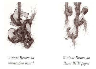
Do you see the difference? It looks softer on the paper, and it also doesn't go quite as dark.
I used cream colored paper ~ I think. I know that sounds stupid. I remember there was a grey (which I didn't want) and this. I know they make both white and cream, and I'm pretty sure what I have here is the cream. I guess I get to go back to the store and check, or order some white from online someplace. (I've already searched online, and when looking at the little color swatches of both colors, what I have here actually looks like something in between the two, which is no help at all!)
Remember when art was easy? You just had your little box of crayons and some construction paper?
To see all the Yarn pieces in this series side-by-side, please go here. Or visit my ebay store to see which are available for sale.
All images and content herein are © Paula Pertile and may not be used or reproduced without permission.
Viewing: Blog Posts Tagged with: Mona Lisa, Most Recent at Top [Help]
Results 1 - 3 of 3
Blog: Drawing a Fine Line (Login to Add to MyJacketFlap)
JacketFlap tags: illustration board, Polychromo, Polychromo, illustration board, Walnut brown, Rives BFK, Walnut brown, Rives BFK, Add a tag
Blog: So many books, so little time (Login to Add to MyJacketFlap)
JacketFlap tags: mona lisa, Add a tag
Most of the book trailers I’ve seen have consisted of clip art that doesn’t go together, accompanied by music I’ll bet wasn’t appropriately purchased. They weren’t professionally made, and they look it.
Now The Bookseller says, “A new project to create film “trailers” for books is being launched by The Bookseller, in partnership with the Random House Group, Play.com and the National Film & Television School (NFTS). The inaugural Book Video Awards will see NFTS students and alumni develop 90-second films based on three novels to be published by the Random House Group early next year. The videos will be launched in March 2008 and screened via Play.com, thebookseller.com, YouTube and other viral sites. The winning film-makers have already been selected by a panel of judges including NFTS director Nik Powell, acclaimed producer of “Mona Lisa”, “The Crying Game” and “Little Voice”.” [Full, totally unrelated disclosure: when Nat King Cole recorded Mona Lisa, my dad was the only person in the audience.]
Read more here.

Blog: The Ballyhoo (Login to Add to MyJacketFlap)
JacketFlap tags: Mona Lisa, Loren Long, Painter X, Divine Proportion, SCBWI, Mona Lisa, Loren Long, Painter X, Divine Proportion, Add a tag
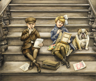 I have been trying to get in the habit of posting a digital painting or writing tip each week. But what is that saying about the road to hell….something about it paved with good intentions? Every week might just be a little too ambitious with my schedule.
So here is the tip for this week…
Many of you have probably already upgraded to the new Painter X And if you have not then here is one of my favorite new features. It is called the Divine Proportion tool.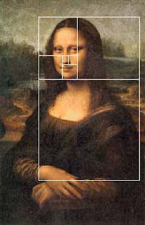
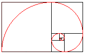 Divine proportion in art is sometimes referred to as the Golden Proportion, Golden Number or if you are a real geek, the Fibonacci Series. The golden number is basically 1.6180339887 otherwise known as phi. Inside of the big rectangle is another rectangle that has an exact ratio of 1:1.618. Inside of that rectangle is another rectangle with a perfect ratio of 1:1.618. Probably the most famous example of The Golden Ratio used in art is Leonardo's Mona Lisa The Golden Ratio can be found in Mona Lisa’s enigmatic face. Shown here:
I have always been fascinated with the idea of Math in art and always try to be aware of planning a composition so that that main action does not fall into a dead zone. The example above is the art I created for the 2007 SCBWI Publication Guide. (available to members at www.scbwi.org) Because this art was created to fit into a small space, I am going to use the divine proportion tool from edge to edge.
Here are the steps:
Step 1: Go to Window/Show Divine Proportion. The tool’s interface with look like this: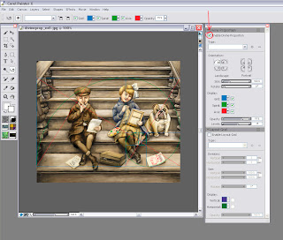 Step 2: Check the box for “Enable Divine Proportion” at the very top.
Step 3: You can now alter your Divine Proportion tool to match your composition. In this example, I selected a vertical orientation for my divine proportion because I want the eye to be carried up the stairs but the focus to be on the little girl’s expression. (In my original sketch she did not fall in this location so I moved her.
Here is an example with the image screened back so you can better see it: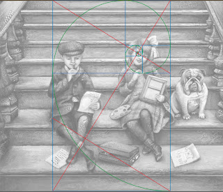
You can also change the rotation and the scale of the divine proportion by tinkering with the controls below the orientation. In most cases, you will not want your divine proportion to go from edge to edge. This image is postcard size and there is not a lot of empty space so the viewer takes the whole thing in at once. In a larger painting this will not be the case.
So of course, I started to wonder if other artists use Divine Proportion in their art. Here is an illustration from the super talented Loren Long and a good example of when you would move the Divine proportion tool.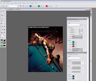
In this painting the viewer would not take in the dark space in the back. It is intentional dead space – sort of like an area for the viewer to rest before they take in the main action. In music, we would call it the build up. So if you move the Divine Proportion tool to encompass only the man then you will see that it falls perfectly into a golden ration.
You move the Divine Proportion tool by selecting it in your main tool bar. It looks like this:  When you move your cursor over your painting, your cursor will turn into a hand so you can position your Divine Proportion guides manually.
In Loren's painting, the first main rectangle encompasses the sweeping motion. The second rectangle encompasses the perfect hand to elbow to face ratio, and then the smaller rectangles encompass the concentrated look on the man’s face.
The composition is perfectly planed. Now let’s take a moment to hate him, but I suspect that Loren is not conscientiously aware of the math behind his art. Most artists do this naturally. For the rest of us….there’s the Divine Proportion tool. Loren has a New Book out now that is stunning as always.
But if all of this makes your head hurt then there is also the good old rule of thirds to go by. In the box below the Divine Proportion tool there is an option to turn on a layout grid. The layout grid will at least tell you if your main action is falling into the thirds of your painting. You can find this option here: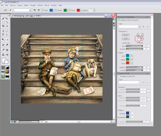
If you would like to learn more about how Math works in art then I recommend Rhythmic Form in Art by Irma A. Richter
I hope this tips help. If anyone is interested in how to do the same steps in Photoshop (not quite as easy) then please comment below and I will make that next week’s tutorial.


Looks like you've been having fun experimenting. Thanks for sharing your discoveries. Adding objects to your yarn pieces makes your work more unique than it already was. Bravo!
I have used both Rives and Strathmore 4ply illustration board.
Made a big mistake once with a large, highly detailed (layered) piece by starting it on Rives.
It stopped taking layers of color before I was 'done'. Had to abandon the piece.
Illustration board presents the same, non-see-through problem for me. I like your solution.
I use a different solution, but it's about as labor intensive.
http://www.lesliehawes.com/wordpress/?p=262
Oh, the sacrifices we make.:)
And to top it off, a number of years ago Strathmore 'changed', 'improved' their board, and now it is too spongy for my liking.