Guest Expert: Sharat Potharaju
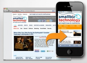
 Research by Gartner has forecasted that by the year 2013, mobile phones will overtake PCs as the most common Web access device worldwide.With mobile market expected to reach 1.7 billion by 2013, a major bulk of your audience will be viewing your website or blog on a screen that takes up just a few inches. The rapid evolvement of mobile ecosystem, supported by availability of high-end mobile devices (including tablets) and better internet accessibility makes it an absolute necessity for content publishers – authors/bloggers/webmasters – to provide mobile friendly content that can be consumed by your target audience, on the move.
Design it for Mobile, but keep the User in mind…
Creating a mobile-friendly version of your content isn’t just about reducing the form factor to fit the small screen. In fact, as a publisher you have to factor in the mobile user experience as well. The following elements will help you balance the limitations of the small mobile screen with your audiences’ expectations:
• Style your designs for mobile: Mobile Web encompasses a diverse set of elements including – different media, browser variations, screen size, connection speed, and platforms among a host of other things. Thus, when styling your mobile site it is always safer to stick to relative units and minimize scroll and page transitions. Furthermore, maintaining visual consistency with the desktop site will help in maintaining brand consistency & recall.
• Re-do for easy navigation: Research has shown that mobile web experience accounts for high bounce rates. It is suggested to focus on a few key areas of your website and eliminate links to destinations that don’t have a high mobile priority. However, be sure to add the ‘contact’ and ‘search’ link as a top-line header item for better usability.
• Use automatic redirection for mobile devices: The mobile version of your website should be automatically triggered for all mobile users. The most reliable way would be to use ‘user agent detection’, wherein a server makes a decision on what to serve based on how an incoming browser describes its capabilities. Alternatively, other devices like DeviceAtlas or WURFL, wherein real-time JavaScript requests databases to supply information on what a device can do, can also be used.
• Check for broken links: Links are the only way to traverse the web, so it’s best check for broken links periodically. Besides, it also helps to keep the links consistent with the version of content a user is viewing.For example, if a www.yoursite.com/category/article/ was the original link, make sure that your mobile visitor is presented with the mobile-optimized m.yoursite.com/category/article/, and not just the m.yoursite.com homepage.
• Resize pictures and images: Viewing a websiteon a screen with limited view requires that the images and pictures are resized for fast and easy loading. A good idea would be to resize the images on the web server as this will take significantly less time to load.
• Keep content clear and updated: With a mobile website it becomes
Add a Comment


