


.jpg?picon=1806)
We're delighted to welcome Hannah Shaw as July's guest illustrator. She discusses how it is to be both an author and an illustrator.
 |
Dianne Hofmeyr has no need to worry about picture book authors who don't illustrate being left in the cold. From the perspective of an illustrator who illustrates for others but does write too, there is room for all of us!
My most recent picture book collaboration with Gareth Edwards (The Disgusting Sandwich) is probably my favourite picture book so far. I had far more art direction and involvement from the wonderful team at Alison Green than on any of my previous books. I think the end result shows that. I also feel that Gareth's writing brought out something exciting and new in my drawings that I might not have done in my own work.
My most recent picture book collaboration with Gareth Edwards (The Disgusting Sandwich) is probably my favourite picture book so far. I had far more art direction and involvement from the wonderful team at Alison Green than on any of my previous books. I think the end result shows that. I also feel that Gareth's writing brought out something exciting and new in my drawings that I might not have done in my own work.
 |
A spread from the Disgusting Sandwich |
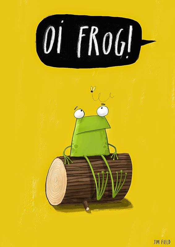
Another author / illustrator collaboration that caught my eye recently was 'Oi Frog!' by Kes Gray and Jim Field. That is my picture book of the year, what an hilarious book! What a fabulous pairing. And where would we be without Julia Donaldson and Axel Scheffler, or Julia Donaldson and David Roberts for that matter?
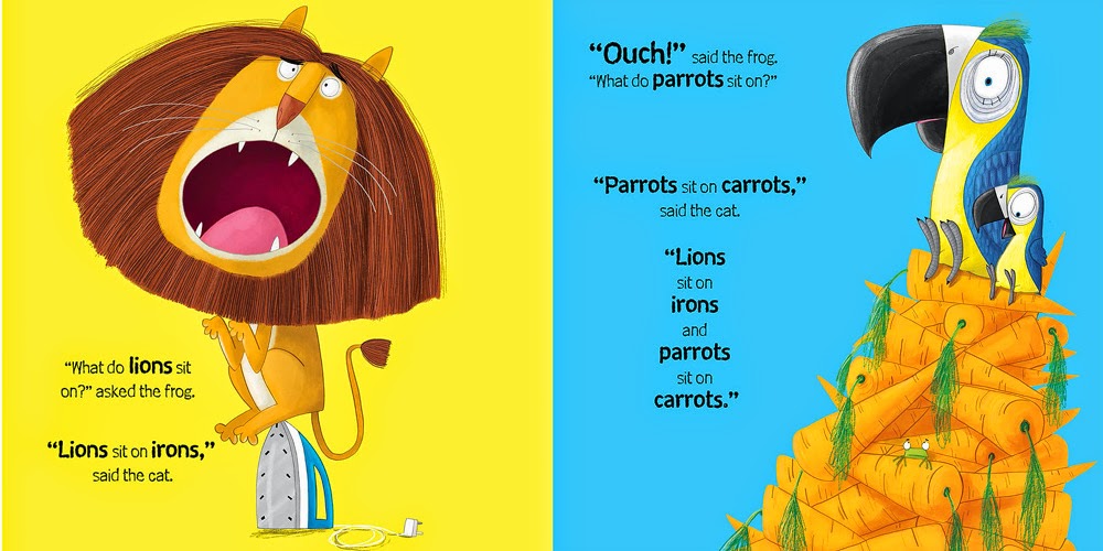 |
Oi Frog images by Jim Field and Kes Gray |
Saying that I do think prizes like the Greenaway are very much focused on the artistic merit of a book rather than the story. I also think they often choose books that appeal to adults rather than necessarily to children - but I think that is another debate.
As an illustrator I do admit that overall, I find illustrating my own books an easier process, I have far more artistic control and generally I feel happier illustrating my own stories, it doesn't necessarily mean that the end result is better but I feel this is the case for my Stan

Could Pic-fic be the future of young fiction for reluctant readers? Children are used to the bombardment of images from TV and online media. A heavily illustrated fiction book does pique their interest. I
am a very visual person and as I write, I know exactly what kind of illustration I am going to add. Often I leave gaping holes in my text as I know that I can get my message across as a series of images instead.
 |
Tom Gates by Liz Pichon another example of Pic-Fic |
I guess my argument is that books are always evolving and collaboration can be a wonderful thing but having a book which has a strong author-illustrator means no compromises. The best books will always be by authors or author/illustrators who keep pace with changes and push the boundaries, bringing new ideas to life, whatever their skills.
0 Comments on Author, illustrator, or both? By Hannah Shaw as of 7/30/2014 11:42:00 PM
Add a Comment
