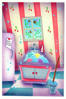
Pardon me while I work, but help yourself to the garden out in back. That is how life is sometimes, to busy to enjoy the garden... My submission for Illustration Friday's "garden" is a greeting card for Marisol to be used for "Some help around the house". It was deemed to dark and was rejected but they had to pay me anyway.

Our theme this week for our blog is "Flower/Flowers". The above is an adult greeting card design I did for Ronnie Sellers/RSVP cards a number of months ago. Not in my usual style, is it? I've been focusing on line work this last year but previous to that, I had done a lot of jobs with collage and mixed media. Over the last decade-plus, I experimented around for a style that would be enjoyable, creative and marketable, and ultimately (or at this point in time), I'm back to my initial style of humorous line work.
I still get jobs for collage and mixed-media, and this card is one of them. I do enjoy working in collage and pushing paint around (in this case, digital paint), so jobs like this are a nice break from my primary style.
After a week of thinking about boys and books, I'm honored that Tami asked me to come on back and talk briefly, if that's possible, to combine our topics with a giant exclamation point.
Early this week, Tami talked about books that let the reader infer. Let's be honest: whether our books are for girls or boys, they better do this. Good books trust the reader. There is nothing that makes me put a book down like an overabundance of self awareness, whining, and telling. Sometimes, when I'm reading, I think, "PLEASE, DON'T TELL ME EVERYTHING." I'm not sure about this, but I suspect that one big difference between books identified as "boy books" versus "girl books" have a lot to do with interior monologue. Feelings. And letting them all hang out.
I think readers today want to SEE. They are used to seeing. We have the tools to do this. We can think like a director and give our readers a world they can imagine.
This is one of the great tools of writing. We can get into a person's head and see what they see. We can take the camera and turn it on the world in the unique voice of our protagonists. No two people witness the same event the same way. Your protagonist must narrate his or her story in a unique voice. I hope this was clear during my posts last week. In light of Andy's comments, isn't that crucial for writers who want to reach boys? If boys want to conquer the world, we need to see that world and the obstacles in front of him. David Klass's FIRESTORM offers a great example. It is action packed. The world is familiar and new. In fact, I couldn't help noticing how often Klass uses sentence fragments that begin with action words. There is very little looking within.
And to go back to the boyless CLEMENTINE, we know she's spunky because she is told with broad visual strokes. We can see her. It does not surprise me at all that this book is loved by girls and boys.
Last, I'd like to offer a twist to this debate: Walter Dean Myers's MONSTER. It has a boy protagonist. I believe it fits the criteria of BOY BOOK. Now, check out what he does using screenplay and narrative. It is really quite extraordinary.
In Monster, Steven Harmon, the protagonist, is on trial for murder. He is accused of being the look-out man in a burglary/homicide. During the trial scenes, Steve turns a virtual camera on himself. He scripts his trial, like a screenplay, complete with director’s cues. Examine how Steve, the narrator, uses cinematic techniques in the following excerpt:
COURT CLERK
Two minutes!
CUT TO: GUARDS, who hurriedly finish breakfast. STENOGRAPHER takes machine into COURTROOM. They unshackle STEVE and take him toward door.
CUT TO: STEVE is made to sit down at one table. At another table we see KING and two attorneys. STEVE sits alone. A guard stands behind him. There are one or two spectators in the court. Then four more enter.
CLOSE UP (CU) of STEVE HARMON. The fear is evident in his face.
MS: People are getting ready for the trial to begin. KATHY O’BRIEN sits next to STEVE.
O’BRIEN
How are you doing?
STEVE
I’m scared.
O’BRIEN
Good; you should be. Anyway, just remember what we’ve been talking about. The judge is going to rule on a motion that King’s lawyer made to suppress Cruz’s testimony, and a few other things. Steve, let me tell you what my job is here. My job is to make sure the law works for you as well as against you, and to make you a human being in the eyes of the jury. Your job is to help me. Any questions you have, write them down and I’ll try to answer them. What are you doing there?
STEVE
I’m writing this whole thing down as a movie. (15-6)
In this scene, Myers demonstrates not simply what a director adds to a screenplay but also what a writer adds to a cinematic suspense novel. Steve shifts the camera, pulls it in and out to show the reader both people and physical objects and details. He cuts the film to strategically create and enhance the tension. He films close ups of all the actors, including himself. He relays the dialogue and the action as he sees it through the camera. When he closes in on a witness or detail, the reader sees what the camera sees without explanation, not what Steve necessarily wants the reader to interpret.
But by using a camera instead of subjective narration, Myers also avoids showing us the scene. He tells us what the director should do, but the reader is kept at a great distance. In spite of the format, Myers’s text avoids showing us the very details that make movies visual.
When asked why he structured the novel this way, Myers answered, “In interviewing inmates I noticed a tendency for the inmates to attempt to separate their self-portrayals from their crimes. In Monster I have Steve speak of himself in the first person in his diary, but when he gets to the trial and the crime he distances himself through the use of the screenplay.”
But Monster is more than just a gimmick. Pull back from Steve, the filmmaker, to Walter Dean Myers, the real director. In Monster, he juxtaposes Steve’s journal entries and innermost thoughts with the screenplay of the trial. He gives us a little bit of interior monologue. We see him. We hear him.
Or do we????
In Monster, Myers abandons the “omnisensual dream” for the screenwriter’s tools. By inserting cinematic commands like “close up” and “cut” instead of describing what Steve sees, the screenplay is oddly distancing. It tells, even as it claims its intention to show. The text offers a format, not the full picture.
At the novel’s conclusion, when Steve is found not guilty, the camera catches him turning to his lawyer to embrace her. She stiffens and turns away. Steve stands awkwardly.
The novel ends with one last journal entry, which concludes:
That is why I take the films of myself. I want to know who I am. I want to know the road to panic that I took. I want to look at myself a thousand times to look for one true image. When Miss O’Brien looked at me, after we had won the case, what did she see that caused her to turn away?
What did she see? (281)
What did O’Brien see? The camera does not show, and the journal does not say. The reader leaves Monster no longer entirely sure of Steve. Will his friends and family always look at him with doubts? Will his self image change? Is Steve in danger of fulfilling society’s prophecies? In the final entry of the novel, Steve tells the reader that he speaks daily into the camera. His mother doesn’t understand him; his father was “thankful that he did not have to go to jail” (280). But he looks at his son differently. With doubts. And questions.
Steve wants to use the camera to see the truth. He wants to see what he looks like. For Steve, the visual image is the authority. He trusts the camera. But Myers never answers these questions. Steve does not see the truth in his films; even at the end of the novel, the camera does not reveal exactly what O’Brien saw.
If Monster were indeed a film, the viewer would be able to see O’Brien’s expression. If Myers had chosen to write the novel in descriptive prose, he might have described the moment. But instead Myers lets the reader imagine the glance. He does not show his readers the images a camera would reveal.
Myers's intention--not to show us his face--not to sew up the ending--works for me. It plagues me. I think about this kid and kids like him. And I bet a lot of boys and girls feel the same way.
I'll be back after CARRIE JONES to talk about SEX!
If there are issues you absolutely want to talk about--if you have questions for the experts--email me at saraharonson at verizon dot net.
Cheers!!!!
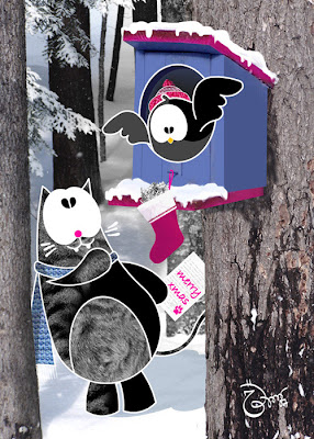
Since today is Valentine’s Day, I can’t think of a better time to share some work I did this past year for this most-holy day set aside to boost restaurant, flower, chocolate and greeting card sells. Heh. Yesterday I posted a Valentine Bear card, today it’s a Valentine Kitty!
Below: The finished card, front and inside copy.

Below: The first seed of the idea in a quick, thumbnail sketch. When I’m in the concepting stage of a project like this, I’ll do a slew of thumbnail sketches, which I try to do quickly, keeping them simple. If one gets chosen to turn into a card, then I’ll spend more time on flushing out the initial idea.

Below: And since the above thumb was selected to be turned into a card, I then played around with the layout, text, and colors. The sketch on the bottom-right was chosen to go to final by the client, with some slight changes (they didn’t want any lines showing hair on the cat).

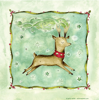
Here's a fine young reindeer from Santa Claus's crew -- it's Cupid! enjoy!
Hey, where have I been?? I 'fell off' my blog. There is no other way to put it. And certainly there's no *pretty* way to put it. It's sort of like falling off a cliff, but there's no cliff...anyway, here I am, and I am happy to be here!!! I've missed posting the past couple of weeks!!
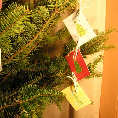
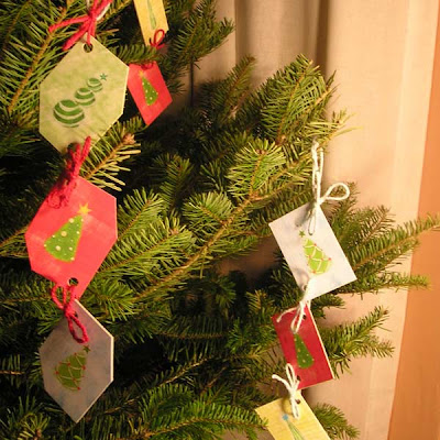
I made some ornaments to "gift" to some my colleagues with.
 How they were made:
I used nice printouts of some of my holiday images (the color-blocked trees). I pasted them (using glue stick and my bone folder with pressure) to hard-board. The opposite side, not shown, has a red "ribbon" illustration on a white background, that allows for plenty of room to write a message. Then I cut them into squares with a paper cutter. After that, I punched holes in them with a heavy duty paper-hole puncher (Swinfgline makes a good one; available at Staples). Then I used hemp yarn to make pretty bows to tie the squares together.
That's the recipe!!
If I'd had more time, I'd have sealed them with acrylic gloss coating, and embellished them with a little glitter. But these worked out nice as is!!Hope you enjoy!! Happy Holidays!
Click on the image to enlarge
Little things...mmm...what about "a little gift for a little friend" ?! - This greeting card is one of the little things I'm working on for the Christmas trade at Monday Artday ATC.... The new character is called Minu Mininus; a lovely cat that is trying to make new friends, at the beginning Quesi and Lori were extremely afraid of him, but now they are geting alone well. Minu is going to be on most of the Christmas stuff I'm doing since the friends I'm sending the gifts to happen to love cats...so i hope they love Minu too!
 It's been a long time coming, but I have *finally* started my Etsy shop! I only have three greeting card designs in there thus far, but I am proud of the work. I am excited to have these vibrant and whimsical designs to share with you this year!! :)
If you would like to, please check out my little (...tiny, right now ;) ) shop and tell me what you think!!
If you are saying to yourself, "Why is Kathy opening an Etsy shop? She already has a Cafe Press shop.. What's the difference??" The answer to that is this: Cafe Press creates all of the actual product for you. You upload your design onto their own stocked product, and you "design" the product online with their tools. They also pack it, ship it and deal with returns. This is all great stuff, but if you want to craft something yourself, or have your original design printed by your own chosen printer and have the most quality control over the final product, Etsy's where it's at. You do all the shipping, packing, and any returns yourself. But it is nice to be able to sell one of a kind art pieces in a unique, safe "online shopping mall" where people visit specifically to purchase hand-crafted or otherwise original works of art and crafts!! It's GREAT!!
while you are at Etsy, visit my sister's jewelry shop, Nancy Rosetta! She's got some cool stuff..
Here is a greeting card which I created - it's one of several in a series with this little kitty character!
See another of my "kitty" cards here on the Picture Book Junkies blog. Greeting cards are fun to create, and fun to brainstorm ideas for. Greeting cards are one of my favorite things to make/create - the medium fits my creative sensibilities very well (as well as my penchant for decorum). I am very into the concept of 'art for the masses' : art on postage stamps, greeting cards, stuff that people buy and really use in their daily lives.
Hope you enjoy the kitty!! :) Make your own wish on the kitty!!
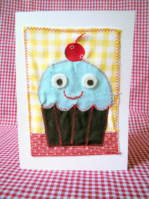 I'm taking a greeting cards class at the School of Visual Arts this summer. When I tell people this, I get alot of "Why do YOU need to take a greeting cards class?" Partly for motivation and inspiration, meeting new people, and simply for me to get out of my studio once in a while. The first assignment was to "create two 5 x7 cards using an icon, exploring different mediums." Ok, I have to admit, I was not thrilled about this assignment. After all, I know how I like to create my illustrations (the computer) and thats that, right? But after a little thought and seeing it as a challenge, it made perfect sense that I started using my left over scraps of fabric to create something.
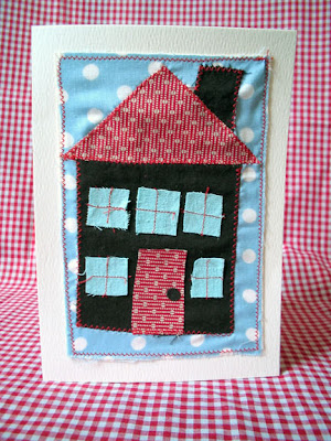 These cards were made using leftovers- watercolor paper (when I use to paint!), fabric scraps, felt. sobo glue and the sewing machine. They were like mini quilts except I feel they were less constricting....I didn't have a need to sew everything, some pieces were glued when I felt necessary. Anyways, I enjoyed making these very much, so you'll be seeing more of these soon!
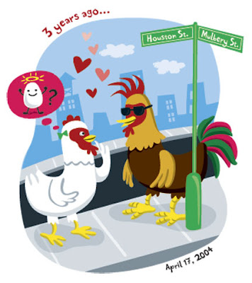 An anniversary card for Math Boy- its been three years and I can still remember our first date like it was yesterday- meeting on the corner of Houston and Mulbery St. And yes, he turned out to be a good egg!


.jpg?picon=479)


nothing dark about it! very cheery wallpaper!
What a gorgeous view to work by! Some clients sure are ding-y! This is just beautiful Val!!
a : )
I love it...so colourful and fun...you always make me smile with your work...
Lovely painting, Val.
Another bubble of joy!
Dark as in darkly themed or darkly coloured? I love it.
dark? with bright cheery cherries and bubbles. If you saw my illo, last week you'd see I'm partial to cherries (they were my towels from Crate N Barrel).
Funny, I would have snapped this up at the greeting card rack. What a shame.
Great take on the theme!
they should be wearing eyeglasses?
the bublles and the wall paper is so cool!
Pure joy!!!
... desire to go out and embrace all those meetings
seems like everyone who looked at this questioned in unison, "too dark?!" hardly! in my housekeeping world, this says it all, including the dear garden on the other side, waiting for me.
have a good weekend, val.
:)
Yo Val: Lets get back to the garden before they put up a parking lot. Love Bad Dog
I'm glad you got paid for it even though they chose not to use it - it's their loss. I love it, as I co all your work and look forward to seeing it every week!
What a fun, playful perspective! I really like this a lot!
Val, nice illo! :-)
...but the sink and refrigerator and even the bucket of water with mop all look so pretty. It would be a pleasure to stay indoors. I bet she has a nice living room and probably an even cozier study. What about the bathrooms. I would clean her bathroom.
I don't see it as dark; it's full of color and life and I love the bubbles and the tiny heart knobs!
Deemed to dark?? that is ridiculous!!.. I love it.. it is one of my favorite!!..
Too dark?? No way! The colors are juicy and playful. What a fun and fanciful, as are all of your works. I love it!
i love your perspective in this one! fun as always.
Too dark? Their loss, it would seem. I love the whimsy of this - that sinkful of suds looks so inviting - I could almost enjoy washing dishes in that!
i like it the way it is, vibrant and pretty :)
too dark? lol this is bright and cheery for me.. nonetheless its yet another wonderful art from you..
thanks for sharing..
val, this is a very happy and colorful piece. i can hear little birdies chirping from outside the window, and visualize a happy homemaker whistling as she works....
xoxox
teri
Great take on the theme. Love the colors.
Too DARK!!! If my sink looked like that, my kitchen would be a lot cleaner! Great card! Glad they had to pay you anyhow...
Excelente ilustración! es adorable el uso de colores.
cariños
Dark! It looks bright, light, and cheerful. It feels like everything is dancing!
I love this! It's hard to get into spring cleaning when there is so much snow here. But this card is wonderful and cheery!
The deemer of this darkness...by chance were they living in a cave?
I need to tack that note on my fridge and start cleaning my place...it IS like a cave in here! Nice with the time change that the light is out there longer, eh dood? Not so...dare I say it, DARK! ;o)
Lovely LIGHT and fun and colorful illo--!
xo
DOOD
wonderful and original composition...I love the colors used!
All your work is soooo beautiful! Your place is one of the most magical places to visit...
Annax
ack! i missed this one last week! dark? where? the MOP HANDLE grain? ohman...i just don't get clients sometimes....this piece is snow-white cheery! :)) love love the wallpaper! :)
hi, tnx for both your most recent comments...
this is very festive and colourful...your best illos always reminds me Alice in Wonderland, am I wrong?
:)
I missed this last week while on vacation. It's great! It's so cheery and fun. Your usual magical, positive, lighthearted stuff! What the heck are they talking about, dark? Perhaps the message was too original for them and not the usual bland, homogenized, pablum you typically see.
You rock.