In Sunday's NY Times Opinions, guest writer Timothy Egan comments on the new book by Joe the Plumber. The opinion is aptly titled: Typing Without a Clue.
Read it here:
In his opinion, he laments: "Most writers I know work every day, in obscurity and close to poverty, trying to say one thing well and true." Later, he adds: If Joe really wants to write, he should keep his day job and spend his evenings reading Rick Reilly's sports columns, Peggy Noonan's speeches, or Jess Walter's fiction. He should open Dostoevsky or Norman Maclean--for osmosis, if nothing else."
Well, this week, we are going to honor the writer at work--pre publication. We are going to meet writers who are going through this process every day. They are people who are working (hopefully, not in poverty), studying the craft, and getting closer every day to publication.
The first is GENE BRENEK!!!
This is Gene:

(with a close friend!)
So first, tell us a little about yourself and your writing life. How long have you been writing?
Writing came late to me. I always considered myself a visual guy, telling my stories as an illustrator. I can’t pin point the exact day that I identified with being a writer but at a certain point when I hadn’t written something in almost a week, I started to feel empty inside, akin to being homesick I guess. That’s when I felt comfortable calling myself a writer.
I realized that my own definition of what a writer meant had changed. I had this notion that once I had my first book under contract then I could call myself a writer. Now I realize that it has nothing to do with being published or pre-published–it’s a state of mind. I’ll save the “author” title for when I’m published.
It IS a state of mind. And a way of life—a way at looking at yourself and engaging story telling. There are a lot of us who started late. I often think that we were just not ready to write...or face our stories head on.
Can you let us in on some things you have done that have helped your writing? Any bumps along the way you care to relive?
Visualize. Visualize. Visualize. The cover. The characters. The setting. For me, I poke around, fumbling in the dark until I have the movie projecting in my head. I need to see each scene with clarity.
Oh yeah. I totally think of myself as a director. And I agree--visualizing our characters really helps us bring them to life.
I don’t think it was so much a series of bumps as it was one gianormous collective one. I was investing all my energy into getting published and not into crafting my writing. Rejection letters can be good. It means you’re putting yourself out there, but it’s important to really be honest with yourself and make sure you’re work is ready. Otherwise you’re just wasting your time and many industry people’s time as well.
Is there a book that has changed the way you look at writing?
Shaun Tan’s The Arrival.

(Read the review here)
Tan told of a very intriguing and emotional journey without using any words. It changed my preconceptions of how to tell a story.
I loved The Arrival, too. I think, like all great books, it opens us up to a new way of looking at story
What advice can you offer to other aspiring writers?
Don’t worry about being perfect. Allow yourself to fail. Actually don’t think of those early drafts as failures; it’s a discovery process. Your characters have a story to tell and until you really get to know who your characters are, you won’t be able to hear their story with any clarity.
All the writers I know have two voices in their head–the creative and the critic. They’re both important to the process, but you’ve got to let the creative go out and play and get the story down first. In the revision phase let the critic, who’s been chomping at the bit, have his say. But most importantly don’t let him rain on your parade. Don’t let your inner critic tell you you’re a fraud. If he does, you need to remind him that he’s wrong and that he should focus on crafting the story.
If you find yourself listening to too many voices in your head, it’s time to get out! Get a life. I find the best thing to help me get unstuck is to step away from the computer. Take a walk, take a shower, or take a trip. Your brain will still be working out your story.
Oh and an oldie but goodie–read, read, read. Read in your genre and also outside of it. It will bring a new perspective to your writing.
I could not agree more. So, tell us about your current project. Please feel free to include a first page.
In January, I’ll get to add MFA Vermont College to my life experiences–I’m excited about that.
CONGRATS!!!!
In terms of current projects, I’m at working at completely opposite ends of the spectrum–a picture book and a young adult novel. There are some similarities in tone. My seven-year old brain likes dark edgy humor. My sixteen-year old brain just like things dark and edgy.
I’ve got a picture book concept that’s a skewed version of aviation history told by a completely unreliable narrator. Very cheeky.
I’ve also just completed my first YA– a thriller. The action plot centers around Kyle, a sixteen-year old who is trying to stop his mom’s wedding. Her fiancé is either a bit off kilter or is masking truly malevolent intentions. Is it typical new step-parent garbage? Or is Kyle really on to something?
The emotional plot of my YA is about a guy who is trying to overcome the recent death of his father and is gauging whether or not to allow his stepfather to be a part of his life. It was also an opportunity for me to explore the concept of being stuck in the past. Could a memory be so clear in its detail, be so cherished, that you’d chuck your present day life and stay there forever?
I love that. It feels real
Oh, I’ve also just completed new Café Press T-shirt designs for Cynthia Leitich Smith’s new book Eternal. We had so much fun working on designs for Tantalize, we decided to collaborate again. (I may be a bit biased, but I’m a big fan of her work.)
My other project, which I hope to complete soon, is the addition of a bio to my website: genebrenek.com. Writing about myself is much harder than writing about my characters for some reason.
Isn't that the truth!!!
Thanks, Gene!!! This has been a lot of fun. Good luck on as you continue your process of discovery. Your work sounds fascinating! I KNOW we'll be reading about you in the future!
--Sarah Aronson
 Gene Brenek on Gene Brenek: "Well I had to put on a little 'ABBA Gold' to gear up for this. Let's see, I was born in Houston many moons ago, but not as far back as when ABBA was still in heavy rotation. I was an 80's kid, more Prince back before he changed his name to a hieroglyph and way before he went back to being Prince. Why is my bio suddenly full of old pop artist references? Dunno, I guess that's what happens when I'm left to my own devices.
"Let's move this ahead a few years shall we? I'm currently a creative director for a big ad agency in Austin, Texas. In my spare time, I'm working on a master's in writing for children and young adults at Vermont College, which is truly a great program. I also have been illustrating dummies for my own picture book ideas. Let's just say I don't sleep. And I'm waiting, PATIENTLY, to be discovered. Ahem."
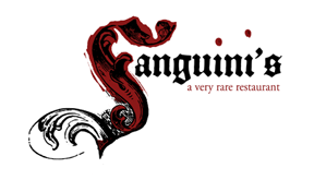
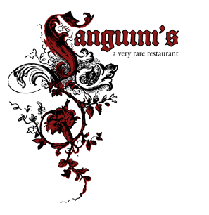
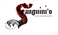
Thanks so much for designing logos for Sanguini's, the fictional vampire restaurant featured in my gothic fantasy, Tantalize (Candlewick, 2007). What was your initial inspiration for the designs?
Designing a logo is a lot like creating a picture book in a way. You need a very simple idea. A logo can't contain several different concepts at once and be effective. The ones with staying power are very iconic.
Certainly what separated the dead from the undead restaurants was the vampire mythology. So I started brainstorming and writing down anything that came to mind when I thought about vampires.
Usually I spend a fair amount of time trying out various color combinations but this assignment begged for two colors. Black, the color of night and red. Yes, black is the absence of color but when you're talking to printers it's still an ink color. Red seemed an obvious but essential choice: blood, wine, marinara.
One logo idea, that for better or worse got nicknamed "the girly one," came out of Quincie's, the protagonist's, femininity. I loved the idea of blood draining off the gothic lettering and dripping down a flowering vine, as if elements of the restaurant were changing who she was.
I also kept coming back to puncture wounds. The other logo (see above) incorporated that idea. So thank you for coming up with a restaurant that had two i's in the name, you made my job easy. If you ever write a book about a vampire-themed Ikea, I may have some leftover ideas for all those umlauted furniture names.
What considerations came into play when developing the logos?
I treated this project as I would any other design project. Before starting any sketches I had a few questions. What the owners were like? What was their vision for the restaurant? Who was their clientele? What cues could I get from the interior spaces? And while that may seem like a tough assignment, given that it's a fictional place, I found that the writing was crafted in such a way that it was very easy for me to get a sense of all of these things.
I approached this as not a design project for author Cynthia Leitich Smith but for Quincie [the protagonist]. I tried to understand her as much as I could and what her sensibilities were. Now it could be argued that Cyn and Quincie are one in the same, certainly there are aspects of that, but they are different people.
What were the challenges in bringing them to life?
Honestly the biggest challenge was not getting to design the menu, interior, the matchbooks, the business cards –all the elements that go into shaping one's identity.
What was your experience working with Printfection and CafePress? Why did you select those companies?
I went with these two companies because they offer so much flexibility. They print on demand, meaning that rather than doing a run of say 100 shirts in every size that I then had to store and ship, when someone places an order then it gets printed and shipped. They take care of it all. And I like the quality of their merchandise.
What advice would you give to folks trying to design and produce book tie-in promotions?
Think outside the box. Why not create items for a fictional vampire themed restaurant? But know that your reader is smart. Just because a tie-in isn't physically in the book, it's a part of the book. Initially I had envisioned staying away from a gothic typeface. I was leaning toward something more modern. Then I read a passage about the gothic lettering on the menu and it guided me away from something slick and contemporary. I needed to remain faithful to the book. It wasn't an entirely blank canvas.
Restaurant items made sense; to me Sanguini's was a prominent character in Tantalize. Designing items based around where the protagonist had gone to school would've made no sense what so ever.
More personally, do you count yourself among fans of the fanged ones? If so, what do you think is the appeal?
Of course I'm a fan. Vampires seem to have all the smarts. They also have big personalities, charisma. You want to hang out with them. Imagine a book where someone opens a tax-attorney-themed restaurant. Yawn.
What do you do when you're not working for the undead?
What do you mean? I'm an art director for an ad agency. I'm always working for the undead.
Actually, I'm writing and illustrating a couple of ideas of my own in the picture book arena. Depending on who you talk to that particular market is either dead or undead. For my sake, I'm hoping it's undead.
Cynsational Notes
Shop Sanguini's at Printfection and CafePress; see the other Sanguini's logo option.