new posts in all blogs
Viewing: Blog Posts Tagged with: AVAILABLE, Most Recent at Top [Help]
Results 1 - 17 of 17
How to use this Page
You are viewing the most recent posts tagged with the words: AVAILABLE in the JacketFlap blog reader. What is a tag? Think of a tag as a keyword or category label. Tags can both help you find posts on JacketFlap.com as well as provide an easy way for you to "remember" and classify posts for later recall. Try adding a tag yourself by clicking "Add a tag" below a post's header. Scroll down through the list of Recent Posts in the left column and click on a post title that sounds interesting. You can view all posts from a specific blog by clicking the Blog name in the right column, or you can click a 'More Posts from this Blog' link in any individual post.

Marble Top, 3 x 3" o/c...
At one time I considered doing a small line of these mini's on little easels. And I theoretically could have been that industrious--but tiny isn't really doing it for me. In fact, for next year I'm thinking of not allowing myself to do anything smaller than 16 x 20. It's time to think big.

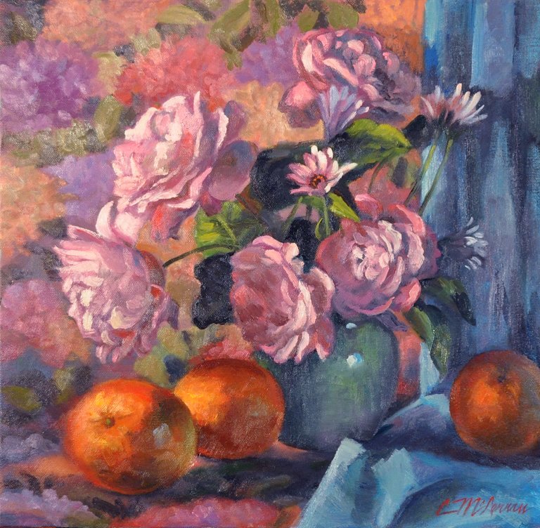
Persimmon Pot; 7 x 7" o/c...
For people who grew up in the Depression, I imagine spending money on artwork was an indulgence many avoided and never allowed themselves even after times improved. Now enmeshed in the art world, surrounded by painters, I think we often forget this is still the case for perhaps the majority of people. As Jack White has said, art is a “want”, not a “need.” Yet in spite of this, we live in a time when painters seem more prolific than ever and more people of ordinary means find owning original art important enough to spend a little money on it.
Once in awhile I "re-realize" and contemplate growing up in a house without a single painting on the walls. True, the house itself was a work of art. Designed by a relative who was a talented architect, it had large, back-to-back, family/living room fireplaces of native granite, hand rubbed birch paneling and doors, and a contemporary color scheme. The kitchen/dining/family room had recessed lighting above a deep purple “light deck”, and the floor was orange linoleum flecked with black and white. Plaster walls were lavender or turquoise--but nothing in a frame hung on them.
Maybe this is part of the reason I have always had so much trouble pricing my work and can never quite believe or get over the kick of people actually wanting to buy it. I am grateful to live in a time and place with the privilege of being able to paint—and for my buyers.

By:
Steve Novak,
on 11/15/2011
Blog:
Steve Draws Stuff
(
Login to Add to MyJacketFlap)
JacketFlap tags:
book,
writing,
drawing,
endings,
steven,
novak,
kindle,
fathers,
beginnings,
sons,
forts,
trilogy,
final,
available,
complete,
piece,
Add a tag

The final part of the Forts trilogy is now available in both ebook and print editions. For all the links fit to link check out
MY WEBSITE!The Kindle edition can be found by simply clicking the picture above.Let me just say that it feels great to finally have this series wrapped up. Could things have gone smoother? Sure. Would I have preferred to not have the issues with the original publisher of the series? Of course. In the end, I wrote three books.Me. I did that.That's nearly 600,000 words and three years of my life. Despite everything that's happened and the way things played out, it's something to be proud of. I like Forts.It was important to me to write it and even more important that I finished it. It was fun and it was therapy, and I learned a lot about myself and my work from it, and in the end I wouldn't change a word.That's a pretty cool thing.Steven

Dollars and Copper, 16 x 19" o/c
This brass and copper teapot is the other little item I got on my mini-splurge at the antiques mall a few weeks ago. I love the shape and the warm tones of the copper--one of my favorite things to paint. The tall, elegantly shaped mauve vase was another thrift shop find, cracked and on sale for $1.

Lavender Roses, 16 x 16" o/c
To encourage students, Craig Nelson has said, "There are no bad paintings, only unfinished paintings." This painting was quite "unfinished" when I left it. I've pretty much re-painted it, but, as usual, am not at all objective yet in judging whether it's a success or a failure. As always, it will have better color when I can scan.
Even though I had completed school and been illustrating for a dozen years when I attended my first workshop with Craig in 1994 (with no idea what I was doing there), I consider him my first painting teacher; because while some illustration certainly can achieve the level of art, most of it is not painting as I have come to understand and aspire to do it.
Surrounded by natural beauty, I grew up in a home and community with virtually no artwork in sight. A couple of primary and secondary classes gave us the chance to dabble in graphite, charcoal and watercolor; but as far as I remember, unlike many of my painter friends who were exposed to art, art history, and even painting instruction at an early age, I spent no time studying or even seeing any of the world's great paintings. I was late to the party and have been playing catch-up ever since. I had a great childhood with many advantages, so this is neither an excuse nor a lament, merely a recognition of what is. How it explains the source of my desire to paint or where it may be going, I can not say. To paraphrase R. F. Coleman, whose books I'm currently devouring, a recounting of my art career reads like a recipe for hot water: nothing to it. I am still an early work-in-progress.

Untitled, 12 x 12" acrylic & oil on canvasboard
I'm a little tired of how dark and/or contrast-y my paintings often are, so thought I'd try something a little different. I painted a splotchy, drippy acrylic ground, used it as a background for photos of some thrift shop bottles and spent hydrangeas, then replaced the board with a similar colored drape (I like to look at both the set-up and my photos) and painted on the board. I covered up more of it than I wanted to, but some of the texture still shows. Haven't decided how I feel about it yet. It's still pretty contrasty, but the color was kind of fun.
After taking longer than planned to finish this thing--as usual--I finally sat down to post and found that Google had "updated" Blogger's upload editor--to one that DOESN'T FREAKING WORK with my Firefox browser. I searched some forums for help and fortunately was able to switch back to the old editor. Why, Blogger? Everything was working just fine, and I really don't have the patience.
Yeah, I'm just a little tense. As well as the Vino de'Art event in Auburn on September 10, I suddenly have both the art tour and a little show in Sacramento scheduled in November. So I'm starting the afterburners and doing whatever it takes to get inspired. Found some fun props at the antique mall last week and plan to use another textured acrylic ground for the next painting featuring the old fan.


Lean on Me, 8 x 8" o/c
I did this with the idea of entering it in a show in which artists will submit 24 8 x 8" thematically related pieces. The idea of choosing and confining myself to some parameters appeals to me right now. Rather than choosing a theme based on subject, I decided basing it on color might make a dramatic and unified presentation. My plan involves compositions of subjects that are black, white and red, but painted with a full palette (and almost no actual black). Even though I have a lot of ideas, in the early stages of this first one I was discouraged, uncertain and thought I might have made a huge mistake in thinking I could pull it off--especially 23 more times. But thanks partly to Hatfield teaching me not to fear mud, and I ended up kind of liking it. Keeping a consistent style may be a challenge, because I know I will be tempted to render some of them more tightly. I have a feeling those black stripes might be making another appearance.

10 x 10" oil on canvas; weird set-up, glare-y photo
Art-wise, it's been a one-foot-in-front-of the other kind of week, after tripping and literally falling on my face on the way into last Tuesday's workshop. Bruised and somewhat in shock, I didn't paint at all well, and that day's piece went straight into the trash. It doesn't take much to derail me; the wolves of self-doubt have been snapping ever since: I'm in some sort of slump for no very good reason. At my age, it seems I should be giving workshops, not taking them. I am teaching a junior college community ed painting class in April, but that's not remotely in the same ballpark.
Nevertheless, I just mailed my registration and am stoked about attending the Masterpiece Christian Artists Conference in Ashland, OR this summer (near my hometown) with fabulous artists Michael Dudash, Chris Hopkins and Mick McGinty. I met Chris and Mick at the Air Force art presentation dinner in October; Michael is a former illustrator turned painter I have admired for literally decades. He is featured in the January issue of Southwest Art. I still have some of the TV Guide covers he did in the 80's and can't believe I'll finally have a chance to meet and work with him.

Latitudes in Winter; 16 x 19" oil on canvas panel; Latitudes Restaurant, where I will be showing (I think) in February and March. (Never mind the “Gallery” page of their website, which apparently has not been updated in seven years.)
Although the superior function and efficiency of modern architecture are undeniable, the Victorian style continues to charm and remind us of a bygone era that was in some ways gentler. There’s my painting comment and segue to at a more “talky” post than usual.
The difficult thing about change is that it nearly always includes loss. This is not news: Judith Viorst’s 1998 book Necessary Losses: The Loves, Illusions, Dependencies, and Impossible Expectations That All of Us Have to Give Up in Order to Grow describes the losses we inevitably experience in the course of a lifetime. Even when change is largely positive, the accompanying loss can be difficult.
After 25 years of meeting illustration deadlines and 20 of being a mom, I am suddenly unemployed--the chronically ill kid survived, thrived and has flown the coop, and illustration as I knew it has all but vanished. Sure, the kid still needs me (though somewhat reluctantly and in less frequent and predictable ways), and I’m still doing art. But the way forward is unclear. With illustration, parameters were defined, and payment guaranteed. Now, the choices are unlimited, the deadlines nonexistent (other than those that are self-imposed and the final big one), and the chances of making regular, significant sales uncertain at best. While the transition was foreseeable, I am adrift in my new found “freedom.”
Clearly I am challenged and have much to do. I only hope I have enough energy, motivation, organization and time left to achieve some form of success . My college teacher and long-time friend DeWitt Jayne was Carmel’s New Masters Gallery's longest-running original exhibitor. He did not begin producing gallery work until he was 55 and painted until he was 90. That’s encouraging. His knowledge and technical skills far exceeded mine; but I have come to believe that technical skills are not necessarily the whole game.
Since Losses, Viorst has written Suddenly Sixty and Other Shocks of Life, and I'm Too Young To Be Seventy: And Other Delusions. Yikes. I won’t read those just yet. Never mind how far I am on one side or the other of 55; let’s just say the age-defying face cream isn't really defying anything.

"Wanna-Be Roses" 6 x 6" oil on canvas panel
One of the many downsides of perfectionism is the delay tactics and mental gymnastics I often go through before getting started. The fear of mistakes or failure is one of the biggest impediments to any creative effort, I think. I'm back in the zone of realistic-but-a-little-more-painterly and am actually fairly happy with this one. But it seems it will take much more painting and many more successes for me ever to get past that initial fear of starting.

11 x 14" oil on canvas
I'm doing a presentation tomorrow that involves some sort of demonstration, so I guess this was practice. Also, everything decent I've ever done is at the gallery, so I have nothing to show. If I can do this in 4 hours or so, maybe I can paint a single apple in one. Anyway, for some reason the family likes this painting. But what do they know? I think the DH likes it because everything is from his garden. I admit I am much happier doing still life than figures--even though Hatfield says it's "all the same thing."
Auction begins Thursday, July 8, at 6:00 p.m. PDT

8" x 10" oil on canvas
.....Right about now, with each painting, I still have to resist adding the disclaimer, "this is not how I really paint"--and redeeming myself with a tight little rendering. I am tending to like each new piece a little more than the last, so I hope that means I am progressing and that this is leading somewhere--though I'm thinking this one probably got tighter than Don would have approved. I really like his latest post about not drawing. Even though that's not easy for me, I love the concept.
.....Painting a little finished piece almost every day is also tough! (and I've only done 3). Gives me even more respect for those daily painters who have kept it up for a year or more. Maybe it gets easier with time? Yeah, right.
SOLD

"Ocean Memory"; 8" x 6" oil on linen panel
I once thought I might write and illustrate a children's book about things whose insides are "bigger" than their outsides. The first verse described the seashell that
" . . . remembers the waves and the foam
and the sound of the ocean that once that once was its home."
For several reasons other than a short attention span, I have lost interest in this. Maybe I'll do some paintings on the theme instead.
The inspiration:
“It seems, then,” said Tirian, smiling himself, “that the Stable seen from within and the Stable seen from without are two different places.”
“Yes,” said the Lord Digory. “Its inside is bigger than its outside.”
“Yes,” said Queen Lucy. “In our world, too, a stable once held something inside it that was bigger than our whole world.”...... ..--C. S. Lewis, The Last Battle (Chronicles of Narnia, Book 7)
AVAILABLE

24" x 8", o/c
This granite bridge in a little park near my house was built by Chinese laborers in about 1900. It is one of the few charming remnants of historic Rocklin. The morning light gave it kind of a storybook quality.
Still too tight.

4.5" x 6" oil on linen canvas laminated to hardboard
The painting is still wet, so this is a digital photo--a little too yellow and dark around the edges. I will post a more accurate scan tomorrow.

16 x 20 o/c
I started this a couple of years ago, from photos I took in Hawaii about six years ago, and then it sat. So it was nice to finally finish it.
AVAILABLE

8 x 10" o/c
Since this originally was just a value study, it isn't much of a composition. I may have been influenced by the friend I was painting with yesterday, who kept nagging me to push it and make it more colorful. I think the underpainting, which I usually do not do, also intensified it.
Next goal: a palm tree close-up-- a larger. "real" painting I started a couple of years ago and never finished.


I am so with you. I do 6x6's only because they sell but generally I do not enjoy getting small cause it usually means getting tight. You did an incredible job on this very small one.