

Summary: Volunteer work with a bike charity in Ohio, and the gift of a new logo illustration.
via Studio Bowes Art Blog at http://ift.tt/2h2X5mO
0 Comments on Holiday Cheer with Elves & More as of 12/21/2016 5:20:00 PM
Add a Comment

 By: Brian Bowes,
on 12/21/2016
By: Brian Bowes,
on 12/21/2016
Summary: Volunteer work with a bike charity in Ohio, and the gift of a new logo illustration.
via Studio Bowes Art Blog at http://ift.tt/2h2X5mO
By: Brian Bowes,
on 9/29/2015
Summary: This blog post covers a book project that I worked on from the end of 2014 to the beginning of 2105. I was hired to create a cover illustration and a number of black and white interior illustrations for the book The Hole Story of Kirby the Sneak and Arlo the True.
via Studio Bowes Art Blog at http://ift.tt/1h8AfKg
By: Brian Bowes,
on 4/3/2015
By: Brian Bowes,
on 4/1/2015
By: Brian Bowes,
on 2/26/2015
By: Brian Bowes,
on 8/30/2014
By: Brian Bowes,
on 3/3/2014
By: Brian Bowes,
on 2/18/2013
By: Brian Bowes,
on 11/6/2010

Well, wish me luck, the images have been submitted and the bill has been paid! Now it's all up to the judges at this year's Society of Illustrators annual show/ contest to vote on this year's winners and participants in the 53rd Illustration Annual.
For my submissions, I had to balance the cost and the number of images that I could afford to submit. I felt that 4 of the images that were created over the last year would be a nice representation. Of course I wanted to submit the piece that I did for the IMC, that was such a formative experience that I wanted to show the final piece. Also, in keeping with the Steampunk vibe, I entered my cover illustration for Steampunk Magazine #6.
Next up for submission and in a different genre, is the wraparound cover completed for PM Press' Noir Anthology;"Send My Love and A Molotov Cocktail." I submitted this one because of the over all feeling of the image, and because it is a little more concept and a little less figurative work, and besides all that, I just like it.
And finally, the piece that I have been working on for the past month or so, and that was alluded to in an earlier post, "A Curious Introduction!"
Watch for an upcoming process post about the creation of not only this image, but of the whole promotional piece that this is a part of, and of the considerations behind the core concept. But for now, these are my four entries, and I feel that they do represent where I've been and where I am at. Of course I live in hope that maybe one or more of these images might be chosen to be amongst the prestigious pages of the Society of Illustrators Illustration Annual #53! Only time will tell.
Links to other blog posts:
Click here to read more about the "Jetcycle Getaway," and part of my IMC experience.
Click here to read about the creation of Ol' No.6.
By: Brian Bowes,
on 6/10/2010
 This piece was commissioned as a wedding present by a friend of mine, for his friends' wedding. I believe that he's kinda hit the trifecta of goodness with this gift. Let me explain, in one way he's strengthened our friendship by believing in me and my aims to support my life with my art (which feels great, I must say), next he's generated more positive energy by giving a totally unique and personal gift to his friends, which all kinda culminates in generating the reciprocal esteem from his circle of friends as well as from myself. It's like a win, win, win.
Technically speaking, this piece was a fun one to work on. I guess sometime here in the recent past I'd become aware of my problem with soft edges. The manner in which I work tends to favor crisp clear edges, which I really like. However, even too much of a good thing can be not so good. It was my intention with this piece to create a soft feel for it. Not only for the technical challenge of it, but more so, because of the subject matter. Toss in a little diaphanous light, and we're starting to set the stage for romance! To see the results of the initial intentions, I would urge you to check out the shadows across the ground as well as some of the passages in the dress, and the bride's shoulder, or the groom's shoe.
I don't suppose that I would've have guessed at the onset how this image would affect me. But I am glad to say that after putting myself in a mind set of affection and love, that my relationship with my own lovely wife got a little bit better. Funny how focusing your mind and energies on everything that this picture represents can change you. I said before that "sometimes even too much of a good thing can be not so good," I should amend that and add, "..unless it's love."
My best wishes and warm regards go out to my friend, and my friend's friends!
By: Brian Bowes,
on 5/3/2010
Now we've come to the end of week 4 of the 12 week challenge. Arguably, we've entered the "fun" part of illustration, making images!
Before I move on to the painting, I have to say that part of this challenge for me has been about zeroing in on what I want to do, who I'd like to purchase my works, and how I can make a business of doing this. After looking at some of the other challenger's works, I have to say that I am at once, both terrified and filled with the "I'm not worthy" thing and, greatly inspired. This, of course is part of the inner, personal challenge. To be able to find my own self worth in the presence of other talented artists may be one of my biggest obstacles. Illustration is unique in this way, where we can find ourselves cheering on our friends while challenging them, and in return to be challenged by their now stronger works.
Now, here's the story of the painting! As some of you may remember from the earlier post "Alien Moon Phases," recently a friend of mine finished writing a
This is will be the cover image for the book, so we talked about some of the key concepts that he wanted to represent his story. High on the list were feelings of ambiguity, of being lost, and that kinda the main character in the story is the journey it's self. After discussing some key scenes in the book, we arrived at a moment wherein the band of travelers is lost in a mountain range and decide to take shelter in a cave.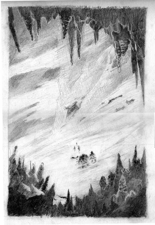 After a few thumbnails, we liked this drawing. The characters were ambiguous, the mountain is big and they are small, and the cave is threatening while offering shelter. I wanted this to be a "frying pan to fire" scene.
 Moving right along, this is the first image that I took after the first washes were laid down. As a technical note, I tried some new paper, an Arches 260lb hot press. In the store I liked the plate finish which seemed smoother than the 300lb paper, but not as slick as the Strathmore 500 series that I had been using. I thought I'd just give it a go. The paper was stretched, it was kind of attached to a board {wet paper and tape don't mix so well, I guess that's why everybody else uses thumbtacks... lesson learned,} and we're off to the races.
 4 Comments on 12WC: Week 4: Get to work!, last added: 5/5/2010
Display Comments
4 Comments on 12WC: Week 4: Get to work!, last added: 5/5/2010
Display Comments
By: Brian Bowes,
on 3/16/2010
 Recently I had the good fortune to paint the cover of Steampunk Tales #6. It so much fun to work in a genre that I really dig. I like to describe Steampunk Tales as a 'Digi-pulp.' They are really taking a great format that has propelled so many story tellers and illustrators forward from the past, and bringing it into the 21st Century by making it accessible to so many tech platforms. Sort of a past future in the present, much like Steampunk.
{ I've posted links at the bottom of this post where you can go to download the latest issue, please check it out! It's a lot of entertainment for just $1.99}
I really enjoy Pulp action and drama, and may have really started my romance with them after reading { and by 'reading' I mean 'mostly looking at the pictures,' } "Bradbury: An Illustrated Life, A Journey To Far Metaphor. Ray Bradbury was one of the first authors who really got to me. His work was a.) short, b.) rich with fantastic imaginings, and c.) just down right beautiful. I've been in love with his works since I was in my single digits. Moving forward, what I saw in this book was how he got his start through pulps and fanzines. Of course, next to each one of those stories were fabulous, bizarre, and wonderful illustrations. Many of those illustrators went on to have full and rich careers, but, in the beginning they were doing it in a spirit of adventure and a love of the stories. I don't mind saying that here too, in this same spirit, I wish to send down a tap root in the hopes that my works will, over time, blossom and bear fruit.
I like to share the process of how these images come about. I have to say right up front that I didn't document a lot of steps on this one, but what I have is here.
I guess what really got the ball rolling was a note from the editor that connected me up with the writer G.D. Falksen, whose authored a series entitled "An Unfortunate Engagement." He briefly described an scene wherein the Hero, Heroine, and Sidekick are liberating slaves from a Siberian airship factory. Already I was drooling, there is just so much to work with here; giant airships, explosions, narrow escapes... ahh the stuff that pulps are made of!
The first take that I was ready to settle on { there were many that ended up on the cutting room floor } was one that showed the Hero charging at the front of the masses, grit in his teeth, and explosions all around! I described it like this in the email: "Take 1: Our intrepid trio crests a hill ready for more action as the giant airship burns to the ground in the background. Airships! Ray guns! Action and Adventure!" As I continued to work over what was going on, I wanted to leave more for the imagination of the reader. Some of my favorite works of art allow the viewer to access what's going on. This can be done in an infinite number of ways, the way I chose was to allow most of the action to be "off screen" and to focus on the Hero and Heroine. The second sketch was discribed thus: "Take 2: The faces of two
By: Brian Bowes,
on 3/10/2010
You just have to love having creative friends. Recently a friend of mine finished writing a fantasy novel, which is looking for a publisher. In order to create a more positive and appealing property he decided to commission a few pieces of work from me, which I am more than happy to do!
The first step was to create what amounts to chapter headers, and a kind of time signature through out the book, he suggested the 28 moon phases of the double moon that hangs above this fantasy world.
 I suppose I could have done quick pen and ink moons, but I couldn't resist just giving it my all, and doing my best. So, I first had to figure out how to create 28 pieces where the moons would go through all of their phases. Early one morning as I woke up, I realized a method that would accomplish just that, { ancient artists secret, corner me at a party and I may tell you. } After a few small experiments I settled on a method of production, and then it was off to the races.
 Considering my choice to work with watercolors, I am often endeavoring to create works that are solid pieces, and that use watercolors for their strengths, as well as trying to strengthen their weak points. Recently I have become fascinated with edges, both hard and soft. For me, it is more difficult to create a soft edge, so I took this opportunity to work it out on the page.
In using watercolor, one method to create soft edges is the wet-into-wet technique. Which if you are unfamiliar goes basically like this; make a puddle of water, charge your brush with color, dump the color into the puddle, stand back and make faces as you try to control the chaos below. So, that became the first pass on the moons. Sometimes I used just blue, other times blue and black in the first wash. Next, after the first wash has dried, I came back over them with a wash of black. There is an effort on my part to consciously loose the edges in the moons' shadows, and to create the chunky craters and such at the shadow's edge. During this wash I also experimented with creating little flares of color to break up the hard edges along the outside of the wash.
That process went a little like; make the first wash, while it's still wet
Heey Brian!! How did you create that lovely snow effect? I really love it! I tend to avoid snowy images, because I have a feeling that I get lost in it and can't seem to add in the details you need to create that snow effect.
I really love this piece! Great job!
Cya!
These are really nice works of art. I like the second one the most but they are all really awesome. I saved them all.
Cheers from your friend Roy!
Love your work... and I actually learned a lot about the process. Sadly, I have no where near the talent and skill that you have... My art is more child-like... would love to have some suggestions and feedback from someone like you. Thanks
Hello Brian, sorry I missed being able to crit the process on this work. I just read all the comments and to tell you the truth, I wouldn't have anything to add!
It's turned out very well. I particularly like the contrast between snow and rock and how you have given the sense of both glow and foreboding.
nice stuff.
Maybe I can get down and dirty with your next piece :)