
This just in from our beloved iheartdaily.
"We've teamed up with our fine friends at Figment for the Books of 2011 Contest where you have a chance to win a Kindle loaded with each of our five favorite books of the year -- that's 10 books!
Here is your mission, if you wish to accept it: Write a review of your favorite book published in 2011. Submit your entry by December 16 at 11:59 p.m ET. Help choose the top 10 finalists by voting for your favorite entries. The finalists will be read and judged by I Heart Daily's very own Melissa Walker, author of Small Town Sinners and four other young-adult novels.
How to enter:
1. Read the full rules here
2. Sign up for Figment
3. Write a review of your favorite book published in 2011, of no more than 300 words, and press “Publish Now"
4. In the details tab, tag your story iheartdailybooks
5. Wait the 2 hours it sometimes takes to see your piece appear below"
How perfect is that, readergirlz? Get those submissions in. Happy holidays!
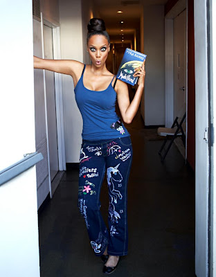 Had to let you guys know that there's going to be this amazing Pajants reading at Books of Wonder on Saturday, December 3rd, from 3-5 PM. Seriously, this lineup rules. Come if you can!
The pajants, as you may have heard, have been worn all over the world... and even on the famous legs of one Ms. Tyra Banks (who signed right between me and E. Lockhart--exciting!):
Check out the full Pajants saga on
Facebook.
 Back in 2009, Nina Malkin talked to me about the gorgeous cover for Swoon, and now the sequel is here with another enticing cover image.
Here's Nina:
"Writing is intensely present for me. With SWEAR I was so in the moment of the action and emotion as it unfurled, no way was I thinking about the cover. I was lucky if I thought about lunch. Besides, it’s such a privilege to be able to publish, I trust the pros at Simon & Schuster to do what they think is best for a book, and that includes the cover. After all, once you deliver a novel it’s no longer this magical collaboration between your conscious and your subconscious—it’s a product.
 "Of course, I didn’t always have such a laissez-faire attitude. My first novel, 6X: The Uncensored Confessions, was about a band. Unbeknownst to me the publisher did an expensive photo shoot—too bad the girl on the cover looked more like a cheap hooker than rock chick (right). I threw some major hissy but got nowhere. And if I thought that cover sucked, the next one was worse. That’s when I realized the novels weren’t 'mine' anymore; I had to let them go..."
Read the rest of Nina's Cover Story at melissacwalker.com.


Beth Kephart has shared many Cover Stories in this space--for Undercover and House of Dance, for Nothing But Ghosts and for The Heart is Not a Size. Her latest novel is high in my pile, and it should be in yours too! I dare you to read a Beth Kephart book and not sigh at the beauty of her words. She's truly a poet (check out her blog for proof).
Here's Beth talking about the cover of her new novel, You Are My Only:
"For many months I have wondered just how I would write this cover story. In some ways, I still don’t know quite what to say.
"Should I start with the title, You Are My Only, which sets the mood? And if I start with the title, then aren’t I really starting (or shouldn’t I start) by thanking my agent, Amy Rennert, and her colleague, Robyn Russell, who helped me toward knowing what the title must be during a week of grave uncertainty?
"You Are My Only, then—a title that I was helped toward. Words that struck me once, and strike me again today, as singular and brave.
 "To create the image, we turned, of course, to Neil Swaab, who had designed the gorgeous cover for Dangerous Neighbors [read that Cover Story on bn.com], and who seems to get books the moment he reads them—seems to settle on that symbol or scene that obsessed the writer or, in this case, kept the writer going. Both of my protagonists—Sophie and Emmy—are caught inside worlds, trapped in places they should not be. Both look out through windows on people and places just out of reach. What might symbolize that? What single image might tell the story of two young women separated by time and place and hurt?"
Read the rest of Beth's Cover Story at melissacwalker.com.
Hi, look at that cover. The title alone intrigued me enough to want to red
Jen Violi's debut, but that cover? I love it!
Jen's here to share the Cover Story:
"I did indeed have my own cover idea, and revealing that will also reveal why I’m a writer and not a designer.
"So, when I was little, my parents had quite a record collection, and I loved listening to so many of them, from
The King and I soundtrack to Vicki Carr or Frank Sinatra or, my absolute favorite:
Aunt Carmela’s Italian Favorites. So many gems on there,
my favorites from Lou Monte. And the cover, priceless. Which of course I have to show you here. Please note the fabulousness of Aunt Carmela, right.

"Believe it or not, as I was writing
Putting Makeup on Dead People, I had a distinct vision for the cover to feature Aunt Carmela. As an enlivened corpse. Basically, my vision involved Aunt Carmela, sitting much like she is on the chaise lounge on the album cover, but instead, on a coroner’s metal slab, with a white sheet draped over her body, sitting up and grinning out at us. Why, one might wonder, would I think that was a good idea?"
Read the rest of Jen's Cover Story at
melissacwalker.com.
 Cynthia Leitich Smith is a huge supporter of the YA writing community who truly rocks. I recently wrote a guest post for her awesome blog, Cynsations, about writing "true" vs. "likeable" characters. She also happens to be the New York Times and Publishers Weekly best-selling author of the Tantalize series: ETERNAL, TANTALIZE, and BLESSED, Gothic fantasies from Candlewick. TANTALIZE: KIEREN’S STORY, illustrated by Ming Doyle, is a graphic edition in which Cynthia re-envisions her dark fantasy through Wolfish eyes. How cool is that?
Here's Cynthia with the Cover Story for TANTALIZE: KIEREN’S STORY:
 "I anticipated that the cover would nod overtly to Kieren’s identity as a human werewolf-hybrid. We often see this with books that involve a shape-shifter protagonist. I tend to prefer those in which it’s more subtle, like Vivian’s wolf shadow on the original cover of Annette Curtis Klause’s Blood and Chocolate (right).
"Usually in shifter books, the transformation is a powerful moment in the story, and as a reader I prefer to experience that in my imagination rather than to be offered a visual up front. However, in my story, because Kieren is a hybrid (and has some issues with that), he doesn’t shapeshift as easily or completely as, say, his mother who has no known homo sapiens heritage.
"I was wary of the idea that the cover might suggest that Kieren would go full Wolf and managing that more delineated duality would be the book’s focus. The story is more of a murder mystery with strong romantic elements than a straight-up creature feature, though certainly creatures abound.
"My first thought when I saw the cover was, He’s a boy. Definitely a boy..."
Read the rest of Cynthia's Cover Story at melissacwalker.com.
PS-Read the original Cover Stories for
Eternal and
Blessed.
 Holly Schindler is here to talk about two of her novels, A Blue So Dark and Playing Hurt. They have really different feels (Playing Hurt makes me want summer back!--and A Blue So Dark has a much eerier feel--I love underwater covers lately).
Here's Holly to talk about each cover:
"While the covers of my YA novels—A BLUE SO DARK and PLAYING HURT—are both stock images, the end result is pretty night-and-day different, as is the content of the books (A BLUE SO DARK explores the possible link between mental illness and creativity, and PLAYING HURT features a romance between two former athletes.)
"The covers have two completely different functions. A BLUE SO DARK is a metaphorical cover; it speaks to the emotional content of the book. It’s a poetic representation of what happens in the book. PLAYING HURT is a literal interpretation.
"I love both covers—but of the two, PLAYING HURT’s my favorite, because I think it better steers the book toward the right readership.
"When A BLUE SO DARK was released, it was frequently purchased on Amazon by readers who also purchased paranormal titles..."
Read the rest of Holly's Cover Story at melissacwalker.com.
Melissa Walker is not just a fiendishly talented author, kindhearted fashion maven, and brand-new mom who knows how to strap her pretty baby on. She's the creator of (among countless other things) a regular feature series called "Cover Stories."
Today she shares a story I told about
how the cover of You Are My Only got made.
Sometimes (no, often), I think these thoughts: Where would we be without Melissa?
 Kirsten Hubbard's Like Mandarin came out in the spring to great buzz. Read bibliophile brouhaha's review for taste of that. The cover always intrigued me for its use of white space and pastels. I think it's lovely.
Here's Kirsten to talk about how it came to be:
"I've always felt like the most iconic images in Like Mandarin are wild girl Mandarin Ramey's long black hair, and the Wyoming badlands where the book takes place. My publisher did offer me input, and I made note of a few covers I really liked, and described the sort of black hair, badlands scene I'd always imagined on the cover of Like Mandarin.
"There's a part in Like Mandarin where Grace's thoughts blank out, then come back as a series of exclamation points instead of words. That's pretty much what happened when I saw my cover. It was taped to the bookshelf in my editor's office the first time I met her. I didn't expect to see it -- nor what I saw! It contained none of the elements I'd suggested, but it was so strong, and simple, and beautiful.
"Interestingly, my editor pulled out the image of another cover they'd been working on: a dark-haired girl from behind, against a backdrop of badlands. If I remember correctly, it was in black and white, and the font (a different one) was some bright color, like pink. It looked like an album cover, while the cover we went with looks almost like a movie poster -- just stronger overall..."
Read the rest of Kirsten's Cover Story at melissacwalker.com.
 Andrea Cremer shared the Cover Story for the hardcover of Nightshade last year, and since then I have eaten pizza with her and can confirm that she's as awesome as the books she writes. Seriously.
And now she has a newly redesigned paperback! Plus, the second novel in the Nightshade trilogy, Wolfsbane, was just released. Here's Andrea to talk covers:
"I didn't have a specific idea for the cover, but it always involved wolves and blood.
"When I first saw the new covers, I was thrilled. To me the new covers depict Calla perfectly. The new
Nightshade cover (right) drew on the poem that inspired Calla's character. The poem is one of Margaret Atwood's and its first stanza is 'Not you I fear but that other/she who walks through flesh/queen of the two dimensions.'
"The
Wolfsbane cover: First of all it's green! My favorite color! I think it continues the theme of depicting Calla's strength. The concept is that she is crouched under the moon about to shift into wolf form. I love it!
"There were some small tweaks - usually about getting the color of Calla's eyes just right..."
Read the rest of Andrea's Cover Story, and see the original series covers, at
melissacwalker.com.

Sending out cherished congratulations to Diva Melissa Walker, for the birth of her daughter, June Hazel! We are thrilled to have this youngest readergirl in our community. Here's to many cherished books read together. I'm packing up a box of board books for this sweetie right now!
Welcome, Baby June! Congrats to you and your hubby, Melissa! We heart you!

 A couple of weeks ago I noticed lots of girls-in-grass covers (my own included) and I mentioned fellow Contemps author Lisa Schroeder's latest, The Day Before, of which Booklist says: "Readers will find plenty of appeal factors in this outing... delivers a punch at the novel's end." (I love an end punch.)
Now she's here to share her Cover Story! Take it away, Lisa:
"I don't think about covers much, mostly because I've learned that it's not good to get attached to anything since who knows what you'll end up with. However, I really thought the cover would be a beach scene of some kind.
"I was surprised, because there wasn't a grain of sand to be found. I thought it was pretty, but I wasn't sure that it conveyed what the book is about. Although, more and more, I'm not sure that's a cover's purpose, necessarily..."
Read the rest of Lisa's Cover Story at melissacwalker.com.

As you know if you read this blog, I'm kind of into covers. So when it comes to the subject of my own covers, I feel especially, um, assertive. I like to give inspiration images, write random things down, and generally insert myself to a point that might be annoying.
When my editor Caroline asked me if I had any cover ideas for
Small Town Sinners, I sent her this email:
"I'm going to attach some images and give a little explanation of why they're in the mix for me.
"If we show LACEY: I picture her sort of like an early Sissy Spacek:


"The FEEL: I love the late sunset, dusty, small-town feel of the NYLON cover, the 'portrait' (really small, sorry), and that GUARDIAN ANGELS book. The color and tone of these images is really appealing to me.
**I do really love the close-up on one girl kind of cover, and an American gothic 70s feel seems right to me.
 I spent my weekend curled up with Dana Reinhardt's The Summer I Learned to Fly (finished last night) and it's just an enchanting summer story. Here's Publisher's Weekly's starred review. Read, read, read!
And isn't that cover just all twilight and fireflies and wildflowers and good things? Here's Dana to talk about it:
"I never have any idea of what my covers should look like. I fully recognize that it’s not what I do—I’m not a designer, I’m a writer. I do have strong opinions, though. I know what I like and I know what I don’t and I’m usually pretty good at articulating why.
"They typically ask me if I have any ideas and I typically say no. Then I hold my breath and wait to see what they come up with and hope that I think it’s on the right track. If it’s not, they’ve been great about listening to my reaction.
"With this cover, I fell in love. Immediately. This hasn’t always been the case, but it was absolutely the case with this particular cover. It’s just perfect. And it obviously doesn’t hurt to have Markus Zusak’s name on the cover. In fact, it might even be better if they just took mine off…"
Read the rest of Dana's Cover Story, and see all of her original covers (which have been redesigned!) at melissacwalker.com.
 Kristen Chandler's Wolves, Boys & Other Things That Might Kill Me (read Book Harbinger's great review) got a paperback makeover this year, and I love the new cover! So I asked Kris how it came to be, and what she thought about the redesign. Here she is:
"I was thinking that the paperback would be like the hardback cover (below right)--urban angsty--but I was wrong. Now it's wilderness angsty. Doesn't it just give you the shivers to look at it?
"I didn't give any input for the paperback. I think that's the way it usually works. I was so used to the hardback cover as the face of the novel... It was like having your friend get a makeover that includes their skin color. But the new cover grew on me quickly.
"I was so consumed with the writing of my next book and the marketing, sharing of the WOLVES I didn't even realize that the paperback would have another cover. So it was sort of like... SUR-PRISE! We hope you love it!"
Read the rest of Kristen's Cover Story, and see her original hardcover at melissacwalker.com.
 Carolyn Mackler's Tangled has a new paperback cover, and it's out this week. So I had a chat with her about the changes (and also how she came to write with Jay Asher)! Here she is:
"My publisher had the vision for the hardcover jacket - the blue and pink tangling hearts, and also this new paperback cover. I love its energy, especially with the butterflies since they strangely showed up in three of my four characters' stories.
"Harper was wonderful about including me in the development of Tangled's paperback cover. They wanted to do a photo shoot with models, and I got to look over several headshots and pick who I thought would work on the cover. The girl is Jena for sure, but in my head the guy is a mix of Dakota and Owen. They're brothers, so they have the same basic look. And Jena DOES kiss both of them. Surprised? Shocked? If you read the book it'll all make sense..."
Read the rest of Carolyn's Cover Story, and see the original hardcover, at melissacwalker.com.
The lovely
Amanda Ashby is here to talk about the cover of her latest book,
Fairy Bad Day (read
a review from Supernatural Snark), which, as you can see, has tons of personality.
"I had no idea of what the cover would be like when I was writing it (hahaha—most of the time I was pretty sure it would never even reach the stage where it would have a cover!)
"My publisher asked for input, and I went and looked at a whole heap of covers to give me some inspiration. I found quite a few adult urban fantasy books that had headless characters who were leaning on a sword and I really loved them so I mentioned the idea..."
Read the rest of Amanda's Cover Story at
melissacwalker.com.
 Elizabeth Scott has been here before to share Cover Stories (which I'll link to when melissacwalker.com is fully functional again--soon, soon!). Now, she's back with a beautiful tale of Between Here and Forever:
"I had no idea about the cover at all--when I'm writing, I never think what I'm writing will be published, so I don't think about it. I wasn't asked for input on the cover, but let me tell you, this cover was everything I had no idea I wanted--and MORE!
"When I first saw my cover, my exact thought, as written to my editor, was, 'OMG I LOVE it! It's so perfect and holy crap, the way it ties into Bloom is BRILLIANT!!!' (I tend to be very caps happy when I'm happy).
Read the rest of Elizabeth's Cover Story, and see the new paperback for her 2010 title, The Unwritten Rule, at melissacwalker.com.
View Next 25 Posts


.jpg?picon=590)
.jpg)
 "I had a fantasy of the cover, which might be different from an idea. When I was a kid, there was this book Forever, by Judy Blume. On the cover was a locket with a picture of a girl's face, and when you opened the cover, you saw more of that picture--the girl's whole body, the boy she was standing with, etc. It was this amazing reveal. Well, since pearl pendants play a big role in the story of the Darlings, I wanted the cover to picture a chain with a pearl on it, and when you opened the cover, you saw that the pearl was actually on a girl's neck and that girl was standing with her two best friends. There's a name for that (a cutaway? something like that). But my editor said that covers like that tend to snag and rip and that's a real problem. As happens with so many things in life, reality intruded on fantasy.


")


Going there right now... :)
fun -- I'll take a look.
I'll have to take a look
Thanks for sharing it, Beth! So glad you got another great cover. x