new posts in all blogs
Viewing: Blog Posts Tagged with: 1960s, Most Recent at Top [Help]
Results 51 - 75 of 140
How to use this Page
You are viewing the most recent posts tagged with the words: 1960s in the JacketFlap blog reader. What is a tag? Think of a tag as a keyword or category label. Tags can both help you find posts on JacketFlap.com as well as provide an easy way for you to "remember" and classify posts for later recall. Try adding a tag yourself by clicking "Add a tag" below a post's header. Scroll down through the list of Recent Posts in the left column and click on a post title that sounds interesting. You can view all posts from a specific blog by clicking the Blog name in the right column, or you can click a 'More Posts from this Blog' link in any individual post.
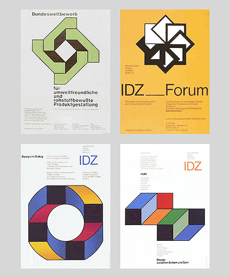
Posters for the International Design Center Berlin (IDZ)
Herbert Kapitzki, a former student of Willi Baumeister, conceived and designed exhibitions for the state industrial inspection board (Landesgewerbeamt) in Stuttgart in the 1950s and the early 1960s. He developed a distinct language of forms modelled on constructive forerunners, and campaigned for the popularisation of functional graphic design. His own groundbreaking work was exemplary in this respect.
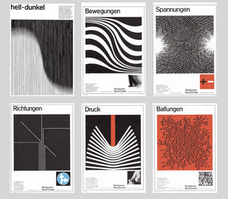
Full-page advertisements in the “Stuttgarter Nachrichten” a German newspaper.
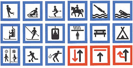
System of signs for sporting and leisure pursuits, 1969
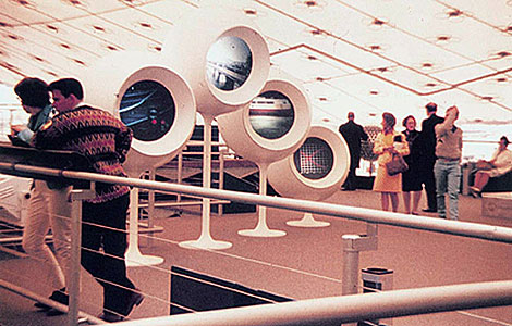
Contribution for the Federal Republic of Germany to the Montreal International Exhibition
1967
When Otl Aicher asked him to teach at the Academy of Design in Ulm, where he remained until the closing of the school in 1968, he already possessed mature creative solutions and precise concepts of modern information design.
The interdisciplinary discussions about actual and future ways of communication of the Stuttgart ‘group 56′ inspired Herbert Kapitzki. He was a pioneer in exploring the visualisation of information through graphic symbols or systems of codes to meet the needs of modern mass communication in times of mobility.
With his pictograms and orientation systems for airports he set international standards for a lingua franca which nowadays seems self-evident to us. Systematic form design remained the central theme of his teaching in Ulm and in Berlin, where he taught at the Academy of Arts from 1970 until his retirement in 1990.
(Source AGI)(Via Swiss Legacy)
——————–
Also worth checking: Publicity and Graphic Design in The Chemical Industry. & Icographic Journal
Not signed up for the Grain Edit RSS Feed yet? Give it a try. Its free and yummy.
——————–
No Tags
Share This
Congrats to B. Rane! She is the winner

A Colt is My Passport (1967) - Directed by Takashi Nomura
If your into classic + cult films it would be worth your while to check Shannon Maldonado’s I Love Hot Dogs. Several times a week Shannon curates a selection of stills from a particular movie. I appreciate her selection process as she sometimes includes typographic/design details that can easily go unnoticed (think street signs, window lettering, etc.). For fans of the art of film title design, there’s plenty of that stuff as well.

Made in U.S.A (1966) - Directed by Jean Luc Godard

La Femme Nikita (1990) - Directed by Luc Besson
The Warriors (1979) - Directed by Walter Hill
Airplane! (1980) - Directed by Jim Abrahams, David Zucker
Une Femme est Femme (A Woman is a Woman) -1961 - Direct by Jean Luc Godard
American classics, Japanese Nikkatsu films, French New Wave, Cult horror flicks etc. Yep it’s there. Check it!
For the Twitter peeps, catch them at @ihearthotdogs.
——————–
Also worth checking: Nikkatsu Films.
Not signed up for the Grain Edit RSS Feed yet? Give it a try. Its free and yummy.
——————–
No Tags
Share This
Congrats to B. Rane! She is the winner in the Photo-Lettering giveaway.
Grain Edit recommended reading: A Russian Diary
©2009 Grain Edit - catch us on Facebook and twitter


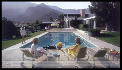
I had a chance to check out Visual Acoustics this weekend and I highly recommend it. The documentary is about the life and work of Julius Shulman, a brilliant architectural photographer whose photos captured the history of modernist architecture in Southern California. During his prolific career he worked with nearly every modern architect since the 1930s including John Lautner, Frank Lloyd Wright, Richard Neutra, PIerre Koenig, Charles and Ray Eames, Craig Ellwood, Raphael Soriano and Gregory Ain.
The release of this film seems especially timely, given that Julius recently passed away. If you are unfamiliar with his work, you are in for a real treat.

Recreation Pavilion. Mirman Residence, Arcadia, California, 1959. Architects: Buff, Straub & Hensman.
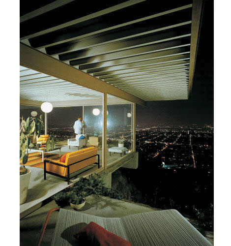
Photo of Case Study House 22 (The Stahl House) c1960 - designed by Pierre Koenig.
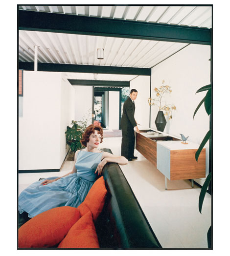
(images via the Visual Acoustics website, Design Public blog+ The Mid Century Modernist)
You can check for screenings of the film in your area here.
——————–
Also worth checking: Saul Bass Case Study House #20.
Not signed up for the Grain Edit RSS Feed yet? Give it a try. Its free and yummy.
——————–
No Tags
Share This
Congrats to B. Rane! She is the winner in the Photo-Lettering giveaway.
Grain Edit recommended reading: A Russian Diary
©2009 Grain Edit - catch us on Facebook and twitter

By: Dave,
on 11/9/2009
Blog:
inspiration from vintage kids books and timeless modern graphic design
(
Login to Add to MyJacketFlap)
JacketFlap tags:
illustration,
travel,
Canada,
Africa,
UK,
France,
Poland,
germany,
1950s,
finland,
vintage,
posters,
1960s,
1970s,
Found design,
israel,
switzerland,
Austria,
Argetina,
Add a tag
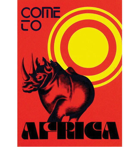
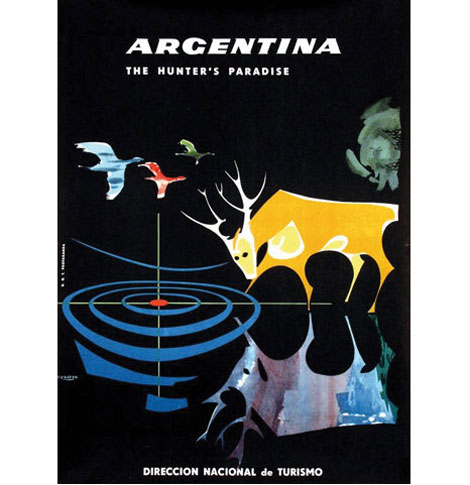
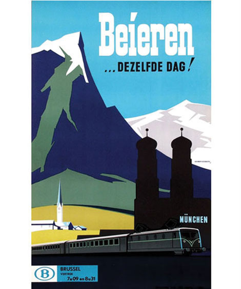
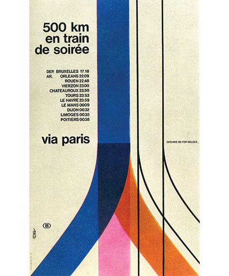
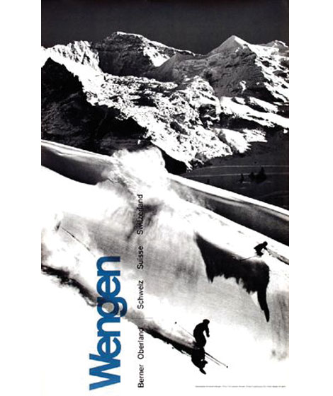
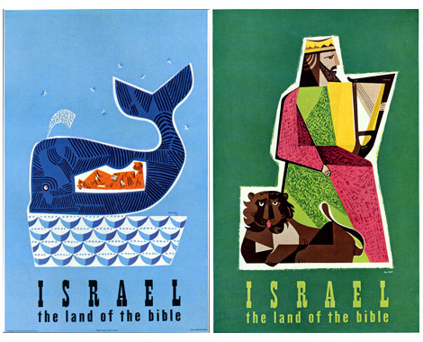
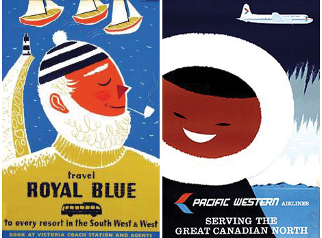
1. Come to Africa - Designed by Gerard van de Voort - c1975
How about virtual tour around the world to start off the week? I dug up a handful of travel related posters from 1950s -1970s for all the desk jockeys that are itching to get out of town. Enjoy!
2.
3.
4.
5.
6.
7.
8.
9.
10.
11.
12.
13.

14.
15/16.
17/18.
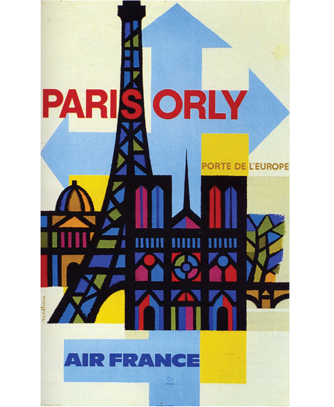
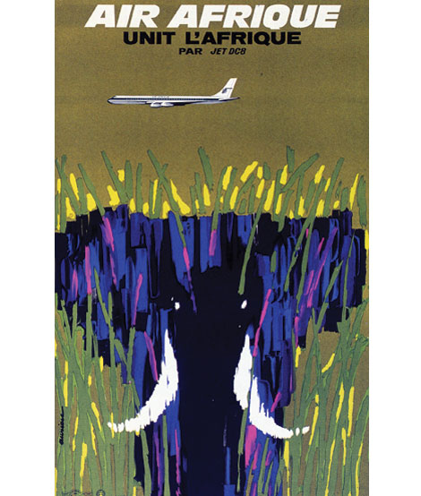
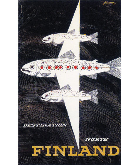
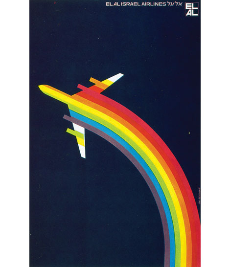
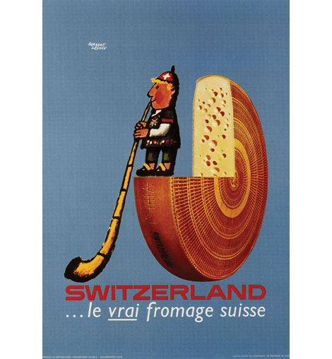
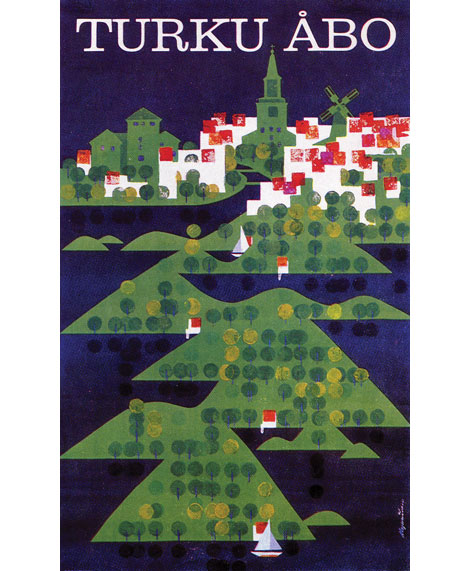
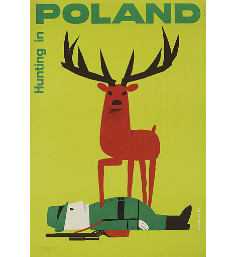
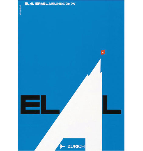
2. Argentina c1950 -Poster artist - Cesareo 3. Beieren c1960- Designed by Herman Verbaere 4. Paris-Orly for Air France c1962- Design & Illustration by Jaques Nathan Garamond 5. Air Afrique c1965- Designed and illustrated by Jacques Auriac 6. Finland print for Finnair c1958 - Design by Erik Bruun 7. Rainbow poster for EL AL Israel Airlines - Design by Dan Reisinger 8. Switzerland c1967 - Design by Herbert Leupin 9. Turku Abo - Tourist poster for the Finnish town of Turku c1966?- Design by Marti Mykkanen 10. Hunting in Poland c1961 - Design by Wiktor Gorka 11. Switzerland poster for EL AL Israel Airlines - Design by Dan Reisinger 12. Poster for Belgian Railways c1966 - Design by Wictor Langer 13. Wengen Switzerland poster c1965 - Design by Martin Lauterburg + Fritz Lauener 14. Austria poster for Pan Am Airlines c1971 - Design by Chermayeff & Geismar 15/16. Israel: The land of the Bible produced for the State of Israel Tourist Centre - Design by Jean David 17. Travel Royal Blue c195? - Design & illustration by Daphne Padden 18. Great Canadian North -Pacific Western Airlines - Anonymous c1960
(images 1,2,3 via Van Sabben auctions) image #12 via grid studio , image #14 via the excellent Container List, image #17 via Larking About
——————–
Also worth checking: David Klein TWA posters.
Not signed up for the Grain Edit RSS Feed yet? Give it a try. Its free and yummy.
——————–
No Tags
Share This
Congrats to B. Rane! She is the winner in the Photo-Lettering giveaway.
Grain Edit recommended reading: A Russian Diary
©2009 Grain Edit - catch us on Facebook and twitter

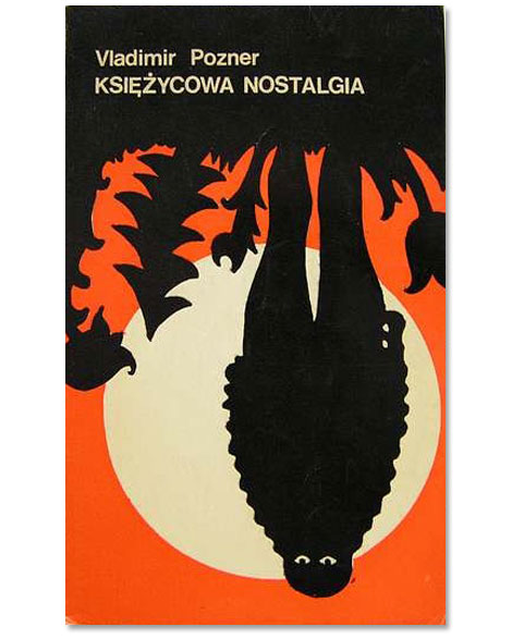
Will over at the excellent Journey Round My Skull posted an amazing collection of Polish book covers. There is some seriously wacky stuff going on these book jackets. Whats up with beard face?
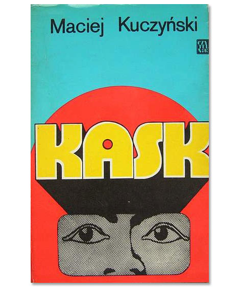
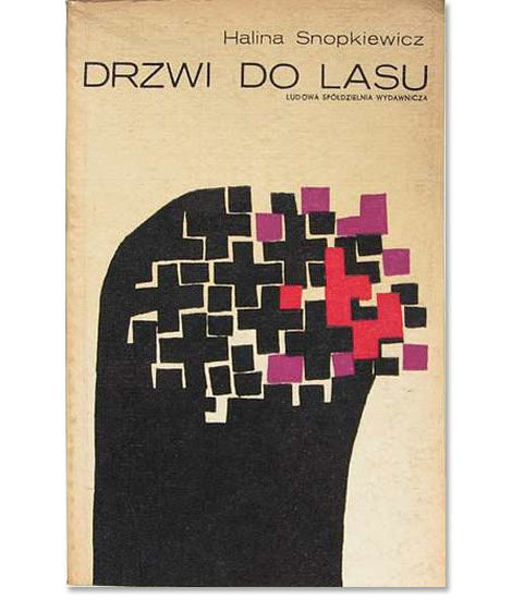
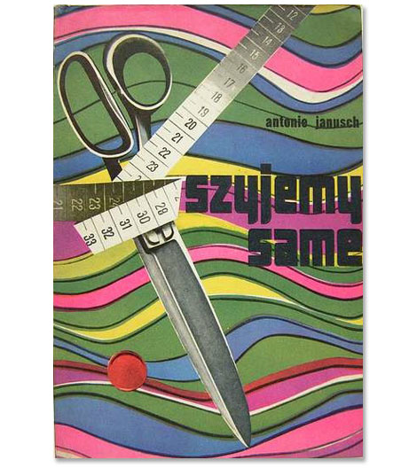
(via delicious industries)
——————–
Also worth checking: Dick Bruna Book Covers.
Not signed up for the Grain Edit RSS Feed yet? Give it a try. Its free and yummy.
——————–
No Tags
Share This
Congrats to MCHL of Sacramento. You are the winner of the Incase HunterGatherer laptop sleeve.
Grain Edit recommended reading: A Russian Diary
©2009 Grain Edit - catch us on Facebook and twitter

By: Dave,
on 10/1/2009
Blog:
inspiration from vintage kids books and timeless modern graphic design
(
Login to Add to MyJacketFlap)
JacketFlap tags:
BOOKS,
illustration,
germany,
Off our book shelves,
vintage,
1960s,
1970s,
swiss,
switzerland,
graphic-design,
Add a tag
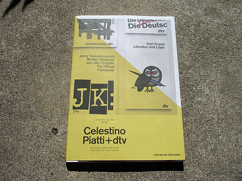
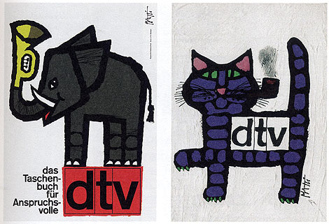
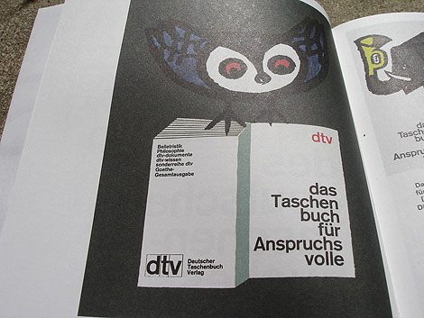
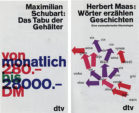
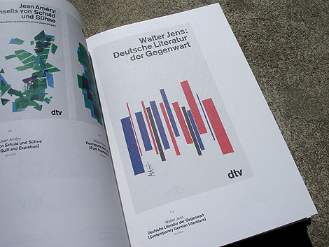
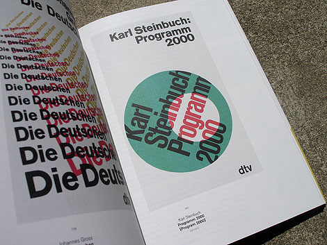
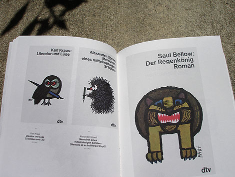
Celestino Piatti + dtv: The Unity of the program - Edited by Jens Muller
Two weeks ago we featured the Philips-Twen book from Lars Muller’s new A5 series. Celestino Piatti + dtv is the third title to be released in the series and my favorite of the bunch.
Celestino Piatti was born in the little Swiss village of Dietlikon on January 5,1922. Early on his parents recognized his talent and secured him training at the Kunstgewerbeschule (School of Applied Arts) in Zurich and later a graphic design internship with fellow Swiss designer Fritz Buhler. After four years with Buhler he left to start his own studio and eventually landed the job of a lifetime. In 1961 Deutscher Taschenbuch Verlag (dtv) hired Piatti to design their bookjackets. A comission that lasted up to his death in 2007. For over thirty years, he endowed the books published by dtv with a singular and unique look. He became the most productive book designer of all times, producing covers for over 6300 books that sold in a total print run of over 200 million copies.
——————–
Also worth checking: Corporate Diversity: Swiss Graphic Design by Geigy.
Not signed up for the Grain Edit RSS Feed yet? Give it a try. Its free and yummy.
——————–
No Tags
Share This
Congrats to MCHL of Sacramento. You are the winner of the Incase HunterGatherer laptop sleeve.
Grain Edit recommended reading: A Russian Diary
©2009 Grain Edit - catch us on Facebook and twitter

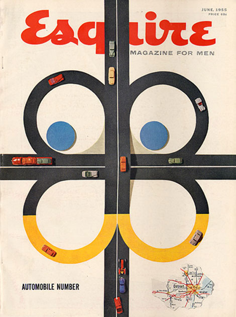
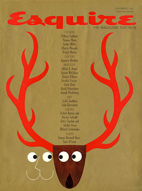
Over the highways and byways we go on the free and open road!
Esquire magazine’s June 1955 issue playfully depicts a typical aerial view of a freeway using toy cars and colored paper. It’s composition is simple and engaging, with its bright primary colors, windy roads, and cars on the move. I especially enjoy the smart and effortless integration of the magazine’s mascot, Esky (designed by E. Simms Campbell), into the area within the highway and in the highway itself. The tiny map of the Motor City is a nice touch too!
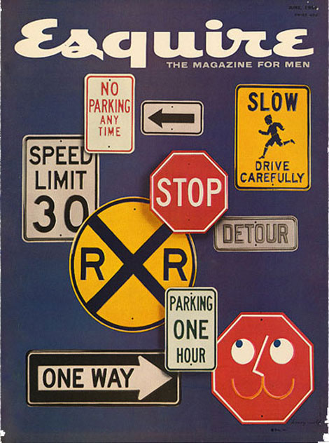
Founded in 1933 by Chicago publisher David Smart and editor Arnold Gingrich, Esquire magazine has a rich design history, with Paul Rand as its art director from 1936-1941.
The covers featured today are primarily under the art direction of designer Henry Wolf, who was the magazine’s art director from 1952-1958. Wolf’s refined style left a sophisticated impression on the magazine’s image. After his departure, he was replaced his assistant, Robert Benton, from 1958-1964.
Esquire Magazine (June 1956)
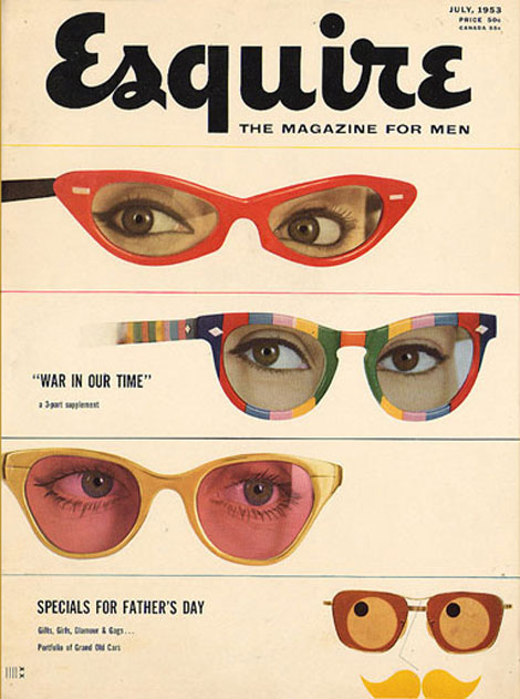
Esquire Magazine (July 1953)
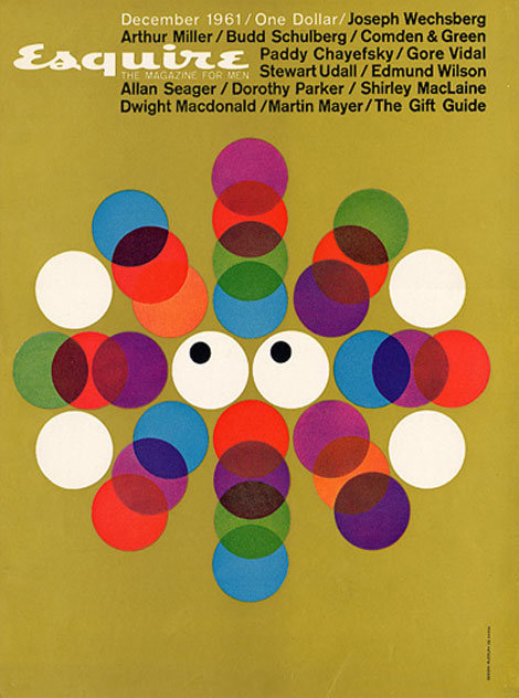
Esquire Magazine (December 1961)
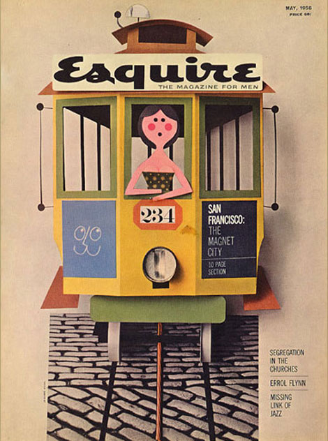
Esquire Magazine (May 1958)
Esquire Magazine (December 1959)
Esquire has a full archive of its entire collection of magazine covers from 1933 to present on full view on their website. There, you can see the Esky’s early antics. Definitely check it out, and don’t forget to look at the neat covers by George Lois from 1962-1972!
No Tags
Share This
Congrats to MCHL of Sacramento. You are the winner of the Incase HunterGatherer laptop sleeve.
Grain Edit recommended reading: A Russian Diary
©2009 Grain Edit - catch us on Facebook and twitter


K.P. Jorgensen & Son Logo - Part of 1960s & 70s Scandinavian Logos Set
This made my day. Vancouver based designer Oliver Tomas uploaded an amazing collection of Scandinavian logos from the 1960s & 70s to his flickr account. Thanks Oliver!


You can catch Oliver on twitter as well @olivertomas.
(via iso50 & AisleOne)
——————
Also worth checking: 60 Years of Finnish Book Design.
Not signed up for the Grain Edit RSS Feed yet? Give it a try. Its free and yummy.
——————
No Tags
Share This
Congrats to MCHL of Sacramento. You are the winner of the Incase HunterGatherer laptop sleeve.
Grain Edit recommended reading: A Russian Diary
©2009 Grain Edit - catch us on Facebook and twitter

By: Stacy Dillon,
on 9/20/2009
Blog:
Welcome to my Tweendom
(
Login to Add to MyJacketFlap)
JacketFlap tags:
2008,
grandparents,
abuse,
moving,
1960s,
Henry Holt and Co.,
copy from local library,
dance lessons,
Friendship,
Add a tag
 Here is a perfect example of the reason why I love going to the public library to browse books. Yes I get invited to a few previews every year, and yes I try to keep up with the professional journals, but nothing will ever replace browsing a shelf. I am taken with titles and covers and upon reading the blurbs I decide what to check out. On my last trip, I picked up this gem of a novel and am eager to share it with you.
Delores, or Itch as she's known to her family, has been living with her Gram and Gramps since her mom decided to leave. She's a girl who collects favourite words, does some serious thinking on her swing in the backyard, loves hanging out with her best friend Bailey, and is a bit of a kindred spirit with her Gramps. When Gramps dies, Itch is upset that Gram wants to move up to Ohio and leave every single memory of him behind.
Once in Ohio, Itch gets a bit of sunshine when she sees that the county fair starts that night. When she goes to check out the grounds on the way to the local Woolworth's, she is beckoned over by a girl in a sequins outfit and Shirley Temple hair who needs help with a zipper. Little does she know that this is the beginning of a complicated friendship between the two.
Once school starts, Itch is eager to be Gwendolyn's (or Wendy as she's known at school) official friend, which is hard since she is friends with popular girls Anna Marie and Connie and she attends lots of dance classes. But once Itch gets her mind to something, she stays true to it, and soon Itch and Gwendolyn are hanging out. Gwendolyn's other friends are surprised when Itch says she's been up to Wendy's room...most of her friends aren't allowed over. Itch wonders why that is, but soon she begins noticing some things about Wendy that just don't seem right. Will Itch have to courage to ask the hard questions and expose what is going on?
Michelle D. Kwasney has written a poignant story that packs a punch. Family structures, friendship boundaries, the realities of abuse are all explored with aplomb. The dialogue between the middle schoolers of the 1960s rings true, and Itch's relationship with her Grams grows so nicely throughout the book, readers will feel privileged to get to witness it. Gwendolyn and her mother's relationship is harder to look at, but Kwasney does it right. The frightening aspects of the abuse are not overdone, but they do not all appear off page either. The amazing thing is that this doesn't feel like a message book...it simply is a great story about two families.
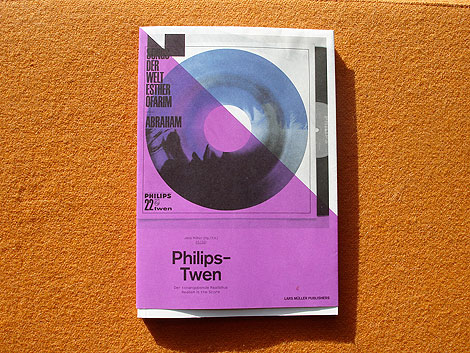
Philips-Twen: Realism is the Score - Edited by Jens Muller
Just got my hands on a few of the Lars Muller A5 titles and they don’t disappoint. I’ll try to get photos of all three titles up on grain edit within the next week or so. Unfortunately these titles are unavailable in the U.S right now, but should be available soon. Amazon has a release date of October 1st.
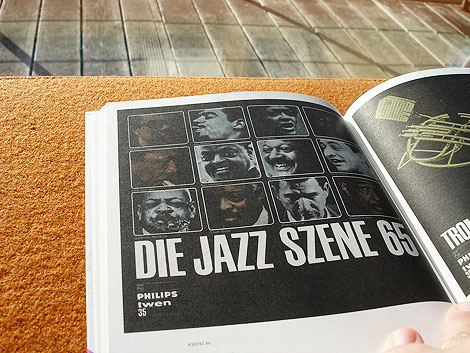
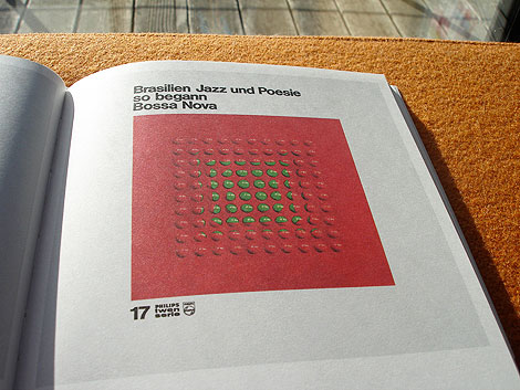
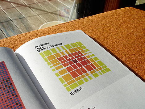
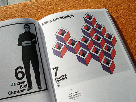
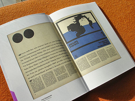
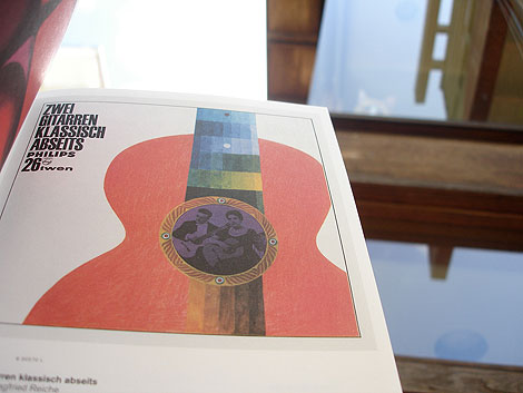
First up is Philips-Twen: Realism is the Score. Between 1961 and 1968, the magazine Twen produced a series of LP recordings in collaboration with the Philips record label. This book illustrates all 70 sleeves from this LP Series and includes an interview with jazz legend Klaus Doldinger, whose first three records appeared on Philips -Twen. The roster of artists/designers who contributed work for the cover art is quite impressive. Willy Fleckhaus who served as the art director for the Philps-Twen series used work by Karl Gerstner, Max Bill, Heinz Edelmann, Michael Engelmann and others to guide the look of the series.
If your interested in the book, you might want to consider pre-ordering it from amazon. I have a feeling the first batch to hit U.S. soil will sell out fast.
For more info check out the Lars Muller website.
——————–
Also worth checking: Corporate Diversity: Swiss Graphic Design by Geigy.
Not signed up for the Grain Edit RSS Feed yet? Give it a try. Its free and yummy.
——————–
No Tags
Share This
Congrats to MCHL of Sacramento. You are the winner of the Incase HunterGatherer laptop sleeve.
Grain Edit recommended reading: A Russian Diary
©2009 Grain Edit - catch us on Facebook and twitter

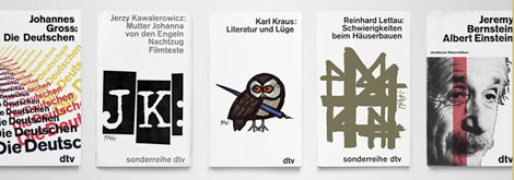
Celestino Piatti and dtv: The Unity of the Program - Edited by Jens Muller
I can’t wait to get my hands on these books.
Lars Muller has just launched the A5 series of books. The series is intended as a growing archive on graphic design. Each volume introduces outstanding personalities and important themes from the history of international graphic design, with numerous illustrations, essays and interviews. The series kicks off with books focused on Celestino Piatti, Philips-Twen and Hans Hillmann.
I’m really excited about the Celestino Piatti book. For more than 30 years, he endowed the covers of books published by dtv with a singular look. With more than 6300 covers to his credit, amounting collectively to a total of 200 million volumes, Piatti was one of the most productive designers of all time.
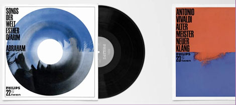
Philips-Twen: Realism is the Score - Edited by Jens Muller
Between 1961 and 1968, the magazine “Twen” produced a series of LP recordings in collaboration with the Philips record label. During this period, all editions of “Twen” were accompanied by LPs drawn from the realms of jazz, classical music, radio plays, world music, or pop. For the designs of his record covers, art director Willy Fleckhaus used Concrete Art by Karl Gerstner, Max Bill, and other dedicated graphic designers such as Heinz Edelmann and Günther Kieser. This now forgotten series, comprising around 70 disks, is a masterful instance of the conjunction of music and graphic design. In collaboration with music archives and private collections, this rare series is reunited in its entirety and documented in this publication.

Hans Hillmann: The Visual Works - Edited by Jens Muller
Born in 1925 in Nieder-Mois/Schlesien, the graphic artist Hans Hillmann is one of Germany’s most important poster designers and illustrators. With his posters after the Second World War, he was one of the first to be honored with the most important graphic design awards, including the Grand-Prix-Toulouse-Lautrec / Paris. As a professor of graphic design whose teaching career spanned more than thirty years, he had a formative influence on entire generations of designers. His illustrations were used by publishers and magazines (including “F.A.Z.-Magazin”) for years.
——————
Also worth checking: Corporate Diversity: Swiss Graphic Design by Geigy.
Not signed up for the Grain Edit RSS Feed yet? Give it a try. Its free and yummy.
——————
No Tags
Share This
Congrats to MCHL of Sacramento. You are the winner of the Incase HunterGatherer laptop sleeve.
Grain Edit recommended reading: IDEA magazine - The Max Huber issue
©2009 Grain Edit - catch us on Facebook and twitter

By: Dave,
on 8/24/2009
Blog:
inspiration from vintage kids books and timeless modern graphic design
(
Login to Add to MyJacketFlap)
JacketFlap tags:
illustration,
stamps,
1950s,
1960s,
1970s,
logos,
Found design,
ephemera,
graphic-design,
Bulgaria,
Add a tag
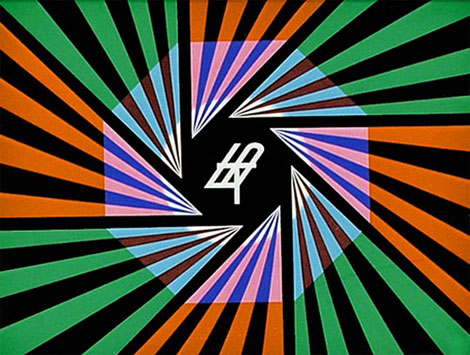

Television graphics
Absolutely stunning work from Stefan Kanchev (1915-2001) who was a Bulgarian graphic artist. During his prolific career he designed hundreds of logos, posters, stamps, book covers, labels as well as graphics for TV. Much of his work is inspired by Bulgarian folklore and traditions.
In 1994 Stefan Kanchev was recognized as one of the top ten designers of trade marks in the world along with Paul Rand, Saul Bass and etc. The title was awarded by the International trademark centre in Ostend, Belgium. His logo work will blow your wig back. I highly suggest you spend a few minutes browsing his archives.

Television graphics
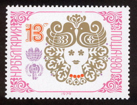
New Year 1980 stamp

New year 1988 stamp
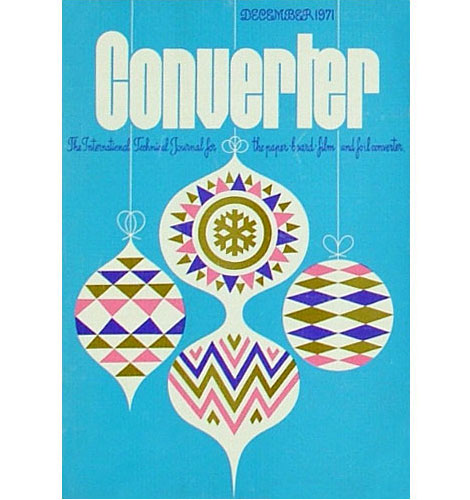
Converter Magazine Cover 1971
(via designboom and delicious industries)
——————
Also worth checking: Modern Stamps From Israel.
Not signed up for the Grain Edit RSS Feed yet? Give it a try. Its free and yummy.
——————
No Tags
Share This
Congrats to MCHL of Sacramento. You are the winner of the Incase HunterGatherer laptop sleeve.
Grain Edit recommended reading: IDEA magazine - The Max Huber issue
©2009 Grain Edit - catch us on Facebook and twitter

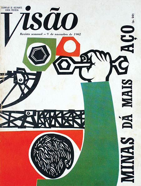
Brazilian designer, Odiléa Toscano, illustrated delightful magazine covers and book jackets in the 1960s and 1970s. This particular illustration, created as the cover of Visão Magazine in 1962, omits a handful of energy as it uses bright complementary colors and geometric heavy forms and type. I really enjoy the intricate cutouts of the subject’s hair and the shapes he’s about to twist with his wrench!
(Via Design Diário)
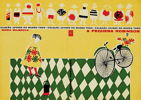
Book jacket from the collection Jovens Do Mundo Todo (1960)

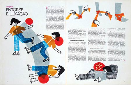
Textbook Criatividade em língua portuguesa (1978)
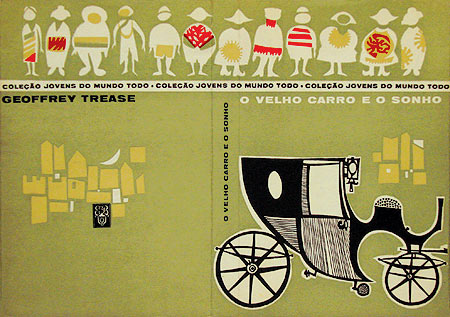
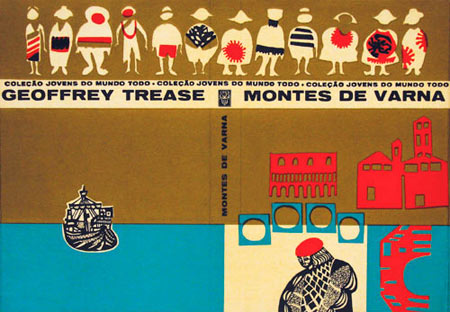
Book jacket cover from Jovens Do Mundo Todo (1961)
In 1961, Odiléa won a prize at the 1st International Biennial of Book and Graphic Arts of São Paulo and some international recognition in design magazines for her work on the book jackets for the collection Jovens Do Mundo Todo (Youth from Around the World). These book jackets feature a row of children, whose clothing feature brightly colored patterned layers, as well as images pertaining to the subject matter of the book. To achieve such colorful effects, Odiléa used art supplies that were relatively new for 1960s, such as Letraset, Pantone films, and markers.
To find out more information about Odiléa Toscano, check out Design Diário’s article on her. It includes a wealth of interesting facts; and be sure to check out other fascinating articles on the site as well!
——————
Also worth checking: Brazilian book covers by Gian Calvi.
Not signed up for the Grain Edit RSS Feed yet? Give it a try. Its free and yummy.
——————
No Tags
Share This
Grain Edit recommended reading: IDEA magazine - The Max Huber issue
©2009 Grain Edit - catch us on Facebook and twitter

If only travel posters still looked this good!
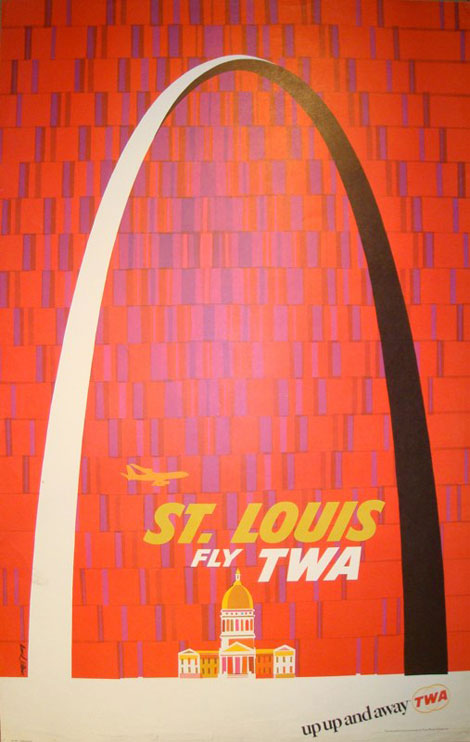
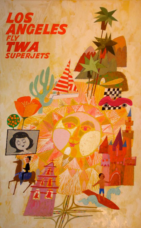
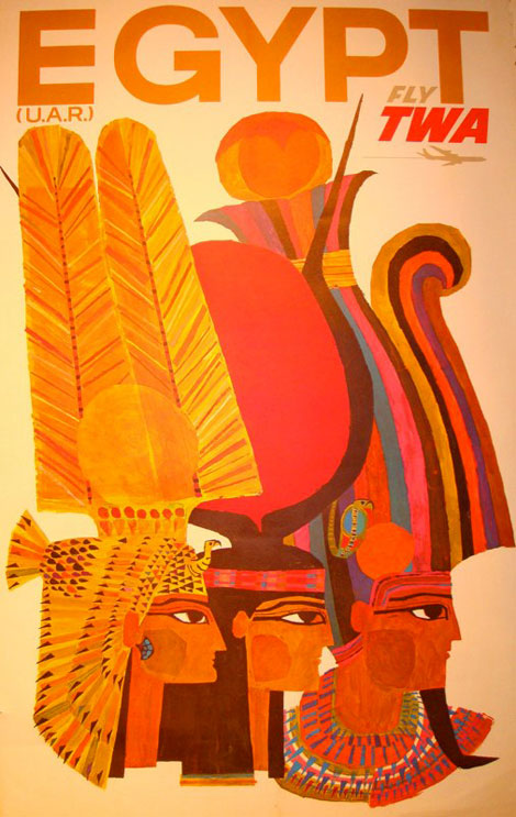
American illustrator, David Klein (1918-2005), created numerous travel posters for Howard Hughes’ Trans World Airlines (TWA) in the 1950s and 1960s. His posters use eye-popping colors, iconic landmarks, and scenic images to advertise global travel.
The composition of this particular poster is fantastic, as Klein sets the St. Louis Gateway Arch against a festively patterned background, emphasizing its momentous size. The analogous colors of the type, airplane, and city hall are a warm treat too!
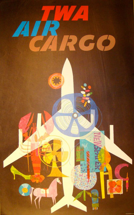
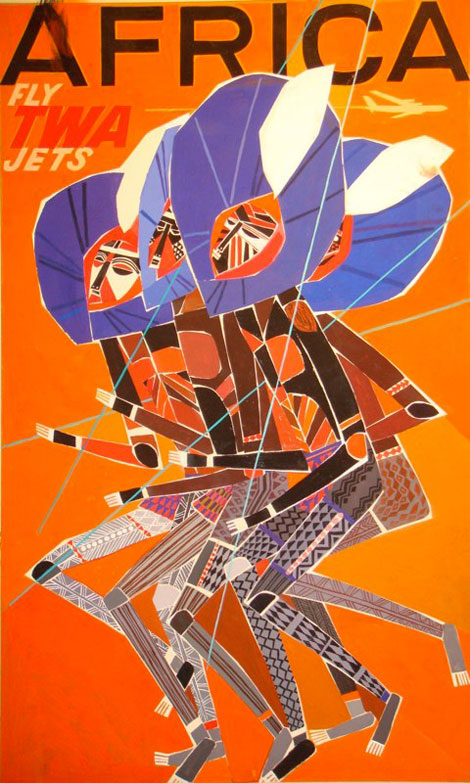
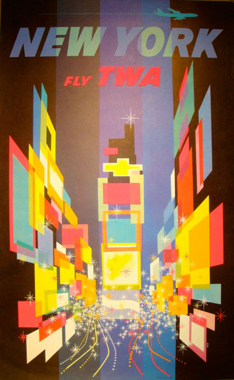
In 1957, the MOMA honored Klein by including his TWA poster advertising New York’s Time Square into its permanent collection.
In addition to creating colorful multi-faceted travel posters, Klein has also designed and illustrated window cards for Broadway plays and the Heights Players community theater. Images of his life’s work can be see on his website, which is managed by his estate.
Be sure to check out the general illustration section, which features some a kooky take on Alice in Wonderland!
——————
Also worth checking: Dan Reisinger Illustration and Design.
Not signed up for the Grain Edit RSS Feed yet? Give it a try. Its free and yummy.
——————
No Tags
Share This
Grain Edit recommended reading: Otto Neurath - The Language of The Polls
©2009 Grain Edit - catch us on Facebook and twitter

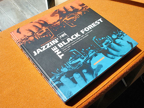
Jazzin the Black Forest - The Complete Guide to Saba/MPS Jazz Records -Published by Crippled Library c1999
Jazzin´the Black Forest is the story of the SABA/MPS jazz label. It was established during the early 1960s and is considered to be Germany´s first independent label. From the label’s beginnings up to its sale to Polygram in 1983, SABA/MPS released over 700 LPs. This book features full color images of all the LPs, a complete index as well as poster reproductions.
Saba/MPS played host to an impressive list of artists including: Albert Mangelsdorff, Joachim Kühn, Volker Kriegel, Wolfgang Dauner, Baden Powell, Oscar Peterson, Duke Ellington, Jean Luc Ponty, Monty Alexander just to name a few.
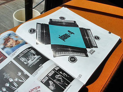
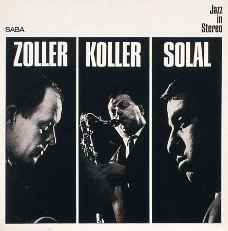
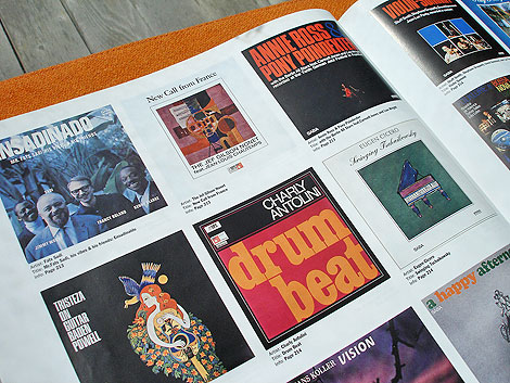
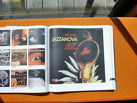
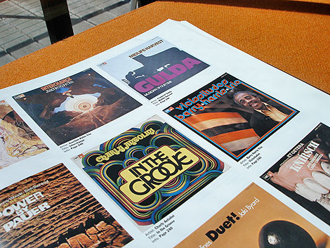
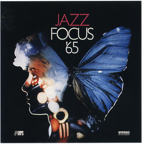
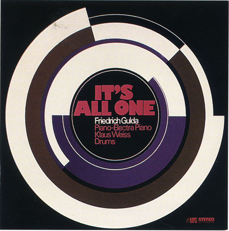
According to the amazing Birka Jazz website “Joachim-Ernst Berendt produced a large number of records, especially live recordings and recordings in studios outside Villingen. Berendt, and his wife Gigi, also contributed to the label’s visual look. Their interest in modern art led to that MPS frequently brought in artists to adorn the covers. Gigi Berendt also designed album covers herself.”
The book is currently out of print, but maybe if enough people contact the publisher they would consider republishing this gem.
———————-
Also worth checking: Mike Cina Jazz Mix
Album covers from the Groove Merchant
———————-
Not signed up for the Grain Edit RSS Feed yet? Give it a try. Its free and yummy.
No Tags
Share This
Congrats to Jenny Eng. She is the winner of the Kevin Dart giveaway.
©2009 Grain Edit

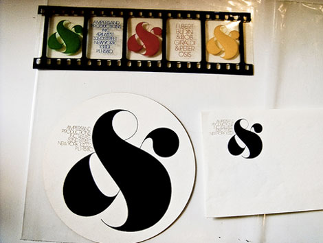
For the Herb Lubalin fans out there, Justin Thomas Kay has just uploaded a slick collection of images from a recent visit to Lubalin’s archive at the Cooper Union in NYC.
In addition to Justin’s Flickr account, you can find photos from the Lubalin collection at 12oz Prophet + So Much Pileup.
———————-
Also worth checking: Photo Lettering: Alphabet Thesaurus Vol.2
Not signed up for the Grain Edit RSS Feed yet? Give it a try. Its free and yummy.
———————-
No Tags
Share This
Congrats to Jenny Eng. She is the winner of the Kevin Dart giveaway.
©2009 Grain Edit

People keep emailing me articles about the “good ole days,” meaning roughly that time period from 1950 to 1964, somewhere between “I like Ike” and the Civil Rights Act. These articles always extol the virtues of a so-called simple life, a time when everything cost less, women were supposed to be virgins when they married, and white Christian men ruled the western world. But do these people really remember what it was like back then? I do. Thank God that time is over!
I was born in 1951, which means I grew up in the 1950’s and came of age in the late 1960’s. I remember lots of trivial things from that era, like manual typewriters, rotary-dial phones, ugly poodle skirts and even uglier hairdos (beehives and cast-iron curls); uncomfortable girdles and stockings; really cool cars and some terrific movies; a few great black-and-white TV shows like “The Dick Van Dyke Show” as well as some dumb-as-dirt TV fodder (remember the Beav?). If you only watched old reruns, and never read a book or talked to people who lived through that era, you’d think America in those days was a bucolic Eden mostly filled with docile Christian white people. It wasn’t like that at all.
When I look at old TV commercials and magazine ads, and when I hear people talking about 29-cent hamburgers, I am reminded of the woefully bad food in America during the “good ole days.” Coming from New Orleans, where great food has always been the norm, I never knew there was bad food in the world until we left town. We moved around some in my childhood, and we traveled a great deal, so I had a chance to see what was out there in the American hinterlands, and way too much of it was not only inedible but downright unhealthy. Remember diets loaded with saturated fat and corn syrup? Remember when the apex of good “cuisine” was a t-bone steak smothered in thick brown sauce or a lobster drenched in butter? The only “foreign” cooking you ever heard about was French, and the only Italian cuisine most Americans had ever sampled was pizza and spaghetti. If you look at a popular cookbook from the 1950’s, you’ll find it loaded with stuff like green bean casserole, tuna noodle casserole, fruit cocktail cake and green jello with marshmallows, all of which were considered fit for human consumption in those days.
Before he married my mother, my American Indian dad had lived all over the world and had developed an international appetite. My mother was well traveled and a good cook, and she would have gladly tried her hand at ethnic cuisine, but she just couldn’t get the ingredients required. If we had stayed in New Orleans like my mother wanted, most of the ethnic essentials would have been available, but my dad’s job moved us several times, and in the late 1950’s we wound up in Pittsburgh (where people had never heard of red beans and rice or fried chicken) for three years and, a couple of moves later, we finally landed in an awful little jerkwater town in Alabama where people fried almost everything that hit the dinner table. In those pre-internet days, living in such a place meant living among people who had never even heard of tacos much less humus or mushu pork. We had to drive a hundred miles either north or south to a real city (not the one attached to the nearby military base) to buy culinary ingredients (and almost everything else), and even in those cities, there wasn’t much to choose from. We’re talking about the south in the 1960’s, where everything was either drowned in mayonnaise or deep-fat fried in lard or corn oil. I remember when I saw my first tub of yogurt in a grocery store. Eureka! In those pre-Starbucks days, my mother was considered weird for lacing her coffee with vanilla or rum flavoring and drinking it iced. At nineteen, I married my first husband, who was from Washington, D.C. He whisked me off to points north and introduced me to a world of culinary delights that I never knew existed except in my dad’s travel tales: lox and bagels, vichissoise, souvlaki, and every other imaginable ethnic cuisine in that truly international city. I had hit the mother lode! I was in absolute heaven. I was also introduced to a city where women and minorities could actually get good paying jobs and were not treated like second-class citizens. For the first time in my young life, I made friends with gay people, African Americans, and people from Japan, India, Egypt, Canada, Ireland, Belgium, Korea, Vietnam, Venezuela. And I found Native Americans other than my dad’s family, a first. I became a hippie and ate granola. I joined the National Organization for Women and burned my bra at a rally. I loudly protested the war in Vietnam. I was reborn! It was the 1970’s and anything was possible. I gladly waved goodbye to the “good ole days.”
There was a reason why things cost less in the good ole days—people made less money than they do now. Duhhhhh! And women were paid a lot less than men as a rule. In those days, women were expected to get married, be housewives and mothers, and generally become servants of their husbands. The poor women who had to work were treated like children by their bosses and they certainly made a lot less money than their male counterparts. It was hard for a woman to become a professional like a doctor or lawyer or engineer in those male-dominated fields. Many women attended college, but they were supposed to become teachers and nurses and secretaries, and until the 1960’s, they were expected to quit working when they got married. Women in those days did not generally make large purchases such as cars and homes, and their husbands usually handled the family finances. And God forbid, if a single woman got pregnant, she had few choices: (1) an illegal back-alley abortion; (2) a shotgun wedding; (3) a home for unwed mothers. If anyone found out the truth, the poor woman was branded for life. Ah yes, the good ole days!
Whenever I receive those “good ole days” emails, I always wonder if the people sending them to me have undergone lobotomies. Don’t they remember the Cold War, Korea, Vietnam? How about Rosa Parks, Martin Luther King, Jr., Vernon Johns, Selma, Birmingham, Little Rock, the entire state of Mississippi? Do these people even remember the assassinations of President John Kennedy, his brother Robert, and Dr. King? Do they remember “restricted” clubs, schools, restaurants? No Jews, blacks, Asians or American Indians allowed. I remember all of that and more.
Having grown up in the south, my memories of the “good ole days” include whites-only signs everywhere, segregated schools, the “n” word, the Ku Klux Klan, rampant racism and classism, Confederate flags, and fear—fear that the southern white Christian way of life would shortly come to end. And it did. That termite-ridden society inevitably came to a screeching halt not long after President Lyndon Johnson signed the Civil Rights Act, and right about the time Johnson ramped up the bombing in Vietnam.
Short-sighted, nostalgic twits have blamed the sea change in American society on everything from Elvis to the Beatles to the mini-skirt, but entertainers and fashion trends are never the cause of societal change, they are merely reflections of it. Even though they had gone through two world wars, Americans before the late 1960’s were still rather isolationist. Except for a very small minority, they really believed in the garbage their government and their TVs were spewing into their living rooms every night. But there is a big world out there beyond our borders, and it was spilling over onto American soil and airwaves exponentially. Did eleven states suffering from social dry rot really think they could keep American apartheid alive indefinitely while the riots raged in south central Los Angeles and our nation’s capital? Did they really think they could get away with killing three freedom riders from the north and four little black girls in Birmingham and Martin Luther King in Memphis? Did men really think they could keep women enslaved in the interior when women in New York and Chicago and San Francisco were burning their bras and demanding equal rights? Yes, most of them really thought they could, until it all came crashing down on their obtuse little pointy heads and the “good ole days” were gone forever.
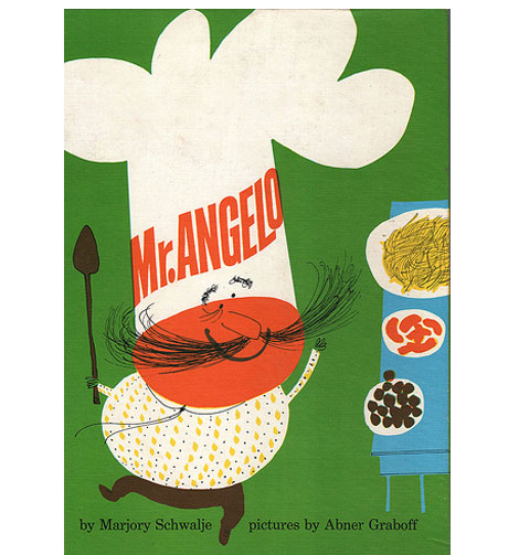
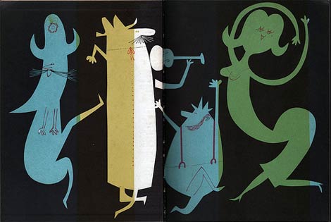
Mr. Angelo by Marjory Schwalje - Illustrations by Abner Graboff c1960
Ward Jenkins has an excellent interview with Jon Graboff over at the Ward-O-Matic. Jon is the son of the uber talented Abner Graboff, an American artist who illustrated a slew of amazing children’s books during the 1950s and 60s. In one part of the interview Jon mentions that his brother informed him that their dad had designed the CBS “eye” logo but didn’t receive credit for it. The credit went instead to the chief art director at the network. That art director would be William Golden. Is it possible that Abner Graboff designed the CBS eye logo?
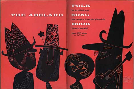
The Abelard Folk Song Book, 1958.
———————-
Also worth checking: Ryohei Yanagihara- Fireboats
Not signed up for the Grain Edit RSS Feed yet? Give it a try. Its free and yummy.
———————-
No Tags
Share This
Congrats to Jenny Eng. She is the winner of the Kevin Dart giveaway.
©2009 Grain Edit


By: Rebecca,
on 6/30/2009
Blog:
OUPblog
(
Login to Add to MyJacketFlap)
JacketFlap tags:
A-Featured,
1950s,
Media,
Elvis,
Jackson,
1960s,
1980s,
John Lennon,
Michael Jackson,
Lennon,
Elvis Presley,
Joseph,
Farrah,
Michael,
Farrah Fawcett,
Joseph Conrad,
Presley,
Fawcett,
Conrad,
Music,
Current Events,
American History,
John,
Add a tag
Elvin Lim is Assistant Professor of Government at Wesleyan University and author of The Anti-intellectual Presidency, which draws on interviews with more than 40 presidential speechwriters to investigate this relentless qualitative decline, over the course of 200 years, in our presidents’ ability to communicate with the public. He also blogs at www.elvinlim.com. In the article below he reflects on nostalgia for the 80’s. See his previous OUPblogs here.
Journalists are not usually in the habit of looking back. They are charged to deliver “breaking news” to us. Novelty is the coinage of the newsroom, not history. Yet this week, the media’s preponderant coverage of the life and death of Michael Jackson has been stridently nostalgic. It reveals a culture needing and ready to sing an ode to the 1980s.
We cannot turn back time, but we can mark its passing. Up till last week, popular culture hadn’t had the chance to address the passing of an 80s superstar and with that, the 1980s. We were given occasion to mourn and contemplate the passing of the 1950s with Elvis Presley’s untimely death, and the passing of the 1960s with John Lennon’s death. So we have sung an ode to the post-war consensus, as we have sung an ode to the cultural revolution.
But enough of the 80s has remained with us - MTV, Nintendo, Reaganomics - not defunct but writhing for relevance, that we have not dared sing its eulogy. Michael Jackson’s and Farrah Fawcett’s death has served us a dramatic notice that it may be time.
After all, it is unlikely that we will see another Michael Jackson. In our era where songs are downloaded one at a time, no one is likely to sell a 100 million records (of “Thriller” or any other album) again. The 80s are over, but it has taken us three decades to find a moment to collectively mark and mourn its passage.
Tragic deaths are compelling not only for human interest reasons, but for the decisive statement about our mortality they make. For if even iconic characters who once defined their age can be so suddenly ejected from the remorseless flow of history, then there is surely no stopping the march of time.
It is no surprise that Michael Jackson is more beloved posthumously than he was all of this decade. Elvis Presley too, had become more and more of a has-been as the 60s progressed. Time is never forgiving - our only feeble antidote is nostalgia. So wrote Joseph Conrad, “Only a moment; a moment of strength, of romance, of glamor–of youth! … A flick of sunshine upon a strange shore, the time to remember, the time for a sigh, and–good-bye!–Night–Good-bye…!”
If the 1980s and whatever the decade repesented are indeed over, then businessmen, journalists, and especially politicians - take note! Nostalgia can only occur when the past has been rendered past.

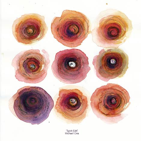
Mike Cina - Spirit Edit Jazz Mix
In this 4th installment of grain edit mixtapes, we caught up with design nut and all-around awesome guy Mike Cina. When Mike isn’t manning the helm at YouWorkForThem he’s digging through your grand pa’s record collection. Today we’re excited to present an exclusive jazz mix he created for grain edit readers.
Before we get to the mix, I had a chance to pick Mike’s brain on record collecting, typography and album cover art.
When did you start collecting records?
I started ‘collecting’ in high-school, 1986, but I started shopping for records when I was 7. My father used to take me out once a month or so to hit up some record stores. Like most kids, I wanted to be like him, so I would buy records but I was into disco and pop. He was into deep heavy rock (Electric Prunes, Blue Cheer, Black Sabbath) so whenever I would play my stuff, he would exit stage left.
In high school I started actually getting a collection together. I probably had 800 or so records back then. Anything from Acid House to Metal. In the mid 90’s I only was buying CD’s. Finally in the late 90’s I realized that CD’s were a waste and started upgrading all my CD’s to vinyl. Never regretted that move.
Can you tell us a little about the albums you selected for the mix and why you chose them?
I chose a wide range of music but the common thread are jazz musicians that had spiritual ties. In the 60’s and 70’s you had a lot of small independent labels (Saturn, Nimbus, Black Jazz, Strata East, Tribe, etc) that put out amazing work. Ideas were everywhere and people were exploring new territories. There were a lot of musicians also deep into religion and they made jazz music based off of their relationship with God. John Coltrane pretty much launched this movement, being an extremely spiritual person. I can’t quite explain it, but the music has a different feeling and sound. This mix takes a journey into what people now call “Spiritual Jazz.”
For some people Jazz can be hard to understand or appreciate, what is it that resonates with you?
The first time I “heard” jazz was when I was in college and a friend dropped Herbie Hancock “Headhunters” at my house one night. It really resonated with me, especially the track Chameleon! When the transition in the middle of the song happens you just get all warm and a light turned on in my brain. I was playing house music out at the time and they would sample jazz a lot, so I knew your basic jazz and soul hooks. The next lp I bought was Coltrane’s “Interstellar Space” and that did not resonate with me at all. After that was Dolphy’s “Out to Lunch” and that was a little better. I kept trying different ‘classics’ until I got to Coltrane’s”Love Supreme” and then things clicked a little more. I think the more you listen to jazz, your ear sharpens and you can hear more things. Doors start to open, you can start to hear emotions, personalities, ideas and conversations with the band members. Raw feelings. The best jazz to me is music that is caught up in a struggle of emotions.
Do you see any connections between typography and jazz?
If you look at anything from the constructivist workings, avant garde typography, down to the Reid Miles covers, or even Niklaus Troxler posters… you can see how words and jazz mix. There is a rhythm in how people speak and can relate to music as well. So if you take how people talk, you can express that visually with the letters. Or even capture the mood or emotion of the players, much like Reid Miles did. I don’t think he captured the music, but more the feeling and personalities of the players. There are a lot of new books coming out about album cover art, so I think that is a testimony that music does inspire design.
What are your thoughts on the downloadable music culture and its
effect on album cover design?
Where do you begin? The music industry does not care about making good music. When they changed from vinyl to tapes to CD’s, they fully knew it was not as dynamic but very portable. Ever since then, they have pushed a more disposable format. Nothing can replace the size, feel and emotion that you can get from a beautiful lp cover. To be honest, I don’t even care what most albums look like anymore if it is digital. They could have any image because I can’t see the cover unless I choose to look at it or add it in iTunes. With an album, you have to look at it. You have to put money and effort into making an LP. It is just the perfect size and shape to get enough detail and do a dynamic layout.
Every collector has that prized find. What record is that for you?
I have found some nice stuff. These are not the most rare but finding a white label of Skull Snaps, Tom Scott’s “Honeysuckle Breeze” was nice. My favorite stuff to find is private-press jazz and boogie. To answer your question, my prized lp is Oriental Jazz by Lloyd Miller. It is one of those lp’s that just resonates with me.
Do you have any other record digging stories you can share with us?
I have been in more than a couple odd situations where I felt like I could have been abducted extremely easily. The classic one was where we are in Ohio and are calling record stores. This guy answers and said he closed his shop but is willing to let us peek around for a bit of what stock he has. We drive up to the address and we are in a bad side of town. When we park I am thinking my car is going to get stolen. I see these guys walking down the street and tell my friend to watch out as he is opening the door and he practically hits these guys with my car door. They murmur something to him and we see this guy opening these big wooden panels on a shop. When we walk in, there are records all over the place and nothing is priced. We sort through it all and found some nice Blue Notes. When we are done, he says yeah your car is still there (he was watching it) want to see more records? So we say yep. We go around this bulletproof glass barrier into another room that looks like a bomb went off in it. Records were everywhere, we were walking on records to get to the main part of the room. We spent a good hour or two there, pulling some nice jazz and Soul. So when we are done, he says there are some lps in the basement. Well we go downstairs and the air is thicker than I have ever breathed. Damp as anything with a mold and mildew stench. My friend and I have our arm over our mouth so we can breathe and the owner doesn’t go down. It’s basically something straight out of Pulp Fiction and the word “gimp” comes in my head immediately.
So we are down there and there is one green bulb on and you can barely see. We said we had enough and he said well there is another basement down from here with more records. We reluctantly say okay and we go
down further and I can’t even breathe and my friend murmers lets get the hell out of here’ and he goes upstairs. I did see a audiofile Herbie Hancock “Maiden Voyage” so I run over and grab it and go upstairs. I was really thinking NOBODY would have found us if something happened, being probably 30 or more feet underground. The only reason I went down is because the owner was a really nice guy.
So he said he had yet another warehouse with some as well so we go there too and had crates and of crates of jazz. I was just spent so really didn’t look as sharp as I should have. It was just a great time but took up a half of a day. I think I got 70 something records there. Checking out closed warehouses full of lps are ALMOST always a treat.
Reid miles/ Blue Note is often mentioned when the subject of cover
art is brought up. What other jazz labels do you feel we’re/are
consistently producing solid cover art?
ECM is probably my favorite overall from front-to-back cover. I used to see them all the time for 50 cents and passed on them until I thought that I should just buy them all for the covers. Well, I started really getting into the releases that came out before 1980 and started collecting them. I have their first hundred-and-something releases (ECM1001-ECM1120) or something. Blue Note is essential, Strata-East, Tribe, Impulse is okay (their spine is the best ever though). Factory Records and 4AD is pretty amazing but not jazz.
……and now the Spirit Edit Mix!

Here’s the track listing:
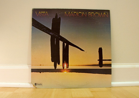
1. Marion Brown - Bismillahi
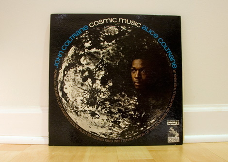
2. John Coltrane - The Sun
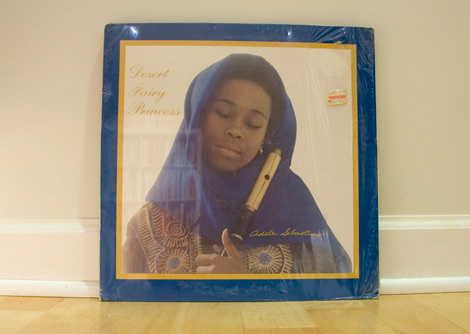
3. Adele Sebastian - Desert Fairy Princess
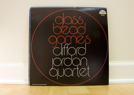
4. The Clifford Jordan Quartet - John Coltrane
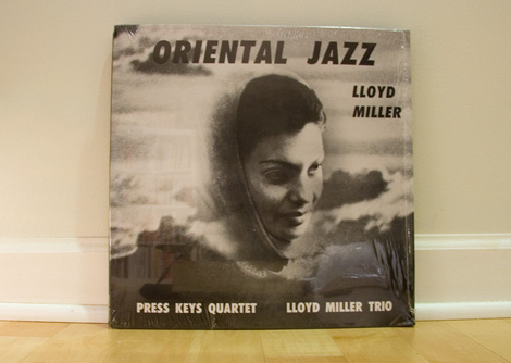
5. Lloyd Miller - Gol-E-Gandom
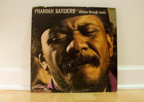
6. Pharoah Sanders - Love is Everywhere
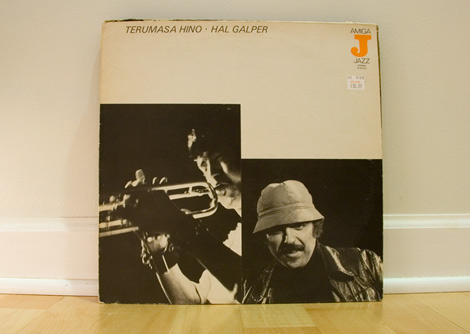
7. Hino and Garper - Red Eye Special
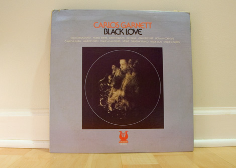
8. Carlos Garnett - Mother of the Future
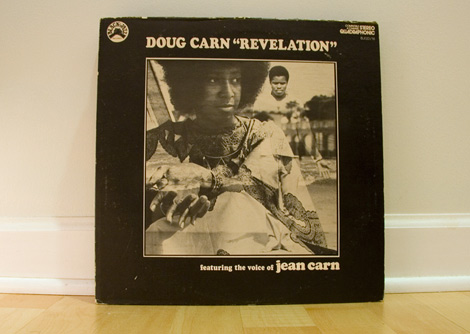
9. Doug Carn - God is One
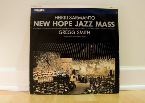
10. Heikki Sarmanto - Duke and Trane
Many thanks to Mr. Cina for putting this mix together. Be sure to catch Mike at YouWorkFormThem and Twitter.
———————-
Also worth checking: Mike the 2600 King Mix, Props Radio Designer Music, Afreeka Mix
Not signed up for the Grain Edit RSS Feed yet? Give it a try. Its free and yummy.
———————-
No Tags
Share This
Congrats to Jenny Eng. She is the winner of the Kevin Dart giveaway.
©2009 Grain Edit

By: Dave,
on 6/22/2009
Blog:
inspiration from vintage kids books and timeless modern graphic design
(
Login to Add to MyJacketFlap)
JacketFlap tags:
Design,
Uncategorized,
ART,
modern,
vintage,
prints,
1960s,
Found design,
Charley-Harper,
Mid-century,
Add a tag
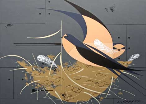
I’d like to thank Rena Hopkins of the Charley Harper Art Studio for passing on the good news that a lost trove of original Charley Harper paintings have been rediscovered. These paintings were commissioned for the Ford Times and Lincoln Mercury Times Magazines and include many pieces from Charley’s beloved bird series. You can find out more info at the studio’s exciting new blog. Original Harper prints for Ford Times magazine are available for purchase here.
Charley’s son Brett will be on hand to personally introduce this new collection at an opening at Fabulous Frames and Art, one of our longest standing retailers, from 11 am-5 pm Saturday, July 11th. This local show will run from July 11th through August 8th.
Fabulous Frames and Art
10817 Montgomery rd
Cincinnati, OH 45231
No Tags
Share This
Congrats to Jenny Eng. She is the winner of the Kevin Dart giveaway.
©2009 Grain Edit

Kaufmann House designed by Richard Neutra in 1946
This looks like its going to be a must see flick for modern architecture fans.
Filmmakers Michael Bernard and Gavin Froome have created a documentary that will take you on a journey through three generations of modern architecture on the West Coast of North America.
This film speaks with the architects and their patrons, and asks if Modernism’s time has finally come or did it ever really go away.


Opdahl House designed by Edward Killingsworth in 1957

Smith House designed by Arthur Erickson & Geoffrey Massey in 1964
You can see the trailer for the film here. They have a blog as well.
——–
Also worth checking: Arthur Erickson: Graham House
& Saul Bass Case Study House #20
Not signed up for the Grain Edit RSS yet? Give it a try. Its free and yummy.
——–
No Tags
Share This
Congrats to our two winners in the Human Empire/Andreas Samuelsson t-shirt giveaway. 1st place winner jessicat - 2nd place winner - Hamsterfish
©2009 Grain Edit

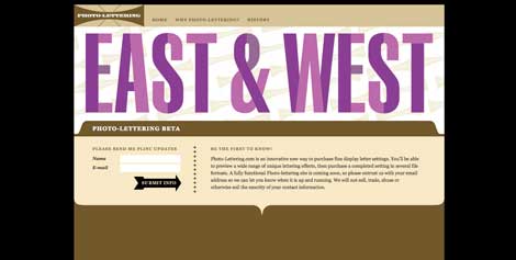
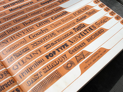
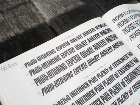
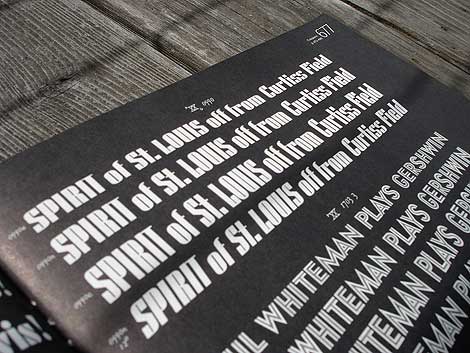
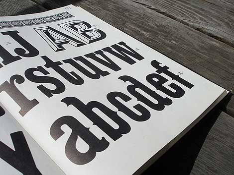
Photo Lettering website
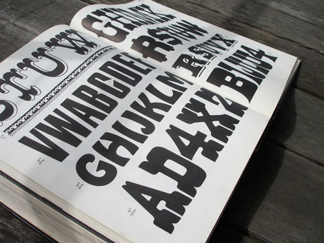
Photo-Lettering was a mainstay of the advertising and design industry in New York City from 1936 to 1997. PLINC, as it was affectionately known to art directors, was one of the earliest and most successful type houses to utilize photo technology in the production of commercial typography and lettering. It employed such design luminaries as Ed Benguiat and sold type drawn by the likes of Herb Lubalin, Milton Glaser and Seymour Chwast as well as countless other unsung lettering greats. The company is best known by most of today’s graphic designers for its ubiquitous type catalogs.
House Industries purchased the entire physical assets of Photo-Lettering and is carefully digitizing select alphabets from the collection and plans to offer them through the new Photo Lettering website.
To celebrate, I thought it would be nice to dig up one my Photo Lettering catalogs. Here for your viewing pleasure is Alphabet Thesaurus Vol.2
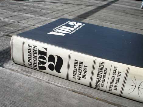
Alphabet Thesaurus Vol 2 - A Treasury of Letter Design
No Tags
Share This
Congrats to our two winners in the Human Empire/Andreas Samuelsson t-shirt giveaway. 1st place winner jessicat - 2nd place winner - Hamsterfish
©2009 Grain Edit


Graham House built in 1965 by Arthur Erickson
The passing of Arthur Erickson last week was as devastating as the demise of his masterpiece, the Graham House, in 2007. Yet the world still continues to be enamored and inspired by his modernist works, particularly his early projects such as the Smith House, the Hilborn House and the Fire Island House to name a few.
Graham House is still considered his most notable midcentury modern residential project. Situated in scenic Horseshoe Bay in Vancouver, BC, the house was built as a series of interlocking volumes descending the rocky slopes. Its visually-dominant suspended wood beams and floor-to-ceiling glass walls are closely reminiscent of Kappe’s Residence.


Photos and links via
Arthur Erickson website
Heritage on the Rocks: Vanmag.com article
Dwell.com’s Kappe Residence article
————
also worth checking: Ferris Bueller House for Sale
————
No Tags
Share This
Join us on Twitter @grainedit .
Join us on Facebook
©2009 Grain Edit

View Next 25 Posts


