 Once I had all of the scenes listed, I laid them out on my kitchen table and looked for patterns, logical groupings (scene sequences in film-speak), plot lines and structure.
This photo (sorry for the lack of detail) shows the entire novel, all 53 scenes. The two columns on the left represent the beginning and the column of six cards on the left represent the climax and resolution.
Why do I do this? Having a visual representation of a story’s plot helps me understand how the author composed the book on an abstract level. For instance, when I read Marcelo in the Real World, the pacing at the beginning seemed slow. It took a while for the story to really get going. The cards show why I felt that way: Stork uses the first quarter of the book (those two left-most columns) to set up Marcelo’s current world and his first day at work in the mail room.
Another interesting discovery I made was that Stork introduced the fourth plot line (the mystery about the girl in the photograph) exactly halfway through the book. That plot line carries the book forward and significantly impacts Marcelo’s attempt to do well at work. This is a good example of introducing a plot line to beef up the middle of the work.
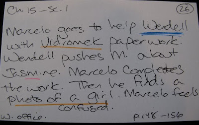
Besides looking at how the scenes worked together, I also marked plot lines or layers, to use a Donald Maass term, in different colors. The card shown above is what Maass would call a “node of conjunction,” where several plot layers intersect (see my posting at StorySleuths for mor


Hi Heather. You and I must share the same Zodiac sign. Or maybe it's just the "J" in our typical writer's INFJ personality type. I occasionally make up charts like this to study various elements of craft (or my own work). For instance, I studied the art of backstory, time looping, and plot weaving by dissecting HOLES. I use the columns feature (or is it tables?) in Word to divide chapters and/or scenes. You can even shade entire blocks and color/highlight text.
Thank you for this informative post!
Hi Danette! Thanks for stopping by! I love the idea of looking at how back story works as well.
Hope your writing is going well--can't wait to hear about the creative thesis.