


Inspiration
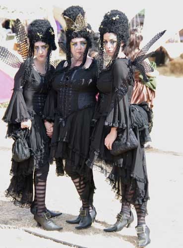
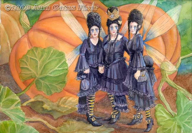
For my next watercolor I chose a picture of three "bad" fairies from the FairyWorlds Festival.
I decided to place them in a pumpkin patch. Why? Because I'm going to be using this painting in a fairy calendar that I'm working on and I think they will be great for October. So I went looking for photos of pumpkins rather than make it up from imagination. I know what a pumpkin looks like but not necessarily what the leaves look like. I found a picture of them but it was still hard to see exact detail. Oh well it's fantasy....right?
Preliminary Sketch
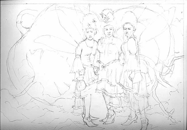
This time everything is pretty much there as far as background. I was more attentive to this,
this time because working with three figures felt a little bit more complicated to integrate
them into the scenery. Plus I already knew that I wanted them against pumpkins.
this time because working with three figures felt a little bit more complicated to integrate
them into the scenery. Plus I already knew that I wanted them against pumpkins.
Color Study
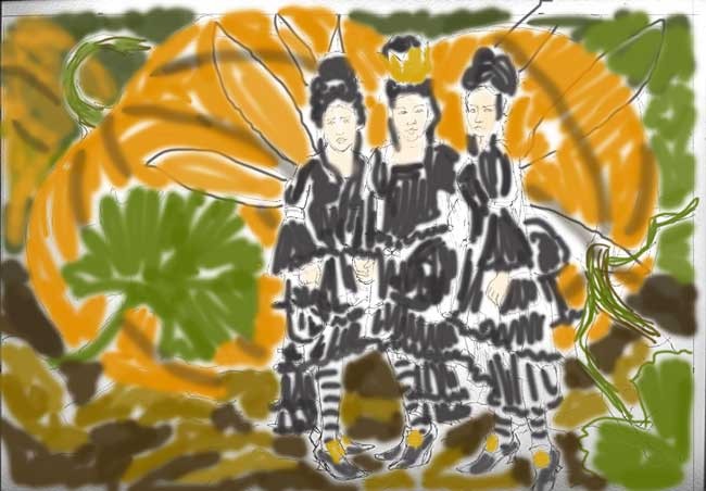
The color study is pretty close to what I ended up painting, except
that when I started painting it I notice that it lacked something.
At this stage of the painting above I have painted the fairies in great detail, except for refining and a few unpainted things they are fairly close to the way that they will be. After laying in the first washes of the background, I turned to my analogous color wheel. (A wheel that shows complimentary, adjacent and discordant colors) Since orange is not a color that figures prominently in my paintings usually, I needed help with this particular color palette, and found that the color that was missing was blue (complimentary to orange, the dominant color in the painting). At first I was at a loss as to how to introduce enough blue into this painting that had nothing naturally blue. I painted some into the greens but it wasn't strong enough nor was it enough to satisfy the need for complimentary color to the orange.
So began the search for blue. Originally I had pictured the wings as white with black definition but realized that I could use blue at the base of the fairy wings and it would be gorgeous against the orange. I painted more layers of blue wash in a few places in the green background. Closer but still I wanted more. And I wasn't happy with the look of their dresses. It was just a little lifeless. That was when I had my happy thought- Use a light blue (cerulean) on the highlights and voila I had enough blue and the dresses had life.
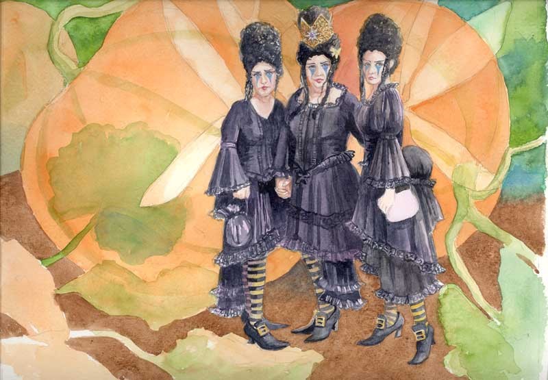
Fine'
Well ti's almost fine' (finished). When looking at the scan I noticed that I had not finished painting the
butterfly in the middle fairy's hair.
I think this might be their prom picture...before they go off to the bad fairy's ball.