Login or Register for free to create your own customized page of blog posts from your favorite blogs. You can also add blogs by clicking the "Add to MyJacketFlap" links next to the blog name in each post.
Blog Posts by Tag
In the past 7 days
Blog Posts by Date
Click days in this calendar to see posts by day or month
Viewing: Blog Posts Tagged with: portableapps, Most Recent at Top [Help]
Results 26 - 50 of 80
How to use this Page
You are viewing the most recent posts tagged with the words: portableapps in the JacketFlap blog reader. What is a tag? Think of a tag as a keyword or category label. Tags can both help you find posts on JacketFlap.com as well as provide an easy way for you to "remember" and classify posts for later recall. Try adding a tag yourself by clicking "Add a tag" below a post's header. Scroll down through the list of Recent Posts in the left column and click on a post title that sounds interesting. You can view all posts from a specific blog by clicking the Blog name in the right column, or you can click a 'More Posts from this Blog' link in any individual post.
How many titles are formed by two nounsconnected by "and" or "or"? How many titles use a verb that ends in "ing"? Sometimes titles follow patterns. Take the titles for today's competitors in SLJ's Battle of the Kids Books. Splendors and Glooms and Liar and Spy. See what I mean?
Do you need help coming us with a superb title? Check out this Title Generator from Fiction Alley. Do it for fun. Do it for profit. A good title can encourage sales - I think.
Just for fun, I entered ten random words. Here are my results.
Your Titles
Title One: frivolous barns through windswept tantrumsTitle Two: the windswept pieTitle Three: the fern through frivolous barnsTitle Four: frivolous pieTitle Five: the turning fernTitle Six: whispering tantrumsTitle Seven: turning barnsTitle Eight: windswept whisperingTitle Nine: whispering for tantrumsTitle Ten: turning and whispering I like Frivolous Pie,Turning and Whisperingand The Turning Fern.Have fun.
0 Comments on Title generator as of 3/19/2013 11:19:00 AM
So what's the difference between persuasive writing and argumentative writing?
In persuasive writing, students passionately defend their point of view, relying upon opinion, personal experience, anecdotes, data, and examples. Argumentative writing, however, seeks to offer a more balanced approach, as it acknowledges points from the opposing view.
This approach may sound counterproductive; after all, won't writers weaken their arguments by providing the reader with counterclaims? Surprisingly, no. By naming objections and then refuting them effectively, writers actually strengthen the position of their arguments. Persuasion, on the other hand, is weak by comparison: it ignores, in a cowardly way, any viewpoint that is contrary and threatening to its own. It's blatantly one-sided and subjective. So where can our young readers witness the power of argumentative writing? In picture books, of course!
In George Bellows: Painter with a Punch, author Robert Burleigh chronicles the career of a fascinating and prolific artist who is celebrated for his gruff and gritty observations of the vitality and vigor of early twentieth century New York City. Burleigh provides the reader with "just enough" details of Bellows the man to make him real and rounded, and "just enough" context of the art scene of the time to build color and context. The majority of the text rightfully focuses on the images (profusely provided in beautiful color) and on Bellows' artistic legacy.
As a teacher of reading and writing, I am struck by Burleigh's use of argumentative text structures which can serve as wonderful exemplars for young writers. Consider this passage from early in the text:
One man - seated at ringside - observes the events somewhat differently. He watches closely both the fury of the fighters and the fans' reactions. But who wins the bout doesn't matter to him. He has his own goal: to wrestle a picture from the chaotic scene, to capture the wild energy of this moment!
Is this strange? An artist here, in a smelly, grungy saloon?
Shouldn't an artist be searching for beautiful things to paint? Golden sunsets? Quiet, tree-lined rivers? Or perhaps a wealthy gentleman, or a celebrity dressed in her finest clothes? Many people would say just that.
But not George Bellows.
In that example, a series of questions defines the opposing viewpoint. We know that George will need a pretty darn good reason for choosing subjects so contrary to those of traditional artists!
In another selection, the opposing argument is presented more traditionally as a juxtaposition of one perspective to another:
George's paintings gain attention. He is among a group of artists who focus on the less romantic parts of the city, like bars, train stations, movie theaters, and alleyways...Reviewers attack the group, calling them "apostles of ugliness" because they dare to paint the seamier side of life...But a few reviewers find complimentary things to say about George's art. They especially praise his ability to convey strong feelings in his work.
One critic, although won over by Bellow's radical approach, still qualifies his admiration for the artist in a compliment that acknowledges the two opposing viewpoints of the time:
"It's in bad taste," one says, "but it's life - and that is the main thing."
As you can see, the examples of argumentation are there. They're subtly written, however, so as not to crowd out the narrative. That is exactly what makes them effective, and so worthy of our students' admiration and study and replication.
In the excerpt below, note that the first two sentences juxtapose opposing viewpoints, with the word yet being the giveaway. The second pair of sentences follows the classic "some people say ______, but _______" format, with though serving in place of but:
"I don't know anything about boxing," he likes to say. Yet the paintings he makes based on these fights will become his best known works. Some critics note that the figures in the paintings are awkwardly drawn or that the ringside spectators have odd, caricatured faces. What concerns George most, though, is creating a "you-are-there" feeling.
Can students incorporate this same argumentative style into their writing? Absolutely. The key, in my opinion, is starting with some great exemplars. The next step is getting students to see that argumentative writing often relies upon a fairly standard set of sentence structures. This "sentence grammar" is more common in writing than you think! Consider these templates:
At first you might think _____, but _____.
While it's true that _____, you need to remember that _____.
It's possible that _______, but __________.
Some people believe that _____; however, _____.
Here are those same templates, reworked with spelling words:
At first you might think that vivacious children are wonderful, but after three hours you would find them to be very exhausting.
While it's true that vitamins are part of a healthy diet, you need to remember that they can't take the place of nutritious foods.
It's possible that coffee increases vitality, but it's still no substitute for a good night's rest.
Some people believe that bees are attracted to sugar; however, bees are equally attracted to vivid colors.
Somewhat better than what students typically produce, right? But with the models, it's possible.
And again, those same templates as part of an expository paragraph about common misconceptions of the Holocaust, based upon a reading of An Introduction to the Holocaust for the Young Reader:
At first you might think that World War II caused the Holocaust since the two events are mentioned together so often; after some study, however, you would find that persecution of Jews in Germany began six years earlier. And while it's true that six million Jews were exterminated by the Nazis, you need to remember five million others who were considered undesirable were killed as well. It's possible to believe now that people should have stepped in to save the Jews, but you'd be surprised how few countries seemed to care at the time. You might think the United States was the exception, that we cared enough to step in; however, of the thirty-two countries that attended the Evian Conference, only one chose to accept Jewish refugees, and it wasn't the United States.
A perfect paragraph? No. But one that shows a balanced consideration of ideas; one that acknowledges common misconceptions, and then dispels them, one at a time.
Extensions:
Share George Bellows: Painter with a Punch with students, reading through from beginning to end for the sheer enjoyment of the narrative and images. Show students additional Bellows' paintings in over-sized library books or online. I prefer using images online, as I can often resize them on-screen to match their approximate real-life sizes.
Reread selections from the text in order to discuss the use of opposing viewpoints. Why does the author include them here? In what way is this text argumentative? How does mentioning the opposite viewpoint strengthen each point that author Robert Burleigh makes?
Once students have discussed some text selections, work with them to identify the "skeleton" or "template" of each argumentative structure. Then, supply students with new content to be rephrased in argumentative format using the author's exemplars. One example from above reads, "Some critics note that the figures in the paintings are awkwardly drawn or that the ringside spectators have odd, caricatured faces. What concerns George most, though, is creating a "you-are-there" feeling." This excerpt relies upon the "Some people..." format, with the counter-punch statement using "though" to express opposition (however could have been used as effectively as though).
Discuss the book's title with students. Some students will notice that the subtitle is alliterative, in that words share the same beginning sounds. If your students have recently read biographies, challenge them to write fictitious subtitles that rely upon either alliteration, rhyme, or word play. (Other students will notice that the top rope of the ring serves to underline the book's main title).
Show students other nonfiction books which utilize a title and subtitle, and discuss this feature's purpose. Authors and editors may do write titles in this manner for many different reasons: to separate their book from others on the same topic, to add a creative twist while still keeping the main topic "out in front," or to provide prospective readers with the book's focus (for example, Abraham Lincoln: A Pioneer Boyhood is aimed at a different audience than Abraham Lincoln: Making of a President).
Require that students use sentence stems (aka templates, models, patterns) such as those above to contrast simple ideas. Start with simple single sentences, move to paired sentences, and finally to paragraphs. My own students have used them for lesson summaries, spelling sentences, responses to current events, summary paragraphs (such as the Holocaust piece above), and comparison/contrast writings about character motives.
If you're looking for a single, go-to title for working with argumentative text models like those above, check out They Say, I Say: The Moves That Matter in Academic Writing. This book explains in clear words, dozens of templates, and numerous real-world examples the powerful concepts which guide argumentative writing. Here you'll find templates for openings, closings, discussion, disagreement, etc. You'll also have at your fingertips many professionally written articles, essays, and speeches which show these same templates at work (check out the explanation of argumentative writing in Martin Luther King, Jr.'s Letter from Birmingham Jail shown in the book preview on Amazon).
This work, aimed at both instructors and high school- and college-aged students, is must reading.
2 Comments on Fightin' Words: Using Picture Books to Teach Argumentative Writing, last added: 2/19/2013
So much to think about here, Keith! Thanks for another thought-provoking insight into using picture books as the basis for teaching writing.
Anonymous said, on 2/19/2013 7:41:00 AM
Thanks for pointing out the idea of sentence templates. I suppose some teachers might steer away from them because they're afraid the writing might sound staged, but I can see my students adapting these to their own styles once they get the hang of it.
Viewers of Beyoncé’s half-time Super Bowl performance—all 111 million of you—might have noticed that it started with this animated intro promoting Pepsi’s sponsorship:
No credits have been released, but Cartoon Brew has learned that the sequence was directed by animation filmmaker Michael Langan. We featured his RISD graduation short Doxology as the very first-ever episode of Cartoon Brew TV.
Filmmaker PES, currently nominated for an Oscar for his short Fresh Guacamole, directed this striking title sequence for the Dutch TV series Het Klokhuis (Apple Core). The long-running show, which first aired in 1988, is the Netherlands’ oldest youth television show.
Credits
Directed by PES
Production Company: PES Productions
Het Klokhuis (NL) Editors-in-Chief: Loes Wormmeester & Jan Pieter Schaap
Fabrication/Production Studio: SCPS Unlimited
Animation: Dillon Markey
Editor: Joshua Balster
Sound Design: PES
Last year Michael Schlingmann found himself designing and animating all the 2D sequences for Aardman/Sony’s The Pirates: Band of Misfits. I wish the whole sequence was online – it’s a real highlight in an already outstanding film – but for now, check Schlingmann’s Doodlepirates blog, illustrated in-depth with words, art and video (like the piece below) detailing his thoughts and process.
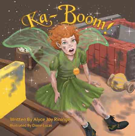
I try to find what I think is the most interesting words in the book, to draw the attention of the child. In my first book, the very first word and the last word is KA-BOOM! It seemed obvious to me the title should be KA-BOOM!
My next book is called, “The Snookered Snookerdoodles”. The Snookerdoodles are the bad guys and Sprout helps Kalynn, a frail challenged girl, have enough faith and trust in herself to single handedly foil the Snookerdoodles attempt to ruin the land of Bippenpook and its people.
To the Bippenpookers, Kalynn becomes a heroine because she snookered the Snookerdoodles. This all happens because of Sprout. To me, the title stood out like a beacon.
I try to make my titles and first page reach out to the child and grab his or her imagination right then. KA-BOOM! could have been called, “Sprout the Fairy” or “The Queen’s Favorite Fairy”. I don’t feel it is fair to Sprout to send her story out with a lukewarm title and beginning.
The lessons from these stories are as good for me as they are for the children. KA-BOOM! has a lesson for everybody.Never give up. The lesson in “The Snookered Snookerdoodles” is also one we all can use. Have faith and believe in yourself.
I actually don’t have a lesson in mind when I’m writing my story. When my story is finished and I’m reading it over, the lesson pops out at me and I say, “yes-s-s, that’s what I mean.”
~~~~~~~~~~~~
Alyce Joy was blessed with four children for whom she composed bedtime verses every night. That inspired her to publish a children’s book of prayers, entitled, “Priceless Gems.” When her children were grown, she began to write stories for her grandchildren.
Always fascinated with arts and crafts, she taught herself the art of pyrography. This fired her imagination, and she started burning life-sized pictures of wildlife onto all the doors of her home. Her wood burnings are scattered through the U.S. and Canada.
After deciding to put away her burning tools and torches, she enrolled in, and graduated from the Institute of Children’s Literature.
Alyce Joy hopes every child who reads her stories will look forward to each new adventure, as her favorite fairy becomes entangled into many, outrageous happenstances.
Alyce Joy's book KA-BOOM! is about a little fairy named Sprout that runs into trouble quite often. She has a shoe fetish, but is one of the queen’s favorites because in the end she gets the job done.
The World of Ink Network & Halo Publishing, Int. is touring author Alyce Joy’s fantasy adventure children’s chapter book, Ka-Boom!throughout August 2012. You can find out more about Alyce Joy’s World of Ink Author/Book Tour at http://tinyurl.com/8q5vw74
0 Comments on How Do You Come Up with the Title of Your Books with Author Alyce Joy as of 1/1/1900
My latest book has been going under the working title of Dogswap for most of it's life thus far. I originally called my story It's Not Fair!, because that's what Lucy thinks when she wakes up: it's not fair that she has to get up for school, while Sparks gets to stay home. Hence the role-swap.
But It's Not Fair! is too negative, so my editor came up with Dogswap. But that makes it sounds like two people swapping their dogs, which is a very different thing. I suggested a list of possible alternatives, the best of which was Dog Day, but we're not satisfied with that - it's a bit limp, compared to the fun and anarchy that you find inside the covers:
It's unusual to get to this late stage with the title still in the air, but not important. But we need to make a decision soon, as we must have everything sorted by mid September, ready to present the finished project to overseasbuyers at Frankfurt Book Fair in early October. This is our opportunity to get other publishers interested in co-editions. So we need a proper title. Here are some of t
3 Comments on A New Name for Dogswap: 'SWAP?!?', last added: 7/16/2012
Paws and Swap is a palindrome, this may be a little too much for young readers, and I've been racking my brain to come up with a title using it :) Let's swap paws? Oh well, worth a try?
Such happy, fun pictures. What lucky children they will be who get this book. Funny how important a title is, but it's always what drives to look at a book or film or artwork. Really do enjoy your drawings.
Headlines That Increase Website Traffic and Website Conversion Rates
Marketing research from MarketingExperiements.com shows that headlines are the most important factor if you are striving to increase website traffic and website conversion rates.
Let me pause one moment and explain what conversion rates are.
The conversion rate is the number of visitors to your site in comparison to the number of visitors who say YES to your call-to-action. Your call-to-action may be clicking on your opt-in box; it may be buying your book or product; it may be signing-up to an ecourse you’re offering . . . you get the idea.
An example of a conversion rate: If you had 100 visitors to your site and one of them said YES, you would have a 1% conversion rate.
Okay, back on track.
In an experiment, in which various elements of a website were tweaked to determine which would have the greatest impact on conversion, having an effective headline was more important than changing elements of the landing page or shopping cart process.
In fact, changing a headline generated 29 percent more leads. That’s close to one-third more leads.
While quality and informative content is a must, the headline is kind-of-like the magnet for your website. It’s what will attract the surfer/browser to stop, pay attention, follow what’s going on, and follow the process to opt-in or buy.
As a writer/marketer, you need to have your message focused on what the customer’s interests are. This is especially critical for the headline. You need to craft a headline that will:
1. Quickly grab a surfer or visitor’s attention. 2. Clearly define the WIIFM (what’s in it for me) or the value. If the visitor knows what the benefits are, he’ll be more receptive to ‘following the yellow brick road’ you have in place for conversion, to say YES to your call-to-action.
To increase website traffic and website conversion rates, the most effective headlines are ‘value-centric.’ This relates to number one and two above. You need to ‘hit’ the target customer’s interests and you need to convey the value of opting-in to your mailing list or buying what you’re offering. And, you need to let the visitor know just how significant the benefit/s will be.
An effective title might be: Get Paid to Guest Blog.
In five simple words you’re telling the reader what the benefit is and what’s involved.
“The Value Litmus Test,” an article at ValueCentricSelling.com, explains that along with having the value front and center, you should also provide the ‘timeline.’ This is another factor that will help bring in that traffic.
The timeline is the length of time it will take the customer to achieve the benefits specified or promised. This may not always be applicable to your product or service, but when it is it’s important to include it.
An example of using the timeline strategy is the 7 Day Ebook by Jim Edwards. You immediately know this product is promising that you can write an ebook in seven days. It meets all the qualifications for an effective headline.
Another example of ‘timeline’ is the Five Minute Writer by Avril Harper. This title also lets the reader know the time element involved. In as little as five minutes a day you can earn money writing. While the title doe
0 Comments on Headlines That Increase Website Traffic and Website Conversion Rates as of 1/1/1900
What if a couple of guys decorated a van with colorful images, drove around the countryside, and invited children to come into their van to watch cartoons? Normally, I’d caution parents to be wary, but Spanish artists Carles Porta and Toni Tomàs are the real deal.
Their whimsical art project on wheels, Puck Cinema Caravana, is returning for its fourth season. They bill themselves as the smallest cinema on earth, and with only seven seats in their van-theater, they’re probably pretty close to that. The trailer above, created by Carles Porta, promotes this year’s programming theme, “Follies de la Simpatia a l’Absurd.”
Everything about Puck is thoughtfully designed from their promotional materials to the van itself. They also have great taste in curating films, and do a great job of introducing quality animated shorts to an audience that may not otherwise experience such films. This year’s all-star line-up of filmmakers includes Mark Baker, Grant Orchard, Torill Kove, Bruno Bozzetto, Alexey Alexeev, Juan Pablo Zaramella, Stéphane Aubier, Vincent Patar, Txesco Montalt, Yann Benedi, Antoine Robert, Dorianne Fibleuil, Maud Sertour, Paulin Cointot, and Nathan Hall.
Puck travels around Spain throughout the summer months. Visit PuckCinema.com for more details.
If you’re looking for title art inspiration—past and present—Cartoon Title Art is a nifty Tumblr dedicated to cartoon titles and intros. The site is a project of the New York studio Rauch Bros. Animation.
The official Pottermore shop was launched this morning, marking the first time that the Harry Potter books are available to buy in an eBook and digital audio book format.
This will be the only place to purchase digital copies of the Harry Potter series, which will be available in all formats for eReaders, tablets, smartphones and mp3 players.
The eBooks for Years 1-3 are available for $7.99, while Years 4-7 are priced at $9.99. Or, the complete series can be purchased for $57.54.
Digital audio books for Years 1-3 will cost $29.99, and Years 4-7 is priced at $44.99. The complete Harry Potter audio collection can be purchased for $ 242.94.
Even though the Pottermore shop is now open, Pottermore remains in beta. It's expected to open to everyone in April.
I am working on a new early chapter series (more details after the contract is signed!) and the first step is to nail down a series title.
What Makes a Good Series Overall Title?
Here’s some of the criteria we are thinking about as we work on a series title.
Search Engines. The title must be easy for search engines to find. No funny spellings. Very obvious. Must be findable on Amazon and Google.
Character Name v. Topical Titles. Many early reader series take the character’s name as a title for the series. Witness: Clementine, Judy Moody, Junie B. Jones or The Buddy Files. However, some take a more topical title, such as the Magic School Bus series, the classic Box Car Kids, or the Magic Tree House. We’re discussing which is more appropriate for this series.
General enough, yet specific enough. The series title must be general enough to allow a variety of individual titles; yet it must be specific enough to individually identify this series from all others. Some suggested titles have been too specific, too restrictive. They would lock the series into certain areas and not allow for flexibility if the series takes off. Others are too general and don’t give enough of a flavor of what is happening in the series.
Short, snappy. In all the above, we are keeping in mind that the series title must be memorable. Short is better, and something that trips off the tongue lightly.
Fun. Of course, writing for the early elementary ages, it must be a fun title.
The individual titles will come later. For now, it is vitally important to nail this one.
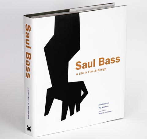
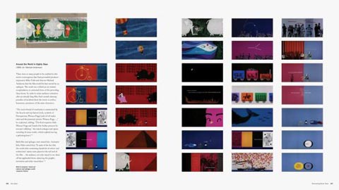
To celebrate the release of the new Saul Bass biography, Art of the Title created this nifty visual guide to some of Bass’s most celebrated title sequences.
There’s a Saul Bass tribute at MoMA in a few hours with the book’s author Pat Kirkham along with Kyle Cooper and Chip Kidd. Tickets for non-MoMA members are at the door so get there early.
Also, now would be a good time to point out that Universe will be re-issuing Saul Bass’s only (and nearly impossible to find) illustrated children’s book next February. Henri’s Walk to Paris, written by Lenore Klein, was released in 1962. I had a copy of the book for a few years, and found it so unenjoyable that I got rid of it. It struck me as being a failure as an illustrated storybook, and my ex-library copy confirmed that—it had rarely been checked out in decades.
It surprised me that I disliked the book as much as I did because Bass had a sense of humor (and his very able and funny collaborator Art Goodman worked on the book, too). But, the book’s illustrations are excessively formalized and austere (the curse of design for design’s sake), with none of the warmth, humor or vitality that the story required. Using minimalist graphics in a children’s book is a tricky task to begin with, but it’s possible to do it well. Graphic designer Paul Rand pulled it off more successfully in titles like Sparkle and Spin and Little 1. Or simply look to the master of super-stylized children’s book illustration, Abner Graboff. In spite of its shortcomings, if you’re a Bass fan, you’ll probably want a copy of the book, and now it’s easier to find than ever before.
Resistance is futile! Pat Kirkham’s long-overdue book about graphic design legend and motion picture title innovator Saul Bass is finally out. Saul Bass: A Life in Film and Design is an epic 440 pages and includes nearly 1,500 illustrations. Designed by Bass’s daugher Jennifer Bass, the book is quite unbelievably the first major American retrospective of Bass’s work.
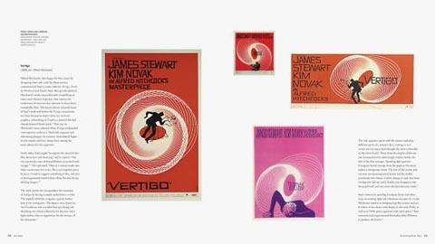
Bass had a long and infuential career in graphic and corporate identity design, but today he is perhaps best remembered for his groundbreaking motion picture titles, of which there are 70 examples in the book. To create those, Bass collaborated with many animators throughout his career, including Bill Melendez (It’s a Mad Mad Mad Mad World titles), Bill Hurtz (Around the World in 80 Days end titles), Fred Crippen (The Sale of Manhattan and Why Man Creates) and John Whitney, Sr. (Vertigo titles).
Everyone knows that when you publish traditionally, you get little or no say regarding the title of your book. Publishers have marketing specialists lined up to pick a title that will grab readers' attention.
Your job is to grab the attention of an agent or publisher. The title is your first opportunity to sell it to them.
There are three basic categories of titles (with a lot of overlapping).
1. Character Titles: Romana the Pest;James and the Giant Peach, Keturah and Lord Death; Julie of the Wolves; Alexander and the Terrible, Horrible, No Good, Very Bad Day; Coraline
2. Plot Titles: The Hunger Games; Island of the Blue Dolphins; Princess Academy; The Lightening Thief; Speak
3. Mood or Subgenre titles (very popular now in YA): Paranormalcy; The Dark Divine; The Forest of Hands and Teeth; Daughter of Smoke and Bone; I'd Tell You I Love You But Then I'd Have to Kill You
Some other things to consider while choosing a title:
Be Provocative Provocative titles (especially one word titles) are extremely popular. Just check the Amazon list of best-selling YA books. Choose words that elicit emotion or curiosity and phrases that make book browsers do a double take. The Perks of Being a Wallflower; Zen and the Art of Motorcycle Maintenance; To Kill a Mockingbird; Pride and Prejudice and Zombies; Marvin K Mooney Will You Please Go Now
Use Resonance Use words that bring to mind something evocative or reminiscent, and phrases that already mean something to the reader. Something Wicked This Way Comes, The Grapes of Wrath; Gone with the Wind
Create a Strong VisualThe Color Purple; Where the Wild Things Are; Love in the Time of Cholera; Cry, the Beloved Country
Use Alliteration, Rhyme, or Repetition This makes the title catchy or memorable, like how we can remember a nursery rhyme we learned years ago as a child. Listen to the flow. I Capture the Castle; The Secret Circle; Maniac McGee; The Wind in the Willows; There's a Wocket in My Pocket
Words that ContradictBeautiful Chaos; The Death Cure; Sacred Sins; Neverwhere
5 Comments on A Rose By Any Other Name or Does the Title of my Book Really Matter?, last added: 10/24/2011
I recently read Aimee Bender's 'The Particular Sadness of Lemon Cake' mostly because of the title. I liked the book, though some of the surreal aspects were a little unsettling for me. It is a really apt title for the book though.
I was thinking about The Merchant of Venice, even though there are no merchants and the story is nowhere near Venice.
Seriously, I'd rather write a synopsis than come up with a title. It's so hard to find a good one. And when I have had decent titles, I've doubted them.
These elegantly styled and animated “cartoon modern” titles were made for the Flemish media news programs Voor de Show by Tom Hautekiet and Mark Borgions. Jazz trumpeter Bert Joris provides the music, and the show’s art director is Luc Lemaitre. I don’t know what follows these titles, but they set a nice mood, and evoke a positive feeling, kind of like the opening and closing titles of Calvin and the Colonel.
James Curran created this clever unofficial title sequence for the upcoming Tintin feature incorporating elements from each of the 24 Tintin book in just over one minute. I like the clever contrast between the flat-colored circle and the spherical dimensionality created through the animation.
If you were designing a book cover, how would you incorporate the title? Using a sign is one technique to join the two together.
The first two covers give the reader the sense that the character is sending them a message. Holding a sign like a person out of work or hitchhiker coveys the feeling of desperation.
EgmontUSA, 2011
BloomsburyUSA Childrens, 2008
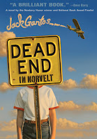
Road signs pop up now and then on children's book covers. The author's name in sky writing is a nice addition.
Jack Gantos (Farrar, Strauss & Giroux, 2011)
Even hungry giants have something to say in writing.
by Caitlin Friedman, illustrated by Shaw Nielson
(Workman Publishing, 2011)
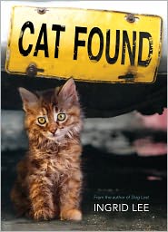
Okay, this cat isn't holding the sign, but it's still pretty cute.
Last year, The Simpsons commissioned an opening couch gag from British street artist Banksy that contained a cockeyed look at the working conditions of overseas animators. This year, which marks the show’s remarkable 23rd season, the producers of the mustard-family went a step further and debuted a new couch gag last night by Ren and Stimpy creator John Kricfalusi.
Banksy mocked the idea of mass-produced corporate art, but his message was muddled because it was made using the same system he was satirizing. There’s no such confusion in John’s approach, which he produced on his own. John’s opening is, in fact, far more subversive because he focuses almost exclusively on making a pictorial statement, relegating the show’s dominant literary elements to the back seat. In 35 short and sweet seconds, he liberates the animation of The Simpsons from years of graphic banality. The visual look of the show, which has been so carefully controlled by its producers, becomes a giddy and unrestrained playground for graphic play, and the balance of creative authority is shifted from the writers’ room to the animators in one fell swoop. Now that’s revolutionary.
On a personal note, I worked on the revival of Ren and Stimpy nearly ten years ago, and artistically, this is not the same John Kricfalusi that I remember from that time. Like any painter or filmmaker worth their salt, John doesn’t stay still, constantly evolving, growing, experimenting, and challenging audiences with new graphic concepts. He continues to be, in my book, one of the most exciting and influential artists working in animation today. Whether everything works perfectly in this opening is besides the point. As John says in our interview, “The day I make a perfect cartoon is the day I’ve run out of creativity.”
In our interview, we talk about how the opening came about, Matt Groening’s reaction to it, how his style has evolved in recent years, and his switch from Flash to Toon Boom. (Note: This is an edited version of an interview that was conducted via email this past weekend. Click on any of the images for a larger version.)
Question:First things first, how did you end up animating an opening for The Simpsons?
John Kricfalusi: Matt Groening and Al Jean [executive producer] asked me to do it. They showed me an opening that Banksy did that satirized the animation production assembly line system in Korea and told me it was really popular, so they wanted to do something similar with me.
At first they just wanted me to do a storyboard and have their regular crew animate it. If we had done it that way, no one would even have known that I had anything to do with it because it would have ended up on model and all pose to pose. I showed them the Adult Swim shorts I had been doing and pointed out that the way things happened was even more important than what was happening in my work. You can’t write visual performance. You have to actually draw it.
This project was the most fun I’ve had in years. It has really hammered home (to me) the importance of animation in animation. I think it’s possible to bring animation back to this country and make the core of it fun again, not be a mere tertiary addition to some high concept or executive’s “vision.” The pure act of animating is the most fun part of animation. I am so grateful to Matt for letting me have some real fun this summer.
Asylum No More is the title I'm trying out today for my new play. One of my playwright friends suggested Asylum. I like it. I like a few more words. When you see the above title, what do you picture in your mind, or hear in your head? Do you think no more sanctuary? Or the end of an insane asylum? Maybe both? Both would be ideal. Either one is good. The one word title could be good as well. Because it means both things: sanctuary and loony bin. My protagonist works at the State Asylum. She helps people escape. By the end of the play, she will leave the asylum forever, and she will also try to put an end to the hospital itself. I've decided on which characters are necessary for the play. I've outlined it. I've done the 15 beat sheet. I have a working title. In the next couple of days I will begin writing scenes. Today I have a murderous migraine that I can't treat until late tonight because I have an event I cannot miss. The young woman I mentored when she was in high school has finally returned to college as an adult and is graduating from college tonight, and has invited me. I wouldn't dream of missing this special occasion. So today, I'm working on the title only. I'm wondering what your thoughts are about my title? Any suggestions or comments?
This is possibly the question I get asked most often about my books. Many people assume that the girls on the cover are my daughters (in fact I have sons) or friends of mine. Or that at very least I've met them and chosen them.
The truth is very different. Many people are genuinely surprised to hear that authors aren't involved in cover design. It's the publishers choice, and as an author you hope and assume they are more expert in selecting a face than the author would be. If your publisher is nice, you are consulted along the way. Occasionally they'll even listen if you don't think it's right. But ultimately I know almost nothing about design or sales and marketing and they have trained experts.
What about the title then? Do authors choose titles? Well, that is far more likely than choosing the cover. I've only chosen one out of five of my titles, but that's because I'm not very good at thinking catchy titles up. Many authors do come up with their own titles and I'm sure publishers are pleased to be saved the work.
And the cover copy or blurb? Do we write that? Generally, no we don't. It's harder than you might think to make your own story sound enticing. I've sometimes collaborated on the cover copy or made suggestions, but I've also sometimes only changed one word. It's something I'm more than happy NOT to do if there's no need.
I'd far rather get on with the next story. That's the part I do best.
3 Comments on Who's the Girl on the Cover? by Marie-Louise Jensen, last added: 7/1/2011
Yes, that was a really brilliant title. My editor came up with my newest 'The Girl in the Mask' and OUP also thought up 'Daughter of Fire and Ice'. Sometimes titles need more than one head thinking!
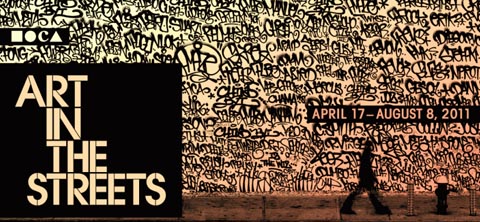
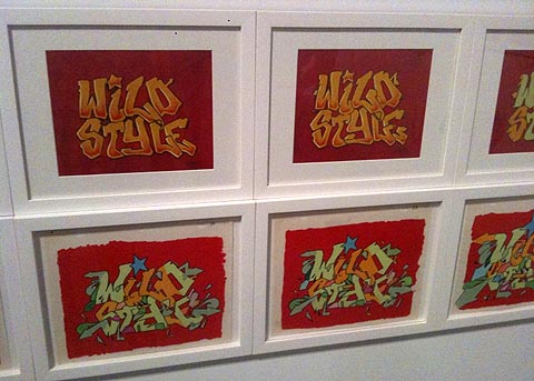
“Art in the Streets,” the first major museum survey of street art and graffiti, opened last week at the Museum of Contemporary Art in Los Angeles and I highly recommend it. It ranks among the most fun art exhibits I’ve ever attended, and features lots of eye candy in the form of large-scale installations that at times can feel more like an amusement park than a museum. As a first-of-its-kind exhibition, it’s also guaranteed to spark plenty of vigorous debate about what was chosen for inclusion and what wasn’t, not to mention all the controversy it’s already generated from the Blu mural debacle to irrational police fury.
Though minimal, animated works do have a presence in the show. A sequence of animation drawings from the opening of the influential early-1980s documentary Wild Style is displayed in one area. The sequence (watch it HERE) was designed by Charlie Ahearn, who directed the film, and graffiti writer Zephyr. In the “Battle Station”, a fantastic recreation of the Tribeca loft of the late Rammellzee, a mograph music video called “Alpha’s Bet” is screened on a television. The video, posted below, was directed by Celia Bullwinkel in 2002. (Disclosure: I am a personal friend of Celia and attended the show with her.)
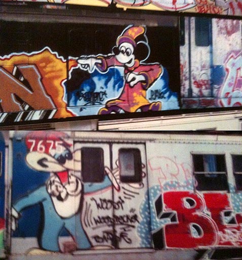
Graffiti/street art has a complicated relationship with animation, which is a thread that the curators of the exhibit never explore. While the show features a handful of artists, like the aforementioned Rammellzee, who have the ability to express personal ideas beyond the confines of referential pop culture, many of the artists from Kenny Scharf to Banksy to the anonymous graffiti writers who painted on the sides of subway cars have relied on animated characters as their lingua franca for communicating with the general public. These cartoon characters, to my surprise, are rarely used to make any statement or to subvert the original intentions of the characters, a la Wally Wood’s infamous Disney “orgy” drawing. For graffiti and street artists, the act of recreating popular cartoon iconography is considered an accomplishment in and of itself.
If one looks only at the art displayed in the show, the conclusion could be drawn that things are beginning to change. More recent artists, like the Brazilian twins Os Gêmeos, have dispensed with drawing pre-existing animated characters and are creating libraries of new cartoon characters drawn in their personal styles. Like any vital art form, street art is evolving, and the evolution points in a positive direction that emphasizes personal creativity.
Below are a few of the cartoon references I saw in the show.
Will you take the Mickey or Woody train?
Kenny Scharf began doing Hanna-Barbera tributes in 1981, long before anybody else considered celebrating Hanna-Barbera’s cruddiness.
Only in the world of graffiti could Hanna-Barbera and DePatie-Freleng characters co-exist.
Here’s the fun, intentionally primitive, animated title sequence from Super, the new Rainn Wilson, Ellen Page superhero spoof. PUNY (Yo Gabba Gabba) in Minneapolis did the animation.


.jpeg?picon=3220)


.jpeg?picon=2691)


.jpg?picon=1806)

So much to think about here, Keith! Thanks for another thought-provoking insight into using picture books as the basis for teaching writing.
Thanks for pointing out the idea of sentence templates. I suppose some teachers might steer away from them because they're afraid the writing might sound staged, but I can see my students adapting these to their own styles once they get the hang of it.