
1960s penguin book covers
Things magazine..wheew sweet mother! They have put together a kick butt gallery of penguin book covers. Includes beautiful covers overseen by Jan Tschichold as well as the late typographer Hans Schmoller. My favorite years are between 1961-1972 when Italian art director Germano Facetti was in charge of design. Facetti enlisted Polish graphic designer Romek Marber to redesign the look of the Penguin series and the rest is history.
Side note: Watched Jules Dassin’s Brute force last night. Great Flick. I also recommend Riffifi which was directed by Dassin as well.
(via Ace jet 170)
book covers,
BOOKS,
Gallery,
graphic design,
Mid century,
modern,
penguinShare This
©2007 -Visit us at Grain Edit.com for more goodies. 
Somehow, I doubt these books will be showing up in any bookstore near you! Someone took some of our favorites and photoshopped parodies.
Here's my personal favorite:

Today we unveiled the cover for the new James Bond novel, Devil May Care, which I hope you'll agree is rather striking.
We're publishing this new chapter in the life of Bond in May 2008 to celebrate the centenary of Ian Fleming's birth. Sebastian Faulks has written the new novel - and it's all set to be one of the most exciting moments in 'book world' next year… keep watching this space.
We knew that this book cover had to be stylish, sophisticated and iconic - all the things one associates with Fleming's world-famous spy. So our Art Directors decided to take a slightly different approach to this artwork and we took on award-winning design agency - The Partners - who have worked with leading British brands such as Jaguar, the BBC and the National Gallery. We wanted someone who would have a slightly different take on designing a book cover, one which would go beyond usual publishing preconceptions about what such things should look like.
 The Partners presented us initial designs based around the concept a blood-red flower with the silhouette of a naked woman as its stem set against a jet black background. Everyone - the Estate of Ian Fleming, Sebastian Faulks and all those involved in-house - reacted really positively to the concept artwork… so the next stage was to find our Bond cover girl. Tough job.
We knew the moment we saw Tuuli that she was the one - she exuded the grace, style and beauty one associates with all the Bond girls. Most of all Tuuli was fantastically enthusiastic and engaged with the project - her vivacity really came through in the shoot. Then the Partners applied their skills in finessing and styling - and the end result was a fantastically iconic image.
Without a shadow of a doubt I think this has been one of the most rewarding covers we've produced - the moment you mention the name James Bond people's eyes light up. Everyone involved in designing the cover has leapt to the challenge with that glint in their eyes - and the artwork really reflects that enthusiasm and passion.
You can't judge a book by it's cover - but you sure as hell can make people want to pick that book up and read it…
Alex Clarke, Editor, Penguin 007
..........................................................................
Remember that by posting a comment you are agreeing to the website Terms of Use. If you consider any content on this site to be inappropriate, please report it to Penguin Books by emailing [email protected]
...........................................................................
My postman had a surprise for me today – a parcel of books with my name on the front covers. These were three titles which I wrote for Mimosa/McGraw Hill Australia a couple of years ago and which have finally made it into print.
Over the Fence is realistic fiction story about two children who engage in a clean up of the creek next door to their house.
Remember Me is a historical fiction story,
My apologies for the paucity of posts. We had a death in the family and have been sitting shiva all week long.
Which leads me to Things It’s Taken Me Too Long To Learn About My Daughter: When she says “My tummy hurts,” that means she’s going to throw up. Like, immediately. Do not pass Go, do not attempt reason, do not offer apple juice. This morning, she awoke, groaning, and proceeded to barf up what looked like a solid mass of undigested rugelach and dark chocolate nonpariels.
Adam has diagnosed Count Chocolutis, brought on by too many sweets at the shiva house. We are hoping for a speedy recovery.
Anyhow…a few weeks ago a friend asked if I’d read Carolyn Parkhurst’s second novel, LOST AND FOUND, which she’d just seen an ad for.
“Read it?” I said. “I loved it!” I trotted off to my bookcase to get it. My friend looked at the book, frowning.
“No,” she said. “This isn’t the right book.”
Turns out, it was the right book…but the publisher had so radically changed the cover between the hardcover and the paperback that it was pretty much impossible to recognize the book in its new incarnation.
Publishers do this all the time, for obvious reasons. When a book – particularly a piece of literary fiction – comes out in hardcover, the image will scream, “SERIOUS WORK INSIDE THAT MUST BE TAKEN SERIOUSLY.”
Then, once the reviews have been secured and it’s time to get the attention of readers (who tend to be female) as opposed to big-shot critics and editors, the book will be repackaged with a cover that pleads. “PUT ME IN YOUR BEACH BAG AND I’LL SHOW YOU A GOOD TIME!”
My favorite example of this phenomenon is Francine Prose's A CHANGED MAN. Here is the hardcover:
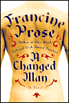
It's great, isn't it? Riveting, original, impossible to miss. The book got amazing reviews. But between the naked tattooed torso and Prose's
farbissena author photo...
...you can see where readers could feel a little put off.
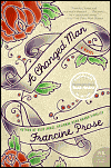
So here's what the publisher did with the paperback:
Flowers! Flowery script! Ladies, how can you go wrong?
Here's another example of the same thing: Allegra Goodman's very fine INTUITION, about love and betrayal in a post-doc research lab. In hardcover, it's all business:
Again, another compelling image that tells the story. Evidently, though, it didn't work well enough to keep it in paperback, 'cause the paperback looks like this:
It's pink! It's green! There may be shoes and shopping!
LOST AND FOUND was, I think, just a flat-out misfire. Here it is in hardcover...
...where the message is less SERIOUS FICTION than JIMMY BUFFETT CONCERT. (To be fair, the book's about a bunch of teams on an Amazing-Race style reality show, and one of the items they have to collect and travel with is a parrot).
So the publisher went back to the drawing board, and here's the paperback:
Much better, I think. You get the mother/daughter thing (one of the teams is a mother and daughter, hiding the obligatory Terrible Secret), you get the travel/adventure component, it's catchy, it's pretty, and I hope it gets the book the audience it deserves.
I hope to post the cover for CERTAIN GIRLS very soon. No parrots. I dig it. I hope everyone else will, too.
Back in blogland again, after a great weekend of eating, drinking and dancing, like you oughta. Still recovering a bit, but I've managed to pull together a link or two. But not many, because I'm sleepy.
Michelle of The Inkwell Bookstore in Falmouth, Mass, suggests that indie booksellers tend to be obsessed with bookcovers -- she sites her store's link to Book By Its Cover, a blog by a designer here in Brooklyn whose posts are mostly just pictures of beautiful book images. Beware -- it's strangely addicting... Thanks, Michelle!
The discussion of Alan De Niro's Skinny Dipping in the Lake of the Dead at the Litblog Co-Op has spilled over into this week -- there's a lot going on in those stories, so you've got time to read more.
Speaking of the LBC, I want to send a signed book and publicity poster for Sacco and Vanzetti Must Die! to contest winner Ed Vick, but I can't seem to get ahold of him by email. Anyone know him, tell him to email me with his mailing address so he can get his swag.
Even though (or because) I live here, I want to be first on the list to sign up for the Brooklyn Walking Tours by great Brooklyn authors sponsored by the ABA on the Wednesday before BEA. Only trouble is they're all at once so I can't go to them all! If anyone else is going, let me know so we can compare notes after.
I personally have been totally lame about spending time on Shelfari, but some cool kids have been making the
BEA Lit Insiders group into something kinda special. Check out what they're talking about
here...
I unfortunately deleted the genius email I got from
Algonquin with the "13 BEA Hazards to Avoid", but fortunately Lance Fensterman reproduces it
here. Beware, booksellers...
Okay, back to wrestling with the wedding budget and schedule spreadsheets. Please email me if you've been reading exciting stories in the book world I've been missing -- I feel a bit like I've fallen off the map these days. Luckily I'm reading the new Michael Ondaatje book, which allows me to fall IN to another sensual world. Hope you all are having similarly luscious reading experiences as the weather turns warmer. Happy reading!


NYT reviewed publishing's ineptitude yesterday. Blogs should assist publishers corral reader statistics.
The Hood Company