new posts in all blogs
Viewing: Blog Posts Tagged with: Found design, Most Recent at Top [Help]
Results 26 - 50 of 831
How to use this Page
You are viewing the most recent posts tagged with the words: Found design in the JacketFlap blog reader. What is a tag? Think of a tag as a keyword or category label. Tags can both help you find posts on JacketFlap.com as well as provide an easy way for you to "remember" and classify posts for later recall. Try adding a tag yourself by clicking "Add a tag" below a post's header. Scroll down through the list of Recent Posts in the left column and click on a post title that sounds interesting. You can view all posts from a specific blog by clicking the Blog name in the right column, or you can click a 'More Posts from this Blog' link in any individual post.
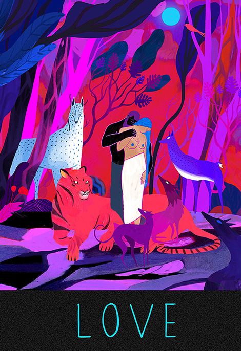
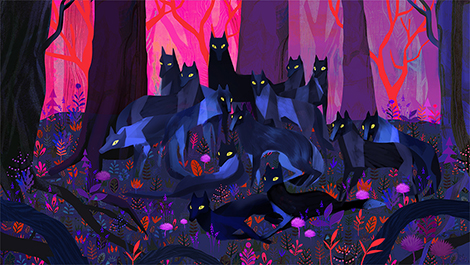
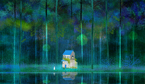
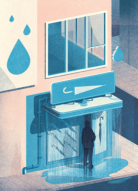
By mixing bristled textures with vibrant neon colors, concept artist, Juliette Oberndorfer, creates woodland landscapes that glow with mysticism. The enchanting, yet mysterious air of her work stems from her stark contrasting of darks and lights as well as the distance she places between her characters and her audience. To take a look at her storyboards and animated work, check out her Vimeo and Tumblr.
——————–
Also worth viewing:
Maud
Rifle
Veronica Grech
Follow us on RSS, Instagram, Pinterest, Wanelo,
——————–
 Share on Facebook
Thanks to this week's
Sponsor // Foto Sushi

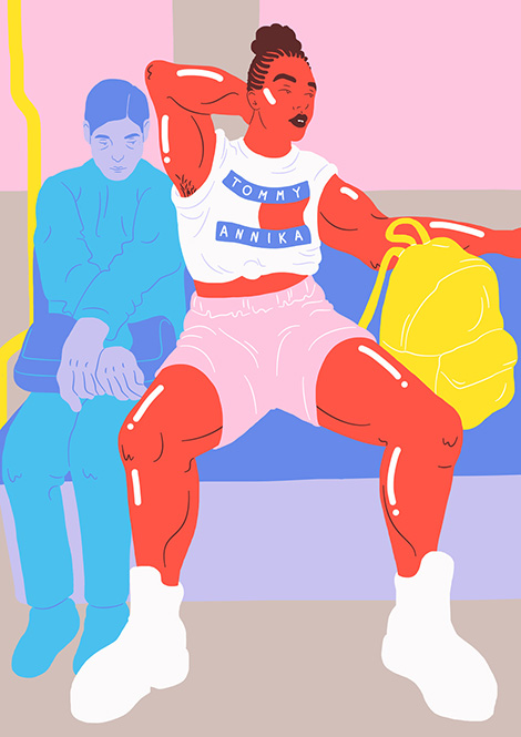
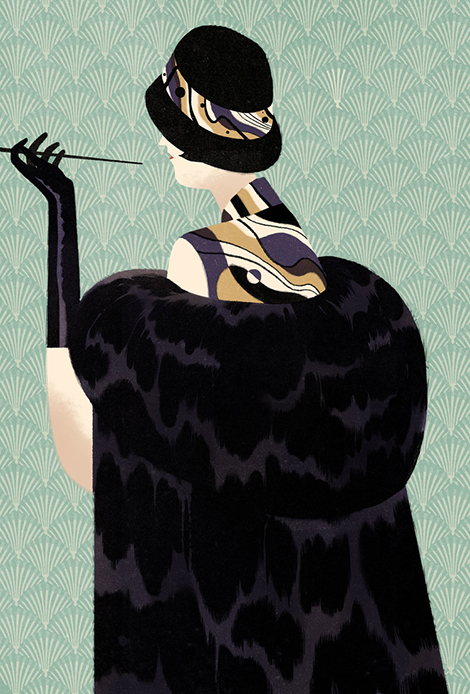
By racking up a list of impressive clients like MTV and Wired, Swedish illustrator, Sara Andreasson, is bringing female empowerment to major audiences. Utilizing traditionally feminine color pallets, she depicts strong characters that don’t conform to traditional ideas of dainty femininity. Her figures ooze confidence as their unconventional clothing and proudly worn body hair stand out in front of minimal backdrops. She portrays women of all backgrounds and body shapes by using irregular skin colors, like blues and reds, and accentuating their curves with thick bright highlights. In addition to her illustrations, she promotes her message of feminism and individualism by editing BBY Magazine, a publication she co-founded to create a community for female and queer artists and writers.
——————–
Also worth viewing:
Webuyyourkids
Virginie Morgand
Jessica Svendsen
Follow us on RSS, Instagram, Pinterest, Wanelo,
——————–
Share on Facebook
Thanks to this week's
Sponsor // Foto Sushi

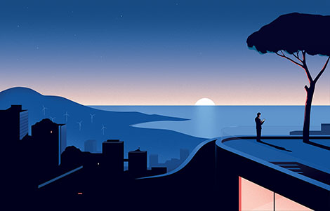
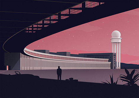
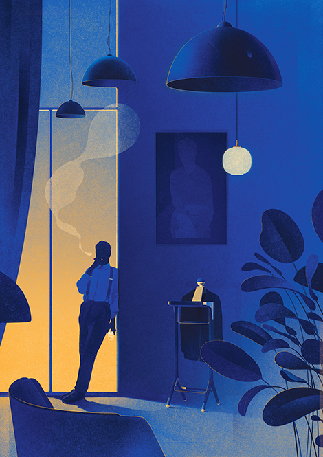
Thomas Danthony is a French illustrator and designer based in London. His cunning use of light and shadow, combined with his characters’ concealed faces give his compositions a mysterious and sometimes eerie aura. This mystifying mood also lingers into his personal work which often centers around the theme of travel, the romance of going on a journey, and how time can affect our memories of the places we’ve visited.

——————–
Also worth viewing:
David Biskup
Storm & Jag
Marta Gawin
Follow us on RSS, Instagram, Pinterest, Wanelo,
——————–
Share on Facebook
Thanks to this week's
Sponsor // Foto Sushi

From typography to architecture, here are a few of our finds from our Instagram feed.
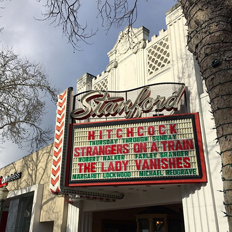
Sweet type at Stanford

Beautiful signage in Piedmont
See all of our Instagram finds here.
——————–
Also worth viewing:
Instagram Finds from the Feild
Sebastian Weiss
Ryan Edy
Follow us on RSS, Instagram, Pinterest, Wanelo,
——————–
Save
Share on Facebook
Thanks to this week's
Sponsor // Foto Sushi

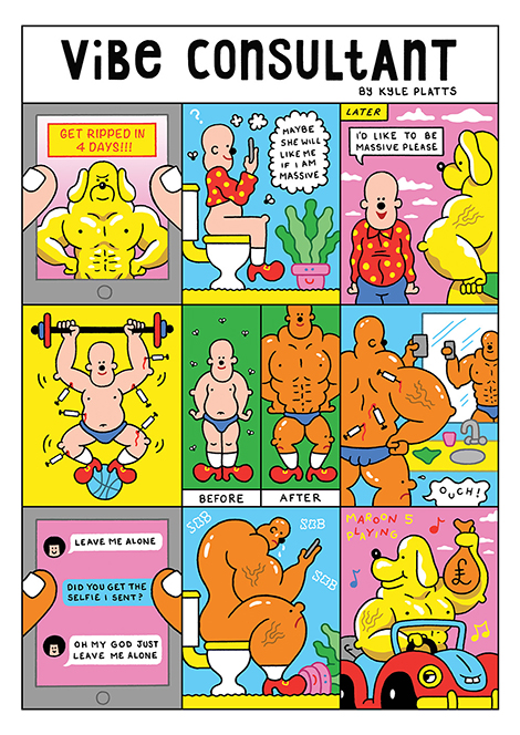
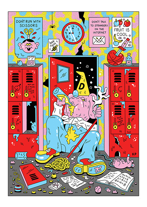
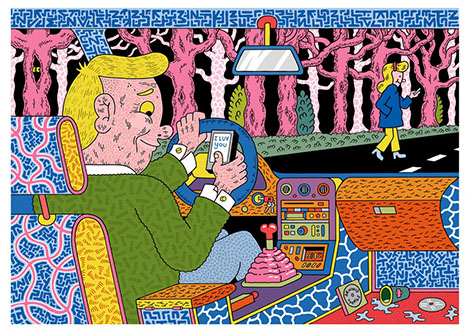
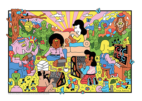
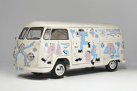
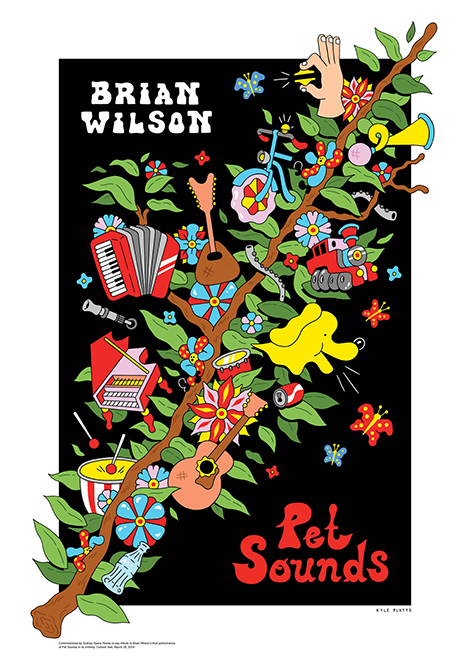
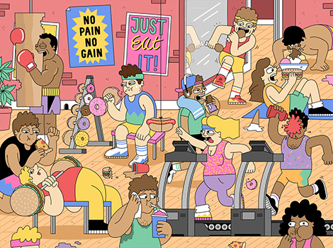
At first glance, Kyle Platts’ work is as colorful and playful as a Schoolhouse Rock! segment, but taking a closer look might make you blush. As seen in his monthly comic, Vibe Consultant, and his book, Megaskull, Platts utilizes absurd characters and dark slapstick humor to point out societal follies. His more lighthearted illustrations can be seen within his collaborations with Moog Music and the Sydney Opera House. To take a look at his daily sketches and animated work check out his Tumblr and Instagram.
——————–
Also worth viewing:
Mike McQuade
Nicolas Dehghani
Michela Picchi
Follow us on RSS, Instagram, Pinterest, Wanelo,
——————–
Share on Facebook
Thanks to this week's
Sponsor // Foto Sushi

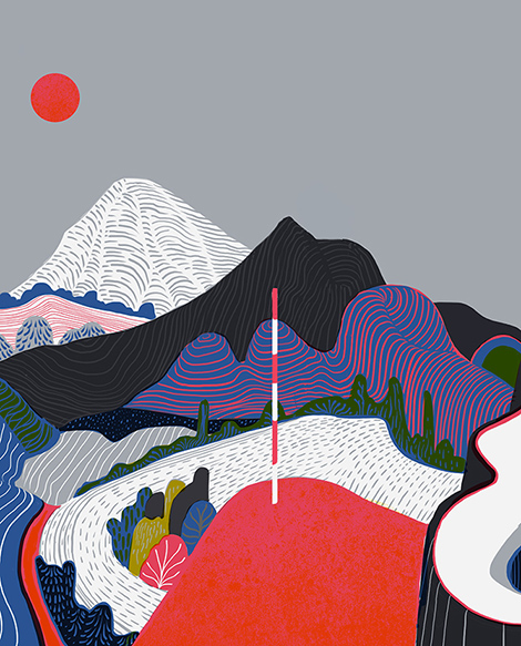
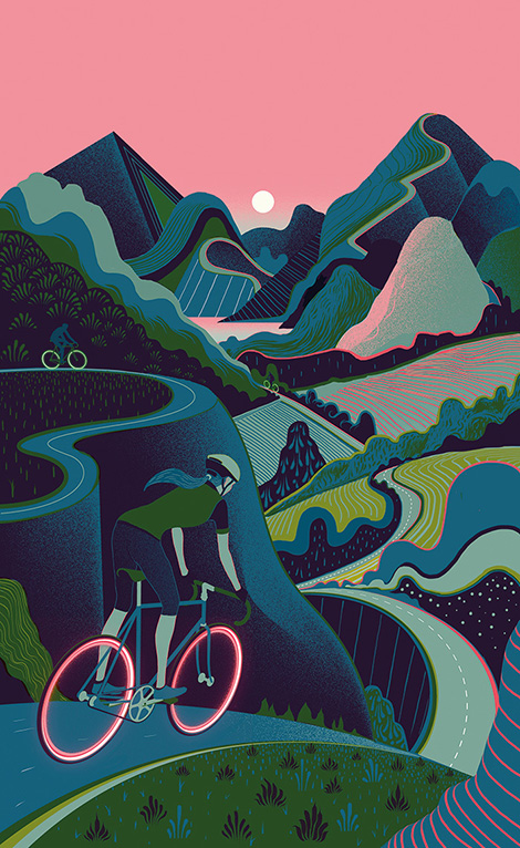
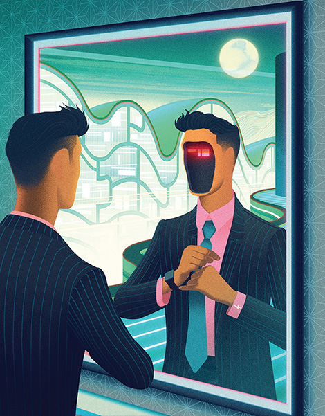
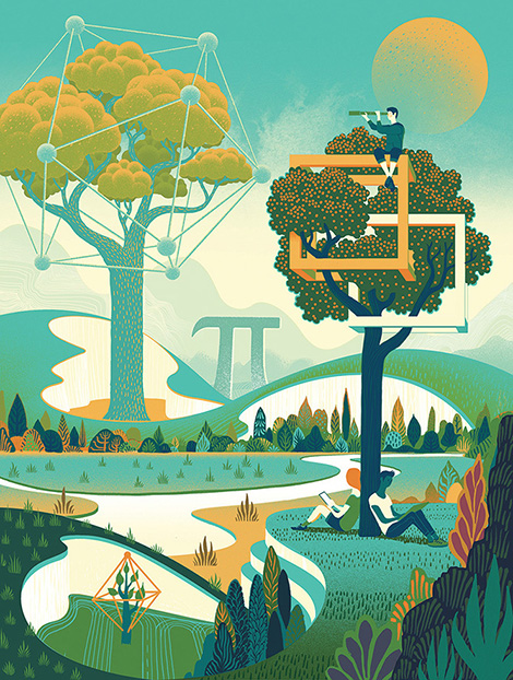
Sam Chivers describes his art as veering “towards that blurry border point between science and nature”. Brimming with fluid topographic lines and colored pencil-like strokes and textures, he creates landscapes filled with blooming foliage and glowing floating interfaces. His desire to constantly fuse nature with technology has built a portfolio that has attracted clients like Adobe and New Scientist. To keep up with his work, make sure to follow him on Twitter.
——————–
Also worth viewing:
Jordan Metcalf
Jay Quercia
Ayaka Ito
Follow us on RSS, Instagram, Pinterest, Wanelo,
——————–
Share on Facebook
Thanks to this week's
Sponsor // Foto Sushi

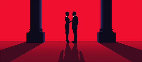
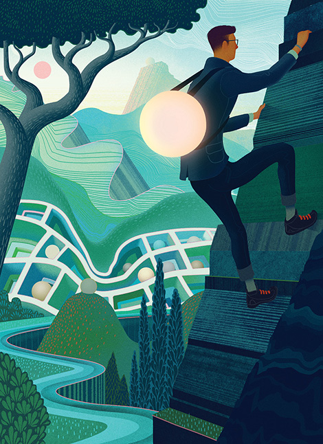
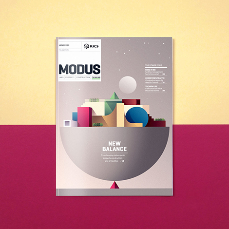
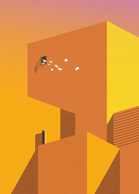
Ray Oranges is a Florence-based designer whose work has caught the eye of Wired, Monocle, and Creative Review. Focusing on the shapes of his subjects rather than their details, he abstracts architecture and landscapes to create artful and geometric pieces. His extreme minimalism, mixed with his calculated use of negative space and long shadows, gives his portfolio a surreal and dreamlike quality. To keep up with his work and architectural inspiration, make sure to follow him on Instagram.
——————–
Also worth viewing:
makebardo
Anagrama Update
Vita Magazine
Follow us on RSS, Instagram, Pinterest, Wanelo,
——————–
Share on Facebook
Thanks to this week's
Sponsor // Foto Sushi

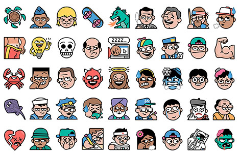
Dan Woodger is a London based illustrator who uses pastel color palettes and black outlines to create eccentric scenes that are bound to make you chuckle. His portfolio of highly expressive characters has helped him land editorial and advertising collaborations with The New York Times, Heineken, and Google. I am especially impressed with his work for the messaging app LINE, in which he crafted 1000 unique emojis in 10 weeks. To keep up with his work and read his personal insights on each of his projects, make sure to follow his blog and Instagram.
——————–
Also worth viewing:
Jordan Metcalf
Cruschiform
One and Done
Follow us on RSS, Instagram, Pinterest, Wanelo,
——————–
Share on Facebook
Thanks to this week's
Sponsor // Foto Sushi

Joseph Navarro is a Costa Rican graphic designer with a talent for typeface design and lettering. His 3D typographic compositions are often lit from unique angles, creating highlights that guide the viewer’s eyes throughout each design. In addition to typography, he also has a knack for crafting sophisticated branding systems and vibrant geometric illustrations.
——————–
Also worth viewing:
makebardo
Braley Design
Flomm
Follow us on RSS, Instagram, Pinterest, Wanelo,
——————–
Share on Facebook
Thanks to this week's
Sponsor // Foto Sushi

Giacomo Gambineri is an Italian illustrator and graphic designer. Using thick outlines and story panels, he illustrates articles and reader’s Tweets for The New York Times and New Scientist. His quirky depictions of social issues and popular culture help bring humor to today’s hot topics. To keep up with his work, make sure to follow him on Instagram.

——————–
Also worth viewing:
Jeremie Claeys
Kelly Thorn
Thomas Vanhuyse
Follow us on RSS, Instagram, Pinterest, Wanelo,
——————–
Share on Facebook
Thanks to this week's
Sponsor // Yana Typeface by Laura Worthington

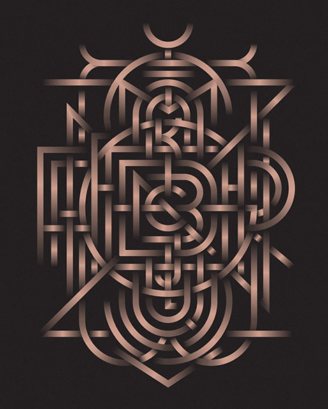
Michael Spitz is a freelance graphic designer based in New York City. From logos to illustrations, he tackles a wide breadth of projects and styles. Having a passion for typeface design, his portfolio is chock-full of innovative lettering and monograms. One exploration that is particularly impressive is a metallic bronze monogram that encases the entire alphabet and blooms from A at its center to Z at its rim. His inventive typographic designs are featured in the books New Graphic Design – The 100 Best Contemporary Graphic Designers and Typism 1 and 2.


——————–
Also worth viewing:
Maud
dn&co
Kyle Read
Follow us on RSS, Instagram, Pinterest, Wanelo,
——————–
Share on Facebook
Thanks to this week's
Sponsor // Yana Typeface by Laura Worthington

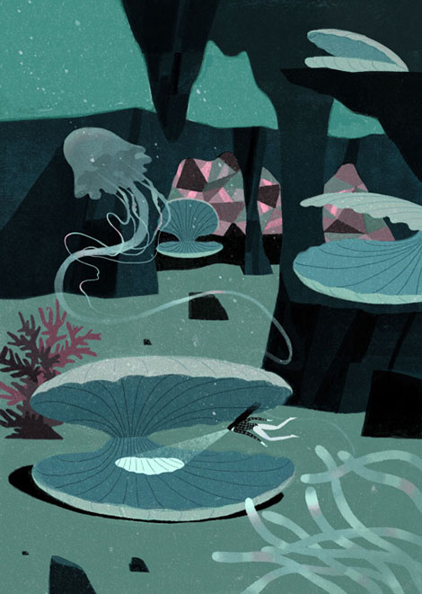
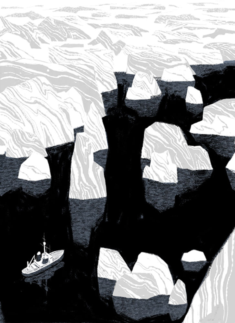
When it comes to storytelling, Chinese illustrator and animator, Jun Cen, prefers to veer away from the obvious. His conceptual illustrations portray stories in clever and inventive ways. A wonderful example of this is his work for Plansponsor magazine. In the illustration, a diver is seen searching for obscure pearls in order to highlight the complexities of finding an ideal healthcare plan.
Cen’s innovation is also evident within his cunning use of patterns to represent ice, stone, and fur. Rather than drawing these textures by hand, he employs marbled and blotchy patterns that mimic the lighting and colors of these natural surfaces. To see more of his work and to catch a glimpse of his process, check out his blog and Vimeo.

——————–
Also worth viewing:
Martin Azambuja
Ludovic Balland
Javier Garcia Interview
Follow us on RSS, Instagram, Pinterest, Wanelo,
——————–
Share on Facebook
Thanks to this week's
Sponsor // Yana Typeface by Laura Worthington

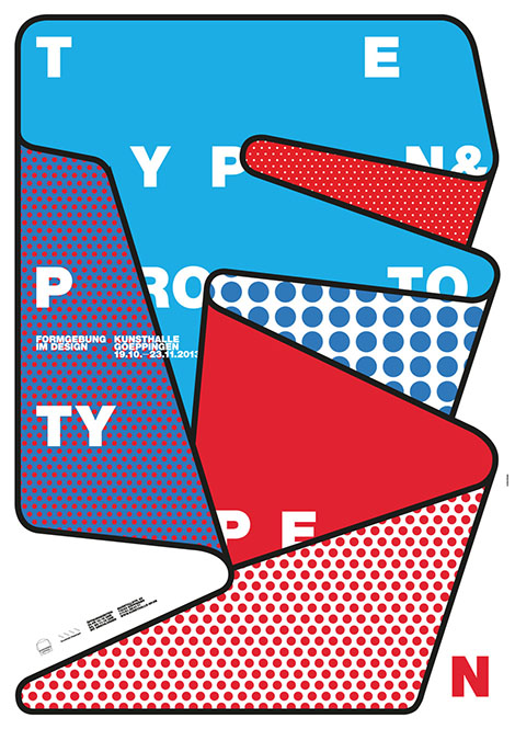
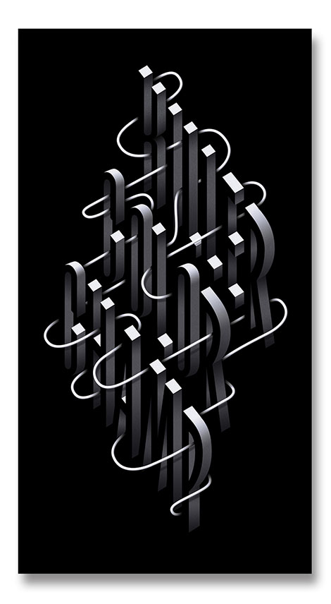
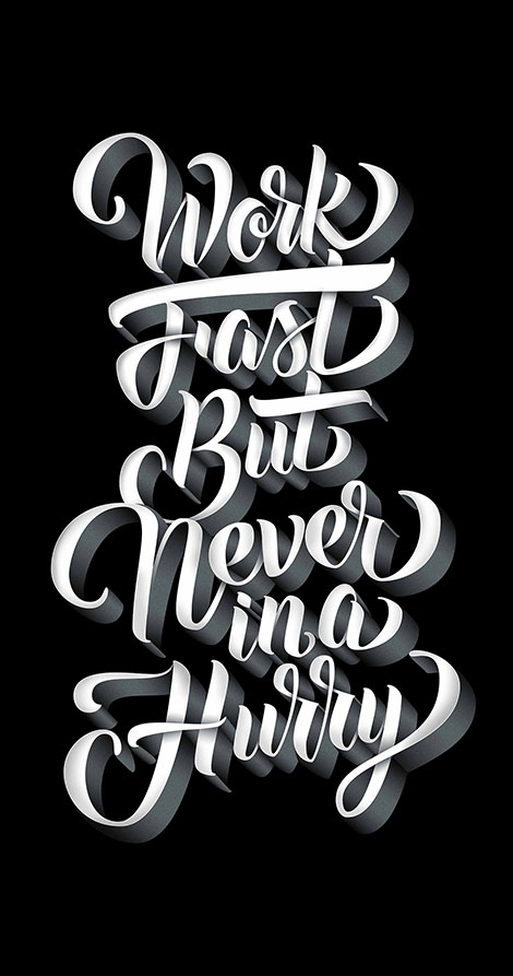
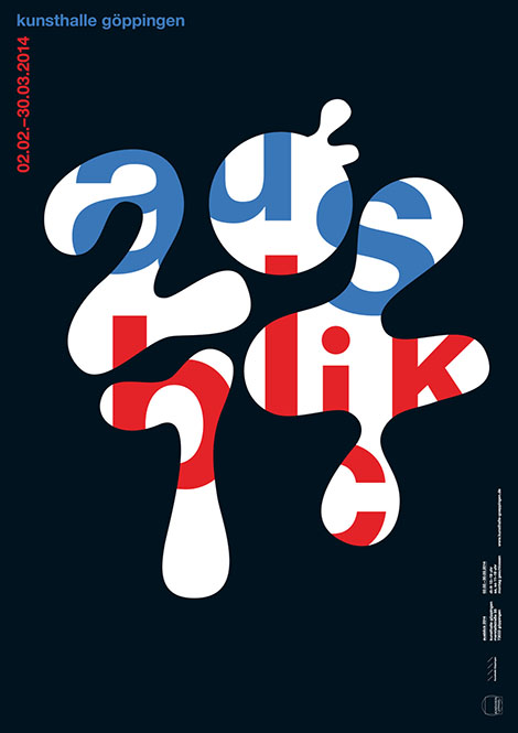
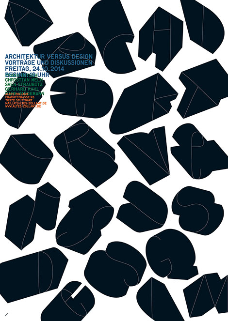
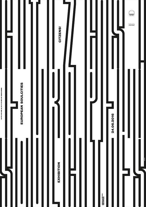
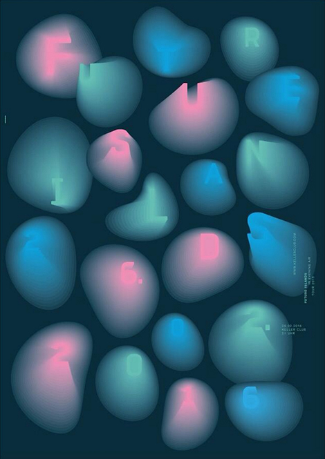
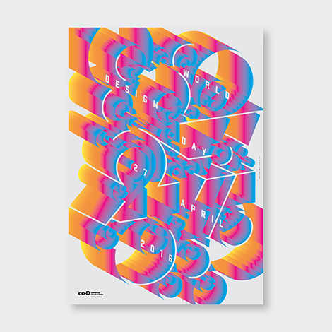
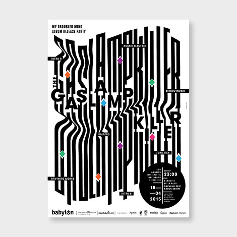
burkhardthauke is a design studio that isn’t afraid of experimentation. Founded by Ralph Burkhardt and Daniel Hauke, the German studio fuses complex layering and inventive lettering to create typographic posters that vibrate with motion. To craft such innovative compositions, the duo deconstructs words, stretches and expands letterforms with colorful gradients, and uses a number of other techniques to distort type. With work so intriguing, it is no surprise that they win numerous awards from type clubs and design organizations every year. Make sure to take a look at their portfolio and follow them on Instagram to check out their most recent work.

——————–
Also worth viewing:
Aron Vellekoop Leon
Herburg Weiland
Stahl R Design Studio
Follow us on RSS, Instagram, Pinterest, Wanelo,
——————–
Share on Facebook
Thanks to this week's
Sponsor // Yana Typeface by Laura Worthington

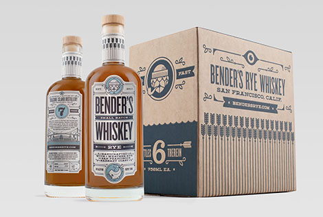
The work of Carl Bender’s design studio, Okay, holds far more merit than its name implies. Having a strong sense of narrative, he creates distinct and memorable brands by integrating his client’s stories into his designs. I’m especially fond of his work for Bender’s Whiskey Co. Inspired by the company’s location on San Francisco’s Treasure Island, the whiskey’s quirky illustrative packaging pays homage to the island’s nautical history and the swashbuckling sailors who have spent time there.
——————–
Also worth viewing:
Peter Tarka
Dadu Shin
Caitlin Keegan
Follow us on RSS, Instagram, Pinterest, Wanelo,
——————–
Share on Facebook
Thanks to this week's
Sponsor // Yana Typeface by Laura Worthington

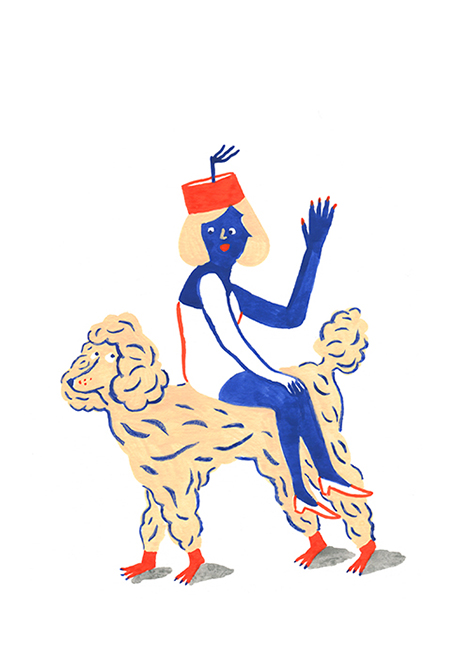
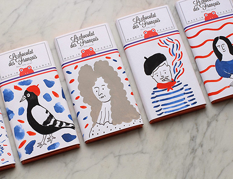
Brooklyn-based French illustrator, Marie Assénat, creates paintings and drawings that have a charming and naive essence. Although her characters are often humorous, her work has a sophisticated flair that has led to collaborations with Le Chocolat Des Français and the French Open. Whether it’s a GIF of a dancing poodle or a painting of a roller skating kitty, her drawings are bound to put a smile on your face.
——————–
Also worth viewing:
Sindy Ethel
Bendik Kaltenborn
Damien Poulain
Follow us on RSS, Instagram, Pinterest, Wanelo,
——————–
Share on Facebook
Thanks to this week's
Sponsor // Yana Typeface by Laura Worthington

Erman Yilmaz’s passion for street art highly influences his digital work. Like graffiti, his typographic arrangements intertwine with illustrations in an elaborate and colorful fashion. As the elements converge, he inserts hidden details that add extra significance to the message of each poster. To see more of his work, check out his street art and Instagram.
——————–
Also worth viewing:
Mike McQuade
Tsto
Endre Berentzen
Follow us on RSS, Instagram, Pinterest, Wanelo,
——————–
Share on Facebook
Thanks to this week's
Sponsor // Yana Typeface by Laura Worthington

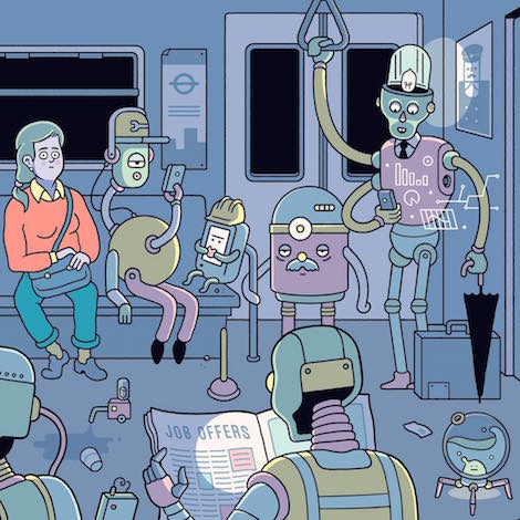
Josh Cochran’s portfolio is a colorful wonderland that is dense with detail and color. Working with muted tones and hand drawn lines, he creates charming monsters and imaginative environments that one could stare at for hours. His whimsical characters have found their way into conceptual illustrations for The New Yorker and large murals for the U.S. Open and Warby Parker. To keep up with his work, make sure to follow him on Instagram.

——————–
Also worth viewing:
Webuyyourkids
Morphoria
Josh Brill Interview
Follow us on RSS, Instagram, Pinterest, Wanelo,
——————–
Share on Facebook
Thanks to this week's
Sponsor // Yana Typeface by Laura Worthington

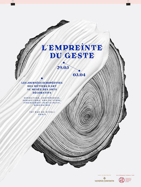
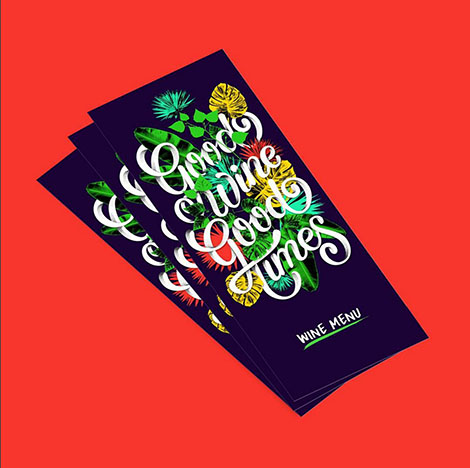
Violaine & Jérémy is a French illustration and graphic arts studio founded by Violaine Orsoni and Jérémy Schneider. Unafraid of mixing digital and traditional techniques, the studio often combines custom designed typefaces with impressive pencil drawings. Their projects with Parisian institutions such as the Musée des Arts Décoratifs exude the studio’s talent for creating identity systems that are chic and elegantly edgy.
——————–
Also worth viewing:
Alec Doherty
Siggi Odds
Supero
Follow us on RSS, Instagram, Pinterest, Wanelo,
——————–
Share on Facebook
Thanks to this week's
Sponsor // Yana Typeface by Laura Worthington

The illustrations of Spanish artist, Raúl Soria, are filled with vivacious colors, whimsical patterns, and pleasant surprises. Although his work is already lively and often surreal, his use of animated GIFs gives his portfolio an extra dose of charm. Don’t be surprised if one of his characters suddenly gives you a friendly wink or curiously raises an eyebrow.

——————–
Also worth viewing:
New Metaphore Books
Joseph Veazey
Nate Harris
Follow us on RSS, Instagram, Pinterest, Wanelo,
——————–
Share on Facebook
Thanks to this week's
Sponsor // Yana Typeface by Laura Worthington

Did you know that it took Adrian Frutiger three years to design the twenty-one sans-serif fonts that make up the Univers family? Or did you know that in 2010, Milton Glaser was the first designer to receive the National Medal of Arts? On Design Facts,designer and art director, Shane Bzdok, shares facts about the history of graphic design, the people who have shaped the craft, and the impact design has made on our culture. To read these fun facts and submit some of your own, make sure to visit the site today and follow its Twitter page.
——————–
Also worth viewing:
Sebastian Weiss
Lo Siento
Variety Show Studio
Follow us on RSS, Instagram, Pinterest, Wanelo,
——————–
Share on Facebook
Thanks to this week's
Sponsor // Summer Font Collection

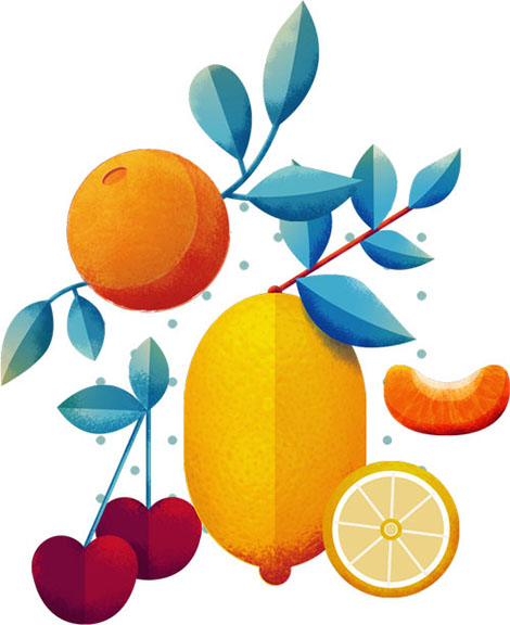
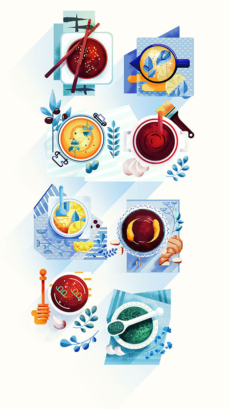
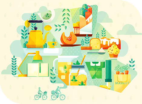
Maite Franchi is a graphic designer and illustrator based in Lyon, France. As seen within her collaborations with Sony, The Huffington Post, and Vanity Fair she crafts editorial illustrations with a bold emphasis on texture and refined color palettes. Often illustrating for articles about cooking and travel, her portfolio is jam-packed with appetizing food illustrations that beautifully pop behind geometric patterns. If pixels were edible, her work would look good enough to eat.

——————–
Also worth viewing:
Krzysztof Iwanski
Blok Design
Michael Driver
Follow us on RSS, Instagram, Pinterest, Wanelo,
——————–
Share on Facebook
Thanks to this week's
Sponsor // Summer Font Collection

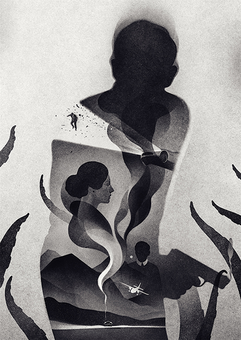
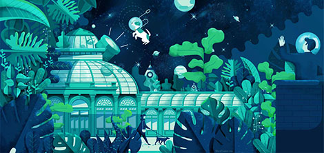
Looking through the portfolio of Lithuanian illustrator, Karolis Strautniekas, feels like stepping onto the set of a film noir movie. Brimming with dark silhouettes, cool tones, and grainy textures, his illustrations tell stories that are seductively mysterious. His work can be found gracing the pages of The New York Times, Forbes, and on his blog where he posts side projects and works in progress.
——————–
Also worth viewing:
Alex Trochut’s Penguin Books Galaxy Series
Tyler Deeb
Daniel Zender
Follow us on RSS, Instagram, Pinterest, Wanelo,
——————–
Share on Facebook
Thanks to this week's
Sponsor // Summer Font Collection

Twice is a Paris-based design studio founded by Fanny le Bras and Clémentine Berry. The duo combines organic textures and abstract shapes to design chic album covers, posters, and lookbooks. Their use of bright colors and bold photography make their designs just as unique and lively as the music and events they often accompany.


——————–
Also worth viewing:
Matteo Colella
Pedro Veneziano
Sebastian Weiss
Follow us on RSS, Instagram, Pinterest, Wanelo,
——————–
Save
Share on Facebook
Thanks to this week's
Sponsor // Summer Font Collection

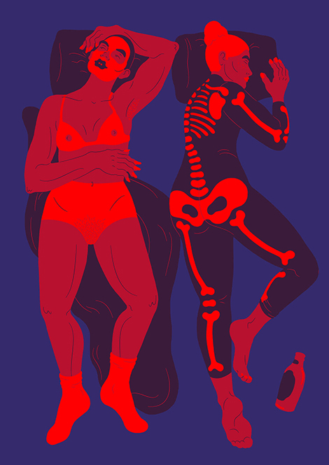
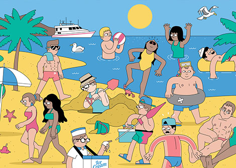
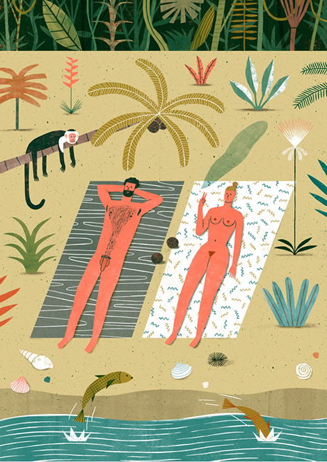
David Biskup is a London based artist whose illustrations have graced the pages of prominent publications such as The New York Times and The Guardian. His signature style combines bright colors, playful characters, and a touch of dark and risqué humor. In addition to his freelance work, he also publishes visual novellas inspired by his personal life and man’s relationship with creativity.


——————–
Also worth viewing:
Peter Tarka
Stahl R Design Studio
Jeremie Claeys
Follow us on RSS, Instagram, Pinterest, Wanelo,
——————–
Share on Facebook
Thanks to this week's
Sponsor // Summer Font Collection

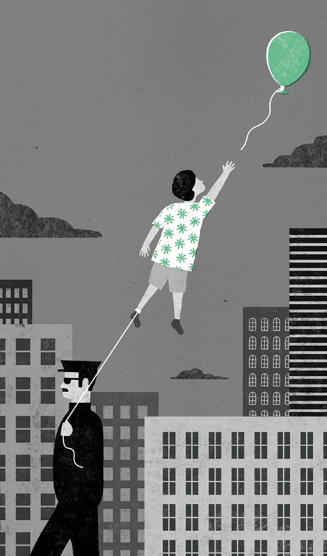
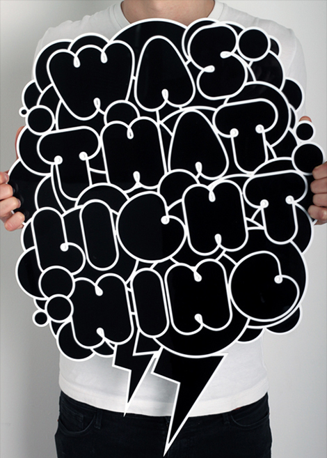
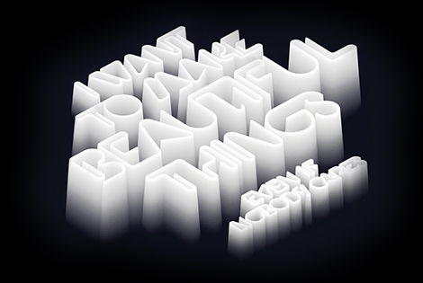
Jordan Metcalf is a Cape Town-based designer, illustrator, and artist who concentrates on type-focused design and lettering. Not afraid to experiment and willing to tackle any letterform, he has collaborated with a variety of clients, including Nike, Adobe, and Harper Collins. His inventive compositions are witty, alluring, and often include a balance of elegant ornamentation and accentuating textures. Although he mostly works digitally, he has also employed tactile mediums such as laser cut perspex and etched wood.
——————–
Also worth viewing:
Bendik Kaltenborn
Ayaka Ito
Inventory Magazine
Follow us on RSS, Instagram, Pinterest, Wanelo,
——————–
Save
Share on Facebook
Thanks to this week's
Sponsor // Summer Font Collection

View Next 25 Posts


