Login or Register for free to create your own customized page of blog posts from your favorite blogs. You can also add blogs by clicking the "Add to MyJacketFlap" links next to the blog name in each post.
Blog Posts by Tag
In the past 7 days
Blog Posts by Date
Click days in this calendar to see posts by day or month
Viewing: Blog Posts Tagged with: Comics/Cartooning, Most Recent at Top [Help]
Results 26 - 50 of 77
How to use this Page
You are viewing the most recent posts tagged with the words: Comics/Cartooning in the JacketFlap blog reader. What is a tag? Think of a tag as a keyword or category label. Tags can both help you find posts on JacketFlap.com as well as provide an easy way for you to "remember" and classify posts for later recall. Try adding a tag yourself by clicking "Add a tag" below a post's header. Scroll down through the list of Recent Posts in the left column and click on a post title that sounds interesting. You can view all posts from a specific blog by clicking the Blog name in the right column, or you can click a 'More Posts from this Blog' link in any individual post.
Here's the scene outside my window (sketched from life).
A guy with a backpack leaf blower is blowing some dust and gravel around.
His buddy, a mower guy, goes past. The leaf-blow guy starts blowing his hair, and the mower guy doesn't seem to mind. He stands there and seems to enjoy it.
Then the mower guy leans over and lifts up his shirt a little.
The air velocity of a backpack blower is about 200 miles per hour, enough to put a rippling dent in the mower guy's butt.
Then they go back to work. And so do I.
16 Comments on Backpack Blower, last added: 6/28/2012
This reminds me of when I saw a lawncare guy with his weedwhip or trimmer thing walk buy his "buddy" mowing and trimmed the back of the guys legs. It was an intentional gag like your story but unlike your story the victim didn't seem to enjoy it.
Here are two examples of animal cartoons. The first is by T. S. Sullivant (1854-1926). Mrs. Hippo says, "Hurry, Hippy, we're late now." He replies, "I just have to take a quick shave, darling — be right with you in about forty-five minutes."
Sullivant revels in the big, goofy, rounded forms, contrasting them with the skimpy plumbing, the small bottle, and the little cigar perched on the rim of the bathtub.
This drawing, "The Daw in Peacock's Feathers" is by Valentin Serov (1865-1911). He was better known as a portrait painter, but he drew a number of animal caricatures to illustrate Krylov's Fables. He shows the imposter and the reaction of the peacocks with simple gestures that are true to the actual animals, but say volumes about us humans, too. As with all good caricature, it's not just about the lines and shapes, it's really about the attitude.
1 Comments on A couple of animal cartoons, last added: 5/26/2012
(Video link) The BBC has produced this excellent documentary on the life and art of Jean Giraud (Moebius), who died yesterday. The production continues in Part 2, Part 3.
Thanks, BBC and Anonymous.
5 Comments on Moebius Redux, last added: 3/13/2012
Oh my god.... Im not easily moved when someone famous dies. But this realy got to me. Jean Giraud/Moebius was such a huge influence. He did all kinds of styles, with such grace.
This month, comic artist and landscape painter Brad Teare started publishing an online comic called "Subterranean Chronicles."
It combines a feeling of the old EC Comics (complete with yellowed paper) with a scratchboard look inspired by great graphic stylists like Lynd Ward.
The seed for the character came from a bit part in Teare's comic Cypher from the 1990s. New installments of the 128-page comic will appear on Tuesdays and Thursdays.
(Video link) Here's a short video clip from a never-released documentary called "A Boy Named Charlie Brown." As cartoonist Charles Shulz draws Charlie sitting at a piano, he talks about the inspiration for the character.
0 Comments on Charles Schulz draws Charlie Brown as of 1/1/1900
Yesterday I visited the Dutchess County Fair in Rhinebeck, New York. It was early in the morning on opening day.
A caricaturist named Mark, the “Cartoon Guy,” was set up under his white tent, waiting for customers.
I did a blog post about Mark a three years ago. He had a new sign out that said “Please don’t text while you’re posing.”
I hung out with him until he got his first customer of the day, a girl who had never been drawn before. During a lull Mark and I drew each others’ portrait.
I love that you sketch people and places everywhere you go, you've carved out a visual journal of your life and travels,and it's incredibly inspirational. Is there any chance you'll ever attend the Illuxcon show in Altoona? I know a lot of your peers show up there and it would be incredible to see some of these sketches (or your Dinotopia paintings of course) in person!
Thanks, CandlePhoenix. I've heard great things about Illuxcon and I'd love to go, but November always ends up being the busiest time for me. One of these days!
I will be making other appearances in the east coast, midwest, and California this fall, and those places will appear in "Upcoming Appearances" on the left column of the blog when they're confirmed. I usually bring a sketchbook to booksignings.
What sketch book do you fancy these days, James? I remember you mentioning a 5x7 Molskine a while back, but this one looks different - and its orientation is "portrait", which I tend to prefer. Maybe a little larger, too?
What a great idea: sketching the sketcher. I, of course, like your draw/painting better ... never been one for cartoon portraits, but then that's just me ... silly cartoon me, likely.
haha "please don't text while posing"! I know exactly how that feels. I was at a portrait painting evening course last year, and it was horrible. The lighting wasn't controlled at all, and they let the model listen to music in ear buds and read her homework while we were painting! You know, she wasn't gonna do anything else while posing, why not get something done at the same time? Ugh.
Tom, I have two sketchbooks going right now. For watercolors, I have the Moleskine 8x6 inch watercolor book. I used that for the calf sketch in the next post.
The other one, which I used for the Cartoon Guy sketch, is a Winsor & Newton Heavyweight A5 sketchbook, about the same size, 14.8 x 21 cm. It’s smooth, heavy weight white paper that takes washes well. The only thing I don’t like are the perforated pages, which I’m afraid will eventually come loose.
i do caricatures at the San Diego Zoo and its always fun to draw other artists. It really pisses me off when I ask someone if they want a sketch and they say," I'm an artist too, i'll just draw my own." i guess that means they only appreciate their own art?? lol people are confusing
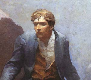
Classic comic artist Roy Crane (1901-1977) reminds us of the compositional importance of black. “Get all you can,” he said in his famous scrapbook. “But use it mainly to bring out the color of white.”
Applies to painting, too. (Rembrandt, Descent from the Cross)
I can't say I've never heard of Roy Crane, so thanks for turning me onto a new artist!
I've gotten a similar lesson out of Milt Caniff and Noel Sickles though! Those were my go-to artists for a short bit in trying to figure out how much black you can use (with the answer usually being "as much as you can get away with.")
Now that I think about it, it might be time to revisit them and get a refresher...
I love black!! Not out of the tube black but the black achieved by mixing red,yellow, and blue from your pallet. Tube black looks like the men you see walking around with that home died hair color, it's flat without highlights.
A really good fairly current artist that does amazing use of black in his art is Tim Sale. I'm putting his website link here if anyone wants to check him out (or u can just google his name). he has a very 30's/40's noir feel to his art.
Since I draw comics too (in fact, I have my own series), black is very important to me on my pages.
It has to be used in conjunction with grays and whites. As Klaus Janson said in his text, The DC Comics Guide to Inking Comics, nothing stands out on a page full of all blacks or all whites or all grays. You have to mix it up and get a good balance!
krysjez, Tim, and MyPen: In this context I don't mean so much black as a pigment in painting, but dark areas as framing areas for light areas--which in comics means black ink.
Whether to use black as a pigment is a great topic for another post.
max- wow yea almost forgot about Janson, he's inked practically everyone. His work with Frank Miller especially stands out as far as his use of shadows to really play up the mood (ex. The Dark Knight Return).
The New Yorker official blog has just shared the results of our "Unfinished Cover Contest," along with an article that tells the story of how it came to be. Thanks, everyone, for participating.
Animators love to caricature each other. Working next to each other day in and day out, they know each others’ foibles and mannerisms.
Bulletin boards at almost every animation studio are decorated with them. Cubicles at DreamWorks are adorned with caricatures drawn by colleagues. When I worked in animation, it was a mark of pride to have your caricature done, and we would trade sketches of each other. Above is a batch of caricatures from Blue Sky Studios currently on show at the Norman Rockwell Museum.
I did a few doodles of my own while I was listening to a panel discussion by Blue Sky’s animation group called the “Lost Boys.” They’re a group that gets together during breaks for rounds of Mario Kart and trips out to Dunkin Donuts for coffee. They include Nick Bruno, Scott Carroll, Jeff Gabor, and Peter Paquette. Pete just finished up at Blue Sky and they threw him a great goodbye party.
Pete struck me as a good-natured sad sack, kind of like Eeyore—if Eeyore were a frog instead of a donkey. And he’s a genius animator--just check out this blog post, where he talks about how Muppet performances can be seen in terms of a CG character with limited rigging points.
Pete Paquette's blog (with other caricatures of him). More about the Lost Boys Book: The Art of Robots
2 Comments on Cubicle Caricatures, last added: 8/2/2011
Cool link -- I have often thought that using talented puppeteers and Mocap would yield as interesting results as actors and Mocap -- and maybe be less of a creepy trip through the Uncanny Valley. The puppeteers would be the first ruff pass and establish the energy -- animators would finish it off with facial expression and fine tune the lip sync and acting -- maybe even add legs to the caricatured motion established by the puppeteers. Diguppetry?
A lot of great entries arrived in the “New Yorker Unfinished Cover” contest. There wasn't room to show them all. It was very difficult to choose, but I’ve picked three finalists, and I’d like to ask you to vote for your favorite in the poll at left.
The winner will receive a signed and specially remarqued poster for Color and Light: A Guide for the Realist Painter. The New Yorker has promised to do a post on their official blog about this impromptu contest, and I’ll let you know when they do. There is a nice post on the Stretchbook blog.
0 Comments on New Yorker Finalists as of 7/31/2011 6:58:00 AM
Last week, I invited you to improve that half-finished New Yorker cover. Well, good news! The New Yorker editors are impressed with what they’ve seen so far, and they’re going to put a slide show of the results on the official New Yorker blog.
It’s not too late for you to send one in (but you'd better hurry). You might get your solution included on their official blog, too. Cartoonists and animators: this could get you noticed! It’s free to submit. Just grab a print copy of the July 4 issue—the one where the artist forgot to include a joke and left half of the cover blank. Fill the blank space with your best gag, and send it in to:
Emily Kan Assistant to cover editor Françoise Mouly The New Yorker 4 Times Square New York, NY 10036
Please email a copy to me, too ([email protected]). On this blog, I’ll pick my three favorites (excluding my own, of course) and let you vote for the top dog. I’ll send the winner a set of signed and remarqued posters for my recent books Color and Light and Imaginative Realism. The deadline is the end of this month.
The New Yorker’s most popular feature is its “Cartoon Caption Contest,” where readers provide captions for unfinished cartoons.
Now, it seems, the magazine has slyly provided its readers with another invitation: the “Unfinished Cover Contest.” The July 4 cover by George Booth features a dog in a window above a sea of flags. Like a standup comic leaving convenient spaces for hecklers to fill, Mr. Booth drew a blank for the left half of his picture, awaiting the pens of GurneyJourney readers.
Here’s my entry, called “Pendent Independent.” I’m not sure if this is an official contest yet, but it will become one if they get enough submissions.
I’m sending in mine today, and I encourage you to do so as well.
Here's a contribution called "The Debt Ceiling" by Larry Roibal.
Digital submissions can be addressed to Françoise Mouly, cover art editor of the New Yorker, subject line “Unfinished Cover Contest” at [email protected].
or you can mail original modified covers to the following address:
Ms. Françoise Mouly Unfinished Cover Contest, c/o TOON Books, 27 Greene Street New York, NY 10013.
Email a JPEG to me, too ([email protected]), and I’ll post a few at the end of the month.
Hi James!!! i want to participate in this contest but i little don't understand -how i can do it? At the first, I need to print this Mr. Booth's picture, and after to drawn my skeetch at the left side?
Jenea, Best thing would be to find a real copy of the Magazine and draw on it. (Every magazine that enters our house gets drawn on.)
I guess you could also do digital art over the file at the beginning of the post, or print it out and draw on it.
Of course this contest isn't sanctioned by New Yorker (yet), just by me at GurneyJourney. It's more of a spontaneous crowd-sourced agit-prop. The deadline for jpegs sent to me is the end of this month. If the New Yorker doesn't acknowledge winners, I certainly will.
James! you know...I live in one small country from est Europe, and here..I just cannot find this amazing magazine..but i can print it..and drawn something on it!
Strange: Sometimes the unfinished looks better than the finished. Open range for people's imagination perhaps?
Same I have noticed with certain step-by-step "How To Paint" books. An antecedent step looking better, and more inviting to imagination, than the finished product/result.
LOL, nice joke. I'll see if I can come up with anything. I'd like to see the looks on their faces when they open a package of images with "finished" work for their cover. Kind of a good marketing idea, actually....
Veteran schoolteacher Andy Wales uses comics in the classroom, and he also he teaches young teachers how to use them. The Sunday funnies was the textbook for his most recent workshop at Alfred University.
Among the teaching techniques he recommends:
1. Comic Book Readers Theater. Reading a comic together as a dramatic exercise. 2. Comic Book Book Reports. Using comics to help students summarize what they have read. 3. Using comics to teach onomatopoeia, alliteration and hyperbole.
What would Bert from Sesame Street look like if you kept his cartoon proportions but made him otherwise real? He’s still got those caterpillar eyebrows, bug eyes, top tuft, bulbous nose and wide grin. But when we see all his details and textures, he has an altogether different charm—or creepiness.
“Untooning” has been a hot internet meme over the last few years, and it raises all sorts of questions about verisimilitude.
A face that has been abstracted can be just as real to us emotionally, maybe more so. Think of African masks. Character designers at CGI animation studios are also very conscious of dialing down the realism on human characters. Too much realism can drop us into the uncanny valley.
I think the same thing is true of storytelling paintings, such as this illustration by N.C. Wyeth from Kidnapped. It’s more of a mental image he was striving for. By not showing his eyes, Wyeth makes David Balfour seem more lost in the fog. ---------- Bert from BoingBoing See Mario, Charlie Brown, and other Untooned characters at Huffington Post
9 Comments on Bert Untooned, last added: 4/23/2011
I think I'm going to have nightmares tonight after seeing burt in this new light (or is that darkenss?). You could make a whole horror movie based on this concept. Move over chuckie, step aside jason, here comes BURT!
The cartoon Bert is poking his tongue out at us. In my view the realistic Bert's "wide grin" makes him look too serious. Therefore it's an inaccurate rendition, in my view.
Scott McCloud discusses the topic of abstraction versus realism in character design in the context of comics in his outstanding book Understanding Comics (see the ToC at Google Books). He talks about how as a face becomes more abstract it can take on a purely symbolic meaning, to point where a smiley face implies the concept of happiness and the reader can apply those concepts to herself instead of seeing the face as a character or representation on the page. Definitely worth a read.
It DOES look like Zippy the Pinhead. I agree with you, James, about abstraction sometimes conveying more than verisimilitude. (Of course, I come from a fine art background, and in academic fine art circles, there is often a strong bias against realism of any kind--even hyperrealism. Not that I agree with that bias!)
My first thought was of Scott McCloud too -- How the abstract cartoon face allows us to easily identify and empathize, because it corresponds with our abstracted mind picture of our own facial features. Our sense is not a photo realistic image of our face, but a simplified, "general placement" of features as they convey emotion.
As you move towards realism, the image represents "another". Combine super realistic aspects with surreal aspects (say inorganic movement or behavior) and the another becomes "other".
I always prefer strong design over mushy realism...
Let's just put it this way: I'm glad Bert doesn't live on my street corner. Enough said. But this is a very interesting topic, and I've always admired and wondered about N.C. Wyeth's decision to mute the eyes in many of his paintings. But in others they are certainly pronounced. I love his painting style so much...
Mr. Gurney- Love your blog and just finished 'Imaginative Realism' -read it cover to cover yesterday. I'm returning to illustration after a 20 year hiatus and your book is the best I've read on the subject. Thank you for sharing so much of your experience and knowledge with us.
Seeing as how pen-and-ink is my primary medium, I have to admire this image. I like how a lot of the traditional pen-and-ink artists worked. You should also check out the work of Aubrey Beardsley, Rockwell Kent, and Charles Dana Gibson. And let's not forget the vintage comic strip artists like Bud Fisher, Elzie Segar, and George Herriman.
My first thought on seeing "Stymied" was of artist “F. Hopkinson Smith” and his book “A White Umbrella in Mexico”. This has nothing to do with the style but how I picture the character.
Wonderful stuff. Shepard is underappreciated, particularly as the Winnie the Pooh books have become pushed aside in favor of the Disneyized version over the years.
-aslo known for his wind and willows - which i think is more popular in england..
He was awarded a cross for bravery during WWI and fought in the trenches - is purported to have done sketches there that would be somthing to see.
BTW james, loving color and light- great reference, i am curious, you list flake of old pigments not recommended - do you paint exclusively with titaninum and zinc? i have tried, would love to but can't seem to get the handling properties of flake(someday, a post on white :)
The new issue of Spectrum has touched down on store shelves and mailboxes. The oversize art book showcases 400 digital and traditional paintings by 300 artists in the field of contemporary fantastic art.
The categories include Advertising, Book, Comics, Concept Art, Dimensional, Editorial, Institutional, and Unpublished.
In an essay at the beginning of the book, co-founder Arnie Fenner gives a health assessment of each of those categories. Even though times are tough, the artists overall have managed to produce some of the most striking, memorable, and ambitious paintings ever, making it clear that we’re living right now in the Golden Age of fantastic art.
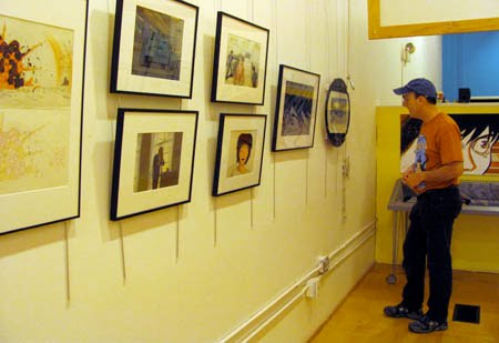
Toonseum is a new museum of cartoon art in Pittsburgh, Pennsylvania. It is currently hosting an exhibition of art from the animated film Akira.
Akira, set in twenty-first-century post-World War III Japan, was directed by comic artist Katsuhiro Otomo. Released in the USA in 1990, Akira was one of the last feature films created with traditional hand-painted cel and painted background technique.
On display are stunning perspective layout drawings and renderings of science fiction cityscapes, as well as effects animation cels and character designs. All of the art comes from the collection of Joe Peacock.
Toonseum is one of only two museums in the USA dedicated exclusively to art from the comic strip, graphic novel, comic book, and animated film. Earlier museums in Rye, New York; Boca Raton, Florida; and Northampton, Massachusetts are sadly no longer in operation.
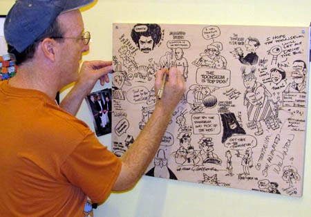
Toonseum is very small—the size of a gallery or shopfront, but it’s fun to visit because it’s run by artists. They encourage you to sit down and draw on an actual worktable from one of Disney’s early animators.
They even granted me the geek dream of holding an original drawing from “Gertie the Dinosaur” by Winsor McCay.
And they talked me into doodling on the hall-of-fame group sketch.
Toonseum is located at 945 Liberty Avenue, Pittsburgh, PA. It’s open from 9 to 3 on most days, Wednesday through Sunday. The Akira exhibit will be on view through July 18.
The film is a stunner. I think the graphic novel version is better - six volumes in the English edition. The full story makes more sense than the shortened version in the film, and Otomo's drawings are superb.
There is also a volume called "Akira Club" which contains a good quantity of additional artwork, much of it in colour.
Another treasure for Otomo fans is the story board book for the film "Sream Boy". This contains around 4000 little drawings (reproduced at about 3x6 cm). Some real gems here.
That's awesome! Akira was really huge with a lot of my friends and me around '89 just before I started at art school. We had a copy in Japanese that someone's dad brought back from Japan. Then my buddy and I picked up a bootleg English dub before it was really available.
I doubt I can make it out to Pittsburgh from Delaware before this show ends, but I would love to see that exhibit.
Otomo has always impressed me. I went to a little tiny theater called The Roxy in Philadelphia (the little tiny one around 21st and Sansom) to see Robot Carnival, some time in '90 or '91. It's a collection of shorts, and Otomo did the opening and closing sequences. Brilliant stuff, even shown on a screen the size of a mattress.
If I walked into a gallery that had original Akira artwork hanging on the walls and James Gurney was there holding a Winsor McCay illustration I would just... well, I would be very happy.
Oh wow, I have great memories from Art School, when a bunch of us piled into a caravan of beat-up cars and pick-ups (art student specials!)and drove from Richmond, VA to the Biograph Theater in DC to see Akira dubbed in English for the first time! Needless to say, it blew our minds and it continues to do so even today. It ranks on the top of all anime films in my opinion. Second to none. Thanks for sharing.
On May 16, at the Delaware Art Museum, I’ll be offering a workshop called “Attack of the Tool People.” We’ll be designing mischievous monsters that are part household tool and part human. Below: Henrich Kley
This workshop is for all ages and ability levels. If you come, you can also see the Dinotopia exhibition and the fabulous collection of Howard Pyle and Pre-Raphaelites. Below: Boris Artzybasheff.
Here’s the backstory: Whenever your Do List gets more than 10 items long, a mysterious enchantment travels into the closets and drawers of your house, bringing a “Tool Person” to life. Tool people are impish superheroes that arise from common household objects. They want to help you with your Do List, but their way of fixing things is unorthodox at best and dangerous at worst. That’s why you want to keep your Do List short. (The Tool People are hammering and sawing in my house every night.)
Here's information for those attending:
Please bring: 1. A tool from the kitchen, art studio or workshop. It should suggest a face or a head, but it doesn’t have to be symmetrical. It might be a wine cork puller, nutcracker, tea strainer, can opener, adjustable pliers, hammer, hole punch, pencil sharpener, drill, camera, or a few computer part. Bring a few other spare parts for components.
2. An action figure or doll. It can be any size. It doesn’t have to match the size of the tool.
3. Your favorite drawing media. Everybody should bring a couple of regular pencils and an eraser to get started with concept work.
If you like, you can also bring markers or watercolors, but please no oils because a lot of people are sensitive to the fumes. I recommend bringing a set of water-soluble colored pencils. Caran- d'Ache Supracolor, Derwent Inktense, Prismacolor, or other brands are OK. Twelve or eighteen colors should be more than enough. If you don't want to get a whole set, you can buy about six or seven individual pencils.
If you bring the water-soluble colored pencils, I also recommend bringing a water brush. This is a hollow-handled plastic brush with a nylon fiber tip, marketed under the name Niji or Kuretake and other brand names. Fill the handle with water from the tap.
4. Sketchbook paper or card stock. The paper should be fairly heavy and smooth. You can use watercolor paper in a separate sheet or a Moleskine watercolor sketchbook, which is perfect.
Recommended for all ages and both beginner and advanced students. Those of you who came to the February workshop are most welcome to return, because we’ll be doing a different challenge this time.
Sunday, May 16 | 11:00 a.m. – 4:00 p.m. $55 Members/$65 Non-Members On Saturday, May 15 at 1:00, I'll be repeating the talk I gave in February: "Fact and Fantasy: The Making of Dinotopia," free wit
6 Comments on Attack of the Tool People, last added: 4/10/2010
even though i dont know what tool people are i'm excited to find out!
and cant wait to catch the lecture too. thanks so much for taking the time to come back out. missing the first class and lecture because of the snow was a huge let down. thanks for looking out for your fans!!
This sounds like a great workshop. I am also glad you pointed out that some people are sensitive to oil paint fumes. I am one such person and appreciate your acknowledging this painfully distressing problem!
Wonderful idea. On another note, will you be doing a song and dance at BYU in the near future? If you are I will just have to make the trip down from Boise. Been looking forward to meeting you.
Mr. Carman, it would be a treat to return to Salt Lake City and Idaho. I don't have your beautiful area of the country on the itinerary just yet, but my arm could be twisted!
Last weekend I drew the t-shirt design for Anthrocon. This year’s theme is “Modern Stone-Age Furries.”
I'll be giving three digital slide lectures and a technique demo.
But the big event will be the fursuit parade. This is one of the largest events of its kind, with over 600 participants. All the costumers don their fursuits, which are handmade and often very elaborate. They’re mostly based on anthropomorphic cartoon animals.
According to an insider's description:
"Fursuits, similar to what athletic team mascots wear, are constructed of fabric, not fur or animal skins. While in a fursuit, a furry walks upright.
Some furries superimpose human clothing on the fursuit; for example, a snow leopard diva may wear a red cocktail dress and a big yellow dog may wear blue jeans.”
convention rules "No water pistols, silly string, or any thrown or projectile-type toy may be used in any area of the hotel or Convention Center"
no silly string?! man, i'm not going, haha.
looks crazy though, hope you have fun!! are you making a suit?...oh wait i bet you already have one! it all makes perfect sense now!! were you in that tigger outfit on the video, the one holding up the line, haha!! hilarous!
Hi! I'm the chap who's doing the colour and layout for the AC badge t-shirt.
Saying fursuits are like Mascot suits is technically indeed true, but really doesn't express the amount of variety and innovation you'll get to see.
Fursuits are often a worn artform. They range from the goofy, big head fuzzy types you're familiar with, to finely fitted, prosthetics with mobile ears, working mouths, camera eyes (And HUD systems inside the heads), and even "Rarsuits" that have their own built in audio effects system for roaring and stomping and other interactions.
the ones that look the strangest are the ones who just walk like 'normal' humans... it doesn't seem to fit - while the ones who have exaggerated 'cartoon' walks look 'normal'
It's an interesting environment, though quite different from other conventions where you may have been. Furry art revolves around animal characters, but especially realistic reanderings of animal characters, which are somewhat rare in commercial art compared to cartoony animals or meterial of other genres. So books like Dinotopia are very prized by furry artists and they made a good number of fans interested in dinosaurs.
Mr. Gurney, I am a furry convention veteran (shhh!). I wasn't planning to go to any this year, until I found that you are GOH at AC 2010. Now, it is IMPERATIVE that I attend with my sister. Dinotopia was a key book in my formative years. I used to stare at those paintings for hours, trying to work out how they had been created. Thank you for inspiring me, for sharing your incredible blog full of wisdom, and for giving furries a chance ;_; we are the nicest bunch of freaks you could ever hope to meet. Glad to know the Anthroconstaff has been an example.
Look for me wearing a Dinotopia-themed, airbrushed t-shirt, which I will hope to have autographed. Peace!
Here's a mouth drawn in the style of American cartoonist Milt Caniff. According to artist and comics historian Ron Harris, "Drawing the lips too round or too full can detract from the "man's man" look realistic artists usually strive for. Impressionists Noel Sickles and Milton Caniff circumvented this potential pitfall by drawing a thin upper lip in shadow, reduced almost to a line, while indicating the lower lip only by the shadow it casts on the chin."
Ron's blog post "Mouthing Off" has a lot more examples of ways the great comic artists simplified the mouth for maximum clarity and expression.
5 Comments on Mouth Shorthand, last added: 2/11/2010
The way I learnt to draw mouths initially was through manga. I was struck by how much could be conveyed through so little. By using simple line width variation you can achieve a startling amount of depth to the lips. If the lines taper off toward the middle, to the point that they vanish, it creates a convincing illusion of light a shadow. This is an image I use in some how-to-draw-manga workshops I do for kids: [Link]
That is a really inventive! I love seeing what people try to do to break out of the normal way of thinking with any art form but of course I more drawn to comics and animation over other forms. Very nice.
That's incredible! I have the utmost respect for artists with the patience to not only create, but figure out how to execute such projects. It certainly is an inspiration and a reminder to me that I can always be drawing more!
This 1992 political cartoon by Ed Stein of Rocky Mountain News says: "Visit the island kingdom of Great Britain, where the monarchy, which miraculously escaped extinction, lives lavishly at the expense of the common folk."
Interesting, Ed recently (Friday) spoke at our commencement for Rocky Mountain College of Art + Design, and you had just visited us last September. The art world is a small place.
James I just wanted to take the time to congratulate you on such a great job you're doing here. Your posts and artwork are inspirational to many generations of artists. Cheers!
By the way, James, didja hear about the new poisonous turkey dinosaur they just found? As you're the definitive apex of dinosaurs and art, I'd love to see your artistic impression of this new creature...or even emcee a drawing jamboree amongst your manyfold adoring fans!
Oh, and while I'm whining about all the great info I always want to dig outta you, I'd love your take on some of the classic Coca Cola-age Christmas illustrations, since it's that time of year.


.jpg?picon=1009)


![[Link]](http://i7.photobucket.com/albums/y272/fuurin/mouthnose_various.jpg)
Haha! So good! :)
Love it
Very funny story. That's what's great with drawing.
He already has a rippling dent there.
cute story in pictures :)
This reminds me of when I saw a lawncare guy with his weedwhip or trimmer thing walk buy his "buddy" mowing and trimmed the back of the guys legs.
It was an intentional gag like your story but unlike your story the victim didn't seem to enjoy it.
Hahaha! Love it!
Ha ha ha! Fantastic!
Hilarious.
You've got more interesting mow-blow-go guys than I do, that's for sure!!
Hilarious! Wouldn't it be funny if one of these guys followed your blog and saw this post?
fun story...always love your blog
ha..! I love your blog, thanks for doing it.
I love it!
I love it!
Classic! LOL
This reminds me of a certain Sponge Bob eps.