
Although such studies were forbidden, he was determined to learn the secrets of the old myths.


5 Comments on if: myth, last added: 1/26/2013
Display Comments
Add a Comment

Although such studies were forbidden, he was determined to learn the secrets of the old myths.
Coles Phillips was active in the early part of the 20th century. His signature “fade-away” style plays with background and foreground and leaves the viewer to put it all together. It was developed at the request of Life magazine, which had asked Phillips to invent a new look for their covers. I’d say he fulfilled that assignment well. I love his highly graphic and stylized look. Some examples follow…showing his style and the usual assortment of pretty girls.
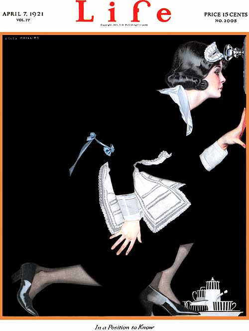
Life, April 7 1921, “In A Position To Know”

(Novel)The Siege of the Seven Suitors – 1910

Good Housekeeping – I don’t see a date, do you?
Good Housekeeping, February 1917
I’m thinking of Phillips now since I’m working more with toned grounds, and letting that tone stand in for the mid values, as many artists have done, especially in chalk studies. Phillips took that convention and pushed it to a very stylish conclusion.

Leonardo Da Vinci – Study of Hands

Jean-Honore Fragonard- Studies of Women

Peter Paul Rubens – Isabella Brant
Links to more examples and information on Coles Phillips

For the past 10 years or so, I have done cards featuring dachshunds for Christmas. This is the last in the series — it will be on to something new next year.
Wishing you peace during the holidays and always.


If a hamster escapes late at night to go exploring, it feels very, very small.

This one was done in watercolor and pastel.

This is an old one.
So old it has whiskers, as we say.


The word for Illustration Friday this week is ZOOM.
I used to live in San Antonio, home of Lackland Air Force Base where all the recruits went to train. We called them “zoomies”.
I don’t know what they called us.
Happy Thanksgiving, one and all!


Bunnies enjoy sunsets, especially when the sun turns carrot-orange.
I enjoy working in pastel and like leaving the toned paper to stand in for the middle values. In this little piece I was experimenting with doing the same thing with oils. It was fun to work on, I like the tonality, and it gave me a good break from writing the book!


One of the characters in the story I’m working on is a chef. I’ve always had Charles de Gaulle in mind as the inspiration for the chef’s look. Imperious, demanding, and French.

What a great face!
With a little wardrobe change….

The clothes make the man, non?


Woo-wee! November, the month of writing and reading, is here! If you are an illustrator or writer of picture books, many thought-provoking, motivating, and inspirational articles can be found on the PiBoMo website. Also lots of linkety-links to make your clicker finger happy. You can start by clicking the badge above.
Normally, I read books and make illustrations that move or embellish the story. This year I’m writing my own Great American Picture Book. Last week I dove into my big list of picture book ideas and there was one that stood out as having the right tone for my current moods, with the scope for lots of silliness. Sometimes just settling on an idea can be really difficult, so when the choice seems to be obvious, the muse must be smiling on my efforts.
I’ll be storyboarding and writing simultaneously. Since I’m primarily an illustrator, the image often comes before the words in my mind. So…the pencils are sharpened, the keyboard has been dusted, and dummy sheets for storyboarding have been printed.
Read about storyboarding for picture books here.
Here’s a storyboard template you can print and use yourself: storyboard
Another resource for storyboard templates with options for horizontal, vertical, or square formats: Scott E Franson
Let’s go — draw! write! Make your mark!

More chapter numbers for a generic scary story.
 Sinister snakes slither silently (breaking writer’s rule #4 – avoid alliteration)
 bearing witness to the evidence of a dastardly deed.
 He will haunt the guilty one forever.

The next few chapter numbers for an unwritten but mysterious and spooky book.

As the moon rises over a deceptively placid ocean,

a chair also rises in the drawing room.

While a hook in the gamekeeper’s shed is much more pointy than necessary.

![]()
Here are a couple of pieces from a series I’m doing in black & white. The idea was to create chapter headers that the sharp reader would discover are both illustrations and chapter numbers. These are generic spooky/mysterious images done for samples. In real life, the subject matter used for the illustrations would actually tie in with the chapter in some way.

This hypothetical book has 10 chapters. Not all the numbers are animals, it just happens that the first two are. I like the beak and feet used as serifs for the number 1. Some of the other numbers are sans serif. Hope there’s no penalty for mixing font styles.

![]()
Some of the most exquisite storybook illustrations of all time were produced by Kay Nielsen. Highly stylized compositions with delicate detail and masterful use of color characterize his illustration work.
Nielsen was one of the Golden Age triumvirate which also included Arthur Rackham and Edmund DuLac. Of the three, Nielsen is my favorite, for his use of empty space in his compositions and also for the folkloric flavor that is especially present in his illustrations for East of the Sun, West of the Moon.
Depth in his work is often indicated by the fore- mid- and backgrounds presented as a series of planes, like sets on stage. Not surprising, since his parents were both theatre people and Kay himself also created stage sets and scenery.

“Don’t drink!” cried out the little Princess, springing
to her feet; “I would rather marry a gardener!” – from the Twelve Dancing Princesses, in Powder and Crinoline
Another recurring motif in his work is the arch form – reminiscent of a proscenium arch or maybe the rainbow bridge to Asgard:

From East of the Sun, West of the Moon

from East of the Sun, West of the Moon
The arch has also been referred to as a Hiroshige wave. Nielsen grew up with Asian art that had be collected by his grandfather. Japanese woodcuts were an influence on him, as they were on Art Nouveau in general.
The work of Aubrey Beardsley was another influence, as acknowledged by Kay himself.
Biography — a tale with a sad ending.
Kay’s active illustration career spanned the years of 1913 – to around 1930; only 20 years. He enjoyed success and fame with his very first books, In Powder and Crinoline and East of the Sun and West of the Moon. More popular illustrated books and theatrical designs followed.

design concept for Night on Bald Mountain
In 1937, he went to work for Walt Disney Studios, where his designs were used for the Night on Bald Mountain/Ave Maria sequences in Fantasia. He also supplied design and concept for other Disney vehicles, but his working methods were out of synch with the pace needed in an animation studio. He was let go from Disney after four years to find that his illustration style had gone out of fashion. Friends and admirers assisted him with living expenses and a few commissions, but sadly he died in poverty.
Friends also preserved his originals, some of which had never been published. David Larkin and Hildegarde Flanner produced “The Unknown Paintings of Kay Nielsen” in 1984.
 It was also David Larkin who edited a 1975 compilation of illustrations which brought Kay Nielsen’s work back into prominence after a long period of neglect. Around the same time, there were fresh editions of the work of Aubrey Beardsley and Arthur Rackham, and a resurgence of interest in Art Nouveau and the Arts & Crafts movements in general.
 She appeared rather faded, but considering she was a ghost, that wasn’t so surprising.
I’ve been working mostly in oils lately, but did this one in acrylic and prismacolor.


 Long time, no post! This week’s word of inspiration at Illustration Friday was kernel. At first I thought maybe I’d wait another week, but then an idea came.
The seven sisters lived tightly packed, one kernel inside the other. Tiny Katya longed for the wide open spaces, and often thought of Texas…


 This is the 12th year that I’ve sent weiner-dog themed Christmas cards, which has been a fun project. Not only are the long little doggies lots of fun in themselves, but it’s been extra enjoyable because I don’t try to maintain any kind of stylistic continuity.
Good wishes to all for a happy holiday season! I hope you get the things that you really want deep down.
If you’d like to look at past cards, you can check them out at the old blog address: Old Storybooky
And if you or someone you know is as besotted with the creatures as I am, I’ve put up some of the designs for sale on my Cafe Press store – which is just starting up, so please forgive the lack of design finesse…Mooney Designs


 “Don’t do that, your face will freeze that way!” Now THAT’s a scary thought.
This little character study is oil over watercolor.


 Lucky me, to have an illo in the drawer that fits this week’s prompt. This is an unintended surprise disguise…drat those pesky little brothers! Who thought it was a good idea to give them access to permanent markers?


 …under the influence.
A tip of the hat to my influence for this piece…Paul Coker and the Horrifying Cliche series he did for Mad Magazine. We’re talking waaaay back in the day, here.


 He continued to swell with his good opinion of himself, until one day….


 Teenage angst.
‘Nuff said.


 Sam Spayed gives the high sign.
He’d done his bit. Lost the shamus that had been tailing him and delivered the dingus as agreed.
All that for a dame. A dame that could make an alley cat think about leaving his old ways behind and curling up by the fire for a spell. A dame with eyes that promised a trip to the fish market and back….
I haven’t done an anthropomorphic animal for awhile because I’ve heard so many editors and art directors say they hate them. But they’re so much fun to do! I like them now, and what’s more, I liked them when I was a kid, too.
Alternate caption…The cat with the gat came back.


 Every dog model knows how to look good in costume…which is his best side…how to hit his mark….lick his lips and smile….and stay.
Happy summer vacation, everyone!


Very cool painting, full of old-fashioned magic. The golden tones are perfect.
This is really beautiful–great colors, and great expression on his face.
Thank you! Limited palettes don’t seem to be so popular these days, do they?
Thanks, Cindy! Old-fashioned is right. Surely there’s still a place for that kind of look.
This is such a wonderful painting