0 Comments on Autumn Oughta Matter as of 10/3/2011 2:08:00 AM
By: Carol B.,
on 9/26/2011
Blog: JACKET KNACK
( Login to Add to MyJacketFlap)
JacketFlap tags:
Add a tag
 | Janet Fox's Forgiven
(Speak, 2011)
Historical |
There's something alluring about an abundance of taffeta and lace. Lately there have been many cover photos of beautiful girls wearing Victorian dress, wrapped in folds of luxurious fabrics that would have made the likes of Mary Todd Lincoln green with envy. These covers must sell--and I know my eye is always drawn to the images. I think these covers promise teens stories of faraway times and places, romance, fantasy, vulnerability, danger. Here are just a few samples. All young adult novels. Beyond the photograph. The designers of the next covers added art to enhance the image.
Note the finger-like roots and magical sparkly dust (is there a word for "magical sparkly dust"?) that set this cover apart. And oh, yeah, the sepia tones.
 | Chime by Franny Billingsley
(Dial, 2011)
Fantasy |
Cool overlaid arabesques just above the title:  | Unearthly by Cynthia Hand (Australian edition)
(HarperTeen, 2011)
Fantasy, first in a trilogy |
I can't explain it, but I find the geometric lines and shapes on this cover irresistible. Is it steampunk-ish? The novel involves genetic engineering. I think it works.  | Wither by Lauren DeStefano
(Simon and Schuster, 2011)
Dystopian Fantasy, first in a trilogy |
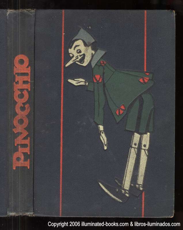
Carol sent me this adorable cover and suggested I do a spread on Pinocchio jackets. As a result, this week's JacketKnack post will be eleven and a half pages long because there are soooooo many Pinocchio covers to choose from. I found dozens upon dozens of renditions of this little wooden boy. Without further ado, here's Pinocchio... ...circa 1926.
...with Robin Williams as Gepetto!
(Sterling Publishing,February 2008)
...as a pop-up book...
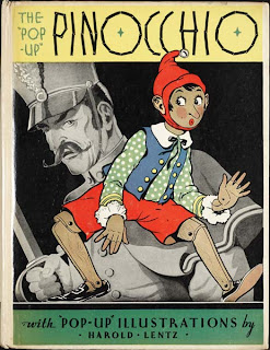 (Blue Ribbon Books, c1932) (Blue Ribbon Books, c1932) ...in the UK...
 (Penguin UK, 2011) and ... en francais!
By: Carol B.,
on 8/29/2011
Blog: JACKET KNACK
( Login to Add to MyJacketFlap)
JacketFlap tags:
Add a tag
 |
Japhet, in Search of a Father by
Frederick Marryat, Henry M. Brock, illus.
(Macmillan, 1895 or 1903) |
Can't. Resist. Urge. To post. Old. Fashioned. Covers. Please. You must. Forgive. Me.
We're looking head-on at the prow of a ship (above) in Marryat's Japhet. See it?
Hard to believe this next one's in such good condition. Does that mean it wasn't read (i.e. loved) much?
 |
Fred Bradford's Debt by Joanna H. Mathews
(Cassell and Co., 1882) |
And who doesn't love a good Edward Lear? This one looks sort of modern in style:
 |
Lear's Book of Nonsense, Edward Lear
(Warne and Co., London,
Scribner, Welford and Co., 1880) |
All is not lost for lovers of olden covers! Here's one with a 1930s feel (1940s, maybe?). But it was actually published in this century (had me fooled):
 |
Look and Cook by Tina Davis
(Stewart, Tabori and Chang, 2004) |
Here's another modern-day charmer :
By: Deirdre,
on 8/21/2011
Blog: JACKET KNACK
( Login to Add to MyJacketFlap)
JacketFlap tags:
Add a tag
The first two covers inspired this week's post with their similar layouts. What stands out in all of these covers is the combination of the photographic images, fonts, and art work.
There has to be a term for this top-bottom design with the title sandwiched in the middle (anyone know?). It certainly works to make the title the focal point.

(Tundra Books, 2010)
Great colour on the "wolves" cover, although I'm not sure about the hair - is she in a wind storm or is she falling?

(Viking Children's Books, 2010)

A.E. Cannon (Harper Teen, 2008)
Another top-bottom split, but this one might still be following the law of thirds by having the title cover more than half.
And on the next cover we get it all, the top-bottom split, some layering with print, and even a yoyo thrown in for good measure.

by Beverley Brenna (Red Deer Press, 2007)
The extra art work builds on the photographs and grounds the images to the page. No floating heads here.
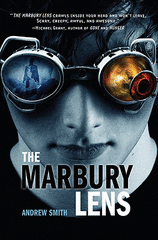
Andrew Smith (Feiwel & Friends, 2010)
Yes, this last one is more of a left-right split, but still very cool images. Great choice with the colour only appearing in the lenses.
By: Patti L Brown,
on 8/15/2011
Blog: JACKET KNACK
( Login to Add to MyJacketFlap)
JacketFlap tags:
Add a tag
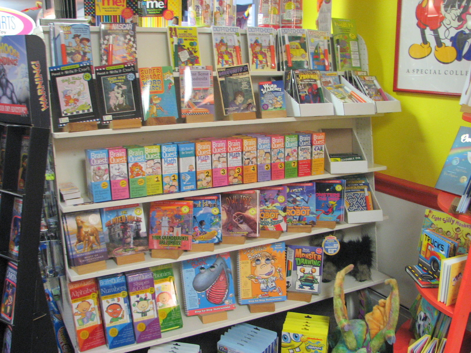
There are many picturesque little towns and communities peppering the eastern shore of Maryland. While there is an abundance of gift stores and nautical-themed décor shops, there’s a serious lack of bookstores--especially children’s bookstores. But I was tickled to find plenty of reading material for youngsters at Calico Toys & Games, in the lovely town of St. Michael’s. Prominently displayed, of course, is local history. This illustrated story tells of the legend of how St. Michael’s was spared from British massacre during the War of 1812.
 |
The Town That Fooled The British : A War Of 1812 Story Lisa Papp.Publisher: Sleeping Bear Press, May 2011).
|
Calico’s book section is a smorgasbord of fun for the kids: Brain Quests! Mad Libs! Klutz books! Read-Write-Draw It! And that’s just their book section. Imagine what the rest of the store is like. But don’t let the fun deceive you. There are some definite gems to be found here, too: Poetry!
 |
Poetry for Young People: American Poetry
by John Hollander (Editor) Publisher: Sterling Publishing, March 2004 |
By: Carol B.,
on 8/8/2011
Blog: JACKET KNACK
( Login to Add to MyJacketFlap)
JacketFlap tags:
Add a tag
 Round and round and round we go . . . Round and round and round we go . . . Shall we talk of circles on children's book covers? We shall! Circles suggest targets, planets, infinity, security, rolling, wholeness, irises, rings, discs. Consider these covers and what may have been the reasons for their circular designs:  | Nickel Plated by Aric Davis
(Amazon Encore, 2011) |
Noteworthy: Outside of logo designs, circles are less common elements of design which makes them good for grabbing attention, providing emphasis, and breaking up familiar rectangular blocks of text. ~ Jacci Howard Bear, About.com  | Countdown by Deborah Wiles
(Scholastic, 2010) |
This clever cover has a circle at its heart:  | Bunheads by Sophie Flack
(Poppy/Little Brown, October 2011) |
Circles abound on the cover of this picture book:  2 Comments on Circular Reasonings, last added: 8/9/2011
 | I, Emma Freke by Elizabeth Atkinson
(CarolRhoda, 2010) |
"The earth is my body; my head is in the stars." ~ MaudeThis week's theme: Covers which defy gravity. Feel free to join in with your own lofty cover recommendations in the comments.  | Cromwell Dixon's Sky-Cycle
by John Abbott Nez, a non-fiction picture book
(Putnam, 2009) |
 | Flying! by Kevin Luthardt
(Peachtree, 2009) |
 | Willoughby and the Moon by Greg Foley
(HarperCollins, 2010)
|
 | The Summer I Learned to Fly
by Dana Reinhardt
(Wendy Lamb Books, 2011) |
More visions of the celestial sphere:
1 Comments on To Chase the Glowing Hours . . ., last added: 8/5/2011
By: Deirdre,
on 7/24/2011
Blog: JACKET KNACK
( Login to Add to MyJacketFlap)
JacketFlap tags:
Add a tag
My cousin was visiting from the UK and wanted to pick up some Canadian books for her daughters. It was fun finding some of the latest Canadian offerings on the shelves. Here are some great covers that caught my eye during the search for Canadian content.
A fun font:
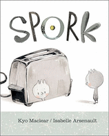 Kyo Maclear & Isabbelle Arsenault (Kids Can Press, 2010) Kyo Maclear & Isabbelle Arsenault (Kids Can Press, 2010)
Strong impact with this title, especially with the contrast to the dust road.  (Double Day Canada, 2011) (Double Day Canada, 2011)
Speaking of impact, nothing like a few bullet holes to disturb a pretty forest scene. Great way to achieve a layered effect too. 
(Candlewick, 2011) This cover seems simple. But why aren't they pairs of feet? And why are they dirty? And what do they have to do with a hare or an elephant? Any cover that leads to this many questions is likely going to have readers opening the book. 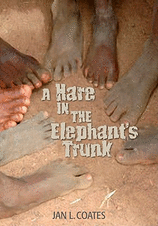
(Red Deer Press, 2010) Feet seem to be a popular device in covers. The hand written envelop is another nice technique to draw in those middle grade readers. 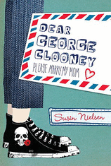
(Tundra Books, 2010) Always good to have visitors remind you to take a new look at some interesting covers. What have you discovered on the shelves lately?
 * I love summertime. Summer is the season of reading everywhere: on the beach, in my Adirondack chair, on a park bench, on a blanket in the grass. In my hunt for some good summer reads, I found lots of covers that capture this season well. Cartwheels on the beach! (Or is that a head stand?)  That Summer by Sarah Dessen (Speak; May, 2004) Ah, the water… 
Tempest Rising by Tracey Deebs (Bloomsbury; July, 2011)
(This is the Kindle Edition cover, which is cooler than the hardback cover.)

Tara Hudson Hereafter (Harper Collins: June, 2011) Summer isn’t all about beaches and boating… 
Keri Mikulski
1 Comments on Summer Reading, last added: 7/21/2011
By: Carol B.,
on 7/11/2011
Blog: JACKET KNACK
( Login to Add to MyJacketFlap)
JacketFlap tags:
Add a tag
Good morning, children's book cover lovers! The time has come for another title font cornucopia. Forthwith, we present a few eye-catchers.
Non-fiction does a typeface proud here:
 | Spiderlings and their Families
A Fact Book on Spiders by Antonio Calabrisello,
Nadia Turner, illus. (Brolly Books (Aus.) 2008 |
See also, Turner's companion book from 2010, Snakelets. (Skip if you don't like spiders and snakes.) Although these letters have some curves, they do give us the sense of squareness. Also note how the wide-apart letter spacing (kerning?) adds to the effect.  | Square Cat
by Elizabeth Schoonmaker (Aladdin, 2011) |
Bink and Gollie's typeface promises fun and laughs for readers:  | Bink and Gollie by Kate DiCamillo and
Alison McGhee, Tony Fucile, illus.
(Candlewick, 2010)
Winner of this year's Theodore Geisel Award
for a beginning reader |
Turn of the last century + outer space. A sort of Jules Verne feel not out of keeping with this novel's 1910/Halley's Comet material:  | Selling Hope by Kristin O'Donnell Tubb
(Feiwel and Friends, 2010) |
By: Carol B.,
on 7/4/2011
Blog: JACKET KNACK
( Login to Add to MyJacketFlap)
JacketFlap tags:
Add a tag
BEFOREfather ----> AFTER
Assignment: Design a cover for a young people's nonfiction book about Independence Day in the U.S.A. Must use images that are fresh, appealing and inviting enough to appeal to today's kids.
My thinking is that it would probably take a lot of talent to successfully create art for this assignment. You'd be trying for a new approach, a lively look that doesn't come across as dull and dry as a New England primer. Here are some recent offerings. Some work better than others, perhaps:
 | Amie Jane Leavitt
Kids' Translations Series/Capstone Press, 2009 |
 | Lori Mortensen/ Matthew Skeens, Ill.
Picture Window/Capstone, 2009
|
 |
By: Patti L Brown,
on 6/27/2011
Blog: JACKET KNACK
( Login to Add to MyJacketFlap)
JacketFlap tags:
Add a tag
Erin E. Moulton's Flutter was released in May, 2011. Check out this gorgeous cover:
 ( (Philomel: 05/12/2011) Wow, these complementary colors are so appealing and offer nice contrast. The blue makes the orange tones of the hands and the butterfly just pop. And the focus: the butterfly and the fingers are clear, but the hands stretching out behind them give an ethereal feel to the whole picture--as if someone snatched this butterfly out of their dream and brought it to life. Her editor at Penguin Books, Jill Santopolo, was kind enough to answer a few questions for us: JK: What inspired you to use the image(s) chosen for this cover? JS: We were so lucky with Flutter because Erin wove a motif of monarch butterflies throughout the story. The butterflies were so meaningful in the text that when the art director, the jacket designer and I met to talk about the cover, we knew that they would be part of the image.
 JK: What other projects are in the pipeline for you? JS: A ton of other projects are in the pipeline, but I think one that would be interesting to you Jacket Knack-ers is Shattered Souls by Mary Lindsey (coming out in December 2011). Check out this jacket! ( http://www.marylindsey.com/books.php) It's a totally different look than Flutter, but I think they're both stunning. Three cheers for the Penguin art department! ...Erin Moulton: http://www.erinemoulton.com/... Jill Santopolo: http://www.jillsantopolo.com/
By: Deirdre,
on 6/20/2011
Blog: JACKET KNACK
( Login to Add to MyJacketFlap)
JacketFlap tags:
Add a tag
A friend shared an article that commented on the finding that males are represented more in children's books than females. Specifically they looked at main characters and names in the titles. (view study at: gas.sagepub.com/content/25/2/197).
Instantly a list of beloved female protagonists came to mind. The question was: Were these girls on the book covers?
In the case of favorites such as Anne of Green Gables, Julie of the Wolves, and even Nancy Drew the main characters were on the covers. But what about others?
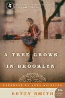
I searched the bookshelves and found that it depends. For example, the first edition of Betty Smith's A Tree Grows in Brooklyn (Harper & Brothers, 1943) there is no sign of Francie on the cover. But the Harper Perennial 2005 version has used her as the focal point (love the mirror image position of the tree).
The same is true for Philip Pullman's The Golden Compass. The UK edition was titled Northern Lights (Scholastic Point, 1995) and features the compass but no characters. The Alfred A Knopf 2007 publication has Lyra sharing the cover.
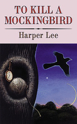
And my copy of To Kill A Mockingbird by Harper Lee (Turtleback Books, 1999) opted for the no character cover whereas the 2002 Harper Perennial cover found a girl to be the face of Scout.
Looking at recent publications, there are some great examples of covers
By: Carol B.,
on 6/13/2011
Blog: JACKET KNACK
( Login to Add to MyJacketFlap)
JacketFlap tags:
Add a tag
Know what? Tween covers don't get enough attention on Jacket Knack. I think it's because so many of them use cover art that's about as visually interesting as a bowl of oatmeal. Stick with the familiar, these designers seem to be thinking; stick with what kids are used to. Then along comes Abigail Halpin, the illustrator for Uma Krishnaswami's new novel, The Grand Plan to Fix Everything, (Atheneum, 2011. Designed by Caitlyn Dlouhy) and we sit up and take notice. Read an interview with Abigail Halpin about the making of this book here. Dini, a Bollywood obsessed, aspiring screenwriter, age eleven, finds out that her family is moving--to India! But not to Bombay, the Bollywood center where films are produced. Instead, they're moving to a tiny town, the center of nowhere. Halpin's Dini looks clever, cute and independent, don't you agree? The artist made her fit inside a map of India so that the country's borders create a frame around her. And the hand lettering for the title is a tween-friendly touch. (See an early sketch of the cover, with a different title (!) at Got Story Countdown. So, I asked Uma to give us her thoughts on the cover art. Did it differ from what she expected? Were there any changes made along the way? Here's Uma's response: From Uma: Here's what I hoped the jacket wouldn't be: 1. pink, like many humorous books with girl protagonists. 2. red and gold, like 90% of books with Indian settings published in the US.
It's neither, and I was very pleased about that. I love the image of the protagonist, Dini. I hadn't planted a single visual cue about Dini's appearance in the book, and yet she looks very much as I imagined her. Rather, it's clear that Abigail mined the text for cues to Dini's personality and energy, and used them to bring the character to life in this jacket. I also love the map. I did suggest changing Mumbai (the correct current name of the city) to Bombay, to be consistent with the book, in which "filmi people" still insist on calling the city by its old name. The location of the fictional town of Swapnagiri got shifted a bit to make it sit more squarely in the real Blue Mountains. Finally, I can claim cr
By: Carol B.,
on 6/6/2011
Blog: JACKET KNACK
( Login to Add to MyJacketFlap)
JacketFlap tags:
Add a tag
 Motion toward, motion away. Consider images of train tracks, roads, etc. on children's book covers and what they suggest to a potential reader. They can visually draw the reader into the book. They can evoke a sense of running away, loneliness, or hint at an adventure to come. Motion toward, motion away. Consider images of train tracks, roads, etc. on children's book covers and what they suggest to a potential reader. They can visually draw the reader into the book. They can evoke a sense of running away, loneliness, or hint at an adventure to come.
Clare Vanderpool's Moon Over Manifest (Delacorte, 2010. Read a summary/review.) is an interesting study. The cover of this Newbery Award-winning novel (which I haven't read yet [blushes]) tells us . . . what? Here's a girl in a rural setting who is alone, but perhaps not lonely. She is going . . . home? Wandering away from home?
A forest path converges on this cover, and there is a light ahead which surrounds the young boy's head like a halo.
 | Desperate Measures by Laura Summers
(Putnam, US Edition, 2011) |
We are confident that we will enjoy traveling with Fred and Ted on their excellent adventure:
 | Fred and Ted's Road Trip
by Peter Eastman (P.D. Eastman's son)
(Random House, 2011) |
A journey. Fear? Hope? Anticipation?
 | Crossing the Tracks
by Barbara Stuber
(Margaret K. McElderry, 2010) |
Motion toward/motion away. Conflict, contrast:
0 Comments on The Open Road Beckoning as of 1/1/1900
By: Deirdre,
on 5/24/2011
Blog: JACKET KNACK
( Login to Add to MyJacketFlap)
JacketFlap tags:
Add a tag
We've just enjoyed a long weekend here in Canada and besides celebrating Queen Victoria, this weekend is also the unofficial "start planting" weekend. I know, it may seem a bit late to some southern friends, but it is the first weekend we can trust (usually) that the frost is out of the ground for good.
To celebrate the planting and blossoming season, here is a bouquet of covers.
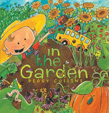 by Peggy Collins (Apple Sauce Press, 2009)
 by Linda Glaser, cut paper illustrations by Susan Swan (Millbrook Press, 2002)
Can't you just feel the mud between your toes on this next one? 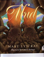 by Mary Lyn Ray, illustrated by Lauren Stringer (Sandpiper, 2001)
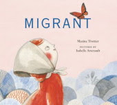 by Maxine Trottier, illustrated by Isabelle Arsenault (Groundwood Books, 2011)
 (Red Wagon Books, 2003)
Here's to more sunny days in the garden. Let us know how your gardens grow.
By: Patti L Brown,
on 5/16/2011
Blog: JACKET KNACK
( Login to Add to MyJacketFlap)
JacketFlap tags:
Add a tag
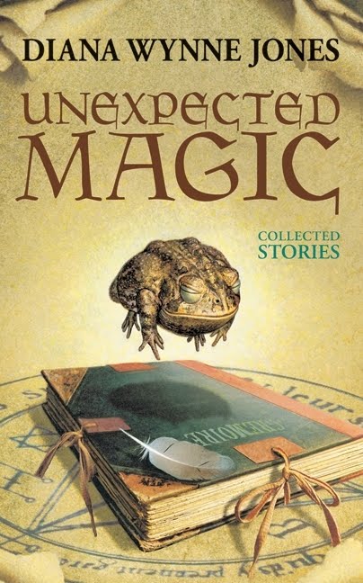
Diana Wynne Jones began her writing career as a playwright in the 1960s, but quickly moved on to be a fantasy fiction author. Since 1970, she wrote over forty books for children and young adults. Her website at http://www.leemac.freeserve.co.uk lists most of them, while Goodreads touts “81 Distinct Works” for Diana Wynne Jones. (Translations of her books are included on this list, as well as short story collections and anthologies to which she contributed.) According to her author page at HarperCollins, “her books have earned a wide array of honors—including two Boston Globe-Horn Book Award Honors—and appeared on countless best-of-the-year lists.” 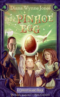 Diana Wynne Jones died on March 26, 2011, after a battle with lung cancer. In trying to find fitting words to describe her wonderful wit, her sense of story, and her keen ability to make the fantastic into something real, I found no better words to use than her own: Where is the road to Babylon? Right beside your door. Can I walk that way whenever I want? No, three times and no more. If you mark the road and measure it right You can get there by candle-light. --The Babylon Secret Deep Secret "I am a believer in free will. If my dog chooses to hate the
whole human race except myself, it must be free to do so."
-- Castle in the Air "Being a child of Earth means more than you think."
-- The Master of the Hunt
Dogsbody
By: Carol B.,
on 5/10/2011
Blog: JACKET KNACK
( Login to Add to MyJacketFlap)
JacketFlap tags:
Add a tag
 | Sylvia Long (Chronicle, 2011)
|
I remember our family copy of Thumbelina, a photographed board book with dolls positioned in little dioramas on every page, greatly abridged. Alas, that was my introduction to Thumbelina. Until I saw Sylvia Long's version (left) I hadn't realized what a wealth of imagery the Hans Christian Andersen tale provides. How beautiful and entrancing some of these images can be in the hands of a skilled illustrator! Andersen's story was first published in Denmark (naturally) in 1835, with the original Danish title, Tommelise. Below is an 1837 edition of Eventyr, fortalte for Børn, in which Tommelise appeared: 
Here's a slightly more recent version:
 | | Tommelise (Tiden, 1967) |
And there are hundreds of other covers, the good, the bad, and the ugly. I've gathered a few of each below, with brief commentary. Interesting backdrop for this easy reader:
Pretty: Sweet:
By: Carol B.,
on 5/2/2011
Blog: JACKET KNACK
( Login to Add to MyJacketFlap)
JacketFlap tags:
Add a tag
 Dateline: Brookline, Massachusetts. This is your bookshop field reporter, once again reporting on what's on display at real live bookshops around the world, with photos of questionable quality! Dateline: Brookline, Massachusetts. This is your bookshop field reporter, once again reporting on what's on display at real live bookshops around the world, with photos of questionable quality!
A recent visit to the cozy, but well stocked The Children's Book Shop near the city of Boston proved a charming way to spend time, with plenty of great covers on the shelves to catch our eyes. Special thanks to Sheryl D. for showing us around!
The Children's Book Shop's wide selection of children's and young adult books offered up oodles of great images, including the following:
What variety! What a great shop. Thanks again, Sheryl!
By: Deirdre,
on 4/25/2011
Blog: JACKET KNACK
( Login to Add to MyJacketFlap)
JacketFlap tags:
Add a tag
After an exciting weekend of egg decorating and searching for chocolate eggs, I wondered how eggs have factored in book cover design.
So I'm sending you on an egg hunt. Grab your basket, head to the kidlit shelves, and don't forget to look under the bed for book covers that display nature's amazing design, the egg. Here are a few of my finds to get things started:
With a shape so recognizable there is no doubt as to the title of this picture book.
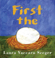 Roaring Brook Press (2007)
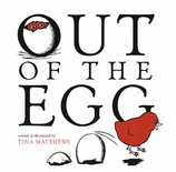
Great font and colour selection on Tina Matthew's Out of the Egg  Houghton Mifflin Books for Young Children (2007)
I really had to hunt around but I finally found an egg on a YA cover:
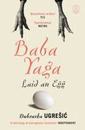 by Dubravka Ugresic Canongate Books (2010)
There is something about Jerry Spinelli's Eggs that I love. Maybe it's the simplicity or the symmetry. Or maybe it's the farm fresh quality.
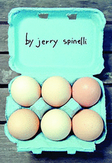 Little, Brown Young Readers (2007)
Come join in the fun. Send us your egg covers (whole, cracked, scrambled or sunny-side up) and we'll post them.
By: Patti L Brown,
on 4/20/2011
Blog: JACKET KNACK
( Login to Add to MyJacketFlap)
JacketFlap tags:
Add a tag
Faces: they’re everywhere. Browse the YA section and you get the feeling you’re being watched. A crowd of faces stares back at you from YA jacket covers. If you ignore the faces, you can also find plenty of body parts to look at (necks and torsos seem to be “in” these days), and there’s lovely scenery featured on covers, too. Sometimes, it’s easy to lose the book title in all the embellishments. Here are some YA covers that focus simply on their title: 
Fallout by Ellen Hopkins
(Margaret K. McElderry Books; September, 2010)
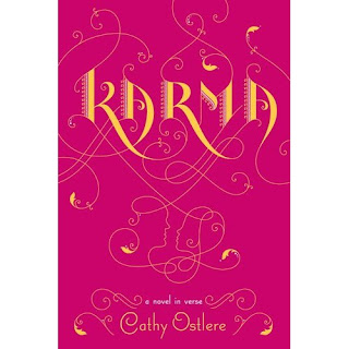
Karma by Cathy Ostlere (Razorbill; March, 2011) The contrasting colors draw the eye to the title, but a closer look reveals profiles of a couple in the scrollwork below it.
 7 Kinds of Ordinary Catastrophes by Amber Kizer (Delacorte Books for Young Readers; April, 2011)

By: Deirdre,
on 4/11/2011
Blog: JACKET KNACK
( Login to Add to MyJacketFlap)
JacketFlap tags:
Add a tag
Watching a toddler enjoy a book by squishing, crumpling and maybe even tasting it brings home the fact that there is more to a book than just the words. Of course we all know that. And so do book designers.
Books for preschoolers capture the child by appealing to many senses. The books by Matthew Van Fleet are perfect examples.
 Heads by Matthew Van Fleet (Simon & Schuster, 2010)
Picture book covers often add something for children to touch and feel. This one uses real sparkles.
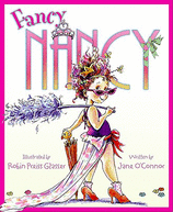 by Jane O'Connor, illustrated by Robin Preiss Glasser (HarperCollins, 2005)
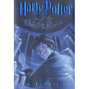
We don't outgrow the desire for texture on book covers, we just get more sophisticated with things like UV varnish, foil stamping and embossing. This kind of texture is where real books have e-readers beat.
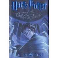 Harry Potter books don't need much help drawing in readers but you'll have to hit the bookstore to really appreciate how the shiny metallic letters attract your fingers as well as your eyes.
 Although the picture looks like a burning light bulb, your fingers will want to do the walking around the embossed spiral when this books is in your hands (Jacket art by Scott Meadows, jacket design by Ray Schappell and published by HarperTeen, 2010).
Some may think twice about touching this spooky face. I like the bumpy feel of the root-like beard. There's also some nice layering with gold foil around the border and the giant even has a jewel in one eye.
![]()
By: Carol B.,
on 4/5/2011
Blog: JACKET KNACK
( Login to Add to MyJacketFlap)
JacketFlap tags:
Add a tag
 Welcome to another installment of "Simply Irresistible," a Jacket Knack feature wherein we travel the world taking cell phone snapshots (of questionable quality) of covers in situ on bookstore shelves and then bringing them here to you. Welcome to another installment of "Simply Irresistible," a Jacket Knack feature wherein we travel the world taking cell phone snapshots (of questionable quality) of covers in situ on bookstore shelves and then bringing them here to you.
This time we find ourselves in Blue Hill, Maine. It was a sleety afternoon in early April when we visited, but a cozy and inviting welcome awaited us at Blue Hill Books, a tiny but well stocked shop.
The kids' selections were downstairs so we tromped on down with our camera to snap pix of any book covers that caught our attention. Despite the limited space, we found plenty of cover candy to feast on, both old favorites and new:
Blue Hill Books provides proof that there's no shortage of local children's book authors in Downeast Maine:
View Next 25 Posts
|
|
|


 3 Comments on No Lies, last added: 9/20/2011


 2 Comments on Circular Reasonings, last added: 8/9/2011


 0 Comments on Thumbody's Thumbelina as of 1/1/1900


I think Entwined was my favorite... the way the vines could be part of the dress; the curly, vine-like font; the gorgeous, poofy dress... all captured by the title "Entwined." The vines look like they are reaching toward her, trying to pull her back. And, I'm a sucker for prime real estate.
Beautiful theme this week, Carol!
love them! a book cover fashion show!
Yeah! If I owned a dress like the one on Entwined I'd wear it everywhere.
Someone give those girls dresses made from old flour sacks!! Good honest cotton!! Taffeta is so Keira Knightly - self-loving and stiff. Or so Housewives of Somewhere Cheesy.
Flour sacks don't sell, I bet.