new posts in all blogs
Viewing: Blog Posts Tagged with: Artistic Process, Most Recent at Top [Help]
Results 1 - 25 of 32
How to use this Page
You are viewing the most recent posts tagged with the words: Artistic Process in the JacketFlap blog reader. What is a tag? Think of a tag as a keyword or category label. Tags can both help you find posts on JacketFlap.com as well as provide an easy way for you to "remember" and classify posts for later recall. Try adding a tag yourself by clicking "Add a tag" below a post's header. Scroll down through the list of Recent Posts in the left column and click on a post title that sounds interesting. You can view all posts from a specific blog by clicking the Blog name in the right column, or you can click a 'More Posts from this Blog' link in any individual post.
I could tell you its been a crazy time in DiTerlizziland, but I think I’ve finally realized its always crazy time here.
I’ve come to lean on the convenience of social media for sharing Post-it notes and Polaroids of my news and information. I assume that is how most of us keep track of the things and people we like, myself included. That said, I will continue to maintain this blog, though in a sporadic meter. I have to seek out the small openings in my schedule where I can pause, take a breather and share what I’m up to.
I think I am actually busier now than during the peak-Spiderwick years. Many projects are percolating, which has me incredibly excited: Movies are slowly developing in the background, I’m creating a pop-up shop’s worth of merchandise for my upcoming return to Gen Con, and there is a constant stream of books being created (by Ang and me).

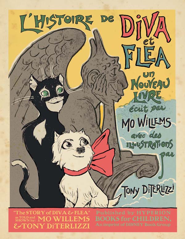
After finishing the WondLa trilogy (all of which are now in paperback), I needed a break from books that required both writing and illustrating. Fortune shined upon me: I was asked to write the picture book version of the original Star Wars films, curate my old gaming art for a published collection by Dark Horse Comics, and Mo Willems asked me to illustrate a chapter book he’d written during his year-long stay in Paris.
As an aside, just to keep it real, as I am listing the books in the previous sentence, I feel like I am writing a news report for another author/illustrator who is not me. I still see myself as a kid living in Florida who likes to draw and write bad poetry. You know, this guy:

Mo was inspired by the building manager’s dog (Diva) and an alley cat (Flea) who frequented the apartment where his family lived. When we spoke, he told me that he envisioned my artwork paired with his words for The Story of Diva & Flea. I was beyond flattered and began sketching right away.

After Mo returned to the states, we discussed books that felt similar to the book we were going to create. I shared my beloved copies Frog & Toad are Friends, Grasshopper on the Road and Little Bear–all of which are beautifully designed and use a limited three-color palette in the art. Of course the only way I could find the colors for the palette I needed was to pack up the family, hop on a plane, and visit the City of Lights.
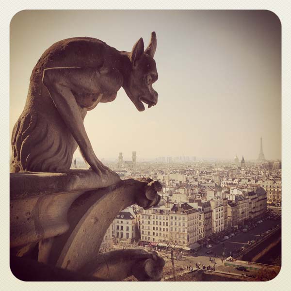
As first-time visitors, we visited many landmarks in Paris (including the gargoyles of Notre Dame cathedral, seen above) but there are some moments that I’ll cherish. One was visiting Mo’s Parisian apartment and meeting the real Diva (seen here with her owner) and locating Flea.

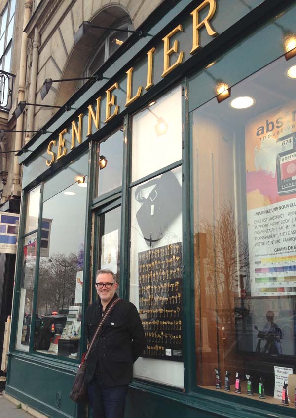
At Mo’s suggestion we visited Sennelier art supply, opened in 1887 and renowned for their custom paints. It is said that Gaugin, Cezanne, Van Gogh and Picasso frequented this shop. Gazing at the containers of old powdered pigments, I found the colors of France.
I returned from my trip invigorated and inspired. To see a glimpse of what an impact it had on me, I share with you the jacket art for Diva & Flea, done last fall primarily for the sales department and promotion of the book. This was created before I visited Paris:
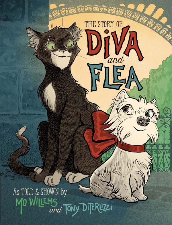
…and this is the final cover, revised after my return:

Not only did I gain an understanding of the palette of the city, I gained understanding of the inspirations behind the characters as well. Though I changed Diva’s breed from Yorkshire Terrier to a West Highland Terrier–in order to create visual contrast between her and Flea–her personality, her essence, was in my art.
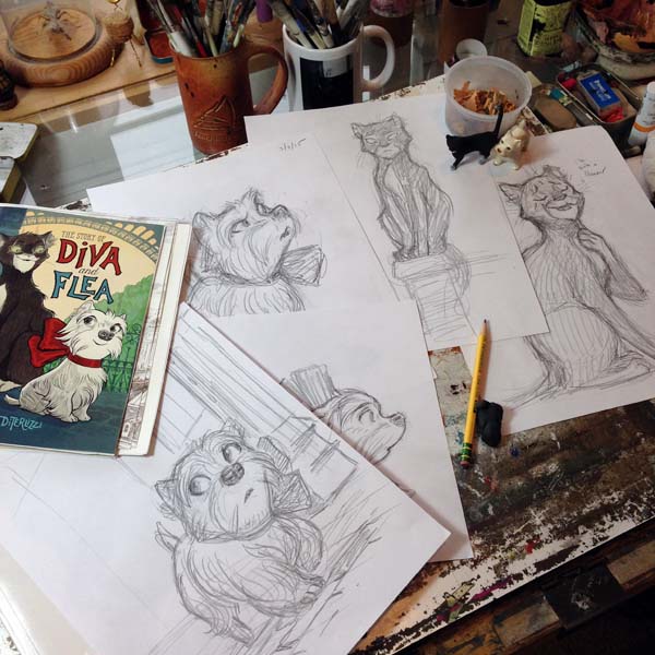
My usual shared advice for young artists is to find reference for whatever they are trying to create. For this book, the reference came in all sorts of ways: colors, architecture, character design, landmarks, etc. For me, this immersion helped me craft a genuine cohesive look to the book. I am grateful to Mo for inviting me along for this experience.
Its been some time since I’ve blogged, mostly because the fall and holidays had me busier than ever.
I traveled to many book festivals, book fairs and cons to promote my picture book retelling of the original Star Wars trilogy, The Adventures of Luke Skywalker, Jedi Knight. At every venue, I enjoyed bonding with my fellow Star Wars nerds. Like many, I am excited for the new film this year. I’ve only watched the trailer and avoided all possible articles/theories/leaks/spoilers in hopes of being surprised, entertained and thrilled once again.
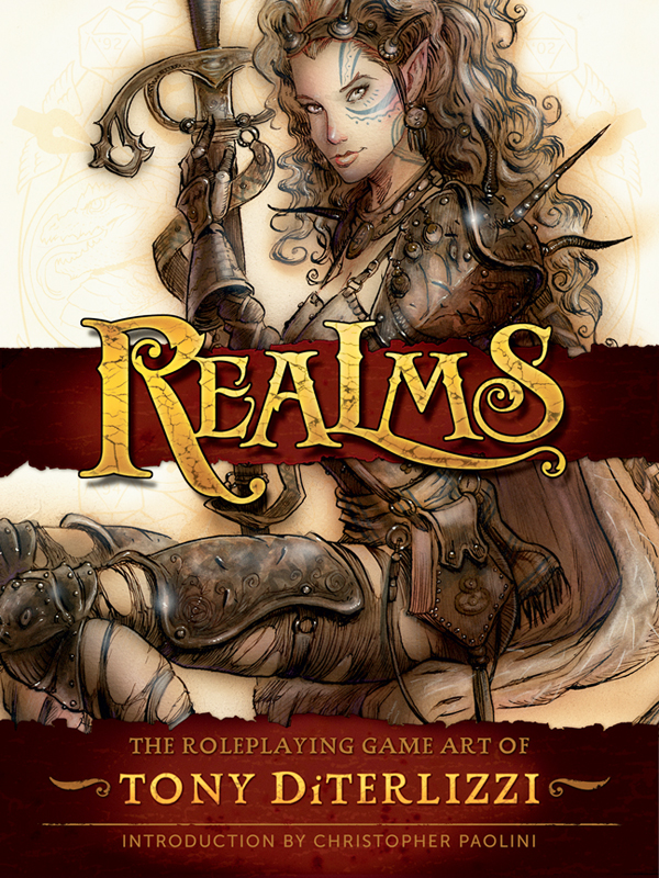
In between touring I managed to work on some new drawings and paintings for the upcoming book, Realms: The Roleplaying Game Art of Tony DiTerlizzi. Though this book collects many favorite images from my years as an artist for RPGs such as Dungeons & Dragons, Planescape and Magic: The Gathering, it also showcases unpublished work and new art.
I’ve sketched from the realm that started my career a number of times over the past years. Usually, these minor excursions are warm-up exercises in preparation for big illustration jobs, like illustrating an entire Spiderwick or WondLa book. For Realms, I was finally able to officially add some favorite monsters, wizards and damsels to my drawing schedule.
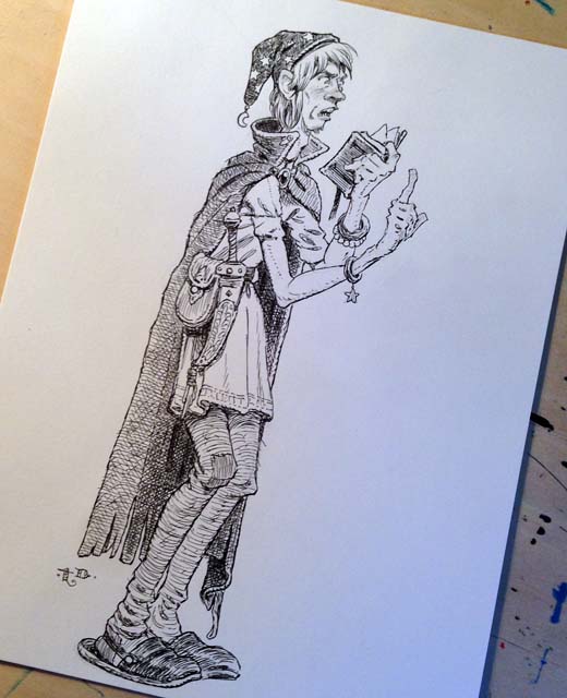
Below are some pen & ink illustrations I rendered over a two-week period while on vacation in Florida this past summer. I was resting after the Battle for WondLa tour and found drawing these D&D-inspired scenes quite relaxing. All 15 images were drawn from my imagination, with minimal photographic reference. Most of them started as a thumbnail doodle on the back cover of the bristol board pad that I drew them on.
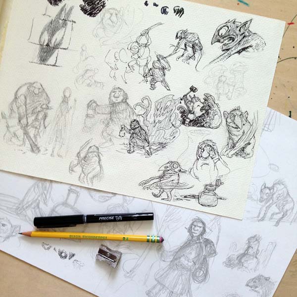
All were sketched with a #2 Ticonderoga pencil and inked with a Pilot Precise V5 micro ball pen on Strathmore vellum bristol board. Here are some favorites that will be included in Realms:
“First Level”, Vacation Drawing No. 3
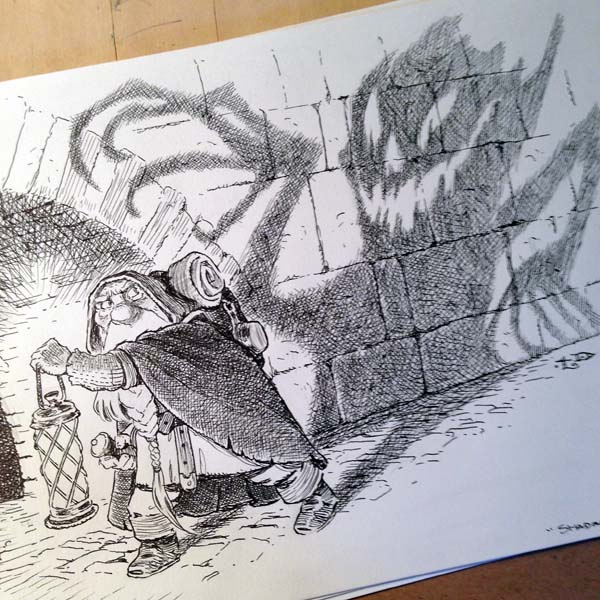
“Shadow Fiend”, Vacation Drawing No. 4
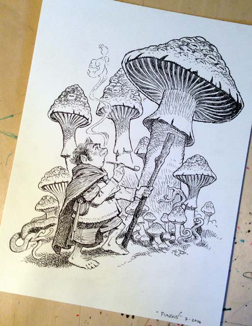
“Fantastic Fungus”, Vacation Drawing No. 5
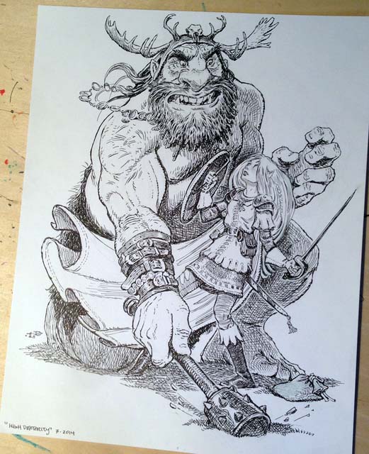
“High Dexterity”, Vacation Drawing No. 9. I believe Eva Nine was still on my mind when I drew this elf facing off with a hill giant.
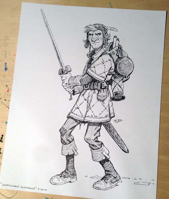 “Player Character of Questionable Alignment”, Vacation Drawing No. 10. I’ve since named this fellow Hans the Loner (after Han Solo).
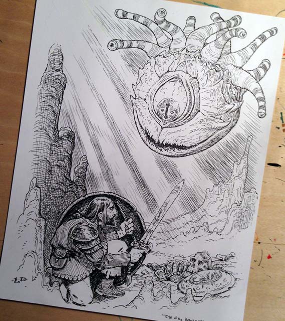
“Eye of the Beholder”, Vacation Drawing No. 15.
Also, while on vacation. I sketched up several ideas for finished paintings that would make a nice finale to the book. But more on that next time…

Lucasfilm has released a trailer for my upcoming picture book adaptation of the original trilogy, title The Adventures of Luke Skywalker, Jedi Knight. Take a look:
Patrick Day of the Los Angeles Times interviewed me while on the road promoting The Battle for WondLa last week.
The interview focuses on the production of my upcoming picture book with Lucasfilm, STAR WARS: The Adventures of Luke Skywalker, Jedi Knight. You can read more here.

As well, I spoke with the fellas at TheForce.net on their weekly podcast, ForceCast. We had a great in-depth discussion about the legacy of these beloved films and the impact they’ve had on the 1970-80′s generation of kids. You can listen to the complete podcast here.
Lastly, while on tour I sat down with Corey McPherrin on Good Day Chicago to chat about WondLa, imagination and Star Wars. Take a look:
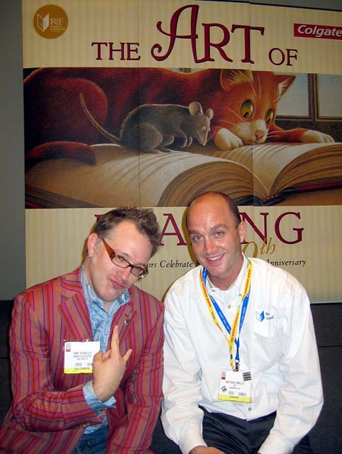
Last November the non-profit organization, Reading is Fundamental (RIF), asked if I would donate an original piece of artwork to be auctioned off at their spring “Cat in The Hat” gala held in Washington DC.
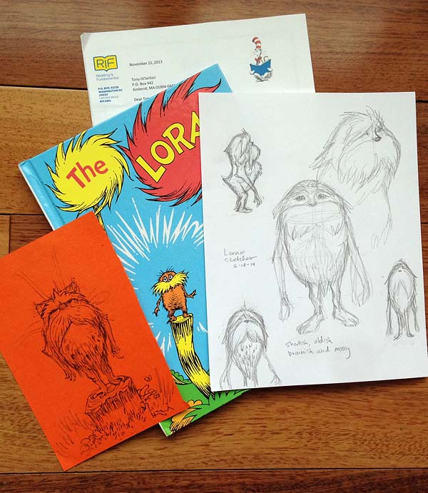
Since RIF’s mission is to provide books for impoverished children, their annual galas are themed around legendary icons of children’s literacy. You may recall my piece for last year’s “Where the Wild Things Are” gala celebrating the work of Maurice Sendak. The theme for this year was another hero of mine, Dr. Seuss.
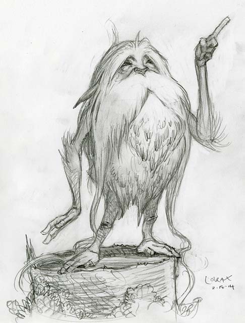
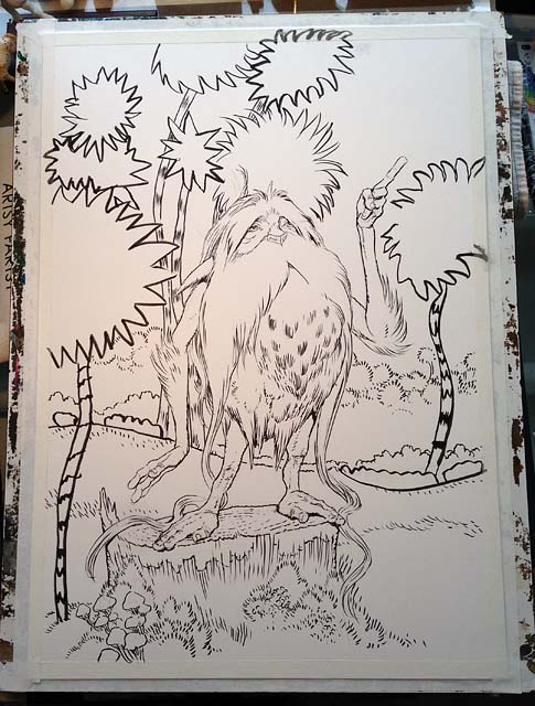
For these auction requests, I could simply rummage through my flat files and send over a sketch or study. Instead, I’ve used it as an opportunity to create one-of-a-kind pieces that I would not normally take the time to do. Though this year’s theme was The Cat in the Hat, I had a favorite Dr. Seuss character that I have loved since grade school. To this day, I continue to cherish – and have been longing to paint – the Lorax. In fact, I’ve been sketching the feisty spirit who “speaks for the trees” for some time. Here’s a sketch from 1999:
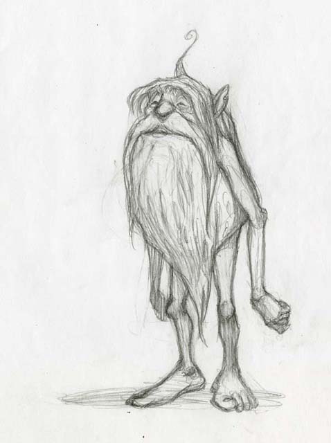
…and another, 10 years later, from 2009.
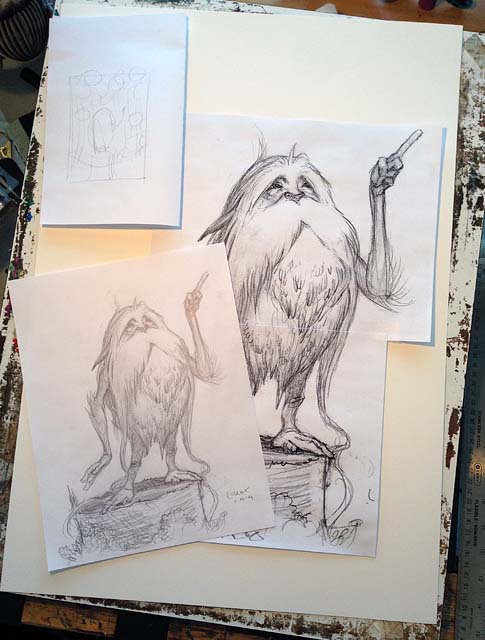
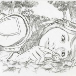
…with my daughter’s copy of the book, I revisited the Lorax in February and tried to put my spin on him while retaining the squat seed-sprout shape of Seuss’ original. I wanted to capture the creature’s ancient wizened face with a hint of sadness in his eyes.
Once I had the sketch down, I enlarged it (using Photoshop) and prepared it for tracing onto a 16×24″ sheet of Strathmore plate Bristol board.
…that’s when I noticed I had a li’l assistant in the studio watching every step that I did.
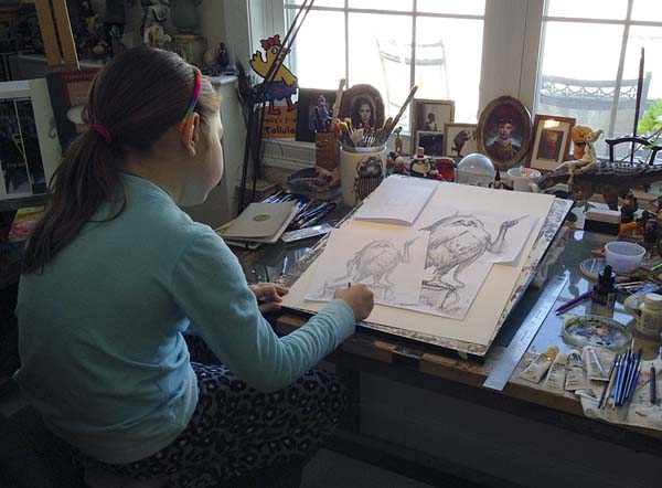
This was was a welcome relief as my daughter is still a bit young for the WondLa books (that I’ve been working on for the past 5 years). I was thrilled to see her genuinely interested in this project so I asked her to help me complete the finished painting. First, I taught her how to draw Truffula trees. We practiced on loose sheets of paper.
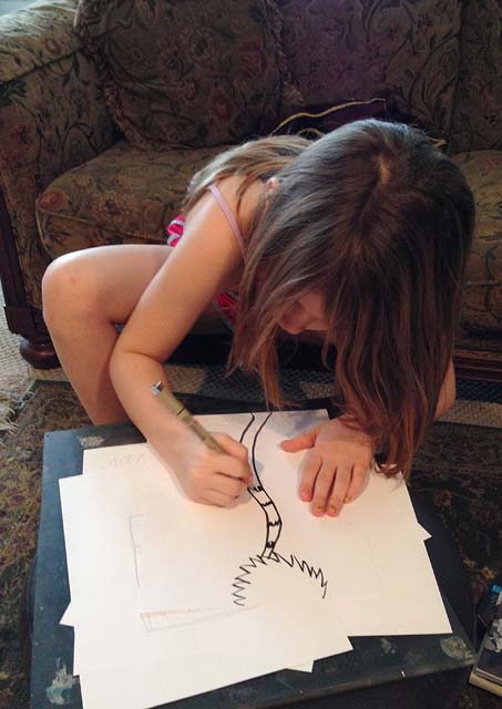
Then I handed her my Pigma brush pen and had her draw and ink the trees.
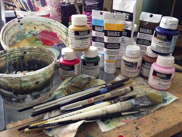
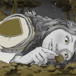
I gave her a break and finished inking the Lorax and his stump. I was thrilled at my daughter’s childlike execution of the trees. It was a chaotic, energetic line that reminded me of why I love Seuss’ art. As I pondered how to paint the image, I thought back on the process I used for the large cut-out animals I created for our local gift shop’s holiday window a couple of years back. I dug out my acrylic paints and got to work.
First I antiqued the entire image in “Unbleached Titanium”. This provided a nice base coat and it white-washed the pen line so it wasn’t as strong a contrast.

Afterwards, I continued under-painting using diluted acrylic paints. I kept the tones cool so that the warm golds and oranges would become richer when added on top.
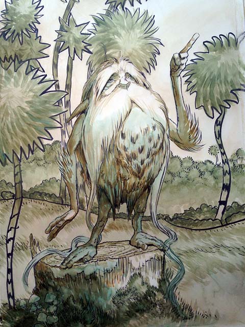
Once I got that where I wanted, I was ready to add the local color. Once again, my assistant came to my aid. I had her paint the distinct bright base colors of the Truffula trees.
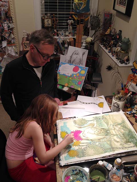
Once her colors were down, I began to build upon them and integrate her strokes into mine for the final painting.

Truth be told, there were moments where I was nervous as to what my 6 year-old might do to this piece during the stages that she helped on, but I realized I’ve totally botched up my own paintings before. Just as I’ve done in the past, I would either fix it or start over. Fortunately, I did not have to do either. She did a fantastic job.

In the end, this collaboration couldn’t have turned out better. Not only did we create this image together, I was able to show my daughter that something she and I love doing – painting pictures – can be turned into something else. In this case, the sale of our painting will provide books to those who don’t have any. I wanted her to know that having a special skill set doesn’t have to be about serving yourself only, it can be about helping others as well.
Providing books to expand young minds is important to the next generation. Books cause us to question, find answers, be entertained and even inspire–just as I was inspired by the good doctor’s words long ago.

“Unless someone like you cares a whole awful lot, nothing is going to get better. It’s not.”
If you’ve been following this blog for the past couple of months, you know I have been sharing much of my process for the upcoming cover to the third and final book in the Wondla trilogy, The Battle for WondLa.
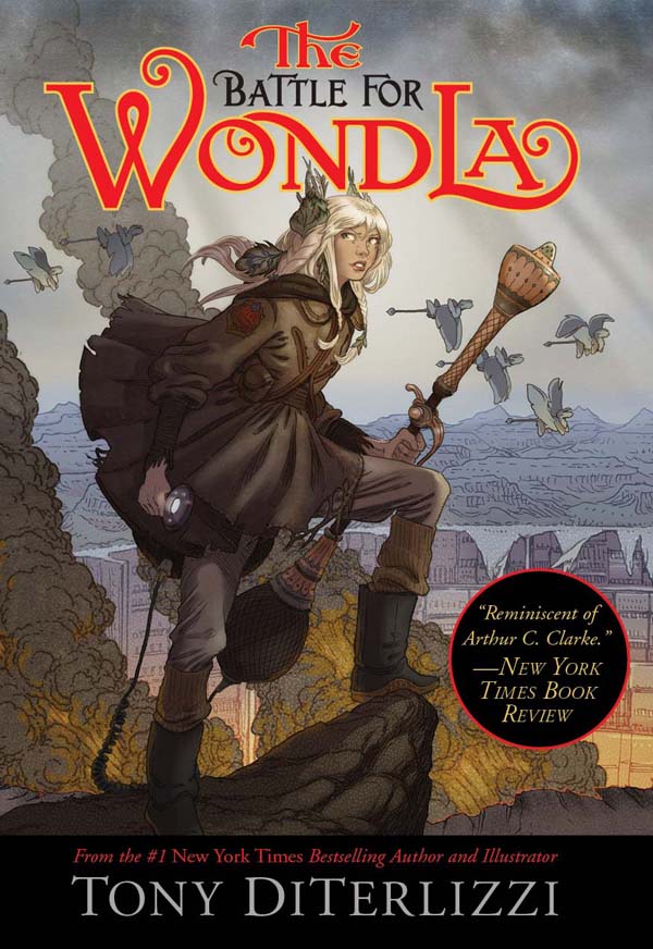
Entertainment Weekly has finally revealed the cover to the finale to WondLa, due out in stores next May. As well, we’ve shot a little video to show a bit of my process in creating the cover. Let me know what you think.
A couple of weeks ago, the ubiquitous Jarrett J Krosoczka contacted me about a project he thought I should be involved in. It turns out he was right.
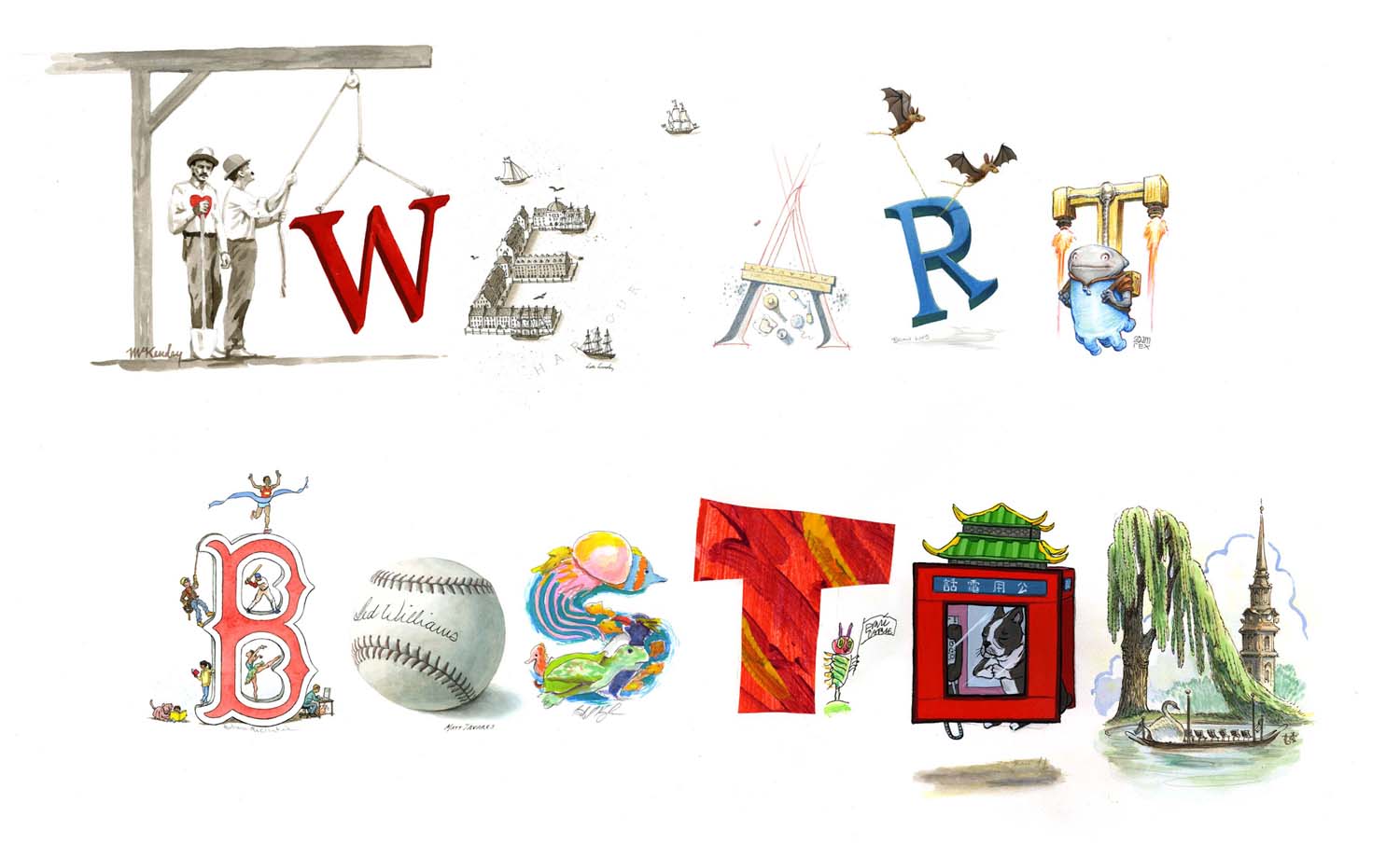
We Art Boston is a fundraising event for the Emergency and Trauma Fund and Boston Children’s Hospital (in honor of the victims of the Boston Marathon bombing). Over 50 fellow children’s book authors and illustrators have donated signed books and original artwork to be auctioned off. And 100% of the proceeds go to the hospital. One of the founders of the project, illustrator Joe McKendry, contacted me to participate and I donated a signed Spiderwick book and a rare limited edition print that was only given as a gift to family and friends back in 2006.
Jarrett, however, had been working with Joe on a collaborative piece in which a gang of illustrators (I think that is the proper term for a group of them…or is it “herd”?) would each render a letter to spell out “We Art Boston”. Prints would be made and the one-of-a-kind original would be the highlight of the auction. Since I’d been traveling quite a bit, I would be last to participate and would be illustrating the letter “N”.
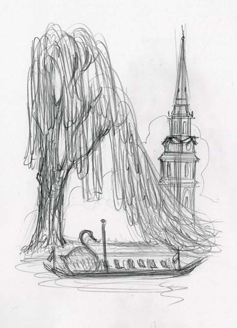
Angela helped me come up with the idea. When we visit Boston, we always try to stop at the Public Garden. I love the vista of feathery willow trees at the pond with swan boats serenely drifting by. Of course, this location is also the setting for two beloved children’s classics – Robert McCloskey’s Make Way for Ducklings and E.B. White’s The Trumpet of the Swan. I added the steeple of nearby Arlington church as a landmark to make it distinctly Boston.

Here it is on my drawing table while I was working away on it. I did fret a bit that I would be the one to spill ink on it after it hand successfully passed through so many hands. Thankfully it made it out of the studio unscathed.
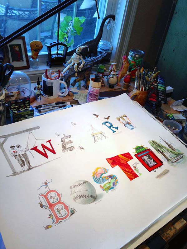
I was honored and delighted to be a part of this piece. As a parent and an ambassador for the Starlight Foundation, I am all for helping children’s hospitals.
Here is the list of fellow artists involved in the “We Art Boston” one-of-a-kind original:
“W” by Joe McKendry,
“E” by Kelly Murphy,
“A” by David Macaulay,
“R” by Brian Lies,
“E” by Adam Rex,
“B” by Barbara McClintock,
“O” by Matt Taveres,
“S” by Jarrett Krosoczka,
“T” by Eric Carle,
“O” by Grace Lin,
“N” by Yours Truly.
The auction starts on October 10th and runs through the 24th, so participate if you can. There are some great pieces up on the block and it all goes to a great cause.
The final stages of creating the artwork for The Battle for WondLa dust-jacket required me to set down my pencils, pens and paper and grab a mouse, Wacom stylus and keyboard.
As proud as I am of my inking capabilities, I never create the perfect ink drawing. Cleanup is required. Nowadays I correct errors in Photoshop, but way-back-when I would “white-out” the part I wanted to fix in white acrylic paint, then redraw over it. You can see this technique here in a piece from The Spiderwick Chronicles. Look closely at Byron’s wings.
Because India ink is so vibrant, it requires A LOT of white paint in order to mask the error and provide a decent background to re-ink upon. In the end, you are drawing on a bumpy surface of blobbed on paint. I am heartened when I learn that even the most accomplished ink-masters dealt with whiting out mistakes. Here’s a close-up of an original Garth Williams drawing from Charlotte’s Web.
The yellowing of the paper has made his corrections more apparent. Charles Dana Gibson would meticulously patch in a new piece of board to fix his inking mishaps. Once the piece is photographed for reproduction the white-out (or the seams from the patch) would vanish and give the appearance of a perfect ink drawing in the final reproduction. With a home art studio housing new(ish) technology, I now scan my ink drawings and upload them directly into the art director’s ftp folder. This allows for digital cleanup and fixes with incredible freedom.
My first exercise that I run it through is the mirror flip. A common practice in art school, it simply requires looking at a reflection of your artwork. With the image in reverse, errors become more apparent. Let me show you:
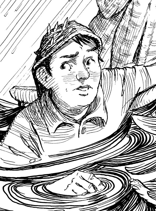
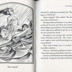
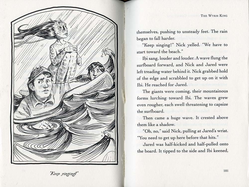
This is a scan of the finished ink drawing from Chapter 6 of The Wyrm King from Beyond The Spiderwick Chronicles. Can you see error in the drawing? I couldn’t while I was working on it, so I’ll give you a clue: It has to do with Nick, the boy in the lower left wearing the seaweed cap.

Here is a close-up of Nick scanned for print (a 600 dots per inch [dpi] bitmap).
Now I shall mirror-flip it in Photoshop. The error becomes more apparent in this reversed image – the axis of his eyes are off (among other facial features). A quick digital fix will show how subtle tweaks to line art can make a big difference.
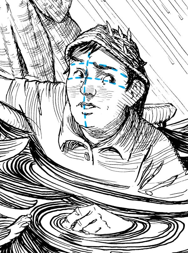
In Photoshop, not only can I erase dust, ink droplets and spatter, I can also alter the drawing itself. Here I am nudging the eye back up a bit and rotating it slightly.
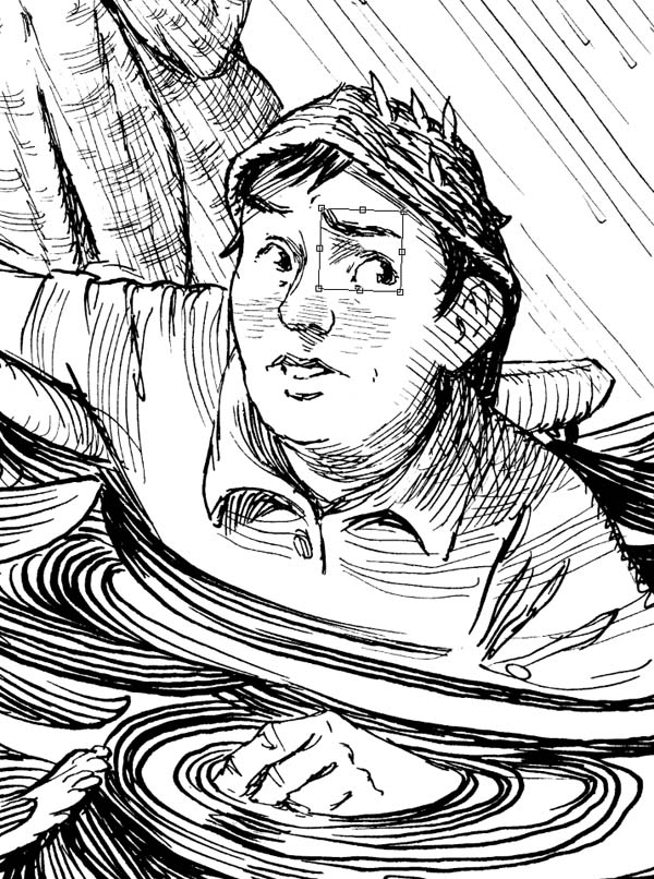
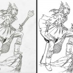
I can also erase any inconsistencies in the line work and redraw whatever needs to be done. Compare the original artwork (left) with the cleaned-up version (right). (Click to see a hi-res image)
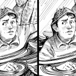 And here is the final printed image.
Of course, this begs the question: Why not just ink the whole thing digitally? Because I like to have a physical piece of art when all is said and done. I want something that’s been held and made by human hands. And, despite these tweaks and cleanup, I want some of the ink blobs, smudges and errors created when by drawing by hand. That is part of the charm for me.
That in mind, I tend to err on the conservative end when cleaning up my ink drawings digitally. More often than not, the original drawing looks pretty close to the final printed image.
And here is the inked artwork of Eva for the cover to The Battle for WondLa. I got lucky on this one and it required little clean up (I fixed the pattern on the muzzle of the boomrod, removed strands of hair, and erased lines where her hand gripped the Omnipod). Now she is ready for color, but more on that next time…
Next month, Reading is Fundamental (RIF) will be celebrating Maurice Sendak’s controversial classic, Where the Wild Things Are.
I was asked to donate a Wild Things homage to be auctioned off with all proceeds benefiting RIF, an organization I am proud to be affiliated with. In fact, some years ago I contributed a short recollection of my mom reading young Tony House at Pooh Corner for RIF’s anniversary book, The Art of Reading.
Maurice’s legacy in words and pictures has inspired me since I first lay eyes on In the Night Kitchen and Higglety Pigglety Pop! 1980′s The Art of Maurice Sendak had a tremendous influence on my journey to become a children’s book creator. In fact, I quoted from it last year when I spoke at the SCBWI’s annual conference. Like many, I was saddened to hear of his passing last year. I honored Maurice by reading Wild Things before beginning my first event in Los Angeles for the Hero for WondLa tour.
Needless to say, I was nervous and excited to “cover” Maurice’s most beloved characters. I’d seen some lovely tributes before and knew I had my work cut out for me. I came across a little drawing of Max, likely done back in 1999 or so.
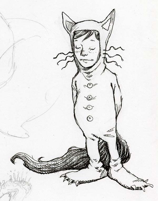
…and since Max is who I associate with most, I started with him for my new rendition.
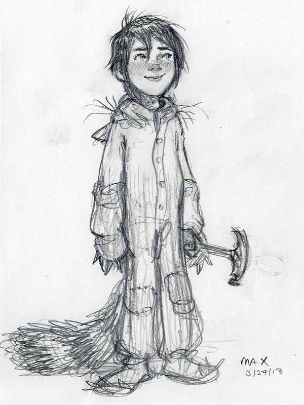
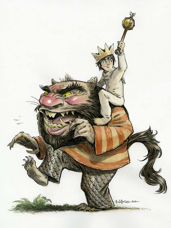
I returned to my dog-eared (signed!) copy of the book looking for inspiration. I really liked the wild rumpus scene where Max is riding the minotaur as king; however, I worried that my version would look really minotaur-y (yes, its a word). So, I swapped out the minotaur for the bearded Wild Thing (with the striped shirt) as he seemed the most iconic of all the monsters.

In drawing the Wild Thing, I realized what an influence their design must have had on Jim Henson when he was creating his more monsterly Muppets – especially Sweetums. (In addition, I once read that Maurice’s Outside Over There was the inspiration for Labyrinth.)
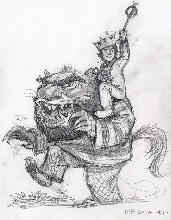
As I refined my sketch, I remembered an interview where Maurice said that the Wild Things were inspired by his aunts and uncles. With that in mind, I put a little of Maurice in the monster. (Or did I just show a little of the monster that was in Maurice?)
I’d like to think Maurice would have liked this. I sure hope you enjoy the final result. I’ll post news on the auction once it goes live.
Every once in awhile an artistic opportunity comes my way that I cannot pass up. Fortunately, this winter I have been presented with two unique and stellar projects that I simply had to do despite my looming WondLa 3 deadlines.
The first project was to create a window display for an eclectic gift shop, Essentials, located in nearby Northampton, Massachusetts. Angela, Sophia and I adore this locally-owned store and its shelves of European (and vintage-inspired) books, games and toys; so when the owner asked if I wanted to design their holiday window, how could I refuse?

We discussed a few ideas:
I could lend the store props to use from my antique toy collection.
I could do a “live drawing” in their window on a large piece of board (similar to what I did for the launch party for The Search for WondLa).
Or, I could design the sort of display that I would want to visit with my family to kindle that holiday spirit. Something that may have been done in the local department store many decades ago. Something hand-crafted and painted. Something not manufactured and printed. Something with artistic spirit.

Subject-wise, there was much talk of wintry faeries and elves in an enchanted wood. Though this was a natural direction for me (especially after the new sprite studies I’d recently painted), I felt that there was a presentation I could conjure that might reach a broader audience. I liked the enchanted wood idea and it led to warm memories of Emmet Otter’s Jug-Band Christmas and even The Wind in the Willows. Obviously it reminded me of my work on Kenny & The Dragon – a world I loved creating. So, over coffee and oatmeal, I scribbled out a procession of woodland animals (all indigenous to our locale) carrying gifts to a holiday party.

The shop owner loved this idea and I was off and running.

For a more timeless feel, I decided to dress the animals in less-contemporary styles. I referenced Everyday Fashions 1909-1920 As Pictured in Sears Catalogs as my go-to for woodland attire.


Of course, Charles Dickens’ A Christmas Carol is such a beloved tale that I had to dress some of the characters in Dickensian costumes. (Click the smaller images for a larger view)


With some anthropomorphic fir trees acting as curtains, my wintry wonderland stage was set. Measurements of the store’s window were recorded and I created a sketch to scale (1 inch: 1 foot). I’d paint the characters directly onto acid-free foamcore and then loosely cut them out, sort of like the images you’d find on an old die-cut holiday card. I’d anchor the cutouts to a wooden base with slats mounted to their back side.

There was only one easy way to enlarge a pencil sketch to fit onto an oversized sheet of foamcore – an opaque projector. Thankfully fellow-artists Scott Fischer and his wife had one that they could loan.

I traced my pencil sketches onto the foamcore and inked them with permanent markers. I tried out several brands before falling in love with Prismacolor’s Premier Brush Tip Markers. The brush tip allowed me to ink at a much larger scale while upholding my line style. Seriously, you’d think that this ink of the raccoon is on a standard-sized sheet of Bristol board, but he is actually 5′ tall.

As the markers dried out from all this heavy inking they produced a sketchy grey line. But this was also valuable to me. I switched back and forth between new full markers and dried ones to ink the procession of woodland creatures.

I know what you’re thinking: Why not just ink and color these on a sheet of Bristol then have color enlargements mounted to the foamcore? I suppose I could have gone that route, but there was something thrilling about working at this scale…something I hadn’t felt in a long time. Not to mention, I always like an artistic challenge.

Since I had never done a project like this before, I made up the process as I went along. The black ink on white board was a bit too contrasty for my tastes, so I laid down a thin coat of Unbleached Titanium White Liquitex acrylic paint over each drawing. The paint “antiqued” the drawing and softened the contrast of the ink line. After that, it was a quick buildup of translucent layers of diluted acrylics to achieve my usual watercolor wash style.


The ink lines became more and more subdued underneath each subsequent layer of paint. This allowed me the opportunity to punch up the contrast of the finished painting by accenting the shadows with the black Prismacolor marker.

After the painting was complete, I added several coats of Liquitex Gloss Medium & Varnish to the eyes (and noses) of the characters so that they would have a wet, glossy look.

The final stage was surface effects. I raided our local Michael’s craft store in search of various glues and glitters that I could apply to each piece to achieve that vintage-holiday-card-feel. The “Recollections” brand of scrapbook supplies manufactures all sorts of decorative textures, including flocking powder. With clear craft glue (and an old paint brush) I went to work.

The cardinal (below) had a layer of pearlescent microbeads glued to his scarf which created quite a shimmer.


For the presents, I decoupaged actual wrapping paper sold at the store to tie the visuals into the merchandise sold within.

The woodland creatures were finished and it was time to move onto the fir trees. These would be painted on 8′ tall sheets of foamcore (I didn’t know foamcore came this large!). Here you can see my studio assistant, Ashley, transferring the sketch onto board using the opaque projector.

As the deadline neared, I decided to forgo the inking stage on the trees and simply draw with paint and brush. I was able to do this because my understanding and confidence in the mediums at this scale had strengthened throughout the week while I painted away.


Also, I taught Ashley (and Angela) how to paint certain areas of the tree so that I could finish these giants. It also allowed me time to detail them more than I would have had I been painting solo.
After an intense week of drawing and painting (into the wee hours each night), it was time to set up the window. The store owner had a local carpenter build some wooden hill mounts to my (loose) specs and had purchased loads of cotton batting for snow.

With the aid of my little sprite (and some great help from the staff) we assembled the woodland wonderland scene.


In return for doing the window I asked for a store gift certificate. Honestly, the experience of creating something at this scale (and creating with my family) for a locally-owned business was payment enough. As I worked away I posted snapshots on my Twitter, Instagram and Facebook pages. The outpouring of kind words and praise from friends, fans and family was tremendously validating and encouraged me to push further and think bigger.


The appreciation of others is what the holidays are all about for me. And so, I thank you.
Keep dreaming. Keep drawing.
Though I am dying to dive back into the writing of WondLa III, I have diverted my attention to a certain trio of siblings and their encounters with the fey-folk.

Next May, The Spiderwick Chronicles will be celebrating its 10-year anniversary(!) For this milestone, I am redesigning and illustrating new jackets for the original five books. Though I can’t reveal the finished artwork just yet, I can share some snapshots of my progress:

Back when I originally illustrated the chapter books, I created a reference model sheet of head shots so that I could keep the main character’s features consistent. This came in handy when I returned to drawing the Grace kids once again. Above, the rough sketch has been traced onto Bristol board using a light table.

Since I have drawn these characters numerous times, I can usually render them fairly accurately out of my head. However, I still used reference for their poses to get aspects of the anatomy and details correct. All this sketch work is done in a #2 Ticonderoga pencil.

The style of art for these is a special mix of turn-of-the-century illustration, comic books and 2D animation. I never want it to veer too close to any one of these styles so it is a bit of an artistic balancing act. There are no rules per say, I’m just going on instinct as to whether the drawing “looks right”. As I did back in 2002, all images are inked using a Hunts 102 nib and sepia FW ink.


Some of the fairy fauna are adorned in plant material. I drew from leaves, grass and weeds plucked from our backyard to get the details just right.

Its not always smooth sailing, especially with ink drawings. The Green-Eyed Elf maiden (from Lucinda’s Secret) didn’t quite come out to my liking the first go-around. I drew up another head and replaced the first one using Photoshop. In 2002, she would have been carefully cut out then glued on as a patch to the original ink drawing.

Some elements, like these bio-luminescent mushrooms, were inked separately on a sheet of vellum. I planned on using a different color for their inked line and having the art separated makes this much more convenient when it comes time to tint it.

In fact, I utilized an artistic process for these pieces that I had been experimenting with for some time. I painted a acrylic paint wash on a transparent sheet of marker paper laid over the finished ink drawing. In Photoshop I merged these elements, along with some stained antique paper, to use as my underpainting for the finished illustration. Though the elements are combined digitally, at this point all are created traditionally.

However, the local color was flatted in using Photoshop. Having the color as a separate element allows me incredible freedom to explore various palettes for the five book jackets.

I’ll go into more detail on just how I combined all these elements next time. In the meantime, I’ve been tweeting and posting these snapshots on my Facebook and Instagram page, so stop by and check out additional pics. Seeya there.
Just as was done with The Search for WondLa back in 2010, Simon & Schuster has printed a limited edition sketchbook featuring some of the designs that went into the illustrations for A Hero for WondLa.

Throughout the year, I handed out these 32-page, 2-color softcover sketchbooks at my various appearances. If you missed me, fear not, for I have sent a signed bundle of books over to my pal Stuart Ng.


These were printed in an edition of 2000. The first sketchbook is long gone (in fact, I only have a few copies here in the studio for my library), so once Stuart sells out of his stock, that will be it until we release the third sketchbook next fall to coincide with the release of the third WondLa book.

The sketchbook was put together by my good pal, John Lind, and designed right here in the studio. It was tough choosing my favorite sketches to jam into the 5 x 7-inch presentation, but we did it. And I hope you enjoy it.
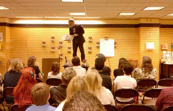
My mind is still awhirl from the Society of Children’s Book Writers & Illustrators (SCBWI for short) summer conference held in Los Angeles last weekend.

I joined an amazing faculty (comprised of award-winning authors, illustrators, editors, art directors and agents) to share knowledge and experience to aspiring kid’s lit creators. Over the course of 4 days I attended workshops, sessions, keynotes, reviews, parties and a massive book signing (with all faculty members signing at once). It was marvelous!

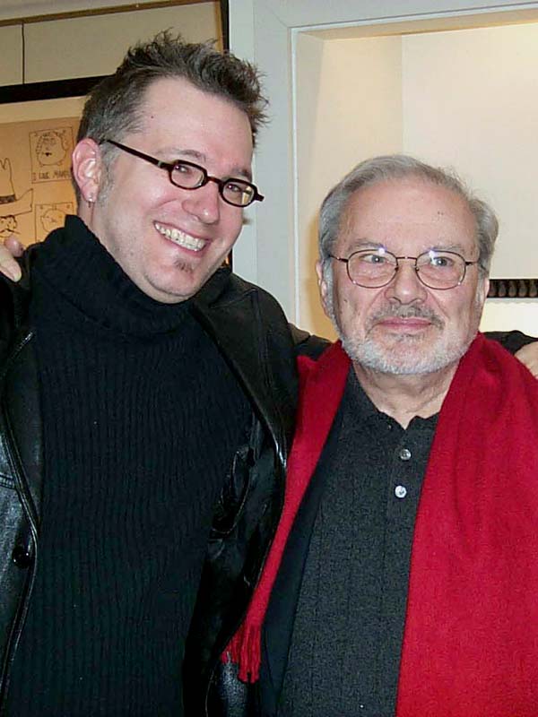
Above: with illustrator David Diaz and art director Cecilia Yung.
Don’t know what the SCBWI is? They are a non-profit organization devoted to encouraging and developing the next generation of children’s lit writers and illustrators. Founded in 1971, many of its members have gone onto win the prestigious awards of children’s publishing, like the Newbury and Caldecott. I have known of this organization for years and have steered many would-be illustrators in its direction, but I had not participated in any of their events prior to the gracious invite from Lin Oliver and David Diaz to the LA conference.

Did I mention the keynote presentations? I was asked to speak on day one, following the illustrious Arthur Levine (known by many as the editor of the Harry Potter books). Speaking in front of the 1200+ attendees I focused my speech less on how I create my books, but more on why I create my books – with a focus on the importance of imagination.
Now, I usually like to open with a bit of a laugh to get everybody in the right frame of mind. For this gathering, I spoofed some ideas I had been toying with for kid’s books, like dystopian tales for preschoolers:

…and Twilight for a new generation:

…not to mention evolving Fancy Nancy for the older crowd:

Thankfully, these went over well and I was off and running for my hour-long presentation.

The following day, I spoke to a room full of illustrators about the process of writing from a visual perspective. I broke the elements of writing down into art terms to help convey the steps in crafting a final manuscript. What surprised me was the amount of note-taking that went on while I spoke. I hadn’t really stopped and thought as to how much of my earned knowledge was coveted by these fellow artists. As I chatted with attendees, I was swept back in time to my own trials and tribulations of breaking into children’s publishing. How I would have loved to have the opportunity to listen to Chris Van Allsburg or William Joyce explain their process to me back then.

On Monday, I spoke more about bookmaking to a group of serious illustrators. This was part of the intensive programming that went on throughout the day. I sat in on many of these sessions but had to take frequent breaks as my poor brain was soon overloaded. (I honestly don’t know how the attendees could absorb anything more after three packed days of the conference – but again there was lots of note-taking.)

Above: Three-time Caldecott winner, Bryan Collier, and his editor, Laura Goodwin, discuss his humble beginnings
I emphasized the importance of working for game companies early in my career. The publications that I did for TSR taught me a whole lot about building a world from soup to nuts.

For fun, I brought bits of my past to show the group. I still had one of my submission portfolios, which I used to point out the flaws of my early work. I also brought along a sketch-covered manuscript and the book dummy for Arthur Spiderwick’s Field Guide to the Fantastical World Around You. All of these tactile components to my presentation seemed to go over well and I was glad to share them.

To say that the conference was amazing would be a gross understatement. If you are attempting to enter this field, I cannot express how invaluable this experience is. Learning from successful mentors (who had similar aspirations when they were getting started) not only galvanizes your drive but also shows that you are not alone in your dreams.

Above: Trying to appear serious with fellow faculty members, Dan Yaccarino and Dan Santat
*With thanks to fellow illustrators, Debbie Ridpath Ohi and Jill Bergman, for use of their additional photos.
In between book tours and summer barbeques, I’ve managed to squeeze in a couple of new pen & ink images of two beloved characters from La Belle et la Bête (better known as Beauty & the Beast) for an upcoming exhibit in Paris, France.

The Daniel Maghen gallery specializes in graphic novel artists from abroad. The talent represented in the gallery’s collection is mind blowing, so I was thrilled when I was asked to contribute an image for their upcoming “Book Show” exhibit in which a gaggle of artists render an image from a favorite book.

Seeing that the exhibition was in France, my mind drifted off to my favorite French fairy tales, especially the work of Charles Perrault. I’ve been enamored by the original Beauty & the Beast story since I first read it, so I used the exhibition as an excuse to create my own interpretation of the main characters, Belle and Beast.

Though the original artwork will not be for sale (Ang wants to hang them in our personal collection), I may yet create prints of them down the road…hmmmm.
")
")
With less than a week remaining until the release of A Hero for WondLa, I thought you may like to see a sample of the 50+ illustrations I rendered for the book.

Click HERE to be taken directly to the gallery of images.
*CAUTION: There may be spoilers, so be warned. Otherwise, let me know what you think.
Dear sweet creatures, while Hero for WondLa is off to the printer and binder, I have turned my attention to preparations for a very special birthday to be held later this year. 2012 marks the 10-year anniversary of my debut as a New York Times best seller, as well as receiving a Caldecott honor, for my adaptation of Mary Howitt’s 1829 poem, The Spider & The Fly.

I have pulled the original artwork from my files and begun a special dust jacket (featuring new art), and which will also have a vintage 1930′s movie poster-inspired image on the flip side. After the 50+ digitally colored images for Hero, I am thoroughly enjoying the use of Holbein’s “Jet Black” and “Titanium White” acryla gouache – the same two colors I used to paint the original book.

Above, from left to right: the original image of Ms. Fly from the finished book, the first character study I did for her (back in August of 2001), photos of 1920′s silent-film star Clara Bow, and the new image for the jacket and poster.

All eight legs are crossed for more exciting news about Spider & Fly which I will reveal as the fall approaches. In the meantime, I’ll keep sharing images from the studio as well as old sketches and memories of the book’s creation. If you’ve any questions or requests, leave a comment.
Okay, I am off to paint a certain devilish spider…
I’ve been fortunate enough to have a lot of amazing experiences come to pass in my life as a result of my career in illustration. One that I suppose I wasn’t expecting until much later was a book about me. However, I was pleasantly surprised last year when Abdo Publishing Company, an educational publisher, added me to their ongoing Children’s Illustrator series which includes the likes of Chris Van Allsburg, Garth Williams and Brian Selznick.

This book is aimed for elementary school libraries. The reading is fairly easy (suggested levels are grades 3-6) with the main focus being on how I came to be an illustrator, along with some career highlights.

I never thought myself worthy of having a book written about my life, which is why I’ve yet to do an “Art of Tony D” book. Besides, I am always looking forward to my next project, with that feeling that I am on the verge of the next big artistic breakthrough…though looking back, I realize I have accomplished a few things here and there. You don’t really realize it as you are experiencing it, only in hindsight does it become a bit more clear.

I like this series of books. Not because I am the subject for one, but because they focus on illustrators (both past and present) who have had an impact on children’s publishing. 10 year-old Tony would have LOVED this series.
I am happy to tell you that all sketches for the interior art for Hero for WondLa are complete and I am now inking them like a madman. The art production will take me into the end of January after which the book will be ready to send off to the printer…and just in time for its May release.

As I read through the manuscript with my illustrator’s hat on, I realized that with WondLa I am often faced with the same dilemma I had with the Spiderwick books – What image do I draw? What scene or action is the right one to illustrate? How can I present the story to the best of my abilities?
My general rule when illustrating the chapter images in a novel is to render the most exciting scene from the chapter without giving away too much. I want to entice the reader to keep going, turn the page, read just one more chapter, before they put the book down. Sometimes I pull it off, sometimes I don’t. It is a tough balancing act.
I know what you’re thinking, “Why not illustrate the scenes in chronological order? Why not illustrate the opening passage of the chapter?” Because often I find those passages are not that exciting. Usually, the opening lines of a chapter are a setup leading to a turning point in the plot contained somewhere later in the chapter. If I were only to illustrate opening lines, you would not have gotten this in chapter 32 of The Search for WondLa:

…instead, you would have seen an illustration of Eva reuniting with Muthr in the Royal Museum of Solas. Sure, it would have been a nice emotional moment, but you wouldn’t see how menacing the pillar guards are. Besides, this was one of the first sketches I did for the book. I couldn’t wait to finish it. This leads me to my first rule of thumb on choosing a scene to illustrate:
If I think its cool, chances are the reader will too.
Let me elaborate: If I am excited to draw something, that enthusiasm is going to come through in the work. I’ll put in the extra effort to render it to the best of my ability and hopefully the reader will respond positively. Of course, there are other reasons for choosing a particular scene to illustrate. Here are some of my determining factors:

Reader Comprehension – An author can spend pages describing what a scene looks like, (sometimes bringing the story to screeching halt) or simply show what something looks like. This approach is used in my picture books and I have adopted it into my middle-grade novel illustration. It has helped especially in complicated, otherworldly things in WondLa, like the towers of Lacus (as seen above). I want my younger readers to enjoy the story and not have to labor too hard over the text.

Elaborate on a Point – Sometimes I want emphasis on something in the text
A couple of weeks ago I cleaned out a storage closet here in the studio used primarily for holding shipping supplies. Back in the farthest corner, I came across a box full of old framed art prints by Michael Parkes and Brian Froud that had once adorned our apartment (from way back when Ang and I were living in Florida). Amongst these old prints, I found some of my early spec work that had I created in hopes of bridging my illustration portfolio from role-playing games to children’s books.

Most of this work was created late in 1994 and throughout 1995. I had been illustrating for Dungeons & Dragons and Planescape for a couple of years at that point, and was visualizing how my art would look in books for children. Though my style and technical skills were becoming more apparent in these images, they all lack any real sense of exhibiting action or portraying sincere moment. At that point, all I was striving for was creating finished scenes in a style emulated from my favorite artists.

Interestingly, I (temporarily) moved away from pen & ink for many of these samples and used a combination of colored pencils over acrylic paints. (I had yet to discover the acryla gouache that I use almost exclusively for my painted illustration nowadays). This early technique was certainly influenced by the style of illustration that dominated during the mid-1990′s. Artists like Gary Kelley, Carter Goodrich and Chris Van Allsburg primarily used pencils (or pastel in the case of Gary’s work) which gave their images a grainy texture.

On top of that, I was (obviously) looking at Brian Froud and Arthur Rackham’s fantastic work. However, there is a lot of composition and figure placement inspired by Maxfield Parrish. Though these artist’s stylistic influence is strong in these pieces, their process was also affecting mine. I began using model reference, just like Parrish would have done, for this image of a traveling elf listening to directions from a dragon…

…in fact, the elf’s pose is taken from my old college life-drawing book,
6 Comments on 1995: Bridging the Gap, last added: 11/11/2011


.jpg?picon=847)


Fantastic. I love how you both contributed to this project. I think the good Dr. would totally approve.
A fantastic blend of styles.
Inspiring as well as I am about to attempt my first acrylic painting for my soon to be born niece. I have been a digital painter for some time, but am really excited to try this. I have no idea what to expect but it should be fun.
Always enjoy your work and I love seeing the progress shots.