new posts in all blogs
Viewing: Blog Posts Tagged with: Figure Drawing, Most Recent at Top [Help]
Results 1 - 25 of 67
How to use this Page
You are viewing the most recent posts tagged with the words: Figure Drawing in the JacketFlap blog reader. What is a tag? Think of a tag as a keyword or category label. Tags can both help you find posts on JacketFlap.com as well as provide an easy way for you to "remember" and classify posts for later recall. Try adding a tag yourself by clicking "Add a tag" below a post's header. Scroll down through the list of Recent Posts in the left column and click on a post title that sounds interesting. You can view all posts from a specific blog by clicking the Blog name in the right column, or you can click a 'More Posts from this Blog' link in any individual post.
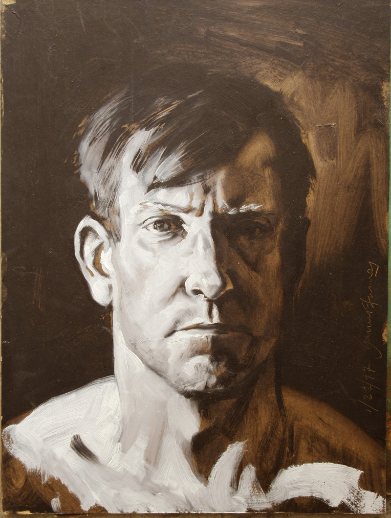
When painting from the figure, it's easy to get lost in all the subtle middle tones, and end up with a painting that has no force or impact. Shadows are usually darker than you think, and lights are lighter and more unified.
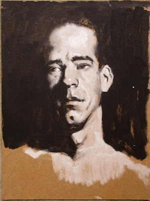
A helpful exercise to push your awareness in this direction is the High Contrast Study. Here's how to do it.
Material Prep before the Painting Session1. Find some 9x12 inch medium brown chipboard. You can also use mat board scraps (ask your framer), heavy brown paper, or even corrugated cardboard. The tone or color doesn't matter that much, as long as it's not black or white. Don't use precious or expensive materials.
2. Seal the surface completely with a layer of acrylic matte medium, brushed on freely.
 Material Prep at the Painting Session
1. Use two #4 or #6 bristle filbert brushes, one for white and one for black.
2. Use titanium white and black oil paint, and
keep them separate. You can "dirty up" the white just a little bit so that you have a little room for highlights, and you can mix the black with a little umber if you want, but don't put any white in your black.
Model Prep 1. Use a single light source on the model, and try to reduce secondary light sources such as reflected or fill light. This exercise doesn't work if there are multiple light sources. And make sure there's some light on your painting so you can see what you're doing.
2. Set up an simple background, either mostly light or mostly dark.
2. Position yourself in relation to the model so that some of the model's form is in light and some is in shadow.
3. Keep the sessions under an hour. The examples in this post were done in 15-20 minutes each.
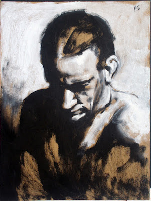 Process
1. Use the "black" brush to draw the lay-in, then mass in the shadows. After those are in, begin massing the lights.
2. Use black for all the areas in shadow, and white for all the areas in light.
3. If two areas of shadow come together, shape-weld them together with the black.
4. If two areas of light come together, group them together with white.
5. Try to avoid outlines.
6. Don't do too much blending at the transition between light and shadow.
7. You can leave some areas of the background tone of the board showing, but not too much.
 Next Steps
1. After doing this exercise in its purest form, you can allow yourself a little variation within the shadows and a little within the lights, but keep those variations very close in value, and don't be seduced by middle tones.
2. Replace the black with a more mid-range color, so that you do the same exercise but within a narrower value range. I'll show examples of this in the future.

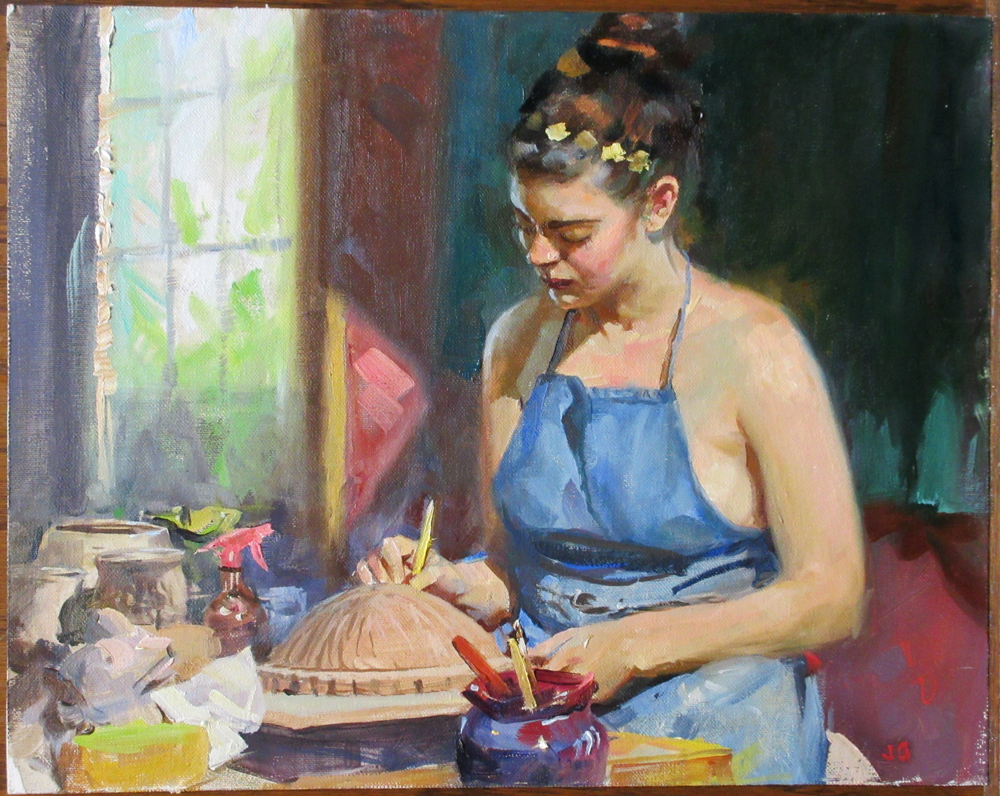
At our figure sketch group we want to paint a person doing a real action, rather than holding an artificial pose.
 |
| Sarah the Potter, oil on canvas, 9x12 inches, 5 hours |
So we ask Sarah to bring her pottery supplies and to do her normal work.
We agree on a base pose that she can return to from time to time. We talk to her during the pose, so she's not holding totally still.
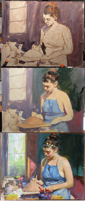
1. I draw with the brush on gesso-primed canvas mounted on a Masonite panel. I begin the quick block-in with casein. Casein is a good underpainting medium.
Right away I'm looking for the big shapes of tone, in this case her light face and figure against the simple dark background.
2. I begin to overpaint with oil on the face, hair, and background. Eventually, about 95 percent of the surface will be covered with oil paint. The oil paint achieves deeper values than the casein because of its glossiness.
I have three cups: Gamsol for thinner, Liquin, and a slow-drying medium (equal parts stand oil, damar varnish, and turpentine).
3. I simplify the tones in the arm and shoulder and torso, painting them with very little value variation and using color temperature to turn the form instead.
Consequently, the front plane of her shoulder has a slightly cooler cast.
Her hair melts into the simple tones of the background. On the left, I paint the window mullions and other background details out of focus.
In contrast to those empty shapes, I revel in the sharp accents and clutter of the worktable.

The revival of academic drawing and painting in America and Europe has largely been guided by the republication of the book by
Charles Bargue and Jean-Léon Gérôme.
But there are other ways of approaching the teaching of academic drawing, most notably the Russian tradition, which has more of a focus on spirit and construction, rather than the outward appearance of the form. I discussed some of the differences between the two approaches in an earlier post
when I interviewed Professor Sergey Chubirko
who teaches at the Russian Academy in Florence.
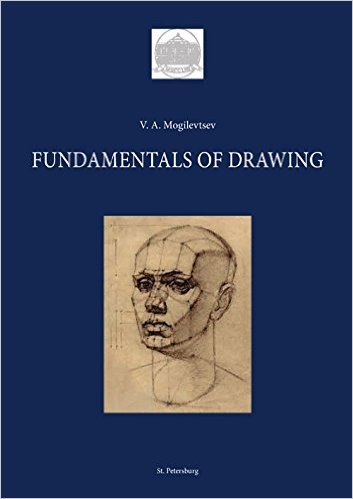
For those interested in Russian academic methods, there are two recent books by a living Russian master named Vladimir Mogilevtsev. He is the head of the Drawing Department of the
Russian Academy of Arts (also known as the Repin Institute) in St. Petersburg.

Mr. Mogilevtsev's primary books are
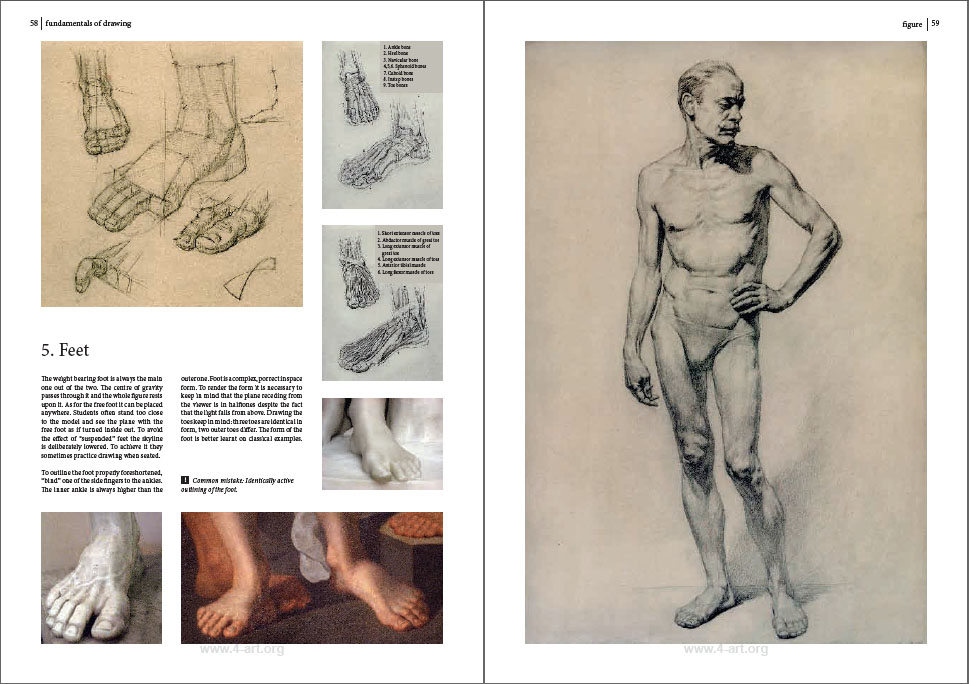
Fundamentals of Drawing
(first published in 2007) and
Fundamentals of Painting
(2012). They were published in Russian, but they have been translated into English, and I've had a chance to read through a PDF version of the English edition, alongside the Russian print editions.
I was interested in the drawings, of course, but even more interested in the thinking behind the drawings, and these books provide an excellent window into the mind of the Russian academy.
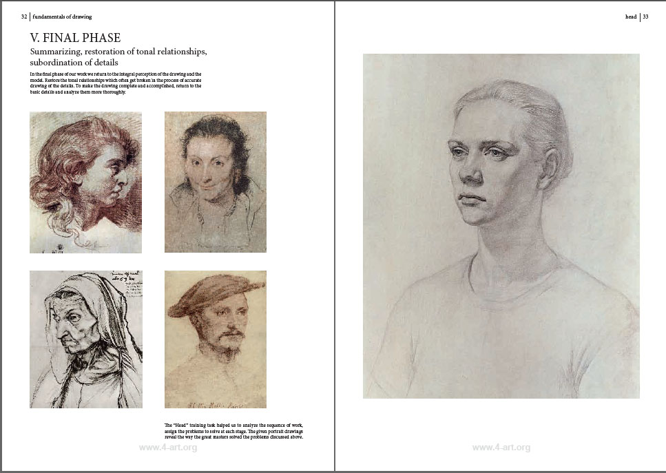
The way the book is organized is that there's a step by step sequence that plays out on the right hand page. On the left hand page is a commentary, along with examples by masters of the past, often including Russian artists such as Repin, Serov and Fechin.
In both the drawing and painting books, Mr. Mogilevtsev places great emphasis on beginning with a strong concept of the subject, analyzing what feeling the subject evokes in the artist, and thinking how best that can be expressed.
He also analyzes the form into its blocky forms, the skeletal foundation, and the individual muscles beneath the skin. The examples from old master drawings, sculptures, and paintings clarify his observations, and deepen the appreciation of the way our predecessors solved similar problems.
Fundamentals of Painting follows a similar structure, with extended step-by-step demos, beginning with a head portrait, a half-figure portrait with hands, a standing nude and a copy of a Rembrandt.
The quotes from the text are refreshing:
"Sometimes students complain that they don't like a scene. This is a sign of laziness and limitation of an artist's imagination. There is a person, and a person is the whole world. Revealing this world is a huge task for any artist."
 |
| Sketches and finished portrait by Valentin Serov |
There's a lot of emphasis on planning with sketches to capture the quality of the subject that attracted the artist, and in maintaining that perception throughout the arduous process. The text emphasizes seeing the whole, contrasting warm and cool, and establishing a hierarchy of details, with not all details being equal.
In their print form,
Fundamentals of Drawing and
Fundamentals of Painting are available from Amazon, but the print copies are currently only in Russian. They're big books (13 3/4" x 9 3/4"), and the quality of the reproductions is outstandingly good. Currently, if you buy them in this form, they will send you the PDF of the English translation. The English translation is also excellent. I'm told the English print editions are soon to come, and I'll update this post when they become available.
I have also been told by the publisher that the drawing book is in the process of being translated into French, Italian, Spanish and Turkish languages. They also already have a Chinese translation a Finnish version.
I also highly recommend
Academic Drawings and Sketches (Fundamentals Teaching Aids) (shown at left). Instead of showing a couple of drawings taken through a long series of stages, this is a large collection of finished examples of Russian academic figure drawings. They're mostly nudes, drawn by the instructors and students over the last 25 years.
It also includes some more informal sketchbook drawings of fellow students and landscapes.

This book is mostly pictures, with high quality reproductions. It has minimal text at the beginning, an introduction by Vladimir Mogilevtsev in both Russian and English. The captions in this book are in both Russian and English.
Academic Drawings and Sketches is 168 pages, softcover, 9.5" x 13.5".

Swiss artist and teacher
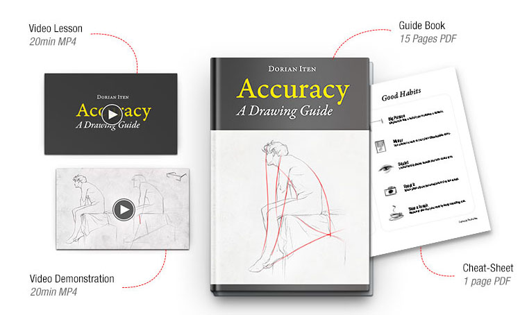
Dorian Iten, who has studied in some of the best ateliers in the USA and Europe, is now offering a teaching package that concentrates on how to achieve accuracy in your drawings.
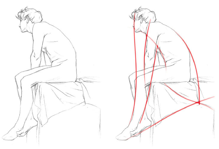
The teaching rubric of "
Accuracy: A Drawing Guide" begins on familiar ground. He takes a line drawing of a figure on the left, and reproduces it on the right. The drawing on the right shows alignments along a vertical line.
Checking alignments is just one way evaluating a drawing for accuracy. There are four others, and he has concretized these modes of seeing by proposing five kinds of glasses. Each pair of glasses representing a different way of checking:
Clockwise from upper left, there are the Alignment glasses, Angle glasses, Measurement glasses, "Creaturizing" glasses, and Implied Line glasses. These are all methods used for 2D copying of static subjects; they don't really help you deal with moving subjects, and they're not about constructing forms in space.
Here's what you look for with the Implied line glasses on. The simplified contours seem to extend beyond the small forms and pick up again in other parts of the pose.
To Dorian, these glasses are more than just a metaphor. He actually has his students cut them out of cardboard (but you don't really have to). Here's Dorian wearing the angle glasses. Very stylish.
The entire teaching package includes two videos, a PDF guidebook, and a cheat sheet that thoroughly discuss this clever approach.
When deciding how to monetize the packet, he decided to offer it as a "$0+" pay-what-you-want product, registered under the Creative Commons license. I asked him why he decided to structure it that way. He said he did it that way because:
"� I'd like more people to be familiar with it - and use it
• I want to make the guide available to everyone, without a paywall
• PWYW removes the upper ceiling of fixed prices and allows happy/supportive contributors to give as much as they like
• It feels easier to promote than a fixed price product
• If there is a sacrifice of profit in order to reach more people (which there might not be), I'm willing to make it at this point in my journey"
One way to approach the transaction is to download the packet for free, try it out, and then decide what it's worth to you based on how much it has improved your drawing. Then you can go back and contribute based on whether, for you, it was worth the price of a cup of coffee, a magazine, or a day-long seminar.

Anatomy instructor
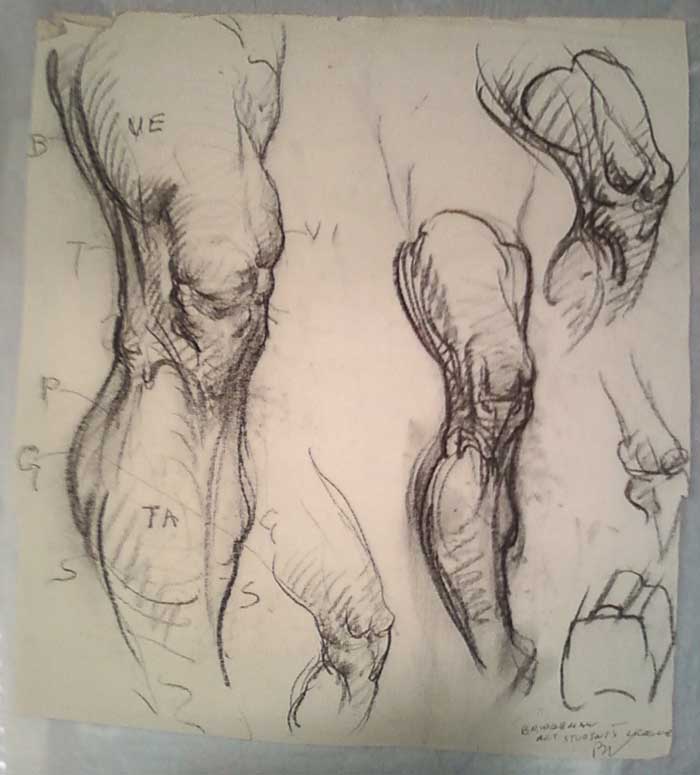
George Bridgman (1865-1943) was famous for drawing directly on the bodies of the models who posed for his figure drawing classes at the Art Students League in New York.
According to Norman Rockwell, Bridgman would dig a piece of soft red chalk out of his shirt pocket, and then would "walk to the model stand and draw the muscles of the stomach and the line of the rib cage right on the model with his chalk. The models disliked this. They say it gave them a queasy, squirmy sort of feeling to have their muscles marked on their skin in soft red chalk. And then there was no place at the League where they could wash properly and they'd have to go home with their muscles outlined in red."
-----

A friend and I use the buddy system to get ourselves out to a local life drawing session, and I show my sketches. It’s great to get out to a life drawing session. It is a bit like going to the gym in that I find it helps to keep my hands and eyes in shape. Just […]
via Studio Bowes Art Blog at http://ift.tt/1cc1hOu
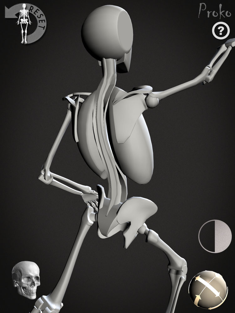
Stan Prokopenko and his team have just released a new app called "
Skelly."
It's named after the virtual skeleton character from Prokopenko's anatomy instruction
videos on YouTube.
The Skelly app lets you put the human skeleton into any pose and to see it from any angle. Tapping on a joint brings up a spherical overlay with directional arrows that let you drag the joint in the desired plane of movement.
It’s a useful tool for art students or professionals wondering what the skeleton is really doing beneath a life pose or for anyone wanting to visualize a pose from scratch.
The interface is intuitive and easy to use without sacrificing any of the nuances of the human body’s complex range of movement.
I tried it on my iPad, which is big enough to really see all the small bones, but it will also work on other mobile devices.
A control in the lower left of the screen lets you switch between a detailed skeleton model and a more simplified blocky skeleton, which Proko calls "RoboSkelly." Two other controls change the background and the light source.
Proko made this
promo trailer with his characteristic wit and sense of fun.
I recommend the Skelly app for animators, storyboarders, comic artists, illustrators, and figure painters.
-----

The following numbered paragraphs cite key points in italics, followed by a brief remark of my own. If you would like to respond to a specific point, please precede your comment by the corresponding number.
 |
| John White Alexander (American, 1856–1915) Oil on canvas; 52 1/4 x 63 5/8 in. |
1. Attention to line can give a work an "innocence and imaginative appeal" that is often lost in work that is concentrating on "the more complete realization of later schools."
Harold Speed will give us a later chapter on the practicalities of line drawing, but for this short chapter he concentrates on the aesthetics of line. He associates line with the sense of touch, but also with more primitive and stylized perception, and that's the core of what he's exploring here.
He makes reference to Botticelli and other early artists who used line predominantly. In the centuries that followed, chiaroscuro and form modeling came to dominate the thinking and made people forget about the power of line.
Artists in Asia were not as obsessed with chiaroscuro in the photographic / impressionist side of things. I was reading a book about the history of photography
(Photography: The Definitive Visual History)
, and it said that when photographs were first introduced in Japan, people didn't like them because they thought they missed the essential truth of what they saw. Now, with the ubiquity of photos, we tend to regard a photograph as a true and complete representation of our vision, but people in Japan and China didn't think so.
2. The eye only sees what it is on the look-out for.
Speed makes this point only in passing, but it's something that I think about a lot. We see what we want to see. This was the theme of an episode in
Dinotopia: The World Beneath (see previous post on
Pareidolia and Apophenia).
 |
Detail from Titian's "Three Ages of Man"
|
3. All through the work of the men who used this light and shade...the outline basis remained. Leonardo, Raphael, Michael Angelo, Titian, and the Venetians were all faithful to it as the means of holding their pictures together; although the Venetians, by fusing the edges of their outline masses, got very near the visual method to be introduced later by Velasquez.
Line and tonal modeling aren't mutually exclusive, nor must one use a hard edge throughout a picture to have a good sense of line. The Titian above combines a fine sense of line with a sophisticated feeling for edges.
4. The accumulation of the details of visual observation in art is liable eventually to obscure the main idea and disturb the larger sense of design.
The problem, according to Speed, comes not only from losing a sense of the contour, but also adding so many small details and textures that the larger shapes are lost.
Speed's cautions about the late 19th century obsession with naturalism, and he points to a time in the academies when line drawing fell out of fashion. He says the use of the stump for blending charcoal added to the problem. Does someone out there know why Speed was so negative about the stump? He doesn't really explain his reasons for disliking it.
5. Art, like life, is apt to languish if it gets too far away from primitive conditions.
It's notable that the
Fauvists and other neo-primitive movements were becoming active in Western art as he was writing this a hundred years ago. European and American artists were also appreciating the currents of art coming from China, Japan, and India.
Speed says that if you're going to study past movements, "to study the early rather than the late work of the different schools, so as to get in touch with the simple conditions of design on which good work is built."
6. No wonder a period of artistic dyspepsia is upon us.Perhaps even truer now than it was in Speed's day!
 |
| Animation model sheet of Disney's Bambi by Milt Kahl |
7. Line as contour vs. line of action
One last thought that I had in reading the chapter is that Speed seems to be talking about line mainly as the outer contour, but I think it's equally important to think of the line of action, the central gesture traveling through the center of all the forms. The great animators carried Speed's ideas forward into a whole new art form, and it is probably in the realm of animation that the art of line was most perfectly developed in the 20th century.
I look forward to your thoughts, and I enjoyed the discussion last week.
-----
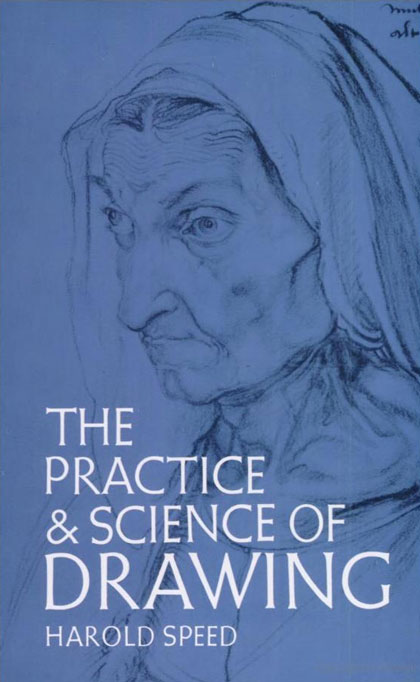
The Practice and Science of Drawing is available in various formats:
1.
Inexpensive softcover edition from Dover, (by far the majority of you are reading it in this format)
2.
Fully illustrated and formatted for Kindle.
3. Free online
Archive.org edition.
4.
Project Gutenberg versionArticles on Harold Speed in the Studio Magazine The Studio, Volume 15, "The Work of Harold Speed" by A. L. Baldry. (XV. No. 69. — December, 1898.) page 151.and
The Windsor Magazine, Volume 25, "The Art of Mr. Harold Speed" by Austin Chester, page 335. (thanks, अर्जुन)
------
GJ Book Club Facebook page (Thanks, Keita Hopkinson)
Pinterest (Thanks, Carolyn Kasper)
Original blog post
Announcing the GJ Book Club
The following numbered paragraphs cite key points in italics, followed by a brief remark of my own. If you would like to respond to a specific point, please precede your comment by the corresponding number.
1. The photographer's camera and the camera obscura are constructed on the same principle as the human eye.There has been a lot of scientific research in recent years about the differences between the eye and the camera, as summarized in this recent video "Eye vs. Camera":
(
YouTube link) True, light goes through the lens and forms an image on the retina, but who is looking at the retina? In fact, image processing begins happening right away at the level of the photoreceptors. In a way, this new science confirms the fundamental point that Speed is trying to make, which is that we don't see with our eyes, but rather with our brains.
Recent science also tells us that our perception of edge contours or lines is a basic part of visual processing. See previous post "
Lines and the Brain" or Wikipedia on "
Edge Detection."
2. The sense of touch vs. the sense of sight.
This notion of connecting drawing with the sense of touch is a powerful one. As I understand it, Speed is making the distinction between the sense of touch and the sense of sight in order to build toward his overarching teaching idea, which is to distinguish line drawing from "mass drawing." By mass drawing, he means tonal, impressionistic drawing.
I've been thinking this week about this idea of drawing as an extension of touch, and it occurs to me that a lot of the things we draw are kind of untouchable: a cloud, a mountain range, the silhouette of a skyscraper—or that cute model at the sketch group.
But for small still life objects, having an awareness of the feel of things can add so much to the conviction of the drawing.
 3. The commonplace painter will paint a commonplace picture...
In this section, he makes an interesting point that you can put two artists side by side painting the same scene, a beginner and a seasoned painter, and the experienced artist will recognize greater depth and power in the same scene. This is not due to technical tricks or better materials, but to their different way of seeing.
 4. A. Type of first drawing made by children showing how vision has not been consulted. B. Type of what might have been expected if crudest expression of visual appearance has been attempted.
I love the "A" and "B" diagram! At first I thought he was saying one way of seeing was better or more advanced than another, but I think in the end he's saying that they're just two different ways of seeing, and that we have to cultivate both.
Am I getting this right? Maybe I'm missing something. I look forward to your thoughts.
-----
The Practice and Science of Drawing is available in various formats:
1.
Inexpensive softcover edition from Dover, (by far the majority of you are reading it in this format)
2.
Fully illustrated and formatted for Kindle.
3. Free online
Archive.org edition.
4.
Project Gutenberg versionArticles on Harold Speed in the Studio Magazine The Studio, Volume 15, "The Work of Harold Speed" by A. L. Baldry. (XV. No. 69. — December, 1898.) page 151.and
The Windsor Magazine, Volume 25, "The Art of Mr. Harold Speed" by Austin Chester, page 335. (thanks, अर्जुन)
------
GJ Book Club Facebook page (Thanks, Keita Hopkinson)
Pinterest (Thanks, Carolyn Kasper)
Original blog post
Announcing the GJ Book Club
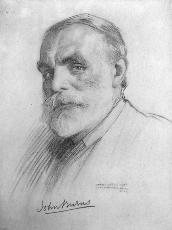 |
| John Elliott Burns by Harold Speed, 1907 |
The following numbered paragraphs cite key points in italics, followed by a brief remark of my own. Your thoughts are most welcome in the comment section of this blog. If you would like to respond to a specific point, please precede your comment by the corresponding number.
1. The expression of form upon a plane surface.
Speed's definition of drawing emphasizes form. That is consistent with most academic training. For the purposes of this chapter at least, he is not focusing on other qualities of drawing, such as the ability to capture texture or atmosphere.
2. Apelles
Apelles was a renowned artist of ancient Greece. His actual original paintings and drawings are lost to history (except for supposed copies), but he is known from his reputation in written sources.
More on Wikipedia.
3. Drawing, although the first, is also the last thing the painter usually studies.
Many great artists such as Rembrandt kept drawing central to their practice throughout their lives. Some, such as Adolph Menzel, pursued drawing relentlessly into their old age. For composers like Beethoven and Bach, keyboard or chamber music occupied a similar place.
4. Colour would seem to depend much more on a natural sense and to be less amenable to teaching.
As an author of
a book about color
, I have to disagree with him here. There's a lot to teach about color, especially given what we've learned since Speed's time about visual perception and optics. Even though color can be approached subjectively and personally, the aesthetic aspects of color can be taught. In fact, Speed himself must have changed his mind on this topic, because he includes two excellent chapters on color in his subsequent book on oil painting (
Oil Painting Techniques and Materials
), which we'll study after we get through this one.
5. To express form one must first be moved by it. There is in the appearance of all objects, animate and inanimate, what has been called an emotional significance, a hidden rhythm that is not caught by the accurate, painstaking, but cold artist.
Speed's definition of rhythm recognizes how emotion drives artistic choices. Rhythm therefore is not merely a design principle.

Charles F. A. Voysey by Harold Speed, chalk, 1896 |
6. Selection of the significant and suppression of the non-essential.
These choices, so central to a successful work, usually happen unconsciously, driven by the emotion the artist feels at the outset. The challenge is hanging onto that guiding feeling in the labor of making the picture.
7. Fine things seem only to be seen in flashes.
In my experience, I find this to be true not only of the process of drawing, but in my creative life more generally. In the fields of character development, scriptwriting, and world-building, the deeper inspirations come unexpectedly in torrents, separated by periods of steady craftsmanship.
8. Art thus enables us to experience life at second hand.
Through great art, we see the world in a more meaningful or enhanced way. After a visit to the picture galleries, our senses are heightened. This effect is even stronger to a student who makes a faithful copy of a master painting or drawing.
 9. One is always profoundly impressed by the expression of a sense of bulk, vastness, or mass in form.
Later he talks about lightness. It's always good to think about gravity when drawing. Muscles are always pulling against gravity. Wings struggle to lift a bird through the air against the pull of the earth. Drawing someone off-balance generates interest, but balance and imbalance are factors of gravity.
10. In these school studies feeling need not be considered, but only a cold accuracy....These academic drawings, too, should be as highly finished as hard application can make them, so that the habit of minute visual expression may be acquired.
In the French schools at least, there were different aesthetic criteria applied to studies from the model. Student studies were expected to be as accurate and finished as possible, and more interpretive works, which allowed for much more distortion and interpretation. A lot of schools in recent decades, needing to cover a lot of ground, tend to skip over the exacting practice of these coldly accurate school studies. It is like playing scales for the musician, or knowing the rules of grammar for the writer, as Carol Berning mentioned in the comments last time.
11. Drawing, then, to be worthy of the name, must be more than what is called accurate.
This point was illustrated by Sargent's portrait of Carolus-Duran in a recent blog post. Speed concludes that "Artistic accuracy demands that things be observed by a sentient individual recording the sensations produced in him by the phenomena of life." Art, then, becomes life filtered through a consciousness. This is a very idealistic view of drawing, and it sets up for next week's Chapter 3: "Vision"
-----
The Practice and Science of Drawing is available in various formats:
1.
Inexpensive softcover edition from Dover,2.
Fully illustrated and formatted for Kindle.
3. Free online
Archive.org edition.
4.
Project Gutenberg versionArticles on Harold Speed in the
Studio Magazine The Studio, Volume 15, "The Work of Harold Speed" by A. L. Baldry. (XV. No. 69. — December, 1898.) page 151.
and
The Windsor Magazine, Volume 25, "The Art of Mr. Harold Speed" by Austin Chester, page 335. (thanks, अर्जुन)
------
GJ Book Club Facebook page (Thanks, Keita Hopkinson)
Pinterest (Thanks, Carolyn Kasper)
Original blog post
Announcing the GJ Book Club
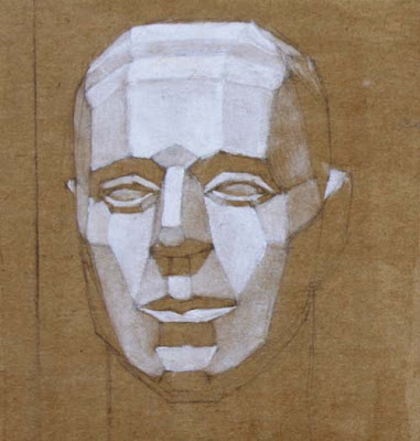
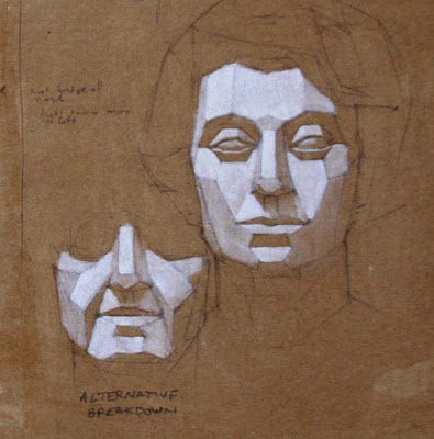
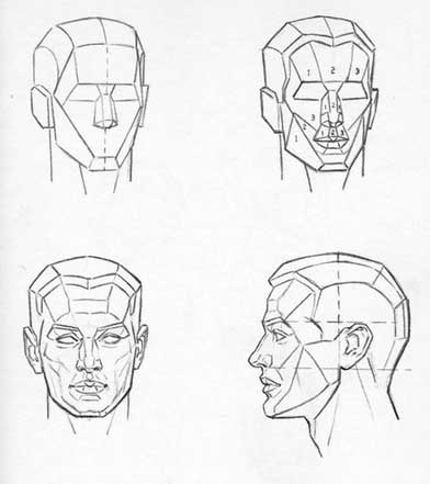
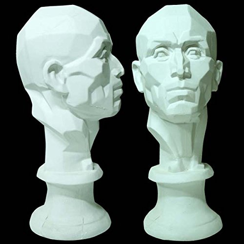
The one on the left is a simple breakdown, with front, side, and bottom planes. The one on the right subdivides the planes further. To be precise, some of these "planes" aren't perfect planes in the geometric sense, such as the curving planes on the top of the cranium.
Fred Fixler, a student of famed Art Students League instructor Frank Reilly, came up with a slightly different plane breakdown for an idealized male head. There are some rounded forms too. The cranium is a ball with the sides sliced off.
Sculpting the plane head brings the plane analysis into the realm of reality. This one is by painter and teacher John Asaro, who has a website called "
Planes of the Head.
" He has taught head painting using his plane head.
Many academic instructors have used plane heads as models before going to the live human, because it's much easier to accurately judge the values and color notes of each plane, compared to the infinitely variegated tones and curving forms of a real face.
Drawing and painting from plane heads is a central part of Chinese and Russian academic practice, and various companies have resurrected some of these art school models, such as this
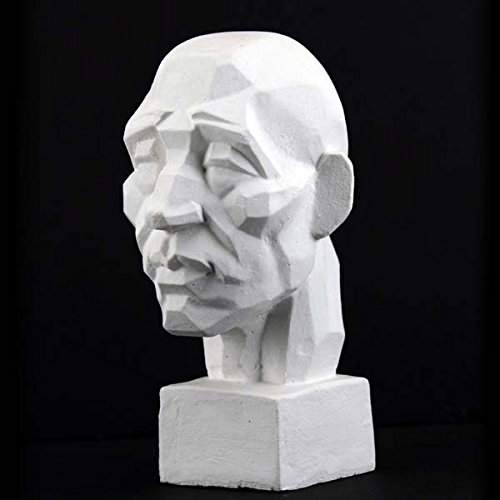
21-Inch plaster head.
This
mini plaster head is very different from a European or American standard head, and the planes are broken down into a mosaic of small forms. But the ear is treated as a single plane.
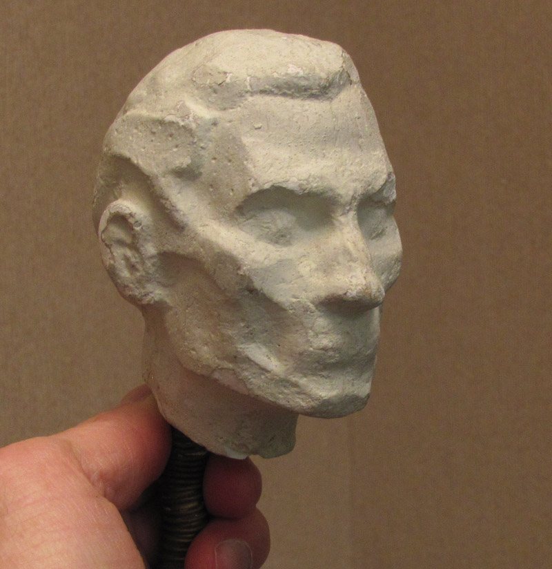
People will debate the merits of these commercially available heads, but I've never been completely satisfied with any of them. I think it's a great exercise for any student to come up with their own analysis, and that's what I did when I was in art school. Before there was
Sculpey
, I made this the hard way, sculpting a
plastilina
original, and then making a two-piece mold and casting it in plaster. Mine was inspired mainly by Loomis and
George Bridgman
.
I have set up my little plane head and painted him in colored light.
Once a student has had practice drawing and painting from idealized plane heads, and even sculpting their own breakdowns, then I think the next best step is to look at real human models and break the planes down in a unique way for that individual model.
This was the
method taught in a seminar I took from Art Center instructor Paul Souza, and here's an exercise I did in that class, scumbling white oil paint over chip board sealed with shellac.
In truth, there is no single ideal plane head, and even an individual model's face can be analyzed in various ways.

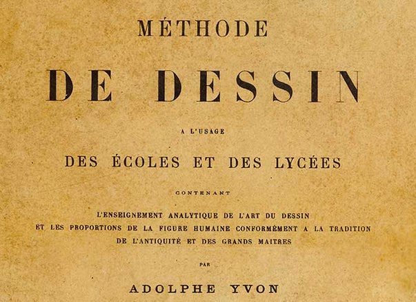
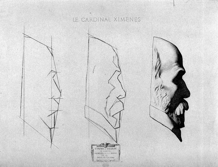
This was the method used by John Singer Sargent when he studied in Paris. According to Rousar, copies of this manual are extremely rare, and he has generously offered to put his copy online for free, but first he's inviting French/English translators to help him render it into English.
Here's a preview of one of Yvon's plates. I'm just guessing from the plate, but it seems to be a slightly different process from Bargue. He still uses the straight lines, but rather than bounding the outside of the form in an envelope or polygonal shape, he seems to find the most general big line going through the contour. The vertical line appears to be a record of measurements and alignments, subdivided into smaller measurements, probably made with the plumb line.
Here's one of Bargue's plates for comparison, with the outside bounding envelope going from the forehead to the tip of the nose and the nose to the chin, with the plumb-line measurements marked on a line drawn inside the form.
Sargent said that the plumb line (basically a weight dangling at the end of a string) was essential:
"When drawing from the model, never be without the plumb line in the left hand. Everyone has a bias, either to the right hand or the left of the vertical. The use of the plumb line rectifies this error and develops a keen appreciation of the vertical."
If you'd like to participate in translating some of first pages (or just read them in French),
here's a link to Darren Rousar's studio blog. ----
Charles Bargue's method from Amazon

Costume day....
Gestures...
Shorter poses....
Longer poses...
Short pose day -
Trying to implement things I'm learning at the Atelier -
- it's making for less-finished drawings, cuz there's lots of thinking going on....
Lovely model. He was fun to draw...
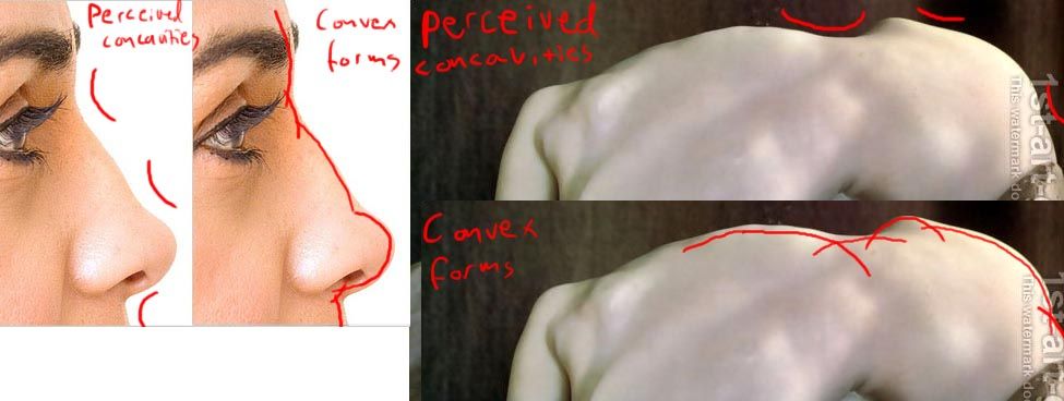
I have run across the idea that the human form should be drawn only with convex lines because "there are no concave lines in the figure." The argument goes that the outer contours are governed by the bulging masses of the bones and muscles. Even when you cup your hand, your hollow palm is made up of a set of smaller convex shapes. Convexity is synonymous with life, volume, and fullness. Even on a thin person, the planes and lines should gently curve outward. Concave contours can be conceived as a series of overlapping convex forms.
The opposing view is that the figure is made up of a variety of lines and planes, including straight and concave. Some artists emphasize only straight lines, especially in the layin. Regarding concave contours, elastic skin stretched across any acute angle will form a concave shape, such as on the inside of the elbow or the curve of the neck. This would be true even on Mr. Universe or a heavyset person. Concavity is expressive of receptivity and inertness. Variety is the spice of life, and good drawing is a product of contrast.
I haven't made up my mind yet on this issue, and would be interested in your comments. Maybe you can make one case or the other better than I can. What have you been taught, and what thought process produces the best for you? You can also add your vote to the poll at left.
A blog reader named Whiskey asked a question about line direction:
If we're drawing so that shading lines describe the contour and volume of an object, how should it be done? Should the lines go in the direction of the light source? Or along a perspective line?
I've attached a little jpg to illustrate my question because I'm not sure if I've made any sense. Which way is best for the lines to go?Answer:
It's a good question. Actually there are no rules. Both ways you've suggested can describe the form well.
The one marked A is often called "shading along the form" or "along the axis." B is sometimes called "
bracelet shading" which I mentioned on another post. In that case, the lines (or brushstrokes, if you're painting) are going around the axis of the form.
On a larger compositional level, your choices often depend on the feeling you want to create.

For example, in this fantastic world drawn by Franklin Booth, the lines on the far mountains are vertical, which reinforces the feeling of soaring majesty.

In this detail of a drawing by Polish artist
Stanislaw Bohusz-Siestrzencewicz (1869-1927), the lines on the horse's neck wrap around the cross section of the form, but he's also connecting diagonal movements from the horse to the man to suggest action.

In this drawing by the same artist, the lines spiral diagonally around the form to suggest the relaxed, informal posture of the woman.
So I'd say: experiment with both kinds of shading: along and across the axis. Also, try shading diagonally if you want to suggest atmosphere or action. Once you're comfortable with the choices, it will become automatic, and you can mix them up in the same drawing.
----
Thanks, Paul Mendonca for the Siestrzencewicz files.
More samples of
Stanislaw Bohusz-SiestrzencewiczAndrew Loomis talks about a similar topic, stroke direction in painting, in his excellent book
Creative Illustration
, which has just been republished.
Costume week - this time we had a full-fledged martial artist. :-)
1-2 minute gestures....
10 minutes.
40 minutes. Charcoal on paper.
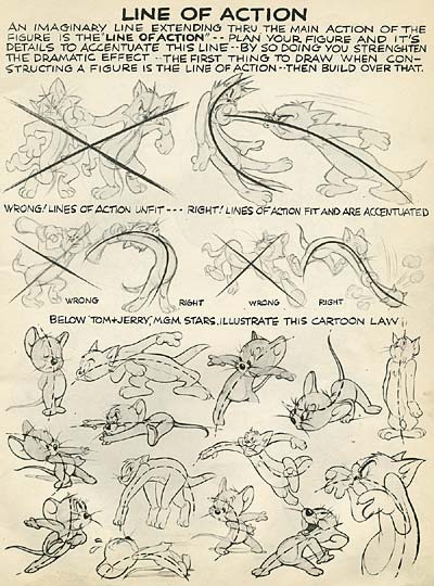
I'm not going to write a whole treatise on the "line of action" because the veteran Disney animator Preston Blair already did.
From his book
Animation: Learn How to Draw Animated Cartoons (How to Draw Series 26)
, which has been republished as
Cartoon Animation 
.
You can also find versions of it online.
In the 1700s, it was a common practice to give an academic figure study a mythological twist. For example, this 1756 painting by Nicolas-Guy Brenet isn't just any reclining figure. It's "Sleeping Endymion."
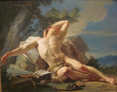
Endymion was a shepherd who had attracted the loving attention of the moon goddess Selene. She caused him to fall into an eternal sleep (with his eyes open) to preserve his beauty and youth. She would then be able to visit him every night.
Here's a similar pose but a different mythological setting. The painting, by Jean-Bernard Restout (1736-1796), is called either "Somnus," "Morpheus," or "Hypnos." Hypnos is the god of sleep or resides in a cave of eternal darkness. He is often shown with wings coming from his head, but here he looks more like an angel resting against his wings.
Adding these mythological layers can seem extraneous or gratuitous if the story doesn't guide the entire conception from the start. But when it's done thoughtfully, it offers both the artist and the viewer many new layers of feeling and association.
The problem for artists these days is that the audience is generally not familiar with the stories and the characters of the Greek and Roman mythology or of the Bible. An artist can count on everyone knowing what a cupid or a mermaid is, but viewers might not be as familiar with characters such as
Sisyphus. Despite Hollywood's recent attempts to popularize mythic stories, the characters most people recognize tend to be comic book superheroes, which are trademarked and owned by big corporations.
-----
Here's another interpretation of EndymionWikipedia / EndymionWikipedia / Hypnos
The last weekend of this month TLCWorkshops is hosting Terese Nielsen who is teaching a fabulous looking figure-related workshop. I'm giving you a sneak peek into the assignment we'll be working on:
Idealized Realism and the Human Figure
The assignment for this weekend is to portray an iconic, idealized image of the essence or attitude of a chosen character. (This would be similar to what is assigned to an illustrator for an interior book illustration, character driven card art, or spot illustrations for a magazine or D&D manual.)
Your Task
Bring a’ bio’ to class of a character that you will depict from mid thigh or waist up. We're focusing on beauty/idealism so choose one (male/female) that you have an affinity for, and will provide the opportunity to portray attitude and charisma. (Think angels, gods/goddesses or characters from mythology). Bring a half page write-up about your character: no need to put your writers-hat on here, just notes and details about the character.
We will only be working on the drawing aspect of the illustration, which will include selecting appropriate, powerful reference, as well as shooting supplemental photos for costuming or hand and arm positions. The final drawing can be drawn entirely by hand or partially composed in Photoshop and printed if you wish to speed up the process of achieving a tight final tracing paper sketch. Keep your design iconic, without complicated backgrounds or surroundings. Select design elements and symbolism that are relevant and supportive to what the character is about.
Come play with us! There are just a couple of spots left.
Yesterday was the last day of the annual convention of the Association of Medical Illustrators in Toronto, Ontario, Canada. I attended the gathering as a guest lecturer and workshop presenter.

(Above: Bert Oppenheim) The AMI includes professional visualizers who create artwork that shows what is going on inside the body. The artwork must be scientifically accurate and clear in its explanatory purpose, for people's lives often depend on it.
The images appear in textbooks, magazines, courtrooms, museums, digital readers, and doctor's offices. These days, most of the work is digital, including 2D, 3D, and animation. About half of the 2000 trained practitioners are self-employed.
Members have traveled from as far away as Russia to attend this convention, but most hail from the USA and Canada. The handful of universities that offer accredited graduate programs in biomedical illustration include
Georgia Health Sciences University, University of Illinois, Johns Hopkins University School of Medicine in Baltimore, Rochester Institute of Technology, the University of Texas Southwestern Medical Center in Dallas, and the University of Toronto.The training includes rigorous work not only in traditional and digital rendering techniques, but also in dissection and an array of life science studies. It's a very interesting field for young artists to consider if they are looking for something that combines art and science.
Thanks, AMI, for inviting me and for being such great hosts and workshop attendees!
----
Association of Medical Illustrators.AMI's FAQ
The poll results are now final for the crowd-sourced list of best classic art instruction books. I asked you to nominate your favorite how-to books that were older than 50 years, and then you voted in
a poll.The top three slots are occupied by Andrew Loomis (1892-1959), whose drawing is at right. Loomis attended the Art Students League in New York, where he studied under George Bridgman. (Bridgman himself has two books himself in the top ten.) Loomis did a variety of story and cover illustration, but his upbeat, glamorous style was especially well suited to advertising illustration. He taught at the American Academy of Art in Chicago.
Loomis's books are practical, encouraging, well-illustrated, and clearly written, though some people have faulted the figure drawings for a lack of ethnic diversity—there really are a lot of 1940s glamour nudes in high heels.
All of these books were huge favorites of mine when I was an art student, except Successful Drawing, which I was unaware of at the time.
128 votes (39%) Available in a facsimile edition from Titan books.
108 votes (33%) Now out of print and expensive, but soon to be republished by Titan.
71 votes (21%) Available in a facsimile edition from Titan books.
A week or two ago, I shared a list of my favorite classic art instruction books from Dover Publishing.

In the comments, I invited you to suggest the classic art instruction books (more than 50 years old) that you thought was particularly helpful.
Here's the list you suggested below. The links take you to Amazon pages where you can read more about each title.
On the left is a poll. Please vote for your favorite books. You can vote for more than one.
An Atlas of Animal Anatomy for Artists by W. Ellenberger et al. 
Animation by Preston Blair
Atlas of Human Anatomy for the Artist by Peck
Bridgman’s Life Drawing by George Bridgman
Composition of Outdoor Painting by Edgar Payne
Constructive Anatomy by George Bridgman
24 Comments on Classic Art Instruction: The Crowd-sourced List, last added: 7/17/2012
A few weeks ago, blog reader Charles Valsechi asked for a step-by-step drawing sequence by an academically trained Chinese artist.

Let's start with the finished drawing by Xubucheng. (Edit) Blog reader ZS has generously translated the Chinese notes in the book, which I'll show in bold after each step, followed by my own observations about what he seems to be doing. (Translation) "1A. Be sure of the position/alignment of the head, and get the block in right."1B. Use simple straight lines to mark out the shape/contour of the head, locking in the basic positions of the eyes, nose and mouth and ears. 35 minutes."
(My observation) In the the first step he doesn't copy contours, nor does he place spots. His framework is built from nearly straight line segments bounding important lines at the edges of the form. He's also looking within the form for big plane changes (brow, cheek, chin) and for feature placement. Since this is an upshot, the lines for the brow, eyes, bottom of the nose and mouth are parallel, slanting downward in perspective. The ear and nose are roughed out in a few simple lines. These lines are drawn with controlled sweeping movements of the arm.
2. "Once the position of the features are determined, use shadow boundaries, projection lines, perspective lines and knowledge of head anatomy to further detail out the form of the features.
(35 minutes." This kind of thinking—using arcs or gently curving line segments—is carried a lot further. Now he's more concerned with smaller plane changes. He's doing a lot of cross-checking at this stage to compare alignments. By the way, I believe each of these drawings was made separately for the purpose of the demo; I don't believe they're actually from the same sequence.
22 Comments on Chinese step-by-step portrait, last added: 6/27/2012
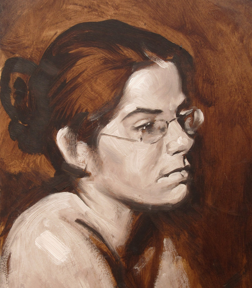
Last Saturday I had the privilege of painting alongside the artist and teacher Max Ginsburg (b. 1931)
He drove up with several of his students to take part in a six-hour figure painting session hosted by Garin Baker's Carriage House Atelier near Newburgh, New York. Max is in the lower right, below.

As we painted, Max offered helpful advice to his students. "Big artists use big brushes," he said as we were all beginning.

Here is Max's six-hour study. The light was set up so that so that it was stronger on the top half of the figure, and he was attentive to the value-mixing required to get the progression of tone. "There's a build up from this tone to that one," he said. He explained how he was painting across the form, rather than just along it, and how he softened certain edges, such as along the shin and the calf. With some of the students, he worked directly on their paintings, but he left problems for them to solve. "I'll leave something for you to do. I think you'll get this by the time you're eighty. That's how old I am."  Here's my painting. Although I'm not one of his students, I was hanging on Max's every word because I've never heard the voice of a painting teacher before. It wouldn't be accurate to say I'm self-taught. I was taught by people who were already dead when I found them: Andrew Loomis , Norman Rockwell , Harold Speed , Solomon Solomon
14 Comments on Voice of the Teacher, last added: 4/12/2012
View Next 25 Posts
|


.jpg?picon=1009)


Beautifully delicate pencil drawings! Degas like I think!