


I have been trying to share Gregory Manchess’s art for most of this year. He is a very talented artist, but a very busy artist. He exhibits all over the world, teaches workshops, lectures at universities, plus everyone is trying to bang down his door for a little piece of his genius talent. I gave up on getting the answers to my too many interview questions and showing him off without the interview. But there is a lot of meat to this post with a lot of tips for illustrators, so take a look and don’t miss the link to his two hour “How to” video.
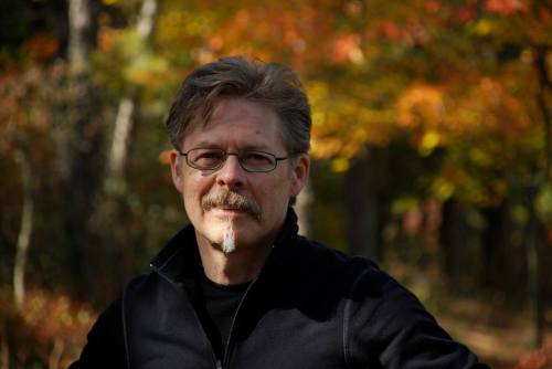
Creating a moment that communicates emotionally with the viewer is the essence of Gregory Manchess’ artwork. A native of Kentucky, he spent two years as a studio illustrator with Hellman Design Associates before striking out on his own in 1979.
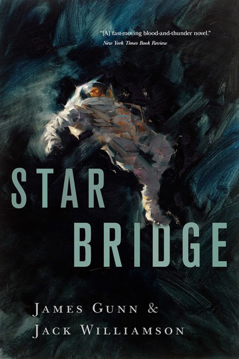
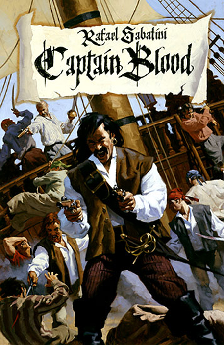
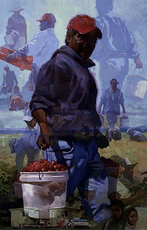
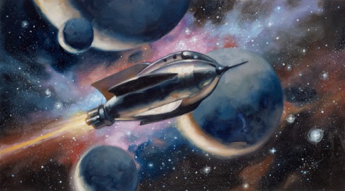
He combined his love for fine art and science fiction and began his freelance career painting for OMNI magazine. His versatility and broad range of interests allowed him to crossover to mainstream illustration. There he was able to expand his client work to include covers for Time, Atlantic Monthly, spreads for Playboy, Omni, Newsweek, and Smithsonian, and numerous book covers.
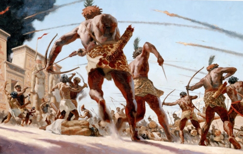
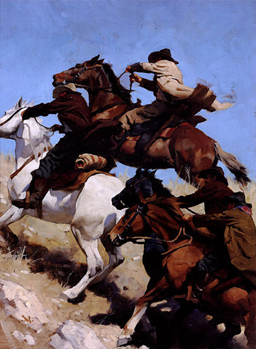
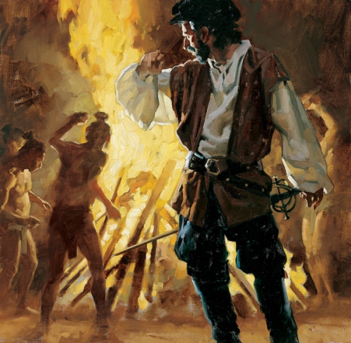
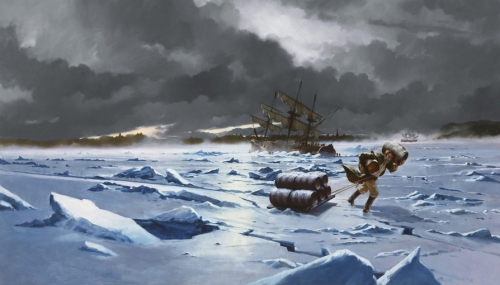
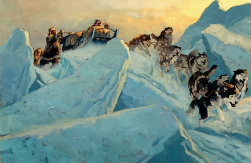
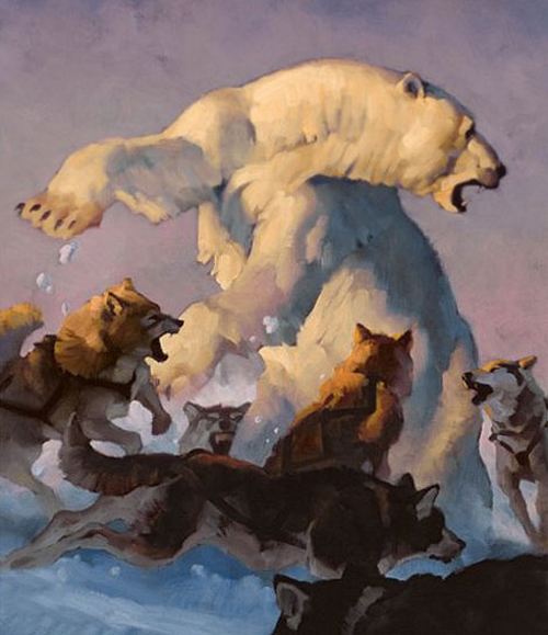
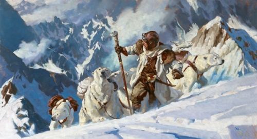
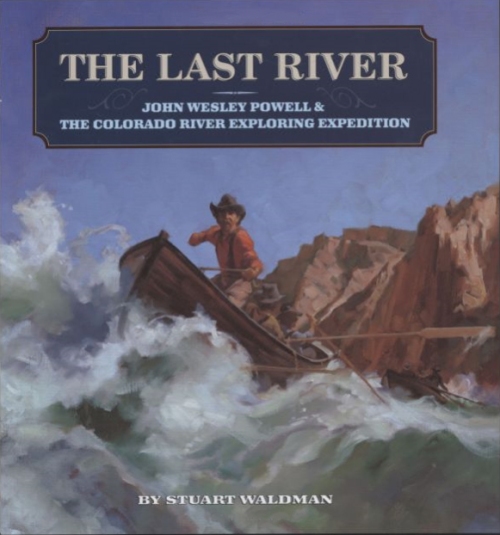
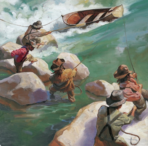
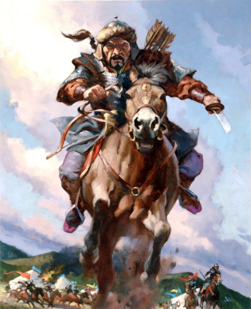
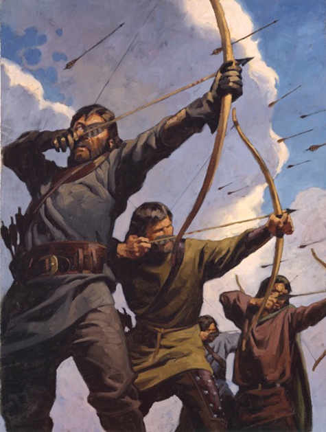
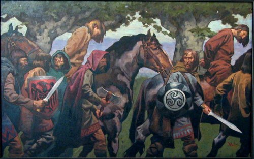
Manchess’ interest in history and his excellent figure work has made his paintings a favorite choice of the National Geographic Society on many occasions, including an expedition down the Fond du Lac river in Canada for the 1996 article David Thomson: The Man Who Measured Canada.
Widely awarded within the industry, Manchess exhibits frequently at the Society of Illustrators in New York. His peers at the Society presented him with their highest honor, the coveted Hamilton King Award in 1999, and a year later, the Stephan Dohanos Award.
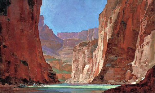
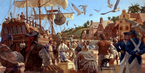
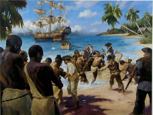
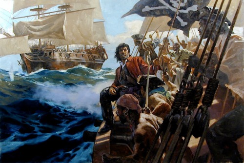
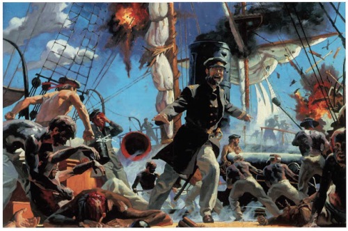
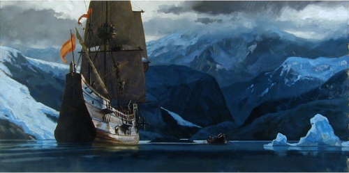
Manchess’ work has also been recognized in the children’s book market. His latest children’s book illustrations narrate the story Cheyenne Medicine Hat about wild mustangs. A lavishly illustrated limited edition of Robt. E. Howard CONAN stories with over 60 paintings, is due out in 2010. He has recently finished 10 murals for a traveling exhibition on the Pirate ship, Whydah, for the Nat’l Geographic Society. His painting of the Oregon coast was used for the 2009 Oregon Statehood Stamp by the USPS.
Gregory is included in Walt Reed’s latest edition of “The Illustrator in America, 1860-2000.” He lectures frequently at universities and colleges nationwide and gives workshops in painting at the Norman Rockwell Museum in Stockbridge, MA, and the Illustration Master Class in Amherst, MA.
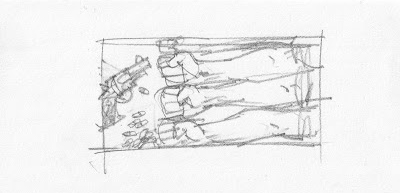
Here are a few pictures showing Gregory’s process:
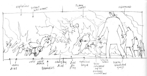
Thumbnail sketch for layout.
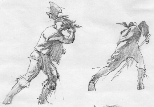
Character sketches
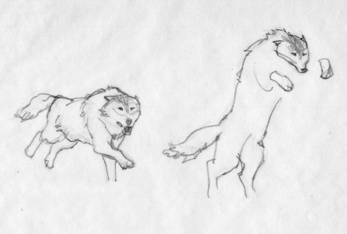
Sketches for the wolves
Cleaned up sketch
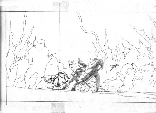
Sketching in more detail.
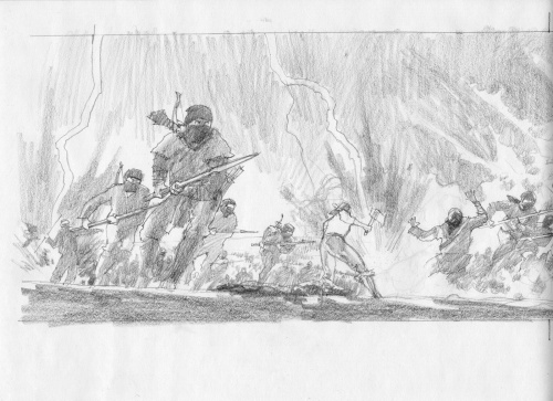
Adding Shadows
Adding foreground characters
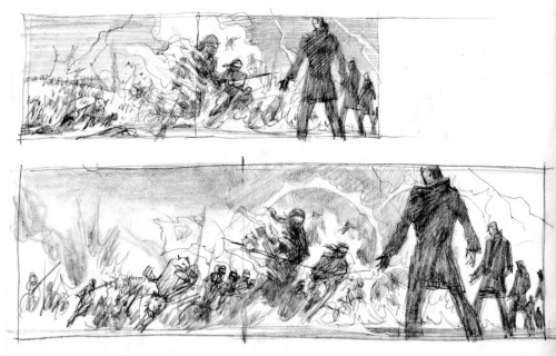
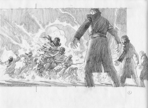
Continuing to develop sketch.
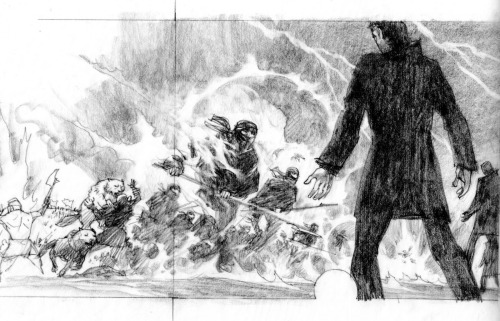
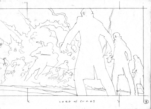
Final Sketch
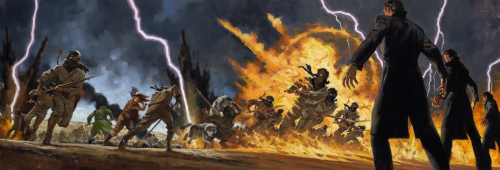
Final Painting done in oil.
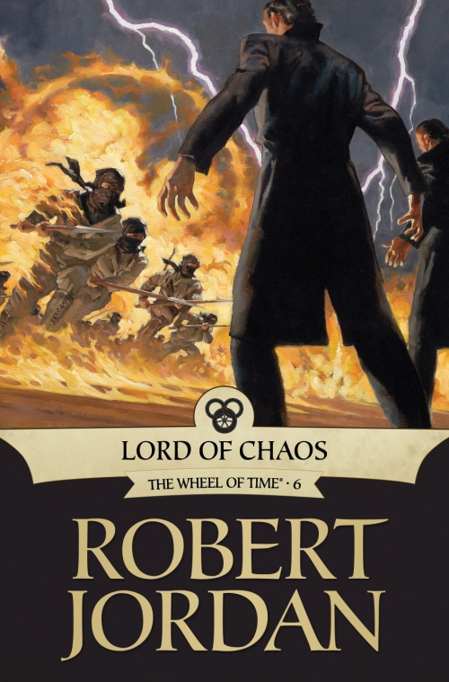
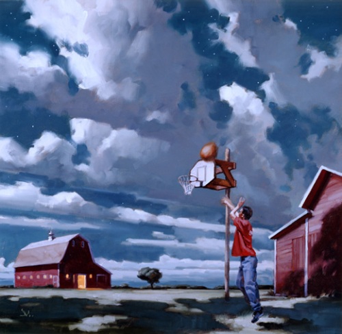
This is the final cover for LORD OF CHAOS published by Tor.
Gregory’s artist rep is Richard Solomon located in NYC. http://www.richardsolomon.com/
You can view a two hour video of Gregory’s painting process available as a download from http://Conceptart.org

One of Gregory’s many murals. Must have been fun to see it on the top of a NYC building.
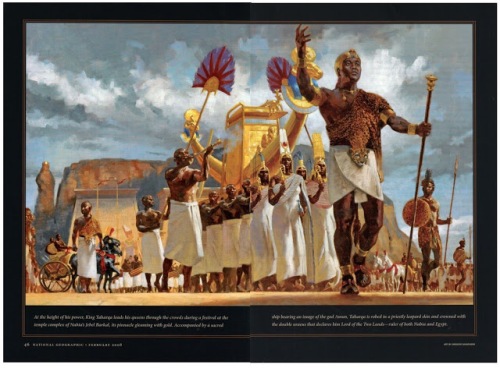
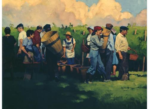
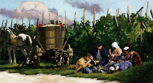
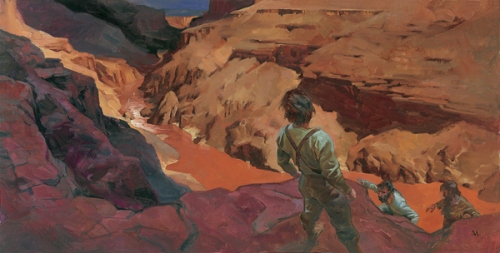
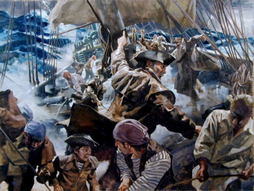
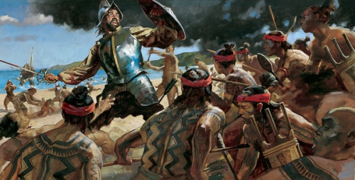
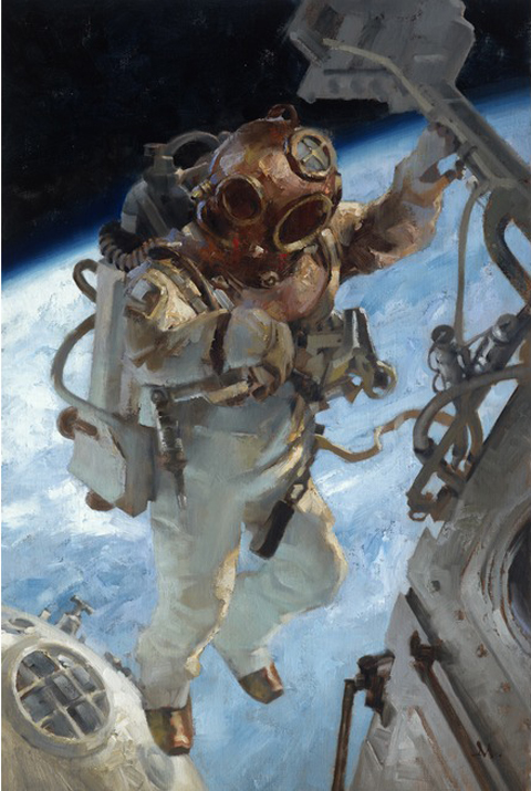
ABOVE and BELOW: Gregory’s illustrations have been in National Geographic Magazine.

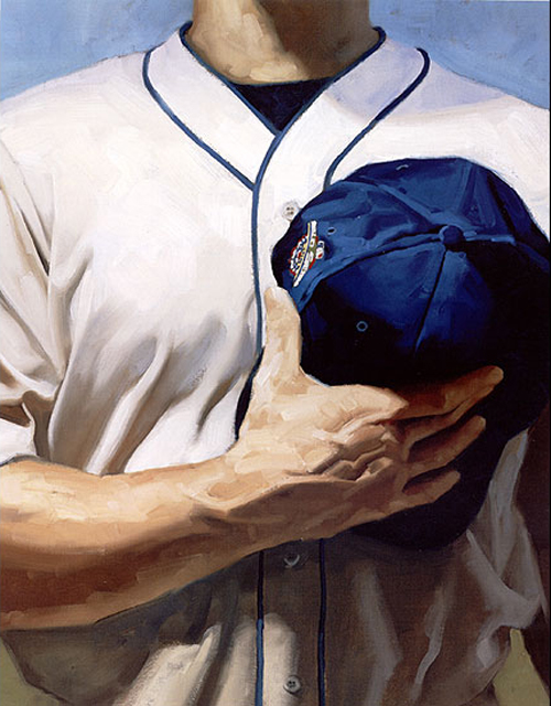
Gregory also was chosen to do a few postal stamps.
The Society of Illustrators exhibited 50 of Gregory’s illustrations in 2013.

ELEVEN GREGORY TIPS:
Value range.
I start with darks first, to get the deep shadows laid in. Obvious places: nostrils, eyelids and eyebrows, mouth line. Next, I’ll put in broader, but slightly lighter shadow shapes like under the nose, under the eye sockets, under the bottom lip, chin, deep cheek bones, hair. I place the boldest shapes to establish deeper values, then work my way up through the darker values of color to the lighter values placed on top.
Avoid highlights.
Until the last bits of painting, I avoid the highlights as long as I can. Two reasons. One, I need to work my way up, so putting them in too soon will defeat that effort. Two, I leave something fun for the last. I delay gratification as long as I can. The best part of painting in oils occurs within the last few layers and strokes.
Vary forms.
Hair is a bold shape, not individual hairs. I study folds and constantly vary them. Repeating the same folds will kill a painting as dead as an assassin’s shot through a pillow. I don’t think about the object I’m painting. I separate myself from the subject and only paint the form. I won’t ‘follow’ the form either. I cut my strokes across the surface of the forms. This adds dimension and lets objects feel sculptured.
New painters: Avoid primary colors.
Ultramarine Blue. It’s deadly. It’ll make mud faster than 35 school kids running for the bus. And no, Cadmium Yellow Light is not a miracle color. Get over it. Using it straight from the tube does not show how brilliant one is at mixing paint. Same is true for Ultramarine. New painters seem to think they are phenomenal because they used Ultramarine Blue straight from the dang tube. They step back and declare, ‘look at me, The Genius. I have explained the essence of pure painting by opening a paint tube and using yellow next to blue. Admire me.’
Using primary colors as a statement of painting brilliance screams ‘AMATEUR.’
Amount of pigment.
I trained to know just how much pigment is on the end of my brush. No matter how large or small, my awareness of the amount is paramount to good layers, good coverage, good overall effect in any painting.
I studied calligraphy. It taught me how to make letterforms with a brush or pen. Knowing the amount of ink held on an instrument for calligraphy is critical to achieve a skilled work.
Brush angle.
Calligraphy also taught me how to angle a pen or brush. Making letterforms is a key factor in learning to paint. I know many great painters who also started by copying letter shapes, making signs, copying comics (bang! zoom! pow!). They learned to handle the brush and at what angle AT ALL TIMES.
The angle of the brush helps lay down the right amount of pigment, at the right angle, in the right direction, with the right pressure to achieve a free and confident stroke.
Brush size.
I start with the largest brush for as long as I can and work my way down to the smaller brushes. Many times, as I near the end of a painting, or even slightly before, I switch back and forth. It’s a good, general idea to keep things from getting too focused too early.
Stroke speed.
Painting fast and loose comes the same way as anything else: with time. I painted very slowly in the beginning, placing my strokes deliberately, to look as if they were painted fast. Once down, it’s usually hard to tell the speed the stroke was laid. Over the years, I built up speed through confidence. It’s just plain ol’ experience. And LOADS of training.
Patient strokes.
I don’t judge my strokes too quickly. I lay it down, and press on. I come back to that area after a bit to judge whether it was the correct feeling, size, color, etc. I don’t lay one down, hate it, and take it off. Or worse, try to keep changing it.
At this point in my career, I lay strokes down that don’t make sense, but I let them sit. I find that they are just fine once I come back to judge them in context, against other strokes that are adding to the whole piece. Judging too early destroys spontaneity.

Scale.
I decide how I want the paint to feel once a piece is finished. I scale the brush size to fit the scale of the painting. If it’s a small painting in a magazine, I have to decide how clearly the strokes will be seen and what feeling they project to a reader.
If it’s a large painting and I want it to feel loose, I have to decide on the size that feels best. Paint it too large with small brushes, and when it comes down in reproduction, it can look too detailed. Too small with large brushes, and the piece can look too loose, too unfocused.
New painters can make the mistake of painting too small with too large of a brush and vice versa.
Below is Gregory explaining his thought processes for Jake and the Other Girl.
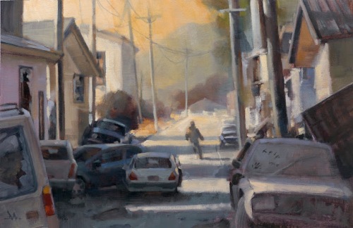
There’s another way to make successful thumbnails that can lead to a final sketch.
Get right to the research first. Instead of exploring small thumbnails on the page, searching for the right image design, there are times where I know that the assignment demands a clearer knowledge of the setting before an idea takes hold.
I read this short story for Tor.com, a follow-up for a previous story, “Dress Your Marines in White,” by Emmy Laybourne. I toyed with a short-lived idea that might connect with my illustration for the first story, based on a set of men’s arms.
But I had a clearer idea that I needed to know & show the environment for the piece. The mood needed to be established instantly. The story is post-apocalyptic. I quickly rejected that early approach after researching, at length, war-torn cities, destroyed cities, hurricane, tornado, and earthquake damaged city streets. There is only a brief scene where the main character is outdoors, but it gives the tale a sense of place and I wanted the reader to feel that.
I gathered abandoned cars, some parked, some wrecked, some neglected. I used the status of the cars to reflect the status of the story. I researched shots of broken buildings, street scenes, and abandoned towns. I put all of these images up on my computer and freehanded a large scale thumbnail as the main sketch.
With that much information, I only needed to hit it one time. Most times, you have to create your own luck.
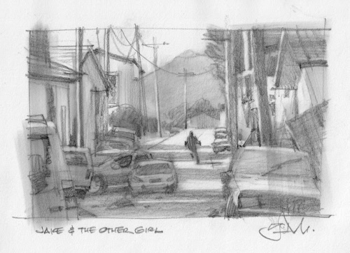
But the challenge after getting the idea was to pull it off. It must read fast and it must feel factual. Rendering cars is not so fun, but discovering and simplifying their shapes to read quickly was very gratifying. But I had to show more than just shiny cars parked. I wanted some to feel like they had just been abandoned, while others had been there for some time.Again, getting the value correct meant the difference here. Capturing that feeling meant I had to forget what it felt like, and pay more attention to exactly what it looked like. By doing that, I managed to capture the feeling of a dust covered car.
Not so intuitive. I had to study and mix the difference in value range to get shiny vs dusty. I wasn’t surprised to find out how much I learned from this painting about simplifying detail.
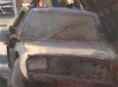
As painters, we must sometimes compartmentalize our feelings to actually capture those same feelings in the image. We start with the impression of feeling, reverse-engineer it methodically through observation and application that then re-communicates the feeling we were after originally. Using contrast was another way of projecting that feeling. I decided to have someone leave a cryptic message on the windshield, like a “wash me” note. The difference between the soft values of the dusty windshield and the crisp, hand drawn letters brought this across. To get that affect, I had to pay attention to exactly what value would be revealed if someone had haphazardly wiped away some dirt.
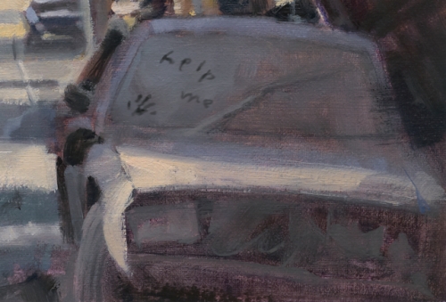
I could’ve added that passage after the oil was dry, but instead, I painted it digitally. This allowed me to give the art director, Irene Gallo, the choice to keep it or not.
This is yet another way in which digital is informing my analog painting development.
Click this link to read Gregory’s Ten Things About Painting in Oils: http://muddycolors.blogspot.com/2013/03/10-things-about-painting-in-oils.html
You can find Gregory Manchess on his website http://www.manchess.com and his facebook page: https://www.facebook.com/pages/Gregory-Manchess-Art/180916225410035
I would love to hear what you think about Gregory’s illustrations. Maybe you have taken a class with him or got to see his illustrations when he exhibited in NYC or for that matter in one of the many places he has exhibited around the world.
Talk tomorrow,
Kathy
Filed under: Advice, How to, illustrating, Illustrator Sites, Illustrator's Saturday Tagged: Gregory Manchess, Illustrated USPS Stamps, NYC MURAL, Smithsonian, Time Magazine
