What is JacketFlap

  • JacketFlap connects you to the work of more than 200,000 authors, illustrators, publishers and other creators of books for Children and Young Adults. The site is updated daily with information about every book, author, illustrator, and publisher in the children's / young adult book industry. Members include published authors and illustrators, librarians, agents, editors, publicists, booksellers, publishers and fans.
    Join now (it's free).

Sort Blog Posts

Sort Posts by:

  • in
    from   

Suggest a Blog

Enter a Blog's Feed URL below and click Submit:

Most Commented Posts

In the past 7 days

Recent Posts

(tagged with 'high five')

Recent Comments

Recently Viewed

JacketFlap Sponsors

Spread the word about books.
Put this Widget on your blog!
  • Powered by JacketFlap.com

Are you a book Publisher?
Learn about Widgets now!

Advertise on JacketFlap

MyJacketFlap Blogs

  • Login or Register for free to create your own customized page of blog posts from your favorite blogs. You can also add blogs by clicking the "Add to MyJacketFlap" links next to the blog name in each post.

Blog Posts by Tag

In the past 7 days

Blog Posts by Date

Click days in this calendar to see posts by day or month
new posts in all blogs
Viewing: Blog Posts Tagged with: high five, Most Recent at Top [Help]
Results 1 - 21 of 21
1. Highlights High Five 2014 Pewter Plate Award

What a nice way to start the week. I just found a package on our front porch that contained a Highlights High Five 2014 Pewter Plate Illustration of the Year Award!  Thank you very much to both Highlights and editor Kathleen Hayes!

0 Comments on Highlights High Five 2014 Pewter Plate Award as of 1/1/1900
Add a Comment
2. That's Silly, Carnival Midway!

My latest That's Silly! piece for Highlights High Five. It is in the June issue which is available now.


0 Comments on That's Silly, Carnival Midway! as of 6/11/2013 8:11:00 AM
Add a Comment
3. That's Silly, Bumper Cars!

This piece was recently published in Highlights High Five. I had a lot of fun doing extensive research on retro bumper cars. I found that the modern ones were just plain ugly.

Make sure to get a Highlights subscription for the little ones in your life. They now have magazines for everyone from ages 2-12.

0 Comments on That's Silly, Bumper Cars! as of 3/25/2013 12:57:00 PM
Add a Comment
4. IF: Snow


It has been a long time since I submitted anything to Illustration Friday so I thought I'd post these three Highlights illustrations for the snow theme this week. Have fun finding all of the Silly/Wrong things!


2 Comments on IF: Snow, last added: 12/17/2012
Display Comments Add a Comment
5. Highlights Illustrators' Party 2012

The Highlights Illustrators' Party took place this past weekend! If you've been following me at all, you know it is something that I look forward to more than Christmas. 

I'll sum up: Each year Highlights magazine invites all of their illustrators to their headquarters in  Honesdale, PA. Besides having time to share portfolios their is an elaborate costume party, delicious PA dutch food and square dancing as well lots of fun children's activities. This year 's theme was Super Heroes. I went as my own superhero, Black&Blue- a take on my habit of constantly hitting my head. 

The illustrators were given a superhero sketchbook spec sheet to fill out (mine is below) which were collected into an awesome booklet/keepsake from the weekend. I used mine to add a deeper story to my costume as did some of the other illustrators...


Here are some photos of Black&Blue with his friends
(photos provided by myself and some very nice folks):


The Freelance League of America!


The Pink Pearl and I pose for villainy.


My daughter Virginia as the Polka Toddler!


The Luchadoro (aka illustrator Dave Klug) and I get ready to defend the street of Honesdale!


David Helton's wonderfully fun backdrop for the square dance and dinner.


My side kicks, the Freelance Pattern Posse! 
Striper, Pop Tartan and Polka Toddler aka my Mother-in-law, my wife, and my daughter.


R Michael Palan's Hungry-Man gives it to me good! Michael made this. 
I wish we set up about 200 others with everyone. They would be awesome.


The Revisionator (aka Rocky Fuller) poses with the Freelance Pattern Posse.


Friend and fellow crime fighter, Robert Squier made this shortly after we returned.


Taking a break with the Polka Toddler.


Command Z (aka Dave Justice) and I chat about the corruption in Honesdale. 
It was a very short conversation.


Black&Blue to the rescue!

Some more photos and a nice reflection on the HIP can be seen on Cheryl Kirk Knoll's blog.

Now, go get a subscription to Highlights for your kids, nephews, nieces, neighbors!
It's the greatest magazine in the world. Honest!


3 Comments on Highlights Illustrators' Party 2012, last added: 10/8/2012
Display Comments Add a Comment
6. HighFive Magazine Cover

I forgot about this until it came in the mail yesterday. It’s the August 2012 cover for High Five magazine. Lots of great stories, poems, games (and illustrations to accompany them!) inside. Thanks so much, Highlight for Children folks! You rock! (I think I’m getting to old to say “You rock!”, but, hey…They do!)

0 Comments on HighFive Magazine Cover as of 1/1/1900
Add a Comment
7. New Work! May 2012 High Five: “Love From Lisa”

Here’s another fun spread I created is in the May 2012 issue of Highlights’ High Five magazine (story by Marianne Mitchell)! So many other fine authors and illustrators contributed their work to this issue, too. Thanks, Highlights!

(c) Highlights For Children

0 Comments on New Work! May 2012 High Five: “Love From Lisa” as of 4/26/2012 10:37:00 AM
Add a Comment
8. Those Silly Kites!


Who doesn't like to fly a kite? God knows I do. I own five and I always have them in the trunk of my car just incase the opportunity presents itself to fly. Keeping this in mind, you can understand why I over did it on the first draft of this That's Silly! illustration for Highlights High Five. I really wanted the perspective to be through the kites, as if you were up in the sky looking down upon the people but it became to busy especially for children under five years of age. In the first revision I tried holding on to some of that flavor but it was still too busy. Sadly even the New England town in the background had to be eliminated. What we ended up with, of course, is the final art above.

Some hidden tip of the hats: A Charlie Brown kite, Amir and Hassan's kite from the film The Kite Runner,  Voyager I and Drew Phillips of Ultimate Extreme Kite Flying. My father and I are flying the fish kite.


0 Comments on Those Silly Kites! as of 4/2/2012 3:50:00 PM
Add a Comment
9. Samples: Pigs Of Summer

I forgot to post this illustration project that I did a-way back in the late winter for the June 2011 issue of Highlight’s High Five magazine. “Pigs Of Summer” was the title of a spread for an “action rhyme”. As always, it’s a pleasure (and blast!) to work with the art directors at Highlights, drawing all kinds of fun and interesting stuff to encourage kids to learn and grow.

Below: The rough sketches.

copyright Highlights For Children, 2011

0 Comments on Samples: Pigs Of Summer as of 1/1/1900
Add a Comment
10. Samples: Busy Day 1

Below: Spot #1 from “A Busy Day” in High Five magazine.

Below: The AD’s sketch and my rough. I like to deviate from normative perspective so wanted to depict this scene from the side. It also made it so that everybody’s face could be seen.

(Copyright Highlights For Kids 2011)

0 Comments on Samples: Busy Day 1 as of 1/1/1900
Add a Comment
11. Happy Monday

Thought I'd share a small spot that was part of a four-page spread for Highlights High Five that I finished up last week. The story was part of the English-Spanish series that runs every month in the magazine and will be published in March. Always fun when there is a dog involved!

5 Comments on Happy Monday, last added: 9/20/2011
Display Comments Add a Comment
12. That Silly Parade!


Drawing a marching band is not easy. So much research was involved in making this as believable as possible. This piece is currently in the July 2011 issue of Highlights High Five which is available now.

I put a lot of cameos of family and friends in this one. The band is loosely based on my wife's high school, North Penn and their Marching Knights, of which she was a member. My wife can be seen playing the clarinet with holly attached to her hat. My Grandfather (of whom I am named after) can be seen on the left with my Grandma Vi. The four children sitting on the curb (one has a horn) are of myself (I'm wearing the Canada cap), my two brothers and my sister. We would often go to parades that were just up the road from us on Frankford Avenue in the Mayfair section of Philadelphia. Some of my nieces and nephews are pictured as well as a couple of friends with their kids. 

Here is the line art:


2 Comments on That Silly Parade!, last added: 6/16/2011
Display Comments Add a Comment
13. That's Silly, Train Station!


Delanco, New Jersey's Riveline train station stars in February's Highlights High Five's That's Silly! (now available on your local magazine rack)
Delanco is a small all American town that sits on a peninsula surrounded by the Delaware River and the Rancocas Creek. I lived on the second floor of a remodeled old general store dating back to 1852 for 8 years. It was the first I was truly on my own. The train station was just three blocks away which would take me into Camden, NJ for my connection to the Patco line into Philadelphia. I love Delanco and I miss it quite a bit. It really is a great place to live. A lot of the suburban illustrations I make get their inspiration from my short time in Delanco.

I knew this scene was going to be published in February so I wanted to give it the feel of a cold snowy morning with the sun just rising. The funny part is that when I started working on this piece it was in the middle of August at 101 degrees.

Also, I am illustrator for the Make it! Cook it! spread each month in High Five (along with the talented Liz Dubois who illustrates the Cook It! Ingredients). I'll post some shots of the recent spreads soon.

For those who don't know, Highlights High Five is a magazine aimed at children 5 and under. Get a subscription today!

0 Comments on That's Silly, Train Station! as of 1/1/1900
Add a Comment
14. Highlights Illustrators' Party!


For those of you not on facebook I thought I would post these photos from the recent Highlights Illustrators' Party. The theme this year was "That's Silly!" so my family and I decided it would be silliest if we all went dressed as Princess Leia. Don't judge us too harshly.

0 Comments on Highlights Illustrators' Party! as of 1/1/1900
Add a Comment
15. That Silly Highlights Building!


Back in July I was asked to create the above mural for the Highlights Illustrators' Party. A big honor. The theme was based on Highlights High Five's "That's Silly!" feature, a variation of the Highlights' "What's Wrong?" feature that is found on the back covers of which I have been doing a lot of the past year.

Since blogger will not allow you to get a closer look at this image I have split and uploaded the mural as close up segments below. A detailed description of how I went about making this piece is below the last segment.


Display Comments Add a Comment
16. City Park - What's Wrong?


This illustration will be featured on the back cover of this March's Highlights for Children. One thing to note in this one is Ranger Kent sitting and watching an old western next to the statue base. I've finished one more of these What's Wrong back covers and I am currently working on two more. I'll post a little snippet from each when I get a chance.

Anyway, below is the line art. I keep certain elements out such as the kite string to be added in later.


Below is the printed piece.


Also, this was in February's High Five if you didn't see it. I'm glad the colors came out well. This one was colored with a new technique and I wasn't sure how it would print. You can see/read more about this piece here.
Add a Comment
17. Now available...

Two of my pieces were published this month. The first here is in this month's Highlights High Five and the second is on the back cover of this month's Highlights for Children. See? I'm not a liar.


0 Comments on Now available... as of 10/13/2009 4:31:00 PM
Add a Comment
18. Little Bird


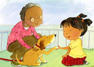
I recently finished this Hidden Picture for Highlights High Five. It will be featured in the February issue "My First Hidden Pictures" which are hidden pictures designed to be easier for younger kids and they are also accompanied with a poem. This was my first time coloring one of my hidden pictures. I have been experimenting with a colored pencil Photoshop technique and decided to try it out for this illustration.

Look for the following objects:
Magic wand, birthday cake, mitten, spool of thread, ruler, pencil, eyeglasses, and a tea cup.


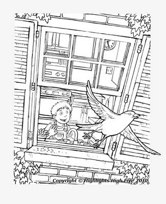
There were many changes to the original sketch (the one posted above is actually the second revision). You can see in the sketch how the window was changed to make it easier for the younger kids to "read." My technique in making a hidden pictures is usually to make a purposefully busy sketch and then find the objects in the sketch with some manipulation. With this one I felt I really had to pull back and simplify which was much easier on my brain.

Below is the line art minus the bird. The bird was done separately so I could control the depth/color of the line in the finish.


High Five is a beautifully illustrated/written magazine. Click here to get a subscription.

1 Comments on Little Bird, last added: 9/8/2009
Display Comments Add a Comment
19. My crazy process.


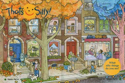
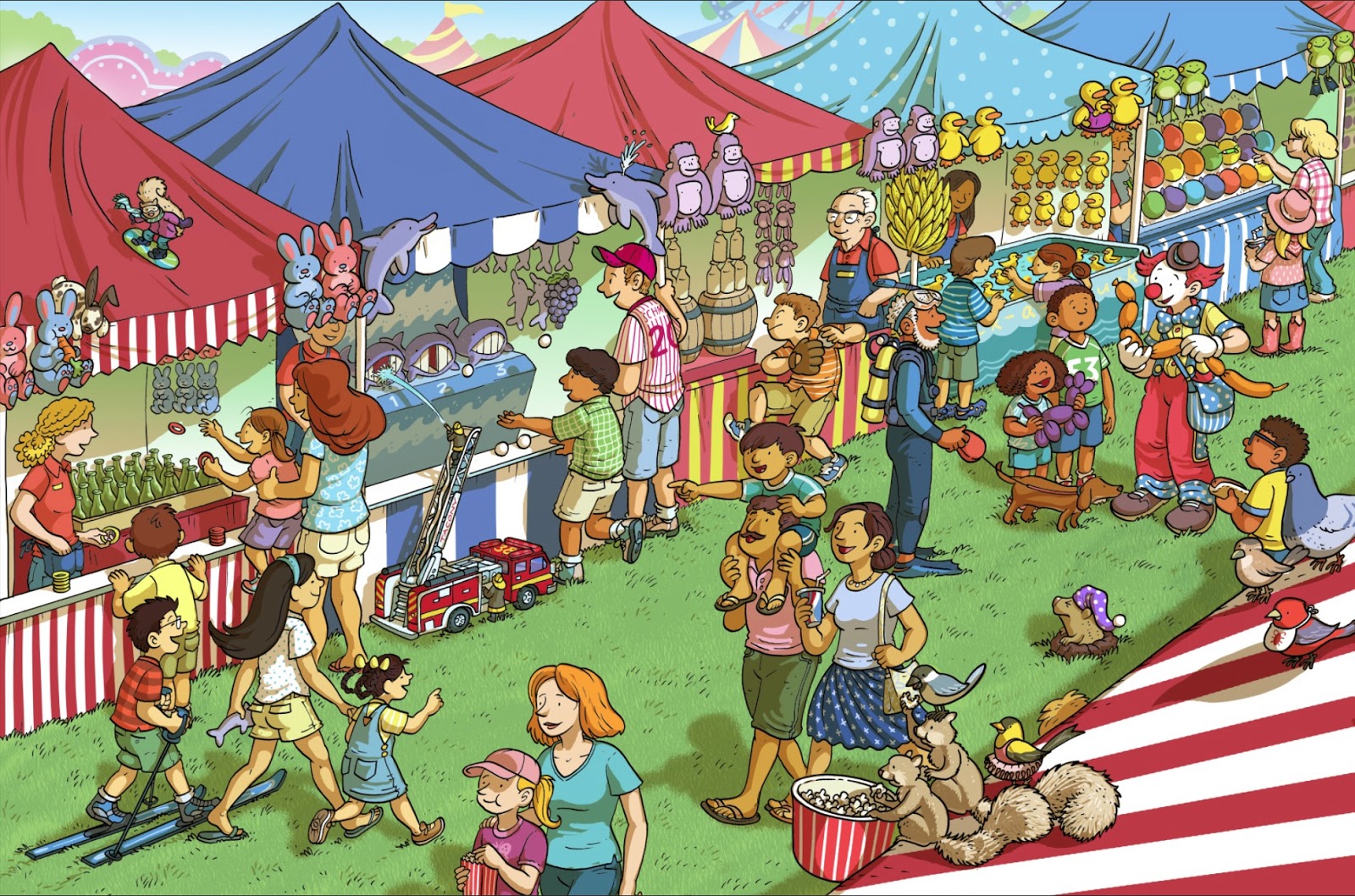
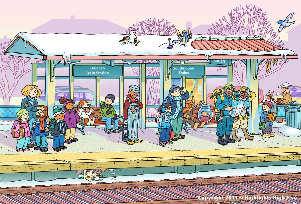
I haven't done what I call a "big and busy" illustration in a while, especially one that required color. I always try to make my hidden pictures fairly busy, that way I have more places to hide objects, but this was kind of a new territory for me. This piece was done for Highlight's High Five, which is a magazine centered around early childhood kids. The illustration is very much in the vain of the "What's Wrong" back covers of Highlights for Children but this is an interior double page spread and goes by the name of, "That's Silly." Since the magazine is aimed at younger kids I had to make sure that everything was clearly visible and easy to discern.
If you're interested, here was my process making this piece...
It all started with some thumbnail sketches, of course. With the excellent help of the Art Director I had a clear idea as to what I wanted right off the bat and I was given some great examples of what other artists had done for past "Silly Things", so that helped me a lot with the overall tone and composition.


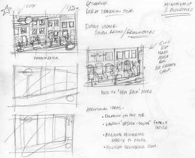
After doing some extensive research about which type of brownstones (aka row homes/town homes) I was going to model them after, I decided to take the easy route with my perspective. I drew the buildings straight on and duplicated the windows with Photoshop (PS) to save some time. The hardest part of making the windows was that brownstones typically have long thin windows, so I had to purposely make them much wider if I was going to fit some silly things within.


After taking the scans into PS and adding all of the needed windows, I used the perspective and distort transform tool to get my perspective right and added the details of the roof and the steps. The trick was to keep all of the windows (which would house most of the silly things) at least a half inch away from the gutter and the margins which was proving to be most difficult.


So I played with it- making the buildings smaller, adding another building, removing windows, etc. I also realized that the Ice Cream shop needed to be more of a part of the composition.


Finally everything fit seamlessly outside the gutter and the margins. The original concept I had was starting to take form. I was finally starting to feel like I was looking at a city street like in my hometown of Philadelphia.


I started to polish it up as more details were added...


The next logical step was to add the trees. I originally thought I'd have smaller trees (as you can see by the thumbnails), but part of what makes the older city neighborhoods so enchanting is the beautiful large Sycamore (a neighborhood without tress is just a group of ugly buildings). My poor planning had wasted time drawing the tops of the buildings since they would now be almost completely covered up by the leaves.


Roughly sixteen hours later and my stage was set and I could add the characters! I was given a list of specific silly things to draw in the windows but I had some extras so I added an opera singer, a cowboy feeding his cow some eggs, and a gorilla reading a paper.


Next was the outside characters. Each was drawn individually so I could move them around and place where I needed them.


Lastly, I added some fallen leaves since this was going to be published in the October issue.


At this point I sent the sketch to the Art Director and was told to change and add a few things. The opera singer was changed to a leopard playing a violin, a robot was added to to give sense to the remote controlled broom, a tiny train was added to the top of the ice cream shop awning, the yarmulke was removed from the man in front of the ice cream shop (not pictured), an upside down address number 45 was placed in the window above the door in the middle and the goatee was removed from the man flipping the pancakes. Also, although it is not in this sketch, I had to add leaves to cover up the branches in the top left center because it was too busy for the "That's Silly" logo to lay on top off.


Finally I did all of the inking. The background and each character was done separately for easier placement. I did the inking 50% larger to ensure that I could get in all of the small details. Using Adobe Bridge I made several scans and pieced it all together.


Using PS and a good Wacom tablet I colored in the background and the trees first (I forgot to mention that the tree on the right was going to have blue leaves and a pink trunk with white polka dots). I made my own custom brushes for the coloring and textures.


Then I colored the interiors.


And then the outside sillies.


Lastly I added the shadows to give more depth. At this stage I also showed it to several friends to see what they thought of the colors. I made some adjustments (already shown) and was ready to send it off to High Five.


As I said this will be published in the October 2009 issue so keep an eye out for it. If you'd like a subscription to High Five or Highlights, just click here. Kids love it.

5 Comments on My crazy process., last added: 6/1/2009
Display Comments Add a Comment
20. HighFive Magazine and Scholastic book club

A few things printed recently:
My spread from this month's High Five magazine.

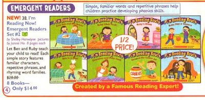
And here are my I'm Reading Now! series in Scholastic's Firefly book club catalog, November.

Yay! :-)

0 Comments on HighFive Magazine and Scholastic book club as of 1/1/1900
Add a Comment
21. High 5!

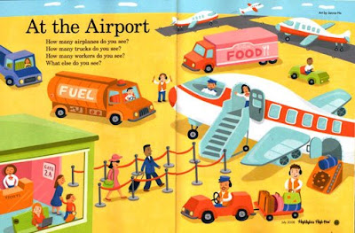
This is a spread I did for the July issue of Highlights High Five magazine. Its like my little homage to Richard Scarry, one of my favorite illustrators of all time!

18 Comments on High 5!, last added: 7/2/2008
Display Comments Add a Comment