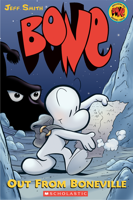
Scholastic’s editions of Jeff Smith’s BONE were what originally put Steve Hamaker on the map, and he’s only improved since his introduction to the comics scene. After coloring over a dozen BONE graphic novels, Hamaker went on to color Jeff Smith’s follow-up RASL, Strangers in Paradise-related projects for Terry Moore and Scott Kurtz’s webcomic Table Titans. Recently he’s been producing his own webcomic named PLOX that shows off his illustrative chops as well as his honed coloring skills. I spoke to Steve about his background, workload and growth as a creator and storyteller.

Let’s start with the origin story. What brought you into comics?
I was working for a small toy design company that worked on license action figures. We did toys for lots of properties, like Street Fighter, Sonic the Hedgehog, Speed Racer, and BONE. I was the designer on BONE, so that’s where I met Jeff Smith. He hired me away from that job, basically the day I was being downsized, so it worked out perfectly.
Was coloring comics always the goal?
Actually no. I’ve always wanted to make my own comics. The toy design thing was a stepping stone, but I really did enjoy that as a creative career. Jeff inspired me and then taught me how to not only make comics, but how to self publish and promote them.

Line art by Jeff Smith.
You only work with a select few artists. Jeff Smith, Scott Kurtz, Terry Moore… How do you decide who to collaborate with?
Well, Jeff happened to be my boss, so that was an easy choice [laughs]. Coloring BONE was a huge undertaking for us both. It taught me every technique I use, and made me fall in love with the whole process. Terry Moore is a good friend of Jeff’s, so that was also very natural to work with him. I have been a fan of Scott Kurtz’s since he started PVP, so I stalked him early on, and once the coloring of BONE got more and more attention he took notice. We became friends along the way too, so that adds another layer to it. Coloring BONE was really the flood gates opening for people taking notice of me. I have a lot more choices to be selective, and that makes a difference in how I approach the work.
With those artists and with PLOX you’re aiming a little outside the typical Wednesday Warrior demographic. Do you have any desire to color a “mainstream” comic?
I would be interested, sure. It would have to be meaningful subject matter to me, so hopefully the right book will come along. Technically, I have done some work for DC with Jeff’s Shazam story, and Marvel was very nice when I colored a Thor story for Terry Moore. Ironically, the bigger publishers pay better, usually give cover credit, and even pay royalties in some cases. That’s not why I would do it, though. It’s just good to see them treating colorists in an increasing positive way.

An example of a reward for Patreon subscribers.
You mentioned marketing earlier. What kind of efforts do you make to market PLOX?
Right now it’s mostly social media, cross promotion with other online comics folks and general word-of-mouth. Terry Moore is running PLOX ads for me while I color his new SiP Kids mini series. Scott is obviously a great help with his PVP audience. He runs banners for my comic and I get to attend shows with him like GenCon and PAX. The audience building has been one of the most incredible experiences in making this comic. Seeing the reader numbers increase, but more importantly knowing that so many of them are genuinely invested in the comic.
Yes! I haven’t given Patreon quite the love and attention it deserves, but it’s a great tool for reaching your audience. It’s tough because I have to spend so much time coloring or creating PLOX that I can’t devote the time to making the Patreon really engaging. It’s a Catch-22 of sorts. I hope to change that in the future.
It must also be hard to use something ongoing like Patreon that it is to promote something one-off like Kickstarter.
Yes. I haven’t done a Kickstarter yet for PLOX, but I plan to. I want to make sure the Kickstarter for the collected book is really well organized and rewarding for the donors, and especially that they won’t have to wait two years to get their stuff! I will most likely tackle that when I am really close to being done with the first PLOX story.
When will that be?
Hopefully later this year. I keep writing new scenes that push the ending back.
Now a question I’m sure you’ve been asked many times: what does “PLOX
mean?
I chose PLOX for the title from the idea of how our language has been affected and truncated on the internet. The word ‘please’ change to ‘pls’, then to ‘plz’, then gamers would type so fast that it became ‘plx’. Then people started speaking over the internet with Teamspeak and Ventrilo, and they would phonetically say “plox”.
It also looked cool as a logo.
How is “please” central to the story?
The word isn’t important really. It was the idea of how the internet can affect things like language, and in the case of my story, relationships.

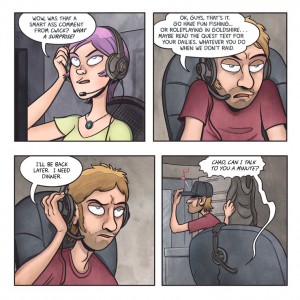
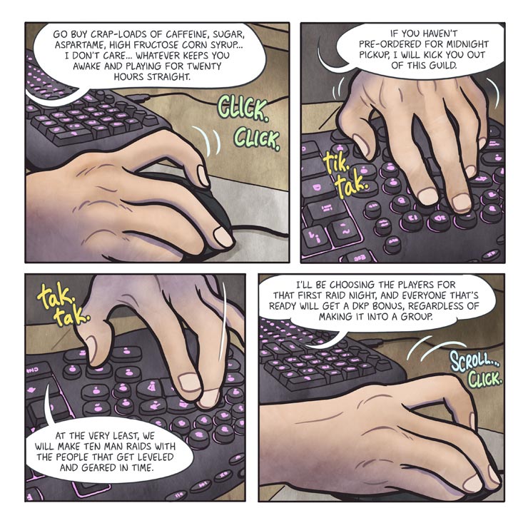
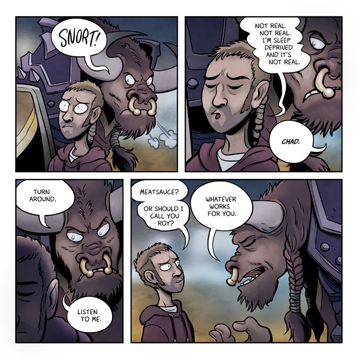
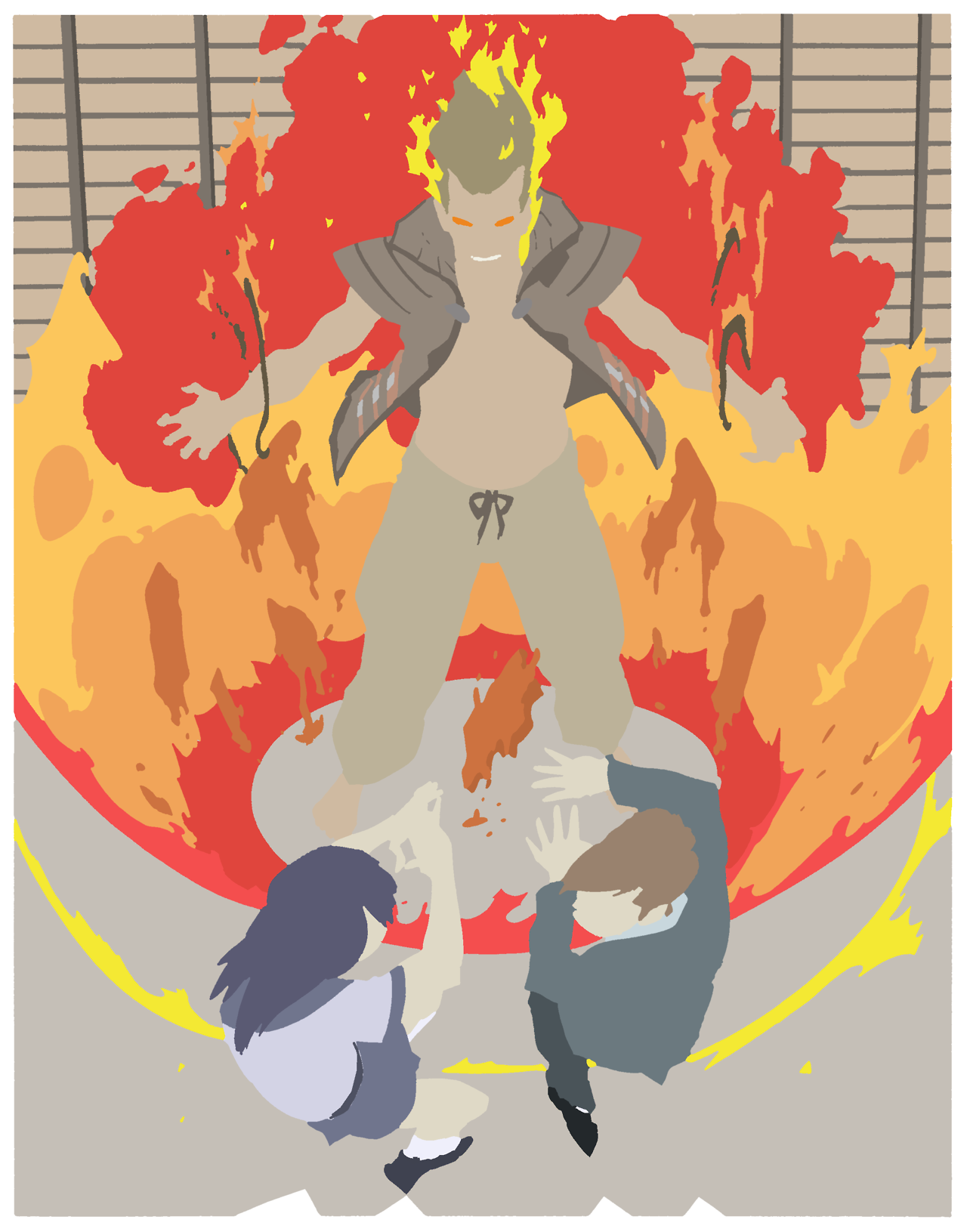
Since the story is centered around a World of Warcraft-like game it would be easy to include a lot of fantasy visuals, but there aren’t many in PLOX. Was that intentional?
Starting out, I definitely envisioned that I would do in game cut-aways, like we do in Table Titans. After writing the first 3 or 4 chapters, I realized that the game isn’t the central ‘thing’ about the story, and it didn’t seem appropriate anymore.
The dream sequences were key for showing the in game avatars, however. That was a big breakthrough for me in writing this.
It’s really important to me that people can read PLOX and not have to know everything about Warcraft. The story is semi-autobiographical, so I felt like I had to include the game because it was tied up with my emotional state and daily life during that time.
It’s a story about three people. That’s hopefully compelling enough [laughs]. I’m half-kidding. I love that it has the gamer slant to it, and it affords a lot of opportunity for comedy, but I don’t want it to be a barrier of entry for my readers.
Chad would be a dick to his Bingo group down at the church. The game could be anything.
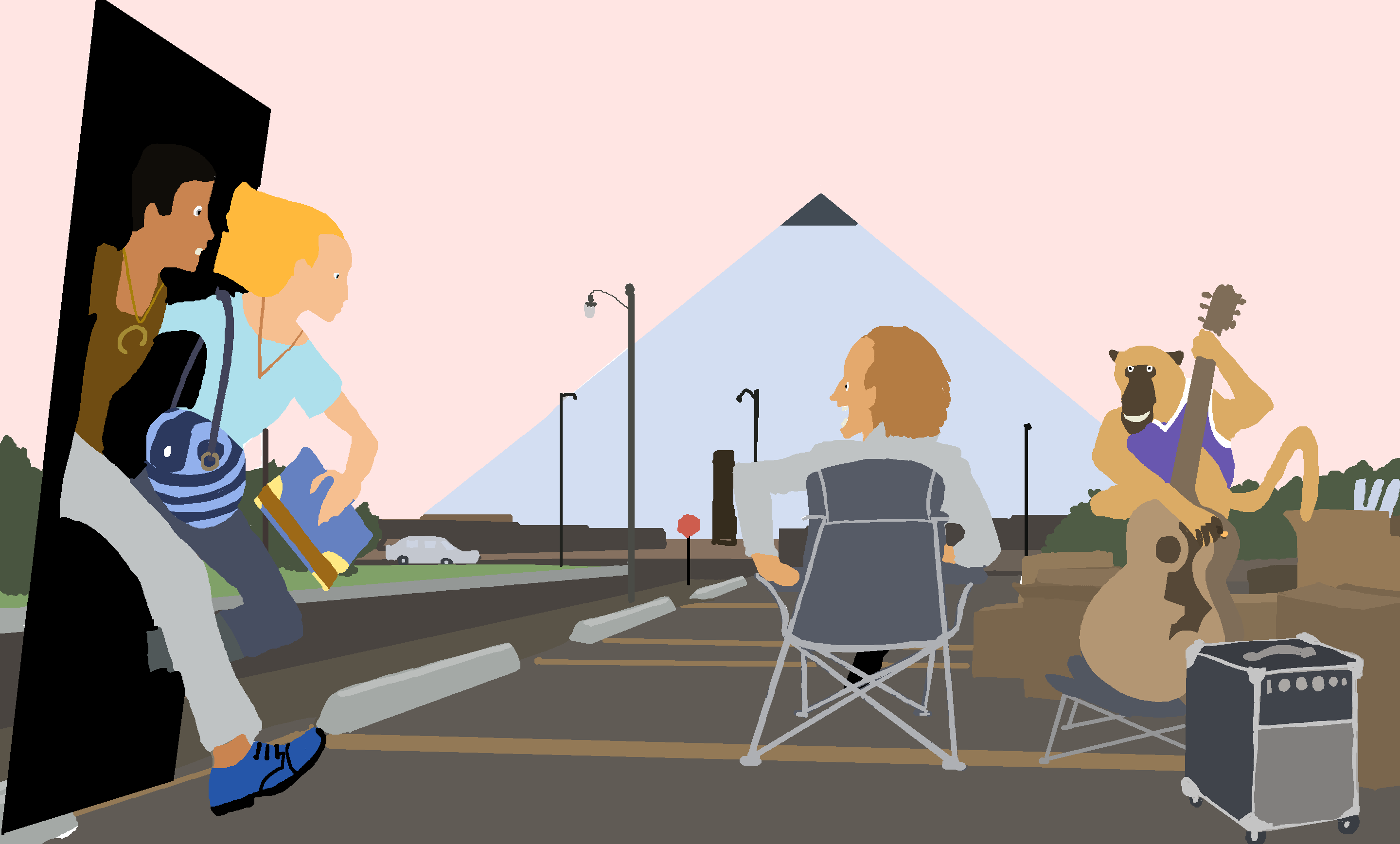
What do you like about the square page layout?
It looks good on the computer [laughs]. Honestly, I wanted the comic to take up more space. I could have gone rectangular sideways, I realize.
The format was kind of mystical for me actually.
It kind of cracked my brain for writing and layout… in a good way! I was struggling with writing a comic page in the conventional format, and the square page just liked me more. I can see pages and scenes before I draw them much more easily.
So you find the four or less panels a page more freeing than restricting?
Exactly.
I think a lot of people who come from more of a writing background would feel the opposite.
I wouldn’t doubt that. I’m not complaining, but It’s a very daunting task to write, draw and color a long form comic. It was a crucial thing for me to overcome in order to move ahead.
Oh, totally. I was just kind of musing on the differences. I feel like in the creative process artists (whether they be illustrators, writers, etc.) do best when they limit the number of things they take chances with. Like how you should only have one or two variables in a science experiment.
I think it’s different for everyone, to some extent, but I agree that limits can (not do) make better art. You can agonize over every aspect of the writing or drawing, but in the end, you need to stop and share it with the world. That’s why God created editors and deadlines.
Where are you kind of taking risks with PLOX?
I don’t have as many fears as I did when I started. The risks were numerous. Can I write, draw, and color the whole story by myself, will people like my art… or my writing for that matter!
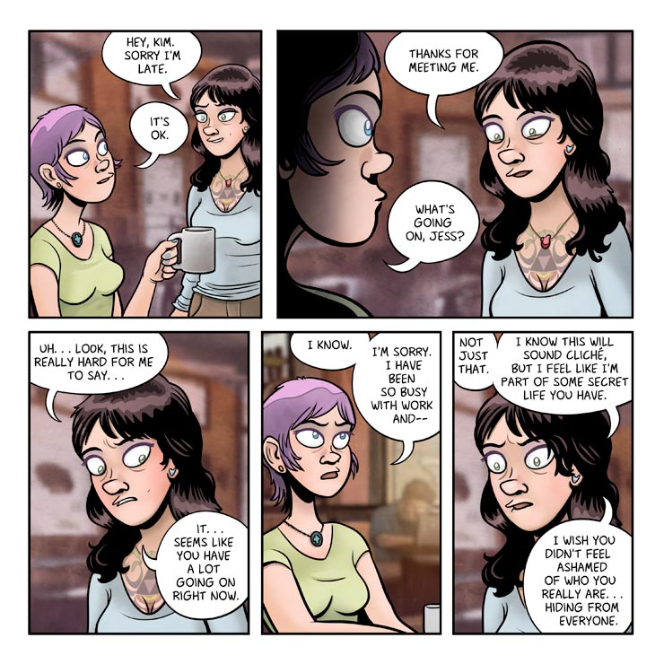
The character of Kim being gay was also scary for me. I’m not gay, so I had this huge weight over my head that was telling me to abandon it.
The more I wrote and thought about each character the less scared I was. It sounds cheesy, I know, but they really started to tell me what they needed.
I think of a setting or a story from my own life, and the characters just kind of embed themselves into it like they were always there.
I know I’m not a really great writer, but I try to be honest with the story in every way.
I disagree with that last part, but well said! Last question: what’s inspiring you? Whether it be comics, stories, life, whatever.
Well, thank you. I’m proud of the writing, don’t get me wrong. I just don’t have an inflated ego that I am doing something new or groundbreaking.
The last few years since I got married and my son was born, my real life has been the most influential. I have art and music that I enjoy, but my friends and family are the ones that really push me forward.
You can check learn more about Steve at his website, follow him on Twitter, support his Patreon campaign and read PLOX at plox-comic.com.
If you like comics, you’ve almost certainly seen Matthew Wilson’s work. Colourist for many of the most acclaimed comics of the last few years, his work has been seen on Wonder Woman, Young Avengers, Swamp Thing, Phonogram, Secret Avengers and many more comics. Colouring is getting more attention now than it has ever done before, and a large part of that is the work done by creators like Wilson. His art is expressive, intelligent, and captivating. I think Young Avengers, on a craft level, especially helped to raise the profile of colorists as part of a cohensive creative team, and there were few reviewers who dared even attempt to overlook the colouring.
With Young Avengers now ended – and his next project, The Wicked and The Divine, at Image – just announced, Matthew was kind enough to talk me through how he approaches colouring. I’m myself only just starting to really get a grip on the various tricks and performances used by colourists, so this was as enlightening for me as for anyone else. We talk about day to day life as a freelance colourist, as well as his use of palette to convey expression, movement, and story.
Steve: One of your biggest projects of the last few years has to have been Young Avengers, a series which got a lot of attention for experimentation and design. How did you come onboard the series?
Matthew: Like most things I suppose, it’s who you know. I’ve been working regularly with Jamie McKelvie for the past six or seven years, and to a lesser extent with Kieron Gillen as well. The first book I ever colored with my name in the credits was Jamie’s Suburban Glamour for Image. When Suburban Glamour was done, Jamie and Kieron asked me to color the second volume of their Image book, Phonogram.
Shortly after that, or maybe around the same time, Kieron and Jamie started doing work for Marvel and they would request me on their various projects (read: I rode their coattails into Marvel!). Fast forward a handful of very busy years doing work for Marvel and various other publishers, and the guys asked Lauren Sankovitch, the Young Avengers editor, to have me on the book as the colorist.
At this point, I had a great working relationship with Lauren, and everything fell into place for me to color Young Avengers.

From Young Avengers, with Jamie McKelvie
Steve: You had to handle a lot within the series, but one of the standouts is the use of negative space in Mother’s dimension. How did this come about? Was this your idea?
Matthew: No, the idea wasn’t mine. It was in the script. If it was my idea, it would just seem like I was being lazy!
Steve: How difficult is it to colour a comic against white backgrounds? There’s no obvious light source, so how do you arrange shadows and colours on the characters?
Matthew: It was easy, both in terms of picking the palette for the characters and the time it took to complete the pages. When picking the palette for the characters in those scenes I went with a “clean” palette. I figured the white everywhere would make for very pure, straightforward representations of everyone’s colors. While there’s nothing drawn in the backgrounds to represent a light source Jamie still inked the figures with indications of a light source so I just followed his lead.
From Young Avengers, with Jamie McKelvie
The first/best place to see this is issue 8, in the inks of Hulkling’s costume, where you can see his head casting a shadow down on to his chest. I only deviated twice, or added anything to the all white dimension palette or lighting. The first was when Prodigy and Hulkling hide from Mother in the beginning of issue 9. I decided that the floating panels they hid beneath would cast a shadow, and that the underside of the panel would be darker. The floating panels before this didn’t cast any shadows, but I thought the gray shadows made that scene feel more claustrophobic and tense than if I would have left the characters still surrounded by all white.
This also changed where the light came from on the characters. Instead of coming straight down it became more of a rim light. The second time the lighting changes in Mother’s all white dimension is in the fight scene in issue 13. Billy’s power is casting a light on everyone else, so I made the palette much more blue to show that.
Steve: Do you build a specific palette for each series you work on? If so, how do you set about with this? Are you looking for a certain sense of tone?
Matthew: It’s not often that I set a specific palette for an entire series. There are exceptions, for example my work on Swamp Thing. That book’s subject matter dictates the use of a lot of browns and greens (so. much. green…); so I have a very loose set palette on that book by default. But even with that book, I try to find places to use other colors for contrast and not make it a completely monochromatic book.
My palette changes usually happen from scene to scene across an issue or series. I look for opportunities to change palettes to quickly convey something to the reader––either a shift in location: from indoors to outdoors, or a snowy forest to a tropical jungle, or a shift in time: one scene is daytime, the next is set at night, this scene is present day and that scene is a flashback.
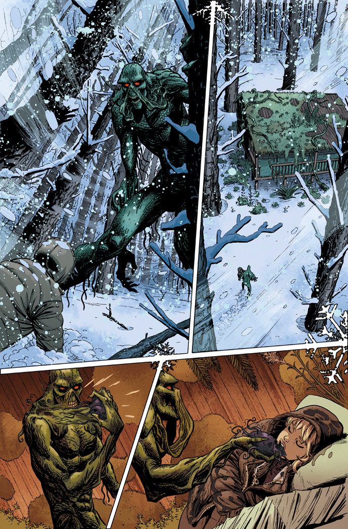
From Swamp Thing, with art by KANO
Another thing you can do with palette, that has nothing to do with time or space, is set the emotion of a scene. Angry reds, sad blues, sickly green, and a million other variations. You can take a simple scene of two people talking in a cafe and depending on the palette you choose, completely change how the scene reads. You can use soft pastels because they’re sharing a tender moment. You can use desaturated blues because one is dumping the other.
From Wonder Woman, with Cliff Chiang
When it comes to creating a palette those are the main three things I usually consider: time, location, mood. But whatever sets the palette, the result I want is that when the reader turns the page to a new scene they’re going to know at a glance that the story has moved on.
Steve: Something I feel we saw in Young Avengers, in particular, was your use of contrasts, especially in the action sequences. You choose contrasting colours to emphasise Noh-Varr, for example – he leaps out on a page, white and green, and you choose colours like orange and purple for his backgrounds. Is this an intentional device on your part?
Matthew: It is most certainly an intentional device on my part. It’s color theory, and studying it makes doing my job so much easier. Knowing how to choose colors that will do what you want them to do, to direct a reader’s eye, to frame a scene, or elicit a certain response is crucial to good coloring. Good color theory can even make up for other shortcomings, like being inexperienced at rendering (adding textures, highlights and shadows to define form).
The biggest mistake I often see in aspiring colorists’ portfolios is their focus on rendering before they have a good grasp of color theory. I went to art school and majored in “Sequential Art”, which is a fancy name for a degree in comics. (I think it’s to get parents of perspective students in the door. If you called it majoring in comic books they’d probably never let the kids anywhere near the school.) Of course, I took a color theory class as part of my foundation classes, and then as required by my major, I took a “computer coloring for comics” class.
I don’t remember the exact number of assignments, but we weren’t allowed to do anything but color completely flat for the majority of the class. The professor wanted us to be able to tell a story using only flat colors. So, without the aid of lighting or texture or gradients, you had to choose your single flat color for each background, or each face, very wisely to get the most out of your choice. I remember I practiced on a lot of Mignola Hellboy pages and studied a lot of Dave Stewart’s flat colors on that book.
Anyway, the point is that the importance of color choice was made very clear to me when I first started coloring comics on the computer. Looking back, it was important to limit myself in a program that had limitless colors and tools to distract a novice colorist.

From Young Avengers, with Jamie McKelvie. Note the clash and contrast for Noh-Varr and his backgrounds
So, to bring this back to what you actually asked… You mentioned the green on Noh-Varr’s costume, and the orange and purple for his backgrounds. Those three colors are all secondary colors on the color wheel, and are a basic color combination that work great together. There are a lot of color combinations that immediately jump out at a reader, and having more than just the most basic combinations at your disposal requires you to understand how the hue, saturation, and value of one color reacts when next to the hue, saturation, and value of another color.
Once you understand the building blocks of colors you can stop guessing at, “what color is going to work well in this background?” and have a good idea of what will get the desired results. That’s not to say that I don’t still get stumped once in a while or have happy accidents (to borrow a phrase from Bob Ross, an American painter that I watched on TV all the time as a kid).
Often, if I’m stuck on a color and I can’t find something I like, or I just want a random starting point to mix things up, I’ll take advantage of the flexible nature of my digital tools. In Photoshop you can play with sliders and all kinds of adjustments that change colors in an instant. I usually only do that for one element in a scene, like a sky, or a prominent piece of clothing, and then build off of that color.
Another specific thing you mentioned was the action scenes in Young Avengers, and the bright contrasting colors in the backgrounds. There are a couple of reasons I like to do that. It’s a great way to accentuate the dynamic silhouettes of the characters that are usually drawn in action scenes, and it helps add to the intensity of an action scene.
Steve: How do you get across movement on a comic page? How do you convey a sense of the dynamic?
Matthew: By choosing specific colors, values, or marks that guide the eye from panel to panel across the page. I suppose there are ways a colorist can add simulated movement to the characters by adding a motion blur filter, but that’s not typically called for in the kind of art I work on. So instead, I try and set a visual beat or cadence with the colors to help the eye move across the page—maybe by repeating a certain color in the backgrounds and then changing it to a contrasting color in an impact panel or escalating the intensity of a color throughout the page.
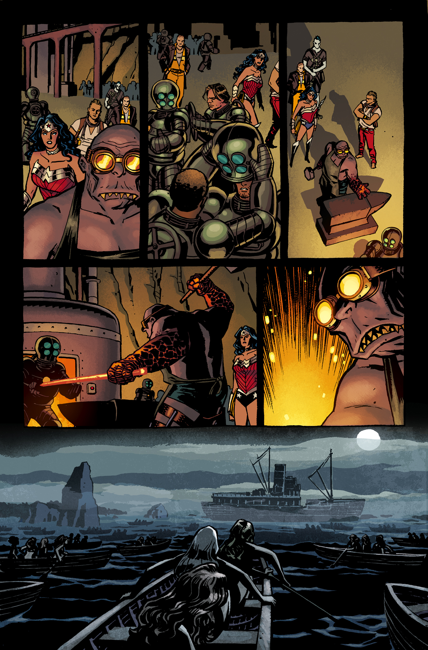
I did a fight scene in Wonder Woman where with each punch the background goes from orange to yellow until the knockout blow goes a really bright pale yellow. You really felt the building force, and then the final punch was the most visually arresting panel. Besides the colors you choose, the way that you arrange your values (lights and darks) in a panel can also lead the eye from one place to another, simulating movement.
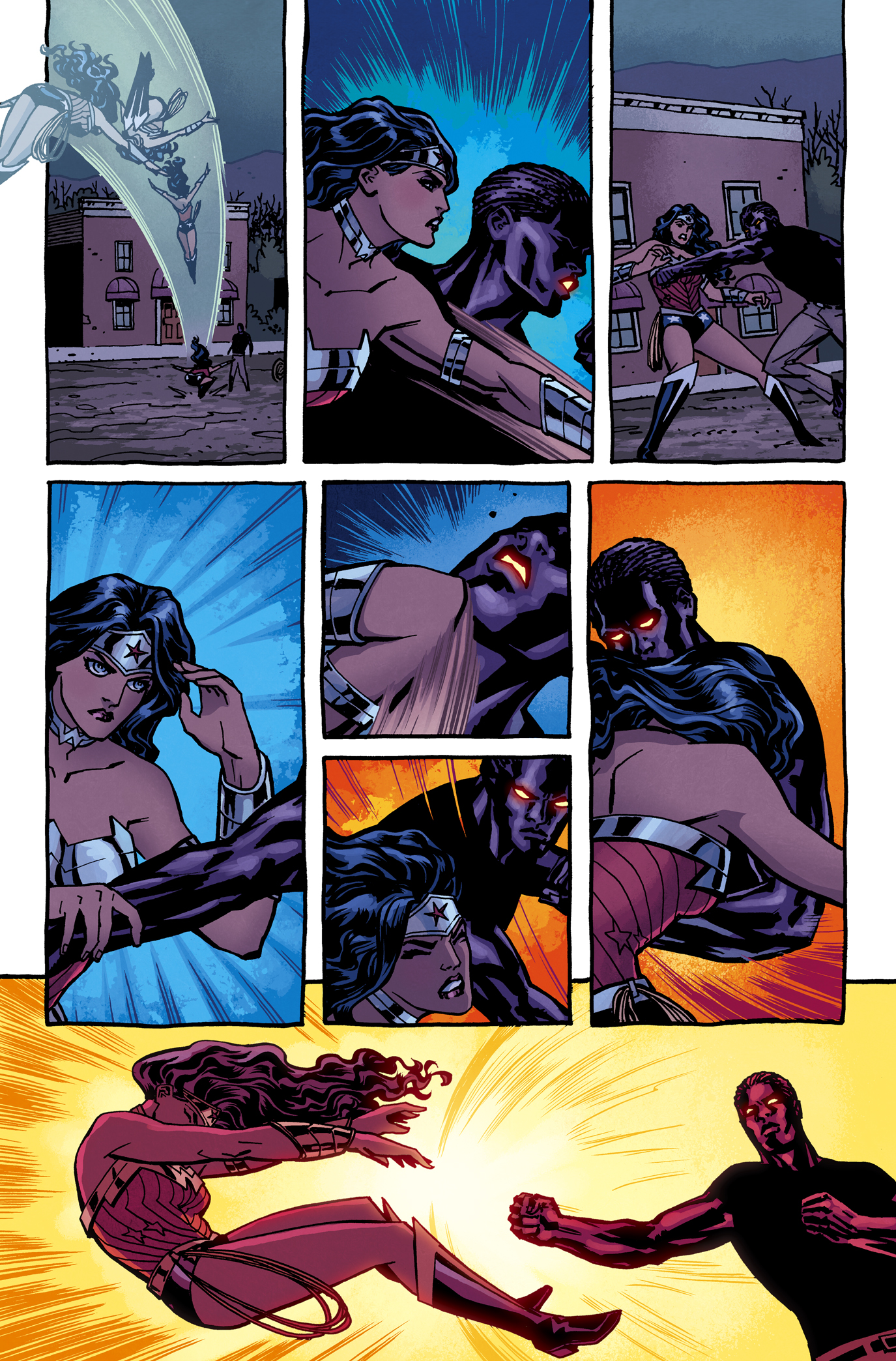
From Wonder Woman, with Cliff Chiang
Finally, if the style is accommodating, mark making is a good way for a colorist to show movement. Making marks that point where you want the eye to go, and accentuate what the artist has done, is another good tool to create movement.
Steve: How does the collaborative process between yourself and an artist work? Do you swap notes based on character, emotion, scene? (or in Jamie McKelvie’s case, fashion ideas?)
Matthew: It’s slightly different with everyone, but there are only really three variations I’ve encountered. Either the artist has notes before I color, they have them after I’ve shown them colors, or none at all. Some artists have a clear idea of what the colors, or certain aspects of the colors, should look like when they’re drawing their pages. It’s not usually very specific, like they ask for the sidewalk to be an exact color, or anything like that. But maybe they have a specific idea about the lighting or time of day when they draw it.
Other than that, it’s mostly more of a feeling or emotion they want to get from the scene. I can also get a lot of clues about the character or their emotions from the script most times. An artist will often send along photos they’ve used as reference if it’s a particular real world location, and details are important on selling that location. I like that kind of reference; it shows me colors on things I never would’ve thought of otherwise.
I remember one time I was in a subway station in Seoul, South Korea, and the ceiling was orange. I thought, “Man, I’ve got to remember that. I’d never have thought of an orange ceiling!” Or, like you mentioned, if it’s Jamie, he’ll send me the link to some article of clothing he’s referenced. That’s much appreciated, because I’m pretty terrible when it comes to picking clothes.
Jamie and Kieron have mentioned in interviews the style blog they started for their new book The Wicked and The Devine. The images on that blog are great examples of the kinds of reference I’m sent by artists or writers. Also, movies, or paintings, or posters that capture the look and feel of a scene are often discussed with the artist if they were influenced by any of those things. Cliff Chiang and I do that a lot on Wonder Woman. We talk a lot about distilling the feeling of a scene down to the colors––that way everything from the words to the drawings to the colors are working to convey the same thing to the reader.
Sometimes those notes can be as simple as, “this place is dark and foreboding, lots of heavy shadows”, and I do my version of that description. That’s usually the most fulfilling to me. It feels like a real collaboration when it’s done like that. The artist gives me their art and their thoughts, and I find one thing in their notes to spring off of, and then add my creativity on top of all of that.
From Secret Avengers, with Matteo Scalera
Steve: What do you look for when you first get a comic script? How do you prepare to colour a comic?
Matthew: The FIRST thing I do is send my pages off to an assistant that’s most commonly called a flatter. Imagine a black and white page, and then imagine tracing every shape on that page and filling it with color. There are tricks so you don’t have to literally trace everything, but still, it takes some time to do, and that’s what my flatter does. With a page flatted I can easily select the flat colors in one quick click and change them however I want.
Let me take the time to say how awesome my flatter, Dee, is. He doesn’t get credit in the books, but he makes my job so much easier. Couldn’t do it without him. Also, a bit of a side note, a lot of colorists started out as flatters for other colorists. I did, and before I could afford to pay a flatter I flatted all of my own pages, so it will benefit aspiring colorists to get good and quick at flatting.
Anyhow, back to preparing to color a comic. By the time I’ve gotten pages back from the flatter I will have read the script and any notes. I always try and read the script from beginning to end before I color. It helps to get an idea of what’s going to happen in terms of color for the entire issue. For example, say I’ve only read the first scene of the script and it’s set in a nightclub. I decide to color walls red because they look really cool that way. Then in the last scene of the script it’s revealed that there’s been a grisly murder in that nightclub and there’s blood all over the walls.
If I read the whole script I would’ve known to make the walls a different color, so that the red of the blood can be as impactful as possible. While the first scene looks great with red walls, the over all impact of the bloody final page is lessened thus hurting the story. Sure, you can go back and change the wall color, but if you read the full script you can avoid doing work twice.
Once I’ve read the script I decide how many pages I’m going to do that day and which scenes I want to work on first. I almost always work in order if I have all the pages, but if I have a handful of pages with scenes from different parts of the book I’ll pick and choose based on what looks more fun or interesting for that day. I also try and color an entire scene at one time if I can. So if my goal is 6 pages for the day and there is a six-page scene, then I’ll work on that. Or do a four-page scene and a two-page scene. Whatever fits my page goal that day.
With my pages picked, I’ll set the palettes for the scenes. After I set palettes, I’ll do a pass on the backgrounds across all the pages in the scene, adding whatever rendering is appropriate for the artwork. Then I’ll begin work on the characters, doing any rendering that fits with the desired style. When the characters are colored, I will tweak the backgrounds if they need changing based on how they interact with the fully colored characters.
The next step is changing any of the inked lines to color, which is called color holds or knock outs (or probably a dozen other things depending on which colorist you ask), and any special effects if they’re required. I’ll then go back and give everything one final look to add any details or make sure I didn’t miss anything or make any mistakes.
Steve: How long does it take to typically colour a page of a comic?
Matthew: This can depend on the book, of course, but I try to spend between one and two hours coloring a page. There are some pages that take far less than an hour, and there are some pages that take closer to three hours. The sweet spot for me though, seems to be around an hour and a half per page. Having said that, I hardly ever time myself, unless I’m under a tight deadline. I mostly set daily page goals. If I’m having a normal workday, not distracted by leaving the house or something else, then I want to do no fewer than five pages in a day.
But if I’m trying to be really productive, like making sure I’ve got enough work done before I leave for a trip, then the minimum number goes up to seven pages a day. As I type these answers I just finished a five-day period where I completed fifty pages, and those days ranged from fourteen pages one day to 5 pages today.
Steve: Do you try and establish a mood in your office when working on a book? Do you play specific music, turn down the lights, or anything like that?
Matthew: I don’t have much of a routine that I have to stick to every day. I usually consume a different type of media while I work from day to day. I suppose if you looked at my habits over a month, and then compared that to other months then you’d probably find somewhat of a broader routine. Once I’ve read scripts, or notes, and I’m done thinking of my palettes and looking up reference, I can pretty much have any kind of media on and still work. Once I’m simply coloring, I can fully absorb a tv show or movie that I’ve never seen before, or listen to an audio book or podcast and retain all the details.
In fact, it’s funny, I can look at a lot of old work and remember what I was listening to or watching when I colored a particular page or scene or issue. I’m also not a big ritual or mood person either, I don’t have to have a morning cup of coffee before I can work, or tea when it’s cold, or anything like that. The only thing that I do to my office regularly before I work is a seasonal thing, and that’s shut the blinds in the summer because of the added heat and then the sunset shines on my monitor.
Oh, and one other regular practice just came to mind. If I’m working really late and need some music to keep me coloring at a quick pace I almost always play The Talking Heads, specifically their live album The Name of This Band is Talking Heads. Something about that album just keeps my fingers flying over my Cintiq and keyboard.

Cover for Snarked, with Roger Langridge
Steve: Once you finish a page, do you send it across to the writer, artist, or editor for notes? Is it common to be asked for a redraft, so to speak?
Matthew: Yes, I send it to the whole team if I know their email addresses. The writer, artist, inker if there is one, letterer, editor, and in some cases like Wonder Woman where we have a regular fill-in artist, Goran Sudzuka, I send it to him as well. On Young Avengers #14 and #15 everyone that worked on those issues was in one big email thread and we were all sending stuff back and forth.
I even gathered a bunch of jpegs of my colors for reference on character colors and my thought processes when coloring the Young Avengers for the other colorists working on the book (Maris Wicks, Jordie Bellaire, and Lee Loughridge). But yeah, there’s always a bunch of commenting after colors are turned in. Of course I love it when the response is, “Brilliant, no notes! Upload the files!” But there’s usually at least a few notes, which is to be expected. They range from small things that I missed completely, or I colored something the wrong color, to larger things like someone not really liking something more fundamental like a palette choice or rendering.
Then there’s sometimes changes that are strictly editorial like, “Whoa, that blood is way too much now that you’ve colored it all bright red! Can we tone it down?” Or, “I didn’t notice there was that much butt crack showing in the inks. The artist will have to draw a fix for that.” In that case, I patch in the new line art and recolor whatever needs to be colored. Basically, notes and fixing some artwork mistakes or recoloring to a certain extent is just part of the job.
I’ve hardly ever run in to anyone that’s taken advantage of that arrangement and had me recolor things completely, or recolor things an unreasonable amount of times.
Steve: What do you think marks out a standout colourist? What should a colourist look to bring to any comic they work on?
Matthew: This is an easy one, as the same answer works for both questions. A colorist should contribute to the storytelling, and help enhance the line art. If the colors aren’t helping tell the story then those colors shouldn’t be there. They become pointless in this storytelling medium. I’m a fan of a lot of different styles of coloring, and the one constant that makes for “good” coloring across very different styles is using color to enhance the storytelling.
If all the colorist does is focus on how well they can render a metal armor bikini in every page, and ignores changing the color palette to suit the changing time or environment, then they’ve failed at coloring a comic. If a colorist uses flat colors but the colors they choose don’t enhance the mood of the story, then they’ve failed at coloring a comic.
Steve: What is it like to be working freelance as a colourist at present?
Matthew: For me personally, it’s great. I stay as busy as I want to be, and with projects that I enjoy. I’m lucky enough to make a living coloring comics, and it’s a wonderful way to pay the bills. That said, it is still very much a job, and like all jobs there are pros and cons, and it has good days and bad days. There’s stress to meet deadlines, there’s stress to meet expectations.
And this is where my answer starts to get dangerously close to sounding like complaining. But I want to make it very clear, that even though I can list cons about coloring comics as a job, I know that I am one of the luckiest people on the planet and that these minor complaints are pretty meaningless when weighed against the pros. So, on to pseudo complaining! Yes, I’m my own boss, and I set my own hours. I work thirty feet from my bedroom, I don’t have to wear pants! A pro for me, a con to some, probably.
But, sometimes those hours I get to set are 12-16 hours a day for 10 days in a row. And because my office (that I spend a lot of time in) is in my house, I miss a lot of opportunities to interact with people on a day to day basis. At one point I had terrible posture and horrible neck pains, we’re not meant to be hunched over a desk all day (got that sorted, no longer a problem). Sometimes I find myself half-jokingly wishing for a Monday-Friday, nine-to-five job so I could guarantee my evenings and weekends are free (grass is always greener, right?).
But to be honest, when I started to answer this question, the first and only lines that came out right away were those first two sentences. Which are both positive! I had to stop and think about the cons, they didn’t instinctually come out. But I want to list the bad with the good in case an aspiring colorist, or freelancer of any kind, is reading. They should know a freelance job has downsides like anything else.
From Moon Knight, with Alex Maleev
When discussing this subject I usually find myself summing it up with something that I remember my very southern grandfather always saying, “It’s better than diggin’ ditches.” Yep, grandpa, it sure is.
Steve: How do you keep yourself busy with new projects?
Matthew: Normal for me for the last two years or so, has been that I’ve been on mostly the same books and haven’t needed to find much new work. Before that I’d be on a book for about 6 issues and then it would end, or the art team would change and I’d move around to different books quite often. When that happened the editor on the book that I was leaving would offer another book to replace it. Or, an editor would write and ask about something that they’ve got coming up in a month or two, and that would coincide with one of my books ending.
In some cases, at some publishers, there are people that have the job to coordinate talent, and move them to a new project as their old one ended. So, once I got firmly established at various publishers, that’s how I stayed busy. It is important to maintain relationships with editors, artists, and writers that you work with, or have worked with, even if you aren’t working with them at the moment. I’ll make sure to email them or chat them up on Twitter from time to time.
I know a lot of professionals that are very good at maintaining an active online presence, and I’m certain that helps them stay busy. I mean, if you can stay in the front of people’s minds, they’ll be likely to email or write when they need a colorist (or whatever job you do). I’m not that great at it, to be honest. I can disappear from twitter for weeks at a time, and I quit Facebook ages ago (it’s a black hole where I lost hours and hours of my life). I think the biggest thing that helps me stay busy is that I go to around four conventions a year to get face time with artists, writers, and editors. Bonus, you get to see a bunch of friends, travel, and it gives me a good dose of socializing that I don’t get sitting at home alone in my office.
I’ve had a lot of conversations at conventions that I know have led to work, which then leads to more work, and it just keeps snowballing. That’s the thing, is once you’re given a shot, bust your ass and knock it out of the park. Good (and on time) work gets you more work.

With Chris Samnee
Steve: You’ve worked with certain artists quite often – Jamie McKelvie and Chris Samnee, for example. Is it common for artists to request a certain artist to follow them from project to project?
Matthew: Yes, I’d say it’s fairly common. Not being a penciler, I can’t speak for them, but I can imagine that it must be a relief to find a colorist that you can trust. That you know when you work hard on your line art and send off the page, that the colorist will enhance what you’ve done and not ruin it. I know Jamie and Chris both ask for me on projects.
I think most artists have a list of a couple of colorists that they like to work with, in case one is too busy. Editors seem more than happy to take suggestions. Why wouldn’t an editor want a happy creative team, as long as they’re going to get the work in on time, right?
Steve: How do you feel the comics industry treats colourists, currently? Do you think more attention should be paid, or that there is a feeling that colourists are starting to be more recognised with each year?
Matthew: If I had to rate the industry currently as a whole, including creators, publishers, fans, convention organizers, journalists, everyone, and I used a one to ten scale, one being very unsatisfied and ten being very satisfied. I’d say a six. I think some individuals would earn tens and some individuals would earn ones or twos. And out of all the groups I listed, creators would probably score the most tens.
There’s a discussion I have had with other colorists, or artists, that I’ll reference parts of here, and who knows how it will come off when typed. I might seem like an asshole that thinks too highly of what I do, but come talk to me in person sometime and you’ll see that’s not the case. This next sentence could rub some the wrong way when just read on it’s own, so read on before judging it… If you look at the amount of a comic page that a reader sees, the largest percentage of it is covered by colors most of the time.
I’m not suggesting that colorists are more important than the artist or writer, but that we aren’t given enough credit considering that we play a big part in determining the look of the final product. To me, at certain publishers, it feels like we’re seen as being more of the back end, readying for print/production side of the process, rather than being on the art side of the process. Which of course is mind boggling to me.
I’ve seen some people argue online that colorists’ contributions aren’t that important because a book has changed the colorist and it didn’t see the sales move one way or the other. But I’d argue that’s because the publishers haven’t done enough to promote colorists as artists or part of the art team, which would increase name recognition amongst the fan base.

From Uncanny X-Force, with Esad Ribic
I’ve heard comments from people saying that they buy books specifically for the colorist, so I know there’s a capacity for recognizing colorists in the fan base. It’s just a very small minority of people that care at the moment.
So, what could publishers do better? They could start with, when referring to the art of a colored comic book, acknowledging that the art is the work of the artist AND the colorist. That should translate to the colorist getting credited anywhere the artist does, like on the cover or spine of the book (DC, give colorists cover credit already. Sheesh.) or any promotional poster, or preview images. Obviously there are times where the colorist isn’t hired when some crediting is done, and then the absence is understandable (example, books are often solicited before a colorist is hired).
Internally, when dealing with colorists, there are some publishers that are better than others at treating colorists like artists, and the color friendly publishers will pay colorists incentive payments based on sales or even offer exclusive contracts. Of course, there are plenty of individuals at every publisher that recognize colorists as artists. However none of that translates into a consistent promotion of colorists as part of a comic’s art team. Even at the most colorist friendly publisher it’s pretty hit or miss to see a colorist promoted along side the writer and artist.
That said, I do think it’s very slowly getting better, and colorists will continue to gain name recognition. While I still see reviews of comic books that mention how bright and bold and colorful the art is, but only mention the penciler/inker, that’s becoming more rare. It seems more common for colorists to at least get mentioned in reviews. Each year over the past four or five, I’ve personally seen more people search me out specifically to sign books when I sit at a table at a convention. So yes, I think some fans are catching on, and more people that cover the industry are making a point to single out colorists when reviewing comic art. I’m sure more people are bound to become more aware of colorists as time goes on.
*Note! I answered most of these questions, then had to pause while I moved houses, and then I finished the interview about two weeks later. In that time Colorist Appreciation Day happened for the second year in a row on Twitter. The response that I saw was fantastic. Clearly people are catching on to what colorists contribute to the comics industry.*
Steve: Is there a sense of community specifically between colourists? I know Jordie Bellaire has spoken often of you as being a mentor to her.
Matthew: Yes, I think there is. There certainly isn’t some strict wall around it, keeping us closed off from the rest of the comics professional community when we all hang out. But when I’ve been around a bunch of other colorists, we definitely have our own specific jokes and gripes we can all share. I mean, those damn artists, and snooty writers. Am I right?
Actually, now that I think about it, if I’m talking with another colorist at a convention, and a mutual artist or writer friend sees us, it never fails that they’ll make a joke about two colorists standing too closely together—usually something about rainbows exploding everywhere. So, everyone else must assume we have our own special club. Like I mentioned earlier, a lot of colorists started off working for other colorists. Or, some colorists just give pointers and help to once aspiring colorists that are now working colorists.
It’s probably the same amongst artists, or writers, I’m sure. Personally, there were a few people that really helped me out when I was starting; seemingly for no reason other than they were cool, and liked my work. I always wanted to do the same when I got the opportunity. I’ve been able to do that, and it feels good when you see someone you helped go on to succeed. I think those kinds of things help build that sense of community.
Teaser for The Wicked and The Divine, with Jamie McKelvie
Steve: What other comics do you have coming up this year? What else should we keep an eye out for?
Matthew: I’m still coloring Wonder Woman this year. That’s been a dream job for almost three years. Everyone on that book just clicks so well. I’m also coloring Swamp Thing at DC, which I am loving. I feel like Charles Soule’s run has been something special, and just keeps getting better. I’ve also worked with some great artists that I wasn’t aware of prior to Swamp Thing, so that’s been great. I’ve been on Secret Avengers at Marvel for quite a while now, and I’m going to continue on it when it relaunches with Ales Kot and Michael Walsh. I’ve never worked with Michael before, and I just saw the first issue’s inks and they’re great. We’ve been messing with a test page to see what we want to do with the colors. So, I’m excited about that.
I’m coloring a Terminator book over at Dark Horse. Terminator the Final Battle with J. Michael Straczynski and Pete Woods. I was born in ’81, so I grew up with Terminator as a major influence. In fact, after the sequel came out I took my plastic toy shotgun and cut the barrel off, then rode around on my bicycle and pretended like I was Arnold on the motorcycle shooting the locks off of gates and riding through those drainage canals. Needless to say, I was pretty pumped about working on something Terminator related. Also, Pete and I have tried to work together several times over the past five years and nothing ever worked out. So this was perfect!
I’m also working on Kieron Gillen and Jamie McKelvie’s new Image series, The Wicked and The Divine. We’ve done some covers and a few pages and I think this book is going to be a lot of fun. Both to work on and to read.
With Jamie McKelvie
I’ve got a few other things that I’m not ready to mention yet, but I’ll be talking about them soon! The other thing I’m excited about is that I just moved, and my new home office is really neat. Not what you asked, but it IS coming up this year!
-
Many thanks to Matthew for his time. If you’d like to find out more, you can head over to his blog right here, or his DeviantArt page here. He’s also on Twitter here!


 A new column by Marissa Louise is the best thing I've ever read about coloring comics.


.jpg?picon=572)


It’s not just you, Heidi. I’m not really sure I can articulate it any better, but the color palette on the modeled coloring just doesn’t pop the way the original colors do. I think that the modeled coloring also changes some of the original storytelling choices, albeit in a subtle manner. For example, as I’m looking at the side-by-side you’ve posted from “The Meaning of Ragnarok,” the original colors make it pretty clear that Thor, Baldur, and… Fandrall? At any rate, the 3 figures on the left, stand apart and in front of the rest of the crowd, while the recolored version, by coloring EVERYONE, has them all sort of jumbled together. Anyway, that’s what struck me as I was looking at this. And after spending Saturday looking at so much of Jack’s original art at the CSU-Northridge exhibit, I’m struck by just how amazing his work looks in black & white…
I completely agree! What the original colorists understood was how to make things pop — to give the most important elements of the art separation in order for them to be emphasized and seen in a two-dimensional medium. You would think modeling would make objects seem more three-dimensional, but as your above illustrations have shown, it has instead reduced everything to a muddy mess.
In some cases, it’s simply understanding the composition and how best to give it clarity. For example, In the Tales of Asgard splash page, there are so many figures and so much lettering in the original art, the colorist understood that by leaving the background white, everything is easy to read. In the modern version, muddy colors on both the characters and the sky bleed together and emphasize nothing making it hard to read. *And* it makes the biggest mistake of most modern, modeled coloring like this — there is no main light source and corresponding back light.
If a colorist *is* to model the color for a greater sense of realism, then they must follow that process all the way. A light source must be decided on. In the Asgard panel it would be the cauldron, and it would hit the figures at appropriate angles for that source. (And for even more separation, edge lighting, from the sun or moon behind them would be added.) Instead, the foreground character is completely soft lit with no source, Odin is front lit and Thor and the other background characters are not lit and all (and at the same value as the sky to boot.) Even in ‘film noir’, which most people think of as being dark and shadowy, great cinematographers like James Wong Howe followed this source light/back light principle. In black and white darkness, their characters popped.
Now the bigger argument is, even if it is done correctly, should molded coloring be done at all. I think not. In the first place, the original art was designed for flat color. Black and white line drawing are not meant to be realistic, so laying realistic color on top of them creates a bizarre mash-up of two completely different styles. Back in the 50’s and 60’s, fine artists/thieves like Warhol and Litchinstein understood the graphic power of comics with line art and flat color. It’s a little amusing to think that colorists now, in an attempt to make old comics more sophisticated and arty, do so by dolling them up with fancy modeled coloring. Except that it’s usually done wrong.
A pox on this. It seems most people hate it when old work is messed with and ‘improved’ — be it colorized movies or George Lucas not being able to keep his hands off the original Star Wars. Let’s restore old comics for us and future generations in a condition as close to their original form as possible.
And give me the wonderful original coloring of the X-Men, New Gods and Thor covers any day of the week!
No offence to such talents as Steve Oliff et al, but the comics of Kirby’s era were never drawn with the expectation of finely-graduated colour or glossy paper.
(That said, I *did* enjoy the recoloured reprints of John Byrne’s original ‘Doomsday+1’ back in the day, if only because the pulpy printing of the Charlton series was woeful even by 70s standards.)
Recoloring old comics is not in itself a bad thing. It really depends on the original line art and how you redo the coloring. I agree that the modeled coloring above is pretty heinous. As Charlie Ryan says, part of that is lack of source light/back light, but part of it is also Kirby’s line art. It really does look best in black and white. Most comic art with a lot of weight to it does. The original Odin above looks like a child’s coloring book, and it’s part of why I have a hard time reading Golden Age books. But the modeled one destroys Kirby’s the pencil/ink work and I wouldn’t want to read that version either. I absolutely don’t mind if Marvel or anyone else wants to recolor old comics when reprinting them, but it needs to be done with care and attention. The first volume of recolored Gaiman’s Sandman was an improvement, but Kieth and Dringenberg are a far cry from Kirby. And I thought the giant hardcover of Simonson’s Thor looked mostly pretty good; there were some weird pages and bad choices, but mostly it made Simonson’s line pop more than before, instead of less.
I have so many thoughts on this, but the short version is:
1) I prefer having the original colors available for historical purposes, so we can see how they actually colored back then.
One of Marvel’s biggest art crimes was having the old comics recolored for the early Masterworks in flat limited-palette manner that made them appear to be the original colors, but that were actually wildly different (and much more restrained and *boring*) than the originals. Even worse, early on they actually tried passing these new colors off as vintage — remember those single issue reprints with the silver borders that included the original ads? And yet the colors were nowhere close to authentic.
2) Modeled color can work on artists like Kirby, but it takes someone who knows how to do it right. Many of the early Marvel covers were printed from airbrushed art, the trick is that the airbrush artists weren’t over-modeling.
Likewise, non-modeled isn’t necessarily superior — again, those early Masterworks that were recolored flat with a limited palette were just terrible (and unfortunately, some of those versions are still the ones on Marvel Unlimited. The FF colors are accurate, but the X-Men issues are so beyond terrible I’ve been tempted to do an article comparing different recolorings).
I consider re-color jobs to be disrespectful to the work of the original colorists. If publishers believe a “modern” (re: generally dull) color palette is what people who buy retro collections are looking for then they are mistaken.
It can also produce cut-rate work. I still remember that part of the Conan Dark Horse reprint where a river is colored green like the grassland around it so the art now shows a bridge just sitting in the middle of a field for no reason.
I’m a duffer at this illustration business, but I know that if I’m going to create inked art to be printed in black and white, I’m not going to do it the same as if I know it’s going to be flat-colored, and I’d do it still differently if I knew it was going to be colored-and-modeled. And I think it goes without saying that Kirby (and his cohort) understood this even better than I do. It’s like colorizing a black-and-white movie or 3D-izing a 2D movie: it might look more modern or exciting … but that means you’re changing it into something the original creator didn’t intend and didn’t envision.
Kate, I’d concur that the early Marvel Masterworks were garishly colored, but I wasn’t aware early Marvel covers were “printed from airbrushed art” (and by “early”, I’m assuming you mean the dawn of Marvel in the early 1960’s.) I always though they were colored with Doc Martin watercolors on production stats and the finished product was only used as a guide for mechanical separations.
The only experimenting with tonal work on covers that I know of was what DC’s Jack Adler did in the late 50’s and early 60’s with his tone wash covers. In those instances, the black and white artwork was shaded with ink wash (diluted indian ink) which was then combined with the standard color separations of the day. In other words, a tonal black and white base was overlaid with flat color. This achieved a much more modeled effect than the usual coloring on covers. It was also a bit muddy looking, but interesting and sometimes beautiful in its own way. Most important, the coloring was intended to be like that from the start of the process.
The problem is that the new coloring isn’t trying as hard as Kirby was to be striking and surreal, but rather to do a serviceable job, adding a grounded sense of realism that does not belong. I would enjoy seeing Kirby’s stuff colored in the manner of JH Williams III Kirby Tribute pages from Seven Soldiers number 1. That stuff was insane. Kirby’s own painted work is similar. Kirby’s art should look like it’s on acid, not like the color grade from a modern motion picture.
I liked quite a lot of the recolored Tales of Asgard Kirby stories, although I wished the browns were toned down a little.
I think the issue lies with who is doing the re/coloring. Coloring is truly an art form in to itself and I think it needs someone with a real affinity for Jack’s artwork as well as being a great colorist themselves.
Putting aside my own instincts to stay as true to Kirby’s own color choices, recoloring his, as well as other artists such as Steve Ditko, John Buscema, Jim Steranko, John Romita, and George Tuska would give fresh commercial life to Marvel’s back catalog. As long as they don’t overcharge for the material.