What is JacketFlap

  • JacketFlap connects you to the work of more than 200,000 authors, illustrators, publishers and other creators of books for Children and Young Adults. The site is updated daily with information about every book, author, illustrator, and publisher in the children's / young adult book industry. Members include published authors and illustrators, librarians, agents, editors, publicists, booksellers, publishers and fans.
    Join now (it's free).

Sort Blog Posts

Sort Posts by:

  • in
    from   

Suggest a Blog

Enter a Blog's Feed URL below and click Submit:

Most Commented Posts

In the past 7 days

Recent Posts

(tagged with 'feature interview')

Recent Comments

Recently Viewed

JacketFlap Sponsors

Spread the word about books.
Put this Widget on your blog!
  • Powered by JacketFlap.com

Are you a book Publisher?
Learn about Widgets now!

Advertise on JacketFlap

MyJacketFlap Blogs

  • Login or Register for free to create your own customized page of blog posts from your favorite blogs. You can also add blogs by clicking the "Add to MyJacketFlap" links next to the blog name in each post.

Blog Posts by Tag

In the past 7 days

Blog Posts by Date

Click days in this calendar to see posts by day or month
new posts in all blogs
Viewing: Blog Posts Tagged with: feature interview, Most Recent at Top [Help]
Results 1 - 13 of 13
1. Karien’s Creative Cache

We first interviewed children’s illustrator Karien Naude of South Africa back in May 2009. Back then she was basically just starting, completely self-taught as an artist, working as a paralegal at a law firm in downtown Johannesburg.

By Karien Naude

Art by Karien Naude

She was among the first batch of students to sign up for the Make Your Splashes Make Your Marks online course on illustrating children’s books.  Somehow we were friends from the start —  because Karien is, well, that sort of a person.  Even my mother wants to adopt her.  (Unofficially she has, with Karien’s bemused consent — though I should say Karien has loving parents and family in South Africa.) She’s very much a citizen of the world, with a network of artist friends that extends to the Austin, Texas SCBWI illustrators’ community, to New York,  the UK and New Zealand to mention just a few places.

Karien's telling of a Sherlock Holmes tale

A lot has happened since 2009. She’s gone full time as a free-lancer, for one thing. Along the way she’s learned, taught herself, tons about the craft and business of illustration.  So it really is time for another visit.

She agreed two years ago to serve as a bit of a guinea pig for the ongoing experiment of my online course and so she’s actually been ready for us to check in with her.

She’s a huge Tolkien and Terry Pratchett fan.  She’s been on safaris. She loves to cook and loves music so much so that you’ll rarely catch her drawing or painting without her earphones on

2 Comments on Karien’s Creative Cache, last added: 10/6/2011
Display Comments Add a Comment
2. “Little toddler feet and hands all over my wall…”

Children’s book illustrator Patrice Barton begins a picture book with a spiral ruled notebook that she soon fills with ideas, tactics and to-do checklists related to the project.

It’s almost as if the words come first. The drawings, which for her are a series of tireless explorations only a tiny fraction of which make it to the book, spring forth after she’s worked out the notions, notations and marching orders for herself.

In the previous post she told how she assembled her scraps of sketches on tracing paper to develop finals for Sweet Moon Baby by Karen Henry Clark (Knopf Books for Young Readers.) This time she reveals the earliest stages of her artwork for the picture book Mine! by well-known children’s author Shutta Crum.

Released in June, Mine! is Patty’s second book for Knopf.

At the end of our video interview minutes before class time at the Art School of the Austin Museum of Art Patty walked through the F&G’s for her third Knopf title, Rosie Sprout’s Time to Shine by Knopf editor Allison Wortche — due for publication in December. Here are sophisticated first graders, not babies or toddlers. With their glances, gestures and placements on the pages, Patty orchestrates a very funny elementary school drama of evil plans, remorse and redemption.

Watching her interpret Wortche’s scenes as text gives us insight into how she thinks about her characters and re-constructs a story in its most telling images.

SCBWI happenings for your calendar

Southern Breeze Illustrators Day poster

Southern Breeze Society of Children’s BookWriters and Illustrators Illustrators Day   – Friday, September 2 on the lower floor of the DeKalb County Public Library, 1 Comments on “Little toddler feet and hands all over my wall…”, last added: 8/29/2011

Display Comments Add a Comment
3. When kids’ book illustrators go wild…

Children’s book author-illustrator Jeff Crosby says he came up with the idea for his funny new picture book, Wiener Wolf  (Hyperion) while he was in the shower one day.

For a long while after that he asked his wife author-illustrator Shelley Ann Jackson if she would write the story for him so he could paint it.

Shelley suggested that he try his own hand at putting just the right words together in just the right order to tell his story.

Then he’d be that appealing combination (for some children’s book editors) — an author-illustrator.

Jeff’s response was to put together a little pencil sketch dummy that told the story without any words at all. But later his and Shelley’s agent urged him to add at least a few words to his pictures — to appease that segment of the market that believes that picture books are meant to be read.

The result is Wiener Wolf  about a dachshund who hears the call of the wild and decides that he’ll leave home with granny to run with the wolves.

The release party for the book is Saturday, July 2nd at BookPeople, 11:30 a.m.  (Yes, there is a dog costume contest, but check the store for details.)

For anyone in the Central Texas area Jeff will teach a University of Texas informal class on illustrating children’s books starting Tuesday, June 28 at 6 p.m.

The above video is from a 90 minute interview I did with Jeff and Shelley for students of my online course on children’s book illustration Make Your Splashes-Make Your Marks.

You can see a little more from that interview here.   

And  you can see how their four year old daughter Harper responds to her daddy’s picture book below.

* * * * *
Mark Mitchell hosts this blog and conducts an ongoing online course Make Your Splashes – Make Your Marks! that teaches how to draw and paint illustrations for books and other media for children.


1 Comments on When kids’ book illustrators go wild…, last added: 6/21/2011
Display Comments Add a Comment
4. Book producer Margie Blumberg adds something new to the tried and true

Children’s book illustrators would do well to make note of the pathfinders as the tectonic plates of publishing, communication and commerce are shifting under our feet — as we speak.

Content providers are rushing to the market, knowing that this day and age are like the Oklahoma Land Rush. In a matter of months, the virtual “land grab” will be over — the first round of it anyway.  The dust will have settled and the publishing landscape will be changed. Those trade books with a foothold in the new media will have an edge.

One of these pathfinders is Washington D.C.  author, publisher and patent holder Margie Blumberg who is making her children’s books available as not only hardcovers but as iTune downloads for iPhones and iPads. Two of her picture books Breezy Bunnies and Sunny Bunnies featuring the art of English illustrator June Goulding

She blogs about grammar and has an e-book available for all ages on the subject, and she’s exploring other formats as well for all her books.

Margie Blumberg, Publisher

Margie knew she wanted to write at an early age. But like many writers, she took a detour on the way to her goal (in her case, law school and legal internships at the Food and Drug Administration and the Center for Science in the Public Interest.)

Undeterred in her heart’s goal, she self- published what she describes as an “autobiographical recipe calendar.” It featured delightful comic strip illustrations by illustrator John Thompson chronicling the  trauma Margie says she faced as a young adult when her doctors ruled out chocolate for her for the rest of her life. !

So she was already thinking outside the box, or “the book” embedding her personal yarn 9and favorite dessert recipes (sans chocolate)  in a desktop calendar!

With co-author Colleen Aagesen, Margie went on to write Shakespeare for Kids: His Life and Times - a biography with 21 activities for kids for the Chicago Review Press’s For Kids series.

But the frosting on the cake (not chocolate, we hope) in preparing her for life as a contender in the new publishing/media was the award of a patent in 2008 for an electronic memory pad. She tells us more about that in the interview.

Margie graciously answered our questions about her books, her apps

2 Comments on Book producer Margie Blumberg adds something new to the tried and true, last added: 11/23/2010
Display Comments Add a Comment
5. “It’s like a Magic Trick…” Perusing the Pop-up Pages of Bruce Foster

The demands are the same as for writing or illustrating a book:  Something must come to life every time a reader turns a page.  Except with a pop-up book, it really has to come to life. By definition. Things move, swing and unfold — physically hopefully with some grace and more than a few surprises. Like life.

It’s done with scissors and scotch tape — and the benign wizardry that comes from years of conjuring castles and creatures and dances from paper.

Bruce Foster received clues to his career’s direction back as a painting and  graphic design major at the University of Tennessee in Knoxville –  though he didn’t know it then. What he did know is that he liked gluing objects on to his canvases — to bring textures and dimension to his art pieces. He cut holes in them for the same reason.

“I was going 3-D in a flat paint school,” he says. “My work wasn’t received very well. It was kind of bizarre.”

Years later as an art director for a Houston ad agency, he received his first pop-up assignment — a High-C fruit juice carton that would blossom out from a grocery store mailer as one opened it. It was the campaign that introduced the first kids’ juice cartons to the consuming world. “This is three dimensional-thinking,” Bruce remembers saying to himself as he worked up the ad.  “I love this.”

It led to more pop up gigs– for books, public relations and ad agencies, cards, more books, museums, a graphic novel, more books and eventually Hollywood!

Clients and creative partners have included some of the world’s major CGI animation studios, Dreamworks and Disney,  fashion designers, an international pastry chef and the national park service.  His 40 books to date are associated with such name authors and illustrators as Mo Willems,  Kate DiCamillo, Charles Schultz, Charles Dickens  and Chuck Fischer.

Sculpting Hogwarts

Pop-up illustrations for "Harry Potter - a Popup Book

The castle that Bruce built

And now J.K. Rowling.  On November 15, three days before the release of the”Harry Potter and the Deathly Hallows!” movie,  the official pop-up book celelbrating all of the movies from Warner Bros “Harry Potter” series will hit the stores where books are sold.

So be on the lookout next month for Harry Potter- A Popup Book with illustrations by Andrew Williamson, lead concept artist for all of the movies, text by Lucy Kee and paper engineering by Bruce Foster.

“It may be a cliché, but this really was a labor of love,” Bruce writes on his website. “My own daughters grew up with Harry as we spent countless nights enjoying the developing epic while I read aloud to them.”

A ‘White Dummy’

Paper engineers work with

0 Comments on “It’s like a Magic Trick…” Perusing the Pop-up Pages of Bruce Foster as of 1/1/1900
Add a Comment
6. The title is everything!

New York illustrator Lisa Falkenstern is working on illustrations for her new children’s picture book.  But she and her editor are having trouble deciding on the perfect name for it.

Lisa's baby dragon

Lisa's Baby Dragon

And so she’s asking readers of How To Be A Children’s Book Illustrator to help her out! Help her choose the best name. Because she knows that the title is the most important decision an author and or/her publisher probably will make on any given book. Titles rule.  Good titles sell the book. Blah or dumb titles seal their doom.

View This Poll
online survey

* * * * *

Lisa has staked out several firsts here.  It’s the first first picture book that she has authored.
It’s the first time that this blog has been asked for help by an artist colleague.  And it’s the first official reader poll that this blog has ever conducted.

How did the dragon story come about?

Lisa: Long story. I keep a file of images that give me ideas for illustrations. I had a photo of an antique silver eggcup that had chick feet sticking out of a realistically done egg. I liked that and when I got around to working on the idea, the chick became a dragon and lost the claws. It didn’t work. then I played around with the egg and it became an Easter egg. So now I had a portfolio piece.

At that time,  while attending a New Jersey SCBWI [Society of Children's Book Writers and Illustrators]  meeting, a friend and I were invited to join another writing group, the Hunterdon County Children’s Writers and Illustrators.  We did and it was my husband who suggested I turn that dragon painting into a story.  I did and when I showed up for a first meeting, to my everlasting shame,  I showed up with a story called The Easter Dragon. I worked on that and got a dummy ready for an SCBWI workshop. I showed it to an agent and he pointed out that it wasn’t an Easter story, it was a dragon and bunny story. I went back to work on it, took out Easter, added a hedgehog to the characters, showed it to the same agent and he wasn’t interested.

Not deterred,  I kept working on it and finally showed it to the publisher at Marshall Cavnedish at an SCBWI  conference who liked it, but had suggestions. About four revisions later, she liked it enough to buy it.

All that from a photo of an egg cup!

Rabbit and Hedgehog -- two friends

1 Comments on The title is everything!, last added: 6/2/2010
Display Comments Add a Comment
7. Should you advertise in an Illustration Directory?


For some children’s artists, this interview might be a little hard to hear and to bear.  For others it could offer new hope.

Jo Ann Miller of Serbin Communication’s Directory of Illustration suggests that illustrators and would-be illustrators think a little bit outside the book.

Jo Ann Miller of Sebin Communications' Directory of Illustration Jo Ann Miller of Sebin Communications’ Directory of Illustration greets a Transformer at this year’s San Diego Comic Con

You’ve seen artists’ directories –  the big glossy annuals where artists or their reps buy display ads.  There were more of them around in the days before the Internet.  The ones that are make sure to also provide their content online.

A couple,  Picturebook and the UK-based ChildrensIllustrators restrict their focus to children’s artists.

But the Directory of Illustration is the dreadnought battleship of illustration directories, aiming its marketing guns at not just children’s publishing but the waterfront of graphic arts. That means children’s products,  fashion and cosmetics merchandising, corporate and retail promotion, medical illustration, the animation industry  and, well, even landscape design.

With the Toy Industry Association as a partner, the Santa Barbara, Ca. based publisher also turns out Play! (“Illustration for Toys and Interactive Games — Your primary source for hiring toy and interactive game artists.” ) Serbin Communications’  other  publications include the Best of Photography Annual, the Medical Illustration Sourcebook and Designer Jewelry Showcase — to name just a few.

It’s  not cheap being in the Directory of Illustration. $2,500-$2,600 gets you a full page with 30 portfolio images. Artists  sometimes share pages with others who have the same agent or art rep, for example. Artists re-up year after year.  Program benefits include national advertising, distribution to 30,000 illustration buyers, free website design and cross promotion with Contact (described as the leading talent directory in Europe and the UK.)

If you’re like me and some other freelancers who keep a death grip on their wallets,   you question trading your hard earned cash or IRA nestegg for a paid showcase.

Why do it when you can upload  images for free to your Flickr page, WordPress.com  blog,  SCBWI portfolio,  or favorite art web ring?

Why do it when you can mail out your own Christmas postcards to the small ranks of children’s

2 Comments on Should you advertise in an Illustration Directory?, last added: 12/18/2009
Display Comments Add a Comment
8. Karien Draws Dragons In Tolkien’s Original Land


Karien's dragon

Karien Naude taught herself to draw, paint and airbrush.

Her native language is the Afrikaans of the Dutch Protestants who settled in southwestern South Africa in the 17th century.

“The wildlife and nature are breathtaking and I love to go camping and take all this splendor in,” she wrote me in an e-mail back in September.

“It’s good for the soul!  There are so many different cultures and the people are fantastic.  The only thing is we are behind in everything.  South Africa is still viewing art as a hobby. But it is changing. There are a lot of different animation programs now available. I’m part of a South African comics group Comicworx Studios, where we try to get the country involved with  comics. It’ s very hard work, but every year we can see some progress.

“We have become friends with a few Marvel (Comics) artists and that has given us a huge boost.  But my passion is still illustration.”

Fantasy artist Karien Naude of Johannesburg

Fantasy artist Karen Naude of Johannesburg

She has far too many interests to mention in this small space.  But I will  say  they include the fairies,  trolls and wizards of the novels of Terry Pratchett and J.R.R. Tolkien (who also was born in South Africa, but moved to England when he was three.)

She also reads Anne Rice and Stephen King, Dean Koontz and J.K.Rowling.

She likes  horror movies, Tim Burton movies  and Harry Potter movies.
She’s crazy about music.  Her tastes range from Counting Crows to Jimi Hendrix to the operas of Richard Wagner.

To the Screeching Weasels.

She answered an online survey question back in the fall and landed in this online course on how to illustrate a children’s book. Originally spurred by a publisher’s contest, she’s been crafting a picture book based on a Zulu folk tale about a supernatural creature, the  Tokoloshe. The Tokoloshe

She’s completed the manuscript and has revised her thumbnail storyboard.  She’s now at the stage of transferring drawings to her watercolor paper. Dismayed by the retail prices of lightboxes in the art supply stores,  she built her own.

I’ll stop here, because Karien does a great job of speaking for herself — in her second language, English.

Karien, what sort of art study have you done?

I’m a self-taught artist with God given talents, and proud of it.  Ever since I can remember I have been drawing. Since kindergarten I’ve made the cutest drawings in my school books and always gotten a golden star from the teachers and I think that was when I realized I wanted to become an artist.   When I got older I started studying every book I could find about Renaissance artists and bought every art book that showed techniques on how to draw and paint.  I started out with pencil drawings and got pretty good in it, later I started experimenting with pastels and paints. I sold a few drawings and got praised by an Art Gallery in Melville but decided that it’s not for me and that I would rather do fantasy drawings and illustration work.  I have had no formal training or studies.

Can you describe a little about your life in South Africa? Have you ever lived anywhere else?  What is school and work like there?

I have been living in South Africa all my life and have not lived anywhere else.  I am planning to visit a friend, hopefully this year, in England, but I will always return to my roots.  South Africa is a beautiful country, the land and people.  I am currently living in a middle class suburban area and the schools in my area are very respectable and up to standard.  I am currently working in the central of Johannesburg town.  I work for a big law firm and we mainly work with properties.  South Africa has 11 official languages and the most difficult system when selling and buying houses. It is stressful and hard work, and because it’s hard to speak all of the languages, we use English to communicate. So Afrikaans people talk, read and use English, although we are very proud of our language. Afrikaans music is big here and even English people listen to it.

Are there any art museums around?

Yes there are two art museums that I know of in Pretoria and Cape Town but sadly non in Johannesburg where I live.  There are however thousand of art galleries that you can visit.  The well known Goodman Gallery is also in Rosebank, Johannesburg, and sometimes a real treat to visit as they have a variety of art exhibitions.

What other  artistic and/or literary interests do you have? (I know you really keep up with all kinds of music!)

I’m very passionate about air brushing and some have even told me I am very good.  I love reading (thanks to my mom) and got my own little library of books that I’ve bought over the years, mostly fiction.

Yes,  music plays a big role in my life.  I play the piano and I’m always listening to all kind of music on my MP3. You will always find me with my earphones on, on my way to work, and I can never draw or paint without music.  It inspires me and I get most of my ideas while listening to it.

woodsinmoonlight

What has brought you to the world of children’s stories and books?

When I go out I love to stop at the nearest book shops and flipping through children books or any book about illustrations.  A few years back I started reading Terry Pratchet’s books about Discworld and always admired the art work on the book covers.  Paul Stewart and Chris Riddell books and illustration work always brings a giggle to me.  One day on my way to work I started thinking of how much I enjoyed the books and illustration work and that I can do it as well.  I started doing research on Children’s books which brought me to your course, Make Your Splashes; Make your Marks!

Your interest in fairies, trolls and elves — how far back in your life does that go? What do you think pulls you to them?

It started with The Hobbit when I was in school and later the Lord of the Rings because the elves where mystical, the hobbits lovable and wizard’s warriors.  I also love Terry Pratchett’s books where you read about trolls, witches, wizards and all kinds of fantasy beings (with a twist).  I will always have a soft spot for them.

Green Fairy What are you working on now in your illustration?

I’ve just finished my Green fairy but I want to do a humorous illustration about my children (dogs) and what they do at home when I’m at work.

How is it going, developing the Tokoloshe story? You’ve been developing your thumbnail storyboard. Have you run into any roadblocks?

The Tokoloshe is my first story that I’ve written and I guess that’s my first roadblock! But every step I take and roadblock I get I learn a lot.  The thumbnail storyboard helps a lot and after my first one (which I wasn’t happy with) I noticed that I was repeating scenes and so I’ve changed it.

I started a second storyboard but a bit bigger and it works like a dream. I can see how my book’s layout would be and if I repeat scenes or if a scene doesn’t fit.  I won’t work without it.

Are you starting to develop any of the full drawings? What difficulties are you finding in this process of working a thumbnail “scribble sketch” up to a complete detailed drawing?

I must say its hard work and long hours. Without the thumbnail and little scribble sketches it would’ve taken me a lifetime to complete but working with the thumbnail it’s much easier and faster.  I’ve noticed that my scribble sketches are really working for me and it’s basically just putting it over and improving the sketch into a detailed drawing.   But it can also bee frustrating to do the detailed drawing as they sometimes takes to long.

100_0469

Can you describe how you work? What is your creative process like?

First I must put my earphones on for some music. hehe.  I first start with the layout of the drawing in H2 pencil and it involves lot of cappuccino and erasing.  When I’m done I always ask my sister to have a look at my drawing and comment on it (she is like my personal editor) and then I start going over it with Faber Castell Ecco Pigment marker and erasing the pencil.  I will then start painting and when Im done and happy with it I will go over some lines again with the Faber Castell Ecco Pigment marker for more effect.

How did you pull off that cool cover for The Tokoloshe?

When I was writing the story I wanted to look at a picture of the tokoloshe so that it would not slip from my mind and I created the picture. After doing it I decided to make it into a cover just for the fun of it.  I was experimenting with paints and colors and I was happy at the time.  Now I see mistakes that I didn’t notice before and the Tokoloshe looks very stiff so I’m planning on giving him a make-over.

What challenges do you find  yourself repeatedly facing in your paintings or renderings?

Sometimes my pencil drawings are really good but after starting painting them they don’t turn out as what I was hoping for and they don’t look good to me.  When I render a piece I sometime mess it up and after spending so much time on the painting I spoiled everything and I have to through it away and start again which is upsetting.

FEAR_by_karien

What questions do you have about the  whole endeavor of  children’s book illustration?

When my story and illustrations are done how will I know what publisher to choose and how do I submit it?  How will I know if my work is even good enough?  If my work is submitted what is the time frame?  If it is accepted, what must I look out for in the contract (pitfalls)?BEEULAH THE WITCH

What children’s book publishing opportunities have you uncovered in South  Africa or the Afrikaans language?

I’ve read a lot of Afrikaans and English books and I’ve jotted down a few South African publishing companies.  There are some famous ones like Random House and Penguin Books, which have branches in South Africa which I’m looking at as well.

Who are your artist muses? Any favorite children’s authors?

People who inspire me are John Howe, Alan Lee, Paul Kidby, Josh Kirby, Paul Stewart, Chris Riddell, Terry Pratchet, J.K .Rowling, Tolkien and Don Seegmiller.

Karien’s art blog, which is on our blogroll , is: http://kariennaude.blogspot.com

We’ll  check in with her from time to time to see how she’s progressing on her dummy for “The Tokoloshe.”

Mark Mitchell, who interviewed Karien, hosts the “How Be a Children’s Book Illustrator” blog.

4156_88162217135_590927135_2267321_935450_n

Karien likes to listens to music while she draws.

3 Comments on Karien Draws Dragons In Tolkien’s Original Land, last added: 5/13/2009
Display Comments Add a Comment
9. Laura’s Medieval Menagerie


Laura Jennings drawing for Shard Studios

Laura Jennings drawing for Shard Studios

Laura Jennings grew up surrounded by animals in the Texas Hill Country town of Kempner.

“I trained my first dog, a Rottweiler for obedience when I was 12,” she says.

Maybe that’s why the dynamic animals she’s created for the role playing game Shard  look like people you might  know — almost  old friends you wouldn’t mind going with you on a harrowing adventure.

 Oh, humans played their parts in her youth, too, and books – fantasy novels mainly — and video games.  “I used to sit and watch my brother play Zelda and Mario for hours,” she says.

After studying fine arts at Central Texas Community College and Texas Tech University, Laurie enrolled in the design art  programming and animation sequence at Austin Community College, She has set her sites on the fields of video game art and character creation.  

Character from "Dardunah", a land where armour is made of crystal, a Shard RPG game, drawn by Laura Jennings

The Lion King changed my life.  I loved the action, the movement.   I don’t have the patience for animation, but that’s what I’m into,” she says.

“At school we’re doing the old  pegboard animation, like the crews did for Bambi , they still ask for the same kind of detail in the industry. 

“Everybody going into this wants to design, do storyboards and be a lead character artist. It’s the very first graphic the public sees.

“I do go for games, and it is pretty astonishing – the emerging media and the economic growth that’s been predicted for games and computer art in the next 50 years. 

“Austin has something like 50 studios; they’re mostly small. In this room there’s an animator and you can walk right next door and take it to the programmer.”

“Video game art is  a combination of animated movie and comic book and it’s  interactive. Some of the most gorgeous art I’ve seen has been in the animation of Nintendo and Capcom games, such as Squaresoft Final Fantasy series and Legend of Zelda.    


Dardunah" character by Laura Jennings

Laura also feels pulled by graphic novels and children’s books and attends meetings of the Austin chapter of the Society of Children’s Book Writers and Illustrators (Austin SCBWI). 

“People think children’s book illustration is easy. It’s actually cutting edge. There are similarities to game art, such as the storyboarding and the composition and how you have to know your story visually so very well. The work of James Gurney holds its metal against any fine art happening today and he (and others like him) have chosen literature, which I thank them for.”

Puffy pants" character from the Shard land, drawing by Laura Jennings

"Puffy pants" character from the Shard land, drawing by Laura Jennings

Laura “liked the idea of puffy pants” for her fantasy
character for the game Shard, designed by art director Scott Jones.

 ”I was trying to turn a lot of the animal motifs on their heads.  So I wanted to make this Aesop’s-like skunk a bit coquetish, like she’s waiting for Pepe Le Pew.”

 Shard is a table-top  role playing game “of heroic fantasy, set in the Realm of Dardunah, World of the False Dawn,”
the website says.   “Players may choose from a wide variety of animal  people who are the main cast of the many adventures the world offers.” 

Dardunah is a medieval Shangrila, far east of Middle Earth. (I spent some time poking around the site. I must say I’m ready for the movie to come out.) 

Laura recalls, “I don’t know what it was that got their attention, but they saw some of my art and told me, ‘We see that you’ve done a bunch of animal creatures.’”

“Actually there were  three of us working on the game’s characters. We had to make it look like all of the illustration was done by one person. We each worked in our own category – I didn’t want  the insects, snakes and reptiles so I raised my hand and said, ‘I’ll take the mammals!’ “

One of the animal people drawn by Laura Jennings for the RPG "Shard

One of the animal people drawn by Laura Jennings for the RPG "Shard"

 She had to research animals in their natural settings, and come up with props, costumery and accessories that  ”fit” into this world with its Persian and Asian flavors, she says. 

“I had to find out what old armour looks like, leggings and foorwear, what kind of robes students of a temple would have worn.” 

Shore dweller of "Dardunah" by Laura Jennings

For the fellow in the game at the right, a seashore dweller, she found photo reference of an otter, stopping by a river, panting.

Pencil drawings were scanned and values were added in Photoshop using the smudge tool and the dodge and burn tool.

“I had a lot of fun with the textures in Photoshop, learning to push things around.

“I was asked to  re-do a squirrel monster because the armor looked too much like beat-up metal. Metal is a material of our world  – whereas in Dardunah, the armor is made of crystal.

 ”The  foundation was in natural media,” she says. “But there was a little bit of cleanup in Corel Painter 9, which replicates whatever natural medium you’re using — in this case it was pencil. The art  was finished and polished in Corel Painter 9.

 ”There’s a lot of movement and dynamic in my own work,” Laura says.

“I’ve been very gestural for a long time. I’m only just now starting to work on the edges, the contour.

“My sketches are half reference — half imagination. Many of them are just from little thumbnail sketches. As I look at these  I’m seeking that pose that speaks about inner character. I’m asking, ‘What has punch. What is moving, or defining,” Laura says.

“In video games, the silhouette is so important. Their silhouettes define who they are in the game.”

Wolverine warrior by Laura Jennings,from the role playing card game

Ursine warrior realized by Laura Jennings. He's a character from the role playing card game, Shard.

Laura Jennings’ fun blog  is now on our blogroll.  You’ll find her art there, too and on her Deviant Art gallery page, where she’s posted some graphic novel panels, backgrounds and more of her exquisite characters.  Deviant Art features concept art by teen and young adult artists from around the world.

                                                           * * * * *
Mark Mitchell hosts How To Be A Children’s Book Illustrator. 
Check out the free lessons of his short course, Power Color: The Keys to Color Mastery  here.  

1 Comments on Laura’s Medieval Menagerie, last added: 4/6/2009
Display Comments Add a Comment
10. Nacho Average Pup


Video by Sean Cunningham for the KLRU Public Television series Docubloggers

nacho-cover
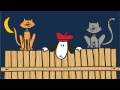
“We’ll chase the cats.

” ‘N watch the bats.

“Do yoga on mats.

“Eat pizza till the sun comes up…”

I had to quote from the Ray Benson song My Name is Nacho because it’s so singable (and so Austin  — especially the watch the bats and do yoga on mats part… Well, the eat pizza till the sun comes up part, too — it’s a college town, after all.)

Emma Virjan, the author-illustrator of Nacho the Party Pup  is a hit with the baby board book set ,as well as with any of us who know her. 
She hangs out with our Austin chapter of the Society of Children’s Book Writers and Illustrators (SCBWI) – when she’s not behind her drawing board meeting deadlines.  As she explains in the video, she has her own design agency.

Emma had been dreaming and doodling around with her Nacho puppy character since 1995, telling herself stories about him, putting him on greeting cards, making piles of drawings of him having adventures in various settings.  Back in the fall, Random House Children’s Book Division published the first book version.

nacho-back-cover1

It’s a board book that sparkles not only with real sparkles on the cover, but with a sly, creative humor that would tickle most party animals of any age.  It also  features bright colors and flaps that you can open to check out what’s behind them. 

Random House will bring out  ”volume #2″,  Nacho the Downward Dog  (in which Nacho learns yoga –what else?) next fall.

Since the release of Nacho the Party Puppy, Emma has been delighting young and old audiences at schools and bookstores, as you can see from the video.

I had the privilege of seeing her interact with the kids at Bookpeople (actually the same signing event  in this video.) I can tell you  it was quite a party. Three year olds were dancing in the aisles. The rest of us were wearing little white party hats that Nacho had cut out  for us the night before.

On Nacho’s website you can hear his song sung by Asleep at the Wheel’s Ray Benson ( a  fan).  You can also see some fun animations them and read Nacho’s interview with Emma. Truly you don’t want to miss getting on Nacho’s  birthday mailing list, so let me give you the URL, too,  for your address records:  www.nachothedog.com 

Fun as it was, Nacho’s  interview with Emma didn’t answer quite all of my technical process and philosphical questions, so I conducted my own with her. (Nacho didn’t mind. He gave me a paw high five and said, ‘Go for it!” )  

ejvirjansm2

 Okay,  so here here we go:

One would expect a dog named Nacho to be a Chihuahua and yet…he is a beagle. A bit like Snoopy in “Peanuts”  – but a more of a frat boy. He’s in the middle of the action.

He does have beagle features, but you know, I don’t really think of him as one. He’s more of a mixed breed. I didn’t start out to draw any one particular kind of dog. He just sort of appeared on the page the way he is and I stuck with it.

Did you have a Nacho puppy in your life at one time?   You”ve always loved dogs — but does Nacho represent all dogs to you ( if you were forced to typecast?)
 
I am definitely a dog person and have always been drawing dogs. All the dogs I’ve lived with with — Nippy (né Napolean). Toby ( né Tobias), Yum-yum ( was 7 when I named him) Charlie, aka Carliotos, Maddie — all had a hand in helping Nacho come to be.

I think he’s always been there, it just took time to get him into his current manifestation.

 In 1995, I was taking creative writing classes at Parsons. I lived in Connecticut, so getting to NY was easy. I was taking a writing class that was designed specifically for visual artists and designers.

Nacho was born in that class. But he wasn’t part of an assignment. We weren’t asked to create a character for a children’s book.

The class was filled with so many creative individuals, especially Esther Cohen,( http://www.esthercohen.com ) the writer who taught the class, that I was inspired to try all sorts of new things. Nacho magically appeared as a natural by product to the class.

If you had to describe Nacho in words on the back of your business card, could you do it? What would you (or he) say?

  Nacho is a fun-loving, hat-wearing pooch, enjoying adventures and spreading laughter wherever he goes. At least that’s what I want him to portray. Hopefully that comes across in the drawings and stories. page-04-bath-copy

 Does Nacho really eat cheese?

 He loves all types except Lindberger. Too stinky. He enjoys cheddar cheese on crackers and feta cheese with olives. He thinks Gruyere makes the best grilled cheese. He sometimes makes his own mozzarella and eats it with tomatoes and basil.

 You told me quite a story one time last year about how you got your foot in the Random House door with this book.  Didn’t it actually involve making an in-person pitch to an editor (or was it several people?) at the N.Y. offices? A pitch session for a baby board bookThat was an amazing story to me — and I’ll always admire your nerves of steel.

It all goes back to Esther Cohen, mentioned earlier. She was over the top about Nacho and so she was one of the recipients of the Nacho greeting cards.

Somewhere at the beginning of 2005, I think it was, she said that he looked fresher and better than he ever looked and that I should show him to Edite Kroll, the woman who is now my agent. I didn’t have full manuscripts though, just drawings. Esther said to show them to Edite just the same.

Edite helped me narrow down what I had into manuscripts with drawings. I put together a package for her and she sent it off to Kate Klimo (also mentioned above) for her review.

It just so happened that in May of 2005, shortly after I had sent the comps, I was in NY. Edite asked me if I wanted to meet with Kate while I was there and I said yes, of course. That’s the right answer.

Edite teed up the meeting as a “go and pitch Nacho in general” meeting. I wasn’t pitching one book over the other. I thought I was going in to do just that, pitch Nacho a little more, which I did.

Kate had liked what she saw of Nacho in the younger age group, the board book age, and offered me a two book contract. I’m still in shock.

I never expected an offer in that meeting, much less an offer for two books.I had never planned for Nacho to start in that young of a group. I see him as much older. But I was (and still am ) willing to see where/how he goes and grows in that market.

I think it brings up a great point  – that even children’s book illustrators or author-illustrators have to be fearless salespeople, and be ready to take massive action to make their projects a reality.

They must take the fates of their projects into their own hands. Do you agree?  Is it important for even picture book author/illustrators to have “elevator pitches” prepared about their characters and/or stories?

 Yes. A character and/or story is a brand, after all, and all brands need to have their elevator pitch, the one to three things that defines them. I’ve worked in advertising most of my career and I work with clients all the time about creating their product’s elevator pitch. What’s been interesting to me is to be in a position where I have to practice what I preach regarding Nacho. It’s been hard at times because he’s personal.

Have you always had this chutzpah in you — or did you just manufacture it in yourself because Nacho was important to you?

I think it goes to what you said above about taking action and being fearless. I think it takes a whole lot of c-c-c-c-ourage, as the Cowardly Lion would say. 

There are those artists that are perfectly ok with showing you all of their work and then there are those that are shy about it. I fall into the latter category, so when I do show it, I end up feeling a bit vulnerable. In that state, it’s hard to pitch my character. It’s definitely a growing edge for me.

music_otr1-1

You got Ray Benson of “Asleep at the Wheel” to write a birthday song for Nacho, which you are now using in your promotion — and you guys didn’t even know each other. (Actually, I realize that it was Nacho who wrote the initial letter. He must be quite good.)
 
When I was creating Nacho’s web site, I wanted a song for the Nacho Unleashed page.
That’s the page where I show a ton of images of Nacho outside of the book illustrations. I tried to write the song myself, but I am neither Rodgers nor Hammerstein. Sitting around with a group of friends one evening, they asked what they could do to help promote Nacho.  

 I shared with them that I wanted a song. Talk turned to “Well there are so many artists in Austin. Try one here. Who would you want?”

 Ray was my first choice. I love his voice and I love his music. As it turned out, one of my friends knows a real good friend of Ray’s. 

So Nacho sat down and wrote a letter to Ray that my friend gave to Ray’s friend. 
 
In August, we got the call from his office that he was interested in doing it.  We are still in shock that he said yes. But everything you’ve heard about Ray being a great guy is true. He’s super nice.  He liked Nacho. He liked how I was going about promoting him and thought he’d take a chance. 

 I wanted a Nacho song that incorporates who Nacho is. So we gave Ray a list of characteristics about Nacho – wears hats, likes pizza, has a girlfriend named Holly Penyo, does yoga, etc,-  and he turned around and hit it out of the park for us.  

What was it like working on this book? Did you do a thumbnail storyboard, and then a dummy?  Must a picture book author for young children have a sense of humor?

Working on the book was extreme fun…and a little anxiety producing. I can be a bit of a perfectionist and sometimes it can get in the way of actually creating. But for the most part, it was literally, a dream come true to work on it.

 It all started with a few sketches of Nacho in birthday scenes. From there, I wrote the text. I did all the black and white sketches first and made a dummy.

The dummy went to RH for approval. Once the b&w dummy was approved, then I took the sketches in Photoshop and Illustrator and added color. 

Yes, a sense of humor is a must for picture book authors.

 Nacho the Party Puppy is a board book — but it is also like one of those sturdy, elaborate fold-out Birthday Cards —- and yet it is priced more affordably than most of those cards. Was this “Card quality” a deliberate direction you wanted to take, since you are — after all – a graphic designer?  Have you made a lot of cards in your business?

I’ve always made my own greeting cards. I love to make them. Some of Nacho’s first manifestations were in greeting cards that I made for family and friends. Everyone kept responding well to him and would tell me, “You need to show these to someone.”

With that encouragement, I took Nacho from card fronts to little vignettes. I’d then write stories around the vignettes and that’s when he started shaping up.

I didn’t originally think of the flaps for the board book.

It was Kate Klimo, VP of Children’s Books at Random House (also my editor), who said, “What if the book had flaps? Where/How would you use them?”

That opened it up for me. My background as a graphic designer kicked in and I created the flaps. Then I worked with RH to figure out best places for them in terms of production.

Was it hard to create this book? Did it take you long to get it right?

  It took a lot longer than I thought it would. As a graphic designer, I’m used to quick turnarounds and thought it would be the same for the book.

But because it’s personal work and not business, I would draw and redraw a scene more than I normally would until I thought it was right. (See above about being a perfectionist.)

I had a deadline and that helped. It forced me to stop noodling pages and get it done.

You’re also doing a lot of post-publication promotions of the book, lots of author-talks and appearances, especially with little 2 and 3 year olds in attendance. Do you feel this kind of activity is important for a children’s author?
 

Absolutely. Above all, it promotes books and reading. As groovy as the computer and the Internet are, books are still so important, at least in my mind. I know that I was influenced by authors who came to speak to me in school. It gave the books voice and made them real. Second, it promotes Nacho. It’s a great way to get Nacho introduced to a lot of people at once. 

  cover-comp-copy

Do you draw Nacho on the computer?

All Things Nacho begin with a black Sharpie and tracing paper. Once I have the drawings to my liking, I scan them as bitmaps. The bitmaps are then placed in Illustrator, where I add text and color. I’ve toyed around with making the bitmaps vector images, but it kind of takes away the sketchy feel I get with the marker.

Have you always liked board books? If the answer is yes, is it the designer in you that likes them?

I like board books because you don’t have to be gentle with them. I like that they create a visual and tactile experience. AND the designer in me loves putting them together.

Nacho has a very cute web site that makes all kinds of sounds — and sends out Nacho  e-greetings to children and adults on their birthdays. Did you always envision the website to go with the book?

The web site serves to promote three things; a. Nacho in general as a character, b. the books and c. my work as an illustrator. Soon there will be more things for kids to download – puzzles, word searches, etc. and some stuff that teachers can use in the classroom that feature Nacho. There will also be a poetry café, as Nacho fancies himself a poet.

Nacho interviews you on the site ’s About page.
But he never asked you about your “process” creating a picture book. Can you tell us just a bit about how that works for you?

Sometimes I start with drawings and then create the words and sometimes it’s the other way around. Most of the time I have ideas or phrases that eventually work themselves into full text for a book. There are drawings and more drawing and more drawings. The process for me involves a ton of drawings, which for me is the most fun.

 And how’s the yoga book going? Is it hard to draw a dog in yoga postures?  

Nacho the Downward Dog, complete with small flaps, is scheduled for release this September. It was my dog, Maddie, that inspired me to draw Nacho in yoga poses, especially downward dog. The pose for cow was a little difficult to get Nacho into, but it all worked out. 

Thank you for the fantastic interview, Emma! 

And congratulations on the success that I’m sure will continue with Nacho. (And congratulations to you, too, Nacho.)

Update – Check out another great interview with Emma  just posted by Cynthia Leitich Smith  in Cynsations, the cynsational children’s literature blog.

Before we close out with Nacho’s own video and Ray Benson’s (complete) party puppy Texas swing song, I wanted to mention two additions to our blog roll — artists Karien of South Africa and Marsha Riti of Austin.   Illustrator-bloggers from different sides of the planet, welcome! 

About the Author: Mark G. Mitchell hosts the How to Be A Children’s Book Illustrator blog and teaches an unusual  online course in children’s book illustration. 

 
Animation video by Emma Virjan

0 Comments on Nacho Average Pup as of 1/1/1900
Add a Comment
11. ‘Twas the Night Before Christmas Aboard the ‘Black Sark’


'Sir Peggedy' visits the pirate ship in "A Pirate's Night Before Christmas

'Sir Peggedy' visits the pirate ship in "A Pirate's Night Before Christmas"

My two all-time favorite Holiday Season  picture books are by members of my own children’s writing group!
One is Santa Knows by Cynthia and Greg Leitich Smith, illustrated by Steve Bjorkman (Dutton).

 The other is the new  A Pirates Night Before Christmas, by Philip Yates, illustrated by Sebastia Serra (Sterling .)  

A Pirate's Night Before Christmas" by Phillip Yates and illustrator Sebastia Serra

"A Pirate's Night Before Christmas" by Phillip Yates and illustrator Sebastia Serra

I guess there would be one more, and that would be the classic  A Child’s Christmas in Wales by the poet Dylan Thomas, but that’s because of the fascinating wash illustrations by the great Edward Ardizzone. (David R. Godine, Publisher)


 But how amazing is that when the two quintessential (modern)  Christmas picture books you can think of are by writers from your own tribe,  in your own town?

Yates is a poet and humorist as well as an author, and in “Pirate’s Night Before Christmas, he applied all three gifts to a sea-yarn retelling of Clemment Moore’s “The Night Before Christmas.”

“I wrote the whole story by asking questions and putting myself into this workd that is uniquely the pirates,”  he told Cynthia Leitich Smith in her children’s and YA literature blog Cynsations.

“That’s what writing successful picture books is all about — asking the right questions and letting the answers come in the most heartfelt way. “

How would pirates celebrate Christmas? Yates wondered.

They would be too bad and mean to deserve a visit from Santa come so they would need their own ornery ’sea dog’ version of Santa — and he would drive a marine sleigh pulled by seahorses!

The rhyme structure of Moore’s famous Christmas classic is  anapestic tetrameter. It’s the meter  also found in Dr. Seuss’s beloved Yertle the Turtle and Cat in the Hat, Yates said.

“It’s a breezy, whimsical, magical form that just flows beautifully and is highly contagious when read out loud,” he  told Smith. 

scan00042

To prepare to put new language and new word pictures into old poetic forms, Yates steeped  himself  in pirate lore – ”the grammar, the slang, the history, the parts of the ship… ” he told Smith.

Actually composing the poem took him only two days.

He sent the ms out to five publishers and received offers from three!

He went with Sterling, who offered first, and Sterling pulled in talented Spanish illustrator Sebastia Serra, who lives in a village on the  Mediterranean coast near Barcelona.

Children’s book illustrators and pirates have a special relationship with each other  that pre-dates Disney and Johnny Depp.

Howard Pyle and N.C. Wyeth leap to mind, and so does Gustaf Tenggren.

Serra’s pirates evoke wooden toys, marionettes and bright-colored sea creatures.  There’s something oddly menacing about them, as there should be — particularly that  ’outlaw santa’,  Sir Peggedy. 

Serra’s  illustrations for the book were created with pencil and ink on parchment,  and then digitially colored.

Pirates — even cliche pirates —  are never cute — not in the best  depictions of them that resonate with children and the child in all of us. 

Robert Louis Stevenson knew this.  Long John Silver had us wondering up until  the very end of Treasure Island  if he was a bad guy or a good guy. We were never sure, not even after turning the novel’s last page, although he usually treated young Jim Hawkins decently.  

As in the word portraits of pirates, pictures of pirates must include some minor key sounds – disturbing elements  in the colors, details of the caricatures, or the ’spirit’ behind a scene (even when the Christmas socks are hung from the bowsprit with care.)

Pirates in children’s picture books can be poignant and a tiny bit  endearing.  But if they come off too cuddly, they’re just wrong!  Children get this.   And so do Yates and Serra.

Serra's pirate ship from "The Pirate's Night Before Christmas

Serra's pirate ship from "The Pirate's Night Before Christmas"

 Yates talked with us about the illustrations that appear in his book. 

 When you were writing, were you imagining the pictures in the book-to-be? Did you kind of visually  “thumbnail” the whole work in your head? 

Or did you mainly focus on the language of the poem – already sort of knowing  that the stanzas would  work as a rollicking, page turning, picture book experience.

A lot of the creation of the narrative involved inserting pictures in my head as I wrote.  I knew the structure of the poem’s anapestic meter so well that I trusted the language to guide me on the voyage. The poem already works and has stood the test of time for nearly 190 years. Since the language was already there, I just had to pop in the images that worked best.

I immersed myself so thoroughly in the pirate world that the images came first and guided the language. For example, in the opening stanzas, I couldn’t hang stockings from chimneys so I had to research how pirate ships looked and where a stocking would hang and it wasn’t until I came across a picture of a bowsprit that  I realized it was a perfect place to hang a stocking.

But with what? Well, I found illustrations of ships that used tar to make repairs and since tar rhymes with thar,the two came together in perfect synchronicity.

I’m not an illustrator, but the book truly was guided by the  ”picture” first, the “narrative” second.

From "The Pirate's Night Before Christmas

From "The Pirate's Night Before Christmas"

Were you permitted any kind of  communication with Sebastia Serra during the illustration process? 

The whole discovery of Serra was simply amazing and all credit is due my editor at Sterling Publishing. Serra had submitted a portfolio to Sterling and one look at his artwork and they knew he was perfect. All the communication regarding the artwork was done between Serra and Sterling, or Sterling and me. I never spoke to him by phone,
communicated by email, or anything. It would have been heavenly to talk to him, but sometimes you have to trust your art director and this was a case where I totally put my trust in them from the start.

Were you given an opportunity to share ideas about the art. (Or did you even want such an opportunity?)

I had very little to contribute since the art was so splendid. I almost think it was eerie how perfectly he captured the world I envisioned. But there were tiny things like “I want to see more seaweed on Sir Peggedy,” or “His tooth needs to be golder,” since this was boldly expressed in the verses themselves.

I also wanted more  people of all colors and races because pirate worlds were pretty diverse, when you think about it.

Any insight into why your editor at Sterling selected
Sebastia to illustrate?

His artwork was modern, moody, had an edgy quality to it that was appealing. Similar to Lane Smith, I think. Lots of clutter, but I mean that in a postive way. Detail upon detail. He could also handle crowds of pirates in one picture, which, when you look at the illustrations, you can see this was necessary. They were also struck by the world he had created on his own with my language as the starting board—the monkey running around,
the fish hanging on the Christmas tree, the treasure map with it’s unique geography. It was all in the details. 

'Sir Peg' with the men. Illustration by Sebastia Serra

'Sir Peg' with the men. Illustration by Sebastia Serra

What was (is) your reaction to his art for the book when you saw it?

I was overwhelmed, to be honest.  As I said earlier, it felt like some telepathic thing had been going on between us. After seeing all the illustrations together for the first time, it almost felt like he had been looking over my shoulder the whole time I was writing it, it
was that spooky. But mostly, to be honest, was the feeling that I had accomplished what I set out to do—I had given him enough of this world so that he could go off on his own and expand it and give it his own twist.

At one reading recently, a parent came up to me and she thought I had done the illustrations and was surprised when she saw Serra’s name on it.

She said that the language and the visuals so perfectly meshed and how did it manage to come out without me even being in the same room with him. I was also proud because now he has several illustrator offers on his table, thanks to the Pirate’s success.

Have you done any kind of teamed promotional activity with Serra? Or are there plans to team the two of you somehow on the promotional circuit?

Well, Sebastia’s in Barcelona, Spain and here I am in Austin. He has been promoting it as best he can, but I imagine that  it’s difficult to translate Clement Moore’s poem from English into Spanish without messing with the rhyme or meter in some way. I imagine the story can be told successfully in Spanish because the pictures are so great. I do hope to meet him some day and he is eager to team up again on another project, but right now it’s difficult for both of us to get together.

Phil Yates

Author Phil Yates


0 Comments on ‘Twas the Night Before Christmas Aboard the ‘Black Sark’ as of 1/1/1900
Add a Comment
12. The Breathtaking Collages of Ed Young in “Wabi Sabi”


The collage illustrations of "Wabi Sabi" by Mark Reibstein, illustrated by Ed Young, had to be redone at the last minute.

Collage illustrations

 
A cat’s journey to find the meaning of her name leads her from her Kyoto home to the pine trees at the foot of Mount Hiei.

And there from a wise Zen monk-ey, our questing cat learns ‘a way of seeing’ that is at the heart of the culture of her land. 

Wabi Sabi, the Japanese and Tao zen concept that is also the cat’s name, ”finds beauty and harmony in what is simple, imperfect, natural, modest and mysterious.”

“It can even be a little dark, but it is also warm and comfortable.”

Wabi Sabi, by Mark Reibstein and renown illustrator Ed Young (published by Little Brown and Company) was named one of The New York Times “Ten Best Illustrated Books” of 2008.

A native of Tientsin, China who was a child in Shanghai during the World War II years, Young  came to the United States in the 1950s and worked as a graphic designer before turning to children’s book illustration. He has illustrated 8o books, several of which he has written.

He has worked in many mediums, from authentic Chinese paper cuts to the soft, bright pastels of Lon Po Po, his 1989 telling of a Chinese “Red Riding Hood” fable, in which three sisters outwit a wolf who comes to their house.  The book published by Viking Penguin imprint Philomel won the Caldecott Medal.

How To Be A Children’s Book Illustrator  recently interviewed Young about his pictures for Wabi Sabi.

Here, Young employed standard and some not-so-standard collage techniques.
“I’ve always used it in doing other mediums, because it’s easier to lay out compositions and make decisions with collage,” he said from his home in Hastings on the Hudson, New York on a Saturday morning in early November. 

(A collage is a work of art created by gluing bits of paper, fabric, scraps, photographs or other materials to a flat surface, often combining the imagery with painting and drawing. Young has cited the collage designs of Henri Matisse as a major influence on his work.)  

“It’s easier to change around, nothing is permanently pasted down,” Young said. “It’s flexible and alive. With other mediums you often get tight too quickly, then you get attached to it and it’s hard to change. Collage was something I used for sketching in the past. Now I use it to finish my work.”

Conversely, he drew pencil thumbnails in his sketchbook to get the idea formation process going for Wabi Sabi.  When he begins to work on an actual collage illustration, Young will place an item such as “a piece of bow” on the paper, and adds from there. For this he keeps several boxes of scraps, ribbons, colored tissue  — arranged in color schemes.

“I work flat until they are arranged in a way that’s satisfactory, then I’ll fix them to the paper with a little dab of Gluestick on the corner so the pieces won’t fly all over the place.

“It’s really play. You don’t get down to make something firm until the [pieces] start to talk to you.  Then you listen. “

Interior illustration of Wabi Sabi the cat is cut paper -- a color Xerox, actually, that Ed Young made of an iron portable stove.

“Illustrating children’s books is like making a movie,” Young said. “You’re making a series of pictures that tell a story. Those pictures are also like words made by you to lay out the moods.

“When you have the pictures together it’s like phrases. The phases have their own spirit and that becomes a poem of some sort — if they hang together right. But it’s very different than making a singular picture.

“In the concept stage, I am placing things down to start telling the story. Then several stages down the line, I introduce the colors. I play around with colors when the composition is right.

“These [colors and shapes] shift around. They have to work with the page. They have to flow from one to the other one so that when you flip the page, you’re either surprised by something, or staying in the mood for the next picture.”

The sequence is something to behold in Wabi Sabi. The viewer does indeed  feel like he’s moving from mood to mood, experiencing all the contrasting sights and emotions, epiphanies and wonderment of this cat on her journey to find who she is.

The story behind the illustrations should be made an epilogue to the book in the second edition.
Young’s first set of illustrations,  which took him two years to complete, mysteriously disappeared after he dropped them off on the front porch of his agent’s house.

(While taking his wife to the hospital, Young had dropped the bundled illustrations in an envelope at the agent’s doorstep, but they never showed up at the N.Y.C. office of his editor Alvina Ling. The agent never saw the package. Police and parcel delivery services were called. Locations were scoured to no avail.)

A few months later, when everyone came to grips with the idea that the art truly was lost, he had to start over with only weeks until his deadline. In the meantime, his wife had just died of cancer.  “I was in crisis mode,” Young said.

He had already cleaned out and re-organized his studio. The brightly
colored paper and tissue scraps and slivers that had been the raw materials for his pictures were gone. He had also tossed all of his visual references — except for some angled, distorted  snapshots that Ling had made of the collages in his studio.

By now, though,  Young knew that in his second go-around he would take a radical approach.
The look of the book would be quite different.

“Wabi Sabi is a term used for celebrating the common things that people overlook and seeing beauty in them,” Young said. “When I did the first round, I used beautiful new things, many done from scratch. And fresh things, although the pictures were beautiful, didn’t really develop the idea of wabi sabi.

“So when I started my second version, I decided to use wabi sabi materials.

“Wabi Sabi does not occur when something is newly made because it hasn’t got to that point where the soul is revealed. New things don’t have stories to tell.

He would have to work very fast. He recruited his 12 year old daughter to help him.
“In the end papers, you see cat foot prints, for example. When they were pouring concrete on my garage driveway, the cat actually walked on it. I wanted the images because that said something about the journey. So I had my daughter photograph that.”

Pine needles that Young’s daughter brought home from summer camp clump and adorn the trees of the forest on the book’s back cover and elsewhere in the pages. (In the original first set of collages, the pines were merely tree stem shapes cut from colored paper.)

The tree bark texture is actually from a large weatherworn outdoor thermometer in his back yard.
(Young is fond of this artifact.)

The autumn leaves on pps 17-18 are … autumn leaves, collected by Young and his daughter.

Other bits of photographed foliage and nature and urban scenes were –in time honored collage tradition — clipped from the covers of Smithsonian and other glossy magazines.

The bamboo leaf shapes are scissored from real corn husks.  A rug mat the cats in the story sleep on is made of lint scraped from the Youngs’ clothes dryer. The speckled cover of a college composition book provides the textured background for our cat heroine in one of Wabi Sabi’s epiphany moments near the conclusion.

The mottled brown pattern of the cat herself throughout the book comes from the rusted surface of a portable cook stove Young owns.

All of these materials  — the leaves, the pine needles, the dryer lint, even the big thermometer and the stove! –were  taken down to a neighborhood copy shop, layed on top of the glass of a color Xerox machine– and photocopied!  (”It probably isn’t something you could do at Staples,” Young offered.) Then he and his daughter merely cut around the myriad shapes and patterns in the color copies — to create the images for the story.  

“I try to take the time to find the soul of a story I illustrate,” Young said. “And, well, Wabi Sabi gave me the theme I needed to make use of that challenge,” Young said. “We were using things people have discarded, things people don’t want to celebrate. And I was reminded that this — and everything — is part of a process.

“With illustration, it’s no different. If I lose this set, I’m not the same person any more — so I’ll do another set.  One round is one telling. The next round is another  telling. I’m just finished for this round.

“The lesson is that nothing is frozen. If the book is ever to be made again, it can be retold by another person in a different way.  And it could be just as good, or better.”

                                                               * * * * *

 The missing set of originals have been alluded to in press releases, a review in School Library Journal  and other sources. I got additional details from Mr. Young and a video he loaned me of a talk he gave this fall at the Hastings on the Hudson Public Library.  The talk was in conjunction with an exhibit of the Wabi Sabi artwork at the library — All the art, Both sets!.  The once-missing original pictures showed up almost a year after they disappeared — in a Lutheran church where Young teaches Tai Chi classes!

“I’ve had Individual pieces of my art that were lost before, and even whole sets of illustrations.
But I never had a set of illustrations that was lost — and then found!”  Young told his appreciative library audience. 

                                                                        * * * *

My warm thanks to Mr. Young,  Tara Koppel with Raab Associates Inc. and Celia Holm, Children’s Librarian at the Spicewood Springs Branch of the Austin Public Library for their help with this article.  Mark Mitchell

Lon Po Po (inside illustration)

Lon Po Po (inside illustration)

0 Comments on The Breathtaking Collages of Ed Young in “Wabi Sabi” as of 1/1/1900
Add a Comment
13. Comics on the monitor: Erik Kuntz and the kid-friendly “Hex Libris”


\ 

Who is the creature lurking in the library in Erik’s comic strip? I think I know, and I’ve entered Erik’s contest, but I can’t share my guess with anyone. But I will say this much — it’s a character from a book we know. After all, the strip is Hex Libris, in which Kirby, the main character is charged with taking care of a ginormous enchanted library. 

Ever read a novel that just comes to life before your eyes? Well you can expect Hex Libris to take that theme and … ramp it up a little for you. 

The serial web comic by designer-writer Erik Kuntz of Austin, Texas began as a New Year’s resolution. So did his illustrator’s blog A Dog a Day  that features Erik’s unstop able canine imagery — with a doggy bite of daily commentary.  But that’s a subject for the next post. 

Erik was thinking of the classic Nancy Drew stories of the 1950’s, mulling how they contrasted and compared with the Nancy Drew graphic novels that are being designed for today’s teens.

“I wondered, ‘What if there was a place where characters could wander out of their books?’ ” Erik says. ”‘And what would happen if the real Nancy Drew ran into the punky Manga style Nancy Drew?’”

Our hero Kirby meets them both as a result of his new archival responsibilities. And so it is inevitable that the trio and who knows who else (stay tuned…)  join forces to solve a mystery, or two.

The story unfolds in  semi-weekly panels that move us easily, cleanly and sweetly through time and space. We care about Kirby and Amy (a girl who likes him) and girl detective Connie Carter ( the “original” Nancy Drew) and even the little old lady (or is she a witch?) who leases Kirby the uptown apartment that somehow, magically contains a Library of Congress-like basilica within its tiny walls.

\

It’s an idea Erik hatched at last year’s Summer Arts Workshop at California State University. He studied comics and animation in the summer program. One of the teachers, Trina Robbins (a comic book writer and illustrator since the 1960s) encouraged him.

“As much as I love comic books, it’s the comic pages in the Sunday paper that I most enjoy and try to emulate here — their sequential nature and the art style and sense of humor — especially from the 40s to the 50s, where they could work bigger and  there was more possibility,” he says.

Kuntz blends his pop knowledge with early 20th century literacy, opening his ”chapters” with such verbiage as “In which our hero acquires new lodgings and meets a mysterious young woman ….” 

“It tells you what will happen without giving it away,” he explains. ”With a serial web strip, just like in the Sunday funny papers, you kind of need to have a stop every day. You want each page of the comic to be a beat  Each one has to be a sort of mini cliff hanger. And each chapter must have its own arc. That’s the other thing I work with to get right.”

Erik begins by writing a synopsis of what’s going to happen in the chapter, without the dialogue.
Then he begins to sketch and figure out the panels and individual frames,” he says. 

“I scanned [pencil on paper] sketches for the early strips, but now I’m working directly on the computer, starting with rough sketches in Corel Painter using my Wacom Cintiq tablet monitor,” he says. “I stay with Painter through the inking process, then I bring the whole thing into Illustrator to do the lettering. Once in a while, when I’m out and about with my sketchbook, I capture a pose I want to use and scan that in and mix it in with my computer sketches.

“To be more precise,  I use Painter’s Mechanical Pencil brush set to a light blue color. When I ink I use a variety of Painter’s Ink Pen brushes, mostly the Smooth Round Pen one. For the next one, I’m going to experiment with the tools that more closely imitate traditional comics inking brushes: it’ll be looser and I am not certain whether I’ll like it.

“I’ll know in a day or two when I get to the inking. “

\


Here’s Erik’s ‘pencil rough’ for the March 13 panel of ‘Hex Libris” — except he’s done it digitally. 

“They look a lot like my traditional sketches look, since I use a col-erase blue to do my roughs on paper,” he says.

“I’m most of the way done with this roughing, I have some poses to adjust, some faces to finish and I’ve got to fix the perspective on the backgrounds, which are currently just scribbled in.  Oh, and I need a background in the final panel. Painter has a perspective grid,  which is useful for simple 2-point perspective, so I’ll be using that to get the kitchen sorted properly.

\


Erik has been a student of


 I’ve done so much study over the last few years as to what makes a comic a comic as opposed to an illustrated story,” Erik says. ”It’s a constant struggle between what needs to be put in the picture and what needs to be said ‘out loud’ in words.”

For inspiration, Kuntz looks to the late “father of Manga” Osamu Tezuka (”Kimba the White Lion was my favorite show as a kid,” Kuntz says. “It was cartoony without being overly simple.”

He also draws from the late E.C. Seegar, the creator of Popeye and Thimble Theatre. “I like the older style of newspaper comics, where the adventure strips had a more realistic look.”


There are a huge number of ppl doing them now.
Early days, doing tremendously.
Most of them are very poor. You won’t get it if you weren’t out drinking the night before.
There are quite a few brilliant child-friendly comics.
Some people thew business model is web advertising, especially if you’re drawn to a certain one,.
Penny-Arcade.com..
If you don’t lnpw anything about video games you’;lbe mystified by the strip,

Advertising art.
Others are off advertising on their site, or sales of merchandize, T-shirts and print versions of ytheir work, and their artisitic expression and online portfolio.
I wouldn’t think that ppl doing the webcomics,
Aren’tmakiny money,

There is a stunning amount of good work out there, on the web, and a much
Web an ideal way for me to do a serial.

Web is an inexpensive way to put the work out there and much easier way to get it in front of somebody.

With the web and the social network everyone’s sharing things, pointg it tout toe each other, it’s a new milleu, an old art form anbut a different way of delivering it.


 could do it free,
I think every artist that does children’s stuff, cartoony stuff.

Kids are more ., kids are reading comics on the web.
My web brouwser, opens all the comics I want to each in tabs. I don’t read them in the newspaper.
Traditional newspaper strips,
Calving and Hobbes being run again and again on the web. They syndicate.
Kidsa nolw reading Calvin and Hobbes on the web.,

Hald of them are newspaper strips and half are web only strips.

The interesting thing about comics is it could be a way to get ppl to your site,
Comic and the dog thing, anything they want to like and put elsewhere they can put ,
Imbedded my website address into the picture,
Then they canb
Its hard for everyone to say, content is not as sacred than it used to be.
url on the left, name and copyright infor


0 Comments on Comics on the monitor: Erik Kuntz and the kid-friendly “Hex Libris” as of 1/1/1990
Add a Comment