new posts in all blogs
Viewing: Blog Posts Tagged with: Raymond Briggs, Most Recent at Top [Help]
Results 1 - 15 of 15
How to use this Page
You are viewing the most recent posts tagged with the words: Raymond Briggs in the JacketFlap blog reader. What is a tag? Think of a tag as a keyword or category label. Tags can both help you find posts on JacketFlap.com as well as provide an easy way for you to "remember" and classify posts for later recall. Try adding a tag yourself by clicking "Add a tag" below a post's header. Scroll down through the list of Recent Posts in the left column and click on a post title that sounds interesting. You can view all posts from a specific blog by clicking the Blog name in the right column, or you can click a 'More Posts from this Blog' link in any individual post.
Here is the final croc art piece.
Once my "final" sketch was complete, I took it into Flash to do the finished line work in vector. I then exported the line work as an .eps and brought it back into Photoshop as a Spmart Object so I could resize it without losing any of the quality of the line. Then I proceeded to color it in in PS, and VOILA, finished illustration!
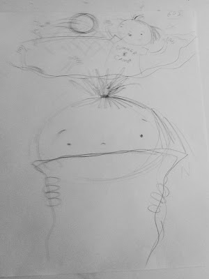
Here is the sketch scanned in and enlarged. This is actually two really rough sketches superimposed. This is really just a rough blocking sketch for layout purposes. I fleshed out the details in Photoshop. I had some other sketches of character studies for this croc which I did not scan. So even though this sketch is pretty obtuse, I have laid a lot of the ground work for the sketch, between other initial sketches and my thoughts and ideas for what was going to be happening in the piece.
Here is the finished phase of the sketch. As you can see, I created just about all of the details in Photoshop.I had fun researching this piece and I liked how the composition came out. It's busy but not so distracting that the story is lost.
Tomorrow, the conclusion!
Did you forget about this piece? It's been a long time since I've posted a progress report. Here is the final-Ta da! Love to hear what you think.
To see the progression of the piece, click on the tag "from sketch to final" and you will see the previous posts.
I've decided to concentrate more on the black line work, instead of planning for a lot of texture and detail in the coloring stage and leaving a lot of white space where I was planning for pattern or texture later on. So I've added details to the girls' clothes, the bench. I also started this composition with an idea of what would be behind our hero but nothing even sketched out. So I have addressed that. Lastly, I revised some anatomy: the legs and positioning of them on the far left girl look much more natural now. I also gave her a larger head. The middle girl's legs below the knee are longer now, so she is now more proportionate.
I have "inked" the art in Flash. I drew in the middle "huddle" girl, but found that she was not working in the composition. No matter what I tried she was off, but then I tried it without her, and I liked it so much better in every way. I like the idea of having one more girl; I think it's good for the story the picture tells-- three has an even stronger "us vs. them" vibe. But I thought this worked as well-maybe a little subtler, but still successful. Plus, the looks on their faces is very important-expressions say a lot. To that end, for the middle girl, I am aiming for a slightly annoyed, slightly bored, kind of snotty, glazed-over, ***SIGH*** expression. The girl on the left is just completely engrossed in what she's saying.. And of course, for our hero to the right, I am looking for a two-thirds abhorring, one-third wistful expression.
Here is my pencil sketch scan brought into Flash, where I did more compositional sketching, adding two more girls to the left. My goal for the illustration is to show that the main character is a loner and is left out of the popular group. I always had the idea to add more tension by adding additional characters, so there is something of a huddle of girls to the left, and then the loner girl to the rightbut I didn't sketch it all together until I brought it into Flash.
Follow along with me as I turn this sketch into a finished illustration.
Watch my HD time-lapse video of painting the below portrait of Calpe & Capri!
(Please make sure to click on the little "HD" button to watch it in HD)
Here is my first-ever time-lapse video. This was a lot of fun to make and something I've wanted to do for a long time. Editing video is not easy. It took a lot of time and energy but it was worth the efforts -- I'm really happy with how it came out. I'm glad I was able to accomplish this and I hope you enjoy it! It's ten minutes long so there may be some download time. I suggest you let it download in the background for awhile while you go on about your other business and then come back to watch it once it's complete. That way you won't waste your time waiting to watch it, and hopefully not encunter the "jaggies".
Completed Calpe & Capri portrait

By:
Kathy Weller,
on 4/30/2009
Blog:
wellerwishes
(
Login to Add to MyJacketFlap)
JacketFlap tags:
Kids,
Process,
Children's Art,
Technique,
Lettering,
Flash,
From Sketch To Final,
Vector Art,
black line,
Add a tag
In the spirit of show and tell, today I will be showing you some of the steps I take to creating a digital illustration. I'm not dealing with the painting part today, just the compositional planning part.
Step one: I do a bunch of sketches while thinking about the concept that I am trying to show visually. I might have a couple of concepts for the idea at first, but pretty quickly one wins out over the other as the best idea to develop further. I don't worry about the actual composition at this point. I am looking to collect quality elements that I can develop and put together later on into a cohesive image. At this point I'm visualizing the concept in my mind, the idea, even if I have not sketched it out properly.

Step two: I scan in all the sketches that I think would be good to use for the composition, and bring them into Photoshop, where I organize each of the element into a framework that I like. This step, to me, is a lot like playing with
Colorforms. (As a kid, I played with lots of Colorforms. My favorite was the Peanuts.)
I will then bring my sketch into Adobe Flash, place it on a layer, make it into a graphic and lock it in a layer. I wil make it transparent and use my sketch to guide my illustration. There are many similarities and also a lot of differences. I often do a lot of on-the-fly changes to the original sketch, and additional embellishments while I do the drawing part.
When I am satisfied with the ink job, I export it as a vector art (Adobe Illustrator) file. I then open it in Photoshop, crop it to the correct size and then move on to the painting. In general I place the "ink" layer above my painting layers. Once in awhile I will paint in a layer on top of the "ink" but that is much later in the process.
You can see the finished piece
here. Hope you enjoyed this window into my process.
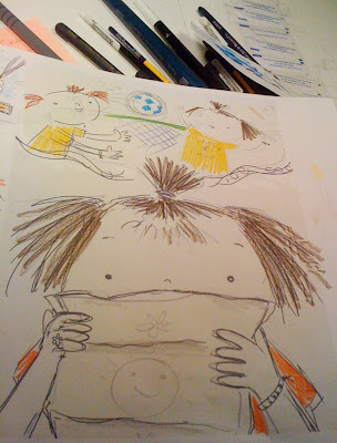
Here's the next step -- a color study. Look at how rough this is. Sometimes I skip this step, but it is really important to do some color planning -- even if it is super rough, and even if it's just helping me to figure out what I don't want to do. (Sometimes I do it in my head, but I think that doing it on paper helps more, even though it never seems to mimic the finished product at all.) This is one step that's never not helpful.
This is just done on the print out from the rough rough initial sketch. See, it's totally non-fancy -- a very useful scribble. (You will see that this little color study helped me figure out what I did not end up doing.)
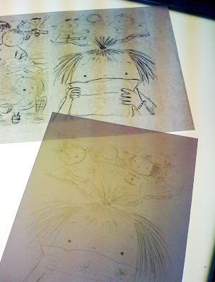
Here is the final sketch (the bottom paper on the lightbox). It's now on watercolor paper, ready to be inked.
When I trace from a sketch on the lightbox, I use the under-sketch as a rough guide. I like to have room for 'happy accidents'. I'm not someone who works incredibly tight from start to finish. I don't do too many preliminary sketches of a given illustration before diving in because for me, it dilutes the final product. I do as much preliminary as I feel is necessary for me to have a very good handle on the general composition and all the elements within it, but I do no more than I need to. I think it affects the life, excitement and energy in it. I build but i don't like to over-build, because I feel that beats it down. The law of diminishing returns is definitely in effect when it comes to my own philosophy about my sketching process. Too much is not a good thing, too little is not a good thing. Just enough is perfect!!
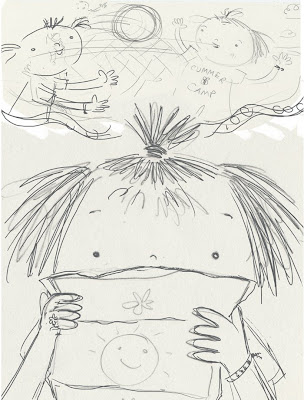
I then scan the rough sketch, and then revise the composition in photoshop. I love to create the rough sketch traditionally; I like the line quality and the life in it. But I like to collage pieces of the sketch together, moving things around, to create a well-balanced composition to move forward with.
This is still super-loose, but I know where I need to go from here, and I plan to fill in the blanks
during the pencil sketch phase.
 This will be the first of a few posts outlining my process of creating a non-digital pen/ink/watercolor illustration.
I start with a very rough sketch from my sketchbook. I either re-sketch/re-doodle it to scale (as seen here) OR I enlarge the small sketchy doodle in photoshop to size (in this case 8.5 x 11), and print it out.
If I use a redrawn sketch to size, I also reference the original small doodle (by eye) when moving on to the next step.

By:
Aline Pereira,
on 9/15/2007
Blog:
PaperTigers
(
Login to Add to MyJacketFlap)
JacketFlap tags:
Little Bear-s Grandad,
Nigel Gray,
The Frog Ballet,
The Puddleman,
Vanessa Cabban,
Children's Books,
Ian Whybrow,
Picture Books,
grief,
Jane Ray,
Books at Bedtime,
reading to children,
Raymond Briggs,
Katie Morag,
Grandparent stories,
A Balloon for Grandad,
Adrian Reynolds,
Amanda McCardie,
Ana Baca,
Anthony Accardo,
Benito-s Sopaipillas-Las sopaipillas de Benito,
Caroline Crossland,
Harry and the Robots,
Add a tag
Following on from Charlotte’s post the other day, I thought I would put together a list of a few of the books my family loves, which focus on that special bond between grandchildren and their grandparents.
 I have already talked about the Katie Morag books, in which both her grandmothers are central. I wish we’d known about Nigel Gray’s A Balloon for Grandad when we lived abroad; as it is, we discovered it recently in our local library. Illustrated by one of my favorite illustrators, Jane Ray, it deals in such an uplifting way with the separation which is sometimes inevitable when generations live a long way from each other. Then there are Ana Baca and Anthony Accardo’s Benito books – look out for a review of their latest bilingual title Benito’s Sopaipillas/ Las Sopaipillas de Benito in next week’s update of PaperTigers (I’ll add the link to this post when it’s available).
 We also love Raymond Briggs’ typically quirky story The Puddleman. You have to be an indulgent grandfather to allow your grandson to lead you around by a dog-lead attached to your wrist and call you “Collar” - but the hint at the end, where Briggs thanks “Miles” for “the naming of puddles, Collar” etc. would suggest that he had real-life, grandson inspiration for the story! It’s a loving, imaginative tale that also provides a particularly special read-aloud experience. Since it is a cartoon strip, you can’t just read it as a narrative; you have to share the interpretation of the pictures alongside the reading of the dialogue and build it up together.
Sometimes we need books to help us talk about the illness or death of a beloved grandparent. (more…)
By:
Aline Pereira,
on 7/27/2007
Blog:
PaperTigers
(
Login to Add to MyJacketFlap)
JacketFlap tags:
Children's Books,
Picture Books,
Leo and Diane Dillon,
Mitsumasa Anno,
Books at Bedtime,
reading to children,
Eric Carle,
Akiko Hayashi,
All in a Day,
Amo,
Corinne Albaut,
Gian Calvi,
Nicolai Ye Popov,
Night and Day,
Raymond Briggs,
Ron Brooks,
Zhu Chengliang,
Add a tag
Here are two books for sharing which take children on a good-night (and good morning) journey all around the world. They both celebrate differences in customs and lifestyles, and emphasise what we all share as members of the human race…

The first, for very young children, is The Nights of the World by Corinne Albaut and illustrated by Amo, which focuses on five children from different parts of the world, who all sleep in different kinds of beds. When the magic sliding window is opened, readers can see what their days are like too, and although their activities may be different, they all laugh and enjoy playing games – then close the shutter again, and they all are quiet and go to sleep!
 The second is All in a Day by Mitsumasa Anno in an amazing collaboration with nine other well-known artists from all around the world: (more…)


OOH absolutely lovely!
I love it - I see a Richard Scarry influence. I was wondering – in your opinion, what are the advantages of creating in Flash as opposed to Illustrator?
OMG, it's beautiful Kathy!
amazing! it looks like watercolor! I would love to take a class from you to find out how to get that effect!
This is so much fun! I love that you're using Flash and Photoshop together..it's really fun isn't it? :) Croc's expression is great
This looks great! Thanks for the tip!
Awesome, awesome, awesome! I love the little giraffe & zebra sipping lattes in the background. Beautiful work Kathy - I enjoy seeing your process too.
Thanks everyone!
Renee - I'm all over Flash for line work these days. Sometimes for coloring in, too. It's terrible that they have not optimized it for use additionally as a straight illustration tool. I've pouted many a time when my file is too large and is slow or crashes because it really is not stable for larger illustrations. Oh well, I suck it up and use it still because it is still the best most natural vector drawing tool for my money and time!!
Claudine - Thanks!! Me, teach? Wow, maybe I will some time. I think I would like to. (I never thought I'd say that, but there it is.)
Redhead- Thanks! I loved Scarry when I was a kid. I still do. What wonderful characters. I used to love to look at those illustrations for days, because you could look at them for days. He was a big influence on me I think, definitely in that sense, the busy "big scene" sense. Not intentionally but these things seep in don't they, when you are not looking I guess. He hee. :)
As for Flash vs. Illustrator, the drawing tool in Flash is just more natural to me. It's terrible on one hand because in Flash, you get ONE brush. ONE brush not the many you get in Illustrator. But wehat can I say? That one brush works in a more natural way for me. I still use Illustrator to draw in, but I really RELY on Flash for my clean vector line work. It is my Go-To for line work.
Gina - Thanks!! Aren't they fun - little shopping Zebra and Giraffe - girlfriends out for the day. Very fun. I'd love to show my process some time-like, the seedy underbelly part of the process. That will have to wait for another day. When I posted this, I laughed when I wrote "VOILA!" because it certainly was NOT "VOILA!" type of a situation-ha!! But I love experimenting, it's part of what makes art so much fun... Ok it is a lot of work, but it is a BIG part. :)
Di, Tamara, Mary Beth - THANKS ladies, I'm glad you like it so much!! :) Appreciate the notes!
Oh Kathy I luv! Awsome work! I just could not wait to see it in color! I really appreciate you explaining your process, too! You are such an awsome illustrator& instructer.
Oh, I also meant to say I like your new header. Looks great! One more thing, I do know how to spell I did a little oopsy with a few of my words above!:-)
Love it Kathy! I really like the sense of depth and all of the fun details in this piece. From the different fonts on the billboards, busy people in the background, and the cool textures on the croc's jacket and hat, so much to take in- amazing!
Thanks so much Carmen and Suzanne! I'm glad you like.
Carmen, I'd like to do a tute on the painting process some time, but honestly it is such a "process" that it's daunting to think about how I would capture it for the blog. Maybe I'll plan that out some time.