After a summer slumber in blogland, I thought I'd wake things up a bit with a happy announcement. The Society of Illustrators in New York will be hosting their 32nd Annual Original Art Show this October. For those who do not know, here's a bit about the juried show from the SI website:
"Founded by Dilys Evans in 1980, the show celebrates the fine art of children’s book illustration. It has been sponsored by the Society of Illustrators for the past twenty-two years. The selection process will be by a jury of outstanding illustrators, art directors, editors, and experts in the field of children’s publishing."
With that, I'm pleased to announce that my latest picture book,
No Dogs Allowed, by Linda Ashman
(2011, Sterling Children's Books), made the cut! After years of submissions, this has become the title that brings a whole other level of validation to my work.
...pat on the back to me...I am so proud of it, and still I strive to want to do better. For now, I will bask in its success, show you a few pieces from its interior pages, and let you know that the
Original Art Show opens Oct. 24 and runs through Dec. 22, 2012. I'll post more news about it as the date approaches!


scottlava:
CRAZY 4 CULT is in NYC this year! And it is happening this tomorrow!
“Crazy 4 Cult NEW WORK”
annual cult movie art show
Thurs, August 9th from 6-9pm
Gallery1988 NYC Pop-up Store
64 Gansevoort St., NY
show open August 9 – September 1, 2012
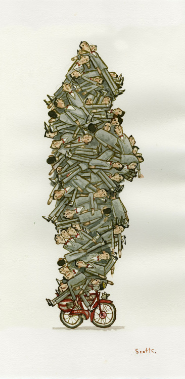
I will not be able to attend, but this painting of mine will be there. It is called “Pile of Pee Wees”.
This show is shaping up to be pretty great, and I’m not just saying that because I have a piece in it. Heck, if I were anywhere near NYC I’d go just to see a Scott C. watercolor in person.


On Monday, the Art Department took a field trip to see the AIGA’s 50 Books/50 Covers of 2009 exhibit. It was a worthwhile show to attend, but I had mixed feelings about it. For one, the non-traditional gallery presentation (above) brought both advantages and challenges. I loved the low bleacher set-up for books, because I could sit and relax while browsing heavier volumes. But the bleachers did the covers a huge disservice; not only did you have to bend down repeatedly to pick up each individual cover, you had to flip the card over to even see the image.
But the main reason that I left ambivalent over the 50/50 exhibit encompassed more of my greater feelings about design in general. Without a doubt, the books on display were creatively inspiring. I loved thumbing through the photos and art, the lavish paper stocks, and the 3-dimensionality of a beautifully-presented package. Books like these make me want to go home, stay up all night and make ART. It makes me feel a little inferior that I’m not doing that kind of work already.
At the same time, though, many of these books get right to the heart of one of my greatest pet peeves: design for design’s sake. Design should always serve a purpose, complement its material, and make content accessible to its consumer. I love design because it places equal importance on being functional AND visually pleasing. But many of the 50/50 books suggest the opposite. Type running into more type, or scattered across the page, or written in tiny Helvetica Bold . . . these things appeal to the hipster art-design community, but aren’t the best solution for the general reader. Go ahead and be as artsy as you want, but please, let it make sense.
That being said, I’ve composed some highlights of the exhibit to present my case. I’ll showcase my favorites, as well as some titles that really made my blood boil.
A perfect example to explain my point? Two books, no type on the cover:
Afrodesiac (AdHouse Books) – Perfectly captures the 1970s exploitation and comic book crazes. The interior contains pictures, not words. Generally all-around badass.
vs.
Manuale Zaphicum (Jerry Kelly LLC) – Yes, the letterpressed interior is absolutely gorgeous, but I found a blank cover for a book about a type designer to be annoying-ironic, not funny-ironic.
See what I mean? Okay, now on to some favorites:
 Pictorial Webster’s (Chronicle Books) – Gimme gimme gi
This is a post in a series of interviews featuring up-and-coming illustrators, in a celebration of the first annual Illustration Week. Enjoy!

Danny Quirk
Website: http://www.behance.net/dannyquirk
Blog: http://danquirk.blogspot.com
Your work is incredibly realistic. What is your process of completing a painting?
Everything is a staged photograph, collaged/comped in Photoshop, and that finished ‘comp’ is my sketch. From there, if I have time I’ll draw it out, or else graphite transfer the image onto paper. From there, just start painting away. ha. For the Marines series, bought uniforms/guns/props (all current to date/location) and used that as reference. If there’s one thing I can’t stress more ESP for realistic artists, it’s DO YOUR RESEARCH/ HAVE SOLID REFERENCE.
It just makes a world of difference in the final.
The anatomical ones are actually lots of fun to do. Generally speaking will ‘dissect’ a region of the body and photograph it. How I go about this is I’ll draw the anatomy ON the body, exactly where it would fall under the skin in permanent marker. From there, paint flesh tone latex over the anatomy, and have the subject cut it/peel it open, so when photographed, there will be the exposed anatomy in slight perspective as it would move with the body.


What gallery shows has your work been in lately? How did you pursue those opportunities?
They started off a lot with restaurant gallery places, and kind of worked their way up from there, a really awesome place everyone should check out is G2 Ave A, it’s free to show in, and the artist keeps 100% of the sales (shown there 3 times so far). From there showed in the 320 studios, and then did a showing of the military pieces in the 69th Fighting Regiment’s Armory. There were others in-between, but I won’t bore y’all with that. haha. But one MAJOR thing learned from these is network your asses off. Go to shows, be proud of your work, and talk to people, form alliances with those who are similarly different to you. It’s easy for galleries to turn down 1 artist at a time, but the more you have coming in, with strong work of similar themes/different styles (or vice versa) they’re less apt to turn you down, giving yourself another opportunity to be seen, and fact of the matter is, you just never know who could come through and see it.
How did you get into drawing Celtic knotwork?
Haha, it’s kind of embarrassing, but I was always fascinated by it, but never knew how to do it… My freshman year at Pratt, there was this girl I was totally head over hee
 "This is the closest I'll ever get to the real thing...heh heh..." *Sob*
Somehow, I can't get the title box to let me write in it. Agh. Anyway:
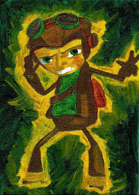
What a great IF theme! I chose the character Raz, from the video game Psychonauts, because I just finished the game and I love the character design. I find this paining geeky on a few levels: 1. Fan art is geeky. 2. You could also say that the character Raz is geeky.
In any case, I adore the geeks. Probably because at heart I still am one.
-Claire

HI guys! I'm back (for a little bit) - Today is actually my 1 YEAR ANNIVERSARY here in IF and also my 100th POST! So amazing how time flies...Thank you to IF and to all the wonderful friends I made this year. You are all an inspiration to me... Cheers!


.jpg?picon=479)


.jpg?picon=365)

Congratulations, Kristin. Well-deserved for sure!
congratulations Kristin!