new posts in all blogs
Viewing: Blog Posts Tagged with: BlogBookTour, Most Recent at Top [Help]
Results 1 - 25 of 264
How to use this Page
You are viewing the most recent posts tagged with the words: BlogBookTour in the JacketFlap blog reader. What is a tag? Think of a tag as a keyword or category label. Tags can both help you find posts on JacketFlap.com as well as provide an easy way for you to "remember" and classify posts for later recall. Try adding a tag yourself by clicking "Add a tag" below a post's header. Scroll down through the list of Recent Posts in the left column and click on a post title that sounds interesting. You can view all posts from a specific blog by clicking the Blog name in the right column, or you can click a 'More Posts from this Blog' link in any individual post.
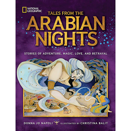
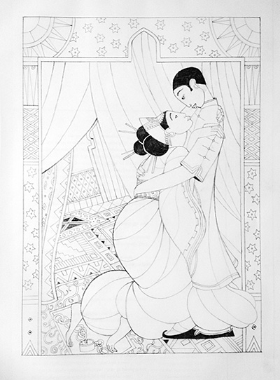
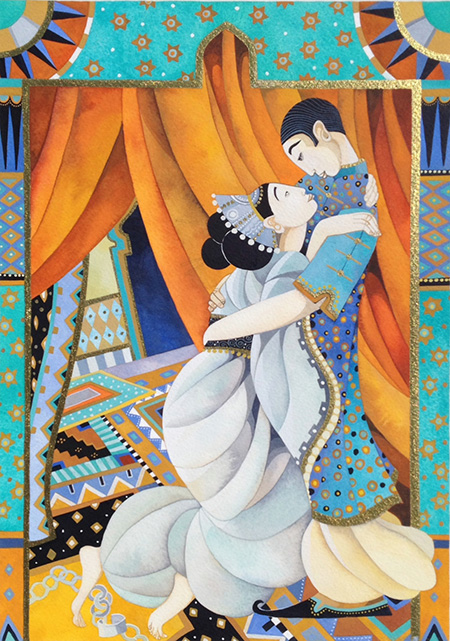
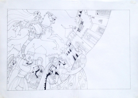
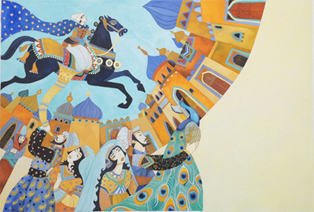
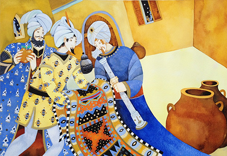
I adored THE ARABIAN NIGHTS as a kid, so I was thrilled when Nat Geo Children's Books asked if I'd like to see their recent incarnation, Tales from the Arabian Nights: Stories of Adventure, Magic, Love and Betrayal, written by Donna Jo Napoli and illustrated by Christina Balit. Christina stopped by to tell us a bit about how she works.
 e: Hi Christina, what is your creative process and what is your medium, can you walk us through it?
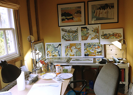
Christina: Well I work in a very tiny room at the top of an old stone house in the middle of the Kent countryside in England. Its packed to the rafters with everything I need and because of the way I work I don't need a great deal. Everything I illustrate is done by hand so first and foremost I need all my reference books (of which I have thousands on shelves throughout the entire house) and a table and a comfy chair. I have two chairs actually...so I make sure that I switch from one to the other throughout the day to change my position and keep my back moving.
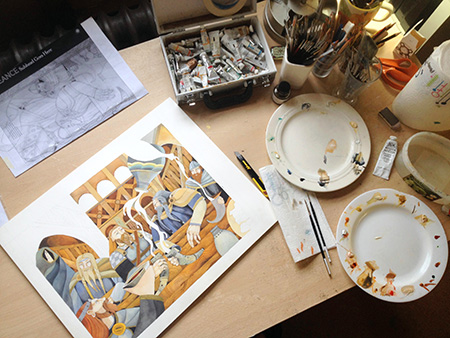
I have a very disciplined routine when making a book. I will have worked out in advance exactly how long I have been given to make each image in a book depending on the deadline that I have been set. First thing I do is read the story and then study the space that I have been given to fill with a picture. I also have various instructions that have been given to me sometimes by an Art Director or publisher that I also have to pay attention to and I start drawing. I used to make all my drawings on thick cartridge paper in the old days and deliver them by hand to my publishers here in the UK, but things have changed so much now with computers and I can now deliver sketches by email to anywhere in the world! I still draw everything by hand but now make them onto tracing paper instead so that I can lay out the drawing over the text panels that I have been sent to make sure my sketches fit correctly into the layout.
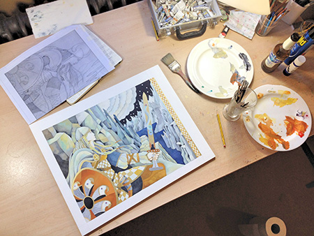
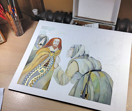
Once my drawings are complete I photograph them carefully using a good digital camera and I send these sketches via email to my designer. He/she then uses these sketches to place them within the books grid design and I then wait on feedback from 'the team' - which is the publishing house itself, the author ect., ect. I then make any changes requested and once the sketch is fully approved I prepare to paint. I do this onto watercolour blocks, which already have the edges gummed down in advance. It's very important to find the right paper as it has to absorb the water and not resist the paint in any way, which can happen and be a disaster. I then trace by hand my original drawing onto the water colour block and begin painting. I use Windsor and Newton watercolour paint tubes only as they have extremely pure pigments and are very concentrated. I also mix into the paint some gouache for opacity (to make the colours a bit thicker) and gold inks. I love using gold inks as they make the original art shimmer but of course re-producing the gold in print can be an expensive process for the printers unless they are planning to add a gold foil in reproduction.
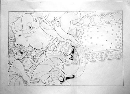
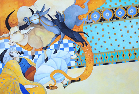
 e: What do you think makes an illustration magical, what I call "Heart Art” - the sort that makes a reader want to come back to look again and again? I’m looking for your definition of “Heart Art.”
Christina: 
Well to answer this I have to think back to what I always loved in illustrations when I was little and pouring through books. And that was beautiful drawing and exquisite detail. But then I didn't have access to all the computer art and digital animation that children have now and books were all we had. But regardless I really think little people love searching for the magic and finding all the little bits and pieces that are sometimes too small to see on a first look. The hidden treasure within the breath-taking awe and wonder of hand made work. Children instinctively draw onto paper and try to make art until they no longer believe they are any good at it, so they instinctively appreciate the loveliness of an illustration.
 e: Did you have any tie to the Arabian Knights - what’s it like to illustrate such a classic?
Christina: Very much so! I actually spent large chunks of my childhood in various parts of the Mediterranean and the Middle East. I went to a small nursery run by some lovely nuns on the banks of the Euphrates in Baghdad, a primary school in the deserts of Abu Dhabi (long before it became a city and it was a small barasti village on a peninsula on the Arabian Gulf) and an extraordinary Quaker school nestled in the mountains of Lebanon. It was a great background to my visual memory.
 e: What are you working on next or what would be your dream project?
Christina: I've been working on two new stories for children - which are based on Babylonian myths and I've also been writing a play (for adults). Furthermore, National Geographic are hoping to produce a further Treasury of Bible Stories soon so that should be just great fun.
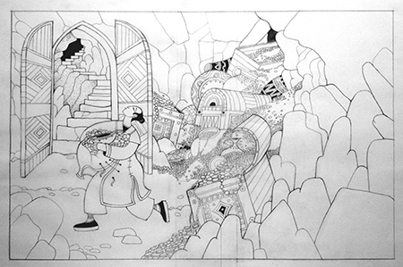

Thank you Christina! These are LUSCIOUS!


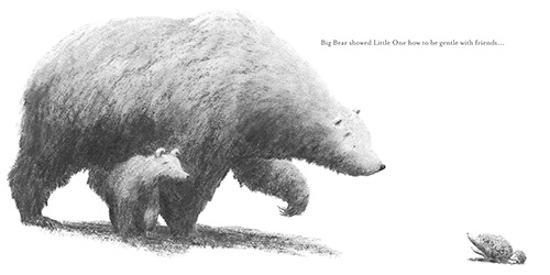
LITTLE ONE
by Jo Weaver e: What is your medium?
Jo: I generally work with willow charcoal and a putty rubber on slightly toothed paper. Willow charcoal is very soft which makes it difficult to get crisp lines, but it has a wonderful texture to it and is great for tonal work. I love the earthiness of charcoal. And there is something deeply gratifying about producing a whole artwork with only one little stick of burnt wood!

 e: What do you think makes an illustration magical, what I call "Heart Art” - the sort that makes a reader want to come back to look again and again?
Jo: This is a tricky question and I’m not sure I can answer it very eloquently. I think that the emotional response an illustration provokes in the viewer is what makes it magical, rather than any specific technique used to create it. For me, one of the most important ingredients of a truly magical illustration is relationship, or rather the depiction of a connection between characters. This could be between two or more characters in the illustration or between the reader and a character. I consider the environment, the setting for the story, to be a character in itself. Because often books are about the relationship between a character and their environment. Certainly this is a big theme in my own work. A magical illustration, I think, often has a strong sense of relationship in it.
 e: What was your path to publication?
Jo: My path to publication probably began way back in my childhood with my absolute adoration of AA Milne's Winnie the Pooh. The joy I experienced in pouring through those books and copying E.H. Shepherd's drawings sparked a life-long love of illustrated stories. But it took me a while to turn my hand to illustration professionally. In my teens I turned down a place at art school because I couldn't visualise where it would lead me. I never wanted to be a fine artist and somehow illustration had never occurred to me. Throughout my twenties I worked in international development and as a support worker for homeless people. I loved my job, but had always had a quiet desire to follow a creative path and had started painting pictures for friends and family. My brother picked up a leaflet in a local cafe advertising evening classes in children’s book illustration with the artist/author Claire Alexander. It was the first time that book illustration had entered my mind as a possible career and it was a bit of a lightbulb moment. I took the class and loved it so much I decided to apply for an MA in Children’s book Illustration at the Cambridge School of Art. I had no formal arts training and my portfolio was pretty meagre at this point, so I was astounded to be accepted. The course completely transformed my artwork and story-telling capabilities. For my final degree project I began to work in charcoal for the first time. Up to this point my work had been very mediocre watercolour, but the moment I picked up a stick of charcoal, it took on a life of its own. My editor at Hodder Children’s Books, the lovely Emma Layfield, happened to visit the college towards the end of my time there. She had a look through my portfolio where she met my charcoal bears and offered me (and them!) a book deal – a very exciting moment!
 e: Is there something in particular about this story you hope readers will take away with them, perhaps something that isn’t immediately obvious?
Jo: I hope that that book has a meditative quality about it. When I was creating it, I always had a sense of quietness in mind as something for the reader to take from it. I believe that there is magic to be founds in stillness, and in maintaining a strong relationship with the natural world. So aside from the story about a mother and her little one, I hope that the book promotes a sense of calm and connection to nature.
Jo's studio...
 e: What are you working on next or what would be your dream project?
Jo: I’m currently working on two books - one is the follow up to Little One, for Hodder Children’s. I’m not sure I can say much more about it yet but I am enjoying it enormously. The other is a very different project. Endorsed by Amnesty International UK, its a novella by the wonderful writer Gill Lewis about the power of music to overcome oppression. Its protagonist is a young Syrian refugee. Its a deeply moving and important story which I feel honoured to be illustrating. It's wonderful working on two such different projects and between them I think they pretty much cover what would be my dream project.
e: Thanks Jo! Can't wait to see them both!
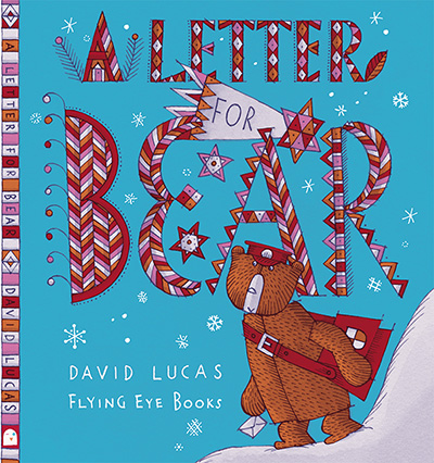
A Letter for Bear
by David Lucas I've been asked about "heart art" - what gives something soul? Writing and drawing come from the same place for me - I love patterns - patterns of words and patterns of shapes and lines. And I look for resonant patterns, patterns that seem to have all sorts of echoes.
Picture books are many layered - and the hidden layers echo on frequencies I am hardly aware of. A common experience for me is reading one of my stories, long after it was published, and thinking: "That's what it's about!"
Even the simplest ideas keep their secrets.
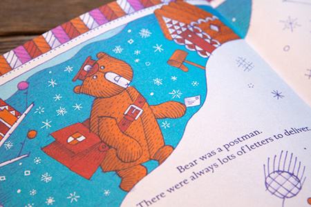
A Letter for Bear is a simple tale of a lonely postman, doing his job, delivering letters but never getting any letters himself. Night after night he sits in his cave alone, with his cup of soup, staring at the dark.

All my story ideas are autobiographical, and on one level the bear is my Dad.
My Dad never had any friends. Not one. He was a lonely obsessive, talented at drawing and making things, but fatally unable to reach out. The real miracle is that he had six kids. But then he met my Mum when she was very lonely, and they were both very young, both misfits in their way. (She had been an elective mute as a child.)
But although she really grew and now lives a full, wonderful, happy life, he had such severe emotional difficulties that he progressively alienated all of us.
An example: at 18 months old, my little brother became seriously ill and had to have an emergency operation. Parents weren't allowed to stay in hospital with their babies in those days - so you can imagine what a horrible experience it was for my Mum - having to leave her baby alone, in pain and distress. Dad drove home, my Mum in the seat beside him, and naturally she was crying. Dad couldn't stand it. They stopped at a red light, and he pushed her out of the car and drove off, leaving her at the roadside, miles from home.
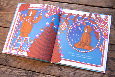
It is hardly surprising then that ultimately he ended his days living in a 'cave' alone, staring out at the darkness, like the bear in my story.
Bears are solitary creatures, harmless in general, but dangerous and vicious when threatened. But why did my Dad feel so threatened?
I've just been reading 'The Autistic Brain' by Temple Grandin, and it confirms my view that Dad was autistic: good at a very narrow range of tasks, with an intense eye for detail, but bewildered by human interaction, forever misreading social cues.
The difficulty for autistic people is information overload. And emotion is particularly hard to deal with - it can't be systematized, pigeon-holed, it cuts you to the core.
Dad was intensely aware - but so intensely aware that what might seem a manageable situation to most people, was to him like bombs going off inside him.
His instinct was for self-preservation. So he did things like push my Mum out of the car - even though she herself was so upset. In fact, precisely because she was so upset.

My love of pattern, my eye for detail, and my own social clumsiness (especially when I was younger) probably place me somewhere on the autistic spectrum myself.
Temple Grandin suggests at the end of her book all sorts of ways that autistic people might learn to reach out to others successfully (she is autistic herself).
As I grew up, I realized that one way to talk to people was simply to make a conscious effort to ask questions, to try not to talk about myself so much.
I might often fail, but that basic principle - of seeing human interaction as a patterned transaction of give and take - is just the sort of structured 'rule' that a high-functioning autistic person can really internalize, and visualize.

Being an author, in fact, is being professionally manipulative - trying to understand the various levers of the heart. What makes people respond - or not. And writing stories has certainly helped me govern my own emotions, and understand myself and others much better. I find writing much more difficult than drawing for these very reasons - and it has a dangerous fascination for me. I often focus on writing when I'd probably be better off just getting on with drawing.
Poor old Bear, in my story, does find an answer to his problem: in his job, in what he is good at - delivering letters. He writes to everyone on his round, inviting them to a party. His letters are like me learning to ask questions. He doesn't sit there forever waiting for the world to meet him on his terms, he reaches out.
And this being a children's picture book, everyone responds warmly.
In the final scene he realizes all the letters in his sack are to him: he has Christmas cards from everyone. Understanding my Dad's autism helps me feel more compassion for him. And I think of those little daily tragedies, like the time he gave me a completely blank birthday card, saying: "I haven't had time to sign it." Or the time, when I was older and I met him in town (typically we'd arrange to meet in a bookshop) and I suggested we go to the pub for a drink.
"I'm not thirsty," was his reply.
He was a funny old bear.


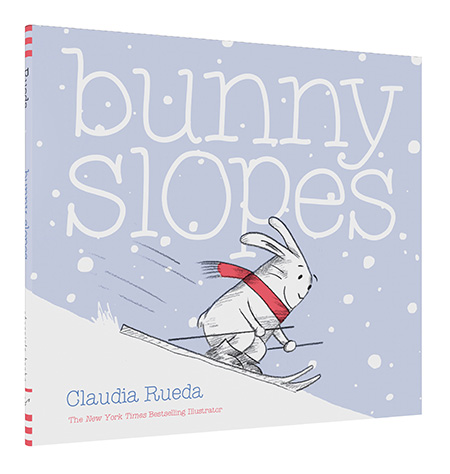
I'm starting to identify a theme with the books I've been featuring lately - lots of SNOW! Claudia Rueda's new book is no exception. She stopped by to talk about BUNNY SLOPE.
 e: What is your creative process, can you walk us through it?
Claudia: I usually begin with a question. It could be why cats have whiskers or the purpose of life. The source of my ideas is always curiosity. Sometimes the answer to the question I ask becomes the theme for a story. I carry sketchbooks everywhere I go, so I can scribble ideas and play around with different styles. Once I have an idea for a story, I plan the book by drawing a storyboard on a plain piece of paper. The storyboard becomes the roadmap for the development of the visual narrative and for the words that tell the story.
 e: What is your medium?
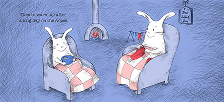
Claudia: I like to reveal the pencil marks on the paper. I use graphite and color pencils, charcoal and ink on paper. Sometimes I use watercolor or I add color in Photoshop. The story usually tells me what the best medium for the book is.

 e: What do you think makes an illustration magical, what I call “Heart Art” - the sort that makes a reader want to come back to look again and again?
Claudia: There’s no formula for how to make art look magical. I think an illustration feels “magical” when it brings you a sense of mystery and when it creates an emotional connection.
 e: What is your favorite or most challenging part of being a creator?
Claudia: Not to repeat myself.
e: Is there something in particular about this story you hope readers will take away with them, perhaps something that isn’t immediately obvious?
Claudia: We could say that Bunny Slopes belongs to the interactive children’s books genre.
Books that require the reader interaction have been around for more than a hundred years, Pat the Bunny (1940) being one of the most celebrated. These books are coming back again, maybe as the authors response to the current ubiquity of digital interactive media. Most of those books are playful and fun. Although Bunny Slopes has that playful element, my intention was to go beyond and to explore interactivity as a narrative resource. I wanted the reader to be able to move the story forward or to change the story. I find this possibility amazing and full of potential.
I also wanted to develop Bunny as an adventurous and playful character, but also caring and warm-hearted.
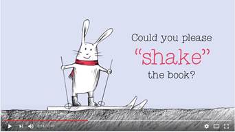
 e: I think it worked! Thanks Claudia! New York Times’ Bestselling author Claudia Rueda’s Bunny Slopes is swishing onto bookstore and library shelves! Time to tackle the bunny slope! Shake to help Bunny make it snow, tilt to help Bunny ski down the slope, and turn to help Bunny escape a cliff in his path. Is there any obstacle Bunny can't conquer? Bringing grins and guffaws with each turn of the page, readers will find Claudia Rueda's innovative bookmaking as entertaining as the twists and turns of a ski slope—and as satisfying as a cozy cup of hot cocoa.
Check out this adorable trailer on
Youtube:

One of my favorite publishing houses, Flying Eye, recently sent me a fabulous graphic novel for younger readers that I positively flipped over. Happily, the creator of ARTHUR AND THE GOLDEN ROPE, Joe Todd-Stanton is here today to tell us more about it.
 e: What is your creative process, can you walk us through it?
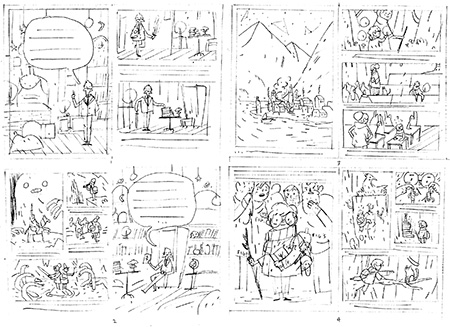
Joe: The main thing I try and do is keep a sketchbook on me and draw whenever I get the chance. Living in London this means 99% of my sketches are done on buses and tubes, which I think are a great place for inspiration. My ideas pretty much always come out of these doodles and it's really rare for me to ever get an idea for a story or single illustration fully formed in my head. Once I have done a drawing that I like I will try and come up with an extra element or see if I can fit it into a bigger narrative. I will then obsessively draw it over and over again until I have developed it into something I want to take to final or never want to look at again. This means doing a final sketch and then scanning that in and doing the final line and colour work using my tablet.
 e: What is your medium?
Joe: Very simple. Just a pencil, paper and Photoshop. I would love to branch out into other mediums but I am very non committal. I think these days Photoshop gives you the amazing ability to experiment with pretty much everything.
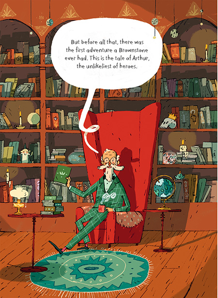 e: Your palette seems so strongly red and green - is that a conscious decision?
Joe: They are both colours I love a lot. Especially Turquoise, which is a colour I have to actively stop myself from using to much. One reason is probably that books like
Where the Wild Thing's Are, which uses a similar dark colour scheme, had a massive influence on me. Also, up until my last year of University I had always worked in Black and White, so since then I think I have always felt more comfortable with a limited colour pallet.

 e: What do you think makes an illustration magical, what I call "Heart Art” - the sort that makes a reader want to come back to look again and again? I’m looking for your definition of “Heart Art.”
Joe: That's a very hard question to answer! I think it's to what extent a book can inspire a kids imagination. When I was young, any book that gave me sense of a world beyond the pages would instantly have me hooked. Especially if that book gave me a sense of magic whilst still being somehow grounded in the real world so some part of me could feel like it was possible.
 e: Is there a unique or funny story behind the creation of this story?
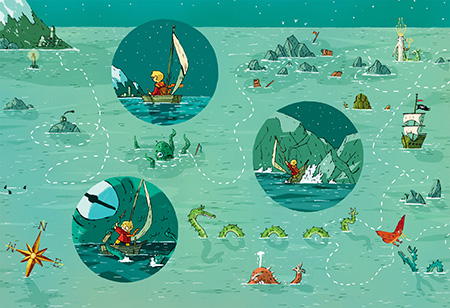
Joe: Well, it's not very funny but it did come out of an idea that was completely different. Originally, I wanted to make a book that documented different kinds of mythical creatures with a narrator that kept souvenirs from each discovery. It would have been much more information based and I wanted to do analytical cross sections of the creatures and their environments. This narrator ended up becoming professor Brownstone and then the rest of the story morphed around his character. I would still love to come back to the original idea one day.
 e: What was your path to publication?
Joe: Three years ago when I finished university we had our final show at the
Coningsby Gallery in London. Someone from
Nobrow must have seen my work because the next day they contacted me asking if I had any ideas for a project. Then with the incredible help and patience of Sam and Harriet from Flying Eye it took nearly two years of on and off developing and changing my original idea to come up with a solid narrative.
e: What is your favorite or most challenging part of being a creator?
Joe: I think that like pretty much every artist I am my own worst critic so making anything that I am kind of happy with is always great. I also love coming up with an idea and then trying to push it as far is it can go, whether that is just one character's individual expression or the detail in a massive image. (Joe's studio...)
 e: Is there something in particular about this story you hope readers will take away with them, perhaps something that isn’t immediately obvious?
Joe: I put a lot of emphasis on books in the story because they are a great way of having adventures in the comfort of your home. I think that amazing ability of being able to get lost in a book is something we shouldn't forget about passing on to the next generation. Although, I guess I would say that being an author!
e: What are you working on next or what would be your dream project?
Joe: I am currently just about to finish the art work on my second children's book, which is about a girl called Erin from a fishing town that discovers a secret. The story is based on an illustration I did back in university so it will be so amazing for me when I finally get to see it in print. In terms of dream jobs I would absolutely love to illustrate
Peter Pan as it has always been my favourite story. So if any publishers are reading this!!
e: Thanks Joe! And I hope you'll come back to share Erin with us when she's ready for the world. 
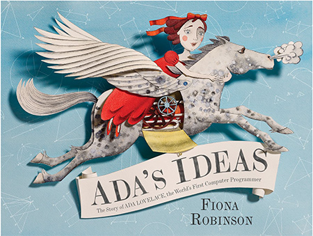
ADA'S IDEAS
Guest Post by Fiona Robinson When writing I try to gather as many facts about about a situation or person, then I let my imagination go! For Ada’s Ideas, my first non fiction storybook, I had to do a lot of research. I read a lot, but then also took trips to places: the Silk Museums at Macclesfield, the Science Museum in London, and the Museum of Science and Industry in Manchester. It was fun but hard work!
For Ada’s Ideas my art process was as follows:
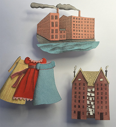
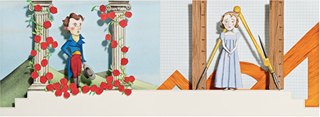
With the art I wanted to try something new - 3 dimensional images, which I hoped would capture a little of the Victorian era, and the drama and theatricality of Ada’s life. This involved drawing out the images, then painting them with my favorite Japanese watercolors.

I then cut out the images very carefully with a sharp blade. I used over 500 blades to produce all the cut images for the book!
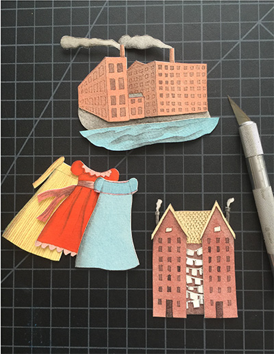
Once cut, I layered all the images for each spread to different heights using my son’s Lego bricks and glued them in place.


Heart art:
I think what makes an illustration magical is imagination. Sometimes illustrations look good because they’re technically proficient. What I like to see and feel with my illustration is that I have poured my heart into it, that I’ve tried my best, and that I’ve created something that will draw readers in - that will connect with them somehow, make them think and feel wonder for the story.
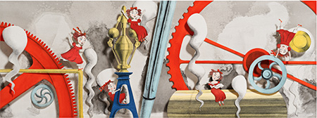
I first got into writing and illustrating children’s picture books about 10 years ago, though it’s something I wanted to do since I was about 6 years old!
When I was young it made me so happy to listen to adults reading picture books. You had their undivided attention, and the picture books were made specifically for children, something primarily for us. Picture books can be many things to a child, but I think what drew me in most was how they seem to make sense of a complicated world. A picture book can not only tell a story, it can spark imagination, and be a friend.
My favorite part of being a creator is that I spend a lot of time in my own world! Whilst it is a demanding job and not at all easy, it means I get to spend my hours being a child again, inhabiting a place where imagination roams free! I hope that with Ada’s Ideas, children and adults will get a sense that while hard study is good and a foundation for life, the most important thing is to have ideas, an imagination. With that you will soar!
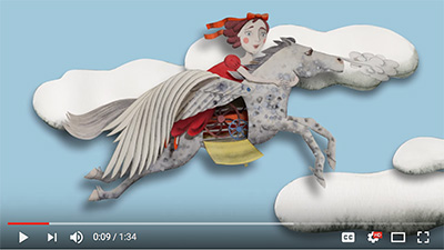
Check out the book trailer on YouTube:

 The Treasure of Barracuda
 is the latest mid-grade novel published by Little Pickle Press (their new imprint, Big Dill Stories) - the publisher of my own
A Bird on Water Street - and it is
marvelous! It was written by
Llanos Campos, illustrated by
Júlia Sardà and translated into English by
Lawrence Schimel. It's a tribute to books and reading, cleverly disguised in a fantastically entertaining pirate story.
Librarians and teachers - you need to check this one out - it will fill a need for you, PROMISE!!!!
Happily, I sent some questions to Llanos and Lawrence translated them for us below, along with answering some questions himself about translating books - Groovy! Read on...
e: Llanos, I so enjoyed this story! It’s a tribute to reading, while keeping a rapid pace for readers. I couldn’t put it down!
Llanos: My life oscillates between theater and literature. This novel was born as a children's theater piece called SoloLeo that I put on with my company years ago, which is about reading, imagination and surprise. In this piece, a boy named Leo (who doesn't like to read--a joke since "leo" in Spanish means "I read") is so bored that one of the books in his room comes to life and starts to tell him a story about knights, dragons and battles. Another tells him a horror story, and another... one about pirates. I wrote the first chapter of THE TREASURE OF BARRACUDA for this theatrical piece, when the crew arrives on Kopra and finds the legendary treasure of Phineas Krane. Since the show was about literature, I thought it would be funny if the treasure they finally found were... a book. And that's where the story remained for almost a year. But I knew there was something more there. If the pirates were illiterate, what would they do with a book? If someone took so much effort to hide something as Phineas did with his "treasure", what would this book contained? The rest, I must admit, emerged with astonishing fluidity.
 e: How did the story idea come to you? Did you begin with a pirate story in mind first, or a story about learning to read?
Llanos: It began as a story about pirates. This is a world that's fascinated me since I was a little girl. Living on board a ship, with no other law but the sea, no other ruler but your captain, traveling from port to port, from adventure to adventure... it seemed to me (and it still seems so now) the height of happiness. And it began there because I think that a story (novel, theater piece, film) whether for children or adults, must in my opinion be fun first of all (in many different ways). Especially if it's for children. What a child must learn first about reading is that it's FUN. And later everything else will follow without effort.
 e: So many action stories can feel like they jump from scene to scene - all your scenes wove together perfectly. Was that difficult to achieve? Was it an issue at all?
Llanos: More than difficult, it was a challenge. And I like challenges. I must also say that perhaps because of my theater background I write thinking about the story almost as if it were a film, I see it clearly in my head, with clear images, being very aware of the rhythm of the action.
 e: What has been your path to publication and your first novel in English?
Llanos: I can't complain. My path has been meteoric. I have devoted my whole life to writing theater. This is my first published novel. I never tried to write one before because it seemed to me to be tremendously difficult. When I finished it, aided by my lack of knowledge in this area, I dared to send it to the very prestigious "El barco de vapor prize" in Spain. In truth, I just wanted someone to read it, and I thought submitting it for the prize would guarantee that. And then I went and won it! No one was more surprised than I was! Not even the pirates in Kopra!
From that moment, everything has been one joy after another. If someone would have told me two years ago that a novel by me (my first novel) would journey to South America, to Italy, to the Arab Emirates, that it would be translated into Persian, into English! I wouldn't have believed it. I still pinch myself every morning.
 e: Will this be the first of a series, I hope? I want to know what happens next!
Llanos: It is already the first of a series. Another proof that I never really thought I'd win the problem was that I didn't even know if one could present a book that didn't end. This story is a series of three books. After THE TREASURE OF BARRACUDA comes BARRACUDA AT THE END OF THE WORLD (already in Spanish bookstores) and at the beginning of next year the third part will be published, BARRACUDA, THE DEAD KING OF TORTUGA, both full of adventures and enormous surprises.
And I must admit that it's been very sad for me to say goodbye to my pirates.
### Now for Lawrence!
e: Lawrence, what was your initial reaction to the story?
Lawrence: I knew this story was going to be great fun to work on from the very start. I was asked by the original publisher to do a sample of the first few chapters, for them to use to show to foreign publishers who don't read in Spanish. And I really hoped that an English-language publisher would pick up this project because I really wanted to continue translating the adventures of Sparks and the crew of the Barracuda! I'm so glad that Little Pickle Stories did just that, and then asked me to continue translating the rest of the book.
e: Do you have to love a story to translate it?
Lawrence: I think that as a literary translator, having an affinity for the work you're translating is really important. Literary translation isn't just a matter of substituting a word in one language for the definition of that word in another. I think that not loving a story you're working on makes it so much harder to do the work, and the end result might feel flat–it isn't fair to the original author, the story, or yourself as a translator (working on the "wrong" story for you can feel like having your teeth pulled).
e: Did the humor translate easily between languages, or was it a struggle?
Lawrence: Pirates and reading are both subjects that kids (and I) love, so there were a lot of similarities between the original and the English, or ways to re-create the jokes in English. I think the trickiest bit was the word play when the pirates are still just learning to read and make mistakes with words that look almost identical but have one letter different–and of course, they mean very different things. In those cases, the wordplay was more important than trying to reproduce the literal sentence in the original, so the trick was to convey the liveliness and the fun of the original.
e: Thanks you Llanos and Lawrence! I hope we get to read lots more about Sparks and the crew of the Barracuda!
I'm thrilled to have my friend Lola Schaefer visit once more. This time she's celebrating a book she co-wrote with her son, Adam. Read more about it below!
BECAUSE OF AN ACORN
written by Lola Schaefer and Adam Schaefer
illustrated by Frann Preston-Gannon Every book idea begins differently. Some are lightning bolts that demand to be written right then and there. Others trickle out, one drop at a time. And sometimes, as in the case of
Because Of An Acorn, it is a team effort of many strong voices.
 The Natural Resources Defense Council
 (NRDC) partnered with Chronicle Books as a way to highlight the importance of their work through the publication of children’s books. If you want to create citizens who conserve, preserve, improve, and safeguard the world’s natural resources, a good first step is to inspire young people. That was the goal – write entertaining, informative books that would ignite interest in the natural world.
So instead of this book starting as a totally original idea, I accepted the challenge to identify one of the NRDC’s areas of interest and make it mine. This organization has so many worthy projects, it was a difficult choice. Did I want to write about the glacier capped mountains of southern Chile? How about Devils Tower? Oh, the Arctic Refuge sounded intriguing, but so did the Cumberland Plateau, as well as the California Baja gray whale nursery.
I should add that our older son Adam and I had been wanting to work on a book together and this seemed like the right project. He would be excellent at research and fact-checking and I could concentrate on the structure and writing. But which topic did we want to tackle?
Due to practical considerations, Adam and I decided to select an ecosystem that was physically near us. In this way one or both of us could visit the white oak forest and be immersed in the flora and fauna. And since we both have always been amazed by the intricate balance of life in the forest, this seemed like a great fit.

I called one of the state parks on the Cumberland Plateau in Tennessee and was put in touch with Randy Hedgepath, a knowledgeable ranger who knew the plateau and its resources better than anyone else in the area. He agreed to be my guide for two days while I hiked and asked question after question. When writing literary nonfiction, finding a curator, scientist, guide, or expert in the field is essential. Serious authors are dedicated to offering readers the most factual information available and one way to do that is to connect with people who know the topic better than anyone else. Randy was such a person.

Adam and I knew from the start that we wanted this to be a book for young readers, therefore we needed the topic to be presented in a simple, relatable format. But what was that to be? Like most projects, we had a few false starts, but once we arrived on this structure, we were quite satisfied.
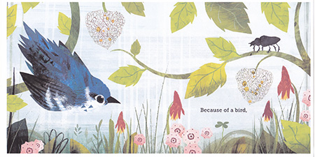

It’s never easy coming up with an original take on an established topic or concept. But that is one reason that I really enjoy writing literary nonfiction. When content and form come together organically, it’s thrilling. However, when
Frann Preston-Gannon added her brilliant illustrations, this book became an art form. The trim size, die-cuts, and vibrancy all come together to create a wonderful read.
So far, teachers, librarians, and parents have enthusiastically received this book. With their support,
Because of An Acorn will reach the hands and hearts of many young readers. Adam and I could not ask for anything more.
About Lola...
Lola M. Schaefer is the author of more than 270 books for children including picture books, easy readers, school/library texts, and classrooms books. Many of her titles have been published in other languages such as French, Japanese, Korean, Russian, Spanish, Swedish, Tawainese, and Turkish. Lola has won An Orbis Pictus Recommended Book Award, The Correll Book Award for Excellence, Outstanding Science Trade Book, and The Children’s Choice Book Award among many others. When she is not writing, Lola visits schools as an author-in-residence offering writing workshops and reader/writer presentations to students. If you would like to learn more about Lola’s books and her work in schools, visit www.lolaschaefer.com.
A few of the other science titles Lola has authored are: Hidden Dangers (Chronicle Books, 2017), Lifetime (Chronicle Books, 2013), and Just One Bite (Chronicle Books, 2010). 

The Problem With Telling, Not Showing Telling
By Janice Hardy, @Janice_Hardy Writing styles evolve and change, and reader taste changes with them. One of the more obvious ways is how we handle show, don't tell. A hundred years ago, books were filled with told prose and heavy passages of description. Books written as recently as a few decades ago can feel dated and stale to today’s readers. The more visual we’ve become as a society, the more shown we expect our books to be.
This is why it’s so important to understand what telling is, what it sounds like, and how it affects your writing, so you can best judge how to handle it. The thriller writer who uses omniscient point of view with multiple characters has different needs than the first-person point of view young adult writer. The same sentence can feel told in one passage and shown in another.
Because of this, there are two sides to the show, don’t tell problem:
• Problems writers face
• Problems readers face
Problems Readers Face Readers might say, “Tell me a story,” but a great story is more than relaying facts and details in a logical order. Readers want an immersive experience with enough descriptive details to bring a story to life in their heads.
Telling robs them of that chance. It explains all the reasons why things are as they are, it telegraphs what’s going to happen, and it leaves little to the imagination. It’s the difference between seeing a movie, and having someone tell you all about the movie, describing it scene by scene.
Half the fun of reading is anticipating what’s going to happen next and how the story will unfold. Readers love to wonder about the characters and try to figure out the plot twists and story secrets ahead of time. If it’s too easy, or all the answers are told to them, there’s really no point in reading.
What a reader considers good writing also varies. Readers of literary fiction might want as many adjectives and word pictures as they can get, enjoying the wordplay and use of language. Readers of thrillers might prefer a little explanation (telling) to keep the pace moving quickly, while romance readers want the focus on the emotions and how everyone feels more than dramatizing the action.
For example:
• Monique dashed along the riverbank, sending flowers dancing into the air, only to land softly on the gentle waves before sinking below the surface.
• Monique raced along the river bank, seconds ahead of the killer.
• Monique ran along the riverbank, Philippe’s warm hand in hers, soft as the flowers beneath their feet.
Problems Writers Face The number-one problem writers face is finding and identifying told prose in their work. It’s hard to be objective, and reading your own words as you “tell” your story feels perfectly normal. Writing, “John was angry about getting fired” is exactly what’s going on in the story. John is angry about getting fired and you’re writing all about his anger and what he does about it. You imagine all the emotions, thoughts, and actions that support John’s anger, but often, those details never make it onto the page.
Let’s take this sentence and expand it into a typical paragraph that might start a chapter or scene:
John was angry about getting fired. He yelled at his wife, his kids, even the neighbors. None of his friends wanted to talk to him, and it had gotten so bad they pretended not to see him when they ran into him at the grocery store. Naturally, this pissed him off even more, and it was the poor dog that suffered his wrath.
Is this paragraph shown or told?
Some people will say this paragraph is shown, but others will say it’s told—and they’re both right. What the writer intends this paragraph to do will determine whether or not it feels told.
• If this paragraph was intended as a quick summary and the point of the scene built off John being angry, this paragraph could smoothly set the scene and readers would read right past it.
• If this paragraph was meant to show how badly John is treating his family and friends, and this is all the reader gets to understand that, then it probably feels told and explanatory.
• If this is from a omniscient narrator, it probably feels shown, but if this is John’s point of view, it likely feels like a summary of a scene, not an actual scene. Look at what happens when I dramatize this sentence instead:
John slammed the door behind him. Who did that stuffed shirt think he was anyway? Fire him? That cesspool of an office would wither and die without him.
“You’re home early,” Maria said, coming in from the kitchen.
“Am I interrupting your bon-bon eating or something?”
Her smile faded. “What’s wrong?”
“I don’t get any damn respect, that’s what’s wrong.”

When you compare the two pieces now, how do you feel about them? Odds are the first feels much more told and summarized, while this feels shown and in the moment. It’s obvious John is angry and lashing out, it’s clear why, and you’re probably much more curious about what will happen next than you were in the first paragraph—maybe even dreading what John might do.
This is why it’s hard to spot told prose. Often, told prose stands out when compared to how the rest of the novel is written. A tiny bit of detached, explanatory prose here and there blends in and bothers no one, but use a lot of it, and the entire novel feels flat.
The second major problem writers face is that both readers and others writers have different opinions on:
• How much telling is acceptable
• What telling sounds like
• What to do about told prose in a manuscript
The person who prefers distant third-person narrators will have a higher acceptance for told prose than the first-person fan. The point of view styles are handled differently, and readers react differently as well. It’s very subjective.
Don’t let this discourage you, however. Understanding this annoying fact is what will allow you to really understand what show, don’t tell means. You won’t be following inflexible rules, but looking at your work and determining where it feels weak and how it could be made stronger.
Do you struggle with show, don't tell? Check out my new book, Understanding Show, Don't Tell (And Really Getting it), and learn what show, don't tell means, how to spot told prose in your writing, and why common advice on how to fix it doesn't always work.
Janice Hardy is the award-winning author of The Healing Wars trilogy and the Foundations of Fiction series, including Planning Your Novel: Ideas and Structure, a self-guided workshop for planning or revising a novel, the companion Planning Your Novel Workbook, and Revising Your Novel: First Draft to Finished Draft. She's also the founder of the writing site, Fiction University. For more advice and helpful writing tips, visit her at www.fiction-university.com or @Janice_Hardy. Website
 |
Facebook |
Goodreads |
Amazon |
Barnes & Noble |
iTunes |
Indie Bound 
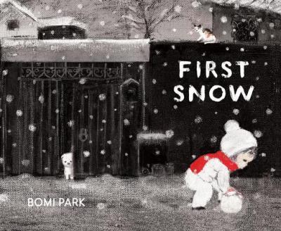
We're getting a bit frosty before it's time, but I have to share this fabulous debut picture book by Bomi Park. All the way from Seoul, South Korea, she stopped by to discuss it with us...
 e: What is your creative process, can you walk us through it?Bomi:
 Out of the many possible subject matters, I’m always observing and keenly thinking about certain images, topics, or short words that might become seeds for my stories. If a seed has the potential to sprout, I save them up no matter what it is. Out of those seeds, I draw a thumbnail sketch which gives me a general idea of the story’s plot or allows me to examine whether the seed provides the framework to become a long story or not. Then I flesh it out.

However, one slight difference I had from other authors was that I went from drawing a thumbnail to the original picture directly without sketching for three of my picture books (including books not yet published). You could say that it is like a composer who directly recorded a song through improvisation without making sheet music.
The fact that this process was possible with three of my picture books was in a way really fortunate for me. It was because I was able to complete the books without much trouble or difficulty. However, I decided to change my method after experiencing a great slump from relying on intuition. After much trial and error, currently I’m sketching out all of the pictures and coloring them after some corrections. I don’t think that my first method of relying on intuition is wrong. This is because each author has his or her own way.
I’m not sure how my process will change in the future. The biggest charm and appeal of drawing a picture book is changing my methods every time I run into difficulty and uncertainty.
 e: What is your medium?Bomi:
 It is hard to choose just one material among those that I’m familiar with.
If it’s a material that best corresponds to the feeling of the subject, I don’t limit myself to one material or several materials. Instead I try to use everything that is on hand.
I don’t really differentiate the process of sketching and coloring. I also don’t prefer planning out the process either.
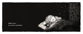
The main materials for “First Snow” were pencils, acrylic paint, oil pastel, ink sticks, digital work and others. However, the most important material was “paper” that had a rich texture. I spent a lot of time figuring out how to express white snow on white paper.
The solution to that was using a paper with grain thick enough to hold slightly heavier paint and crayon. I wanted to express the warm and tender feeling of snow.
e: Is there a unique or funny story behind the creation of this story?Bomi: “First Snow” was a picture that I painted to complete my course at an illustration school.
While taking courses for several months, I put a lot of effort into making a three dimensional miniature house for an exhibition with the topic of “season” and “house.” However, less than one month before the exhibition I realized that my plan and image concept was wrong. I was devastated.
However, I didn’t want to give up on the exhibition and after a lot of thinking I came up with a new plan called “First Snow.”
I didn’t have much time, so I thought of the clearest image inside me and that image was of “A child rolling a snowball on a snowy day.”

This was because I had worked for 6 years as a Christmas card designer before I became a picture book author. So it wasn’t difficult for me to think of winter and in a way it was the most natural thought I could come up with.
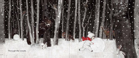
It was only during the publish process that text was added. In other words, until the exhibition the book had been a picture book without text. Since the picture book didn’t have any text, each reading of the book had its own interpretation. This was amazing and very interesting. There were those who interpreted the book as a fantasy of a boy who couldn’t walk. Even now, after the picture book was published with the text, I think how it would have been like if it didn’t have the text.
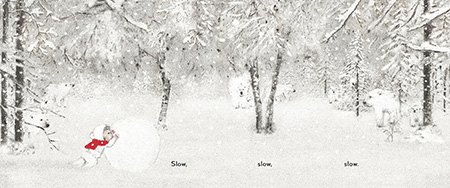
Although at the time I was bewildered from having illustrated the book in such a short amount of time, now I realize that it was the picture book that most reflected compared to other books I spent more time on. It is said that each author has his or her own breathing rate. I think my breathing rate must be very short.
(I’m currently working on a nonfiction picture book with 100 pages and it’s just exhausting.)
 e: What is your favorite or most challenging part of being a creator?Bomi:
 When I was little, I was the only child in a large extended family made up of adults. Although I received a lot of love and attention as the only child in the house, I was always lonely. Living under a quiet and serious atmosphere and being unable to play carefree as a child should, I spent most of time alone imagining trivial things and thinking of fantasies. Rather, I grew up as a mature child who hid her feelings to understand the adults.
That may have been the reason, that even though I grew up to become an adult, I still developed a mentality of wanting to receive compensation for my childhood. This might have provided me with the motivation to become a picture book author.
I want to live in an exciting story whenever possible and I also want to create “a world where children create for themselves” in which children can live without interference or attention of adults.
 e: What are you working on next or what would be your dream project?
Bomi: I’m currently working on a story about Korea’s lunar calendar seasons (subdivisions of the seasons) which are very distinct. The content is also very wide in scope and the book is quite long as well.
Although it includes the fictional story of one child who lives in different animal’s houses every two months for one year and has various adventures and experiences of the past, it is true that the book is overall nonfiction, so it has many points to study, and requires a lot of energy and patience to create.
If I complete the book, it will become a very rewarding journey for me. The book is very natural, and I’m continually surprised of my ancestors’ wisdom of dealing with 24 distinct seasons that only occur in the East. Therefore, I hope to introduce the book all over the world.
Other than that, I always dream of freely imagining myself flying around in my stories.
Check out Bomi's work space... e: Thank you Bomi!
 Learn more at the
Chronicle Books website.

This sweet new book written by Caroline Nastro is illustrated by Vanya Nastanlieva. She stopped by to talk us through her process.

 e: What do you think makes an illustration magical, what I call "Heart Art” - the sort that makes a reader want to come back to look again and again? Vania:
 Heart-Art : If I can feel something, anything, like emotions, mood, atmosphere, then there is a magic. If I am able to get closer to the character's soul, to his/her emotions, fears, dreams, then there is a magic, there is life, there is heart in it.
 e: What is your creative process, can you walk us through it? Vania:
 I am constantly learning and up-grading the process of my work. Sometimes it really depends on the the project I am working on and what I need to achieve in my illustrations. I do not have a specific or unique process/ style. Generally the idea drives my work, and then the creative process/style will follow the idea. I always try to experiment with a variety of new techniques and materials.

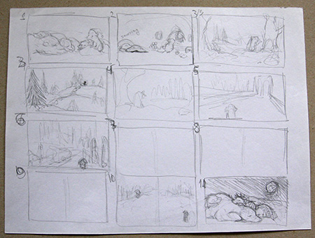
I love my pencil and I love the process of drawing and sketching.

I start with sketching, doodling, storyboarding in my sketchbooks and notebooks.


There I have many notes/ideas I make that I can refer back to anytime, it could be an image, a sequence or just simple words or even a text or very often a combination of everything above. I find it very natural and easy to focus on developing and getting to know my characters, the setting, the composition, when I use my black pencil. Once the rough sketches are to my satisfaction and the publisher's, as well I do the more detailed drawings. And next I add the colours to the black and white drawing.

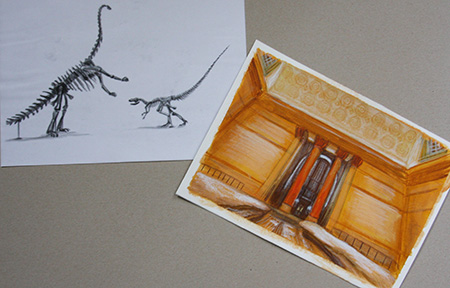
Sometimes the colours could be on a different paper, sometimes I can add the colours on one piece of paper.

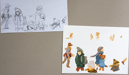
I use a more limited-colour-palette, probably because of my textile background.
The computer comes in when I need to scan the illustrations and the different layers. I scan it, clean it if needed in Photoshop and then connect the layers all together, the black and white drawing with the colour ones. There could be some finishing touches, adjustments or arranging but generally my work is all hand-rendered.
e: For illustrators - what is your medium? Vania: Pencil, pastel pencils, oil pastel, tempera, gouache, acrylic, watercolour, Photoshop. It could be from dry technique to mix media.
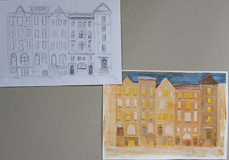

 e: What was your path to publication?
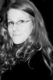 Vania:
 Years ago, after I finished my high school, I had a solo exhibition in my home town. There was a writer who liked my drawing of animals very much and contacted me and asked me to illustrate his book, so I did.
While I was studying at the National Academy of ART, I was juggling various part time jobs and doing illustrations for a children's magazine, then a newspaper for a short time. I also illustrated short stories written by my friends.
The real break-through happened after I studied for an MA in Children's Book Illustration in Cambridge, UK. As soon as I graduated I went again to the Bologna Book Fair in Italy (this time more prepared). I met and made many contacts with publishers, art directors and editors, while showing my work and my dummies. I kept in touch with the ones who were the most interested in my work. I was lucky enough to meet the right people and then, after a while, I was offered my very first picture book deal and this is how it started.
 e: What is your favourite or most challenging part of being a creator?Vania:
 The Favourite - to be able to create, anything, anytime, anywhere, even if I don't have any a pencil, pen and paper (that is very unlikely, but it happens sometimes). I just do it in my mind, I make mental notes and try to remember the main idea or even very small things till I can get hold of some paper and a pencil and then write it down so I won't lose it.
The challenge is to express and leave on the paper what is in my mind, in my heart. Sometimes the way from the heart to the hand can be very long and very challenging. But once you catch the flow it goes very easily and smoothly, just like fluid pouring from your heart through your hand and leaving the marks on the paper. I love it when this happens.
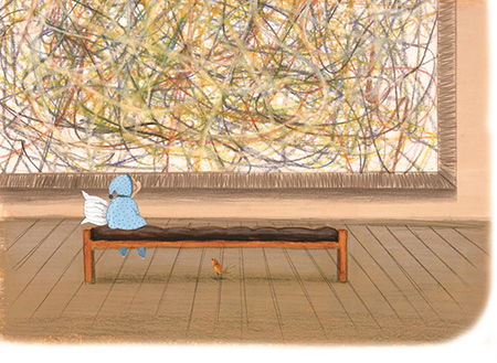 e: Is there something in particular about this story you hope readers will take away with them, perhaps something that isn’t immediately obvious?Vania:
 I have always believed that everyone has his/her own special path to go through and discover himself/herself. And everything, everyone who she/he meets on this path is just a part of the big puzzle, the big picture and serves to rediscover and develop herself/himself.
 e: What are you working on next or what would be your dream project? Vania:
 At the moment I am working on a third book of my own. I wish I could say more but it is still at a very early stage.
e: Thanks Vania! Kirkus Reviews said, "Cuddle up with this Bear and his pillow for a just-right bedtime story."
Visit
www.northsouth.com for free, downloadable activities for The Bear Who Couldn't Sleep.


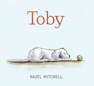
Thanks for inviting me to visit your blog, Elizabeth, Toby was happy dancing when he heard!
I’d like to share a little about how I created the art in TOBY published by Candlewick Press Sept 13th 2016. It ‘s a departure from my previous books, which have tended to be brighter and using more digital creation. As the author and illustrator of TOBY (my first solo gig!) I knew the feel I wanted for the book from the get go and that was to create an emotional mood in the illustrations, coupled with a retro look. People have commented that it feels very ‘British’ in tone – which is fine by me! (As I’m British).
Pretty much all of my art is created first using graphite, usually something soft in the 6B -9B area, or in some cases with dipping pen. In Toby I used graphite on 300lb Fabriano hot press paper. In previous books I’ve used cold press to get a rougher feel, but I wanted a smoother look for Toby. I start, as we all usually do, with thumbnails, rough sketches and incomprehensible scrawls, the meaning of which sometimes even the artist has no idea about! Sketches and visuals came first for me with this book.
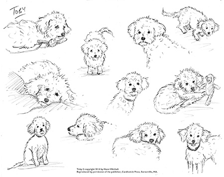
I’d been drawing Toby since I adopted him in 2013 and these sketches turned into scenes.

I began to weave a story around him and a young boy who adopts him. I linked scenes together, added more sketches to make sense of the story as I went along.

I never did write a manuscript as such. The scenes were written on index cards and swapped around until the arc was achieved. I scan my roughs in to the computer so I can piddle around with them in photoshop, I add gray wash for depth and love being able to cut and paste easily.

It’s then easy to save in PDF format and send to the art director and she in turn can add notes and comments. I’ve worked with photoshop since the late 1980s, it’s second nature now and an important tool in my studio.
When sketches (and revisions) are approved I move on to finals. Always an exciting moment! How will I create the looseness, not get too tight and detailed, create the mood I am looking for? I tried a few samples pieces and decided on the following technique:
In a previous book (Imani’s Moon by JaNay Brown Wood, publisher Charlesbridge) I’d used a technique most commonly seen in oil painting (although J.W.M Turner used it in watercolors too) the grisaille. First I lightly trace the sketch onto the final paper on my lightbox then complete the pencil work in soft graphite. Then I paint the grisaille, which is a monochrome underpainting in one color, often burnt sienna or prussian blue or gray. My underpainting for Toby was in burnt sienna which gave me soft lights and darks. I didn’t stretch the paper because the watercolor wash I was using would be fairly light and without salting or much texture work. (In Imani’s Moon I stretched the paper, because I punished the paper quite a lot to get texture).
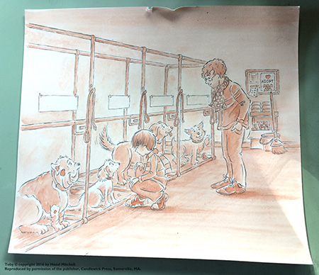
Once the underpainting is completed and dry (the pencil does not smudge as much as you’d imagine, so I don’t fix it before the wash), I scanned at 400dpi CMYK tif file and imported into photoshop. Then I turned it to grayscale.

(So why, you may well ask, do I use burnt sienna in the first place? Well, I somehow can see the light and darks better in that color and the mood, which was for a fall season in the book, so it made sense to me). I could have left some of the brown in once in photoshop, but it would have given the book a very sepia feel which my art director (Ann Stott at Candlewick Press) and I decided against. The overpainting of colors gave it warmth.

The final stage in my process is to paint over the underpainting (on a separate layer in photoshop) using a brush set to ‘color’ and the layer setting is ‘color’ also. I use only a couple of brushes, a soft edge and hard edge at different sizes, and very light colors so that the texture and pencil work show through in the finished art.

I find this is the best of both worlds! I get the happy accidents and freedom of hand-done work with the speed and ability to make fast changes with digital art. All the pages go ready to be sent to production as digital files.
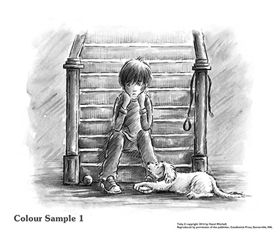


Hints – always work in CMYK. Work only a little larger than the page (125% ish) so that things don’t get ‘too tiny’ and the lines are standardized. Make sure you see a proof from the production department PRIOR to F&G’s. Try and get an ICC file from your production manager before starting work in photoshop ... it will help with color proofing on and off screen.
Hazel Mitchell has always loved drawing and still cannot be reliably left alone with a pencil. She has illustrated several books for children including
Imani’s Moon, One Word Pearl, Animally and
Where Do Fairies Go When It Snows? ‘Toby’ is her author-illustrator debut from Candlewick Press. Her work has received several awards and been recognized by Bank Street Books,
Learning Magazine, Reading is Fundamental, Foreword Reviews, NYCReads365, Society of Illustrators of Los Angeles, Charlotte/Mecklenburg , Chicago and Maine State libraries among others. Originally from England, where she attended art-college and served in the Royal Navy, she now lives in Maine with her poodles Toby and Lucy and a cat called Sleep. She still misses British fish and chips, but is learning to love lobster. See more of her work at
www.hazelmitchell.com. Repped by Ginger Knowlton, Curtis Brown Ltd.


THE SONG OF ORPHEUS
by Tracy Barrett I’ve published twenty middle-grade and young-adult books with Random House, Macmillan, Oxford University Press, and others. My first book came out in 1993, when self-publishing was difficult to do, expensive, and mostly looked down on as a way that clueless wannabe authors would get sub-par books printed, only to have unsold copies mildew in the writer’s garage.
Now, of course, that has changed. Self-publishing—now usually called “indie publishing”—is less expensive and easier to do than it used to be (although doing it well still isn’t cheap, and indie publishing isn’t without new challenges), and the advent of print on demand and eBooks means you don’t have to stockpile.
Many still look down on indie-published books, and that’s understandable. It’s possible to self-publish a dreadful story with no editing and a garish cover. Of course, plenty of traditionally-published books are bad too. But the lack of gatekeepers means that the percentage of awful books is higher among the indies than the traditionals. Still, every day there are more and more beautifully written, interesting, well-edited, and attractive indie books. A tiny fraction of them become bestsellers and a few are even made into movies.
So when one of my manuscripts received careful consideration by several major publishers, only to be rejected for vague reasons each time, I decided to give indie publishing a whirl.
The result is
The Song of Orpheus: The Greatest Greek Myths You Never Heard, which came out in July. My target reader for this collection of little-known myths is the kid who loves Greek myths but is tired of reading the same ones over and over. The research was challenging and enjoyable, and I loved discovering stories that I thought middle-schoolers would like. Rewriting them to keep true to the originals while sounding fresh to today’s readers was great fun.
But there are many facets to a published book. It’s not enough for it to be well written. To be successful—and for the author to be able to take pride in it—the book must also be well edited, copy edited, and designed, with an attractive cover and formatting. It has to be made available to readers and promoted effectively.
I’m a professional in only one of those areas: writing. I used to copy edit, but I know better than to copy edit my own work, and similarly, I’m not about to trust my own judgment of my writing. My very editorial agent had made me go through several revisions before she submitted it, and then, as I said, it received positive attention at some good houses. So I was comfortable that I wasn’t deluding myself about its quality. But what to do about the rest of the book-production process?
Fortunately, my agent, Lara Perkins, came to the rescue. Her agency (
Andrea Brown Literary Agency) was one of the pioneers of “agency-assisted self-publishing,” and she steered me to a copy editor, a cover artist, a designer, and a formatter, who all did stellar jobs. She also handled getting the ISBN, dealing with Amazon, and lots of other aspects of publication, some of which are ongoing. I found
a publicist on my own, after getting Lara’s input.
What’s in it for Lara? She collects her standard commission after I’ve earned back what I spent on everything but the publicist and other expenses I’ve run into after publication. (This is another reason I was confident that this was a marketable project; Lara’s not about to spend all that time on a book that she didn’t think would sell!)

I had complete control over every step. Lara presented me with options for each of the services she helped me find, and I consulted directly with Joe Cepeda, the brilliant illustrator who did the cover. For this reason, I’m not going to say how much all this cost—you can spend a lot less than I did, or a lot more. Expect to go into four figures, up to five, for high-quality work.
Is this expensive? Yes, it is. But it’s a business, just as a KFC franchise is a business. And considering that a KFC franchise costs between $1,250,000 and $2,530,000, I feel like my much, much smaller investment was money well spent.
One of my added expenses was getting a review from Kirkus Reviews. You have to pay for their review of an indie book, but this doesn’t guarantee it will be a favorable one. They allow you to choose whether or not to publish their opinion, and rumor says that at least 90% of the time, the author chooses not to do so—Kirkus is notoriously tough! This was another financial risk, but it paid off: While I was writing this post, Orpheus received a
glowing review!
Tracy's fave work spot - notice the light bulb.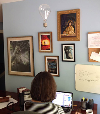

When asked to blurb BE LIGHT LIKE A BIRD by Monika Schröder, I said, "This story of loss and healing introduces us to bird-loving Wren, who turns out to be stronger than she knows as she finds her path back from grief. She learns that that there is no straight path to healing, and that it’s okay to honor good memories while growing from bad ones. Wren’s sense of self and ingenuity will inspire readers to find hope and opportunity right alongside this gutsy main character." I'm thrilled to have Monika here today to talk about her book herself!

BE LIGHT LIKE A BIRD
by Monika Schröder Thank you for inviting me to your blog and for giving me the opportunity to share a bit about the process of writing BE LIGHT LIKE A BIRD.
BE LIGHT LIKE A BIRD is the emotional, realistic fiction story of 12-year old Wren who is heart-broken after loosing her father in an airplane crash. Wren's father always told her to be "light like a bird, not like a feather" — to control her own destiny, to make her own choices. But Wren is adrift after her father dies and her mother acts distant and angry. Over the course of the story Wren needs to heal and grow, and when she finally learns the reason for her mother's behaviour, they both have to learn to forgive.
In early drafts of the book the focus was on Wren's trouble being the new girl in school and her fight to save the bird sanctuary. Over many revisions I felt that I hadn't reached the core of who she was and what was hurting her. But I didn't know how to fix it and left the manuscript in the drawer for a long time. And then I suddenly knew who Wren was: her father had died and her mother had dragged her to northern Michigan. From there I rebuilt the emotional arc of the novel, focusing on the grieving and her relationship to her mother.
It still took me a lot longer to finish BE LIGHT LIKE A BIRD than my previous novels. In hindsight, I realize that one reason for a slower writing process may have been that for the first time I braided together several subplots in a book: Wren's relationship with her best friend Theo, her desire to fit in with the popular girls at school, her grief, the relationship with her mother and, finally, the school project she and Theo work on together which leads into their campaign to save a bird habitat. I am not a fast writer, and, after I had taken the original manuscript out of the drawer, more than two years went by before I had put all the scenes in the right place so that Wren's emotional arc as well as the different plot components were aligned. Only when that structure were in place, I could begin to polish and edit the text.

Sometimes it was difficult to write about a grieving girl, but I also enjoyed getting deep into her character and describing her growth over the course of the story. I particularly enjoyed when Randle appeared. He just 'came to me' as I envisioned Wren looking for her dad's car and he became an important person, helping Wren to learn to forgive.
Since it took so long to finish the book I experienced many moments of frustration. Like many writers in those moments I thought I could never shape this manuscript into a decent book. My poor husband had to listen to me whine frequently and repeat the question, "Will I ever finish this book?" I appreciate his patience and constant encouragement. He reminded me that time actually doesn't matter while writing a book. What matters is to get it right -- and not to loose faith.
Monika Schröder writes novels for middle grade readers. Among her books are SARASWATI'S WAY, a story of an Indian street child and THE DOG IN THE WOOD, set in eastern Germany at the end of WWII. She grew up in Germany but has lived and worked in American international schools in Egypt, Oman, and Chile. Before moving to the US she was the elementary school librarian at the American Embassy School in New Delhi, India. She now lives and writes in the Blue Ridge Mountains of North Carolina with her husband and her dog. This is where she writes...

I met Leonard Marcus years ago at the Decatur Book Festival and we've been friends ever since. I'm also a fan. Not only did he curate the wonderful picture book exhibit at the New York Public Library, "Why Picture Books Matter" (which I was lucky enough to see and blogged about here), but he is a renowned scholar in the field of children's books. His latest endeavor is sure to be the new bible for graphic novels...
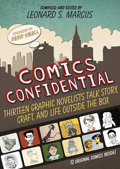
GUEST POST
by Leonard Marcus Some time around 2005 I heard a talk given by a librarian about how his library was struggling over what to do about “graphic novels”—whether to purchase them and if so where to put them. I was intrigued. By then I was well aware of the long-standing opposition of American librarians to old-style comic books, which many librarians going back to the 1930s regarded as sub-literary, and which some thought morally or psychologically harmful to young people. I began nosing around. The first graphic novel I read was Art Spiegelman’s Maus, and I found it to be one of the most powerful books I had ever read. In fact I cried when I got to the end. Then when First Second Books came along with graphic novels ear-marked for young readers, I began to pay close attention to their lists. One of the next comics-formatted books I read was Alan’s War by Emanuel Guilbert—a dramatization of one G.I.’s experiences of the Second World War. Next I discovered the funny, bittersweet work of Sara Varon. I kept on going from there.
I realized that comics were another compelling way to tell stories—both true stories and fictional ones. The best comics feel to me like a cross between a traditional print narrative and a film. When I read a graphic novel now I have almost the sensation of being at the movies, with the text pared down in the same way the captions are in a foreign film, and with images aimed not just at depicting the action but also at setting a particular tone, rhythm, and point of view. Also, for “reluctant readers,” comics have proven to be a gateway to reading generally. How great—and valuable—is that?
Once I decided to do the book that became Comics Confidential, I immersed myself both in the work and life stories of each author/artist I wanted to interview. After a while, questions always present themselves. I think of an interview as an “encounter”—a sort of meeting of minds—and I try to keep the conversation from feeling too one-sided. I am always on the lookout for any thread that connects the storyteller to the story. My favorite moments are those when the person I am speaking with says, “I never thought of that.” Conversation is usually messy. I don’t ever want to lose that quality altogether but I always edit a transcript enough to give an overarching clarity to what was said.

People in general surprise me, which is one reason I like doing interviews so much. Gene Luen Yang surprised me when he said that he did not consider himself a particularly strong draftsman--but then B.B. King did not think all that much of himself as a guitarist. I was amazed (though not surprised) by the extraordinary depth of knowledge that Harry Bliss, Geoffrey Hayes, and others have of the comics tradition. I found it fascinating—and surprising—that Catia Chien came to art via a serious interest in entomology and that Matt Phelan taught himself to draw. I was delighted to learn from Hope Larson that after finishing her graphic novelization of A Wrinkle in Time her idea of a good break was to enroll in a class in “ice-cream school.” I am pretty sure that Madeleine L’Engle would have approved.
One of the best things about how the comics genre has grown is that it offers so much variety now—something for almost every taste and temperament. Readers who enjoy biography might want to try Feynmann, by Jim Ottaviani; illustrated by Leland Myrick; or (as mentioned earlier) Alan’s War. Fans of Harriet the Spy would enjoy Mariko and Jillian Tamaki’s This One Summer and Skim. Sara Varon’s Bake Sale is goofy and poignant—an unexpected combination. For newly independent readers, Geoffrey Hayes’ “Benny and Penny” books are total charmers—and models of fine drawing and composition. The list goes on …Who can resist? Not me.
Leonard at his desk...

And Leonard with some publishers recently in Beijing.

How's this for a treat? Cheryl Klein, American consistency editor for Harry Potter and one of the most popular speakers for conferences across America because she is so chocked full of good advice, has a new book on writing, THE MAGIC WORDS. Her first book on writing, SECOND SIGHT, was a huge hit and this one adds even more information to help every children's book creator. I've learned so much from Cheryl over the years so I'm thrilled to have her drop by to tell us more about it...
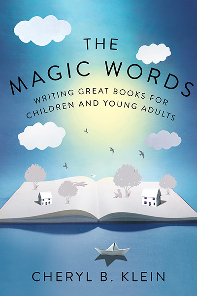
THE MAGIC WORDS
Interview with Cheryl Kleine: As an editor - what do you think makes an illustration magical, what I call "Heart Art” - the sort that makes a reader want to come back to look again and again? Cheryl: I think it’s a combination of a well-rendered, recognizable reality; an artist’s individual vision of that reality; and a clear idea, action, or (especially in children’s books) emotion communicated through the picture. Without the reality, the illustration has no anchor in common experience; without the vision, it could have been made by anyone; and without the idea, action, or emotion, it’s fine art or flat (or both) — it’s not illustration.
 e: I loved SECOND SIGHT. Between that and THE MAGIC WORDS, this book has had quite a journey! What was your path to publication? Cheryl:
 In 2005, I started a blog, and put up a few of my talks for writers on the first iteration of my website. The two sites quickly became popular among writers, who eventually began asking when I was going to write a book, and I thought that sounded like a great idea. I created one of the first publishing projects on Kickstarter in order to fund my first printing, and I raised $2000 in nine days. As a result, in April 2011, I self-published a collection of my best speeches and blog posts, entitled Second Sight: An Editor’s Talks on Writing, Revising, and Publishing Books for Children and Young Adults.
The book went through four printings, but as the years passed, I found myself writing more material and refining and deepening a lot of my thinking about the major components of fiction. In late 2014, I decided I wanted to revise the book, ideally with the editorial, marketing, and distribution support a traditional publisher could offer. I found an agent who believed in the book—the excellent Brianne Johnson of Writers House—and she sold it to W. W. Norton, who has truly ben my dream publisher. It’s been an educational and exciting experience all around.
e: As a publisher yourself, what was it like to seek out and work with another publisher?Cheryl: Fascinating! Three different editors were interested in the book, and I had conversations with all three of them to see which one felt like the right editorial fit -- something I recommend all writers do at the acquisition stage, actually, to be sure the editor's and writer's visions for the project align. My editor, Amy Cherry, described herself as someone who loved nitty-gritty manuscript work, which is exactly what I wanted -- someone who would be as rigorous with my writing as I try to be for the books I work on. (I've actually stolen one of Amy's line-editing techniques -- a checkmark on the page for a nice moment or line.) And I've always admired the quality of W. W. Norton's books and their ethos as a publisher, so being published by them has been a dream come true.
e: What is new in this new version? Cheryl: So much! I added new essays on the principles of good prose, the elements of writerly talent, how to develop an idea, how to write a novel, how to hook readers into your characters, writing cross-culturally, novel pacing, scene structure, what makes a great first chapter, writing speculative fiction, publishing as a whole . . . Just a ton of stuff. (And some material in Second Sight went away accordingly; the picture-book talk is no longer a part of the book, for instance.) I know readers really valued the practical tools in Second Sight, so I also included more exercises, checklists, and worksheets to help writers define and refine their work.
e: What is your favorite or most challenging part of being a creator?  Cheryl: Most challenging:
 There are simply too many cool projects to pursue, cool people to work with, cool ideas to try to put into book form — either as a writer myself or as an editor who wants to make great books. In short: There’s not enough time.
Favorite: I love it when someone just absolutely nails an idea or emotion. This might happen when I write something myself and finally pin down all the nuances of a concept that’s always been vague in my head; or it might be one of my authors or illustrators revising a scene so it makes me laugh, or so I feel kicked in the stomach, or simply so I say “Ohh” or “Ahhh” or “Wow.” That’s what I read and write for — moments like that.
e: What is your favorite writing spot?Cheryl: I'm attaching a photo of my the chaise on my couch here, where probably a third of THE MAGIC WORDS was written or revised. I also worked at my local library branch in Brooklyn; Muse Cafe and Tea in Park Slope, where I went every Sunday after church; and the Betsy Hotel in South Beach, Florida, which was kind enough to invite me to stay in their blissful "Writer's Room" for a residency, where I made the final push on the revision.
Here's Cheryl's fave writing spot - her chaise: e: Thanks so much for sharing Cheryl!
I am a huge fan of Eliza Wheeler's work, so am absolutely thrilled she was able to spare some time from her very busy schedule to stop by and share her creative process with us today. Happy reading!
Eliza Wheeler on Method I have illustrations in two books that came out in August; the first is a picture book by Varsha Bajaj, THIS IS OUR BABY, BORN TODAY, and the second is a middle-grade novel by Kate Milford, THE LEFT-HANDED FATE.

These two books couldn’t be more different! THIS IS OUR BABY, BORN TODAY is a bright, sweet book celebrating the first day in the life of a baby elephant, with all the jungle family and friends welcoming him into the world. THE LEFT-HANDED FATE is a nautical adventure set during the war of 1812, when three teenagers land on a mysterious island city to search for pieces to a weapon that could change the fate of the world.
Since I started illustrating full time, about half the books that I illustrate are picture-books, the other half are middle-grade novels. It’s a great balance of work that’s bright and sweet, and dark and more mature. I’ve experienced distinct differences illustrating for both formats that I’d love to share with fans of the children’s book genre. For simplicity’s sake, my examples are traditionally formatted middle-grade novels and picture books. But, it’s worth mentioning that there have been a growing number of highly-illustrated middle grade novels and chapter books these days (for example, THE INVENTION OF HUGO CABRET and other Brian Selznick novels), which is exciting for both illustrators and kids resistant to books without pictures (which I is how I was as a kid).
FORMATPicture Books: Typically consist of 32 full color pages, with every spread of the book covered in artwork. The text and artwork share page space. The size of the book is often somewhere around 9”x11” (closed), which means that the physical paintings are larger in size. (I work at 100% to the print size.)

Click the image to see a larger version in a new window.Middle Grades: Vary in length, but are usually a hundred to several hundred pages long. Occasional illustrations supplement the text throughout (typically one image per chapter; sometimes less, sometimes more). The book size also varies, but they are often around 5.5”x8” (closed), and the illustrations are a mix of black and white full page and spot illustrations laid out separately from the text. For THE LEFT-HANDED FATE, I also created a few illustrations that cover an entire wordless spread. The physical paintings are much smaller than picture book artwork.
 VISUAL FUNCTION and FLOWPicture Books:
 The words and pictures play their own equally important roles in telling the story. The visuals flow from page to page, and need to have rhythm, cohesion in characters and colors, and variety in compositions. The way that the pages are strung together is as important as creating singular successful images. I begin every picture book by working first on storyboards to get a sense of how all these elements are flowing together. In THIS IS OUR BABY, BORN TODAY, the book begins in the morning and ends at night, so I used these storyboards to plan how the colors would flow as well.

Click the image to see a larger version in a new window.Middle Grades: The words are the main vehicle for the story, while the images work as stand-alone scenes sprinkled throughout the text. They’re less about telling the story, and more about giving little windows into the world the author has described. While the images’ relationships to each other are not as important, what is important is that they correctly correspond with the scenes in the text.

Click the image to see a larger version in a new window.CONTENTPicture Books: The child audience is usually ages 3-7, and so the child characters in the book should be somewhere around that age, too. Picture books have another important audience—the adult who’s reading the book aloud to the child. When I create the artwork, I’m hoping that it will appeal in some way to both of these audiences. Generally, picture book artwork is sweet, colorful, and playful.
Middle Grades: The audience here is generally in the 8-12 year-old range, so the characters in the book are often in that age range as well. I’ve had to study visual differences between kids that are 5, 8, and 12. I seem to naturally draw 5 year-olds and 80 year-olds. Anything in between takes some work! As with the writing style and topics of middle-grades, the artwork is often darker and more mature.
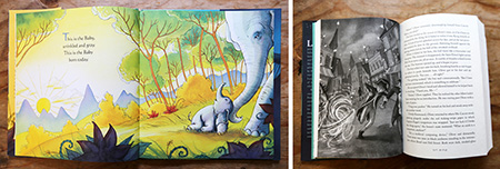 SCHEDULE and PAY Picture Books:
 Have longer schedules; I typically need a year for sketches, revisions, and final artwork. The art deadline is 1 year from the publication date, so if a book is going to be published in the spring, the artwork is due the previous spring. As for pay, advances for picture books are higher than middle grades, and as the illustrator, the royalty earnings are split equally with the author (generally 5% for each).
Middle Grades: The sketching process can stretch out over months (or years) due to the editorial process between the writer and editor, and I find with novels there’s a lot more “hurry up and wait” time involved. Once the sketches are approved, the time to create the final artwork is much shorter than for picture books, usually a couple months, and it happens closer to the publication date. The pay for middle grade artwork is lower than picture book work as well, and for books with minimal illustrations it’s rare to get royalties for the work. For the novels like THE LEFT-HANDED FATE, with a high quantity of drawings, the illustrator usually gets a small royalty.

Click the image to see a larger version in a new window. WORKING PROCESS 
The difference between working on large full-color paintings and smaller grayscale paintings is a big one. With grayscale painting, the biggest focus is on tone and contrast. With full-color art, there are so many more decisions to be made about color palette, saturation, brightness, contrast, etc. As a result, I find working on a picture book to be a more immersive, all-consuming process. I try to keep my schedule completely free of other work during the last months on picture book final artwork, and often I’m exhausted, physically and creatively, when finished. Since middle grade books are less labor intensive, the work is often refreshing coming after months on picture book art. That said, the immersive quality of a picture book is thrilling, and creates an emotional bond with the world and characters that’s intrinsically rewarding.
I love creating bright, sweet artwork for very young readers, and dark, magical art for older audiences. The differences in these formats are what make them a perfect balance of projects for me.
Thanks so much to Elizabeth for inviting me to share about this work with everyone!
Thank YOU Eliza! - e 
I've become a fan of Eugen Yelchin's creations, so I'm thrilled to have him on today...
STORY BEHIND THE STORY
Eugene Yelchin Thank you so much for inviting me to share a “behind the scenes” glimpse of The Haunting of Falcon House. As with my previous books, this is a middle grade novel that could be read on several levels by both young and adult readers. On the surface Falcon House is a classic ghost story in which a protagonist uncovers a crime that had occurred in the past yet still haunts the present. However, the crime here serves to present a moral argument on a larger scale — is it possible for an individual to feel free in a society that allows one group of people to oppress another?
The story takes place in St. Petersburg. I wanted to write a book about my Russian hometown for a very long time; the feelings that that city can stir in one’s heart could never be forgotten. The reason is not particularly the beauty of its historical center, but rather the fact that the authors like Pushkin, Tolstoy, Dostoevsky, and Gogol had all used St. Petersburg as the prime location for their stories. As a result, for the dwellers of St. Petersburg, the real city and the city imagined had always blurred into one. “Below us in the waiting stillness gleamed Saint Petersburg. The churches, palaces, and bridges lay buried under the brilliance of snow. The sky shone with stars. Their pale blue flicker reflected from the frozen river that sliced the city into islands like shards of a shattered mirror.”

“We dashed along snow-coated streets that sparkled like sugar, crossed bridges arching over frozen canals, and passed palaces gleaming with gold. Shops with enormous windows flashed by like tinfoil. The gas lamps had just been lighted, and below the lamps flowed crowds of richly dressed people. Sleighs and carriages I’d never seen the likes of crisscrossed in all direction. The crisp and frosty air rang with crackling whips, ringing bells, and sleigh runners squeaking over the dazzling snow.”

While working on the book, I’ve collected a great deal of photographs of the 19th century Petersburg, some beautiful, some spooky, most giving me exciting ideas for the narrative. “Bewildered, I gazed at my grandfather’s death mask. The leaping shadows cast upon his aspect by the moving light of candelabrums conferred upon it a peculiar impression of a living face. His cheeks were sunken, eyes tightly shut, and the drooped corners of his mouth seemed to gather into an unpleasant grimace; was Grandfather sneering at me?”

Because the main hero Prince Lev is the “last of ancient lineage”, I was particularly interested in the images of the Russian aristocracy. “Two piercing eyes were fixed upon me. I gasped and stumbled back. From the vibration of my near fall, the fire flared in the fireplace, light swept across the shadowy recess from where the eyes were glaring, and I saw their owner. A man hovered in the utter darkness. His body was distorted, strangely incomplete, swaying slightly in the flicker of the candles. I could scarcely breathe.”
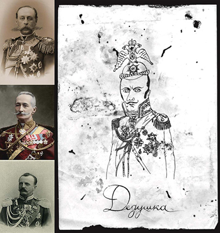
Prince Lev is summoned, or so he thinks, to take charge of the Lvovs’ family estate by his aunt Olga Lvovna, a classic tyrannical and highly manipulative antagonist.
“I had seen Olga Lvovna’s pictures in my father’s photographic album. In every picture, she smiled, her eyes shining brightly, and she was always dressed in white. That little girl was no more. Olga Lvovna was my father’s older sister, but how much older I couldn’t tell; she looked about a hundred. Her eyes were circled with dusky rings, her waxy cheeks were hollow, and all that remained of her once smiling lips was but a brief thin line. Her dress was black, and she was so pale and skinny, I fancied she had spent her life in prison with neither sunlight not fresh air.”

Given the book’s genre, I had a lot of fun writing scary passages, while trying to stay faithful to the 19th century’s supernatural style. There are chilly shadowy hallways, and candles that go out by themselves, and of course there are bats, lots of bats.
“There was a terrific crash. The whole house shuddered. In an instant, an earsplitting shriek echoed through the shaft. A boiling black cloud rose from below, screeching, shape-shifting, and cartwheeling right at us. I sprang away from the opening. Bats poured out of the shaft, swooping across the landing in a thick, black smudge.”
My favorite place to write is always my art studio, but this time I had to surround myself with objects that would help me creating a believable atmosphere of the 19th century Russian aristocrat’s study — period weapons, taxidermy, silhouette portraits, etc.

And finally, to design the book as an original 19th century volume, I acquired and studied a great deal of antiquarian books —a priceless addition to my library!
 Thanks so much Eugene! To learn more about Eugene and his books, visit his website.
Do you remember LITTLE ELLIOT BIG CITY by Mike Curato? Well, Little Elliot has a new adventure in LITTLE ELLIOT BIG FUN! Mike stopped by to answer some questions about it...
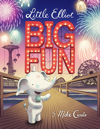 e: What is your creative process, can you walk us through it, and what is your medium?
Mike: Usually, when I begin a book, I start with sketches of Elliot in various situations. Then, I start writing about each drawing that stands out to me. I go back and forth until a story starts forming. I don’t really set out with a theme in mind, I arrive there through the process. As in life, we don’t know what some experiences are about until we have some distance from it. Then, we can see the full picture and say, “Oh! That’s why I went through all of that! Life was teaching me X lesson.” Once I feel confident that my story has a beginning, middle and end, I start sharing it with my editor, Laura Godwin. We go back and forth with ideas for how to tighten up the book. To make my illustrations, I draw with pencil on paper, scan, and color digitally. Also, I spend a huge amount of time doing research. The Little Elliot books all take place in late 1930s New York, so I try to be as authentic as possible.
 e: What do you think makes an illustration magical, what I call "Heart Art” - the sort that makes a reader want to come back to look again and again?
Mike: I think Heart Art is that element of an illustration that cannot be said with words (the whole reason why we need illustrations to accompany a text). A good illustration speaks directly to the soul. It’s a vulnerable truth that tells the viewer that someone else understands what they’ve been through and how they feel, much like music. This isn’t something one learns. It’s the result of the artist searching for the right visual elements that stir something in their being. It’s the part of the illustration that isn’t technical, but is more unto a sixth sense.
e: What was your path to publication?
Mike: I went to Syracuse University’s illustration program from 1999-2003, where I realized that I wanted to focus on picture book making. After graduation, I tried to break into publishing on and off for ten years, working as a graphic designer in the meantime. In 2012, I attended the SCBWI winter conference in NYC, where I was fortunate enough to win the portfolio showcase. In most of the illustrations in my portfolio, I featured a character I had been drawing for years, a small polka-dotted elephant. Brenda Bowen (who is now my agent) slipped her card into the portfolio. The next day, I received emails and phone calls from several publishers inquiring about who this elephant was and what was his story. By summer, Little Elliot went to auction and found a home with Henry Holt Books for Young Readers at Macmillan.
e: What is your favorite or most challenging part of being a creator?
Mike: I think my favorite part of being a creator is that magical moment when I am able to make something that makes me happy. I don’t mean that in a prideful way, it is more about witnessing the Art Heart that you were just asking about. I have a poet friend who once told me that when she’s performing, it’s her time to talk to God, and everyone else gets to watch. It’s a feeling that’s worth its weight in gold.
Click the image to see Mike's studio larger in a new window.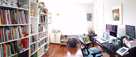
 e: Is there something in particular about this story you hope readers will take away with them, perhaps something that isn’t immediately obvious?
Mike: For me, the book is about confronting fears, and how to be a good friend to someone who is afraid. Life is full of scary rides, but when friends stick together, they can get through them.
Click the image below to see a GIF of Mike's process:
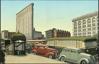


I have a treat for you today - a new way of sharing an interview.
Will Hillenbrand, illustrator of BEAR IN LOVE and the new BEAR AND BUNNY, put together a video response to my questions! In it, he talks about the development of Bear and Bunny.
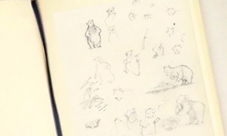

His media (digital - Adobe Photoshop Sketch).
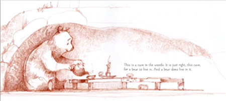
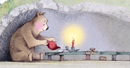

I especially liked his answer to my Heart Art question:
"I think it comes down to our audience. Children are magical. They have a sense of discovery, a magical sense of curiosity, a sense of joy of being alive in the world. As adults we are often spoilers if we think wee are showing the magical world to them without receiving it from them first, the magic turns to dust. The children are the inspiration for the magic. That's why I work and choose to work for them."


Click the image below to enjoy the full interview or
CLICK HERE to view it on YouTube:

And visit
WILL'S WEBSITE to learn more.
BEAR AND BUNNY. Text copyright © 2015 by Daniel Pinkwater. Illustrations copyright © 2015 by Will Hillenbrand. Reproduced by permission of the publisher, Candlewick Press, Somerville, MA.

I've been quite excited Bethan Woollvin's LITTLE RED from Peachtree Publishers - Bethan Woollvin's LITTLE RED. It's become a great companion piece for teaching alongside Molly Bang's PICTURE THIS. So I am thrilled to have Bethan here today...
 e: What is your creative process, can you walk us through it?
Bethan: My creative process can vary depending on what project I’m working on. With picture books I usually start by generating ideas. I try to do an exercise where I think of as many ideas as I can in three minutes which brings out all sorts of wild ideas.

When I have an idea, I then begin to work on loose sketches which is my favourite part of the process. At this stage, I’m probably still working in a sketchbook creating my characters and their world. I would then move out of my sketchbook and onto larger paper where I would start to experiment with different materials and book dimensions. Its not long before the idea then begins to take shape, and starts to feel like a book.

Once my characters are just right, I then begin thinking about colour which is such an important part of my work. I usually work with around three colours, for example - with Little Red I used red, black and grey. When I have drawn out rough sketches of all my spreads which often takes a great deal of planning, I can jump into my final artwork. This is then one of the quickest parts of my creative process. I actually generate the final artwork quite quickly as the looseness and bold line are key in my artwork. Then the final stage of my artwork is scanning it, and cleaning it up on photoshop.
 e: What was your path to publication?
Bethan: My path to publication started on my illustration (BA) course at the Cambridge School of Art. My class were given a 6 week book project in the second year of our degree. The brief was quite loose, so we were encouraged to find a text, or a competition to give it some structure. I chose to make a book for the Macmillan Childrens Book Competition. I only had six weeks, so I didn’t have enough time to create my own story from scratch, so I used a pre-existing text, Little Red Riding Hood. I had never illustrated a story, nor illustrated for children, but I really enjoyed it! I submitted my picture book to the prize, and a little while later I was told that I had won the prize! I worked on Little Red with Macmillan on its journey to being published, which it finally was on the 24th March.
 e: What is your favourite or most challenging part of being a creator?
Bethan: 
I think the most challenging part of being a creator is having an ‘off’ day. As an illustrator you rely on your mind and hands to work together to create artwork, but sometimes that doesn't happen. It can be really frustrating to set aside time to illustrate and you just aren’t feeling very inspired! If I am ever suffering from a creative block like this, I have found the best thing is to go get inspired. Inspiration can come in all forms, but I like to go to museums or new exhibitions, as it really helps to go and learn about something new. Having enough ‘me’ time is important too, a lot of creatives juggle freelancing with other part time work. Although it’s really tempting to spend all of your spare time making things, you’ll run out of creative juice if you don’t have a movie day every once in a while!
 e: What do you think makes an illustration magical, what I call "Heart Art” - the sort that makes a reader want to come back to look again and again?
Bethan: I think my definition of ‘Heart Art’ is about the relationship between the text and illustrations. The text gives us the story, but the images can be used to tell us more of the story and in a really exciting way. An example of this would be from Little Red:
The text reads ‘And he made a plan’, but the illustration tells you more.

I think this makes it more exciting for the reader, encouraging them to engage with the story and pick up the visual clues that complete the story. Sometimes these cues aren’t noticed at first, so the reader finds something new when they come back to read it again.


Today I'm thrilled to have renowned author/illustrator, and Co-Director of the Writing and Illustrating Children's Books MFA and Certificate programs at Hollins University, Ruth Sanderson at dulemba.com. She has a fantastic new book to share...

THE GOLDEN KEY
by Ruth Sanderson Reading "The Golden Key" close to forty years ago instilled in me a profound desire to some day create pictures that illuminated this evocative text. Over the years, when people have asked, “If there was one book you’d like to illustrate, what would it be?” —my answer has always been "The Golden Key" by George MacDonald. I loved the story, and the version I had was illustrated by Maurice Sendak with beautiful, dream-like pen and ink pictures. There were only 6 plates in the book, however, and I wanted to do a fully illustrated version.

After I became a working author/illustrator I tried to edit down the story to fit a picture book format, but it didn’t feel right. The story is simply too long and complex for a picture book. So my "dream project" was put on the shelf for thirty years.
In 2007 with Brian Selznick's Invention of Hugo Cabret I became aware that artists were challenging the standard format of books for children. A few years later when thinking wistfully about how The Golden Key could absolutely never be made into a picture book in this climate of shorter and shorter texts, it occurred to me that this very long story might be easily broken into chapters, as it alternates between the two characters' points of view. I also felt that 8-12 was a more suitable age group for this unusual story than that of a younger picture book audience.
In contemplating the style and medium to use, I felt that scratchboard would be perfect to convey the story's mythic quality and dramatic light and dark imagery. In my spare time between other book projects In 2011 I started to create some of the key scenes that I wanted to include in the story. My favorite scene is Tangle descending the stairway into the earth, and I always felt this was like Persephone descending into Hades.
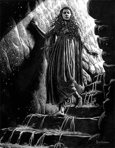
I split the story into 9 chapters and created a dummy that paged out to around 224 pages, carefully planning room for over 45 illustrations. Some are wordless spreads, some are single pages, and some are vignettes that wrap around the text. I wanted to create the look of a fully illustrated novel. It is really a very long picture book for an older audience.

One thing that will set my version apart is the fact that, as a picture book illustrator, I decided to add elements that were not expressly stated in the text, that would “expand” the story and add an interesting subtext. This subtext was created as I mused on the object and meaning of the golden key itself and the fact that MacDonald places the key in Fairyland. I have framed the story with wordless pictures, one before the text of the story starts and one right after it ends. I have always been intrigued by the fact that the golden key seems to magically appear at the base of a rainbow in Fairyland. I imagined that perhaps a fairy might be put in charge of placing it there. And perhaps that fairy might arrange for a particular person to see the rainbow and seek the key. Or perhaps in "flitting from place to place" lest anyone should find the key, she notices a boy with a spark of desire for something beyond our normal human grasp.
Therefore, in the first illustration, before the text begins, the creatures in Fairyland watch the boy as he listens to his great-aunt's stories. One fairy is sitting on a tree stump with the golden key. I imagined her observing his spark of interest in the key.
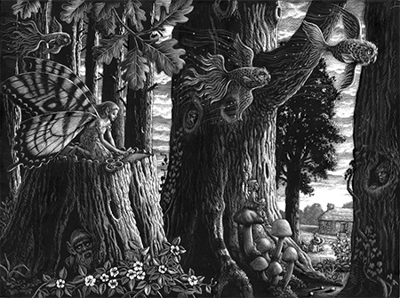
After showing a close-up of this conversation between Mossy and his great-aunt at the start of the text, I added another wordless spread with the fairy flying off with the key, implying that she was going to hide it for the boy to find.
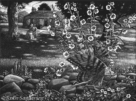
And sure enough, he could not resist dashing into Fairyland that evening when he sees the rainbow, a "grand sight, burning away there in silence, with its gorgeous, its lovely, its delicate colors, each distinct, all combining."

At the end of the story, in the picture where Mossy and Tangle climb into the rainbow in the distance, the fairy flies off with the key in the foreground, indicating that their story is over, but another story is about to begin. The final wordless illustration shows the fairy bringing the key back to the base of the rainbow in the forest, looking back toward the reader—an invitation for the next person to seek the key.
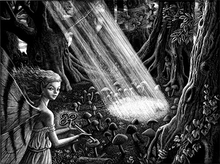
George MacDonald considered Fairyland to be a symbol of the imagination, and he invited each reader to interpret his stories after his/her own sensibilities. I invite readers to interpret my pictures in the same light. For me, imagination is the Golden Key.

Ashley Wolff teaches Creating Picture Books for Children here at Hollins University in the MFA in Writing and Illustrating Children's Books and Certificate in Children's Book Illustration programs. And I'm happy to share she had a new book come out this year while we were apart - IN THE CANYON written by Liz Garton Scanlon. Today, Ashley dropped by to share her creative journey with us...

Welcome to the Grand Canyon
by Ashley Wolff 
One the “Seven Natural Wonders of the World”
It’s about 270 miles long, up to 18 miles wide and a mile deep, Its walls contain rock layers that reveal a timeline of Earth’s history.
To make In The Canyon as good as it could be, I had to explore the Grand Canyon. I took my excellent and intrepid little sister and in we went!

from RIM to RIVER…

and back!
The main character of In the Canyon, written by Liz Garton Scanlon, speaks in the 1st person voice. She begins her narration like this:

“Here’s a map, some boots, a pack, a walking stick, a sandy track.”
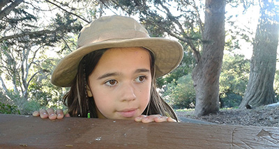
I always enjoy working with a model and I found a lovely girl in San Francisco named Willa.

I spent a few hours with Willa taking pictures, and then used those to draw from while illustrating the book.
She gazes at the reader from the jacket, inviting you to join her In the Canyon.
As soon as you dip below the rim of the canyon you enter a vast, deep bowl that has no direct route to the bottom. The trails are constantly zig zagging down the steep walls. Occasionally you can spy the river, way down deep.
My sister Peri, seen from a few switchbacks above, with many more to go. The Colorado river, bright green, is crossed by 2 bridges. One is visible here.

If it is a cool spring morning on the rim, it is full, hot summer at river level. Along the way are blooming cacti and yucca, birds, lizards and curious squirrels.

I can't get enough shots of the blossoming Beavertails.
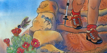
“Here’s a footstep, dusty red, another one and more ahead.”

Signs like this one are a regular sight. To do this rim to river to rim hike one must be very fit and prepared for a lot of heat and exertion.
Some people choose to travel by mule. Mules are chosen from Tennessee and Missouri. They are used for pack supplies to Phantom Ranch and pack mail out of the canyon and later promoted to trail mules.

I used a photo of a family, gathered under an overhang, as inspiration for this illustration.

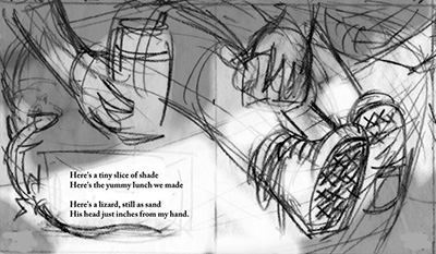
“Now here’s a tiny slice of shade, a yummy lunch, some lemonade. And a lizard, still as sand, his head all speckled, body tan.”

Finally, we're at river level, where the deep shade around Phantom Ranch is most welcoming. Time to recharge and load up on water and salty snacks for the hike back out. Peri and I made it back to the rim by nightfall, a 16 mile roundtrip.

But the child in
In the Canyon is luckier. She gets to spend the night, camping by the river.

“Here’s the dark and here’s the shine, and here’s the moon—it’s like it’s mine. To tuck inside me way down deep, Grand and wild, mine to keep."
I'll come back to the Canyon someday, no doubt with enough overconfidence to descend to the bottom and back in one day as I did with Peri.
After all, I have what it takes: "a map, some boots, a pack, a walking stick, a sandy track.”


I have news from our most prolific Professor and author here at Hollins University. Candice Ransom has published over 130 books and she has more coming out this year. I'm thrilled to have her drop by to talk about these new books and her creative process.
Have (Orange) Notebook Will Travel
Candice Ransom I once believed nothing was harder than writing a picture book. Writing picture books is a cakewalk compared to beginning readers. Kids don’t have to read picture books, just enjoy them. Beginning readers are designed for newly-independent readers who have graduated from phonics texts. Levels vary according to publishers, but usually include an early level for pre-readers and/or kindergarteners.
The kindergarten readers have very short texts and are splashed with cheerful illustrations. They look easy to write. Fun, even! I’ve written three Level 1 books for the Step into Reading imprint of Random House. I’d love to brag I dash these fripperies off in a day or so, but my orange notebook would be quick to report the fib.
My orange spiral notebook is used exclusively for writing level 1 readers. It’s battered because I drag it everywhere. Sometimes I throw it across the room. The orange notebook knows I will pick it up with a sigh and go back to the difficult line giving me fits.
My first Level 1 ideas were rejected for being too sophisticated, such as the canine etiquette guide written by fleas. Gradually I understood this audience needs stories about their world.

I finally got it right with Pumpkin Day (2015). The story, about a pumpkin-picking family, employs rhyme and rhythm and has a narrative arc. The 113 words were carefully chosen and discarded, revised and reworked, page after scribbled page, as evidenced in the orange notebook.
Apple Picking Day, out July 26, follows Pumpkin Day. Same family on a different fall adventure. This story was even harder because there was no story. After you’ve picked pumpkins, what surprises await picking apples? Plus I had to use the same rhyme and rhythm scheme as in Pumpkin Day.
No metaphors, my editor warned. And no contractions. While I wasn’t given a word list, I relied on common sense. The stanza “Over mountains/cross a bridge/apple orchard/on the ridge” contained “mountains,” “bridge,” and “ridge.” I loved the image of the family’s little yellow car motoring through the countryside, but the stanza was too hard. The published version reads, “Over hill tops,/big and small./I see apples./Hello, fall!”

Tooth Fairy Night will be out in February 2017 to coincide with Dental Month. Draft pages in the orange notebook are littered with marginal lists of simple end rhymes, like stay, away, day, play. Words that seem ridiculously easy to us fill the youngest readers with pleasure and satisfaction.
I actually love writing these little stories. The orange notebook often sits on the kitchen counter while I fix dinner. I’ll mutter lines or try out rhymes while stirring spaghetti. If I’m riding in the car, my trusty notebook rests on my lap like a puppy.
When I was asked recently to write three more Level 1 “Day” books, I was glad my orange notebook came with me to Hollins. Right now I’m fiddling with “Snow Day.” My orange notebook already has lists of simple rhyming words and a tiny little outline. Outside it’s 92 degrees. In the orange notebook, it’s 30 degrees and snow is piled up high.

 Over the next few weeks I'll be featuring my fellow faculty here at Hollins University MFA in Children's Book Writing and Illustrating and Certificate in Illustration programs. Today we begin with our newest faculty member, Mark Braught. His latest release is WHOSE SHADOW DO I SEE?
Mark says, "This book was drawn initially conventionally with pencil, then finished digitally with Photoshop and Sai. There were a lot of thumbnails for composition and content, as well as lighting studies. Light and how it works in a piece is the magic. It sets the stage and is last word in the story behind a narrative piece of art. This is my first journey into the digital world for children's books."
 About his path to publication, Mark shared that, "Initially, I was approached by the author at a literary festival and finally by the publisher that purchased the title. This process occurred over a year's period."
Before this book was DEAR BABY, I'M WATCHING OVER YOU, with this stunning interior, which will send chills down your spine.

For this book, he used pastels. You can get a peek into his pastel process via his recent pastel workshop here at Hollins University -
CLICK HERE.
Mark says that, "Creating images that create a story by themselves and bring another dimension to a manuscript in a unique and compelling is a challenge that is very addicting because it is so rewarding."
Mark has been illustrating picture books for a long time. You may be familiar with P IS FOR PEACH or COSMO'S MOON.
Mark says that, "The details of my life keep finding their way into the art. Lamps, childhood memorabilia, shoes, haircut of the neighborhood kid add a texture to the story."
Mark also illustrates other projects outside the children's book industry. A recent project has been watercolor birds, which you can buy in his Etsy Store.

I asked Mark about his opinion of heart art. He said, "We all see things, but some of us see those same things and see a whole story the rest of us missed. They find mystery, adventure and wonder in everything."
So what's he doing now? Mark says, "Currently working on an image for a storytelling festival, and a couple of book projects. One, I am Illustrating, and the other I'm author/illustrator. That's about it for the kid's genre."
Sounds good to me - I look forward to seeing it!

View Next 25 Posts


 Well to answer this I have to think back to what I always loved in illustrations when I was little and pouring through books. And that was beautiful drawing and exquisite detail. But then I didn't have access to all the computer art and digital animation that children have now and books were all we had. But regardless I really think little people love searching for the magic and finding all the little bits and pieces that are sometimes too small to see on a first look. The hidden treasure within the breath-taking awe and wonder of hand made work. Children instinctively draw onto paper and try to make art until they no longer believe they are any good at it, so they instinctively appreciate the loveliness of an illustration.


 e: What are you working on next or what would be your dream project?


 e: What was your path to publication?


 When you compare the two pieces now, how do you feel about them? Odds are the first feels much more told and summarized, while this feels shown and in the moment. It’s obvious John is angry and lashing out, it’s clear why, and you’re probably much more curious about what will happen next than you were in the first paragraph—maybe even dreading what John might do.


 Vania: Years ago, after I finished my high school, I had a solo exhibition in my home town. There was a writer who liked my drawing of animals very much and contacted me and asked me to illustrate his book, so I did.
  e: What is your favourite or most challenging part of being a creator?


 I had complete control over every step. Lara presented me with options for each of the services she helped me find, and I consulted directly with Joe Cepeda, the brilliant illustrator who did the cover. For this reason, I’m not going to say how much all this cost—you can spend a lot less than I did, or a lot more. Expect to go into four figures, up to five, for high-quality work.


 People in general surprise me, which is one reason I like doing interviews so much. Gene Luen Yang surprised me when he said that he did not consider himself a particularly strong draftsman--but then B.B. King did not think all that much of himself as a guitarist. I was amazed (though not surprised) by the extraordinary depth of knowledge that Harry Bliss, Geoffrey Hayes, and others have of the comics tradition. I found it fascinating—and surprising—that Catia Chien came to art via a serious interest in entomology and that Matt Phelan taught himself to draw. I was delighted to learn from Hope Larson that after finishing her graphic novelization of A Wrinkle in Time her idea of a good break was to enroll in a class in “ice-cream school.” I am pretty sure that Madeleine L’Engle would have approved.


 e: I loved SECOND SIGHT. Between that and THE MAGIC WORDS, this book has had quite a journey! What was your path to publication?
  Cheryl:


 The difference between working on large full-color paintings and smaller grayscale paintings is a big one. With grayscale painting, the biggest focus is on tone and contrast. With full-color art, there are so many more decisions to be made about color palette, saturation, brightness, contrast, etc. As a result, I find working on a picture book to be a more immersive, all-consuming process. I try to keep my schedule completely free of other work during the last months on picture book final artwork, and often I’m exhausted, physically and creatively, when finished. Since middle grade books are less labor intensive, the work is often refreshing coming after months on picture book art. That said, the immersive quality of a picture book is thrilling, and creates an emotional bond with the world and characters that’s intrinsically rewarding.


 e: Is there something in particular about this story you hope readers will take away with them, perhaps something that isn’t immediately obvious?


 And visit


 I think the most challenging part of being a creator is having an ‘off’ day. As an illustrator you rely on your mind and hands to work together to create artwork, but sometimes that doesn't happen. It can be really frustrating to set aside time to illustrate and you just aren’t feeling very inspired! If I am ever suffering from a creative block like this, I have found the best thing is to go get inspired. Inspiration can come in all forms, but I like to go to museums or new exhibitions, as it really helps to go and learn about something new. Having enough ‘me’ time is important too, a lot of creatives juggle freelancing with other part time work. Although it’s really tempting to spend all of your spare time making things, you’ll run out of creative juice if you don’t have a movie day every once in a while!


 I finally got it right with Pumpkin Day (2015). The story, about a pumpkin-picking family, employs rhyme and rhythm and has a narrative arc. The 113 words were carefully chosen and discarded, revised and reworked, page after scribbled page, as evidenced in the orange notebook.
 Over the next few weeks I'll be featuring my fellow faculty here at Hollins University MFA in Children's Book Writing and Illustrating and Certificate in Illustration programs. Today we begin with our newest faculty member,
 About his path to publication, Mark shared that, "Initially, I was approached by the author at a literary festival and finally by the publisher that purchased the title. This process occurred over a year's period."


What a beautiful post. And this is just one of the reasons why we continue to try to remove the stigma of various mental illnesses and brain disorders and conditions--because when we can understand a little bit the person's mindset and rules, we can be so much more compassionate. I connected with your story in so many ways. My family member has different issues, but they have also resulted in the cave. He's realized he doesn't like it and has reached out over the past many years, because some (not all) of his behavior is within his control. It's amazing what we can forgive when we can understand. Thanks for sharing this, e. Happy holidays!